Visualizing emoji usage in geo-social media across time, space, and topic
 Samantha Levi
 Eva Hauthal
 Sagnik Mukherjee
 Frank O. Ostermann
- 1Faculty of Environmental Science, Institute of Cartography, TUD Dresden University of Technology, Dresden, Germany
- 2Faculty of Geo-Information Science and Earth Observation, University of Twente, Enschede, Netherlands
Social media is ubiquitous in the modern world and its use is ever-increasing. Similarly, the use of emojis within social media posts continues to surge. Geo-social media produces massive amounts of spatial data that can provide insights into users' thoughts and reactions across time and space. This research used emojis as an alternative to text-based social media analysis in order to avoid the common obstacles of natural language processing such as spelling mistakes, grammatical errors, slang, and sarcasm. Because emojis offer a non-verbal means to express thoughts and emotions, they provide additional context in comparison to purely text-based analysis. This facilitates cross-language studies. In this study, the spatial and temporal usage of emojis were visualized in order to detect relevant topics of discussion within a Twitter dataset that is not thematically pre-filtered. The dataset consists of Twitter posts that were geotagged within Europe during the year 2020. This research leveraged cartographic visualization techniques to detect spatial-temporal changes in emoji usage and to investigate the correlation of emoji usage with significant topics. The spatial and temporal developments of these topics and their respective emojis were visualized as a series of choropleth maps and map matrices. This geovisualization technique allowed for individual emojis to be independently analyzed and for specific spatial or temporal trends to be further investigated. Emoji usage was found to be spatially and temporally heterogeneous, and trends in emoji usage were found to correlate with topics including the COVID-19 pandemic, several political movements, and leisure activities.
1 Introduction
Social media can be seen not only as a platform through which users express thoughts and ideas, but also as a powerful source of data generated by billions of users. The content of social media posts can provide valuable insights into individual and collective reactions to events, products, and people (Li et al., 2012; Kim et al., 2016; Gabarron et al., 2019; Kruspe et al., 2020). This research takes a transdisciplinary approach to digital humanities, leveraging digital cartographic tools and data analysis methods to study trends in social media data on X, hereafter referred to as Twitter, which is a popular platform for the distribution of thoughts and ideas.
An integral feature of social media is the use of emojis. Emojis are visual communication cues that are widespread, pervasive, and present in an ever-increasing portion of social media posts and communications (Barbieri et al., 2016; Ljubesic and Fiser, 2016) and are a valuable resource that can play a vital role in interpreting meaning expressed in social media data (Guibon et al., 2016). Emojis are just one of many non-verbal cues used to aid computer-mediated communication, along with capitalization, exclamation points, and emoticons (Bai et al., 2019). It is essential here to note the difference between emojis, which are Unicode characters rendered differently depending on a device's operating system, and emoticons, which are ASCII character sequences that mostly resemble facial expressions either horizontally (Western) or vertically (Eastern) (Guibon et al., 2016; Wiesław, 2016). While emoticons were among the first visual attempts to convey emotion in text, the increasing adoption of Unicode and better rendering displays have led to emojis being a great deal more popular than emoticons. Additionally, while emoticons are mostly only used to display a limited range of emotions, emojis can display a much wider range of emotions as well as animals, activities, concepts, and symbols. Only emojis were analyzed in this study.
The location and time at which emojis are used can further contextualize the meaning of emojis used in social media posts. Date and time information are automatically stored within a post's metadata, and users can optionally choose to provide their location either in the text of their post or via geotagging. Such geotagged social media posts, hereinafter referred to as geo-social media, can be applied to a variety of use cases, from assessing customer satisfaction to predicting results of elections and understanding current events and places (Li et al., 2012; Ostermann et al., 2015; Kim et al., 2016; Andersson and Öhman, 2017; Ayvaz and Shiha, 2017; Hauthal et al., 2019, 2021; Imran et al., 2020). Geo-social media has been constantly evolving since its adoption and many researchers in the field of digital humanities are investigating what this means for public discourse; this study presents one way of investigating this topic.
This study visualized emoji use via maps to reveal thematic trends across space and time in geo-social media data. Emojis were used as thematic indicators in order to simplify analysis and circumvent some of obstacles posed by text-based approaches, including negations, slang, and spelling, grammatical, and punctuation errors (Wiesław, 2016; Hauthal et al., 2021). While some emojis may have slight semantic variations depending on their cultural context, the degree to which cultural differences affect the use and interpretation of emojis is not consistent and is certainly still less than the cultural differences in language encountered during text-based analyses. Indeed, when comparing emoji usage between eastern and western countries, Guntuku et al. (2019) found that, while some variation in emoji interpretation exists across cultures, evidence implies a significant degree of universality of emoji interpretation across cultures.
Existing research on the use of emojis in social media often analyzes emoji use over time or space, but seldom both. Most existing studies also frame their analysis within the scope of a single, preselected topic rather than being exploratory. This study therefore seeks to fill the existing research gap by illustrating the spatial-temporal evolution of topics on social media through emoji usage. To do so, we sought to (1) identify emojis with consistent semantic meanings and (2) visualize and map their use over time and space. The variations in emojis closely linked with a particular topic were used as a proxy for mapping the changing topics of discussion on Twitter. The results of this analysis enable the visual analysis of large geospatial data across Europe, providing insights as to whether significant changes in emoji use happen over time and space, if these changes have thematic connections, and what the most appropriate visualization methods are to represent these thematic, temporal and spatial changes.
2 State of the art
The vast majority of existing studies leverage social media data to explore public sentiment and reactions toward a single predetermined topic (Dunkel et al., 2019; Gabarron et al., 2019; Imran et al., 2020; Kruspe et al., 2020; Chandra and Krishna, 2021). In these contexts, social media allows for the collection of subjective and user-related information on a scale that would be impossible to replicate using traditional survey-based data collection methods (Hauthal et al., 2021). Within the scope of geographic data, Goodchild (2007) famously described how individuals act as sensors when they contribute volunteered geographic information (VGI) to public platforms like OpenStreetMap. In this way, geo-social media data can be seen as a form of passive crowdsourced geographical information (See et al., 2016), of which geotagged Twitter data is an extremely popular source. In a survey of 59 papers using VGI for disaster management, an overwhelming majority of data-centric studies were found to use Twitter as a data source (Granell and Ostermann, 2016).
In recent years, many tweets have increasingly included emojis in addition to text; both June and July 2022 were record-breaking months for emoji usage, with the highest instances of emojis-per-tweet on record. In June 2022, over 22% of all tweets contained at least one emoji (Broni, 2022). Emojis were originally developed in the 1990s by Shigetaka Kurita for Japanese mobile phone providers (Ljubesic and Fiser, 2016; Lin and Chen, 2018) and can represent not only faces, but also concepts and objects (Guibon et al., 2016). Emojis are just one of many non-verbal cues used to aid computer-mediated communication, along with capitalization, exclamation points, and emoticons (Bai et al., 2019). It is essential here to note the difference between emojis, which are Unicode characters rendered differently depending on a device's operating system, and emoticons, which are ASCII character sequences that mostly resemble facial expressions either horizontally (Western) or vertically (Eastern) (Guibon et al., 2016; Wiesław, 2016). While both are considered paralinguistic cues (Prada et al., 2018), some emoticons have no emoji equivalent, and vice versa (Guibon et al., 2016). Existing research indicates that emojis are not included in tweets arbitrarily; Feldman et al. (2021) found that a compensatory relationship between emojis and lexical diversity exists, and Li et al. (2019) determined that emojis convey clear semantics that can be used to supplement and fill in the gaps from sentiment analyses conducted with Natural Language Processing. This suggests that emojis are not simply used as afterthoughts but play a significant role in online communication.
3 Materials and methods
The analysis workflow consisted of the following main stages: data collection (see Section 3.1) and preprocessing (see Section 3.2) were followed by an initial, exploratory analysis of the full collected data set and its spatial and temporal typicality (see Section 3.3) that allowed us to investigate the topical consistency of emojis (Section 3.4). A cartographic concept was established to facilitate the visualization of the data across Europe (Section 3.5). This design concept was then implemented in a second emoji-specific analysis (see Section 3.6) that used selected emojis as proxies for various topics of discussion. Geovisualization played a crucial role in the assessment and interpretation of the results from both analyses.
PostgreSQL and Python and databases were implemented as data management and processing tools in this study. The resulting maps were generated using the geopandas and matplotlib Python libraries (Hunter, 2007; Jordahl et al., 2020). In the interest of transparency and replicability, the precise steps of all data analysis and visualization are available as Jupyter Notebook files that can be found in this project's Github repository (see Data availability statement).
3.1 Data collection
Because the aim of this research was to analyze tweets spanning a variety of topics, no keywords were used to filter the dataset. This crucial step deviates from the methodologies proposed in other analyses of emojis as indicators of thematic developments (Gabarron et al., 2019; Kruspe et al., 2020; Chandra and Krishna, 2021) and is essential to ensure that all topics of discussion can be analyzed over time and space. However, the data was filtered to ensure that each post contained at least one emoji and one hashtag and was geotagged within Europe in the year 2020. Hashtagged words were collected to provide contextualizing information about the topic of each tweet. Hahstags are a user-generated way of creating references across topics and additionally serve as a form of meta-commentary. The final dataset consisted of 4,020,046 tweets and the associated post date and time, geotagged coordinates, emojis, and hashtags. Some temporal gaps in the dataset were identified during exploratory analysis and could not be retroactively sourced from the Twitter API; therefore, gaps exist in the dataset during the second, third, and fourth weeks of April, the last two weeks of October, and the month of November. This means that topics that were discussed on social media at those times are likely to be underrepresented in the dataset.
In addition to the Twitter datasets, country boundary data was sourced from Natural Earth at a precision of 50 meters for analysis and visualization purposes. The study area was defined as the spatial extent of the available data and not according to any administrative boundaries. The study area will therefore generally be referred to as Europe although the area of analysis also includes small amounts of data from Middle Eastern, Asian, and North African countries.
3.2 Emoji processing and simplification
Several necessary modifications were made to the dataset in order to improve data processing. For example, emojis containing Regional Indicator Symbol letters, such as flags, were processed as text rather than emojis in the Jupyter Notebook. To account for this, posts containing only emojis with Regional Indicator Symbol Letters were removed from the dataset. This ensured that each row in the dataset contained at least one character in the emoji column. The step-by-step workflow of this process can be found in RawDataCleaning_Final.ipynb in the Data availability statement Github repository.
For the purposes of this research, differences of skin color on the same emoji were considered to have negligible effects on the meaning of the emoji and were therefore removed to simplify calculations and analysis. This was done so that multiple versions of the same emoji, for example the dark-skinned thumbs-up emoji and the light-skinned thumbs-up emoji, could both be considered simply as the generic thumbs-up emoji.
3.2.1 Geovisualization
Existing geovisualization techniques for social media data include raster surfaces, thematic mapping, and transmission diagrams. In studies that analyze emoji use in social media data, point mapping is a popular visualization method (Chen et al., 2018; Kejriwal et al., 2021). However, while using emojis as points can increase the information density of a map visualization, it is impractical for instances with large numbers of data points. Since geo-social media datasets can consist of millions of data points, other methods have been adapted to reduce both computing time and visual clutter. One such strategy is the spatial aggregation of points and the reduction of spatial granularity during either the data collection or visualization phases. In some cases, data may be collected at a higher precision in order to improve the accuracy of the analysis but then generalized to a lower precision for visualization purposes in order to protect user privacy (Dunkel et al., 2020). In instances where the de-sensitization of user data is a priority, thematic mapping through choropleth maps is “specifically suited to exploration in combination with visualization techniques that focus on identifying patterns of data and contexts where definite answers are not a requirement” (Dunkel et al., 2020). This study therefore used generalized choropleth maps for visual exploratory analysis as well as final data visualizations.
3.3 Exploratory analysis
Absolute frequency was used as a starting point to investigate whether emoji usage indeed varies over space and time. After generating lists of the most frequently used emojis and hashtags per month and per country, it became evident that while emoji varies over time and space, the most frequently occurring emojis do not have thematically consistent hashtags; in other words, the hashtags associated with popular emojis often refer to a wide variety of topics or have very general or ambiguous meanings. For example, the hashtag “love,” which is often used in combination with the red heart emoji, could refer to anything from love between two specific individuals to general approval of a particular object or idea. This hashtag would therefore not be considered thematically consistent, and the red heart emoji therefore also has an ambiguous meaning. Absolute frequency could therefore only give superficial insights into trends in emoji usage and that these insights would be subject to significant influence from automated accounts (bots) posting with high frequency. Simply converting from absolute to relative frequency was insufficient for the purposes of this research. The fact that popular emojis do not remain consistent over time or space, as demonstrated in Figures 1, 2, supports the claim that differences in emoji usage exist over time and space. However, additional measures were needed to gain deeper insights, reduce the influence of bots, and to look beyond the most frequently used emojis in a given spatial or temporal subset. The temporal scope of the subsets were one month intervals, while the spatial subsets were either country boundaries or 100 by 100 kilometer grid cells, depending on the analysis. The typicality measure was therefore implemented to address these concerns and gain a better understanding for where and when certain emojis typically occur.
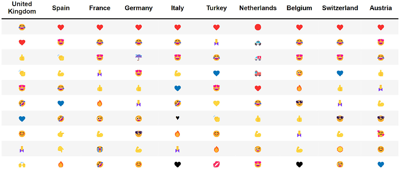
Figure 1. The top 10 most frequently used emojis by country.
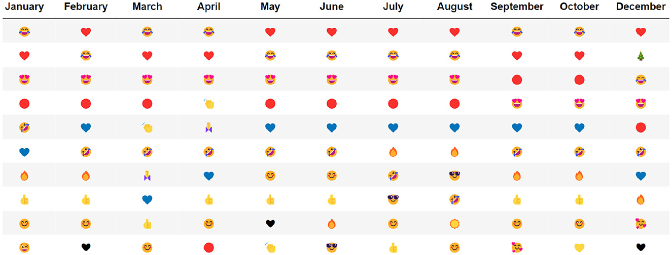
Figure 2. The top 10 most frequently used emojis by month.
3.3.1 Typicality
Absolute and relative frequency are popular tools in studies that work with social media data. However, although several existing studies make use of these standard statistical measures for data analysis, many also point out that these metrics are sufficient only for general trend analysis and are limited in their use with emojis (Barbieri et al., 2016; Li et al., 2019). In comparison with text, emojis are vastly more limited in their diversity and therefore the absolute and relative frequency of their occurrence provides results of only limited significance (Hauthal et al., 2021).
Typicality is an alternative statistical measure introduced by Hauthal et al. (2021) that determines how typical a given emoji is within a subset of a given dataset. This measure is calculated as the normalized difference of relative frequencies and the result is a proportional number indicating the typicality of the emoji occurrence.
Equation 1 shows the equation for typicality, where ns represents the number of occurrences of a designated emoji in a subset, Ns represents the number of all emojis in the subset, nt represents the number of the designated emoji in the total dataset, and Nt represents the number of all emojis in the total dataset. If a given emoji's typicality is positive for a subset, the emoji is considered typical; if the typicality is negative, the instance is considered atypical. The greater the absolute value of the result, the stronger the result.
Since typicality values are normalized and calculated for individual emojis within a subset, the influence of overactive users is reduced while accounting for the varying amounts of data available for each monthly subset given the temporal gaps in the dataset. Although other normalization and relative frequency measures exist, typicality was selected for use in this study due to its relative simplicity of calculation.
The protection and preservation of data privacy is a topic that inevitably rises when discussing social media data, and existing studies have used a wide variety of approaches to address this issue. HyperLogLog (HLL) is an algorithm and data abstraction format that is particularly popular for scenarios involving Big Data because it can be used to efficiently estimate the number of distinct elements in a large dataset in a process called cardinality estimation (Dunkel et al., 2020). HLL also helps to address issues posed by user overrepresentation and non-human users including bots (McKitrick et al., 2022) by reducing the influence of overactive users in the dataset. Although HLL does not completely anonymize data (Desfontaines et al., 2019), the HLL data format can be used in combination with other data abstraction strategies, such as cryptographic hashing and spatial data aggregation, to improve the protection of private user information in comparison with raw data.
The HLL algorithm is explained thoroughly in Flajolet et al. (2016). In the analysis, the HLL algorithm was used to calculate the total number of user days per emoji and per country. The term user day is adopted from Wood et al. (2013) and refers to the number of unique users who posted at least once during a day. For example, if the same user posts the red heart emoji on two different days, then that emoji was used on two user days. The emoji may also have two user days if two different users post the red heart emoji on the same day.
Lists of the top countries and emojis by user days were used to narrow the focus of the initial data analysis. Unfortunately, the HLL-formatted data could not be used to investigate individual emojis because the algorithm separated emoji and hashtag pairs during the data transformation. Due to the ambiguity of the results from the HLL data analysis, only the methods and results of the raw data analysis will be further discussed in this article. The details of the HLL analysis can be found in Dunkel et al. (2020) and Levi (2022). To address user privacy in the raw data analysis, usernames were not collected at all and cartographic results were visualized in aggregated grids to avoid the visual identification of individual users.
Temporal typicality in the context of this research refers to the iterative calculation of each emoji's typicality for each monthly subset of the larger dataset. To limit the exploratory analysis to the most influential emojis, the temporal typicality was calculated for the top 50 emojis by absolute frequency and the top 50 emojis by user days. Due to some overlaps between the two lists of emojis, the temporal typicality was conducted for 55 emojis. Each calculation was conducted using monthly subsets of the 11-month dataset (see Section 3.1).
After calculating typicality based on temporal subsets, spatial subsets were also used to identify spatial trends in emoji usage. Spatial typicality was conducted for two spatial aggregates: country boundaries and 100 by 100 kilometer grid cells.
First, the spatial typicality analysis was conducted on subsets of tweets generated by a point-in-polygon operation using the boundaries of the ten countries with the highest number of user days as determined by the HLL analysis. Then, typicality was calculated for each of the 10 most frequently used emojis within each country, resulting in 100 typicality scores. Next, for emojis that were found to be typical for a particular country (i.e., emojis which had positive typicality scores), a list of co-occurring hashtags was collected in order to determine the most common topics associated with that emoji. In order to focus the analysis on countries with more social media activity, the most typical emojis were then calculated for the ten countries with the most user days using the HLL algorithm for cardinality estimation. Because typicality scores can be exaggerated for infrequently used emojis, a function was created to calculate typicality for emojis used at least 1,000 times in each country. This function returned a Python dictionary containing country names (keys) and dataframes with emojis in their generic form, the total occurrences of the emoji in the given subset, the name of the emoji, and the typicality of the emoji where the country dataset is used as the subset (values). Figure 3 shows the generated output for Spain. The emojis are listed in descending order by typicality.
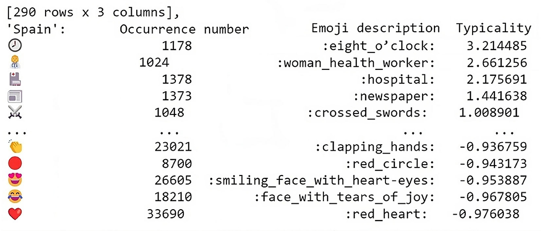
Figure 3. The typicality of emojis used over 100 times in Spain.
Each of the resulting Python dataframes was then filtered and ranked so that only emojis with positive typicality values within each country were included in the dataframe. Emojis with negative typicality values which had been previously been included in the analysis were filtered out. The resulting dictionary was then exported for use during the emoji-specific analysis portion of the workflow. In other words, only emojis which were found to have positive typicalities in one of the selected countries were used in the next portion of the analysis. Further spatial analysis and visualization was necessary to illustrate the typicality of these emojis outside of across the entire study area. This method revealed several emojis with high typicalities that, due to lower absolute frequencies, would otherwise not have been investigated in this analysis. Emojis with positive typicalities for each country were further analyzed during the emoji-specific analysis. For countries with many typical emojis, the top three most typical emojis were selected for analysis. In many cases, the emojis with the highest positive typicalities are some of the least frequently occurring emojis within the given threshold.
The second spatial analysis of typicality used a 100 by 100 kilometer grid for analysis and visualization. This system follows the methods used in Mukherjee et al. (2022) which demonstrate the usefulness of spatial typicality visualizations for interpretations. For each of the 100 selected emojis, a choropleth map was generated by assigning each grid cell a color according to the typicality value of the emoji in that location.
Once each point in the dataset was assigned to a corresponding grid cell, spatial typicality was calculated for the top 100 emojis by absolute frequency. That is, for each cell in the generated grid, the typicality of an individual emoji was calculated using all points assigned to the same grid cell as the subset. Once the typicality of each emoji within each grid cell was calculated, resulting maps were generated using the GeoPandas (Jordahl et al., 2020) and Matplotlib (Hunter, 2007) Python libraries. The following section provides more detail about the design decisions.
Each of the 100 resulting maps serve to visualize locations in which each emoji was found to typically occur. These maps effectively visualize and communicate the regional popularity of certain emojis. All of the resulting maps are available in the results folder of the Data availability statement repository under SpatialTypicality_Grids.
3.4 Cartographic design process for in-depth visual analysis
The goal for the visualizations in this study was to create legible maps with minimalistic design to facilitate the visual analysis of dozens of maps at a time following the concept of small multiples. One map would be created per emoji at this stage of analysis. Design decisions were based on basic cartographic design principles of legibility and compared with existing examples wherever possible.
A custom color ramp ranging from beige to white to blue was used to represent negative, negligible, and positive typicality values, respectively. Beige was selected to represent negative values so that locations where an emoji is atypical would still be visible but less visually dominant than locations with strong typicality. The color palette diverges around white so that typicality values close to zero, which give us very little information about the typicality of an emoji at that location, are granted the least visual weight.
The size of grid cells used for visualization was also an important element in the design of these spatial typicality maps. Two data granularities were compared for legibility, one with grid cells measuring 50 by 50 kilometers and one with grid cells measuring 100 by 100 kilometers (see Figure 4). While the 50 by 50 kilometer grid allows for the more precise identification of local trends in emoji usage, the presentation of so much visual information at a fine granularity is not ideal for the efficient interpretation of spatial trends. The 100 by 100 kilometer grid, on the other hand, presents a coarser representation of spatial trends which smoothens the visual representation by reducing the number of values shown. In practice with the small multiples technique, the larger grids display fewer values to be visually assessed, making them easier and faster to interpret—an important quality when interpreting results across one hundred emojis as was performed in this analysis. Due to the nature of the point-in-polygon calculation method used during analysis, only rectangular grid cells were suitable for the analysis.
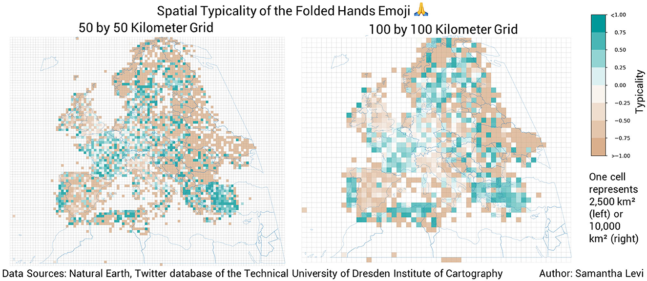
Figure 4. A comparison of the spatial typicality of the folded hands emoji visualized on a 50 by 50 kilometer grid (left) and a 100 by 100 kilometer grid (right).
Other reasons for the selection of the larger grid include privacy awareness and the reduction of computational effort. The 100 by 100 kilometer grid cells offer a more conservative protection of location information (Dunkel et al., 2020). This is especially useful in this application because the original data used for spatial typicality calculations was not spatially aggregated during collection. Visualizing the data at a coarser spatial resolution allows for a more privacy-aware display of coordinate points by concealing fine detail, especially in sparsely populated areas as discussed in Dunkel et al. (2020). Since the spatial extent of grid cells is also used for the creation of the subsets used in typicality calculations, it is also beneficial to use larger grid cells since they produce similar visual results while requiring only one-quarter of the typicality calculations. This also greatly reduced the processing time required to create each map.
Another critical element of the cartographic design was the decision not to crop grid cells to country boundaries. While cropped maps were created as part of the iterative design process in an attempt to improve aesthetics, the maps obscured coastal data and in some cases prevented the visual detection of high-typicality areas (see Figure 5). For example, in the cropped map representing the spatial typicality of the microbe emoji, regions of typical emoji usage in western Turkey and the Baltic Sea are difficult to interpret due to obscured coastal data. In the uncropped map, these regions of typical emoji usage are just as visible as other regions. In order to provide spatial context in the uncropped maps, country boundaries were laid over the grid cells.
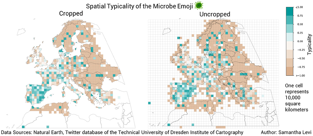
Figure 5. A comparison of the spatial typicality of the microbe emoji in cropped (left) and uncropped (right) formats.
Here it should also be acknowledged that some grid cells in each map indicate typicality values over bodies of water. This phenomenon is documented in other visualizations of geo-social media data (Kejriwal et al., 2021) and is sometimes the result of tweets being published from small islands and boats. Since Twitter geolocation information is sent from a user's browser or device, the precision and accuracy of the geotagging also depends on the GNSS of the device.
Given these design considerations, the spatial typicality analysis was conducted at a spatial resolution of 100 by 100 kilometers. This workflow allows for the visualization of emoji use over space to supplement the findings of the country-based calculations. The workflow of this section can be found in the notebook named SpatialTypicality_Grids in the Data availability statement.
3.5 Topical consistency
After conducting the raw and HLL data exploratory analyses, it was necessary to distinguish between topic-specific and non-topic-specific emojis because certain emojis not only exhibit more distinctive variations in typicality over time, but also seem to represent more concrete topics. For example, the temporal typicality of the face with medical mask emoji over time varied much more than the temporal typicality of the red heart emoji. Between these two emojis, the face with medical mask emoji also seems to represent a much more specific concept (medical masks) than the red heart emoji (love or general approval). Furthermore, only a few of the most frequently used emojis demonstrated significant changes in typicality over time; most typicalities hovered around zero, indicating their consistent use across time (see Figure 6).
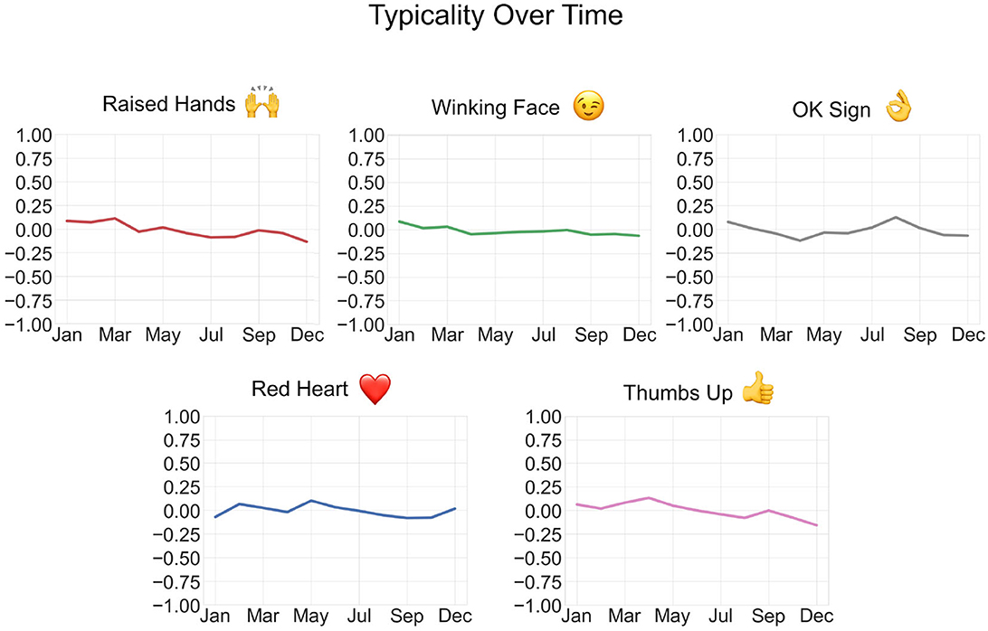
Figure 6. Some emojis displayed little to no change in typicality across the monthly subsets (no data for November).
Because many of the emojis analyzed did not demonstrate significant change in typicality over time, topical consistency over the study period was not investigated for all top 50 emojis by absolute frequency or user days. Take, for example, the red heart emoji. The red heart emoji is used consistently over space and time; in other words, it was not found to typically occur during any one month or at any particular locations. Therefore, even if the red heart emoji was found to consistently refer to a specific topic, occurrences of this emoji would not help to illustrate changing topics of discussion online. Therefore, the focus of analysis was restricted to emojis that were either hypothesized to be topically consistent, or which demonstrated positive typicality within one of the top 10 countries by user days. Once the topical facet of each emoji was established, spatial and temporal typicality analyses were conducted for topic-specific emojis. In other words, only once potential topics of discussion were identified through emojis could the spatial and temporal occurrences of those topics be analyzed via emoji use.
Our aim was to identify topically consistent emojis whose typicality over time and space showed variations that could lend insights about popular topics of discussion on Twitter. Determining topical consistency via an empirical methodology was an essential step to mitigate the influence of author's assumptions about emoji meanings.
To establish a method for identifying topically consistent emojis, two emojis were selected that were hypothesized to be topically consistent: the wine emoji and the beer mug emoji. These emojis represent concrete objects that are semantically similar to each other (both alcoholic beverages) but still distinguishable and specific enough that differences in the topical facet should still be detectable during analysis. Further, based on known consumption patterns across Europe, we can also assume a spatial variation in their occurrence. A viable method for the determination of topical consistency should be able to successfully differentiate these two emojis.
The topical facet of the data was defined as the combination of emojis and hashtags that occur within the same post. Therefore, a list of co-occurring hashtags was generated for each emoji selected for analysis. Topically consistent hashtags were quantified, and the resulting ratio of topically consistent hashtag uses to total hashtag uses in the list was calculated. Since the process of interpreting hashtags and grouping them by theme was a labor-intensive process that could not be automated, only the 20 most commonly co-occurring hashtags per emoji were analyzed. This resulting percentage was the topical consistency of the given emoji. In order to determine what topic an individual hashtag was referring to, the Twitter hashtag explorer (www.twitter.com/explore) was used to gather related posts and compare them for topical consistency. The number of co-occurring hashtags in the list comes with a time-completeness trade-off; more hashtags in the list could return more precise results but would also take more time to analyze. Since many hashtags in the list had to be individually contextualized and interpreted, it was not feasible within the time frame of the project to include more than 20 hashtags per emoji.
Since the beer mug and wine emojis both represent concrete objects, their topical consistency percentages were used as a guideline to assess other emojis. The beer mug emoji demonstrated a topical consistency of 92.1% and the wine emoji demonstrated a topical consistency of 75.4%.
The lower percentage of topical consistency for the wine emoji is due to the conservative definition of topically consistent hashtags. Hashtags that were too vague or which might have been used in reference to a different topic were considered not topically consistent for this analysis. In other words, a co-occurring hashtag has to be both topically consistent and topically specific in order to be included in the calculation of topical consistency. For example, the hashtags #france and #italy both frequently co-occurred with the wine emoji and could be used in reference to the wine production of these countries. However, to avoid the over-estimation of topical consistency, both hashtags were not considered to be topically specific to the wine emoji and were not included in the calculation of topical consistency.
Based on these benchmark calculations, an emoji was said to be topically consistent if more than 70 percent of posts using the top 20 co-occurring hashtags refer to the same topic. To this end, occurrences of thematically similar hashtags were summed up and divided by the total number of posts created in each co-occurring hashtag table. An example of this methodology is shown in Table 1 for the face with medical mask emoji, which was confirmed as being symbolic of the COVID-19 pandemic and associated safety measures. To see the co-occurring hashtag tables for all emojis analyzed, see the Data availability statement Github repository.
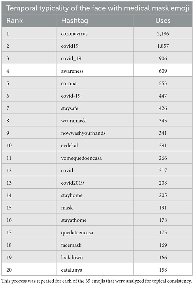
Table 1. An example of a co-occurring hashtag table with topically consistent hashtags highlighted in gray.
While the meaning of some hashtags was relatively straightforward and consistent, additional investigation was often necessary in order to determine topical consistency. The Twitter hashtag explorer was used as a way to “ground-truth” the data with real examples of how the hashtag was used. Thematically ambiguous hashtags, such as names of cities, regions, or countries, were always considered to be non-topic specific, resulting in more conservative estimates of topical consistency. Hashtags not written in English were translated either by the authors or using online translation services. In instances where hashtag meanings were still unclear even after translation into English, native speakers were consulted to deduce their meaning in context.
3.6 Emoji-specific analysis
Although the analysis of temporal and spatial typicality per emoji helped to identify trends in emoji usage, they each only illustrate part of the picture. In order to gain an understanding of how emojis are used over both space and time, the temporal and spatial facets of the data needed to be analyzed together. To achieve this goal, we visualized the spatial typicality of selected emojis over time. The results for each emoji are eleven maps displaying spatial typicality per month which can either be viewed as a matrix or as an animation (see Data availability statement).
Of the sixteen emojis that were determined to be topically consistent, nine emojis which demonstrated less bot influence and which represented a variety of topics were selected for further spatial-temporal analysis (the face with medical mask, raised fist, rainbow, microbe, breast feeding, golfing man, woman health worker, ballot box with ballot, and bomb emojis). A 100 by 100 kilometer grid was once again implemented to create spatial subsets of the data. The subsets in this case were groups of posts that were posted in the same month within the same grid cell. Spatial typicality maps of the entire study area were generated for each individual month in the dataset, meaning 11 maps were generated for each emoji (one for each month except for November, which was missing from the dataset). When these map frames are viewed simultaneously, they allow for a visual analysis of changing trends in emoji usage over both space and time following the methods used by Koylu (2019). The map frames can be found in the Data availability statement Github repository.
As discussed in McKitrick et al. (2022), a common method used in geo-social media analysis is the comparison of results from a social media dataset with evidence from an alternative confirmatory source. This comparison demonstrated the validity of the findings by determining the degree to which the results from the social media data emulate the patterns observed in real-world events related to the given topic. An effort was therefore made to ground-truth trends found in the spatial-temporal analysis using evidence from real-world events. However, due to time constraints and the labor-intensive nature of the comparison, this additional investigation could only be conducted for a subset of the emojis selected for the emoji-specific analysis. This workflow involved identifying typicality hot-spots on the generated maps and researching corresponding events occurring at that time and location as well as researching large events related to each topic and searching for corresponding trends in the visualizations.
4 Results
4.1 Emoji use over time and across space
Basic summary statistics of the absolute frequency of emojis on monthly subsets demonstrates that variations in emoji use over time exist, while the temporal typicality analysis was able to uncover more specific temporal patterns within the dataset.
Not all emojis demonstrated similar levels of variation. While some emojis were used fairly consistently over space and time, others varied greatly over one or both dimensions. Figures 6, 7 show a selection of emojis with stagnant and dynamic temporal typicalities, respectively. The degree to which emoji use changes over time depends on the emoji and the list of analyzed emojis is not exhaustive; therefore, no conclusions can be made about changes in general emoji use over time.
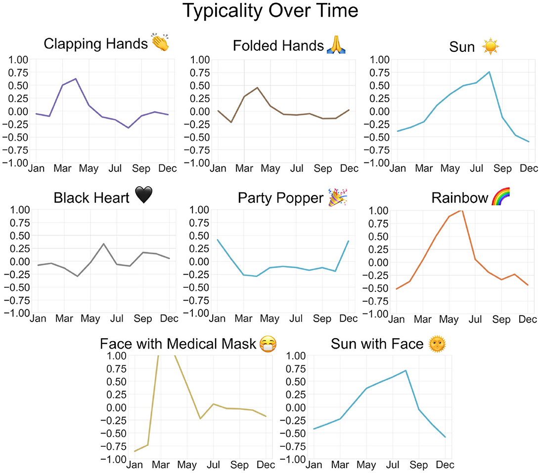
Figure 7. Some emojis were selected for further analysis based on identifiable trends in typicality over time.
The results of the spatial typicality analysis support the conclusion that emoji use is heterogeneous across space. While many of the most frequently used emojis, including the red heart and laughing crying emojis, demonstrated typicalities ranging from only –0.5 to 0.5 (indicating they are so consistently popular across space that they are not typically found in any one location), some emojis displayed significant geographic trends.
Figure 8 demonstrates the ambiguous spatial trends of the party popper and hot beverage emojis. These emojis, like the majority of the 100 analyzed emojis, did not demonstrate patterns in spatial typicality which could be identified without further clustering analysis. However, some emojis did display strong trends in use over space, sometimes along country boundaries, like the dog face emoji in Germany and the United Kingdom and the soccer ball emoji in Spain and Poland (see Figure 9), and sometimes along landscape features, like the water wave emoji which has positive typicality in coastal regions and the snowflake emoji, which is typical along mountain ranges like the Alps and the Pyrenees as well as in Scandinavia (see Figure 10).
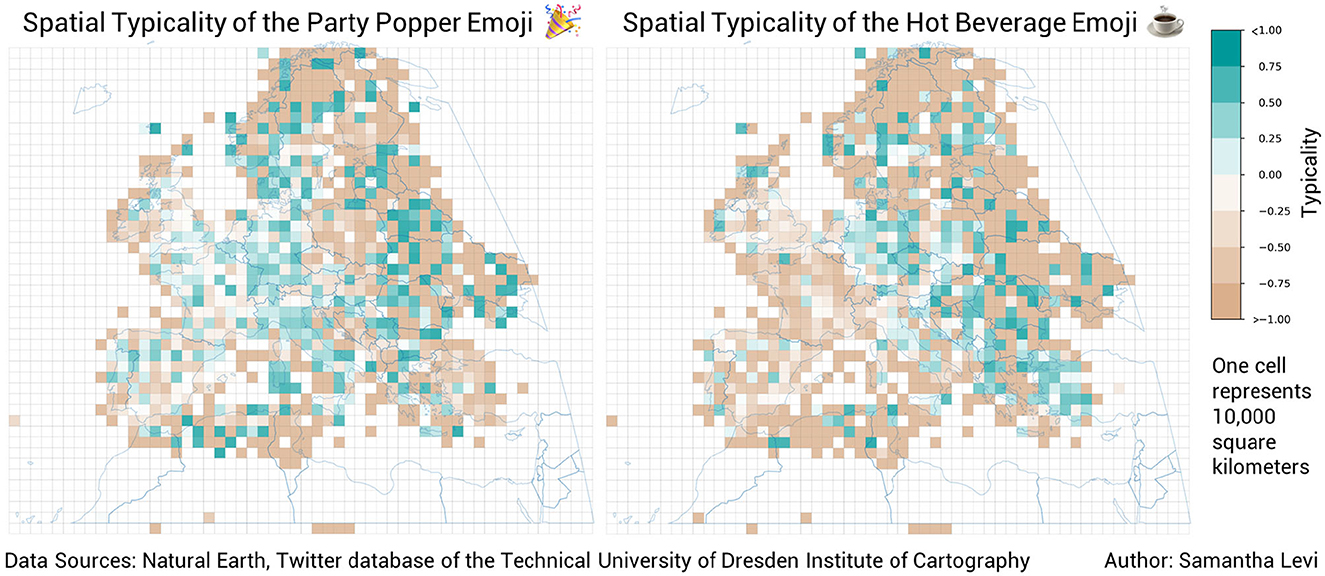
Figure 8. The spatial typicality of the party popper and hot beverage emojis. Both of these emojis demonstrate ambiguous spatial trends that do not give concrete insights into the use of either emoji.
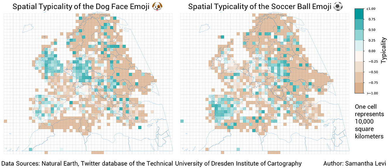
Figure 9. The spatial typicality of the dog face and soccer ball emojis. Both of these emojis demonstrate distinctive, country-based spatial trends.
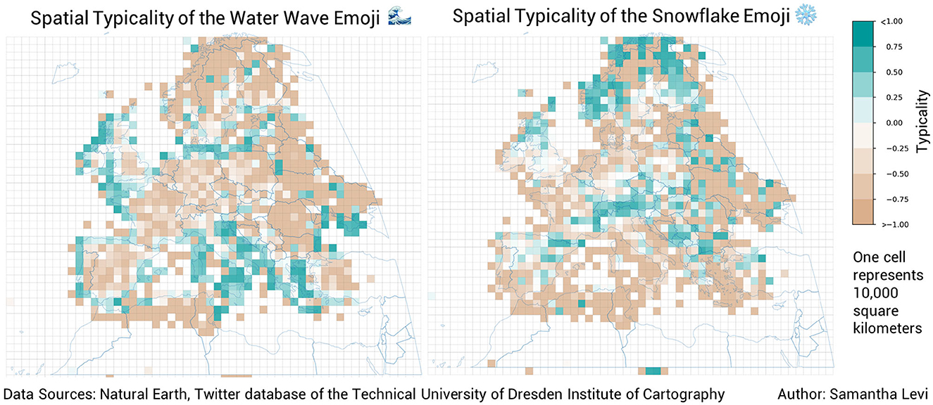
Figure 10. The spatial typicality of the water wave and snowflake emojis. Both of these emojis demonstrate distinctive, environment-based spatial trends.
4.2 Topically consistent emojis
Ultimately, 35 emojis were investigated for topical consistency. Ten of these were selected based upon their hypothesized connection to relevant topics, and the remaining 15 were analyzed because they were found to be highly typical in one of the top 10 countries ranked by total user days. Several examples of trends and their coinciding, real-world events are listed below. It should be noted that this workflow was not equally feasible for all emojis and was only performed for emojis that were both topically consistent and displayed significant spatial, temporal, or spatial-temporal trends.
The raised fist emoji was found to have a topical consistency of 90.94% concerning the Black Lives Matter (BLM) movement. Based on the results of the temporal typicality, it is clear that a general increase in typicality of raised fist emoji occurs in June 2020 (see Figure 11). This phenomenon coincides with the international BLM movement gaining momentum online after the infamous murder of George Floyd by police officers in the United States in late May 2020. More specifically, in May of 2020, the results of the spatial-temporal analysis show the raised fist emoji being typical in the area surrounding Paris, France (see Figure 12). This phenomenon corresponds accurately with the discussion and organization of a demonstration on June 2nd that took place despite a ban on gatherings of more than 10 people that existed at the time.
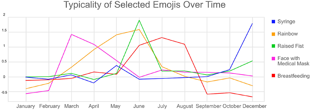
Figure 11. Typicality of the raised fist, syringe, rainbow, face with medical mask, and breastfeeding emojis over time.
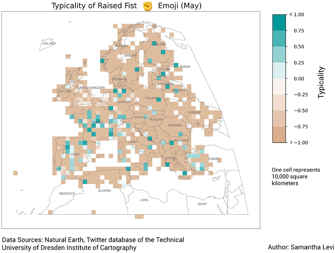
Figure 12. Typicality map of the raised fist emoji.
The ballot box with ballot emoji also displayed a striking trend during spatial analysis (see Figure 13). The ballot box emoji demonstrated a topical consistency of 72.1% concerning elections and was typically found in France and Poland, two countries which held elections during the year 2020. In Poland, the presidential election was scheduled to take place in May but was postponed due to the pandemic. The first round of voting took place in late June, but since no candidate received a majority of the vote, a second round was held in July. In France, both senate and municipal elections took place in the same year.
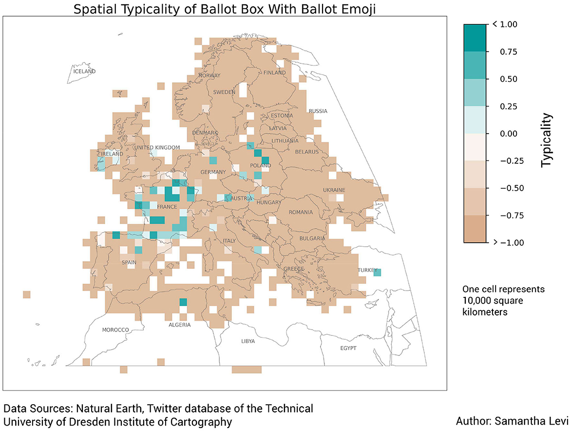
Figure 13. Typicality map of the ballot box with ballot emoji.
The breastfeeding emoji demonstrated a topical consistency of 88.8% concerning breastfeeding and childcare. This emoji experienced a spike in typicality during the months of June, July, and August, as shown in Figure 11. This time frame corresponds with World Breastfeeding Week and similar social media campaigns that took place in July of 2020 to raise awareness and support for breastfeeding (Moukarzel et al., 2021).
The face with medical mask emoji had a topical consistency of 92.9% concerning COVID-19 and displayed a dramatic increase in typicality for the month of March and remained typical throughout the months of April and May as shown in Figure 11. This trend coincides with the beginning of the COVID-19 pandemic in March 2020 and the subsequent establishment of mask mandates and other restrictions in many European countries. Indeed, the effect of the COVID-19 pandemic can be seen in the coinciding rise in typicality of the folded hands emoji, the 8 o'clock emoji, hospital emoji, and the woman health worker emoji, which all have increases in typicality during March and April. The syringe emoji demonstrated an increased typicality at the end of the year in October and December due to a rise in discussions about vaccines.
The rainbow emoji had a topical consistency of 71.7% with regard to LGBTQIA+ rights and was found to be typical for the months of April, May, and June. This can be partially explained by the fact that June is international pride month, during which topics related to the LGBTQIA+ community are discussed. The rise in typicality during April and May may be due to the frequency of weather patterns that produce rainbows during these spring months.
5 Discussion
This study was able to successfully glean insights about popular topics of discussion on Twitter by tracing emoji use within geo-tagged tweets. A methodology was established to determine the topical consistency of a given emoji using co-occurring hashtags and then to map that emoji's usage across time and space to detect relevant patterns. Although some emojis have ambiguous or vague meanings, emojis that were found to be topically consistent could be spatiotemporally analyzed to reveal trends in online discussions. Unlike similar studies in the realm of spatial analysis of geo-social media data, this research used a dataset that was not pre-filtered thematically and traced changes in emoji usage over both space and time. The typicality measure was successfully used to measure the comparative popularity of emojis within spatial and temporal subsets of data.
The results of this study benefit the field of digital humanities because it proposes a relatively computationally non-intensive method for topic detection in social media data. As opposed to similar studies like Kruspe et al., which leveraged trained neural networks for text-based sentiment analysis on social media data, the methodology developed in this study is comparatively less computationally intense due both to the limited number of emojis that exist and the relatively straightforward computation of typicality. The relative simplicity of typicality makes the methods presented in this study much more transparent and easily reproducible than other, more advanced computational methods.
It is essential to note that, while this dataset is as complete as possible given the available Twitter data, geotagged Twitter data is not necessarily representative of the global population (Malik et al., 2021; Ostermann, 2021) or even of all Twitter users (Sloan and Morgan, 2015). In order for posts to be geotagged with a precise location, users must override Twitter's default settings and specifically agree to the use of their precise location. Therefore, the users represented in this dataset do not make up a random sample of the population; rather, they form a specific subset of users who are comfortable with these alternative settings. By including only Tweets containing both emojis and hashtags, this dataset also represents only those users comfortable using both of these features. Individuals who are less comfortable with using emojis or hashtags, or who use social media less frequently for whatever reason (age, socioeconomic class, etc.) will be unavoidably under-represented in this dataset. Despite these unavoidable qualifications, the Twitter dataset allows for a much broader scope of data than is possible through other methods at this time.
Analyzing emojis in tandem with co-occurring hashtags helped to reveal the influence of bots. Several instances were identified in which the high typicality values of certain emojis in certain countries could be attributed to hyperactive non-human users known as bots. For example, the red circle, police car, ambulance, and fire engine emojis all displayed abnormally high typicality values in the Netherlands (11.12, 17.93, 15.14, and 15.99, respectively). Each of these emojis co-occurred with the hashtag #p2000, which is an automated Dutch emergency alert system which uses these emojis in tweets to notify the public about dangerous activity. Similarly, the automobile, vertical traffic light, and construction sign emojis demonstrated typicalities of 165.05, 106.916372, and 143.16, respectively, in the Czech Republic. Upon further analysis, the top co-occurring hashtag by far for each of these three emojis is #nehody, the Czech word for accident. According to results from the Twitter hashtag explorer, this hashtag is used by a Czech emergency alert system. The umbrella with rain drops emoji in Germany also displayed a high typicality value (11.44) which was later linked to the hashtag #wetter and an automated weather-update Twitter account. These examples illustrate the importance of further analysis for emojis that demonstrate high typicalities.
Improvements could also be made to strengthen the statistical validity of the results presented in this study. While the results of the spatial-temporal typicality analysis allow for the non-arbitrary visual analysis of trends in emoji usage, further quantitative spatial-temporal analysis could be conducted using data clustering algorithms such as Density-based spatial clustering of applications with noise (DBSCAN). Space-time scan statistics could also be used to detect statistically significant clusters of emoji usage.
The results of this study support the use of emojis as indicators of spatial-temporal-thematic developments in geo-social media and illustrate the necessary considerations to be made when working with such data. Namely, the degree of topical consistency of each emoji should be taken into consideration when drawing comparisons between the use of emojis over time and space and the discussion of related topics on Twitter. Additionally, statistical measures that are easily skewed by hyperactive and non-human users, like absolute and relative frequency, are limited in their ability to derive meaningful insights from the data and should be avoided for the selection of relevant emojis. Metrics that are normalized across users, like typicality and user days, serve to minimize these influences.
This analysis sought to fill an existing research gap by using a non-thematically-filtered dataset that analyzed emoji use across both space and time. Typicality calculations were performed for spatial and temporal subsets of the dataset to gain insights as to the variation in emoji use over space and time. The topical facet was explored via emoji-hashtag combinations, and a methodology was proposed for the approximation of an emoji's topical consistency using the top 20 co-occurring hashtags with each emoji. For emojis which demonstrated topical consistency, further spatial-temporal typicality analysis was conducted. The resulting visualizations of this study highlight emojis that have significant spatial or temporal variations in use and which demonstrate approximate topical consistencies of over 70%. These visualizations have a minimalistic, straightforward design and can be viewed either as static matrices or as animations that facilitate comparison over time and space.
The approach used in this study and the methodologies proposed for data analysis and exploration proved sufficient to identify relevant topics within the dataset. However, additional considerations could be implemented in the methodology to produce further insights. Some modifications that were made to the dataset to simplify calculations, such as the removal of skin tone modifiers on emojis and the removal of Regional Symbol Indicator letters representing flag emojis, could be eliminated in future research, or other modifications, such as the removal of gender modifiers, could be added.
Data availability statement
The generated datasets, visualizations, and code used in this study can be found in the following GitHub repository: https://github.com/samsmop/Visualizing_Emoji_Usage_Geo-Social_Media.
Author contributions
SL: Conceptualization, Formal analysis, Investigation, Methodology, Validation, Visualization, Writing—original draft. EH: Conceptualization, Funding acquisition, Project administration, Supervision, Writing—review & editing. SM: Data curation, Resources, Software, Supervision, Writing—review & editing. FO: Supervision, Writing—review & editing.
Funding
The author(s) declare financial support was received for the research, authorship, and/or publication of this article. This research was completed as part of a thesis for the M.Sc. Cartography program which is funded by the European Union's Erasmus Mundus program. The Article Processing Charges (APC) were funded by the joint publication funds of the TU Dresden, including Carl Gustav Carus Faculty of Medicine, and the SLUB Dresden as well as the Open Access Publication Funding of the DFG.
Acknowledgments
The authors would like to thank Prof. Dipl.-Phys. Dr.-Ing. habil. Dirk Burghardt for his feedback during the research process and Dr.-Ing. Alexander Dunkel, who lent his expertise and technical guidance to this project.
Conflict of interest
The authors declare that the research was conducted in the absence of any commercial or financial relationships that could be construed as a potential conflict of interest.
Publisher's note
All claims expressed in this article are solely those of the authors and do not necessarily represent those of their affiliated organizations, or those of the publisher, the editors and the reviewers. Any product that may be evaluated in this article, or claim that may be made by its manufacturer, is not guaranteed or endorsed by the publisher.
Supplementary material
The Supplementary Material for this article can be found online at: https://www.frontiersin.org/articles/10.3389/fcomm.2024.1303629/full#supplementary-material
References
Andersson, E., and Öhman, J. (2017). Young people's conversations about environmental and sustainability issues in social media. Environ. Educ. Res. 23, 465–485. doi: 10.1080/13504622.2016.1149551
Ayvaz, S., and Shiha, M. O. (2017). The effects of emoji in sentiment analysis. Int. J. Comput. Electr. Eng. 9, 360–369. doi: 10.17706/IJCEE.2017.9.1.360-369
Bai, Q., Dan, Q., Mu, Z., and Yang, M. (2019). A systematic review of emoji: current research and future perspectives. Front. Psychol. 10:2221. doi: 10.3389/fpsyg.2019.02221
Barbieri, F., Espinosa-Anke, L., and Saggion, H. (2016). “Revealing patterns of twitter emoji usage in barcelona and madrid,” in Artificial Intelligence Research and Development, 239–244.
Chandra, R., and Krishna, A. (2021). COVID-19 sentiment analysis via deep learning during the rise of novel cases. PLoS ONE 16, e0255615. doi: 10.1371/journal.pone.0255615
Chen, Y., Yuan, J., You, Q., and Luo, J. (2018). “Twitter sentiment analysis via bi-sense emoji embedding and attention-based lstm,” in Proceedings of the 26th ACM international conference on Multimedia (ACM), 117–125. doi: 10.1145/3240508.3240533
Desfontaines, D., Lochbihler, A., and Basin, D. (2019). Cardinality estimators do not preserve privacy. Proc. Priv. Enhan. Technol. 2019, 26–46. doi: 10.2478/popets-2019-0018
Dunkel, A., Andrienko, G., Andrienko, N., Burghardt, D., Hauthal, E., and Purves, R. (2019). A conceptual framework for studying collective reactions to events in location-based social media. Int. J. Geogr. Inf. Sci. 33, 780–804. doi: 10.1080/13658816.2018.1546390
Dunkel, A., Löchner, M., and Burghardt, D. (2020). Privacy-aware visualization of volunteered geographic information (vgi) to analyze spatial activity: a benchmark implementation. ISPRS Int. J. Geo-Inf. 9, 607. doi: 10.3390/ijgi9100607
Feldman, L. B., Barach, E., Srinivasan, V., and Shaikh, S. (2021). “Emojis and words work together in the service of communication,” in Workshop Proceedings of the 15th International AAAI Conference on Web and Social Media.
Flajolet, P., Fusy, E., Gandouet, O., Meunier, F., Morales, C., and Welke, P. (2016). “Understanding the hyperloglog: a near-optimal cardinality estimation algorithm,” in The 3rd Computer Science Conference for University of Bonn Students (CSCUBS).
Gabarron, E., Dorronzoro, E., Rivera-Romero, O., and Wynn, R. (2019). Diabetes on twitter: a sentiment analysis. J. Diab. Sci. Technol. 13, 439–444. doi: 10.1177/1932296818811679
Goodchild, M. F. (2007). Citizens as sensors: the world of volunteered geography. GeoJ. 69, 211–221. doi: 10.1007/s10708-007-9111-y
Granell, C., and Ostermann, F. O. (2016). Beyond data collection: objectives and methods of research using vgi and geo-social media for disaster management. Comput. Environ. Urban Syst. 59, 231–243. doi: 10.1016/j.compenvurbsys.2016.01.006
Guntuku, S. C., Li, M., Tay, L., and Ungar, L. H. (2019). Studying cultural differences in emoji usage across the east and the west. arXiv [Preprint]. arXiv:1904.02671. 226–235.
Hauthal, E., Burghardt, D., and Dunkel, A. (2019). Analyzing and visualizing emotional reactions expressed by emojis in location-based social media. ISPRS Int. J. Geo-Infor. 8, 113. doi: 10.3390/ijgi8030113
Hauthal, E., Dunkel, A., and Burghardt, D. (2021). Emojis as contextual indicants in location-based social media posts. ISPRS Int. J. Geo-Inform. 10, 407. doi: 10.3390/ijgi10060407
Hunter, J. D. (2007). Matplotlib: a 2D graphics environment. Comput. Sci. Eng. 9, 90–95. doi: 10.1109/MCSE.2007.55
Imran, A. S., Daudpota, S. M., Kastrati, Z., and Batra, R. (2020). Cross-cultural polarity and emotion detection using sentiment analysis and deep learning on covid-19 related tweets. IEEE Access 8, 181074–181090. doi: 10.1109/ACCESS.2020.3027350
Jordahl, K., den Bossche, J. V., Fleischmann, M., Wasserman, J., McBride, J., Gerard, J., et al. (2020). Geopandas/geopandas: v0.8.1.
Kejriwal, M., Wang, Q., Li, H., and Wang, L. (2021). An empirical study of emoji usage on twitter in linguistic and national contexts. Online Soc. Netw. Media 24, 100149. doi: 10.1016/j.osnem.2021.100149
Kim, K.-S., Kojima, I., and Ogawa, H. (2016). Discovery of local topics by using latent spatio-temporal relationships in geo-social media. Int. J. Geograph. Inf. Sci. 30, 1899–1922. doi: 10.1080/13658816.2016.1146956
Koylu, C. (2019). Modeling and visualizing semantic and spatio-temporal evolution of topics in interpersonal communication on twitter. Int. J. Geograph. Inf. Sci. 33, 805–832. doi: 10.1080/13658816.2018.1458987
Kruspe, A., Häberle, M., Kuhn, I., and Zhu, X. X. (2020). Cross-language sentiment analysis of European twitter messages during the COVID-19 pandemic. arXiv preprint arXiv:2008.12172. doi: 10.48550/arXiv.2008.12172
Levi, S. (2022). Emojis as indicators of spatial-temporal-thematic developments in geo-social media. Master's thesis. doi: 10.5194/ica-abs-5-75-2022
Li, C., Sun, A., and Datta, A. (2012). “Twevent: segment-based event detection from tweets,” in Proceedings of the 21st ACM International Conference on Information and Knowledge Management, 155–164. doi: 10.1145/2396761.2396785
Li, M., Chng, E., Chong, A. Y. L., and See, S. (2019). An empirical analysis of emoji usage on twitter. Ind. Manag. Data Syst. 119, 1748–1763. doi: 10.1108/IMDS-01-2019-0001
Lin, T. J., and Chen, C. H. (2018). A preliminary study of the form and status of passionate affection emoticons. Int. J. Design 12, 75–90. Available online at: https://www.ijdesign.org/index.php/IJDesign/article/view/2650/821
Ljubesic, N., and Fiser, D. (2016). “A global analysis of emoji usage,” in Proceedings of the 10th Web as Corpus Workshop.
Malik, M., Lamba, H., Nakos, C., and Pfeffer, J. (2021). “Population bias in geotagged tweets,” in Proceedings of the International AAAI Conference on Web and Social Media, 18–27. doi: 10.1609/icwsm.v9i4.14688
McKitrick, M. K., Schuurman, N., and Crooks, V. A. (2022). Collecting, analyzing, and visualizing location-based social media data: review of methods in GIS-social media analysis. GeoJournal. 88, 1035–1057. doi: 10.1007/s10708-022-10584-w
Moukarzel, S., Rehm, M., Caduff, A., del Fresno, M., Perez-Escamilla, R., and Daly, A. J. (2021). Real-time twitter interactions during world breastfeeding week: A case study and social network analysis. PLoS ONE 16, e0249302. doi: 10.1371/journal.pone.0249302
Mukherjee, S., Hauthal, E., and Burghardt, D. (2022). Analyzing the eu migration crisis as reflected on twitter. KN - J. Cartogr. Geogr. Inf . 72, 213–228. doi: 10.1007/s42489-022-00114-6
Ostermann, F. O. (2021). Linking geosocial sensing with the socio-demographic fabric of smart cities. ISPRS Int. J. Geo-Inf. 10, 52. doi: 10.3390/ijgi10020052
Ostermann, F. O., Huang, H., Andrienko, G., Andrienko, N., Capineri, C., Farkas, K., et al. (2015). Extracting and comparing places using geo-social media. Int. Soc. Photogram. Rem. Sens. 2, 311–316. doi: 10.5194/isprsannals-II-3-W5-311-2015
Prada, M., Rodrigues, D. L., Garrido, M. V., Lopes, D., Cavalheiro, B., and Gaspar, R. (2018). Motives, frequency and attitudes toward emoji and emoticon use. Telem. Inform. 35, 1925–1934. doi: 10.1016/j.tele.2018.06.005
See, L., Mooney, P., Foody, G., Bastin, L., Comber, A., Estima, J., et al. (2016). Crowdsourcing, citizen science or volunteered geographic information? The current state of crowdsourced geographic information. ISPRS Int. J. Geo-Inform. 5, 55. doi: 10.3390/ijgi5050055
Sloan, L., and Morgan, J. (2015). Who tweets with their location? Understanding the relationship between demographic characteristics and the use of geoservices and geotagging on twitter. PLoS ONE 10, e0142209. doi: 10.1371/journal.pone.0142209
Wiesław, W. (2016). Sentiment analysis of twitter data using emoticons and emoji ideograms. Centr. Eur. J. Soc. Sci. Human. 296, 163–171. Available online at: https://api.semanticscholar.org/CorpusID:12981030
Keywords: geo-social media, location-based social media, emoji, spatial-temporal analysis, geovisualization
Citation: Levi S, Hauthal E, Mukherjee S and Ostermann FO (2024) Visualizing emoji usage in geo-social media across time, space, and topic. Front. Commun. 9:1303629. doi: 10.3389/fcomm.2024.1303629
Received: 28 September 2023; Accepted: 04 January 2024;
Published: 17 January 2024.
Edited by:
Karolina Uggla, Mälardalen University, SwedenReviewed by:
Tumasch Reichenbacher, University of Zurich, SwitzerlandAntoni Moore, University of Otago, New Zealand
Copyright © 2024 Levi, Hauthal, Mukherjee and Ostermann. This is an open-access article distributed under the terms of the Creative Commons Attribution License (CC BY). The use, distribution or reproduction in other forums is permitted, provided the original author(s) and the copyright owner(s) are credited and that the original publication in this journal is cited, in accordance with accepted academic practice. No use, distribution or reproduction is permitted which does not comply with these terms.
*Correspondence: Eva Hauthal, eva.hauthal@tu-dresden.de