SimpleChartsRI: A User-Friendly Web-Tool for Creating Effective Visualizations
 Spaulding Matthew Michael
 Sean Khang
  Hamouda Sally
- Rhode Island College, Providence, Rhode Island, United States
Data visualization tools can help teachers engage students who are visual learners. Current web-tools that focus on the creation of visualizations are not beginner-friendly and require little support for teachers wishing to implement visualizations into their classrooms. As a result, teachers rarely use visualization tools. This paper addresses the lack of visualization tool usage in classrooms, analyzes why this is based on previous research and current research we conducted, and offers potential focuses a visualization tool should have—through the lens of our own tool SimpleChartsRI—for pedagogical use. SimpleChartsRI aims to help high-school teachers create effective visualizations through a simple user-friendly interface that guides them on best practices.
Introduction
Given that 40% of students are visual learners (Ricketts et al., 2018), visualizations are crucial for students retention. They allow students to make sense of complex data that would otherwise be difficult to understand. Ricketts found that with current instruction mostly coming in the form of auditory and textual learning—written and spoken word—students who are visual learners underperform (Ricketts et al., 2018). With the rise in technology and big data, data and visualization literacy are becoming necessary skills for students preparing to enter the workforce in any field—and in the case of visualizations becoming increasingly more present in day-to-day life, visualization literacy is crucial in a time where misinformation is commonplace. Yet, data science and data visualization classes are not widely common in high schools.
In order to address the low usage of visualizations in classrooms, given that adding entirely new classes is extremely difficult, one must rely on teachers to incorporate visualizations into their classrooms. While this would not result in students having the same understanding of data science and data visualization if they were to take an entire class on the subject, it would help some students retain key information better in general classes. However, available tools for creating visualizations are limited in accessibility due to their steep learning-curves, download requirements, sign-in requirements, and paywalls. The time-cost associated with these limitations can prevent teachers from incorporating visualizations into their classrooms, and thus harm visual learners and reduce data and visualization literacy in students.
While current tools offer expansive collections of fancy charts, they fail to deliver the essential charts—bar charts, line charts, area charts, etc.—in a way that is simple to access for students and teachers. Available tools provide methods to create charts but provide little support (apart from random samples of data) to help the user find relevant and effective datasets. For high-school teachers, finding datasets that engage and connect with students is a difficult task. Additionally, these tools do not often guide the user on the best visualization practices, which can result in ineffective visualizations that fail to deliver on their desired outcome. Having a tool that helps teachers create visualizations through a simple process can allow teachers to include visualizations in their classrooms and help increase data science literacy.
Why Data Visualizers Are Not Widely Used as Educational Tools
While visualization tools offer unique and effective methods of delivering information, they are not commonly used (Knobelsdorf et al., 2012). Knobelsdorf analyzed the use of visualization tools by teachers and students when teaching and learning programming respectively and found that both parties tend not to use visualization tools (Knobelsdorf et al., 2012). Hundhausen, as cited by Knobelsdorf, claimed that teachers who used visualizations were most likely apart of the development process of that tool (Knobelsdorf et al., 2012).
The reason for the low usage of visualization tools is practicality according to Knobelsdorf (Knobelsdorf et al., 2012). While tools can help students simply visualize complex concepts, there is an associated cost for teachers when using these tools. This cost comes in the form of time. If a teacher is interested in a visualization tool and wants to utilize it to, for instance, create a chart, they must first learn the tool, then find a good dataset that is suitable for their lesson and will likely be intriguing to their students, and then finally find a way to incorporate that visualization into their lesson plan. For something as simple as adding a single chart into their lesson, the time-cost associated with this process makes it unlikely for a teacher to utilize a visualization tool.
This idea of practicality being a reason teachers do not use visualization tools is supported by Astafieva when she analyzed the responses from 41 higher education professors and found that about half of the respondents rarely or never use digital visualization tools when teaching Mathematics (Astafieva et al., 2020). The responses for the lack of systemic use concerning data visualization tools (Table 1) were high time spent on preparation for classes (76%), lack of methodological support (73.7%), and a lack of digital skills (26.3%).
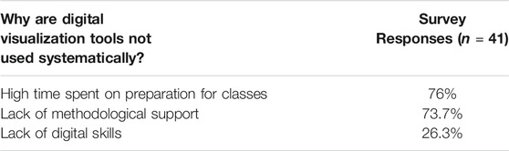
TABLE 1. Survey responses (Astafieva et al., 2020).
In May of 2020 we sent our own survey to Rhode Island high-school teachers. This survey was sent to teachers interested in attending a Data Visualization workshop. 13 high-school teachers who taught Science, Computer Science, Math, and Data Science responded. When asked, “Do you think your students will have the necessary skills at graduation for a Data Science major in college?” (Figure 1) the responses were as follows: 23% of teachers reported that all their students would be prepared, while 77% of teachers answered that some/few of their students had the necessary skills to major in Data Science. When asked further about whether they believed their school was equipped to teach students the skills they needed to know for a Data Science major or career (Figure 2), 23% said yes, 69% said they were somewhat equipped, and 8% said they were not equipped. In response to the previous question, when asked what their school might need in order to be better equipped (Figure 3), most teachers said they would need more teachers, computers, and training/personal development.

FIGURE 1. Teacher Responses to the question asking if students have the necessary skills to graduate for a data science major in college.
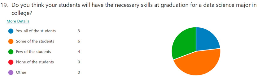
FIGURE 2. Teacher Responses to the question asking if schools are equipped to teach data science.
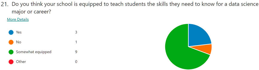
FIGURE 3. Teacher Responses to the question asking about school needs.
In summary, based on our surveys as well as past research, resources and lesson plans that teachers can utilize/create under guidance can increase the likelihood of visualizations entering a classroom.
Related Works
EduClust is an online application for teaching clustering algorithms that supports both real time teaching and learning in the classroom. The design was based on cognitive processes of active learning for the students to apply the algorithms, analyze them, evaluate, and then create their own. It has 15 pre-loaded examples of different as well as a create mode for users to import their own JSON file (Fuchs et al., 2019). In SimpleChartsRI, we also took a similar approach by having real time pre-loaded data that teachers can use on the go in the classroom and students can use as inspiration to create their own data.
CORGIS is a free, open-sourced web-based tool created at Virginia Tech to enable CS professors to use it as a teaching tool to teach non-CS majors data science. This tool contains over 40 real-time datasets that have been cleaned up and simplified for beginners (Bart et al., 2017). The visualizations created through the pre-loaded data can be interacted with but to an extent. The tool lacks interaction, such as highlighting or zooming the teaching capabilities of focusing on or hiding specific data. Our data also focuses on proximity techniques primarily to Rhode Island.
Visualization Resources is a web-based catalog for open-source resources for data visualization such as tools, survey papers, literature, and other websites. It is aimed at students, practitioners, and researchers. This web catalog was created to reduce the need to blindly search for data visualization resources (Liu et al., 2021). SimpleChartsRI is similar as we have a resource tab that includes slides on our workshop, activity books for teachers and students, auto-graded activities, and teacher-created activities. Our tool is more focused on data visualization, but we too want to give resources to our users, especially teachers and students.
Many Eyes is a public web-based tool for uploading data and creating interactive visualizations. Its focus is on its powerful data analysis capabilities and accessibility to users who don’t have much experience with visualizations. This tool also allows for communication amongst the community of users as well. With a registration requirement, users can comment on other visualizations and have discussions or link other resources (Viegas et al., 2007). Having this feature and having the accounts as a requirement is geared more towards older and single users and isn’t a tool that would allow quick simple access in the classroom.
Methods
SimpleChartsRI is a free web-tool focused on simplicity and accessibility. Unlike other visualization tools, it is specifically targeted towards teachers. It provides resources to help teachers build effective visualizations as well as references to visualization activities made by teachers and students. High-school teachers in the Rhode Island/New England area helped shape the focus of the site through surveys that asked for their most requested features. Written in HTML, CSS, and JavaScript, our tool utilizes multiple libraries such as Chart. Js and PapaParse to help high-school teachers create effective charts from csv data. Creating a chart is a three-step process (Figure 4). First, the user uploads, creates, or selects (from a sample list) some data (Figure 5). Second, they choose a chart that best fits their data (Figure 6). Then third, users are given options to customize, interact with, and download their created chart. SimpleChartsRI was tested in multiple browsers such as Chrome, Firefox, Opera, Edge, and Safari. It is available at simplechartsri.com.
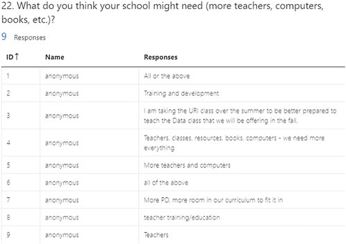
FIGURE 4. simplechartsri.com landing page.
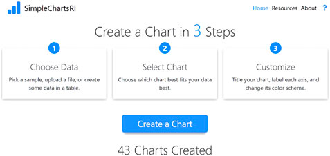
FIGURE 5. simplechartsri.com choose data step.
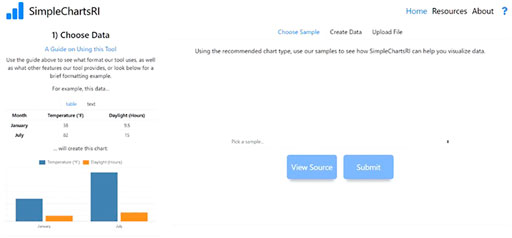
FIGURE 6. simplechartsri.com select a chart step.
Data Input and Parsing
Data can be uploaded through a csv file, chosen from a list of samples, entered as raw text (as Comma Separated Values or Tab Separated Values) in a textbox, or created through a table on the site. Creating data through the table allows users to drag and drop or copy and paste some data from another application like Excel, which further allows users to modify that data on the site itself.
SimpleChartsRI is deliberately designed to minimize features and allow users to create charts out of their data as quickly as possible. Uploaded or created data is expected to already follow a certain format. After some data is submitted, the data is parsed. All files are parsed locally on the user’s computer. This is done to protect the user’s privacy and ensure any sensitive data is not uploaded to a server or transmitted over the internet. The tool will parse through the file using PapaParse which is the fastest in-browser CSV parser for JavaScript. Data is parsed one row at a time and all values are stored as arrays of rows. Each column of data is stored as the same index of each array. The first column in a file is used as the header for x-axis values and will be converted as the first element in each array. The following columns are used as the corresponding y-values which follow the respected x-axis value. If needed, x-axis values are concatenated. All chart types follow this format, except for bubble charts which require a slightly different format because of the radius value which determines the size of each bubble.
Effective Sample Data
When using datasets in their lessons, teachers have two choices; to use artificial datasets, or to use real datasets. While artificial datasets save time, they can fail to motivate students. On the other hand, using real datasets involves a significant time-cost for teachers wishing to incorporate some data visualization into their teaching. This has been a significant problem for decades, as pointed out by Singer and Willett in 1990:
“Artificial data sets are often used to demonstrate statistical methods in applied statistics courses and textbooks. We believe that this practice removes much of the intrinsic interest in learning to do good data analysis and contributes to the myth that statistics is dry and dull.” (Singer and Willett 1990).
Artificial datasets not only harms statistics courses, as was the case with Singer and Willett, but they also harm students on other courses by preventing students from connecting to a topic, and thus failing to motivate them. Given advancements in technology—mainly in the availability of data and in the increasing number of visualization tools—teachers should strongly consider using real datasets. But the time-cost associated with finding real-world datasets is still a concern, even if it has improved.
Until recently, there was a lack of a single unifying source that pulls together the unique datasets found across the web and shows them on a single website. Google has attempted to solve this problem with their Dataset Search feature which allows users to find thousands and millions of datasets from across the web on their site alone. This feature relies on websites having the proper semantics attached to their datasets, and so it is up to the individual site owners to add the proper metadata. The tool exited beta on January 23rd, 2020 and is intended for scientists, data journalists, and anyone interested in data analysis.
With millions of datasets, it can still take time for teachers to find effective datasets. Many of these datasets found in Dataset Search are massive in their file size—thousands or millions of rows of data—and may not be interesting to the average high-school student. In courses unrelated to Computer Science and Big Data, these datasets may be too large and complex for beginner analysis. Overall, many of these datasets may be too overwhelming for students first being introduced to data analysis or for teachers looking to incorporate a simple visualization into their classroom without having to use Python or R, as is typically required when analyzing large datasets.
As a solution to this problem, SimpleChartsRI provides a growing list of sample datasets that are relevant and engaging to students. There are three types of sample datasets; datasets on popular topics affecting the world such as COVID-19 rates or climate change, datasets that are about topics popular among teenage students such as music or sports, and topics that are particularly effective because of their proximity. For data that is effective because of proximity, the site currently focuses on data local to students in Rhode Island and, occasionally, in the surrounding New England area. All these datasets contain sample sizes less than 1,000 and, in most cases, contain samples sizes less than 100, in accordance with feedback we received from high-school teachers in a survey that asked their preferred dataset size and based off Singer, who found that datasets in the 35–75 range were most effective for students (Singer and Willett 1990).
Effective Charts
SimpleChartsRI focuses on five basic charts: bar charts, line charts, pie charts, scatter charts, and area charts. These were chosen as the most useful charts based on a survey from high-school teachers that asked which charts they would most like to have.
In the third step of the chart-making process, users can customize the most impactful aspects of a chart (Figure 7). In accordance with the idea of simplicity and minimalism as a design philosophy to assist users unfamiliar with web-tools of this nature, the available customization options do not allow users to customize every specific aspect of their chart, as is common in other tools. Rather, users can customize their chart by giving it a title, naming the x axis and y axis, choosing a color scheme, and changing the chart type for different datasets to allow overlapping datasets of different natures (for example, a line chart can be overlayed on a bar chart). Certain charts have additional modification options; bar charts have a toggle to be transformed dynamically into horizontal bar charts or stacked bar charts. If the user is not pleased with the type of chart they choose, they can also change their chart type without reentering their data by changing to their desired chart on a dropdown menu. Once the user has customized their chart, they can download it as a PNG file.
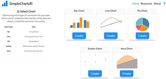
FIGURE 7. simplechartsri.com chart customization and interaction screen.
Just as chart customization is crucial, so is chart interaction. Users can explore their data dynamically in their chart in several ways. They can zoom and pan on the chart to key in on certain sub-stories being told within the larger story. Users can also toggle datasets on or off by clicking on their names in the legend at the top of the chart. This feature, tied in with the ability for users to hover over datasets in the legend and bring them into focus (by turning all other datasets transparent except for the dataset the user is hovering over), allows users to clean up and simplify their data. This enables users to, at runtime, visually explore the stories within their data without having to first find those stories in the, for example, csv files before they can see that data visually.
Ease-Of-Use
While the surplus of customization options in other tools can appear beneficial, they can also heighten the learning-curve associated with these tools and can lead to visualizations that do not adhere to the best practices. Additionally, many of the chart types found in other tools are obscure and rarely, if ever, used by most teachers in their instruction.
Since many powerful visualization tools require complex interfaces, SimpleChartsRI scales back on the complexity of these tools while maintaining essential key features to accommodate beginner users. While having many customization options and ways of mapping the dimensions of a dataset can empower users, it can also overwhelm them. Similarly, having many pages and different screens the user must navigate through can further alienate users who are new to a particular tool/website.
Based on this, the site focuses on a three-step process that allows users to create a chart. Steps progressively unfold as the user inputs their data and choices into the information fields. This is done so the user avoids scrolling down the page. Each step is a separate page and divided so that the main content of that step is shown on the right, while a panel giving more information for that specific step is shown on the left. SimpleChartsRI also includes a brief guide that shows an overview and breakdown of certain key features. Additionally, all input fields on the chart page have an assisting tooltip to further clarify their use.
The main priority of the site is interface usability. This is done for non-tech-savvy teachers in order to ensure that they can create effective visualizations. Usability optimizations are based on common practices (large fonts, large buttons, black text on white backgrounds) while more specific optimizations are based on Phiriyapokanon’s user interface guidelines for elderly users (Phiriyapokanon, 2011). Optimizations, some in general terms, based on these guidelines are as follows: maintain a simple task structure, make use of multi model communication, avoid using a scroll bar, avoid all uppercase letters, avoid attention-grabbing techniques (moving or flashing text), do not use more than four different font sizes per screen, use sans-serif font, use size 14 or higher, use left-justified text (for paragraphs, not simple sentences), maintain consistent commands and menus, offer some user guidance such as help systems or online manuals, have page-function unity (one page-one task).
Evaluation and Application
In the Summer of 2021, there was a 3-days workshop for high school STEM teachers who experienced using the tool and came up with plans on implementing it into the classroom. There were 11 teachers in total who attended. Following the end of the workshop, they filled out a survey on the tool’s overall usability and features.
Customization and Interaction Rating
Using a 1 (not good) to 5 (really good) scale on their overall experience with the customization and interaction of the charts they gave an average rating of 4.27. One teacher commented, “I like that labeling and pop-up information is easy to adjust. This also means that students become more proficient at improving the message for their audience.” and another that they would like to see the addition of trees and maps as other options for charts. Another teacher also expressed they would like to see additional features such as double Y-axes. The speaker for the workshop also gave a presentation on how she would implement the interaction with the chart into their lessons. In Figure 8, they revealed how highlighting the RBC count focuses the attention to that data by keeping the color for that data and greying out the others.
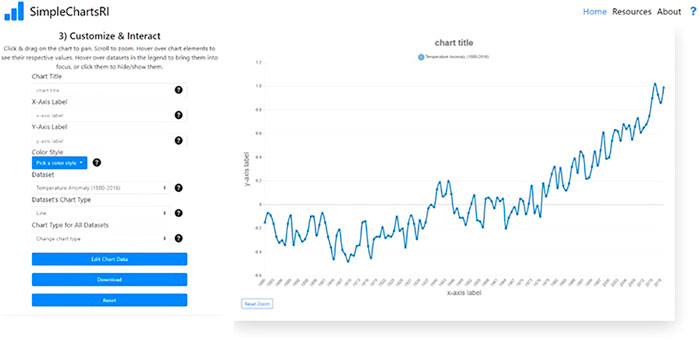
FIGURE 8. simplechartsri.com highlighting feature of the customization and interaction page.
Overall Rating
When asked to give an overall rating using the same scale, the teachers gave an average score of 4.36. They wrote in their evaluations “It is very easy to use” and “It seems very easy to navigate”. Some evaluations also came with ideas to add to the tool such as having more variety in chart options such as being able to generate equation of lines and confidence levels, access to metadata for the samples, and a video tutorial. One teacher also added that they would like to see a way for the work to be stored so that users can go back into their previous work. Overall, the teachers were satisfied with the simplicity of the tool and its ability to compliment their lessons. They enjoyed that our tool contained sample data that they could pull up right away in the classroom without having to search. Lastly, they found that they could implement the tool into assignments for the students and could use the tool to increase their students skills of data analysis.
Application
One of the teachers came up with a lesson in which they would help high school students train their analyzing chart abilities that they would lack when testing for the PSAT and SAT. Using one of the sample data from SimpleChartsRI, students would be tasked with filling out any missing components: title, labels, and scales by viewing the source of the data, indicating what the graph is depicting, and make conclusions about the relations between data such as the correlation between the lines of data in a line graph as shown in Figure 9.
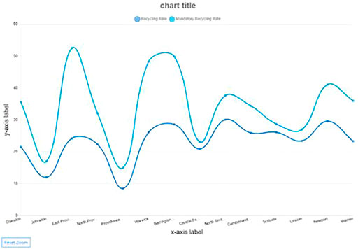
FIGURE 9. simplechartsri.com created line graph of actual recycling rate of Rhode Island cities compared to the mandatory rate.
Another lesson created was focused more on choosing which chart type would best visualize the data. The teacher used example data of pH levels of water both on the surface and bottom. As shown in Figure 10, they turned the data into three different charts: line, bar, and pie. After having the students look at the charts, the students would have to answer which chart best fits the data that is being represented. The answer that is being sought out is that the line graph is best to show the correlation between the surface vs the bottom pH levels while the other two charts make it more difficult to differentiate between the variations in the pH levels between the surface and bottom.
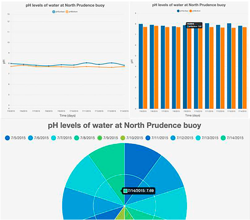
FIGURE 10. simplechartsri.com creation of line, bar, and pie chart from data table of pH levels by workshop attendees.
Using the same data, another teacher would also have students look at the correlation between the surface pH levels and the bottom pH levels. This time though, they would also need to figure out possible reasons why the surface pH levels are higher than the bottom. In this way, students would have to not only analyze the data but also critically think about the results of the collected data and what conditions affect the data.
Conclusions and Future Work
The intuitive nature of SimpleChartsRI removes the steep learning-curve found in other web-tools and enables users to create effective charts. Beyond allowing users to make static charts, SimpleChartsRI enables users to interact with their charts and dynamically simplify their data. Through this, users can explore multiple stories within their data and save additional time normally lost to reload their data. With a simple interface that removes the bloat of features found in other tools—which leads to users tinkering with customization options rather than focusing on data—SimpleChartsRI allows users to simply create effective charts and engage students with their data.
Currently, there are two planned features for SimpleChartsRI; the first feature focuses on expanding the sample data section to further assist teachers with finding effective datasets for classroom use, while the second feature would assist users with cleaning and restructuring their own dataset in order to then use with our tool. The former feature would focus on smaller, engaging datasets. This could come in the form of hand-picked datasets that would appear to be a more in-depth collection on the site. It could also come in the form of a search that brings together datasets from other sites, like Google’s Dataset Search—though this feature would focus primarily on small datasets, as previously mentioned. The second planned feature would help users minimize the time it takes to create a chart once they find an interesting dataset. The main functionality of this would revolve around transposing datasets, cleaning null values from datasets, and removing any comments or unwanted characters from datasets that would otherwise cause an error during parsing.
Data Availability Statement
The original contributions presented in the study are included in the article/Supplementary Material, further inquiries can be directed to the corresponding author.
Author Contributions
MS was responsible for creating SimpleChartsRI (the web-tool in which the paper is based on) as well as writing the paper. SH envisioned the web tool, was responsible for overseeing the work done on the web-tool and editing the paper. SK built version two of the system, wrote a related works section, and edited the method section.
Conflict of Interest
The authors declare that the research was conducted in the absence of any commercial or financial relationships that could be construed as a potential conflict of interest.
Publisher’s Note
All claims expressed in this article are solely those of the authors and do not necessarily represent those of their affiliated organizations, or those of the publisher, the editors and the reviewers. Any product that may be evaluated in this article, or claim that may be made by its manufacturer, is not guaranteed or endorsed by the publisher.
References
Astafieva, M. (2020). "The Use of Digital Visualization Tools to Form Mathematical Competence of Students.".
Bart, A., Whitcomb, R., Kafura, D., Shaffer, C., and Tilevich, E. (2017). Computing with CORGIS: Diverse, Real-World Datasets for Introductory Computing, 57–62. Available at: https://dl.acm.org/doi/pdf/10.1145/3095781.3017708.
Fuchs, J., Isenberg, P., Bezerianos, A., Miller, M., and Keim, D. (2019). EduClust - A Visualization Application for Teaching Clustering Algorithms. Eurographics Available at: https://diglib.eg.org/handle/10.2312/eged20191023.
Knobelsdorf, M., Isohanni, E., and Tenenberg, J. (2012). The Reasons Might Be Different: Why Students and Teachers Do Not Use Visualization Tools. Proceedings of the 12th Koli Calling International Conference on Computing Education Research, Koli, Finland, November 01, 2012 (New York, NY: Tampere University of Technology).
Liu, X., Alharbi, M., Best, J., Chen, J., Diehl, A., Firat, E., et al. (2021). Visualization Resources: A Starting Point. Available at: https://arxiv.org/abs/2108.08907.
Phiriyapokanon, T. (2011). Is a Big Button Interface Enough for Elderly Users? towards User Interface Guidelines for Elderly Users. Available at: www.diva-portal.org/smash/record.jsf?pid=diva2%3A416488.
Ricketts, H. K., Salsbury, A. M., Bevan, D. R., and Brown, A. M. (2018). Using Immersive Visualization Environments to Engage Students in Hands-On Learning. Proceedings of the Practice and Experience on Advanced Research Computing (PEARC ’18), New York, NY, USA, July 2018 Association for Computing Machinery, 1–5. doi:10.1145/3219104.3229274
Singer, J. D., and Willett, J. B. (1990). Improving the Teaching of Applied Statistics: Putting the Data Back into Data Analysis. The Am. Statistician 44 (3), 223–230. Available at: www.jstor.org/stable/2685342. doi:10.1080/00031305.1990.10475726
Keywords: technology, website, simplechartsRI, education, data visualizer, simple interface
Citation: Matthew Michael S, Khang S and Sally H (2021) SimpleChartsRI: A User-Friendly Web-Tool for Creating Effective Visualizations. Front. Comput. Sci. 3:706939. doi: 10.3389/fcomp.2021.706939
Received: 08 May 2021; Accepted: 11 October 2021;
Published: 27 October 2021.
Edited by:
Tom Crick, Swansea University, United KingdomReviewed by:
Adamantios Koumpis, University of Passau, GermanyRobert Laramee, University of Nottingham, United Kingdom
Copyright © 2021 Matthew Michael, Khang and Sally. This is an open-access article distributed under the terms of the Creative Commons Attribution License (CC BY). The use, distribution or reproduction in other forums is permitted, provided the original author(s) and the copyright owner(s) are credited and that the original publication in this journal is cited, in accordance with accepted academic practice. No use, distribution or reproduction is permitted which does not comply with these terms.
*Correspondence: Spaulding Matthew Michael, mattmspaulding@gmail.com