Interpreting Reports From Universal Screeners: Roadblocks, Solutions, and Implications for Designing Score Reports
 Pooja Shivraj
 Leanne R. Ketterlin-Geller
- 1American Board of Obstetrics and Gynecology, Dallas, TX, United States
- 2Research in Mathematics Education Unit, Southern Methodist University, Dallas, TX, United States
Many teachers struggle with interpreting formative assessment data. As a result, they are often unable to modify instruction that is responsive to student performance. To support valid interpretations and uses of assessments, test developers need to better understand teachers' ability to read and interpret score reports, their perception of the information that is being conveyed, and how they use the information to change instruction. The purpose of this manuscript is to report on a series of focus groups examining (a) how teachers interact with various score report features and (b) how these features support or hinder their ability to interpret and analyze formative assessment data. Results provide insights into the design of score reports that may facilitate teachers' ability to interpret and analyze data. Solutions to the roadblocks teachers encountered are proposed and generalized examples of how score reports can be designed to facilitate teachers' interpretations are provided. Findings from this study may help test developers anticipate challenges the intended audience could face when interpreting assessment results on score reports, and subsequently improve the quality of score reports to enhance teachers' interpretations and decision-making at the classroom level.
Introduction
Score reports, as defined by Rankin (2016), are the communication of assessment data through tables, graphs, and words, typically turning the data into actionable information. They are intended to convey how scores from an assessment can be understood appropriately in the context of the purpose, and what actions could be taken from the data (Hambleton and Zenisky, 2013). A score report may be a static report (online or paper), a series of reports, or a dynamic online reporting system. As O'Leary et al. (2017) note, score reports are not simply outputs of an assessment system, but instead are an integral cog in the assessment system on which they are reporting.
There is a growing body of research in the field of score reporting, specifically exploring how different representations are understood by end users and how score reports can be designed based on end-user recommendations (Hattie, 2009; Zapata-Rivera and Van-Winkle, 2010; Zenisky and Hambleton, 2012; Hambleton and Zenisky, 2013; Wainer, 2014; Zapata-Rivera and Katz, 2014; Brown et al., 2019; Hegarty, 2019; Slater et al., 2019; Tannenbaum, 2019). However, a review of recent research by Gotch and Roberts (2018) showed that between 2005 and 2015, there were only 60 scholarly works retrieved on score reports, with only nine examining the relationship between design/layout and end-user interpretations.
Conveying important information for end-users is not the only goal for score reporting; the information needs to be provided in a representation that is visually appealing and easily understandable (Tannenbaum, 2019). The data must be presented in a format such that accurate interpretations can be made, and reasonable, formative actions can be taken (Van der Kleij et al., 2014). Although research about score reporting is emerging, there remains a dearth of empirical studies focused on how educators interpret different representations within score reports, and the roadblocks they face while interpreting these reports. The purpose of this manuscript is to examine how teachers interact with score report features and how these features support or hinder their ability to interpret formative assessment data. Results provide insights into the design of score reports to facilitate accurate interpretation and use of assessment data.
Formative Interpretations of Assessment Data
From a test design and validity standpoint, a well-designed score report should ensure accurate interpretation and use of assessment data. However, ensuring educators interpret data from score reports accurately serves an additional purpose, especially if they can take action from data appropriately. Teachers' use of formative assessment data to make instructional decisions is positively associated with increased student achievement (Wayman, 2005; Wohlstetter et al., 2008; Gersten et al., 2009; Hattie, 2012; Datnow and Park, 2014). Although correlated, research on the causal relationship between teachers' use of formative assessment data and improved student outcomes is mixed. Black and Wiliam (1998) conducted a meta-analysis in which they concluded that assessments used for formative purposes, if implemented and interpreted appropriately, had the potential to increase student learning, with effect sizes ranging from 0.4 to 0.7. This review is one of the most commonly cited as evidence for the impact of use of formative assessment data on student achievement (Kingston and Nash, 2011; Briggs et al., 2012; McMillan et al., 2013). In a 2011 meta-analysis, Kingston and Nash identified 42 effect sizes from studies published between 1988 and 2011 (Kingston and Nash, 2011). The weighted mean and median effect sizes observed were 0.20 and 0.25, respectively, both smaller than previously reported; however, they still concluded that while further research was needed in the field, the results supported the assertion that teachers use of formative assessment data may improve student learning. Contradicting these reports, Briggs et al. (2012) and McMillan et al. (2013) disagreed with the conclusion that sufficient evidence is available to unequivocally link formative assessment use with improved student learning, noting methodologic issues with the previous analyses. More research is needed to understand the role teachers' use of formative assessment data plays on improving student learning. One possible mediator for this relationship is teachers' ability to first understand the results from the data and then modify their instruction based on their interpretation of the data (Heritage et al., 2009).
Hamilton et al. (2009) model a theory of change, and present how data use could impact student achievement. As part of this theory of change, Hamilton et al. (2009) describe an ongoing three-phase data use cycle, where teachers (1) collect a multitude of data about student learning, (2) interpret and analyze the data based on triangulation of different sources, and (3) modify their instruction or take other actions based on these results. Given that this is an ongoing process, the authors recommend restarting the cycle by collecting more student data to determine if teachers' instructional changes or actions have impacted their students' learning. The theory of action underlying Hamilton et al.'s model is that educators need to know how to interpret and analyze data so that they can eventually use the results to make decisions that will lead to improvements in student achievement (Datnow et al., 2012). Designing appropriate score reports to enhance educators' interpretability of assessment results can help them use the data produced within these reports to take appropriate instructional actions.
However, surveys administered by the U. S. Department of Education, Office of Planning, Evaluation and Policy Development (2008) showed that teachers and administrators face barriers enacting the second and third phases of the data use cycle proposed by Hamilton et al. (2009). More specifically, in a nationally representative survey of 1,039 districts, about 48% of teachers indicated the need for additional support on how to interpret data from the assessments they administered. Because many teachers struggle with data interpretation, they are unable to modify their instruction based on the data available to them and about 55% of both teachers and administrators expressed the need for help on how to modify and/or adjust instruction based on the observed results (Datnow et al., 2012).
The purpose of this manuscript is to present findings from a study examining how teachers interpret and analyze score reports from a universal screener to inform their instruction. The results reported here explicitly focus on phase two of the data use cycle and explore the intersection between data interpretation and assessment purpose. We examine how teachers interact with various report features and how these features support or hinder their ability to interpret and analyze data from universal screeners. We do not report on teachers' uses of these data within classroom contexts; further research is needed to empirically investigate the relationship between teachers' data interpretations and the actions they take during instruction.
Teachers' Interpretation of Data From Score Reports
Formative assessment is an evolving term that commonly refers to the process of using data collected during instruction to adjust ongoing teaching and learning for the intent of supporting student learning (Herman, 2016). A teacher may conduct a classroom discussion on adding integers and interpret students' responses as an indication that many students have a misconception about “two negatives make a positive” when adding. The teacher then uses this interpretation to design a review session and provide additional practice opportunities to distinguish the rules in integer operations. In this simple scenario, students' responses were interpreted and used to guide the teacher's instructional decision making; this process illustrates teachers' formative uses of data. Because the instructional actions are based on the accuracy of the teacher's interpretation of the data, understanding factors that impact teachers' data interpretation should be carefully considered. Summarized below is existing literature on teachers' personal characteristics associated with their data interpretation and features of score reports that impact interpretation.
It is important to note that factors impacting teachers' interpretation of data may vary depending on the purpose of assessment. For example, data used for accountability purposes might evoke different emotional states which impact teachers' interpretation of the data. Similarly, data displays might change for assessments designed for different purpose, thereby requiring additional knowledge and skills to interpret the results. In the context of the present study, data from the universal screeners within a multi-tiered system of support (MTSS) are used formatively by teachers, multiple times a year, to help them determine the level of instructional support students need to help the meet end-of-year curricular expectations. We thereby examine teachers' data interpretations for this specific formative purpose, namely interpreting scores from universal screeners with the MTSS. As such, after reviewing the general factors that impact teachers' data interpretation, we describe the score reporting features that may facilitate teachers' interpretation of results for this purpose.
Personal Characteristics Associated With Teachers' Data Interpretation
A score report may be able to provide all the necessary information to the end-user; however, user interpretability is essential for the score report to be put to use. Multiple personal characteristics impact teachers' data interpretation, including content-area knowledge, affective characteristics (i.e., attitudes toward teaching, learners, data, etc.), and experience and skills in accessing data systems. First and foremost, teachers must have sufficient content knowledge to interpret student learning goals obtained from the data (Aschbacher and Alonzo, 2006). This includes knowledge of both subject-matter content as well as application of the state and district content standards for instructional planning. In addition to content knowledge, another factor shown to impact teachers' data interpretation is their assessment literacy (Wu, 2009; Datnow and Levin, 2012), specifically understanding and applying measurement- and assessment-related concepts. For example, the U. S. Department of Education, Office of Planning, Evaluation and Policy (2009) found that only 33% of teachers with access to an electronic student data system felt that they were capable of forming their own data queries.
Reporting Features Associated With Teachers' Data Interpretation
Features of score reporting systems impact teachers' interpretations of data. For teachers to modify their instruction effectively using data from score reports, the third stage of the data use cycle (Hamilton et al., 2009), they need to be able to successfully interpret and analyze data in a meaningful way. Four key considerations of score reports have been examined that—if appropriately designed—can facilitate teachers' interpretation and use of assessment results including: (1) the format or layout of the report (e.g., graphical and tabular representations), (2) the clarity and accuracy of data summaries, (3) the use and explanation of specialized measurement and statistical vocabulary, and (4) the processes or steps required to read and decipher results (Herman et al., 1990; Hambleton and Slater, 1994; U. S. Department of Education, Office of Planning, Evaluation and Policy Development, 2011; Hegarty, 2019).
Format and layout of the report
The format or layout of the report refers to how the data is displayed within the report. The format or layout in which data within score reports is presented to end-users impacts their ability to interpret test results (Hegarty, 2019). Herman et al. (1990) and the U. S. Department of Education, Office of Planning, Evaluation and Policy Development (2011) found that practitioners had trouble interpreting reports when they were in formats that were non-graphical, such as bulky tables or narratives. They also found that practitioners showed an interest in trends via graphs over knowing exact numbers presented through tables. In addition, formats that reduced the cognitive load on end-users also make for effective displays (Foley, 2015). This could be done by deleting extraneous material from reports, highlighting essential material, or intentionally placing words and graphics to reduce cognitive load and enable simplicity in design (Wong, 2010; Foley, 2015). Forte-Fast (2002) described effective design features of tables that allow easy interpretation, which included putting numbers in the table without the percentage symbol to remove clutter, prominent gridlines to allow users to visualize sorting of data, and numbers that are rounded to the nearest whole (Wainer, 1992, 1997). Clarity in graphics was also specified as a key factor for effective reports (Hegarty, 2019). Clarity in graphics include making graphs easy to perceive in terms of contrast of the different elements, adding gridlines to graphs to make readability easier, and keeping text legible (Lane, 2015).
Effective score reports include a combination of tables and figures that provide consistent and complementary pieces of information along with text descriptions (Herman et al., 1990; Wainer, 1997; Forte-Fast, 2002; Lane, 2015; Evergreen, 2017; Hegarty, 2019). An effective and user-friendly reporting system also coordinates data across multiple reports, where applicable (Forte-Fast, 2002). Wainer (1997) and Education Commission of the States (2000) described effective reports as integrating both figures and text to allow for easy interpretation. Additionally, using a combination of tables and graphs can support educators, as well as serve different purposes since trends in data are easier to demonstrate via graphs, while tables can be used to display exact numbers (Wainer, 1997; Forte-Fast, 2002).
Clarity and accuracy of data summaries
The clarity of data summaries refers to how the data is summarized and interpreted within the report. Data from graphs and tables are often summarized within the report as a way to help the user interpret the report with ease. The way in which these representations clearly summarize data impacts the end-users' ability to interpret (and eventually use) the information. Lack of executive summaries or well-laid out keys posed a problem for practitioners when interpreting data (Herman et al., 1990; U. S. Department of Education, Office of Planning, Evaluation and Policy Development, 2011). Forte-Fast (2002) suggested that words in tables be fully spelled out to avoid misinterpretation or a separate key. Education Commission of the States (2000) and Forte-Fast (2002) also described effective reports as having well-labeled titles and footnotes. Additional features of interpretable reports that address this barrier include well-labeled titles, axes, and keys (Education Commission of the States, 2000; U. S. Department of Education, Office of Planning, Evaluation and Policy Development, 2011), and a brief introduction of the data, including the sample tested, the sample size, the administration window, and how the analysis was performed (Education Commission of the States, 2000).
Use and explanation of specialized measurement and statistical vocabulary
The use and explanation of specialized measurement/vocabulary refers to how specific terminology relating to the data is both used and explained within the report. Specialized vocabulary can pose as a barrier for interpreting data (Zwick et al., 2014). Case studies and interviews conducted by the U. S. Department of Education, Office of Planning, Evaluation and Policy Development (2011) with individual teachers from schools that were thought to be ahead of most schools in the nation with respect to data use showed that teachers struggled with understanding concepts of reliability and measurement error, and most teachers understood the concept as extrinsic to the measurement. Hambleton and Slater (1994) also noted that a common question from educators and policymakers revolves around the true meaning of the score and error associated with it. They also reported that educators and policymakers wanting to see more descriptive information about statistical jargon presented based on the interviews they conducted since they usually “glazed” over it or did not know how to use the information.
Processes for reading and deciphering results
The process or steps required to read/decipher results specifically refer to the cognitive load required to move from one data format to the next in order to make the interpretations and conclusions needed. This is tightly related to each one of the above considerations in that if the format, the summaries of the report, or the use of specialized vocabulary are not clear, the cognitive load required to decipher the results will be high. Many reports require end-users to complete multiple steps in order to interpret results within the score report (e.g., use a value within a table, make their own comparisons across time or people, etc.). U. S. Department of Education, Office of Planning, Evaluation and Policy Development (2011) found that while teachers could read off values from a graph or table easily, they struggled with two-step analyses, such as reading and comparing values, given the cognitive overload associated with the task requirement. Wainer (1997) stressed the importance of a summary statistic (i.e., the mean or median) for each column to describe the data as a whole, which may ease the barrier of the multi-step process educators would have to endure while interpreting data presented to them. Multi-step processes may also be easily digested by minimizing the amount of numbers and maximizing the interpretations made from the numbers instead (Hattie, 2012).
Although recommendations for effective and efficient report design are present in the literature (Herman et al., 1990; Wainer, 1997; Education Commission of the States, 2000; Forte-Fast, 2002; Wong, 2010; U. S. Department of Education, Office of Planning, Evaluation and Policy Development, 2011; Hattie, 2012; Foley, 2015; Lane, 2015; Hegarty, 2019), questions remain about what features support or hinder teachers' interpretation of formative assessment data from score reports.
Context of the Current Study
In this study, we focused on the second phase of the theory of action by examining how teachers interpret and analyze formative assessment data presented through intentionally-designed score reports. Specifically, we conducted a series of focus groups with 13 middle school mathematics teachers to determine how they interacted with various features of the score report and how these features supported or hindered their ability to interpret and analyze the data.
This study was situated within a larger statewide initiative that focused on implementing multi-tiered systems of support (MTSS) in elementary and middle school mathematics with the express purpose of supporting students' readiness for algebra. The initiative emerged from state legislative efforts to improve student achievement in middle schools and subsequently, in algebra (Perry et al., 2012). As part of this initiative, the state education agency engaged in efforts to equip schools and teachers with evidence-based resources for implementing MTSS, including assessments, instructional resources, and professional learning experiences. The assessments that were created for this initiative include universal screeners and diagnostic assessments, both intended to be used formatively. This study focuses on score reports designed for the universal screeners that were created for this initiative.
Universal Screening Within MTSS
Within an MTSS framework, one of the main purposes of universal screeners is to measure students' response to core instruction and to determine if students are in need of supplemental instruction (Ikeda et al., 2008; Parisi et al., 2014; Clemens et al., 2015). Universal screening is a process that includes systematically implementing short, technically adequate assessments to all students at regularly spaced intervals during the school year (e.g., fall, winter, and spring; Batsche et al., 2005). Results are used to identify if students are on track or at risk for meeting curricular expectations by the end of the school year (Glover and Albers, 2007). Using data from each administration of the universal screener, teachers can determine the level of intensity of instructional support students may need to help them reach the end-of-year curricular expectations (Mellard et al., 2010).
For the statewide algebra-readiness initiative, universal screeners (US-AR) were created that focus on key algebra-readiness knowledge and skills in Grades 5–8. These screeners are freely available to schools within the state who wish to engage in the MTSS initiative to improve students' algebraic readiness. Professional development materials are available to support implementation of MTSS, including teachers' understanding and use of assessment data. Because participation in this initiative is optional, schools who elect to use these resources are demonstrating a commitment to using formative assessment data to improve student learning.
As part of the systems-level MTSS framework, all students regardless of educational classification take the US-AR. The US-AR is an online multiple-choice test with 24 dichotomously-scored items and is administered three times a year (fall, winter, and spring; see Basaraba et al., 2015; Shivraj et al., 2015a,b; Ketterlin-Geller et al., 2019; for technical documentation). As previously noted, results from the US-AR are used to (1) identify students who are on-track and those who are at-risk for not reaching the grade-specific curricular expectations in algebraic reasoning, and (2) determine the intensity of instructional support required for those who are at risk for not meeting expectations, specifically for algebraic reasoning. To facilitate these interpretations, several considerations for score reporting were taken into account.
First, to determine if students are on-track or at-risk, teachers need to interpret the results in reference to the MTSS model and identify students' tiered placement. Categorical data are created by dividing the score distributions for each administration are divided into three tiers based on the level of instructional support needed: (a) Tier 1: Minimal to None; (b) Tier 2: Strategic; (c) Tier 3: Intensive. Students' scores are reported in reference to these criteria, and measurement error is noted to help teachers understand the certainty of the placement. These criterion-referenced interpretations can help teachers make instructional grouping decisions to which different interventions are applied.
Second, teachers need to interpret students' scores along the continuous scale to better understand the intensity of the instructional support needed. Examining the distribution of scores within each tiered category provides more information about student proficiency, and thus the intensity of instructional support students need to reach expectations. For example, a student scoring at the lower end of the score distribution for Tier 2 will likely need more intensive instructional support to reach Tier 1 than a student scoring at the upper end of the Tier 2 score distribution. In addition to helping teachers design their intervention strategies, these data can help teachers further refine their instructional grouping decisions.
Third, teachers need to monitor students' response to instruction and determine if all students are making adequate progress toward reaching expectations throughout the academic year. To facilitate these decisions, teachers need to interpret changes in the overall distribution of students' scores, students' tiered placement (categorical data), and their relative location within the tier (continuous data) over time. Changes in performance can be examined for individual students as well as groups of students.
Design of the US-AR Score Reports to Facilitate Decisions
As part of the initial instrument development process, the design team considered the intended interpretations and uses of the US-AR when specifying the format and features of the score reports. The design team included representatives from the state education agency, university partners, and the vendor. External consultants with expertise in mathematics education contributed to the design specifications. A process similar to that outlined by Zenisky and Hambleton (2012) was followed in which the purpose of the report and needs of the intended audience were carefully considered in the initial design process. The Standards for Educational and Psychological Testing (American Educational Research Association et al., 2014) and research available in the early 2010s (c.f., Wainer, 1992; Goodman and Hambleton, 2004) were consulted during this process. Many of these resources provided recommendations about the design of score reports for summative purposes; there was and continues to be a dearth of research on designing score reports for formative purposes, with a few notable exceptions (c.f., Roberts and Gierl, 2010).
Next, the design team reviewed sample reports from similar assessment systems in a series of meetings. Features of each report were discussed and strengths and limitations were noted. Based on these discussions, prototype reports were developed and refined until the final versions were created. Feedback on the final versions was solicited from key stakeholders across the state; minor changes were made based on the feedback process. Unlike the process outlined by Zenisky and Hambleton (2012), the final score reports were not field tested with a large sample of test users prior to implementation.
Data were gathered from key stakeholders about the professional development needs of test users, including teachers and school administrators. As a result, a suite of resources was created that was accessible from the online reporting system. Two online professional learning courses (one for teachers and one for school administrators) were designed that described the purpose of the universal screeners in the context of MTSS, provided interpretive guides for each report, and discussed the decision-making process for several example students. Additional materials included a quick-guide for interpreting the reports in reference to the MTSS tiers and a guide for communicating information with parents.
To facilitate the two purposes of the US-AR, the reports needed to convey the following information:
• Each student's performance and risk status and the intensity of support needed
• Comparison of performance of each student to class performance within administration
• Comparison of performance and risk status of each student across administrations
As previously noted, risk status was reported as a categorical variable (Tier 1, Tier 2, or Tier 3), while student performance on the US-AR was reported as a continuous variable using a scaled score. Using these criteria, two main reports are generated after administering the US-AR: (a) the Class Summary Report, and (b) the Comparison Over Time Report. Each report includes header information such as the report name, teacher name, and class period (when applicable for middle school settings) and is accompanied by a brief introductory statement that described the purpose of the assessment within the context of MTSS. An interpretive guide, key, and hyper-links to measurement vocabulary (e.g., measurement error) are accessible directly from the report.
The Class Summary Report is designed to help teachers determine which students within their class are at-risk, and the level of intensity of instructional support these students need. In addition, the other features of the report support teachers' understanding of (a) the overall performance of students in the class by tier, (b) the proportion of students in a particular tier within the MTSS framework, and (c) the trustworthiness of the student scores on the screener based on how close the scaled scores are to the cut scores and their measurement error.
This report presents assessment results in multiple representations, including a graph and table from a single administration of the US-AR. The table includes students' names, scaled scores, and measurement error. Scores are sorted into tiered categories. A histogram was chosen as the graphical representation for this report because it is an efficient way of presenting the distribution of students' scaled scores on the x-axis and the frequency of those scores on the y-axis (see Figure 1). The continuous variable (scaled score) is then categorized and color-coded by tier. To aide teachers' interpretation of the visual displays, the legend within the chart corresponds to the colors on the graph and provides information about the intensity of instructional intervention necessary for student progress toward algebra-readiness. Below the graph is a corresponding sortable table that provides students' names, their scale score, and their measurement error by tier. To support teachers' knowledge of specialized vocabulary, measurement error is defined.
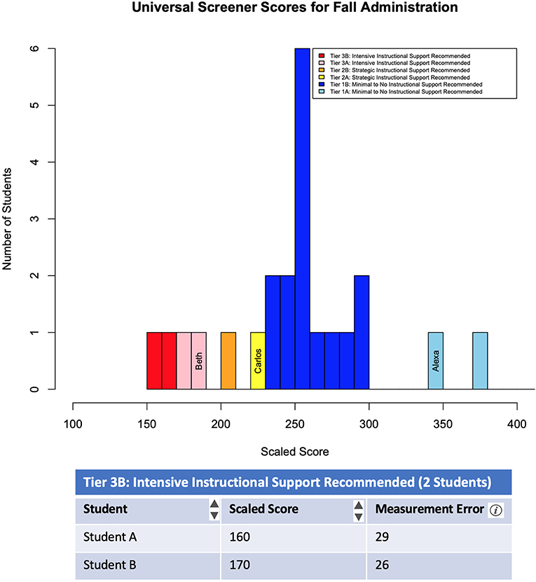
Figure 1. The Class Summary Report (students' names hidden; rest of table not shown). Each tier is divided into two additional tiers (A or B), with B having a lower scaled score than A.
Teachers can gather information about which students require strategic or intensive intervention by hovering over the histogram bars or using the table below the graph. In addition, teachers can see the overall performance of the class and how many students require intervention by looking at the distribution of the scores across the scale and the frequencies of students within each color-coded tier, or by scrolling to the table below the histogram. Finally, information about the trustworthiness of students' scores can be gained by evaluating measurement error of each student's score.
The Comparison Over Time Report is intended to help teachers monitor student progress over time. The report also supports teachers' understanding of (a) the minimum, maximum, mean, median, and quartiles of scores in a particular class, (b) a single student's score compare to the class statistics, and (c) a single student's score change over administrations (fall to winter to spring). To facilitate these interpretations, the design team elected to report class-level score distributions using a series of box-and-whisker plots with individual-level data superimposed via line graphs (see Figure 2).
Figure 2. The Comparison Over Time Report.
Each box-and-whisker plot displays the distribution of the students' scores (y-axis) for each administration of the US-AR (x-axis) for ease in examining changes over time in the distribution for a particular class. Box-and-whisker plots allow comparative analyses of the score distributions across multiple administrations of the US-AR. The cut score for proficiency is superimposed on the display to minimize the multiple steps required to interpret the information. The tiers of instructional support are indicated by color-coded bands on each plot. The meaning of the colors is clearly identified in the accompanying key and are consistent across reports to form a coherent and coordinated reporting system. Line graphs are superimposed on the box-and-whisker plots to display an individual student's score across multiple administrations. This additional graphic allows teachers to compare individual student's performance to growth of the class as a whole. Tabular data are not provided on this report because they are available on the Class Summary Report.
In this graph, the whiskers depict the minimum and maximum, the midline depicts the median or quartile 2 (Q2), and the box depicts Q1 and Q3 for teachers to interpret the descriptives of the scores generated from the US-AR. The mean of the class also overlays the box-and-whisker plot as a small dot to allow teachers to see how the class has performed on average. These descriptive statistics can be seen over time for both the class and a single student so teachers can make student-to-class comparisons as well as conclusions about how the student or class scores have changed over time.
As described, the Class Summary Report and the Comparison Over Time Report were intentionally designed to facilitate teachers' interpretation and analysis of data by attending to elements of the format and layout of the report, clarity and accuracy of data summaries, use and explanation of specialized vocabulary, and processes or steps needed to decipher the results. The purpose of this research study was to examine how teachers perceived of these reports and if attending to these elements supported or hindered their ability to interpret and analyze test results.
Methods
Participants
Thirteen sixth-grade mathematics teachers within a suburban independent school district in a southern state were recruited. Two of these teachers did not consent to participate for unknown reasons. Data are presented from the 11 consenting teachers who were from 10 different elementary schools within the district. All teachers were female, 10 of whom were White/Caucasian and one was Black/African American. The teachers had between 1 and 21 years of experience teaching mathematics (M = 9.46, SD = 5.75). All teachers were certified to teach 6th grade math either through math certification, such as Math 4–8, or Elementary Education, such as Elementary Education 1–6. The school district had already been implementing the US-AR situated within the MTSS framework at the start of the study.
Procedure
Teachers were randomly divided into two groups of 5 and 6 teachers. Structured focus groups with specific, tailored questions, were conducted with each group after the winter administration of the US-AR by researchers from the university partners involved in the design team. Each focus group lasted ~2 h. As part of the larger study, these teachers received 2 h of professional development on the interpretation and use of the US-AR prior to the start of their school year (~5 months before the focus groups).
Each focus group began with an introductory activity followed by a description of the purpose and intended uses of the teachers' feedback. Next, researchers engaged teachers' in an initial discussion about their use of data within their classrooms. Then, static screenshots were displayed of the Class Summary Report and the Comparison Over Time Report, successively, which were generated using real, deidentified student data. The interpretive features (e.g., hyper-links) were discussed but not interactively displayed. Prior to soliciting feedback, the researchers reiterated the purpose of the US-AR within the context of MTSS. Then, a general discussion about each report was facilitated using the following prompts:
• What was your overall impression of these reports?
• What additional information could be included in these reports to make them more useful or easier to interpret?
Follow up questions were asked based on the initial discussion. Data about teachers' perceptions and recommendations for improvement were captured through videos and field notes.
Analysis
The transcripts from the focus groups were analyzed qualitatively for common themes. A priori codes were established prior to coding (Creswell, 2013) using primary codes related to the questions, specifically roadblocks, likes, misinterpretations, and proposed suggestions/recommendations for improvement. These a priori codes were then nested by report for each of the two reports. The use of emergent codes was also made as patterns emerged from focus groups (i.e., tables, graphs, format, legend, summary, statistical vocabulary, color, recommendations, etc.). The emergent codes represented a second level of analysis, with the first level being the a priori codes and the second level being the emergent codes. The codes were aggregated into larger clusters of ideas or themes, specially based on the four key considerations of score reports listed above that can facilitate teachers' interpretation of assessment results (Herman et al., 1990; Hambleton and Slater, 1994; U. S. Department of Education, Office of Planning, Evaluation and Policy Development, 2011). For example, the emergent codes describing format of the report, such as format, graph, table, etc., were aggregated into the key consideration Format and Layout of the Report, as described in the literature.
The transcripts were coded by two independent researchers with a 20% overlap of transcripts for purposes of reliability, achieving an inter-rater reliability (kappa) of 0.86. NVivo was used for analysis and calculation of inter-rater reliability (QSR International, 2012). Since a kappa of over 0.80 was achieved with a 20% overlap, the rest of the focus group transcript was coded by a single researcher.
Results
Teachers' perceptions of the US-AR Class Summary Report and the Comparison Over Time Report, and the roadblocks they encountered in their ability to interpret both reports are presented in this section. Results provide insights into how teachers interact with various score report features, how these support or hinder teachers' ability to interpret and analyze data, and misconceptions when reading graphical displays. Teachers' perceptions and recommendations for improvement to enhance interpretations on the US-AR reports are presented by report within the context of the four overarching considerations found in the literature which were used as the emergent codes (i.e., data format, legends and summaries of graphs and data, specialized measurement and statistical vocabulary, and multi-step processes).
The Class Summary Report
Format and Layout of the Report
Teachers from both focus groups said that the Class Summary Report was helpful, and that it was easy to read, use, and understand. Comments that exemplify this perception included, “…a quick visual of how many kids are at each level…,” “I really like this [report] and the fact that it just gives me really quickly who's in which tier information. That's usually the first place I go to be able to see.”, “easy to use and understand”, and “…the colors provide a quick snapshot…” Teachers specifically liked that “…it's got colors… at the bottom…”. One teacher also said, “It gives you broad information and shows your range and where most of the scores tend, the trends that you have. I like looking at that, and then I scroll down and I look at the specific kids after that.” Given that the intended use of this US-AR score report is to allow teachers to determine what level of instructional intensity each of their students require and where each of their students are, the Class Summary Report was perceived as providing a quick visual to help teachers interpret the data.
Clarity and Accuracy of Data Summaries
Multiple teachers across both focus groups described having issues with distinguishing colors on the graph and corresponding legend, stating that, “I have a hard time distinguishing between a couple of the colors,” and hence distinguishing each of the tiers. Given the intended use of the US-AR score report is to identify students in the different tiers, a barrier to distinguishing colors on the legends of the graph would hamper data use from the US-AR Class Summary Report.
Use and Explanation of Specialized Measurement and Statistical Vocabulary
For the students listed in the table, teachers were unable to interpret the measurement error listed near the scaled score, and were also unable to determine how the scaled score was calculated or why the student was struggling, stating that they would be “…curious to know how it is scored,” “…what it is (students) struggled with,” “like the quick overview, but I don't really use the bottom numbers [in the table] much,” and “what the score means.” Specifically relating to the scaled score, a teacher said, “I don't really look at the numbers on it, but I mainly look at the tier it places them in, because you're going from zero to…it's just such a huge number range, that when I look at it,…I don't even look at, and maybe I should, but the actual numbers. I mainly look at the tier that they're in.” Given that the intended use of the US-AR is to determine whether students are or are not at-risk for algebra-readiness, providing teachers with information about the content on which students struggle is not necessary, and would typically be provided in a diagnostic assessment.
Processes for Reading and Deciphering Results
One teacher wanted the, “…option to sort in the different ways,” Based on just this graph, teachers were unable to gain a sense of how their class performed as a whole from the previous administration or what the mean/median of the class was—information they thought was important for decision-making. This required delving into other reports and processes. Because of this, teachers described a need to compare students across classes and triangulate information from the Class Summary Report and the Comparison Over Time Report in order to better understand data about their students.
Summary of Results From the Class Summary Report
Features that were considered to facilitate teachers' interpretation and analyses of the Class Summary Report included (a) the clear, color-coded legend, (b) the combination of a graph and a table to provide complementary pieces of information, and appeal to different types of end-users, (c) the color-coded graph to demarcate instructional tiers quickly and efficiently, and (d) the addition of a measurement error category so teachers can identify which students are close to the cut-scores who may either be considered false positives or false negatives.
However, teachers encountered roadblocks when interpreting this score report. First, teachers had difficulty distinguishing the color-coding of the instructional tiers on the graph. Second, teachers wanted to be able to monitor progress over time for individual students by scaled score and tiers within this report, as opposed to using the Comparison Over Time Report. Finally, teachers struggled to understand the meaning and range of the scaled scores.
Another theme that emerged focused on teachers' understanding of the purpose of universal screeners. Teachers noted that they would like to compare classes to determine the relative standing of each class. Because universal screeners are not intended to make class comparisons, this recommendation suggests that teachers may need additional training on the intended uses of these scores. Some cross-class comparisons may be useful for allocating resources; however, this was not the intent of these comments.
The Comparison Over Time Report
Across both focus groups, teachers struggled more with interpreting the Comparison Over Time Report than the Class Summary Report. General positive comments such as “I really like this report” emerged. On the other hand, comments such as “needs more detailed information,” “not as user-friendly,” and “I wouldn't go back to it after one quick glance” provided another view of how teachers perceived the report.
Format and Layout of the Report
One teacher said, “I really like this report. I feel it has like a lot of information that's very easy to read in a short amount of time… it's color coded so it's easy to kinda of, very quickly look at this and see where we were…”, and another stated that she liked it because “for a visual person, it is very helpful.” However, other teachers found it difficult to distinguish the squares and diamonds denoting the class mean from the student scaled score, saying “Once you know the report better, it's easier, but still colors [are]hard for me to differentiate between the levels.” Teachers also struggled with the lack of definition on what the boxes and whiskers meant in the box-and-whisker plot. Given the intended use of the US-AR over time is to determine whether students were moving across tiers within the year, not being able to interpret the graph would be a barrier to using the data from the reports.
Clarity and Accuracy of Data Summaries
Teachers were confused about the difference between the class vs. the student growth, especially since the graphs did not have titles, and/or have student names listed in the header, stating “The title would be nice. So I know what's being compared, because that was something that we couldn't really decide what is being compared to.”
Use and Explanation of Specialized Measurement and Statistical Vocabulary
Teachers made it clear that they were not necessarily familiar with the representation of a box-and-whisker plot since it was not used on a regular basis, stating “… [I need] a little bit more information about what the different… boxes, the box and whisker, and the class average. But like the dotted line, I know we had it in our training, but maybe the meaning and the meaning of the length of the whiskers as a key down [at the bottom] … But the size of the box and the size of the whiskers, the meaning of those things… Because, since you look at it more rarely, just having those right there.”
Summary of Results From the Comparison Over Time Report
Features that were considered to facilitate teachers' interpretation during the design of the Comparison Over Time Report included (a) the clear, color-coded legend, and (b) the quick graphic visual to denote changes in time for each student in comparison to class performance. Similar to the Class Summary Report, teachers encountered roadblocks when interpreting this score report. First, teachers had difficulty distinguishing the colors used to denote tiers on the graph and shapes used to distinguish the class mean and individual student's performance. Second, teachers also struggled to interpret the meaning of the box-and-whisker plot, which is a common barrier seen in the literature in relation to interpreting specialized graphics, including statistical terminology, such as quartiles and whiskers. Third, teachers found it hard to distinguish the “Class Over Time” and the “Student Over Time” graphs given the lack of labels. Finally, teachers stated that they did reference the measures of central tendency.
Discussion
The three-phase cycle of data use proposed by Hamilton et al. (2009) assumes that teachers (a) collect data from multiple sources, (b) interpret and analyze these data, and (c) change or modify their instruction based on their interpretation. Because of the directionality underlying this model, teachers need to know how to interpret and analyze data before they can make instructional decisions that may lead to improvements in student achievement. As argued in this manuscript, appropriately designed score reports may enhance teachers' ability to interpret and analyze data so that they can take action from the results, thereby information about users' experiences with report features may contribute meaningful validity evidence for assessment systems (Tannenbaum, 2019).
As shown by the findings in the research study, the design of reports goes beyond just the care taken in the development of assessments, where in the end-users' feedback is valuable for the development process of score reports. It is important to note that there may be a plethora of information that could be generated from an assessment; however, the intended information that should be provided to the end-users for decision-making may only be a part of all that is generated. In other words, information in the score report should reflect only the primary and intended uses of the assessment to support decision-making.
Ideally, the development and design of score reports should be part of the initial stages of the test development process when deciding what information the end-users would need, who the end-users are, and what they would do with the information once they had it available (Zenisky and Hambleton, 2012). As described by the Standards for Educational and Psychological Testing (American Educational Research Association et al., 2014), test scores and materials related to the test should be easily interpretable by those receiving the score report. More specifically, they recommend interpretations being described in simple language as to what the scores represent, how the scores are intended to be used, and the reliability of the scores. The design process would ideally also involve an iterative development cycle where feedback would be obtained from end-users in order to gain feedback on the reports. As shown in the results of this research study, feedback from the end-users, the teachers, provided insight into the modifications needed for them to better understand and use the reports.
The purpose of this manuscript was to provide insight from a research study on (a) how teachers interacted with various score report features from a universal screener and (b) how the features support or hinder their ability to interpret data for informed decision-making. The results from the study provide an understanding of the features of reports that are and are not useful from the existing reports as well as specific misconceptions teachers have during interpretation. Based on this, generalized examples of how these score reports can be modified to facilitate teachers' interpretations and support valid decision-making are provided in this section. We apply evidence-based practices in designing visual representations of data to enhance the readability and interpretation of these existing score reports. Next, proposed modifications to each of these reports are described to enhance its readability based on evidence from effective report design (Wainer, 1997; Education Commission of the States, 2000; Forte-Fast, 2002; Wong, 2010).
The Class Summary Report
Format and Layout of the Report
To better enhance the readability and clarity in distinguishing tiers on the score report, a possible modification of the graph would be to make the colors more vivid and distinguish the tiers with vertical lines. This would make the readability on the graph easier, as suggested by Lane (2015), as well as add clarity in graphics (Hegarty, 2019). An additional table with descriptive statistics to summarize the data as a whole may support teachers' interpretation; these descriptive statistics could also be color-coded to help visualize the data, as recommended by Wainer (1997) and Foley (2015).
Clarity and Accuracy of Data Summaries
The redundancy of text within the key could be removed (“…Instructional Support Needed”) and made more succinct; the key could also be more clearly color coded and organized so it is made more distinct (Wainer, 1997; Education Commission of the States, 2000; Wong, 2010).
Use and Explanation of Specialized Measurement and Statistical Vocabulary
To help teachers with the specialized measurement and statistical vocabulary issues, the measurement error could be removed and scaled scores with high measurement error could be highlighted in the key (e.g., **) using appropriate language and less statistical jargon (Education Commission of the States, 2000; U. S. Department of Education, Office of Planning, Evaluation and Policy Development, 2011).
Processes for Reading and Deciphering Results
Finally, the suggestion to compare scores across multiple classes directly addresses one of the barriers of undertaking multi-step processes to synthesize data to make the interpretations needed, while this is an unintended use of the screener and we would not recommend changes to the score report based on its interpretations and uses. Figure 3 depicts proposed modifications to the Class Summary Report that incorporates plausible solutions to the roadblocks teachers encountered.
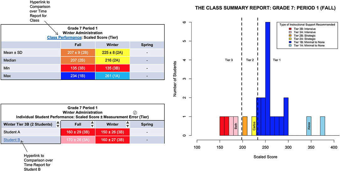
Figure 3. Suggested modifications to The Class Summary Report using proposed solutions for the roadblocks encountered by teachers and literature on effective report design.
One proposed modification to the report that could not be illustrated in Figure 3 includes selecting which descriptive measures (mean, median, minimum/maximum scaled score) to display on the report, also for purposes of decreasing cognitive load. It is important to note that the modified Class Summary Report shown in Figure 3 is a proposed version of its current report, and not an active report.
The Comparison Over Time Report
Format and Layout of the Report
Modifications include making the colors and shapes more vivid or completely different. This would make the readability easier, as suggested by Lane (2015), as well as add clarity in graphics (Wainer, 1997).
Use and Explanation of Specialized Measurement and Statistical Vocabulary
To help interpret the box-and-whisker plot, a possible modification could be to create a legend or a footnote with information on how to interpret the midline, boxes, and whiskers.
Clarity and Accuracy of Data Summaries
Similar to the Class Summary Report, the redundancy of text within the key could be removed (“…Instructional Support Needed”) and made more succinct; the key could also be more clearly color coded and organized so it is made more distinct (Wainer, 1997; Education Commission of the States, 2000; Wong, 2010).
Processes for Reading and Deciphering Results
Finally, because teachers did not use all central tendency measures, cognitive load could be reduced by allowing teachers to choose the measure of central tendency they would like to display either graphically or using a table (U. S. Department of Education, Office of Planning, Evaluation and Policy Development, 2011; Foley, 2015). Figure 4 depicts a generalized example of a proposed modification to the Comparison Over Time Report that could be created based on solutions to the roadblocks teachers encountered. As noted above, the modified Comparison Over Time Report is a proposed version of its current report, and not an active report.
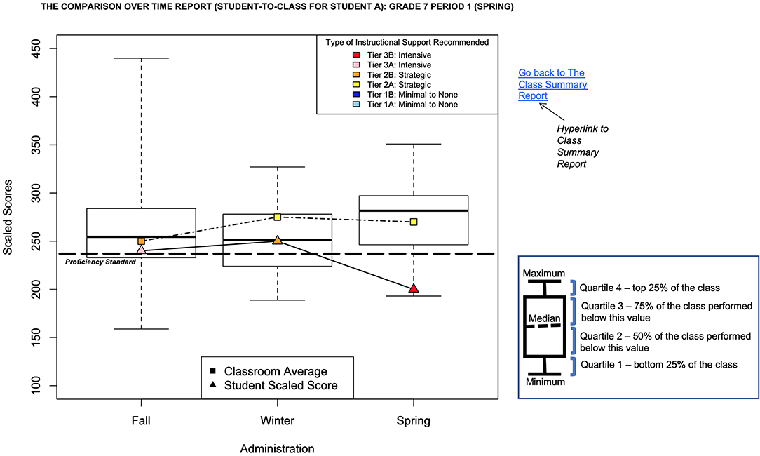
Figure 4. Suggested modifications to The Comparison Over Time Report using proposed solutions for the roadblocks encountered by teachers and literature on effective report design.
A proposed modification to the report that could not be illustrated in Figure 4 is the option of including more than one student from a Tier receiving similar interventions on to the same report to see trends in their growth from one administration to the next.
Coordination Across Score Reports
Since teachers thought the two score reports were disconnected and were unable to directly compare the two, we proposed a modification of coordinating the two score reports where students' names within the Class Summary Report in the table can be hyperlinked to their student-to-class performance within the Comparison Over Time Report. This recommendation aligns with the literature's recommendation of coordinating multiple score reports within a data system (Forte-Fast, 2002).
The roadblocks encountered by teachers as well as their future desires for both the Class Summary Report and the Comparison Over Time Report are summarized in Table 1, along with proposed solutions and modifications to the report for how these roadblocks can be addressed in order to help teachers better interpret the report. Modifications to the reports are proposed based both on solutions to the roadblocks encountered by teachers as well as the literature supporting effective report design.
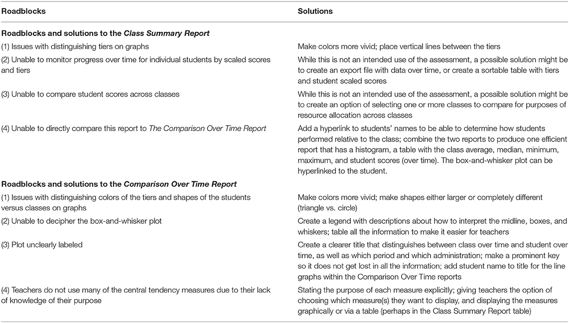
Table 1. Roadblocks and solutions to the Class Summary Report and the Comparison Over Time Report.
These proposed modifications to the reports described above and illustrated in Figures 3, 4 are potential measures test developers may want to consider when developing assessments and the score reports generated from them. These modifications are simply one of many ways these score reports could be modified.
Implications for Practitioners
Teachers use a variety of data sources to formatively adjust their teaching processes and procedures with the intent of improving student learning. Some data sources include informal minute-by-minute observations or evaluation of students' responses, while others require carefully constructed instruments. Regardless of the data source, teachers follow a similar process of gathering data, interpreting and analyzing the information, and taking actions. When using formal instruments, the test and supporting materials (e.g., score reports) should be developed to facilitate the intended interpretations and uses. The research reported in this manuscript focuses on teachers' data interpretation as it relates to a specific formative purpose, namely the use of universal screening data within an MTSS framework. The manuscript provides value to the field since teachers' use of the data from the screener, i.e., decisions made in the classroom by teachers, are based on their interpretations of these data. The US-AR assessment system described in this manuscript was carefully and systematically designed to facilitate the intended interpretations previously described. However, participating teachers' data interpretations did not always align with these intentions.
Although many of the teachers in our study were enthusiastic to use the reports, their understanding of the displays impacted their ability to make meaning of the data. Three important issues emerged. First, even though the participating teachers received professional development about the intended purpose of the US-AR, their interpretations were variable. Some teachers used the score report features to facilitate the intended interpretations (e.g., using color coding to quickly organize and classify students into tiers to form instructional groups). However, a number of teachers described their interpretations in a way that did not align with the purpose. For example, several teachers expressed difficulty interpreting the box-and-whiskers plot in the Comparison Over Time Report. They used the plots to make a “quick glance” at the general trends in their students' performance over time, but without understanding the exact meaning of the display, the details in their students' growth was lost.
Relatedly, a second issue that impacted teachers' ability to use the US-AR results as intended was that teachers did not use the full features of the score reports to maximize the intended interpretations and uses. For example, when interpreting the Class Summary Report some teachers noted that they did not examine their students' relative performance as displayed on the histogram, but instead focused on categorical data. Without examining their students' scaled scores and associated measurement error, the teachers may have inadvertently misclassified students.
Third, in soliciting their input for future revisions to the US-AR reports, teachers expressed their desire for report features that extended beyond the specific purpose of universal screeners within the MTSS framework. By not recognizing the constraints of the assessment system, teachers may inadvertently make unintended and potentially inappropriate decisions.
These findings point to a possible disconnect between the purpose of the US-AR and the teachers' interpretations and subsequent uses of the results. Because the teachers had received PD, another mechanism may be at play. Considering the broader context in which assessment data are used within schools, multiple factors impact how teachers interpret and use assessment data. Teachers and school leaders' actions and perceptions can directly impact the interpretations of assessment data. It is possible that the professional learning opportunities were insufficient to support teachers' interpretations. A possible solution may include embedding a structured process for reviewing data that references the purpose of the assessment. However, as teachers engage with score reports, they must also assume responsibility for studying the interpretive guidelines published by the test developer and building their own understanding of the data displays.
Limitations
Several limitations about this study should be noted. First, with only 11 teachers participating, the sample size was small. Moreover, all participants worked for the same suburban independent school district in a southern state. Because of local policies and/or practices, the participating teachers may be systematically different from teachers in other districts or geographical regions, thereby limiting the generalizability of our findings. Additional research with a more diverse sample is needed to verify the results. Second, our study focused exclusively on a carefully and systematically designed assessment system use within a MTSS framework. As such, the application of these findings to other instruments or assessments with different formative purposes may be limited. In terms of analyses, there were several limitations. Data on saturation of themes, or how many participant comments informed each theme, were not captured.
Conclusion
The main purpose of score reports from formative assessment data in an educational setting is to ensure educators have important information from the associated assessment in an easily interpretable format (Tannenbaum, 2019), so that they can take reasonable action (Van der Kleij et al., 2014) and modify their instruction based on their interpretation of the data (Hamilton et al., 2009). In this manuscript, we applied best practices in designing visual representations of data to enhance the readability and interpretation of score reports and provided examples of possible modifications that could be made to these reports. These suggested modifications were made to improve the quality of current screener score reports to enhance teachers' interpretations based on their feedback and the roadblocks they experienced while interpreting reports to make instructional decisions in the classroom. The examples of modifications instantiated into the two reports combine both teacher recommendations from the focus groups as well as effective report design features, such as understanding the audience, providing adequate interpretive information, and making the reports user-friendly. The modifications support that regardless of how well an assessment is designed and implemented, if its score reports are not easily accessible and interpretable by the end-users, the effort put into the assessment development process may be futile given that score reports are key to the interpretation and intended use of assessment scores.
Data Availability Statement
The datasets generated for this study are available on request to the corresponding author.
Ethics Statement
The studies involving human participants were reviewed and approved by Southern Methodist University IRB. The participants provided their written informed consent to participate in this study.
Author Contributions
PS and LK-G were responsible for the design and implementation of the research. PS was involved in the implementation of the focus groups and data analysis. LK-G supervised the project and was the principal investigator on the research project underlying this study.
Funding
This work was supported by the Texas Education Agency. Opinions expressed herein do not necessarily reflect those of the Texas Education Agency or individuals within.
Conflict of Interest
The authors declare that the research was conducted in the absence of any commercial or financial relationships that could be construed as a potential conflict of interest.
References
American Educational Research Association American Psychological Association, and National Council for Measurement in Education. (2014). Standards for Educational and Psychological Testing. Washington, DC: American Educational Research Association.
Aschbacher, P., and Alonzo, A. (2006). Examining the utility of elementary science notebooks for formative assessment purposes. Educ. Assess. 11, 179–203. doi: 10.1207/s15326977ea1103&4_3
Basaraba, D., Shivraj, P., Yovanoff, P., and Ketterlin-Geller, L. R. (2015). Middle School Students in Texas Algebra Ready (MSTAR): Universal Screener Alignment Pilot Study For Grades 5–8 (Tech. Rep. No. 15–10). Dallas, TX: Southern Methodist University; Research in Mathematics Education.
Batsche, G., Elliott, J., Graden, J. L., Grimes, J., Kovaleski, J. F., and Tilly, D. W. (2005). Response to Intervention: Policy Considerations and Implementation. Alexandria, VA: NASDSE.
Black, P., and Wiliam, D. (1998). Inside the black box: Raising standards through classroom assessment. Phi Delta Kappan. 80, 139–144.
Briggs, D. C., Ruiz-Primo, M. A., Furtak, E., Shepard, L., and Yin, Y. (2012). Meta-analytic methodology and inferences about the efficacy of formative assessment. Educ. Meas. Issues Pract. 31, 13–17. doi: 10.1111/j.1745-3992.2012.00251.x
Brown, G. T. L., O'Leary, T. M., and Hattie, J. A. C. (2019). “Effective reporting for formative assessment: the asTTle case example,” in Score Reporting Research and Applications, ed D. Zapata-Rivera (New York, NY: Routledge), 107–125. doi: 10.4324/9781351136501-9
Clemens, N. H., Keller-Marguilis, M. A., Scholten, T., and Yoon, M. (2015). “Screening assessment within a multi-tiered system of support: current practices, advances, and next steps,” in Handbook of Response to Intervention: The Science and Practice of Multi-tiered Systems of Support, eds S. R. Jimerson, M. K. Burns, and A. M. VanDerHeyden (New York, NY: Springer), 187–213. doi: 10.1007/978-1-4899-7568-3_12
Creswell, J. W. (2013). Qualitative Inquiry and Research Design: Choosing Among Five Approaches. Thousand Oaks, CA: SAGE Publications, Inc.
Datnow, A., and Levin, J. A. (2012). The principal role in data driven decision making: using case study data to develop multi-mediator models of education reform. Sch. Eff. Sch. Improv. 23, 179–201. doi: 10.1080/09243453.2011.599394
Datnow, A., Park, V., and Kennedy-Lewis, B. L. (2012). High school teachers' use of data to inform instruction. J. Educ. Stud. 17, 247–265. doi: 10.1080/10824669.2012.718944
Education Commission of the States (2000). Performance Management: Informing Practices and Improving Results With Data-Driven Decisions. Denver, CO: Education Commission of the States.
Evergreen, S. D. (2017). Effective Data Visualization: The Right Chart for the Right Data. Los Angeles, CA: Sage.
Foley, B. P. (2015). “Tailoring visual displays to improve test score interpretation,” in Use of Visual Displays in Research and Testing: Coding, Interpreting, and Reporting Data, eds M. T. McCrudden, G. Schraw, and C. W. Buckendahl (Charlotte, NC: Information Age Publishing, Inc.), 265–298.
Forte-Fast, E. (2002). A Guide to Effective Accountability Reporting: Designing Public Reports That Effectively Communicate Accountability, Assessment and Other Quantitative Education Indicators in an Easily Understood Format. Washington, DC: The Council of Chief State School Officers.
Gersten, R., Beckmann, S., Clarke, B., Foegen, A., Marsh, L., and Star, J. R. (2009). Assisting Students Struggling With Mathematics: Response to Intervention for Elementary and Middle Schools. Washington, DC: U.S. Department of Education Institute of Educational Sciences.
Glover, T. A., and Albers, C. A. (2007). Considerations for evaluating universal screening assessments. J. Sch. Psychol. 46, 117–135. doi: 10.1016/j.jsp.2006.05.005
Goodman, D. P., and Hambleton, R. K. (2004). Student test score reports and interpretive guides: Review of current practices and suggestions for future research. Appl. Meas. Edu. 17, 145–220. doi: 10.1207/s15324818ame1702_3
Gotch, C., and Roberts, M. R. (2018). A review of recent research on individual-level score reports. Educ. Meas. Issues Pract. 37, 46–54. doi: 10.1111/emip.12198
Hambleton, R. K., and Slater, S. (1994). Using performance standards to report national and state assessment data: are the reports understandable and how can they be improved?. Paper Presented at the Joint Conference on Standard Setting for Large-Scale Setting (Washington, DC).
Hambleton, R. K., and Zenisky, A. L. (2013). “Reporting test scores in more meaningful ways: a research-based approach to score report design,” in APA Handbook of Testing and Assessment in Psychology: Vol. 3. Testing and Assessment in School Psychology and Education, ed K. F. Geisinger (Washington, DC: American Psychological Association), 479–494. doi: 10.1037/14049-023
Hamilton, L., Halverson, R., Jackson, S. S., Mandinach, E., Supovitz, J. A., and Wayman, J. C. (2009). Using Student Achievement Data to Support Instructional Decision Making (NCEE 2009-4067). Washington, DC: National Center for Education Evaluation and Regional Assistance.
Hattie, J. (2009). “Visibly learning from reports: the validity of score reports,” in Paper Presented at the Annual Meeting of the National Council on Measurement in Education (NCME) (San Diego, CA).
Hattie, J. (2012). Visible Learning for Teachers: Maximizing Impact on Learning. London: Routledge. doi: 10.4324/9780203181522
Hegarty, M. (2019). “Advances in cognitive science and information visualization,” in Score Reporting Research and Applications, ed D. Zapata-Rivera (New York, NY: Routledge), 19–34. doi: 10.4324/9781351136501-3
Heritage, M., Kim, J., and Vendlinski, T. (2009). From evidence to action: a seamless process in formative assessment? Educ. Meas. Issues Pract. 28, 24–31. doi: 10.1111/j.1745-3992.2009.00151.x
Herman, J. (2016). Comprehensive Standards-Based Assessment Systems Supporting Learning. Los Angeles, CA: The Center on Standards & Assessment Implementation; University of California.
Herman, J. L., Golan, S., and Dreyfus, S. (1990). Principals: Their Use of Formal And Informal Data (CSE Tech. Rep. No. 315). Los Angeles, CA: University of California; Center for Research on Evaluation, Standards, and Student Testing.
Ikeda, M. J., Neesen, E., and Witt, J. C. (2008). “Best practices in universal screening,” in Best Practices in School Psychology, Vol. 2, eds A. Thomas and J. Grimes (Bethesda, MD: National Association of School Psychologists), 103–114.
Ketterlin-Geller, L. R., Shivraj, P., Basaraba, D., and Schielack, J. (2019). Universal screening for algebra readiness: why, what, and does it work? Investig. Math. Learn. 11, 120–133. doi: 10.1080/19477503.2017.1401033
Kingston, N., and Nash, B. (2011). Formative assessment: a meta-analysis and a call for research. Educ. Meas. Issues Pract. 30, 28–37. doi: 10.1111/j.1745-3992.2011.00220.x
Lane, D. M. (2015). “Guidelines for making graphs easy to perceive, easy to understand, and information rich,” in Use of Visual Displays in Research and Testing: Coding, Interpreting, and Reporting Data, eds M. T. McCrudden, G. Schraw, and C. W. Buckendahl (Charlotte, NC: Information Age Publishing, Inc), 47–81.
McMillan, J. H., Venable, J. C., and Varier, D. (2013). Studies of the effect of formative assessment on student achievement: so much more is needed. Pract. Assess. 18, 1–15.
Mellard, D., McKnight, M., and Jordan, J. (2010). RTI tier structures and instructional intensity. Learn. Disabil. Res. Pract. 25, 217–225. doi: 10.1111/j.1540-5826.2010.00319.x
O'Leary, T. M., Hattie, J., and Griffin, P. (2017). Actual interpretations and use of scores as aspects of validity. Educ. Meas. Issues Pract. 36, 16–23. doi: 10.1111/emip.12141
Parisi, D., Ihlo, T., and Glover, T. A. (2014). “Screening within a multi-tiered early prevention model: using assessment to inform instruction and promote students' response to intervention,” in Universal Screening in Educational Settings, eds R. J. Kettler, T. A. Glover, C. A. Albers, and K. A. Feeney-Kettler (Washington, DC: American Psychological Association), 19–46. doi: 10.1037/14316-002
Perry, L., Ketterlin-Geller, L. R., Benson, S., Schielack, J., and Broadway, E. (2012). Supporting students' algebra readiness: a response to intervention approach. Texas Math. Teach. 59, 26–29.
QSR International (2012). NVivo 10 [Computer Software]. Available online at: http://www.qsrinternational.com (accessed January 4, 2016).
Rankin, J. G. (2016). Standards for Reporting Data to Educators: What Educational Leaders Should Know and Demand. New York, NY: Routledge.
Roberts, M. R., and Gierl, M. J. (2010). Developing score reports for cognitive diagnostic assessments. Educ. Meas. Issues Pract. 29, 25–38. doi: 10.1111/j.1745-3992.2010.00181.x
Shivraj, P., Bell, J., and Ketterlin-Geller, L. R. (2015b). The Structural Supports Teachers Require Implementing the MSTAR Assessment System Effectively: A Feasibility Study (Tech. Rep. No. 15-09). Dallas, TX: Southern Methodist University; Research in Mathematics Education.
Shivraj, P., Bell, J., and Ketterlin-Geller, L. R. A. (2015a). Learning From Teachers' Use of MSTAR Assessment Data: A Case Study (Tech. Rep. No. 15-08). Dallas, TX: Southern Methodist University; Research in Mathematics Education.
Slater, S., Livingston, S. A., and Silver, M. (2019). “Score reports for large-scale testing programs: managing the design process,” in Score Reporting Research and Applications, ed D. Zapata-Rivera (New York, NY: Routledge), 91–106. doi: 10.4324/9781351136501-8
Tannenbaum, R. J. (2019). “Validity aspects of score reporting,” in Score Reporting Research and Applications, ed D. Zapata-Rivera (New York, NY: Routledge), 9–18. doi: 10.4324/9781351136501-2
U. S. Department of Education Office of Planning, Evaluation and Policy. (2009). Implementing Data-Informed Decision Making in Schools: Teacher Access, Supports and Use. Washington, DC: U.S. Department of Education, Office of Planning, Evaluation and Policy Development.
U. S. Department of Education Office of Planning, Evaluation and Policy Development. (2008). Teachers' Use of Student Data Systems to Improve Instruction: 2005 to 2007. Washington, DC: U. S. Department of Education, Office of Planning, Evaluation and Policy Development.
U. S. Department of Education Office of Planning, Evaluation and Policy Development. (2011). Teachers' Ability to Use Data to Inform Instruction: Challenges and Supports. Washington, DC: U. S. Department of Education, Office of Planning, Evaluation and Policy Development.
Van der Kleij, F. M., Eggen, T. J. H. M., and Engelen, R. J. H. (2014). Toward valid score reports in the computer program LOVS: a redesign study. Stud. Educ. Eval. 43, 24–39. doi: 10.1016/j.stueduc.2014.04.004
Wainer, H. (1992). Understanding graphs and tables. Educ. Res. 21, 14–23. doi: 10.3102/0013189X021001014
Wainer, H. (1997). Visual Revelations: Graphical Tales of Fate and Deception From Napoleon Bonaparte to Ross Perot. Mahwah, NJ: Lawrence Erlbaum. doi: 10.1007/978-1-4612-2282-8
Wainer, H. (2014). Visual revelations: on the crucial role of empathy in the design of communications: genetic testing as an example. Chance 27, 45–50. doi: 10.1080/09332480.2014.890870
Wayman, J. C. (2005). Involving teachers in data-driven decision-making: using computer data systems to support teacher inquiry and reflection. J. Educ. Stud. 10, 295–308. doi: 10.1207/s15327671espr1003_5
Wohlstetter, P., Datnow, A., and Park, V. (2008). Creating a system for data-driven decision-making: applying the principal-agent framework. Sch. Eff. Sch. Improv. Int. J. Res. 19, 239–259. doi: 10.1080/09243450802246376
Wong, D. M. (2010). The Wall Street Journal Guide to Information graphics: The Dos and Don'ts of Presenting Data, Facts, and Figures. New York, NY: Norton.
Wu, P. (2009). Do we really understand what we are talking about? A study examining the data literacy capacities and needs of school leaders (Unpublished doctoral dissertation). University of Southern California, Los Angeles, CA, United States.
Zapata-Rivera, D., and Katz, I. (2014). Keeping your audience in mind: applying audience analysis to the design of score reports. Assess. Educ. Princ. 21, 442–463. doi: 10.1080/0969594X.2014.936357
Zapata-Rivera, D., and Van-Winkle, W. (2010). A Research-Based Approach to Designing and Evaluating Score Reports for Teachers (Research Memorandum 10-01). Princeton, NJ: Educational Testing Service.
Zenisky, A. L., and Hambleton, R. K. (2012). Developing test score reports that work: the process and best practices for effective communication. Educ. Meas. Issues Pract. 31, 21–26. doi: 10.1111/j.1745-3992.2012.00231.x
Keywords: formative assessment, universal screening and progress monitoring, data interpretation, score report interpretation, score reports
Citation: Shivraj P and Ketterlin-Geller LR (2019) Interpreting Reports From Universal Screeners: Roadblocks, Solutions, and Implications for Designing Score Reports. Front. Educ. 4:108. doi: 10.3389/feduc.2019.00108
Received: 27 May 2019; Accepted: 17 September 2019;
Published: 05 November 2019.
Edited by:
Chad M. Gotch, Washington State University, United StatesReviewed by:
Mary Roduta Roberts, University of Alberta, CanadaJade Caines Lee, University of New Hampshire, United States
Copyright © 2019 Shivraj and Ketterlin-Geller. This is an open-access article distributed under the terms of the Creative Commons Attribution License (CC BY). The use, distribution or reproduction in other forums is permitted, provided the original author(s) and the copyright owner(s) are credited and that the original publication in this journal is cited, in accordance with accepted academic practice. No use, distribution or reproduction is permitted which does not comply with these terms.
*Correspondence: Pooja Shivraj, pshivraj@abog.org
†These authors have contributed equally to this work