
- Department of Architecture, Design and Planning, University of Sassari at Alghero, Alghero, Italy
The aim of this work is to study the phenomenal organization of shape and color in vision and art in terms of microgenesis of the object perception and creation. The idea of “microgenesis” is that the object perception and creation takes time to develop. Our hypothesis is that the roles of shape and color are extracted in sequential order and in the same order these roles are also used by artists to paint objects. Boundary contours are coded before color contours. The microgenesis of the object formation was demonstrated (i) by introducing new conditions derived from the watercolor illusion, where the juxtaposed contours are displaced horizontally or vertically, and based on variations of Matisse’s Woman, (ii) by studying descriptions and replications of visual objects in adults and children of different ages, and (iii) by analyzing the linguistic sequence and organization in a free naming task of the attributes related to shape and color. The results supported the idea of the microgenesis of the object perception, namely the temporal order in the formation of the roles of the object properties (shape before color). Some general principles were extracted from the experimental results. They can be a starting point to explore a new domain focused on the microgenesis of shape and color within the more general problem of object organization, where integrated and multidisciplinary studies based on art and vision science can be very useful.
Introduction
The Problem of Figure–Ground Segregation
Rubin in 1921 started the studies of figure–ground segregation, which is one of the basic problems of vision science, by asking what appears as a figure and what as a background. Through phenomenological experiments, he discovered some general figure–ground principles: surroundedness, size, orientation, contrast, symmetry, convexity, and parallelism. More importantly for our purposes, he suggested the following main properties, which belong to the figure but not to the background. (i) The figure assumes the shape traced by the contour, implying that the contour belongs unilaterally to the figure (border ownership, see Nakayama and Shimojo, 1990; Spillmann and Ehrenstein, 2004; Pinna, 2010a), not to the background. (ii) Its color/brightness is perceived full like a surface and denser than the same physical color/brightness on the background that appears instead transparent and empty. (iii) The figure appears closer to the observer than the background. These properties can be related to the three main object attributes: shape, color, and depth (Rubin, 1915, 1921).
In Figure 1A, the two inner regions of the square, separated by a wavy contour, can be perceived alternately as a figure or as a background. If the left side region is seen as a figure, the right one is perceived as a background. Consequently, the wavy contour appears as the boundary of the figure, while the background is perceived without a boundary and, thus, it amodally completes behind the figural region: as an empty space it fills the square frame. The figure–ground segregation induces in the two regions a brightness differentiation. The figure shows a clear surface color/brightness property (Erscheinungsweise, Katz, 1911, 1930): the chromatic paste appears solid, impenetrable, and epiphanous as a surface. On the contrary, the background is not seen colored but empty, penetrable and diaphanous as a void (Katz, 1911, 1930). Finally, the left side region appears to protrude in front of the background and sometimes also seems to pop out from the square frame. The background spreads and creates a penetrable depth in distance within the frame. All these properties synergistically contribute to the perception of the square shape like a frame or a window.
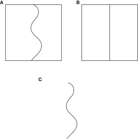
Figure 1. Three examples of figure–ground segregation induced by contours (see the text).
In Figure 1A, the figure–ground differentiation can be attributed to the concave–convex alternation along the contour. Even if this alternation can play a role on the basis of the convexity principle studied by Rubin, the same complementary results, previously described, are obtained by replacing the wiggly contour with a straight line, as shown in Figure 1B. Furthermore, similar property differentiations emerge also when the surrounding frame is removed (Figure 1C).
These outcomes suggest that a single line/contour behaves like a watershed differentiating the visual field in complementary (opposite) attributes related to shape, color, and depth perception. A single contour can be considered as a source of phenomenal asymmetry on both its sides with respect to the visual distribution of figure–ground attributes. If this were not true, then it would be impossible to perceive a wiggly irregular circular surface in Figure 2A or two women in Matisse’s drawings illustrated in Figures 2B,C, but the expected results would have been respectively a wiggly closed contour in Figure 2A and a complex set of contours running in different directions and intersecting each other, without showing any specific surface and object organization in Figures 2B,C. The phenomenal organization of contours in figure–ground attributes can be considered as the visual evolution of a contour in a surface. The results of Figures 1 and 2 show indeed shapes, surfaces, and objects. These outcomes cannot be explained by invoking the role of past experience. In fact, as shown in Figures 1 and 2A, the same properties emerge without involving any kind of past experience.
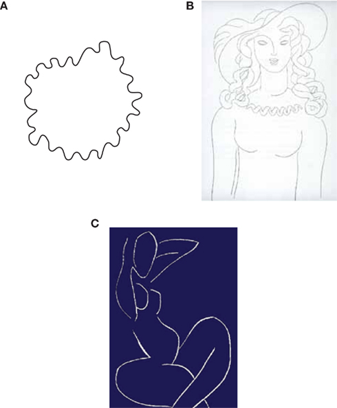
Figure 2. A wiggly irregular circular surface (A) and Matisse’s drawings (B,C).
Among the figure–ground attributes, the least strong within the previous figures is the chromatic/brightness differentiation between the figure and the background. In fact, why should a contour create a chromatic/brightness differentiation? What is the relation between a contour and a chromatic/brightness difference?
In Figure 3A, the brightness effect is enhanced. Under these conditions, the figure–ground segregation created by the wiggly contour within the black square induces also a clear brightness variation in the two complementary regions. Being the black square per se a figure segregated from the white background surrounding it, the presence of the wavy contour and of the T-junctions on its boundaries favors its appearance as a window. In spite of this new organization, the previous figure–ground differentiation of attributes persists. The two regions can be partially, alternately, and reversibly seen as a figure or a background, even if it is easier to perceive the smallest region on the left side of the wavy contour as a figure, according to the size principle suggested by Rubin.
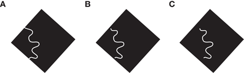
Figure 3. By placing the wavy contour more and more included (from A to C) within the black square the strength of the surface color and brightness induction decreases.
The chromatic/brightness differentiation and the figure–ground segregation also persist but appear less and less strong when the T-junctions are ineffective, i.e., by placing the wavy contour more and more included within the black square (Figures 3B,C).
The figure–ground differentiation of attributes is increasingly perceived in the three conditions illustrated in Figure 4, where the wiggly surface appears transparent, mostly in Figures 4B,C, and the overlapped regions of the black squares, seen behind the transparent layer, are perceived with chromatic/brightness properties very different from the non-overlapped ones.
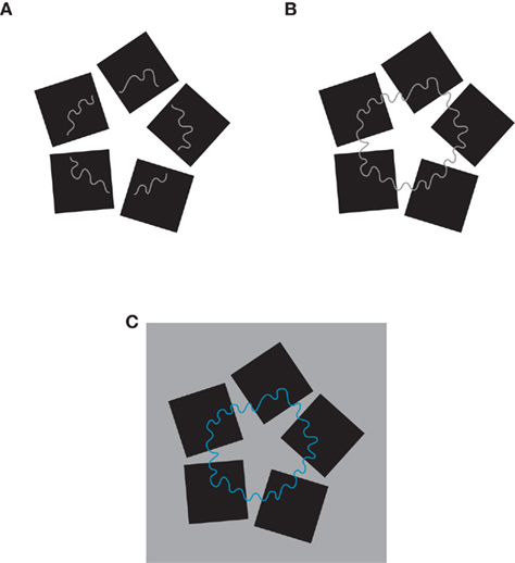
Figure 4. Three transparent wiggly surfaces showing chromatic/brightness effects (see the text).
The figure–ground segregation problem, posed by the previous figures, is related to the way the complementary properties and, more particularly, those related to shape and color are reciprocally linked and organized. The main questions we asked in this work are the following: Where is information about shape and color mostly located? Are shape and color independent? Does their creation take time to develop? Are they organized in sequential order or in parallel? Is there any phenomenal logic in their visual organization? How are they bound? How do shape and color contribute to determine and define a visual object and what is the difference between them? How are shape and color used by visual artists to create objects and scenes? Is the way artists use shape and color related to the way we perceive them?
General Methods
Subjects
Different groups of 10 undergraduate students of linguistics, literature, architecture, and design and of children from 6 to 16 years old (only for the results reported in When the Color Becomes Boundary), 10 for each year, participated in the experiments and, for each experiment, to the two methods adopted and described in the Section “Procedure.” Subjects had some basic knowledge of Gestalt psychology and visual illusions, but they were naive both to the phenomena studied and to the purpose of the experiments. They were both male and female undergraduates and all had normal or corrected-to-normal vision.
Stimuli
The stimuli were the figures shown in the Introduction and in the Section “Results.” The overall sizes of the visual stimuli were ∼4°. The luminance of the white background was 122.3 cd/m2. Black shapes had a luminance value of 2.6 cd/m2. The figures were shown on a computer screen with ambient illumination from a Osram Daylight fluorescent light (250 lux, 5600° K). Stimuli were displayed on a 33-cm color CRT monitor (Sony GDM-F520 1600 × 1200 pixels, refresh rate 100 Hz), driven by a MacBook Pro computer with an NVIDIA GeForce 8600 M GT. Viewing was binocular in the frontoparallel plane at a distance of 50 cm from the monitor.
Procedure
In order to study the phenomena here presented two methods were used: one more qualitative (phenomenological task) similar to those used by Gestalt psychologists and another more quantitative (scaling task).
Phenomenological task
The task of the subjects was to report spontaneously what they perceived for each stimulus by giving, as much as possible, an exhaustive description of the main visual property perceived. The descriptions were provided by no less than 8 out of 10 subjects and were reported in the next sections within the main text to aid the reader in the stream of argumentations. The descriptions were later judged by four graduate students of linguistics, naive as to the hypotheses, to provide a fair representation of the ones given by the observers.
During the experiment, subjects were allowed: to make free comparisons, confrontations, afterthoughts; to see in different ways; to make variations in the illumination, distance, etc.; to match the stimulus with every other one. All the variations and possible comparisons occurring during the free exploration were noted down by the experimenter. This was necessary to define the best conditions for the occurrence of the emerging phenomena. About these tasks and procedure see Pinna (2010b).
Scaling task
The phenomenological free-report method is complemented by a more quantitative one, based on magnitude estimation. The subjects were instructed to rate (in percent) the descriptions of the specific attribute obtained in the phenomenological experiments. New groups of 10 subjects were instructed to scale the relative strength or salience (in percent) of the descriptions of the phenomenological task: “please rate whether this statement is an accurate reflection of your perception of the stimulus, on a scale from 100 (perfect agreement) to 0 (complete disagreement).” Throughout the text, we reported descriptions, whose results of the magnitude estimation (mean rating) were greater than 88.
The task of the children is reported in Section “When the Color Becomes Boundary.” All subjects were tested individually. During the experiment, observation time was unlimited. Reports for visual stimuli occurred spontaneously and fast.
Results: Shape and Color Organization
Boundary Contours and Color Contours in the Watercolor Illusion
The previous figures show a possible answer to the first question: where is information about shape and color mostly located? They suggest in fact that the information about shape and color is placed along the contours. Given that a single contour is perceived like the boundary of an object and appears to impart a surface color/brightness attribute, it follows that the information about shape and color is placed on the contour. This is clearly demonstrated by the watercolor illusion (Pinna, 1987, 2005, 2008; Pinna et al., 2001, 2003; Wollschläger et al., 2002; Spillmann et al., 2004; Devinck et al., 2005; Pinna and Grossberg, 2005; von der Heydt and Pierson, 2006; Werner et al., 2007). The illusion (see Figure 5), induced by two juxtaposed contours of different colors and luminance contrast, strongly increases the unilateral belongingness of the boundaries and the surface coloration through a long range color spreading (see Pinna, 2010a). These results are related to the fact that the watercolor illusion fulfills the phenomenal asymmetry on both sides of a contour, previously described. More particularly, by creating a physical asymmetry and opposite gradient attributes, the watercolor illusion increases the complementary figure–ground properties that are spontaneously induced on both sides of a contour, where the asymmetry is not physical but apparent. This asymmetry induces also a volumetric effect similar to the Chiaroscuro technique aimed to create a bold contrast between light and shadow. Leonardo da Vinci improved the chiaroscuro through the Sfumato (from Italian “toned down” or “evaporated like smoke”) obtained with a fine shading that produces imperceptible transitions from light to dark areas, without lines or borders, between colors and tones and aimed at obtaining soft lighting effects (see Da Vinci, 1452–1519; for a deeper discussion on the watercolor illusion and the Chiaroscuro, see Pinna, 2010c).
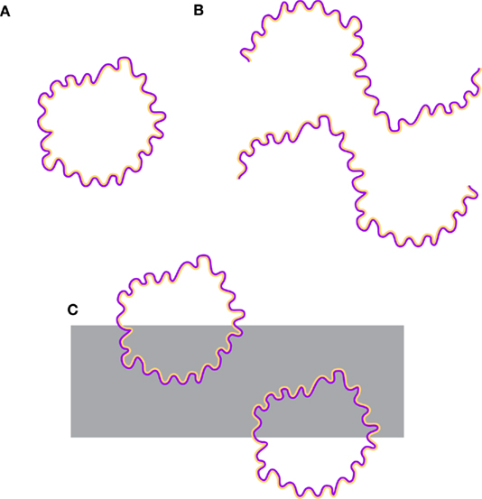
Figure 5. Three examples of watercolor illusion (see the text).
In the watercolor illusion, high luminance contrast between adjacent contours shows the strongest figure–ground and coloration effect, however, the color spreading is visible at equiluminance (Pinna et al., 2001; Devinck et al., 2005; Pinna and Reeves, 2006). Under these conditions, the border ownership is weakened and the figure–ground segregation appears reversible. This result suggest that figure–ground and depth segregation are independent from the coloration effect (Pinna, 2005; Pinna and Reeves, 2006; von der Heydt and Pierson, 2006). Pinna (2005) and Pinna and Reeves (2006) introduced the “asymmetric luminance contrast principle” (Pinna, 2005) stating that, all else being equal, given an asymmetric luminance contrast on both sides of a contour, the region, whose luminance gradient is less abrupt, is perceived as a figure if compared to the complementary more abrupt region perceived as a background. These results are summarized by the following spontaneous description of Figure 5A: a wiggly orange object with a sinusoidal overall shape. An orange object is perceived also when the contours are not closed as shown in Figure 5B. Finally, the wiggly orange object appears transparent or like a hole (see Pinna and Tanca, 2008) in Figure 5C.
These results can shed light on how shape and color are related, i.e., in the phenomenal logic of their organization. To clarify this point, it is necessary to analyze more deeply the previous description. On one hand, by saying “a wiggly orange object” the color of the boundary contour of the object is not mentioned. Even if it is clearly perceived, the purple color does not appear as a color of the object but like the boundary belonging unilaterally to the wiggly orange object. In other terms, the purple contour does not define the color but the boundary and, therefore, the shape. On the other hand, the adjacent orange contour defines the color of the object. It does not appear like the boundary contour of the object but like its color. It follows that the two contours play different roles.
These phenomenal properties of the watercolor illusion suggested the following general rule: The juxtaposed contour with the highest luminance contrast in relation to the surrounding regions tends to appear as the outermost boundary of the figure (Pinna and Reeves, 2006). This is the “boundary contour.”
Modal and Amodal Coloration
The previous observations are supported by Picasso’s colored drawing illustrated in Figure 6 and showing a yellow cock. Under these conditions, the two sets of curved contours, black and yellow, belonging to the body of the cock, clearly assume different roles: the black contours appear like boundaries, while the yellow ones define the color. To better perceive this result, it can be useful to judge the phenomenal plausibility of the description opposite to the previous one, i.e., a black cock. Straightaway, the black cock appears as an inconsistent result, quite impossible or totally absurd. This outcome suggests that the differentiation of roles between contours also occurs when they are not adjacent like in the watercolor illusion.
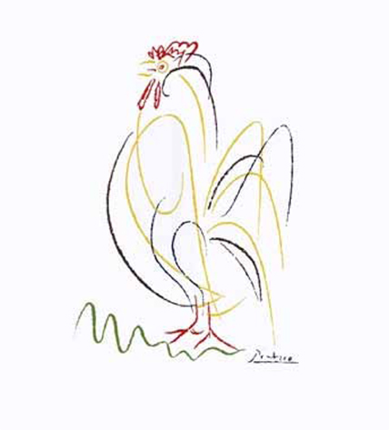
Figure 6. Yellow cock by Picasso.
These results suggest clear phenomenal differences between Figure 6 and the watercolor illusion of Figure 5. While the coloration of Figure 5 is actually and modally perceived, the one inside the body of the cock is perceived amodally (Michotte, 1951; Michotte et al., 1964; Kanizsa, 1985, 1991). More particularly, by reporting a yellow cock, the yellow coloration is vividly perceived as completing within the cock body despite it is not actually (modally) seen filling the whole shape like in the watercolor illusion. In other words, in spite of the few contours that do not fill the entire area, their coloration is perceived with an amodal sense of unity and homogeneity within the area traced and surrounded by the black contours. On the contrary, the coloration of the watercolor illusion is modally perceived as filling the entire area traced by the boundary contour. Modal and amodal coloration were previously studied by Pinna (2008a,b). The difference in the phenomenal quality of the coloration suggests again that the necessary information needed to define shape and color is placed on the boundaries. From the boundaries, these properties fill-in the whole shape (Pinna and Reeves, 2006; Pinna, 2008a).
Other examples of amodal coloration can be observed in children paintings where sometimes the color does not fill completely and perfectly the whole shape, but again the amodal coloration emerges spontaneously. A similar amodal completion of color is also easily perceived in Monet’s self-portrait illustrated in Figure 7A, where all the elements are incomplete and sketchy. Nevertheless, the lower part of Monet’s body appears amodally colored of homogenous black. Another way to obtain the amodal coloration is shown in Picasso’s painting in Figure 7B. Under these conditions the color overflows the boundaries of the figures, but again it appears not as something else but as the color belonging to the figure.
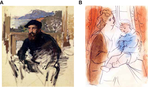
Figure 7. Monet’s self-portrait (A); Picasso’s painting (B).
In the last two examples the contours and the color appear different in terms of the area occupied by one or the other component, i.e., the chromatic area is much larger than the one of the contours, instead in Figures 5 and 6 both contours are of the same width. Furthermore, Figures 7A,B use the incompleteness or the exceeding of color in relation to the external boundaries to show the amodal coloration, while the watercolor illusion and Picasso’s cock use only contours respectively juxtaposed or separated and tangled up. The separation of the two contours of Figure 6 switches the coloration effect from modal to amodal.
When the Contour Becomes Color
In Figure 6, it is not clear how the differentiation of roles occurs: Is the overlapping of contours responsible for that or the fact that the yellow contours are mostly included in the black ones or something else? What defines the differentiation of roles? To better understand the distinction between boundary contour and color contour, we used the next conditions, where the connection between Picasso’s Cock and the watercolor color illusion can be more clearly understood.
It has been shown that in the case of the watercolor illusion the juxtaposition of contours generates the figure–ground and the coloration properties perceived modally. The presence of a gap between the two contours weakens the two main properties of the illusion more and more (Pinna et al., 2001). The modal effects become amodal. This amodal regeneration of effects is likely related to the necessary and inevitable process of boundary and color/brightness induction perceived whenever a contour is given, as we suggested for Figures 1–4.
In Figure 8A, Matisse’s Woman has been modified with two sets of black contours, slightly but clearly shifted in the horizontal direction. The two shifted contours elicit an effect of blur or duplicity of the boundaries of the woman. Both contours are perceived as boundaries. More particularly, no contour prevails on the other as a boundary contour and none prevails as a color contour. Therefore, the shape appears split into two or strongly blurred. Moreover, the color/brightness differentiation is very weak or totally absent.
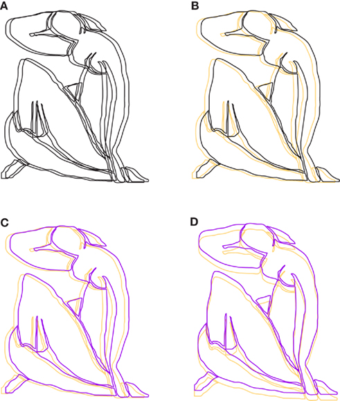
Figure 8. Several variations of Matisse’s woman (see the text).
These results change if an orange contour replaces one of the two blacks. In Figure 8B, an orange woman is perceived. Similarly to Figure 6, none of the subjects perceived the figure as a black woman. Under these conditions, the blurred effect is very weak or totally absent. It appears clear that the black contour is predominantly perceived as the boundary of the woman, while the orange contour appears as the color of the whole figure. This is the reason why we don’t perceive a black woman. The spreading of color is under these conditions perceived filling the entire object amodally and independently from the fact that the orange contour is inside or outside the figure surrounded and shaped by the black contour. This is one of the many conditions (other conditions were described in Figure 7) of amodal coloration that we call “amodal wholeness of color.” On the other hand, the “amodal wholeness of shape” is represented by Monet’s self-portrait illustrated in Figure 7A, where the rough contours of the legs and hands fill the wholeness by completing amodally their sketchy shape.
By replacing the black contour with a purple one (Figure 8C), the phenomenal description is the same, i.e., an orange woman. The orange contour assumes again the role of color and the purple one the role of boundary. Once again, this differentiation of roles explains the fact that we perceive an orange woman and not a purple or a purple–orange woman. The vertical displacement of the two chromatic contours shows the same differentiation of roles (Figure 8D).
Phenomenal Logic of Assignment of the Roles of Boundary and Color Contours
Assignment of the roles under equiluminance
When the two sets of contours are near equiluminance (Figure 9A), their roles as boundary or color contours appear instable and easily reversible. What appears difficult to assign, in the first place, is the role of the boundary contour. Phenomenally, the differentiation of roles is addressed first and foremost to the boundary and then to the color. The boundary contour fixes the shape that has to be filled modally (in the case of the watercolor illusion) or amodally by the color contour. Pinna and Reeves (2006) suggested a similar sequential microgenesis in the formation of the watercolor illusion. This instable alternation of role assignment gives the figure a global effect that differs from the one described for Figure 8A, where both set of contours are black. In this case, there is not any competition. Both contours are perceived as boundaries and none of them is perceived as a color contour. The effect of blur and duplicity of the boundaries is related to the primary assignment of the boundary contour. In Figure 9A, the blurred effect is absent, but the competition of roles is plainly perceived. Since it becomes difficult to assign the role of boundary, the color contour cannot be assigned. Following the instability and reversibility of the boundary contour, the color contour role is also instable and reversible.
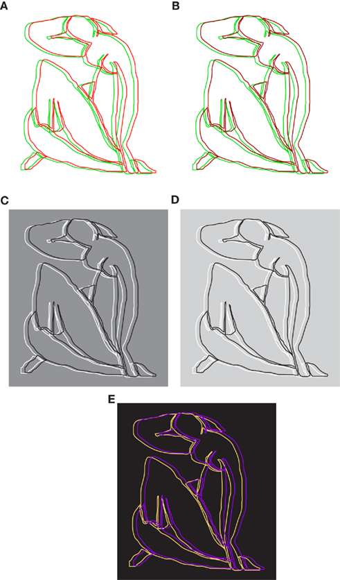
Figure 9. More variations of Matisse’s woman (see the text).
It is sufficient to increase the luminance contrast of one of the two contours to favor the assignment of the boundary and color roles (Figure 9B). Phenomenally, the dark red contour pops up instantly as the boundary of the woman and immediately after the green contour becomes its color. This sequence of assignments was spontaneously reported by the observers.
If the luminance contrast is responsible for the boundary/color role assignment, then an instable and reversible equilibrium between the two contours can be obtained by reversing their reciprocal contrast and by keeping their luminance at the same difference in relation to the background, as illustrated in Figure 9C. The phenomenal results are similar to those of Figure 9A: the instable and reversible alternation of the boundary role and the assignment suspension of the role of the color contour. As a consequence, by reducing the luminance contrast of the background, the differentiation of roles emerges spontaneously (see Figure 9D): the boundary role is assigned to the contour with the highest contrast and the color role to the contour with the lowest contrast. Finally, by reversing the contrast of Figure 8C, as shown in Figure 9E, opposite roles are now perceived in the purple and orange contours: the orange contour appears as the boundary and the purple becomes the color contour.
Assignment of the roles with multiple contours
Assignments of boundary and color roles occur also when, instead of two, there are three displaced sets of contours. In Figure 10A, the three black contours show even stronger results than those described for Figure 8A: besides the blurred and the triplication, a sense of repetition of the same shape is also perceived. Among the contours there is not competition to take on the role of boundary, but all the three appear as such at the same time. By changing the color and the luminance of the two external contours (Figure 10B), the boundary and color roles are assigned immediately: the contour in the center pops up as the boundary of the woman, while the other two appear as a two-tone coloration.
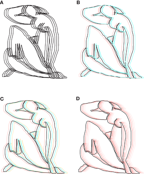
Figure 10. Other variations of Matisse’s woman (see the text).
By adding a further displaced contour, the amodal coloration appears now three-tone (Figure 10C) or as having the same color graded in brightness (Figure 10D). If any of the two sets of contours are black, the blurred and duplication of the boundary contours of the woman emerge again (not illustrated).
Assignment of the roles with polychromy
From the instances illustrated in Figure 10, the polychromatic properties of an object emerge clearly: more than one contour can assume the role of color contour. While multiple colors can occur within the same object, multiple boundaries cannot (see Figures 8A and 10A). This suggests the multiplicity of colors and the uniqueness of the boundary. What happens if the polychromy occurs along the same contour? In Figure 11A, a black contour and a displaced polychromatic one are perceived like a multicolored woman. The polychromatic contour with the lowest luminance contrast is perceived as the color contour. In Figure 11B, the chromatically homogeneous contour, with a luminance contrast lower than the one of Figure 11A is clearly perceived as the boundary of the woman, while the polychromatic contour assumes the color (multicolored) role.
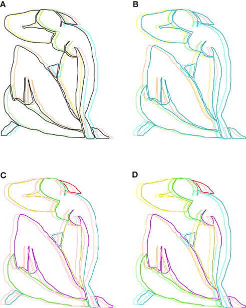
Figure 11. Other variations of Matisse’s woman (see the text).
In Figure 11C, a condition opposite to the one of Figure 11B is illustrated. Now, the contour with the lowest luminance contrast is the homogeneous one. The results show that the assignment of roles is less effective than in the previous condition. Both contours compete to appear as boundaries and the strength of the boundary assignment to the contour with the highest luminance contrast is very low or absent if compared with the one of Figure 11B. The global configuration appears in fact blurred and with a duplication of the boundary contours. A control is illustrated in Figure 11D, where both contours are polychromatic but with different luminance contrast. The effect of the luminance contrast in assigning the boundary role is now more effective than the one of Figure 11C, where polychromy and luminance contrast are one against the other. However, the effect is less effective than the one illustrated in Figure 11B, where the chromatic homogeneity and luminance contrast are synergistic.
These results demonstrate that the homogeneity (uniqueness) is a factor that plays a clear role in defining the boundary contour. More generally, the polychromy can be part of the amodal coloration effect, rather than of the boundary formation and assignment that requires an overall chromatic homogeneity and therefore a oneness and uniqueness. In fact, given that the boundaries tend to surround and induce a figure–ground separation with their unilateral belongingness, to obtain the best effect they required being homogeneous and unique.
Assignment of the roles with thickness variations
The thickness of the contours also plays a role in assigning to it the boundary attribute. In Figure 12A, the thickness of the red contours of Figure 9A is increased. Under these conditions, the instability and reversibility of the boundary assignment, previously described for Figure 9A, is reduced or totally absent: the red contours assume quite easily the role of boundary. The opposite occurs when the thickness of the green contours is increased: the boundary/color role between the two contours is now exchanged (Figure 12B). Thickness and luminance contrast can compete, as shown in Figure 12C. Nevertheless, when the thickness exceeds a certain threshold (likely when it is not anymore a contour but appears like a surface) it is perceived like a coloration attribute (Figures 12D,E).
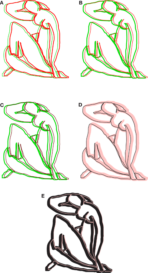
Figure 12. Other variations of Matisse’s woman (see the text).
In Figure 13, three drawings/paintings by Matisse (Figures 13A,B) and by Rouault (Figure 13C) are illustrated. They demonstrate that by increasing the thickness of the boundary contours, they appear less and less as such and assume other visual meanings, such as stripes (Figure 13B) or shades and shadings (Figure 13C).
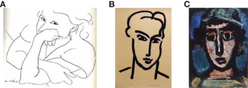
Figure 13. Drawings/paintings by Matisse (A,B) and by Rouault (C).
Chromatic and achromatic attributes in boundary and color role assignments
Several readers may have noticed that, all else being equal, the assignment of the role of boundary to achromatic and chromatic contours is not necessarily symmetrical, but it can be more easily attributed to the achromatic ones, while the role of color to the chromatic contour. To demonstrate this hypothesis, we can go back to Figure 8B and compare it with Figure 14A, where the relationship between chromatic/achromatic and high/low contrast is reversed on the same white background. Phenomenally, the luminance contrast appears as the most important factor in defining the boundary role. In spite of this plain result, a weakness of this kind of stimulus is that by increasing or decreasing the luminance contrast of the orange contour like in Figure 8B, the chromatic contour appears more and more achromatic (low saturation). Therefore, to demonstrate the asymmetrical role of chromatic and achromatic contours, we followed another way based on the spontaneous description of the simplest conditions.
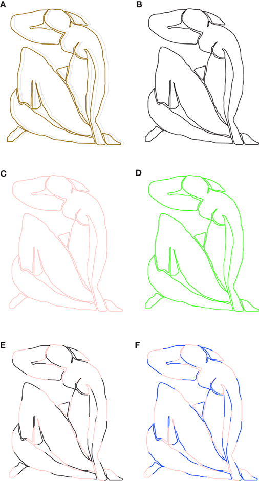
Figure 14. Other variations of Matisse’s woman (see the text).
In Figure 14B, the subjects reported simply “a woman,” but in Figures 14C,D, they stated “a light red or a green woman.” These naïve descriptions suggest that, in the limiting case of one contour only, the chromatic contour tends to be perceived both as a boundary and a color contour, while the achromatic one is perceived only as a boundary contour. This hypothesis is supported by Figure 14E, where the continuation of the same contour is alternated by black and light red components. Under these conditions, the subjects reported to see a light red woman. The role of the achromatic contour in becoming more effortlessly as boundary is supported even more by the results of Figure 14F, where being both contours chromatic “a blue and light red woman” is more easily perceived.
Why do We Say “A Red Square” and not “A Square-Shaped Red” or “A Square Red”?
A further help in the understanding of the complex relationship between shape/boundary and color comes again from the spontaneous descriptions. Malevich’s “Red Square” (Figure 15A) is a clear demonstration of the distinction between shape/boundary and color. This simple description corroborates previous results according to which shape and boundaries are extracted before color: the noun is the square and not the color. The color describes and qualifies the main and first component, the noun, i.e., the square shape. To show this more clearly, we can try again to judge the phenomenal plausibility of the inverse description: a square-shaped red or a square red. Even if both descriptions (red square and square-shaped red) are logically equivalent, phenomenally are totally different. The first is congruous and “real,” the square-shaped red is incongruous and perceived odd or totally impossible.
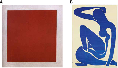
Figure 15. Malevich’s red square (A); Matisse’s blue woman (B).
We suggest that the order of the two object attributes when they are linguistically described is related to their perceptual organization. In other words, the formation of nouns and adjectives in the case of shape and color strongly depends on the microgenesis of their formation. The same argument can be used for Matisse’s “blue woman” illustrated in Figure 15B. Under these conditions, it is much more difficult to formulate the inverse description (similarly to the square-shaped red), thus corroborating the previous argument about the organization of shape and color in sequential order.
When the color becomes boundary
A further and stronger demonstration of the previous argument emerges by asking 6–7 years old children to paint a red square and a square-shaped red. Children up to 9 years old consider the square-shaped red as normal and unexceptional. Only later does it appear odd. Nevertheless, even if the two descriptions are logically equivalent, they are depicted in different ways as shown in Figures 16A–C, where typical instances painted by the young subjects are illustrated. When asked to paint a red square, young children chose a black pastel, draw a square shape, then took a red pastel, and colored the square shape in red. In the case of the square-shaped red, they chose a red pastel, draw the square shape, and then with the same red (i) filled the inner area of the square or (ii) filled the square with a more delicate pressure of the pastel creating a brighter red. These results are predominant up to 9 years of age.
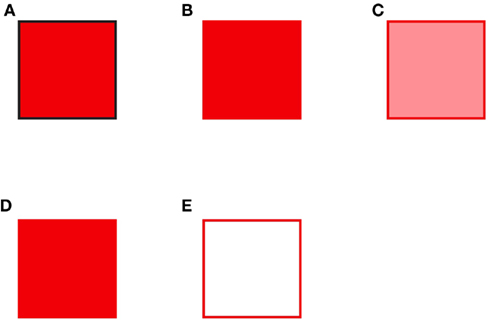
Figure 16. Red squares and square-shaped red.
These results demonstrate that the color attribute needs a boundary. Briefly, the boundary precedes the color. Moreover, shape and color are used like juxtaposed attributes of an object. The shape is something else, independent from the color property. Only after 9 years old, children integrate the two attributes of the red shape in a single object, represented in Figure 16D, which is geometrically identical to the one of Figure 16B but phenomenally different as we described previously. Besides, they consider the square-shaped red as odd. This is a further demonstration of the previous statement: boundary precedes color. A final observation concerns the clear tendency of the achromatic contours to assume the role of boundary as demonstrated by the results of the boundaries outlined with the black pastel.
It is worthwhile noticing that, from a logical point of view, the task “draw a red square” can also be interpreted as a red outline of a square (see Figure 16D). The same possible result can be expected for the square-shaped red. Very few subjects draw only the red outline. This result is supported by the fact that, on the basis of all the previous results and on the visual organization of shape and color, it does not take into account the presence of two attributes within the linguistic description: shape and color. Therefore, if shape and color are independent and the shape precedes the color, then they cannot be joined and integrated in a red outline, at least not in the stage of the juxtaposition of properties. This result is very rare also during the stage of integration, i.e., after 9 years old. This can be interpreted in terms of phenomenal qualities of the color that tends to fill the entire shape both modally, like in the watercolor illusion, and amodally, like in the variations of Matisse’s Woman.
Although this kind of result is unusual, the main answer to the task “describe what you see in Figure 16E” is a red square and never a white square or a white square with a red outline. Similar results are obtained from the description of Figure 16A. None of the subjects reported to see a red square with black boundaries, but only a red square. These results validate once again the visual shape and color organization previously described.
Finally, the results of this section demonstrate that boundary contours are not invisible even when they are invisible, in the sense that they pop out from a homogeneous colored shape, like Malevich’s Red Square, both through the naive description (but also through what it is not said) and the spontaneous drawings of young children. Therefore, they are not amodally invisible even when they are modally invisible. These implications can be extended to how artists paint their object. They used in fact to start outlining the boundary contours with a black pastel and then filling with chromatic paste the shape traced. This is normally the way children draw and paint. The fact that boundaries are visible also when they are invisible is what emerges in Altamira’s and Lascaux’s cave paintings (Figures 17A,B) or in Matisse’s Pink Nude (Figure 17C). Examples of this kind are present in most history of art, and this is because of the visual organization of shape/boundary and color that we studied in this work.
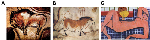
Figure 17. Altamira’s and Lascaux’s cave paintings (A and B); Matisse’s Pink Nude (C).
Discussion and Conclusion
In the previous sections we demonstrated new examples useful to understand the general problem of figure–ground segregation and, more particularly, the unilateral belongingness of the boundaries to the figure and the color/brightness induction within its surface. We showed that to split two regions into figure and background and, as a consequence, into complementary attributes (border ownership, depth segregation, and surface color), a single contour is sufficient, just as many artists do when they create their work starting from a contour or using only contours. In other terms, a contour contains information about shape, depth, and color.
In this work we focused our attention on shape and color by starting from the watercolor illusion with its juxtaposed contours that play the roles of boundary and color. Then, we introduced the notions of modal and amodal completion of color and suggested new conditions where the contours are not adjacent, like in the watercolor illusion, but displaced both horizontally and vertically and where they are perceived as boundary or color contours, not modally but amodally. By varying the main conditions of the displaced contours (luminance contrast, color, number, thickness, and chromatic homogeneity), we studied how these factors influenced the assignation of the roles of boundary and color to the displaced contours. Through these experiments our purpose was to answer the following basic question: Where is information about shape and color mostly located? Are shape and color independent? Are they organized in sequential order or in parallel? Is there any phenomenal logic in their visual organization? How are they bound? How are shape and color used by visual artists to create objects and scenes? Is the way artists use shape and color related to the way we perceive them?
On the basis of the results described in the previous sections, the following answers emerged. (i) The information about shape and color are placed along the contours. (ii) The contour with the highest luminance contrast is perceived as the boundary contour of the object. (iii) The contour with the lowest luminance contrast is perceived as the boundary contour of the object. (iv) If one contour takes on a role (e.g., boundary contour), then the other adjacent (watercolor illusion) or displaced (variations of Matisse’s Woman) contour assumes a different role (e.g., color). (v) The boundary contour is confined or restricted to a tiny contour surrounding the perceived object to which it belongs, while the role of the color contour is not confined to its geometrical end but it spreads into and fills the entire object. (vi) The coloration can be either modal, like in the case of the watercolor illusion, or amodal (see also Pinna, 2008), like in the case of Picasso’s Cock and in Matisse’s variations. (vii) The two roles of boundary and color contours are extracted one after the other, in sequential order, i.e., one role can be defined only if and only after the other is defined. (viii) The color contour spreads and fills the entire object within its boundaries, therefore again the role of the boundary contour, representing the end of the spreading, is logically extracted before the color of the object. (ix) This suggests the idea of “microgenesis” according to which the object perception and creation takes time to develop; according to this hypothesis the roles of shape and color are extracted in sequential order and in the same order they are also used by artists to paint objects. (x) Each object tends to show and to be perceived as having a single boundary contour with the highest luminance contrast, even when it is not really present. (xi) While the boundary contour tends to be one, the color contour can be multiple: i.e., one boundary, many colors. (xii) Achromatic contours tend to assume the role of boundary. (xiii) Linguistic descriptions and object representations are related (by some kind of morphism that requires to be studied more deeply) to the visual organization of shape and color, i.e., semantic and syntactic organization like the order of adjectives and the tendency of some attributes to become adjectives and not nouns or vice versa (see the linguistic and phenomenal plausibility of “a red square” against the phenomenal oddness of “a square-shaped red”). Finally (xiv), because shape and color take time to be integrated, during the development of how the visual system leads the reproduction of perceptual and linguistic objects, the integration of visual attributes (stage of integration) can manifest an intermediate stage, before the full integration, where both attributes are simply juxtaposed (stage of juxtaposition).
Studies on visual processing of contour and shape, based on illusory contours (Shapley and Gordon, 1985; Dresp et al., 1990; Dresp, 1992) and on contrast/assimilation phenomena (Shapley and Reid, 1985), suggested that independent brain mechanisms are involved. More recent studies demonstrated that neurons in V2 respond differently to the same contrast border, on the basis of the side of the figure to which the border belongs (Zhou et al., 2000; Friedman et al., 2003; von der Heydt et al., 2003). This can be considered as a neural correlate of the unilateral belongingness of the boundaries. More particularly, figure–ground segregation is likely processed in areas V1 and V2 (Zhou et al., 2000; Friedman et al., 2003; von der Heydt et al., 2003), in inferotemporal cortex (Baylis and Driver, 2001) and the human lateral occipital complex (Kourtzi and Kanwisher, 2001). Furthermore, Zhou et al. (2000) reported that approximately half of the neurons in the early cortical areas are selective in coding the polarity of color contrast. The same correlate can be assumed to explain the figure–ground effect of the watercolor illusion (von der Heydt and Pierson, 2006). The specialized phenomenal roles of the juxtaposed and displaced contours in boundary and color and the phenomenal logic of their organization can shed light to understand how neurons become more and more specialized by firing to only one attribute and how they are then integrated, after a level of juxtaposition of attributes.
The main general principles, here suggested through novel conditions taken from vision and art, can be starting points to explore a new domain focused on the microgenesis of shape and color within the more general problem of object organization. In conclusion, integrated and multidisciplinary studies based on art and vision science are desirable because they can strongly contribute to the fully understanding (even in terms of neural circuitry) of the basic and common problem of perceptual organization of shape and color.
Conflict of Interest Statement
The author declares that the research was conducted in the absence of any commercial or financial relationships that could be construed as a potential conflict of interest.
Acknowledgments
Supported by Finanziamento della Regione Autonoma della Sardegna, ai sensi della L.R. 7 agosto 2007, n. 7, Fondo d’Ateneo (ex 60%) and Alexander von Humboldt Foundation.
References
Baylis, G. C., and Driver, J. (2001). Shape-coding in IT cells generalizes over contrast and mirror reversal, but not figure-ground reversal. Nat. Neurosci. 4, 937–942.
Devinck, F., Delahunt, P. B., Hardy, J. L., Spillmann, L., and Werner, J. S. (2005). The watercolor effect: quantitative evidence for luminance-dependent mechanisms of long-range color assimilation. Vision Res. 45, 1413–1424.
Dresp, B. (1992). Local mechanisms sketch out surfaces but do not fill them in: evidence in the Kanizsa square. Percept. Psychophys. 52, 562–570.
Dresp, B., Lorenceau, J., and Bonnet, C. (1990). Apparent brightness in the Kanizsa square with and without illusory contour formation. Perception 19, 483–493.
Friedman, H. S., Zhou, H., and von der Heydt, R. (2003). The coding of uniform color figures in monkey visual cortex. J. Physiol. (Lond.) 54, 593–613.
Katz, D. (1911). Die Erscheinungsweisen der Farben und ihre Beeinflussung durch die individuelle Erfahrung. Z. Psychol. 7, 6–31.
Katz, D. (1930). Die Erscheinungsweisen der Farben, 2nd Edn, [Translation into English: MacLeodC, R. B., and Fox, W., 1935 The World of Color]. London: Kegan Paul.
Kourtzi, Z., and Kanwisher, N. (2001). Representation of perceived object shape by the human lateral occipital complex. Science 293, 1506–1509.
Michotte, A. (1951). “Une nouvelle énigme de la psychologie de la perception: le « donné amodal» dans l’expérience,” in International Congress of Psychology, Stockholm.
Michotte, A., Thinès, G., and Crabbé, G. (1964). Les compléments amodaux des structures perceptuals. Louvain: Publications Universitaires, Studia Psychologica. Repr. in Thinès, G., Costall, A., and Butterworth, G. (1991). Michotte’s Experimental Phenomenology of Perception. Hillsdale, NJ: Lawrence Erlbaum.
Nakayama, K., and Shimojo, S. (1990). Towards a neural understanding of visual surface representation. Cold Spring Harb. Symp. Quant. Biol. LV, 911–924.
Pinna, B. (1987). “Un effetto di colorazione,” in Il laboratorio e la città. XXI Congresso degli Psicologi Italiani, eds V. Majer, M. Maeran, and M. Santinello (Milano: Società Italiana di Psicologia), 158.
Pinna, B. (2005). The role of Gestalt principle of similarity in the watercolor illusion. Spat. Vis. 2, 185–207.
Pinna, B. (2008b). A new perceptual problem: the amodal completion of color. Vis. Neurosci. 25, 415–422.
Pinna, B. (2010a). New Gestalt principles of perceptual organization: an extension from grouping to shape and meaning. Gestalt Theory 32, 1–67.
Pinna, B. (2010b). What comes before psychophysics? The problem of “what we perceive” and the phenomenological exploration of new effects. Seeing Perceiving 23, 463–481.
Pinna, B. (2010c). What colour is it? Modal and amodal completion of colour in art, vision science and biology. Int. J. Arts Technol. 3, 195–220.
Pinna, B., Brelstaff, G., and Spillmann, L. (2001). Surface color from boundaries: a new “watercolor” illusion. Vision Res. 41, 2669–2676.
Pinna, B., and Grossberg, S. (2005). The watercolor illusion and neon color spreading: a unified analysis of new cases and neural mechanisms. J. Opt. Soc. Am. A 22, 2207–2221.
Pinna, B., and Reeves, A. (2006). Lighting, backlighting and watercolor illusions and the laws of figurality. Spat. Vis. 19, 341–373.
Pinna, B., and Tanca, M. (2008). Perceptual organization reconsidered in the light of the watercolor illusion: the problem of perception of holes and the object-hole effect. J. Vis. 8, 1–15.
Pinna, B., Werner, J. S., and Spillmann, L. (2003). The watercolor effect: a new principle of grouping and figure-ground organization. Vision Res. 43, 43–52.
Shapley, R., and Gordon, J. (1985). Nonlinearity in the perception of form. Percept. Psychophys. 37, 84–88.
Shapley, R., and Reid, R. C. (1985). Contrast and assimilation in the perception of brightness. Proc. Natl. Acad. Sci. U.S.A. 82, 5983–5986.
Spillmann, L., and Ehrenstein, W. H. (2004). “Gestalt factors in the visual neurosciences,” in The Visual Neurosciences, eds L. Chalupa, and J. S. Werner (Cambridge, MA: MIT Press), 1573–1589.
Spillmann, L., Pinna, B., and Werner, J. S. (2004). “Form-from-watercolour in perception and old maps,” in Seeing Spatial Form, eds M. R. M. Jenkin, and L. R. Harris (Oxford: Oxford University Press), 153–166.
von der Heydt, R., and Pierson, R. (2006). Dissociation of color and figure-ground effects in the watercolor illusion. Spat. Vis. 19, 323–340.
von der Heydt, R., Zhou, H., and Friedman, H. S. (2003). “Neural coding of border ownership: implications for the theory of figure-ground perception,” in Perceptual Organization in Vision: Behavioral and Neural Perspectives, eds M. Behrmann, R. Kimchi, and C. R. Olson (Mahwah: Lawrence Erlbaum Associates), 281–304.
Werner, J. S., Pinna, B., and Spillmann, L. (2007). The brain and the world of illusory colors. Sci. Am. 3, 90–95.
Wollschläger, D., Rodriguez, A. M., and Hoffman, D. D. (2002). Flank transparency: the effects of gaps, line spacing, and apparent motion. Perception 31, 1073–1092.
Keywords: shape perception, color perception, perceptual organization, watercolor illusion, vision and art
Citation: Pinna B (2011) The organization of shape and color in vision and art. Front. Hum. Neurosci. 5:104. doi: 10.3389/fnhum.2011.00104
Received: 03 May 2011; Accepted: 07 September 2011;
Published online: 04 October 2011.
Edited by:
Luis M. Martinez, Instituto de Neurociencias de Alicante, SpainReviewed by:
Jan Johan Koenderink, Katholieke Universiteit Leuven, BelgiumBirgitta Dresp-Langley, Centre National de la Recherche Scientifique, France
Copyright: © 2011 Pinna. This is an open-access article subject to a non-exclusive license between the authors and Frontiers Media SA, which permits use, distribution and reproduction in other forums, provided the original authors and source are credited and other Frontiers conditions are complied with.
*Correspondence: Baingio Pinna, Department of Architecture, Design and Planning, University of Sassari at Alghero, Palazzo del Pou Salit, Piazza Duomo 6, 07041 Alghero, Sassari, Italy. e-mail:YmFpbmdpb0B1bmlzcy5pdA==