 Akhil Anil Rajput
 Qingchun Li
 Xinyu Gao
- UrbanResilience.AI Lab, Zachry Department of Civil and Environmental Engineering, Texas A&M University, College Station, TX, United States
New York has become one of the worst-affected COVID-19 hotspots and a pandemic epicenter due to the ongoing crisis. This paper identifies the impact of the pandemic and the effectiveness of government policies on human mobility by analyzing multiple datasets available at both macro and micro levels for New York City. Using data sources related to population density, aggregated population mobility, public rail transit use, vehicle use, hotspot and non-hotspot movement patterns, and human activity agglomeration, we analyzed the inter-borough and intra-borough movement for New York City by aggregating the data at the borough level. We also assessed the internodal population movement amongst hotspot and non-hotspot points of interest for the month of March and April 2020. Results indicate a drop of about 80% in people’s mobility in the city, beginning in mid-March. The movement to and from Manhattan showed the most disruption for both public transit and road traffic. The city saw its first case on March 1, 2020, but disruptions in mobility can be seen only after the second week of March when the shelter in place orders was put in effect. Owing to people working from home and adhering to stay-at-home orders, Manhattan saw the largest disruption to both inter- and intra-borough movement. But the risk of spread of infection in Manhattan turned out to be high because of higher hotspot-linked movements. The stay-at-home restrictions also led to an increased population density in Brooklyn and Queens as people were not commuting to Manhattan. Insights obtained from this study would help policymakers better understand human behavior and their response to the news and governmental policies.
1 Introduction
COVID-19 global pandemic has caused unprecedented social, economic, and environmental impacts (Bashir et al., 2020). New York City, which became a major hotspot in the United States during the early stages of the pandemic, had more than 500,000 confirmed cases as of January 15, 2021. New York City observed its first peak during the first week of April. Public policy and implementation of control measures are essential to support social distancing, which might help slow the spread of COVID-19 (Kraemer et al., 2020; Lasry et al., 2020). Huang et al. (2020) have shown that mobility changes correspond well with the declaration of mitigation measures, implying effectiveness. Abulibdeh and Mansour (2021) found that despite the imposition of policy measures in Global South countries, the number of people leaving their homes increased, leading to more cases. This gives rise to the question of whether policies are enforced stringently and followed by the general population. Additionally, a study done in the United Kingdom analyzed the impact of government control measures on human mobility reduction and identified a relationship between human mobility trends and COVID-19 cases (Hadjidemetriou et al., 2020). They found out that reduction in mobility led to lower COVID-19 related casualties.
This study assesses the impact of the COVID-19 pandemic and government policies on human mobility for four major boroughs of New York City. The city was an early epicenter of the COVID-19 pandemic in the United States (Thompson et al., 2020). New York City is also one of the most densely populated cities in the United States, has a well-established intracity public rail, and diversity in transport options. Studies have shown that human mobility correlates directly with the number of positive cases with some time lag (Badr et al., 2020; Cartenì et al., 2020; Glaeser et al., 2020; Xiong et al., 2020) and disease reproduction number (Linka et al., 2021). Iacus et al. (2020) found that mobility alone can explain more than 90% of the initial spread of the COVID-19 virus. Furthermore, Gatto et al. (2020) have found that policies restricting population movement in Italy resulted in lessened mobility and reduced virus transmission by 45%. Yabe et al. (2020) found that even non-compulsory measures in Tokyo resulted in a 50% drop in mobility and led to 70% fewer social contacts. Bönisch et al. (2020) found that the median daily distance traveled reduced significantly in the lockdown period. Therefore, understanding the effectiveness of government policies on reducing human mobility will help shape these policies and better control any future outbreaks.
Almagro and Orane-Hutchinson (2020) found that crowded spaces play a more critical role than population density in spreading the infection. Gao et al. (2020) used Venables distance as a means to understand the agglomeration of human activities at the county level for 194 US counties. Li et al. (2020) classified points of interest (POIs) as hotspots or non-hotspots and assessed the mobility patterns among them for US cities. They found that while visits to hotspots decreased in some cities, some did not show a considerable drop; however, these studies did not focus on a granular level. Our study focused on finding these measures at the borough level for New York City to understand whether boroughs show any disparity in movement patterns. We aggregated the POIs at the borough level for New York City to assess the inter-borough and intra-borough hotspot and non-hotspot mobility trends. This knowledge may enable policymakers to better manage the control measures for different boroughs.
Researchers have also analyzed the effect of mobility on greenhouse gas emissions by the aviation and transport sectors (Abu-Rayash and Dincer, 2020). For instance, Jiang et al. (2021) identified the impact of human behavior and mobility on Singapore’s environment. They also reported a 30% reduction in mobility leads to about 44–55% reduction in air emissions related to transportation.
Zhou et al. (2020) used mobile phone data to build an exposure model for Shenzhen, China, and found that the reduction in mobility helped flatten the peak number of cases and lead to a delayed peak.
Studies have looked at mobility data from different sources for the same dataset but not different types of datasets (Huang et al., 2021; Iacus et al., 2020; Yabe et al., 2020). To the best of our knowledge, our research is a first of a kind that incorporates various datasets, such as population density, aggregated population mobility, intracity rail use, vehicle use, hotspot and non-hotspot movement patterns, and human activity agglomeration. The novelty of our research lies not only in performing the analysis at a finer scale but also in considering multiple datasets to reduce the uncertainties and gain multi-dimensional insights. The goal is to understand how a pandemic impacts mobility in different sectors, such as transportation—intracity rail and vehicular traffic. Looking across six different datasets, we endeavor to answer the following research questions: 1) How COVID-19 and government policies to counteract the spread of the virus influence human mobility within and across New York City boroughs? 2) How changes in overall mobility are explained by mobility through different means? 3) Does reduced mobility lead to reduced high-risk movements? The first research question gives us insights on how mobility is affected by COVID-19 awareness, state policies, local policies (New York City) and news (Figure 1) and whether these policies have a significant impact on mobility. Focusing on different datasets gives a holistic perspective on human mobility. The second research question identifies if people switch from high-risk transportation means (New York City subway) to low risk (vehicle) or show similar mobility reduction. The third research question gives insights as to whether reduced mobility causes reduced movements to and from hotspots, as movements linked to hotspots exhibit high risks of spreading the infection. Even a small minority of super-spreader POIs can account for a large number of infections (Chang et al., 2020).
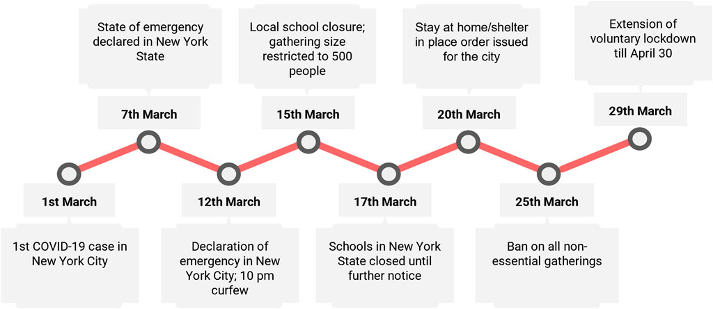
FIGURE 1. Timeline of policies and COVID-19-related news for the month of March for New York City and New York State.
2 Data and Processing
For our study, we obtained mobility data from five sources: Facebook, the Metropolitan Transportation Authority database, New York State open data portal (data.ny.gov), and from studies by Li et al. (2020) and Gao et al. (2020).
From Facebook, we acquired the Facebook Population and Movement datasets for March and April 2020. Facebook anonymizes data by adding a small random noise, implementing spatial smoothing, and dropping small counts. For these datasets, the metrics were aggregated over each tile and linked to the center of a tile or a polygon (or a combination of both). The density dataset consisted of population density, user count (number of users with the location on), among other measures for each data point. The mobility dataset consisted of start and end coordinates and the corresponding movement associated with the start-end coordinate pair. These datasets were available at a frequency of 8 h but were aggregated over days for the movement dataset and at a weekly resolution for the density dataset. Baseline and crisis values are available for both population and movement datasets. Facebook computed the baseline values in the dataset for each data point using 5–13 weeks of pre-crisis data. Baseline values were calculated using data from the previous weeks of the pre-crisis period (Maas et al., 2019). We used crisis and baseline values of population density for our study. Similarly, we used crisis and baseline values for movement from the movement dataset from the start-end coordinate pairs.
We obtained MTA turnstile data from New York State open data portal for January through April 2020. The turnstile dataset consisted of the cumulative entry and exit counts for each turnstile for all subway stations in New York City at an hourly interval. To obtain the hourly entry and exit count, first the difference was computed for entry and exit time series. We then aggregated the entry and exits for these turnstiles at 1-day intervals. Tunnels and bridges toll data from MTA contained the number of vehicles (cars, buses, trucks and motorcycles) crossing it.
Mobility data for 16 US cities (including New York City) across points of interest classified as hotspots and non-hotspots were acquired from the study by Li et al. They used SafeGraph data to map the origin-destination network and identified the hotspots and non-hotspots on the mapped network. Here, hotspots represent high-risk zones, and non-hotspots represent low-risk zones in terms of infection risk (Li et al., 2020). Hotspot and non-hotspot movement data for New York City were taken from this study and aggregated at the borough level for our analysis.
To consider the agglomeration of human activities, we used data Venables distance data for the study by Gao et al. (2020). They calculated Venables distance for 193 counties in the United States by using digital trace data from Mapbox. Venables distance aggregates the spatial distribution of human activities of different tiles in a county. It would give insights into the effectiveness of shelter-in-place/lockdown orders as the activities get clustered and more localized. For more information on the calculation of Venables Distance in this dataset, please refer to Gao et al. (2020). In our study, we performed the analysis at the borough level for New York City.
Table 1 gives an overview of the datasets used in this paper and unique insights offered by each of these datasets.
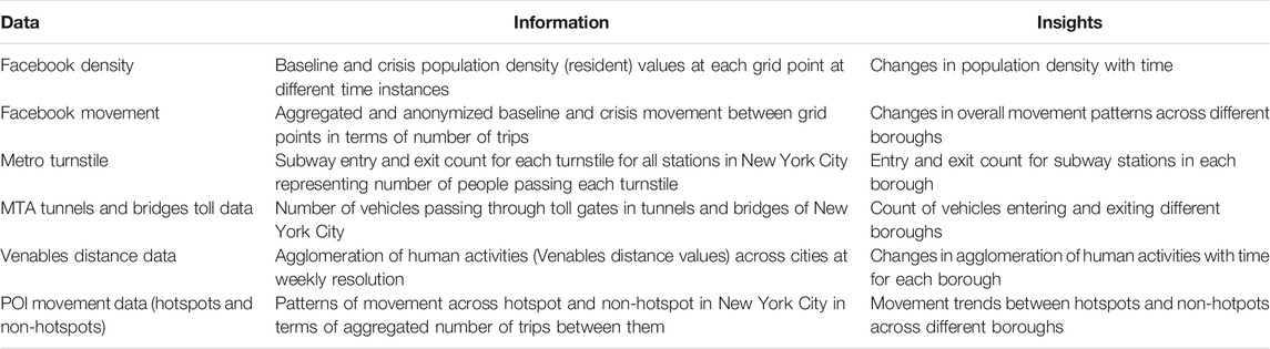
TABLE 1. Data description and insights obtained from each dataset.
3 Methodology
This section describes methods used to analyze datasets for aspects of human mobility and to compute baseline values for Facebook Movement and subway turnstile dataset. Figure 2 illustrates the steps followed for the analysis in this paper with further explanation below.
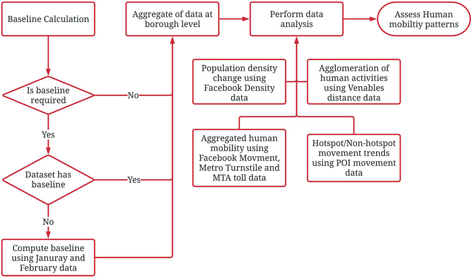
FIGURE 2. The process followed for analyzing human mobility using six datasets.
3.1 Baseline Calculation
Datasets other than those acquired from Facebook did not have baseline values from previous data. To assess the change in mobility, for Facebook Movement and Metro Turnstile datasets, the baseline values were computed by taking the average value of the data from months January and February as a combined average for both months. We used a 2-month combined average instead of a day-wise average over the weeks for two reasons: 1) We did not have sufficient pre-crisis data; 2) We adopted a 7-day rolling mean approach to assess mobility for various datasets to remove the variations in mobility on weekdays and weekends, so a precise averaging was not necessary.
3.2 Population Density
To assess the pandemic-related variation in population density for March and April, we first extracted the population density data for four main boroughs of New York City: Brooklyn, Manhattan, Queens, and Bronx. Then, we computed weekly averages of baseline and crisis values for population density from March 1 through April 30. After aggregating the data weekly for each grid point, we estimated the percentage change in population density with respect to the baseline values. We then mapped the density change for New York City for different weeks.
3.3 Aggregated Population Movement
We analyzed inter-borough and intra-borough population movement using the Facebook Movement dataset, which represents users’ general mobility patterns based on the location data of mobile phones. We spatially aggregated the baseline and crisis values from Facebook Movement data at the borough level. Each start or end coordinate was assigned to a borough if it was within that borough boundary. The resampled data, therefore, instead of capturing start-end coordinate movements, captured inter-borough and intra-borough movements. Borough-to-borough movements lacking enough data points to produce statistically significant results were discarded. Then movement change time series (7-days moving average) for inter-borough and intra-borough movement for March and April were plotted.
A similar approach was adopted for the turnstile data. Analyzing subway turnstile data gives insights into how mobility in the subway compares to that observed from the Facebook Movement dataset, which corresponds to general mobility trends. MTA does not directly provide turnstile location (coordinates). We first obtained a dataset containing the coordinates of subway stations from MTA. Then we merged these with the primary dataset consisting of turnstile data for each station using station names as the common joining parameter (station names). Since these datasets were not produced in the same year, the station names had minor changes (updated name, short-form, long-form, etc.). We linked these stations manually to a coordinate. After geocoding these stations, the entry and exit data were aggregated over boroughs, applying the same approach as for the Facebook Movement dataset. The exit numbers were slightly less than the entry number for each station because people tend to use emergency exits to exit the station to save time. We, therefore, considered both entry and exit numbers separately for this analysis.
3.4 On-Road Movement
Restrictions on public gatherings may have a different impact on travel via personal vehicles, as they conform to the social-distancing measures and are safer from the standpoint of contact than public transport. To assess road traffic, we considered tunnel and bridge toll data as a proxy to measure the inter-borough road traffic. Since these bridges or tunnels did not connect places within a borough, we could not use this dataset to compute intra-borough vehicle statistics. All of the tunnels and bridges in New York City link different boroughs, so we grouped the toll dataset on the basis of the direction of flow and the linked boroughs. For example, incoming traffic to Brooklyn and outgoing traffic from Brooklyn were grouped separately. This gives an idea about the net inflow or outflow of traffic from a particular borough. The dataset contained the count for vehicles that pay using an E-Z pass or cash (includes payment by mail). Because of the pandemic, however, some toll gates did not accept cash, and the exact date of this transition was not available publicly, so this study analyzed only total traffic flow and not the payment methods (contactless or cash). Baseline traffic values were computed for each toll plaza considering total vehicle traffic. The percent change in traffic was calculated using the baseline values for March and April. Time series plots (7-days moving average) for inbound and outbound traffic for four main boroughs were plotted for further analysis.
3.5 Hotspot and Non-hotspot Movements
Knowing movements linked to high-risk zones (hotspots) is crucial as they might contribute to the faster spreading of the infection (Almagro and Orane-Hutchinson, 2020). Li et al. (2020) mapped the Origin-Destination (OD) networks from SafeGraph data as directed and weighted bipartite networks. They classified POIs based on a threshold in-flux and out-flux values obtained from the OD bi-adjacency matrix. For our study, these POI (hotspots and non-hotspots) datasets from the study by Li et al. (2020) were reclassified into different boroughs then the movements between POIs were spatially aggregated borough-wise to obtain the inter- and intra-borough movement. For each borough movement case (16 cases, – inter- and intra-borough movement), we obtained movement patterns for the hotspot to hotspot (HH), hotspot to non-hotspot (HN), non-hotspot to hotspot (NH), and non-hotspot to non-hotspot (NN) movements for March and April. This classification would give additional insights into the composition of overall movement patterns into high-risk and low-risk movements, where high-risk movements correspond to those linked with hotspots and low-risk to non-hotspot.
3.6 Human Activity Agglomeration
While higher population density and movement activity may correspond to a higher risk of infection, studying the agglomeration of human activities is also important. Higher agglomeration would imply that the average distance between people is less and could lead to a higher risk of disease spread. This measure takes into consideration the areas (ZIP code or census tract) where population density might be lower, yet still show higher agglomeration. Therefore, such areas might have a higher risk of infection spread than would be expected from assessing only population density. We obtained more-granular level data from the study by Gao et al., 2020 for New York City at the borough level to observe the activity density for Manhattan, Queens, Brooklyn, and Bronx.
3.7 Venables Distance
Venables distance is calculated by the following equation:
where ak(t) represents the metrics of human activities at tile k at time t, dij represents the center-to-center distance between tiles i and j. The numerator represents the weighted distance of these activities, and, by dividing by the denominator, the value is normalized, and we obtain the weighted average, or Venables distance (Louail et al., 2014). Higher Venables distance implies higher distance between people and therefore reduced risk of infection spread.
4 Results
We observed the changes in population density for the four boroughs in New York City by analyzing the weekly aggregated density data from Facebook. Figure 3 shows the results for the density change (in percentage) for four boroughs of New York City—Manhattan, Brooklyn, Bronx and Queens—for March and April. We observe that in the first week of March (Figure 3A), the variations in density changes are within five percent. In the second week of March (Figure 3B), we begin to see a slight reduction in density in Manhattan. From the third week of March (Figures 3C,D), the changes are more apparent, and it is observed that there is a significant decrease in population density in Manhattan and other boroughs show an increase in population density. For some places in Manhattan, the reduction is more than 75%. Since Manhattan is a hub for offices and commercial spaces, results suggest that after a national emergency was declared on March 13 and office strength was reduced by 50% on March 18, people started working from home. The area of Queens showing a decrease in population density can be attributed to the location of John F. Kennedy International Airport. The airport has nearly equal passengers for both domestic and international travel (New York City data portal, 2015 data). Due to travel restrictions put on by many countries after the third week of March, people traveled less globally and also domestically, leading to lower footfall in the airport region.
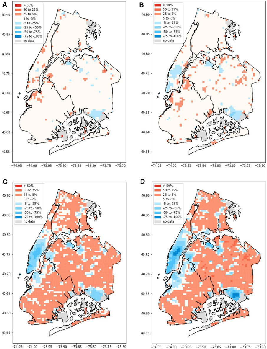
FIGURE 3. Percent resident population density change (with respect to baseline values) timeline for four boroughs of New York City. (A-D) represent the population density for the first, second, third, and fourth week of March, respectively. Red represents higher population density; blue represents lower population density compared to baseline.
It is observed that in the third week of March, the reduction in population density is the highest in comparison to previous weeks; the reduced population density in the last week of March remains similar for the month of April. The majority of the change happened in the third week of March, which coincides with the announcement of a state of emergency and stay-at-home orders. Moreover, the changed density state remains the same for the entire month of April (figures are available in the Supplementary Appendix), which could imply that the populace effectively followed the guidelines throughout, and a steady state was achieved.
The above results indicate a reduction in population density for Manhattan, which may reduce the risk for infection spread. For other boroughs, which show an increase in population density, it is not clear whether this increases the risk. We analyzed the mobility patterns and measured the inter- and intra-borough movement through Facebook Movement and subway turnstile data to address this question. Figure 4 shows the inter- and intra-borough movement patterns for four boroughs for New York City for general mobility using Facebook Movement data. Figure 5 shows subway ridership for each of the boroughs’ stations. Figures 4, 5 show that the reduction in mobility happens in the third and fourth week of March.
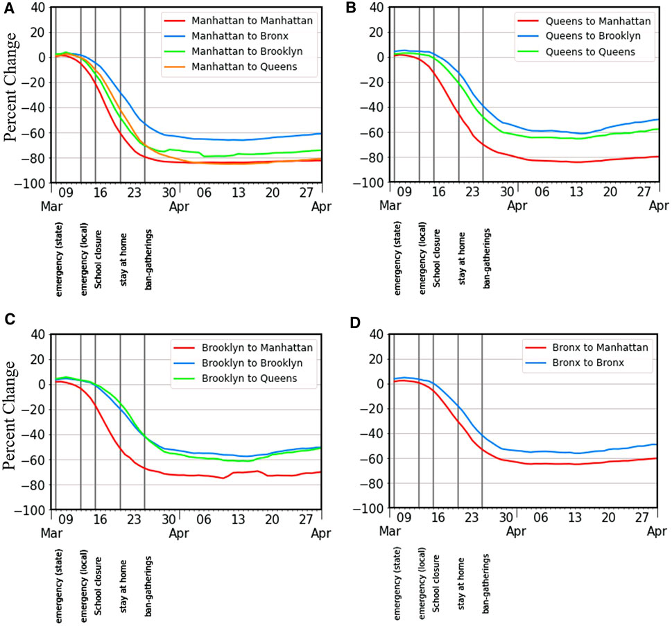
FIGURE 4. Seven-day rolling mean aggregated movement among four boroughs of New York City. Some borough-to-borough movement plots are not shown due to insufficient data. (A-D) show the movement from Manhattan, Queens, Brooklyn, and Bronx, respectively, to other boroughs.
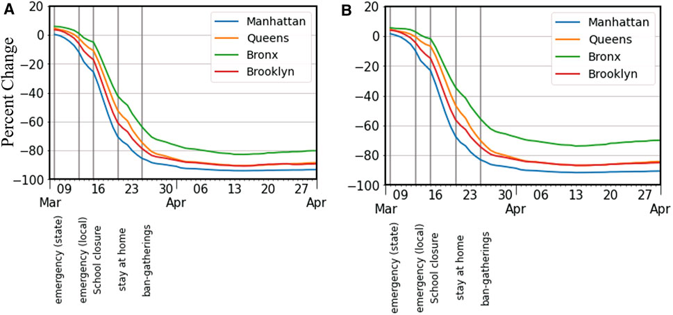
FIGURE 5. Seven day rolling mean of percent change of Metro ridership in four boroughs of New York City. (A,B) represent the percent change in entry and exit counts respectively for Manhattan, Queens, Bronx, and Brooklyn.
Figure 4 suggests that the aggregated movement patterns to and from Manhattan saw a significant drop. Also, movements from Manhattan to other boroughs reduced by 60–80%, the largest percentage among the four boroughs. For inter- or intra-borough movements that are not Manhattan linked, the reduction was between 50 and 60%. From Figure 5, analyzing the percent change in entry counts at stations in each of the boroughs, it is evident that subway ridership dropped by more than 80% for the four boroughs. Similar to observations from Figure 4, Manhattan showed the highest drop in subway entry count (90% reduction). The use of the subway remains reduced for the month of April. This suggests that people, in general, were following the recommendations of social distancing, working from home, and avoiding the use of public transport. Movements within Bronx, Brooklyn, and Queens were slightly higher than their inter-borough movements in general, which may indicate commute for purchase of essential goods. In contrast, for Manhattan, the intra-borough movement was the lowest (compared to movement from Manhattan to other boroughs), which could be due to a reduction in the population density in Manhattan; therefore, the local commute by people who come from other boroughs is comparatively less, though people working with essential services may commute to Manhattan and back from other boroughs.
Results from the Facebook Movement data and Metro turnstile data indicate that while subway usage dropped by more than 80% for all the major boroughs, the overall movement within and across different boroughs showed a drop between 50 and 80%. For movements not liked with Manhattan, this reduction was only about 60%. This suggests that other means of travel might result in a lesser reduction in the overall movement than observed from the Facebook Movement data. One aspect that we have not considered yet is people traveling via road. People may resort to traveling by personal vehicles for essential shopping or for jobs exempt from having reduced workforce capacity. Analyzing mobility through roads may give additional insights into the observed difference.
The above results give insights into the total movement patterns and mobility through the subway system. But people involved with essential facilities may commute through roads for work, or people may travel to shop for essentials. We analyzed the tunnels and bridge toll data to observe if decreased ridership in the subway leads to an increased flow of vehicles. Figure 6 shows traffic through the tunnels and bridges connecting the boroughs. We used tunnels and bridges toll data as a proxy to study road movement. The results indicate that incoming traffic to Manhattan from the boroughs showed a drop of 70%. Incoming traffic to Queens and Bronx boroughs was reduced by about 60%. Outbound traffic to boroughs other than Manhattan shows a drop of 50–70%. These results show that the traffic towards Manhattan shows the highest decrease, and in general, we see about 60% less movement through roads to other boroughs.
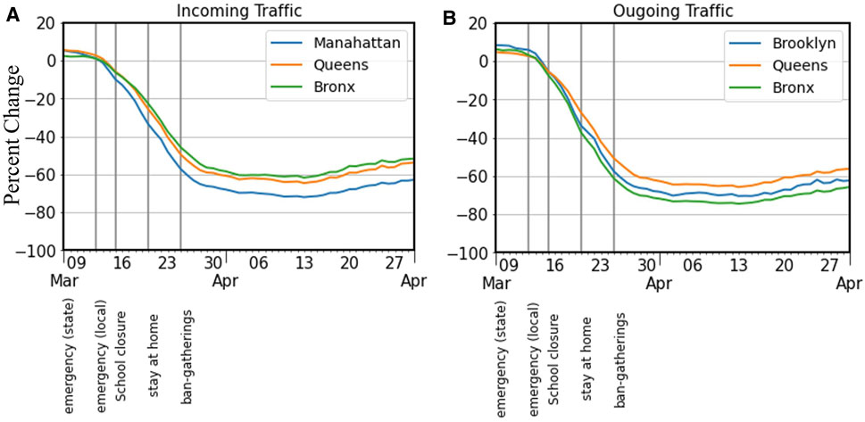
FIGURE 6. Seven-day moving average of (A) incoming traffic for Manhattan, Queens, and Bronx; and (B) outgoing traffic from Queens, Bronx, and Brooklyn.
We observe similar mobility reduction patterns in road movement as observed before for different boroughs, but the magnitude of reduction is not as much as that observed with Metro ridership. This could be because commuting by car is a safer means of transportation vis-à-vis possible contagious diseases as compared to public modes of transportation. Moreover, people employed in the operation of critical facilities or emergency response would still need to commute. Additionally, this dataset accounts only for the number of vehicles that pass through a toll plaza, and there is no information about the number of passengers per vehicle. If people shared rides before the pandemic, they may not do so anymore, which could implicate slightly higher than the observed movement of cars per passenger.
Our analysis so far only accounted for mobility patterns and trends for different boroughs. While it may be true that reduced mobility may mean lesser risk if there are still significant movements that are linked with hotspots, there may be some movement types that contribute to the spread of the infection. In order to determine whether reduced mobility leads to a reduction in high-risk movements, we investigated the HH, NH, HN, and NN movement patterns for the four main boroughs for New York City. Figure 7 shows the HH, NH, HN, and NN movement patterns between Manhattan, Bronx, Queens, and Brooklyn (more borough to borough movement results can be accessed in the Supplementary Appendix section).
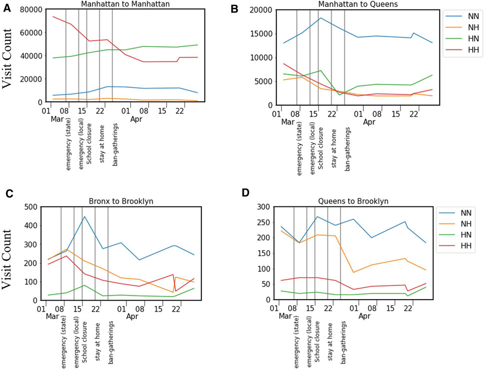
FIGURE 7. HH, HN, NH, NN movement patterns across four boroughs of New York City at weekly resolution. (A–D) show the movements from Manhattan to Manhattan, Manhattan to Queens, Bronx to Brooklyn, and Queens to Brooklyn, respectively. (For all figures, please refer to the Supplementary Appendix section 2).
Results indicate that movement towards Manhattan involved a high number of HH movements. In contrast, movement from Manhattan to other boroughs involved a higher number of NN movements. Intra borough movements showed declining trends for HH movements and had low HN movements except for Manhattan. In other inter and intra-borough movements, NN movements were in higher numbers but did not show a significant drop in activity. This suggests that even though Manhattan saw the highest reduction in mobility, the risk of infection is still high as hotspot linked movements are higher in comparison to other movement pairs. Moreover, the HN type movement does not show a declining trend implying that people from hotspots, if infected, may infect people in non-hotpots. Other inter and intra-borough movements have dominated NN type of movement, which is favorable if traveling cannot be avoided. NN type of movement corresponds to the least risk travel, compared to other movement types in terms of likelihood of spreading the infection.
To further understand the perturbed state where we have reduced mobility, we investigated the Venables distance for these boroughs to get insights into how clustered the activities are with respect to distance. Figure 8 shows the Venables Distance for four boroughs of New York City. The results suggest that the clustering of human activities increased significantly by twenty percent for Manhattan in the first 2 weeks of March. Other boroughs showed small increments till the end of March then had a gradual decline. This indicates that Manhattan showed the most clustering of activities in comparison to other boroughs. Gao et al., 2020 found that at the county level for the US, the average increase in Venables distance for social ties was about 15%. For Bronx, Brooklyn and Queens boroughs, the change in Venables distance was less than the US average. Combining insights from hotspot linked movement to Manhattan, results suggest that even though the distance between people is increasing, it may not reduce the risk substantially as movements linked to hotspots dominate. Even though clustering of activities is observed for Manhattan, the borough has a substantial number of movements that are linked with hotspots. This would not help much to reduce the risk as these clusters could still get infected by a large number of hotspot to hotspot, hotspot to non-hotspot and non-hotspot to hotspot type of movements. Other boroughs like Queens, Bronx, and Brooklyn show only a marginal increase in Venables distance.
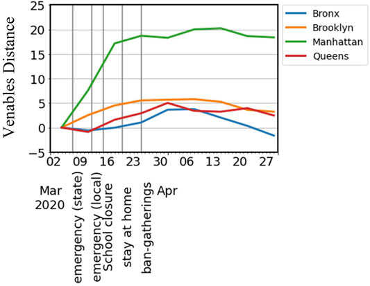
FIGURE 8. Venables distance time series for four boroughs of New York City.
These results indicate that the average distance between people did not change significantly for boroughs other than Manhattan. When people started working from home, they did not commute to their offices in Manhattan; hence, the Venables distance increased by roughly twenty percent only for Manhattan. For other boroughs, it is unclear why Venables distance only increases marginally. It may be because of the balancing effect of increased population density and a reduced number of trips within a borough.
5 Discussion
This study shows how human mobility was affected by the pandemic and how the influence exerted by the first COVID-19 positive case, government policies, and major news had on them. The estimates of aggregate flows of people can help officials understand which policies are most effective (Buckee et al., 2020). The news of the first case of the COVID-19 in New York City and the declaration of the state of emergency did not have much impact on mobility. There is marginal decline in mobility a few days after a state of emergency is declared in the state of New York, but there is a significant decrease in mobility only after a local emergency is declared. We see a steep decrease in mobility only when the curfew is imposed on restaurants and bars, and schools are closed by the Governor of New York. We see that in March, inter- and intra-borough movement of population declines, and towards the end of March, it reduces to a 60–90% lower value that continues until the end of April. The highest drop in mobility is observed for Manhattan since it is a business hub and has a smaller number of residential complexes. After the ban on all non-essential gatherings, there is still a declining trend in mobility. Still, when the voluntary lockdown is extended by one month on 29th March, the mobility had already reached its lowest, and no further decline is observed. This trend of decrease in mobility is consistent across different datasets, but we observe slight variations in the magnitude. This variation could be because data from Facebook relies on users who keep their location services enabled. While it may give valuable insights into the movement trends, we can expect some variations as they do not represent all the people. Moreover, the dataset captures general mobility trends and does not specify whether this movement is associated with traveling via road, subway, bicycle, or walking.
Subway turnstile data results indicate that the reduction in subway ridership is 10% more for Manhattan and 20–30% more for other boroughs. Overall, the reduction in subway ridership is more than 80% for all the boroughs, indicating the effectiveness of government control measures. Vehicular mobility shows similar patterns to that of general mobility patterns, but for boroughs other than Manhattan, the reduction is slightly more. Venables distance shows high variation only for Manhattan because it is dominated by office space and has a relatively small percentage of the residential population. When the workforce started to work from home, only these areas showed clustered activities. Higher-density areas in Manhattan may be associated with residential areas. Moreover, people did not commute to work to Manhattan, which contributed to an increased average distance among people. Although we see an increase in population density for boroughs like Queens, Brooklyn, and Bronx, the mobility remains between 60 and 90%: low for both inter- and intra-borough movement. This suggests that people were commuting less frequently and strictly following the stay-at-home orders. This is substantiated by a reduction in subway ridership did not increase vehicle traffic, which showed a similar reduction in movement. But the risk of infection in Manhattan is not reduced significantly, as hotspot-linked movements still dominate even after a significant drop in overall mobility.
Data Availability Statement
The data analyzed in this study is subject to the following licenses/restrictions: Some datasets are not publically available, requests to access these datasets should be directed to https://www.mapbox.com/data-products; https://www.streetlightdata.com/; https://dataforgood.fb.com/; Datasets available publically: MTA Turnstile data—http://web.mta.info/developers/turnstile.html; Tunnels and bridges toll data—http://web.mta.info/developers/data/bandt/trafficdata.html.
Author Contributions
Research design and conceptualization: all authors; Data collection, processing, analysis, and visualization: all authors; Writing: AR, AM; Reviewing and revising: all authors.
Conflict of Interest
The authors declare that the research was conducted in the absence of any commercial or financial relationships that could be construed as a potential conflict of interest.
Publisher’s Note
All claims expressed in this article are solely those of the authors and do not necessarily represent those of their affiliated organizations, or those of the publisher, the editors and the reviewers. Any product that may be evaluated in this article, or claim that may be made by its manufacturer, is not guaranteed or endorsed by the publisher.
Acknowledgments
The authors would like to acknowledge funding supports from the National Science Foundation RAPID project #2026814: “Urban Resilience to Health Emergencies: Revealing Latent Epidemic Spread Risks from Population Activity Fluctuations and Collective Sense-making. The authors would also like to acknowledge that Safegraph, Mapbox, and Facebook provided datasets under their Data for Good initiatives. Any opinions, findings, and conclusions, or recommendations expressed in this research are those of the authors and do not necessarily reflect the view of the funding agency and the data providers.
Supplementary Material
The Supplementary Material for this article can be found online at: https://www.frontiersin.org/articles/10.3389/fbuil.2021.654409/full#supplementary-material
References
Abu-Rayash, A., and Dincer, I. (2020). Analysis of Mobility Trends during the COVID-19 Coronavirus Pandemic: Exploring the Impacts on Global Aviation and Travel in Selected Cities. Energ. Res. Soc. Sci. 68, 101693. doi:10.1016/j.erss.2020.101693
Abulibdeh, A., and Mansour, S. (2021). Assessment of the Effects of Human Mobility Restrictions on COVID-19 Prevalence in the Global South. The Professional Geographer. doi:10.1080/00330124.2021.1970592
Almagro, M., and Orane-Hutchinson, A. (2020). JUE Insight: The Determinants of the Differential Exposure to COVID-19 in New York City and Their Evolution over Time. J. Urban Econ., 103293. doi:10.1016/j.jue.2020.103293
Badr, H. S., Du, H., Marshall, M., Dong, E., Squire, M. M., and Gardner, L. M. (2020). Association between Mobility Patterns and COVID-19 Transmission in the USA: a Mathematical Modelling Study. Lancet Infect. Dis. 20 (11), 1247–1254. doi:10.1016/S1473-3099(20)30553-3
Bashir, M. F., Ma, B., and Shahzad, L. (2020). A Brief Review of Socio-Economic and Environmental Impact of Covid-19. Air Qual. Atmos. Health 13, 1403–1409. doi:10.1007/s11869-020-00894-8
Bönisch, S., Wegscheider, K., Krause, L., Sehner, S., Wiegel, S., Zapf, A., et al. (2020). Effects of Coronavirus Disease (COVID-19) Related Contact Restrictions in Germany, March to May 2020, on the Mobility and Relation to Infection Patterns. Frontiers in Public Health 8 (October), 1–10. doi:10.3389/fpubh.2020.568287
Buckee, C. O., Balsari, S., Chan, J., Crosas, M., Dominici, F., Gasser, U., et al. (2020). Aggregated Mobility Data Could Help Fight COVID-19. Science 368, 145–146. doi:10.1126/science.abb8021
Cartenì, A., Di Francesco, L., and Martino, M. (2020). How Mobility Habits Influenced the Spread of the COVID-19 Pandemic: Results from the Italian Case Study. Sci. Total Environ. 741, 140489. doi:10.1016/j.scitotenv.2020.140489
Chang, S., Pierson, E., Koh, P. W., Gerardin, J., Redbird, B., Grusky, D., et al. (2020). Mobility Network Models of COVID-19 Explain Inequities and Inform Reopening. Nature 589, 82–87. doi:10.1038/s41586-020-2923-3
Gao, X., Fan, C., Yang, Y., Lee, S., Li, Q., Maron, M., et al. (2020). Early Indicators of COVID-19 Spread Risk Using Digital Trace Data of Population Activities. Available at: http://arxiv.org/abs/2009.09514 (Acccessed On: November 18, 2021).
Gatto, M., Bertuzzo, E., Mari, L., Miccoli, S., Carraro, L., Casagrandi, R., et al. (2020). Spread and Dynamics of the COVID-19 Epidemic in Italy: Effects of Emergency Containment Measures. Proc. Natl. Acad. Sci. USA 117 (19), 10484–10491. doi:10.1073/pnas.2004978117
Glaeser, E. L., Gorback, C., and Redding, S. J. (2020). JUE Insight: How Much Does COVID-19 Increase with Mobility? Evidence from New York and Four Other U.S. Cities. J. Urban Econ., 103292. doi:10.1016/j.jue.2020.103292
Hadjidemetriou, G. M., Sasidharan, M., Kouyialis, G., and Parlikad, A. K. (2020). The Impact of Government Measures and Human Mobility Trend on COVID-19 Related Deaths in the UK. Transportation Res. Interdiscip. Perspect. 6, 100167. doi:10.1016/j.trip.2020.100167
Huang, X., Li, Z., Jiang, Y., Li, X., and Porter, D. (2020). Twitter Reveals Human Mobility Dynamics during the COVID-19 Pandemic. PLoS ONE 15, e0241957. doi:10.1371/journal.pone.0241957
Huang, X., Li, Z., Jiang, Y., Ye, X., Deng, C., Zhang, J., et al. (2021). The Characteristics of Multi-Source Mobility Datasets and how they Reveal the Luxury Nature of Social Distancing in the U.S. During the COVID-19 Pandemic. Int. J. Digit. Earth 14 (4), 424–442.
Iacus, S. M., Santamaria, C., Sermi, F., Spyratos, S., Tarchi, D., and Vespe, M. (2020). Human Mobility and COVID-19 Initial Dynamics. Nonlinear Dyn. 101 (3), 1901–1919. doi:10.1007/s11071-020-05854-6
Jiang, P., Fu, X., Fan, Y. V., Klemeš, J. J., Chen, P., Ma, S., et al. (2021). Spatial-Temporal Potential Exposure Risk Analytics and Urban Sustainability Impacts Related to COVID-19 Mitigation: A Perspective from Car Mobility Behaviour. J. Clean. Prod. 279, 123673. doi:10.1016/j.jclepro.2020.123673
Kraemer, M. U. G., Yang, C.-H., Gutierrez, B., Wu, C.-H., Klein, B., Pigott, D. M., et al. (2020). The Effect of Human Mobility and Control Measures on the COVID-19 Epidemic in China. Science 368 (6490), 493–497. doi:10.1126/science.abb4218
Lasry, A., Kidder, D., Hast, M., Poovey, J., Sunshine, G., Winglee, K., et al. (2020). Timing of Community Mitigation and Changes in Reported COVID-19 and Community Mobility ― Four U.S. Metropolitan Areas, February 26-April 1, 2020. MMWR Morb. Mortal. Wkly. Rep. 69, 451–457. doi:10.15585/mmwr.mm6915e2
Li, Q., Bessell, L., Xiao, X., Fan, C., Gao, X., and Mostafavi, A. (2020). Disparate Patterns of Movements and Visits to Points of Interests Located in Urban Hotspots across U.S. Metropolitan Cities during COVID-19. arXiv:2006.14157.
Linka, K., Goriely, A., and Kuhl, E. (2021). Global and Local Mobility as a Barometer for COVID-19 Dynamics. Biomech. Model Mechanobiol. 20, 651–669. doi:10.1007/s10237-020-01408-2
Louail, T., Lenormand, M., Cantu Ros, O. G., Picornell, M., Herranz, R., Frias-Martinez, E., et al. (2014). From mobile Phone Data to the Spatial Structure of Cities. Sci. Rep. 4, 1–12. doi:10.1038/srep05276
Maas, P., Gros, A., McGorman, L., Alex Dow, P., Iyer, S., Park, W., et al. (2019). “Facebook Disaster Maps: Aggregate Insights for Crisis Response & Recovery,” in Proceedings of the International ISCRAM Conference, Anchorage, AK, August 4–8, 2019.
Thompson, C. N., Baumgartner, J., Pichardo, C., Toro, B., Li, L., Arciuolo, R., et al. (2020). COVID-19 Outbreak - New York City, February 29-June 1, 2020. MMWR Morb. Mortal. Wkly. Rep. 69 (46), 1725–1729. doi:10.15585/mmwr.mm6946a2
Xiong, C., Hu, S., Yang, M., Luo, W., and Zhang, L. (2020). Mobile Device Data Reveal the Dynamics in a Positive Relationship between Human Mobility and COVID-19 Infections. Proc. Natl. Acad. Sci. USA 117 (44), 27087–27089. doi:10.1073/pnas.2010836117
Yabe, T., Tsubouchi, K., Fujiwara, N., Wada, T., Sekimoto, Y., and Ukkusuri, S. V. (2020). Non-compulsory Measures Sufficiently Reduced Human Mobility in Tokyo during the COVID-19 Epidemic. Sci. Rep. 10 (1), 1–9. doi:10.1038/s41598-020-75033-5
Keywords: COVID-19, human mobility, multi-dataset, public transport, New York City
Citation: Rajput AA, Li Q, Gao X and Mostafavi A (2022) Revealing Critical Characteristics of Mobility Patterns in New York City During the Onset of COVID-19 Pandemic. Front. Built Environ. 7:654409. doi: 10.3389/fbuil.2021.654409
Received: 16 January 2021; Accepted: 08 December 2021;
Published: 31 January 2022.
Edited by:
Samiul Hasan, University of Central Florida, United StatesReviewed by:
Annesha Enam, Bangladesh University of Engineering and Technology, BangladeshArif Mohaimin Mohaimin Sadri, Florida International University, United States
Copyright © 2022 Rajput, Li, Gao and Mostafavi. This is an open-access article distributed under the terms of the Creative Commons Attribution License (CC BY). The use, distribution or reproduction in other forums is permitted, provided the original author(s) and the copyright owner(s) are credited and that the original publication in this journal is cited, in accordance with accepted academic practice. No use, distribution or reproduction is permitted which does not comply with these terms.
*Correspondence: Akhil Anil Rajput, YWtoaWwucmFqcHV0QHRhbXUuZWR1