 Virginia LeBaron1*†
 Natalie Crimp1,†Nutta Homdee2,†Kelly Reed1,†Victoria Petermann1,†William Ashe3,†Leslie Blackhall4,†Bryan Lewis5,†
- 1Department of Research, University of Virginia School of Nursing, Charlottesville, VA, United States
- 2Center for Research Innovation and Biomedical Informatics, Faculty of Medical Technology, Mahidol University, Nakhon Pathom, Thailand
- 3Division of Cardiovascular Medicine, Center for Advanced Medical Analytics, University of Virginia School of Medicine, Charlottesville, VA, United States
- 4Division of General Medicine, Geriatrics, and Palliative Care, University of Virginia School of Medicine, Charlottesville, VA, United States
- 5University of Virginia Biocomplexity Institute, Charlottesville, VA, United States
Background: The Behavioral and Environmental Sensing and Intervention for Cancer (BESI-C) is a remote health monitoring system (RHMS) developed by our interdisciplinary team that collects holistic physiological, behavioral, psychosocial, and contextual data related to pain from dyads of patients with cancer and their family caregivers via environmental and wearable (smartwatch) sensors.
Methods: R, Python, and Canva software were used to create a series of static and interactive data visualizations (e.g., visual representations of data in the form of graphs, figures, or pictures) from de-identified BESI-C data to share with palliative care clinicians during virtual and in-person 1-hour feedback sessions. Participants were shown a sequence of 5–6 different data visualizations related to patient and caregiver self-reported pain events, environmental factors, and quality of life indicators, completed an electronic survey that assessed clarity, usefulness, and comprehension, and then engaged in a structured discussion. Quantitative survey results were descriptively analyzed and “think aloud” qualitative comments thematically summarized and used to iterate data visualizations between feedback sessions.
Results: Six to 12 interdisciplinary palliative care clinicians from an academic medical center, a local hospice, and a community hospital within Central Virginia participated in five data visualization feedback sessions. Both survey results and group discussion feedback revealed a preference for more familiar, simpler data visualizations that focused on the physical aspects of pain assessment, such as number of high intensity pain events and response to pharmacological interventions. Preferences for degree of data granularity and content varied by discipline and care delivery model, and there was mixed interest in seeing caregiver reported data. Overall, non-physician participants expressed greater interest in visualizations that included environmental variables impacting pain and non-pharmacological interventions.
Conclusion: Clinicians desired higher-level (i.e., less granular/detailed) views of complex sensing data with a “take home” message that can be quickly processed. Orienting clinicians to unfamiliar, contextual data sources from remote health monitoring systems (such as environmental data and quality of life data from caregivers) and integrating these data into clinical workflows is critical to ensure these types of data can optimally inform the patient's plan of care. Future work should focus on customizing data visualization formats and viewing options, as well as explore ethical issues related to sharing data visualizations with key stakeholders.
Introduction
Despite decades of policy and practice efforts, an estimated 40%–90% of patients with cancer continue to experience moderate to severe pain (1–10). Even terminally ill patients with cancer enrolled in home hospice programs, which are uniquely designed to provide comprehensive support at the end-of-life, can experience poorly managed symptoms (11–14). The impact of inadequately managed cancer pain is well documented, negatively affecting sleep, adherence to treatment, mood and overall quality of life—for both patients and family caregivers (2, 15–20). Most cancer pain is chronic (lasting longer than 3 months), punctuated by acute pain episodes, commonly referred to as “breakthrough pain”. Breakthrough cancer pain is defined as a transient exacerbation of pain that “breaks through” a background of generally well-controlled pain (21); it can be especially distressing for patients and caregivers (22, 23) and contribute to unplanned healthcare utilization/emergency department visits, which may not be compatible with patient goals at the end of life (4, 24–27). Additionally, most cancer pain management occurs at home (15, 28, 29) with family caregivers often playing a crucial role in this task, especially as patients experience disease progression (16, 17, 29, 30). We also know there is a dyadic (reciprocal) and dynamic dimension to patient and caregiver distress (31–37); however, a better understanding of these relationships are essential to inform effective interventions (15), especially regarding pain management (38).
A related key gap is communicating the complex experience of cancer pain in the home context to busy clinicians in ways that are most helpful to inform the plan of care and improve health outcomes. Too often, patients and caregivers seen in the outpatient setting are asked, “how has the pain been over the past few weeks?” These well-intended assessment questions unfortunately present patients and caregivers with the daunting task of not only remembering—but efficiently and effectively summarizing—the most salient details of a highly dynamic physical and psychosocial symptom experience.
Remote health monitoring systems (RHMS) have tremendous potential to extend the reach of healthcare, enhance symptom and pain management outside traditional healthcare settings, and support clinicians in developing an effective plan of care (39). RHMS take many forms, but broadly involve the use of mobile, wearable, and wireless devices to monitor and share health-related data, most commonly with clinicians, but also with patients and caregivers (39, 40). RHMS are increasingly being deployed for multiple health conditions (41), including cancer (42–51). Visually representing RHMS generated data in an understandable and meaningful way can help inform care decisions, tailor and personalize care, and improve care outcomes (52); however, how to best create effective data visualizations from large amounts of complex, heterogeneous RHMS data is unclear (52, 53) and a critical research need (53–56). For the purposes of this paper, we define “data visualization” as the visual representation of scientific data in the form of graphs, plots, and pictures (57). Representing RHMS data with effective visualizations can facilitate self-efficacy in pain management, not only for patients and caregivers, but also for clinicians who may feel uncertain about how to guide patients and caregivers in the management of difficult pain (58, 59). Significant work related to data visual analytics has been done in chronic care disease management, such as diabetes (60–62); to our knowledge this would be the first exploration of data visualizations specifically related to advanced cancer pain from the dyadic perspective of patients and family caregivers. As RHMS rapidly become more ubiquitous (63), along with the concurrent use of clinician dashboards/platforms to view collected data (64–66), it is critical to understand how to best share output from such systems with clinicians to improve health outcomes and strengthen communication between clinicians, patients, and caregivers. In this paper, we discuss an approach to creating and sharing data visualizations generated from a novel remote health monitoring system, Behavioral and Environmental Sensing and Intervention for Cancer (BESI-C), with palliative care clinicians related to pain experienced at home by patients with advanced cancer.
Overview of the BESI-C remote health monitoring system
Behavioral and Environmental Sensing and Intervention for Cancer (BESI-C) is an innovative RHMS developed by our interdisciplinary team to monitor, and ultimately manage, cancer pain in the home setting by delivering personalized, “just in time” interventions. We have reported previously on our user-centered design process (67, 68), initial feasibility and acceptability testing (69), and pilot study results (70–72). Briefly, BESI-C collects heterogenous sensing data from patients, caregivers, and the ambient home environment using a combination of wearable (smartwatch) and environmental sensors. The system is deployed as a “BESI-Box” (Figure 1) which is shipped to participants, self-installed and used for approximately 14 days. Both patients and caregivers are asked to wear a smartwatch programmed with the custom BESI-C application which allows them to record and characterize patient pain events and other quality of life information via user-initiated (i.e., on-demand) and scheduled Ecological Momentary Assessments [EMAs, brief surveys delivered on mobile devices in real-world settings (73); Figure 2]. When a patient or caregiver records a pain event on their respective smart watch, BESI-C provides a comprehensive “snapshot” of what is occurring at, and around, the time of the event. A unique feature of BESI-C is the breadth of data collected from both patients and caregivers, including physiological, psychosocial, behavioral, and contextual data that can be used to inform and train personalized models to deliver real-time notifications for early intervention.
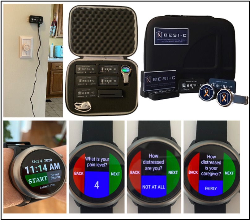
Figure 1. BESI-C system components: Top, environmental sensor and “BESI Box”; bottom, BESI-C custom wearable application and examples of ecological momentary assessments (EMAs).
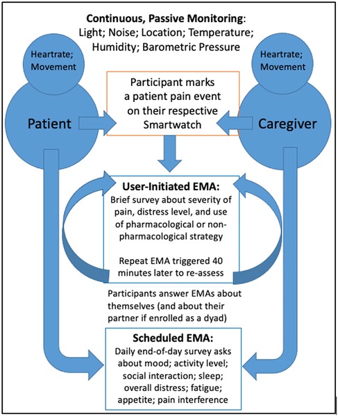
Figure 2. The BESI-C assessment model. Reprinted with permission and in accordance with the terms of the Creative Commons Attribution License (https://creativecommons.org/licenses/by/4.0/), which permits unrestricted use, distribution, and reproduction in any medium, provided the original work, first published in JMIR Research Protocols (67), is properly cited: JMIR Res Protoc. 2019 Dec 9;8(12):e16178. doi: 10.2196/16178.
Materials and methods
Overview
Findings presented in this paper represent one aim of our study that deploys BESI-C to characterize a “digital phenotype” of advanced cancer pain in the home context (74). This paper describes our multi-method approach to collect both qualitative and quantitative feedback from clinicians regarding data visualizations generated by the BESI-C remote health monitoring system (RHMS). Approval was obtained from the University of Virginia Health Sciences Institutional Review Board and all participants provided informed consent prior to data collection. Participants were offered a $25 gift card for each feedback session they attended to compensate them for their time.
Data curation and collection procedures
Participant sample
Eligible participants included clinicians (any discipline) over the age of 18 involved in the care of patients with cancer who may experience pain. Participants were recruited from three diverse study sites in Central Virginia (academic medical center; community hospital; hospice) that served as patient-caregiver referral sites for the BESI-C study. Invitations to participate in a focus group, along with approved informed consent documents, were emailed by the PI to the study contact coordinator at each site, who then shared the information with their respective staff. If multiple data visualization feedback sessions were offered at a study site, clinicians were invited and encouraged to attend as many as they could.
Preparing the data visualizations
Data visualizations were created from data provided by patient and caregiver dyads who used the BESI-C system in their home for approximately 14 days. All patients had a diagnosis of locally advanced or metastatic cancer (any type of cancer); difficult cancer-related pain [documented as ≥6/10 on the pain Numeric Rating Scale (75) or as per the referring clinician]; prescribed as-needed (PRN) opioids for cancer-related pain; and could identify a primary family caregiver (“family” defined broadly as an informal care partner) who lived with them and was also willing to participate. In consultation with study site leaders, and through discussions with our interdisciplinary research team, we identified preliminary questions of interest we could answer with the BESI-C data and which data were likely to be most useful to clinicians (e.g., “how many pain events were reported over the 2-week period?”), and ideas about ways to present the data (e.g., bar chart, line graphs). Selected data features (all de-identified) were then curated from completed BESI-C deployments to generate both static and interactive data visualizations using R, Python, and Canva software. For example, with Python we used data features such as timestamps and pain severity ratings from pain reports to create circular plots to visualize time-based events, as shown in Figure 3. If users desired more details about a specific pain report, they could interact with the circular plot by hovering over an individual event to see pop-up information, such as whether an opioid was taken, or the distress level associated with that particular pain event. In later feedback sessions, in response to feedback that clinicians would like simpler visualizations, graphic design software (Canva) was used to create more infographic-style layouts. To optimize data visualization creation, we utilized our internal data quality reports to select BESI-C deployments with the highest quality data (e.g., minimal missingness). As our goal was to gather feedback on RHMS data visualizations with clinicians—vs. representing a specific dyad experience with complete fidelity—some data were imputed, amalgamated, or adjusted slightly to ensure visualization clarity and completeness. Preliminary visualizations were discussed, iterated, and refined within our research group during weekly team meetings over approximately 5 months to create a final set of initial visualizations to share with clinicians that represented unique aspects of the patient and caregiver experience. The final set of visualizations included a combination of bar charts, line graphs, circular plots, donut charts, bubble plots, and Sankey diagrams (see Supplementary Data 1).
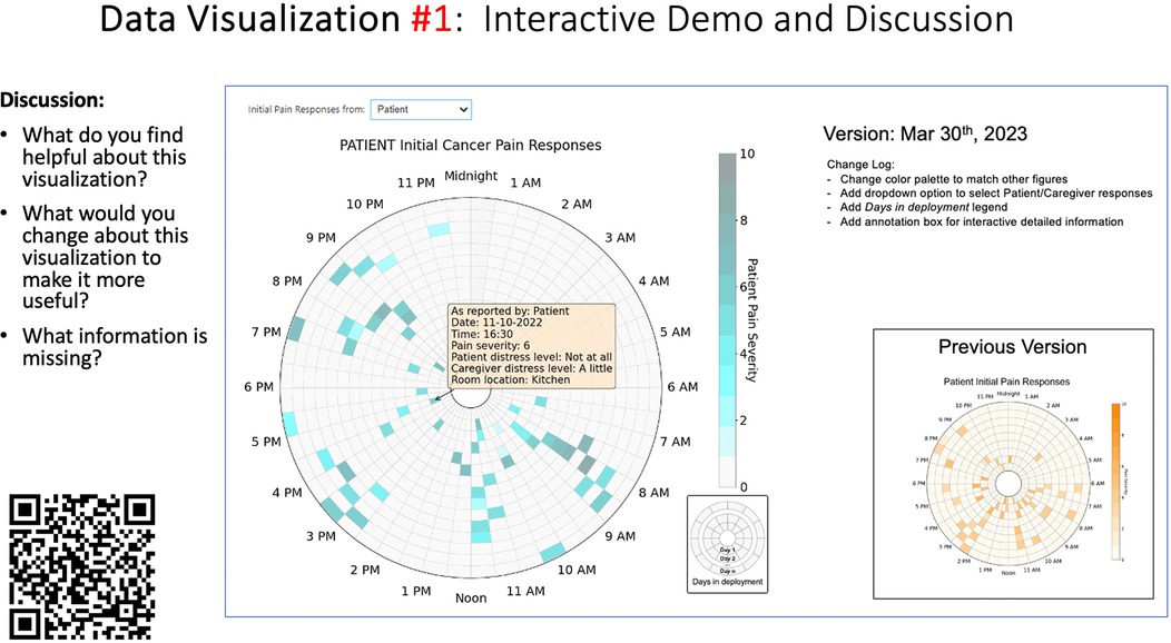
Figure 3. Example of data visualization slide shown at feedback session 2.
Creating the feedback survey
To help gather participant demographic information and quantitative data visualization feedback during each focus group, an electronic survey (Qualtrics v.2023; Provo, Utah) was designed. The survey was designed with collaborative input from the University of Virginia Center for Survey Research and internally pilot tested and iteratively revised within our interdisciplinary research team (e.g., nurses, data scientists, biostatisticians, engineers) to ensure flow and ease of completion on a mobile device/smartphone. Given the challenges of demanding clinician schedules, it was especially important that participants could complete survey items quickly on their smartphones during our synchronous feedback sessions. Survey items were informed by the data visualization literature (54, 76, 77) and included demographic items; items assessing general preferences related to viewing symptom data; items specific to each visualization that assessed clarity, perceived usefulness, and comprehension; and a free-text write-in option for any additional comments. The survey used during each data visualization session is included as a Data Supplement (see Supplementary Data 2).
Conducting the feedback sessions
Based on preferences and availability of participant groups, we used two different approaches to collect feedback—either in-person or virtually over Zoom. For in-person sessions, our research team traveled to the participant study site to conduct the feedback session. All participants were asked to bring their mobile phone with them to the feedback session to facilitate participation in the electronic survey (this was not an issue for any participant; all participants had access to a smartphone). During the feedback session, participants were provided with a QR code to complete the anonymous electronic Qualtrics survey on their smartphone. Participants were shown a sequence of 5–6 different data visualizations over the 1-hour session (allotting approximately 10–12 min of discussion per visualization) related to patient and caregiver self-reported pain events and quality of life indicators. Data visualizations were presented as a screen-share slide show during virtual feedback sessions, or as individual participant paper packets (printed in color) for in-person sessions. Before reviewing any data visualizations, a brief overview of BESI-C was provided to ensure all participants had the same baseline understanding of the system and to help participants better contextualize the data sources used to create the visualizations.
Each visualization was first presented without discussion and participants independently answered survey items that assessed: (1) clarity; (2) usefulness, and (3) comprehension related to that visualization (Table 1). Then, participants were invited to engage in a structured group “think aloud” discussion that focused on three discussion prompts: (1) what did you like or find most helpful about this visualization?; (2) what would you change about this visualization?; and (3) what information is missing? At least one research assistant (distinct from the session group facilitator) attended all feedback sessions and took notes during the open discussion portion of the feedback sessions to capture the “think aloud” comments. For multiple sessions held within the same institution, we showed the previous version of the data visualization and how it was iterated/changed based on the group's prior feedback (Figure 3). Survey results and “think aloud” comments were analyzed between each session and data visualizations iterated based on participant feedback. Some iterations were significant (e.g., deciding that a visualization “missed the mark” and needed to be represented in a very different way or omitted altogether), other changes were more minor, such as changing the color palette or clarifying wording on a graph. After session 2, we created a style guide to standardize font and color palette across all visualizations.
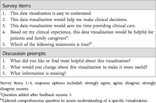
Table 1. Survey items and discussion prompts used to assess each data visualization in a feedback session.
Data analysis
Quantitative survey items were descriptively analyzed (IBM SPSS Statistics v.29; R v.4.4.0; R Studio v. 2024.04.1+748) and summary statistics generated (e.g., frequencies, counts) along with box plots and bar charts to display results. Write-in free text survey responses were few; they were exported from Qualtrics and summarized in a Word document by data visualization session and considered along with discussion data from the feedback sessions. Qualitative comments generated during the discussion portion of each session were summarized by data visualization for each session (e.g., all comments related to data visualization #1 during feedback session 1 were combined) to look for overarching themes and patterns across, and within, feedback sessions. We followed principles of qualitative descriptive analysis (78) in reviewing our free text and “think aloud” discussion comments, as our goal was not to reach a high level of abstraction with our data, but to stay well-grounded in the specific and concrete questions asked of participants related to each data visualization.
Results
Between January 2023 and December 2023 we conducted a total of five (n = 5) separate data visualizations feedback sessions at our three different study (i.e., patient-caregiver dyad referral) sites. Between 6 and 12 interdisciplinary palliative care clinicians attended each feedback session and submitted an electronic survey; with a total of 47 (n = 47) participants across all 5 sessions. Sessions 1, 2, and 3 were all held virtually (over Zoom) with clinicians at the academic medical center referral site; session 4 was held in-person at the community hospital referral site; and session 5 was held in-person at our hospice referral site. For the virtual sessions at the academic medical center, 50% of participants (n = 16) reported viewing the visualizations by themselves on their individual desktop/laptop, while 50% of participants (n = 16) viewed the visualizations with others on a shared screen. Table 2 presents demographic sample data for each session. Across all data visualization feedback sessions, we presented a total of 28 data visualizations (22 unique visualizations that were iterated between sessions and 6 visualizations that remained essentially unchanged between sessions).
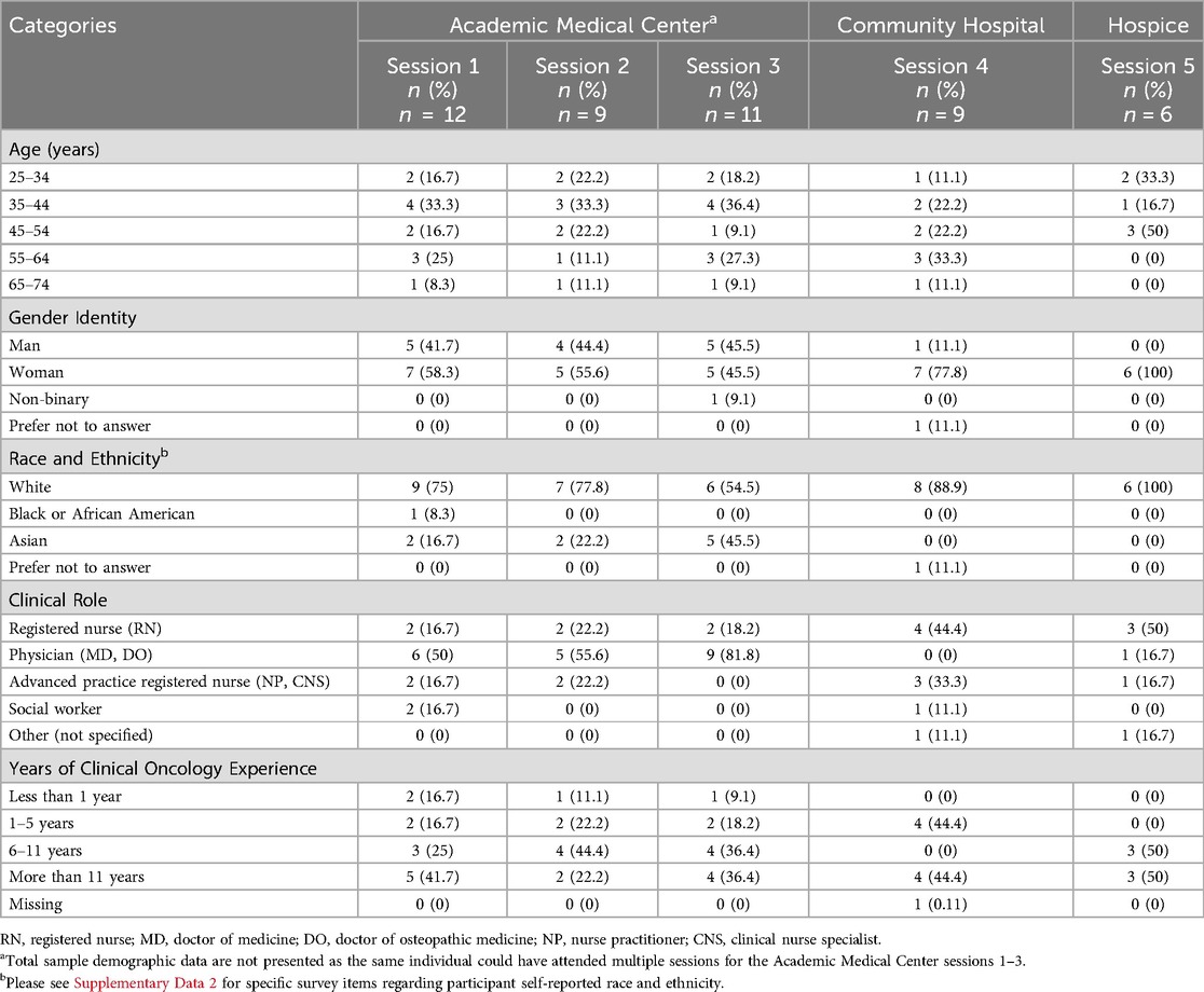
Table 2. Participant group self-reported demographic characteristics, per feedback session, per site.
Quantitative results
Surveys results related to: (1) perceived clarity, usefulness, and comprehension of each visualization; (2) general data viewing preferences; and (3) priorities related to types of data included in potential data visualizations are presented below.
Perceived clarity, usefulness, and comprehension of shared data visualizations
Tables 3–7 (columns A and C) show the specific data visualizations shared at each feedback session and the proportion of participants who agreed or disagreed with statements related to clarity and usefulness. Overall, reception to the data visualizations improved from session 1 to session 5, with more participants agreeing that the visualizations were clear and useful. Bar chart and line graphs were generally more favorably received compared to less familiar data visualizations, such as the Sankey diagram (Table 3, data visualization #3; Table 4, data visualization #6) and bubble plot (Table 3, data visualization #4; Table 4, data visualization #5)—but interestingly, did not always fare as well with the corresponding comprehension question (Tables 3 and 4, column B). For example, in session 2, data visualization #2 (Table 4)—the stacked bar graph—89% and 78% agreed that the visualization was “easy to understand” and “would help make clinical decisions”, respectively,—but only 67% of participants answered the comprehension question about this visualization correctly. Relatedly, in session 4 (Table 6), data visualization #6—the circular pain wheel plot—50% of participants disagreed that it was clear or useful, but 100% of participants answered the comprehension question correctly. Data visualizations that received 75%, or less, accuracy with their corresponding comprehension question included: session 1, data visualization #5; session 2, data visualizations #1, #2, and #4; session 3, data visualization #5; session 4, data visualization #3; and session 5, data visualization #4 (Tables 3–7, column B).
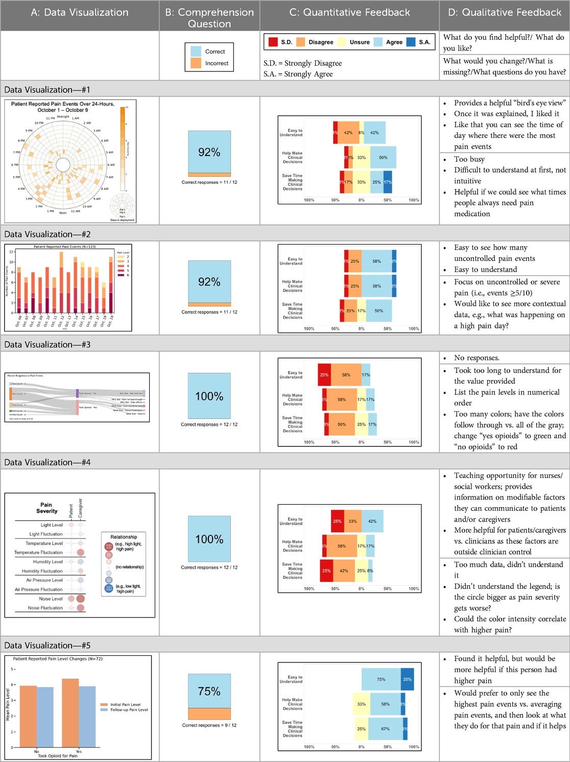
Table 3. Feedback session 1—Academic Medical Center.
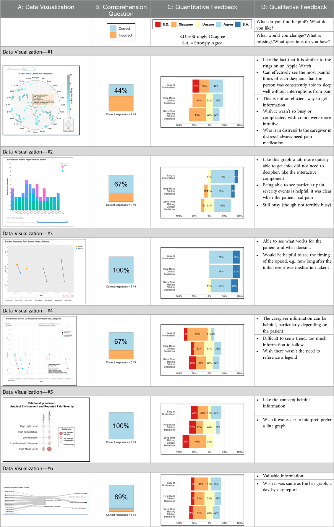
Table 4. Feedback session 2—Academic Medical Center.
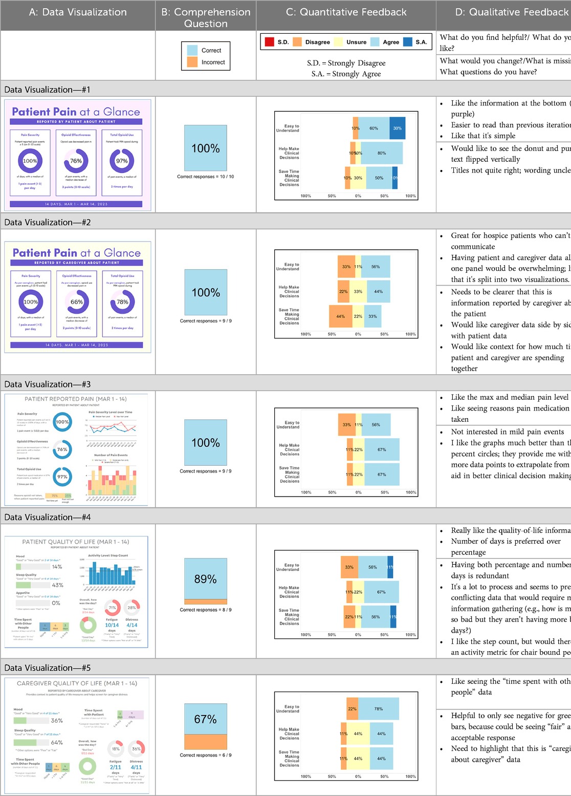
Table 5. Feedback session 3—Academic Medical Center.
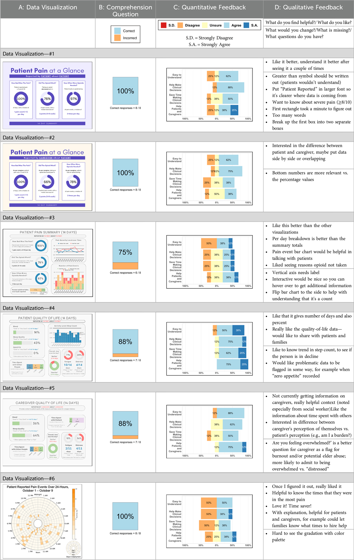
Table 6. Feedback session 4—Community Hospital.
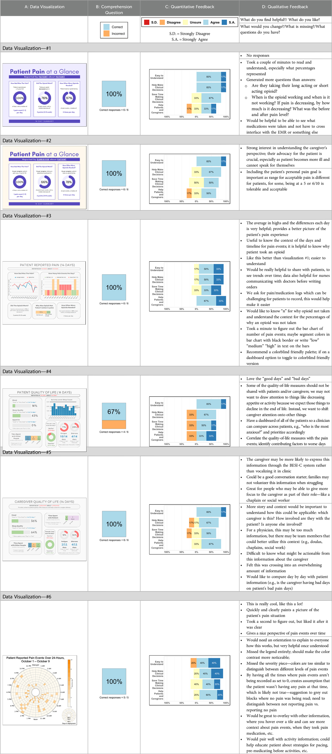
Table 7. Feedback session 5—Hospice.
Data visualization viewing preferences
Regarding overall data viewing and sharing preferences, (survey items answered by n = 24 participants in sessions 3, 4, and 5; these items were not asked in sessions 1 and 2, see Supplementary Data 2), the majority (62%; n = 15) said they would like to have both options—an interactive dashboard and a static document (such as a PDF attached to the patient record)—to view patient and caregiver reported symptom data; 38% (n = 9) said they would prefer only an interactive dashboard where they can change parameters and customize the data they see; no (0%) of participants expressed a preference for viewing data visualizations only as a static document. When asked, “how important is it to you that patient/caregiver reported symptom data are integrated within the electronic health record?,” 92% (n = 22) of participants reported it was “important” (n = 10; 42%) or “extremely important” (n = 12; 50%); 1 participant (n = 1; 4%) reported it was “a little important” and 1 participant (n = 1; 4%) reported it was “not at all important.”
Data visualization content priorities
When asked to rank which quality of life data (out of 7 options: activity; sleep; mood; overall distress; fatigue; appetite; social engagement) are most helpful when assessing a patient (survey items answered by n = 26 participants in sessions 3, 4, and 5; these items were not asked in sessions 1 and 2, see Supplementary Data 2), 62% (n = 16) of participants ranked “sleep”; 58% (n = 15) ranked “activity” and 46% (n = 12) ranked “mood” in the top three spots. Figure 4 shows these results as a box plot, with “activity” receiving the highest average helpfulness ranking. When asked to rank which pain-related information is most helpful when assessing a patient, 85% (n = 22) of participants ranked “severity of pain events”; 62% (n = 16) ranked “frequency of pain events” and 58% (n = 15) ranked “number of times they took a PRN opioid” in the top three spots. Figure 5 shows these results as a box plot, with “severity of pain events” receiving the highest average helpfulness ranking.
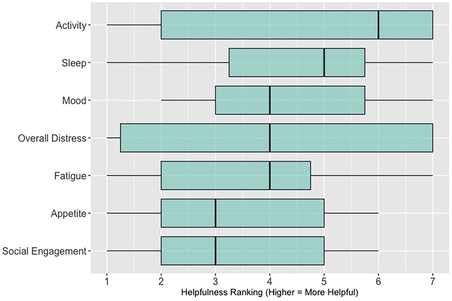
Figure 4. Clinician rankings related to perceived helpfulness of patient quality-of-life data.
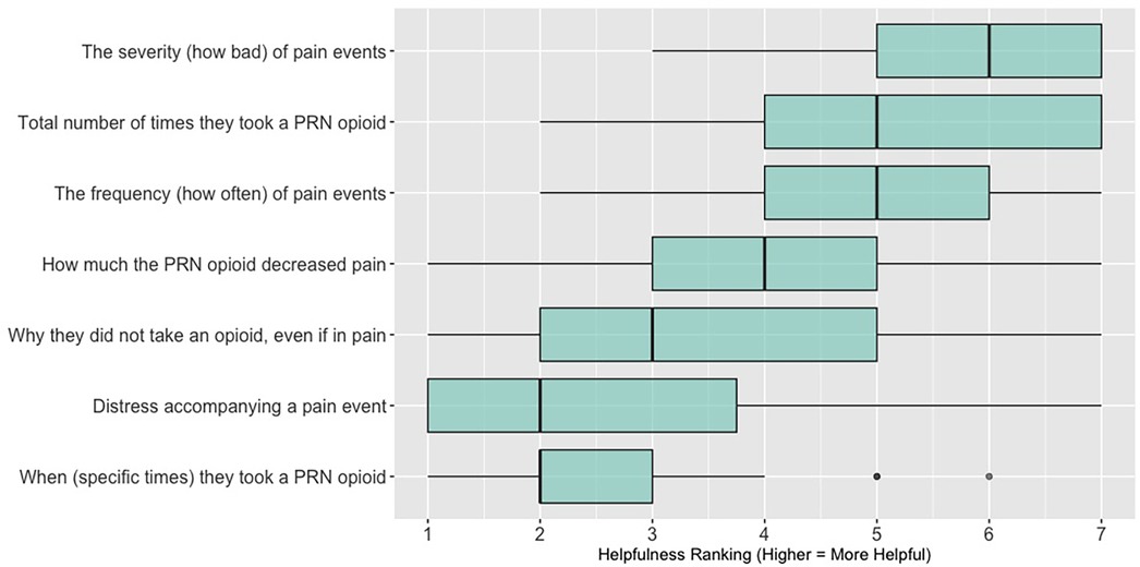
Figure 5. Clinician rankings related to perceived helpfulness of patient pain assessment data. PRN, as needed.
Qualitative results
Qualitative feedback from the discussion portions of each feedback session (along with the write-in free text survey responses) are summarized for each feedback session, per visualization, in Tables 3–7, column D. While each feedback session provided granular comments specific to particular visualizations, there were also overarching themes that emerged across all discussions and applied to multiple visualizations; these themes are summarized below.
Key themes related to discussions of data visualizations
Desire for simplicity
There was a strong preference for simplicity and ability to quickly grasp the core take-home message for each data visualization. As one participant in session 4 succinctly stated, “less words, and more pictures!” Participants often volunteered their self-perceived low data literacy related to being able to interpret data visualizations. However, appreciation for the value of less familiar visualizations, such as the circular plot pain wheel, usually improved after a brief explanation (e.g., “after it was explained, I really like it!”).
Differences by care delivery model and discipline
We observed differences in data visualization preferences across sites, likely reflective of their unique care delivery processes, mission, type of patient served, and mix of clinician disciplines. For example, clinicians at the community hospital and hospice (sessions 4 and 5) were, overall, more enthusiastic about the circular plot pain wheel, while this visualization, overall, was not well received in all 3 sessions with academic medical center clinicians. Interestingly, the hospice team was the only group of participants to raise questions about the ethical aspects of data sharing. For example, hospice clinicians raised legitimate and important concerns about what data should be shared with whom, and when. If, for example, a caregiver has rated their quality of life very low and their overall distress levels very high, should this be shared with the patient? Or vice versa? Should some data only be shared with clinicians—and if so, is that overly paternalistic given recent trends toward more open-access personal health data? Hospice staff verbalized the importance of not just “pushing out data” to patients/caregivers but being with patients/caregivers when they view the data so it can be explained and contextualized by the clinician. Likewise, while the hospice team, overall, liked the “good day, bad day” data (Table 5, column A, data visualizations #4 and #5), they had concerns about how sharing these data may influence care or the illness trajectory in unintended ways. Specifically, they expressed that some quality-of-life data may not be appropriate or helpful to share with the caregiver as hospice care is designed to shift attention away from a focus on these metrics and more to the comfort of the patient. As one hospice clinician participant explained, “I’m not sure we’d want to collect this information or have patients and caregivers focus on it, as we try to reduce the fixation on things like appetite as we know they will decline during the course of the illness.” Additionally, the hospice team discussed the importance of benchmarking responses against the patient's goals and wanted this information included within the data visualization to help contextualize the information. For example, if a patient experienced baseline high levels of severe chronic pain, then a 5/10 pain score may be considered “great” for them, and they may not take medication. In contrast, a patient with pain severity typically at a 2/10 would likely be struggling with a pain severity level of 5/10.
Overall, non-physician participants (nurses, social workers) expressed greater interest in visualizations that included environmental variables impacting pain and non-pharmacological interventions, along with more interest in caregiver data. Some clinicians viewed the visualizations not just through the lens of their own disciplinary perspective, but also considered how the visualizations would be received by patients/caregivers and how they could be helpful. For example, in session 4 a participant recognized that the circular plot (data visualization #6) could be very helpful for family members planning resources and knowing when the patient may need the most assistance.
Mixed interest in viewing caregiver data
There was mixed interest in viewing caregiver data. Overall, participants expressed a greater receptivity to seeing caregiver reported data about the patient (e.g., caregiver reporting about their perception of patient's pain) vs. caregiver reported data about themselves (e.g., caregiver reporting about their own quality of life, such as how much they, as caregivers, are sleeping). During the hospice feedback session, one participant upon viewing the caregiver's self-reported quality of life data stated, “I’m unclear what here would be actionable.” One participant from session 1, emphasized the importance of including caregiver-reported data about patients, stating, “it is going to be very useful in certain circumstances, particularly when the patient is confused or unreliable for other reasons.” During session 3, some participants expressed the caregiver self-reported quality-of-life visualizations were helpful, noting that caregivers may feel guilty or be reluctant to divulge how much they are actually struggling or how bad things have really been in front of the patient.
Discussion
Our results contribute to the broader literature regarding sharing patient reported outcome (PRO) data with clinicians. Specifically, we provide interdisciplinary perspectives across diverse clinical sites to visualizations generated from complex, remote health sensing data related to advanced cancer pain. Importantly, our findings can help inform future electronic health record (EHR) integration efforts, particularly in optimizing data visualizations to support clinical decision making. We also offer an approach to effectively collect both quantitative and qualitative data from busy clinicians, and document how clinicians respond to seeing holistic data about the pain experience from both the perspective of the patient and their family caregiver. In general, survey results and group discussion feedback were congruent (e.g., a visualization that scored low on the survey was also not reviewed favorably during the discussion) and strongly favored simpler data visualizations that summarize clinical information perceived to be most relevant, such as number of severe pain events and response to medications. Clinicians wanted to understand the “take home message” of a data visualization quickly without having to spend a lot of time deciphering the visualization; our most “successful” visualizations were ones where participants felt like they could most quickly grasp the information. Additionally, we found that offering options is important, which we attempted to do by presenting visualizations that could be viewed as stand-alone static figures as well as those that allow users to probe for more information using interactive features (e.g., hovering over a data point to learn more about it). Just as the BESI-C system is designed to deliver tailored pain management interventions, we found that data output from BESI-C must be tailored, too; for example, some individuals desire visualizations with high levels of granularity, others may not. An important lesson learned is the importance of tailoring visualizations based on the goals or roles of the intended clinical audience and presenting them accordingly during feedback sessions. Other recommendations based on our experiences generating and sharing data visualizations from BESI-C data with clinicians are summarized in Table 6.
Our findings reinforce much of what has been previously reported in the literature regarding clinician preference for simple, familiar visualizations (e.g., bar and line graphs), as summarized in Hancock et al's excellent scoping review (79). Similar to previous studies, we also found that less familiar visualizations were generally not as well received (79)—although after a brief explanation, some participants found these extremely helpful. Data presented in familiar ways was more likely to be better received and understood by clinicians. For example, overall, participants preferred more familiar bar charts and line graphs to the less-familiar circular plot (“pain wheel”, session 1, visualization #1) or the bubble plot (used to visualize environmental factors related to pain management, session 1, visualization #4) where we learned not everyone is comfortable interpreting correlational data. Interestingly, however, we found that an expressed preference for bar and line graphs didn't necessarily correlate with their increased comprehension, as measured by our objective comprehensive question for each visualization. This may be due to other factors that made interpreting the bar/line graphs we presented confusing (such as poorly worded axes) or a default/unconscious preference for more familiar types of data visualizations, even if they are actually unclear. In other words, what clinicians say they prefer may not always be what is best understood, or vice versa, and this is important to keep in mind when creating visualizations and seeking feedback. We also found that using a traffic-light color palette was helpful to orient clinicians quickly to thresholds related to symptom severity (80, 81). However, in contrast to previous studies (82, 83), our participant sample was less interested in seeing written summaries or explanations to help contextualize the visualizations; in fact, we generally found confusion regarding legends accompanying visualizations and a strong desire to be able to grasp the take-home message without needing to digest or read additional information.
Participants also drew connections and comparisons between visualizations they had seen before or in similar ways. For example, the “pain wheel” was especially well received by a participant who used an Apple Watch and had seen data represented in a similar way previously. Participants had varying degrees of comfort viewing and interpreting data visualizations and different levels of data literacy. Some participants were interested in “digging deeper” and wanted to understand the analysis behind the visualizations (e.g., how was the average calculated?). Others asked very astute questions that prompted us to rethink how data were presented, such as in session 5, visualization #6, where one participant pointed out that having all the times where pain events aren't recorded as set to zero (on the 0/10 pain severity Numeric Rating Scale) creates the assumption that the patient isn't having any pain at that time; their suggestion to grey-out time blocks where no pain event was being recorded was a helpful suggestion to distinguish between not reporting pain vs. reporting no pain. At times, participants asked questions that we had the data to answer but that we hadn't included for brevity or simplicity and these questions were helpful in validating our instincts of what features to include in future visualizations. Some participant suggestions were excellent, but not possible given time and scope of the current project (e.g., full integration with the electronic health record system); keeping a list of these suggestions for future work is recommended.
In general, clinicians were more interested in outcomes related to the physical domain of pain (e.g., severity levels; medication use; impact of pharmacological interventions) than psychosocial factors related to quality of life, environmental variables impacting pain, or non-pharmacological interventions. The limited interest/preference in viewing psychosocial data underscores the reality that despite efforts to challenge the biomedical model of pain care in the U.S., practice commonly lags behind theoretical advancements (84, 85). Few care delivery models, even in highly resourced contexts, are adequately equipped to holistically support the emotional, psychological, and social challenges we have long known are associated with difficult physical pain (86–88). Given these constraints, it is understandable, albeit unfortunate, that clinicians may focus on physical aspects of pain management that can be perceived as more straightforward to measure and treat. For example, we were struck by the importance of pain severity as the preferred metric for assessing pain that was evident in both the quantitative and qualitative findings. Across all groups, clinicians were most interested in pain events that were “severe” (although the perceived cut-off value for “severe” varied, for some it was ≥5/10, for others ≥7/10) and some participants suggested omitting any information about pain events that did not rise to this level. While pain severity is clearly a primary assessment parameter, research has shown that frequency of pain events (even of lower-intensity pain events) can be equally, if not more, important in assessing and understanding the pain experience (89). A limited focus on high severity pain events could be particularly problematic for stoic patients, or for those who may struggle to use the traditional 0–10 Numeric Rating Scale. One solution if using interactive visualizations could be to include all reported pain events, regardless of severity score, but offer a filter to allow clinicians to select the pain severity threshold they feel is most relevant for a particular patient.
Not surprisingly, we found that preferences for, and interpretations of, data visualizations were influenced by the model of care delivery (e.g., hospice vs. academic medical center vs. community hospital) and the expected involvement of family caregivers (e.g., hospice relies heavily on family caregivers to participate in and oversee a patient's care, whereas in the academic medical center and community hospital care is primarily overseen by clinical staff). There were qualitative differences in how data visualizations were viewed between sites and disciplines, and we recommend tailoring visualizations to specific care sites and disciplines, recognizing that certain data and visualizations may be highly appropriate and helpful in one context, but not so much in another. A good example of this relates to the astute feedback we received from hospice clinicians about concerns related to data sharing that may not be aligned with the organizational ethos or that may create unintended distress. For example, data related to declining appetite, an expected outcome at the end-of-life that would likely not warrant intervention in hospice, could be an important metric for intervention for a patient on a clinical trial at an academic medical center. Overall, we found that community hospital and hospice clinicians had a higher tolerance for detailed visualizations and responded more favorably to complex representations of pain data. The hospice team was especially interested in correlational data (e.g., “how is activity affecting pain?”) and seeing more granular data details related to pain. Whether these differences are related to in-person vs. virtual feedback sessions (both the hospice and community hospital session were held in person, whereas the academic medical center sessions were all over Zoom) or is more a function of different care philosophies or care delivery models, is difficult to fully assess.
Some visualizations were just simply not well-received. For example, the Sankey diagram, shared first in session 1 and then iterated and shared again in session 2, received few positive comments and did not score well in the survey. After session 2, we abandoned it in favor of developing new visualizations. This decision was difficult for some members of our research team who felt the Sankey diagram was an important way to view reasons patients may not have taken pain medication. From this, we learned some data visualizations may have significant merit in a research context or as an educational tool for clinicians but may not translate well to the bedside. While it may seem obvious in retrospect, an important lesson for our team in presenting complex data is that no one data visualization can be all things to all people. For example, the circular “pain wheel” plot visualization continued to receive very mixed, and mostly negative, reviews with our academic medical center participants regardless of how we iterated and revised it—but it was extremely well received by the community hospital and hospice participants.
We found that first impressions were paramount. For some participants it was clear that once they had made up their mind that a particular visualization was not helpful, no amount of iteration or improvement was likely to alter their perception. Bearing in mind that first impressions matter when sharing data visualizations, there are some easy steps that can be taken to achieve a more polished look from the start; for example, such as using a consistent color palette and font across visualizations; ensuring axes are clearly labeled; and providing enough context about the key message and source of data with clear and succinct titles (e.g., “Patient-Reported Pain Events—Past 14 days'” or with a question, “How many severe pain events did patient experience over the past 14-days?”). These are some strategies we found useful to prevent formatting details from becoming distractors and precluding more constructive feedback.
We were surprised by the tepid reception to caregiver reported data, as we anticipated there would be greater clinician interest in this unique aspect of BESI-C data. Participants acknowledged that caregiver data are important, but expressed an uncertainty about what to do with it or how to use it. While most participants agreed there was value in seeing data about the patient as reported by the caregiver, there was markedly less interest in seeing caregiver self-reported data about their own (caregiver) quality of life. This speaks to broader concerns, well documented in the literature, and beyond the scope of this paper, about the many unmet needs of family caregivers and care partners (90–93). Lack of interest in caregiver self-reported quality of life data may also reflect the reality that clinicians are not used to receiving such information and feel unprepared as to how they would begin to address these needs. This reaction may be akin to the reluctance of clinicians to ask about sexual health or intimacy concerns when they feel they cannot offer feasible solutions (94, 95) (i.e., “isn’t it worse to open up a can of worms if I can’t do anything to help?”). This finding reinforces significant gaps in our healthcare system and the critical need to improve support to caregivers through innovative models of care delivery, such as offering point-of-care support to caregivers in parallel with patient appointments. For example, a palliative care clinician could serve as the provider of record for both the patient and caregiver and address focused quality of life caregiver needs during patient visits, negating the need for an already overburdened caregiver to schedule and attend additional medical appointments. Clearly, such a model would require workflow and reimbursement restructuring, but could be a feasible way to empower clinical teams to do more to support caregivers, which, in turn, benefits patients.
Lessons learned about conducting the feedback sessions
We made some practical discoveries regarding the data visualization feedback sessions that may be helpful to others engaged in similar work. Gathering data from busy clinicians is not easy due to scheduling and competing priorities, and it was important to make it as easy and convenient as possible. Tagging onto existing staff meetings when feasible was immensely helpful with scheduling, and a generous offer by clinician partners (underscoring the importance of having clinical champions at recruitment sites). With limited time for each session, we had to make tough decisions about which visualizations (e.g., new ones each time or iterations of previous visualizations? We ended up using a combination approach) and how many to present. With the in-person sessions we were able to get through more (6 visualizations); with the virtual sessions, sometimes we only had time for 5.
Overall, we found in-person feedback sessions richer, more interactive, and more helpful in iterating data visualizations and we highly recommend this format when possible. In-person sessions had a more organic and natural flow of conversation, with the added benefit of being able to better read non-verbal cues and confirm participants were all viewing the same visualization in the same way at the same time. However, one advantage of virtual sessions, in addition to scheduling convenience, was the ability to demonstrate interactive features of data visualizations more easily over a shared screen. We also strongly suggest starting a visualization feedback session with “easier” or “more familiar” visualizations; in hindsight, beginning sessions 1 and 2 with the less-familiar circular plot (pain wheel) was probably not the best strategy and may have impacted its reception; in sessions 3–5 we changed tacks and began by presenting more infographic-style visualizations as a “warm-up”; these were generally very well received, and participants commented on their simplicity and ease of understanding.
Future directions
Future work should focus on feasible approaches to integrate RHMS data visualizations into electronic medical records and creating a library/dashboard of data visualizations that can prioritize feature customization, such as allowing users to select “low, medium, or high” degrees of data granularity or presentations of data in different formats (e.g., bar graph vs. circular plot). An important related aspect of this work involves sharing data visualizations with patients and caregivers; those findings will be the basis of a subsequent paper. Additionally, exploring ethical issues related to sharing of data visualizations, and solutions to ensure privacy, is also critically important (e.g., which data visualizations should be shared with whom, when, and in what ways) and another priority area for future work.
Limitations
We iterated data visualizations between feedback sessions, and presented them in different sequences, which limits direct comparisons between sessions and likely influenced participant perceptions. We also added a few survey items in later feedback sessions to capture valuable information related to data sharing. Additionally, because surveys were anonymous, and not linked to individual participants, we were unable to aggregate demographic data for the total sample (e.g., the same participant could have attended sessions 1 and 2; thus, aggregating their demographic data would inflate our participant numbers and misrepresent our demographic results). Our sample size for each feedback session—while consistent with focus group size recommendations (96)—precludes statistical comparisons within, or between, groups. We also did not have the same number of feedback sessions at each study site due to time and logistic constraints. We would have liked to share more iterations of visualizations during each feedback session, but time constraints limited how many were feasible to discuss during the 1-hour time block. Additionally, we were unable to find a brief, validated assessment tool to quantitatively assess clinician preferences related to data visualizations and ultimately created our own that focused on clarity, usefulness, and comprehension. Lastly, our clinician sample was primarily White and non-Hispanic, and we did not capture perspectives on data visualizations that may differ based upon diverse sociodemographic factors, an important limitation.
Conclusion
Finding meaningful ways to share complex, holistic, remote health sensing data with clinicians is critical to improve cancer pain management support for both patients and family caregivers. We discuss an approach to creating and sharing data visualizations from a novel remote health monitoring system (BESI-C) with palliative care clinicians related to pain experienced at home by patients with advanced cancer. Orienting clinicians to unfamiliar data sources (such as environmental data and caregiver self-reported quality of life data) and integrating these data into clinical workflows and electronic health records is critical to ensure remote sensing data can optimally improve health outcomes and strengthen communication between clinicians, patients, and caregivers. Future work aims to create a library of data visualizations with a customizable range of viewing options to meet the needs of diverse, interdisciplinary clinical audiences; gather feedback from patients and caregivers; and explore ethical issues related to sharing data visualizations.
Data availability statement
The raw data supporting the conclusions of this article will be made available by the authors, without undue reservation, in compliance with institutional guidelines that ensure protection of participant privacy.
Ethics statement
The studies involving humans were approved by the University of Virginia Institutional Review Board for Health Sciences Research. The studies were conducted in accordance with the local legislation and institutional requirements. The participants provided their written informed consent to participate in this study.
Author contributions
VL: Conceptualization, Data curation, Formal analysis, Funding acquisition, Investigation, Methodology, Project administration, Resources, Supervision, Validation, Visualization, Writing – original draft, Writing – review & editing. NC: Data curation, Formal analysis, Visualization, Writing – review & editing. NH: Data curation, Formal analysis, Visualization, Writing – review & editing. KR: Formal analysis, Writing – review & editing, Data curation. VP: Formal analysis, Writing – review & editing, Data curation. WA: Data curation, Formal analysis, Writing – review & editing. LB: Conceptualization, Validation, Writing – review & editing, Data curation, Methodology. BL: Conceptualization, Data curation, Formal analysis, Methodology, Supervision, Validation, Writing – review & editing, Resources.
Funding
The author(s) declare that financial support was received for the research and/or publication of this article. This research was supported by the National Institute of Nursing Research of the National Institutes of Health under award number R01NR019639. The content is solely the responsibility of the authors and does not necessarily represent the official views of the National Institutes of Health.
Acknowledgments
With thanks to: Penny Amos; Leah Bianchi; John Lach; Emmanuel Ogunjirin; Sarah Ratcliffe; Amber Steen. Limited aspects of this work were presented as a poster at the American Academy of Hospice & Palliative Medicine State of the Science, March 2024.
Conflict of interest
The authors declare that the research was conducted in the absence of any commercial or financial relationships that could be construed as a potential conflict of interest.
Generative AI statement
The author(s) declare that no Generative AI was used in the creation of this manuscript.
Publisher's note
All claims expressed in this article are solely those of the authors and do not necessarily represent those of their affiliated organizations, or those of the publisher, the editors and the reviewers. Any product that may be evaluated in this article, or claim that may be made by its manufacturer, is not guaranteed or endorsed by the publisher.
Supplementary material
The Supplementary Material for this article can be found online at: https://www.frontiersin.org/articles/10.3389/fdgth.2025.1520990/full#supplementary-material
References
1. van den Beuken-van Everdingen MHJ, Hochstenbach LMJ, Joosten EAJ, Tjan-Heijnen VCG, Janssen DJA. Update on prevalence of pain in patients with cancer: systematic review and meta-analysis. J Pain Symptom Manage. (2016) 51(6):1070–90.e9. doi: 10.1016/j.jpainsymman.2015.12.340
2. Goodwin PJ, Bruera E, Stockler M. Pain in patients with cancer. J Clin Oncol. (2014) 32(16):1637–9. doi: 10.1200/jco.2014.55.3818
3. Deandrea S, Montanari M, Moja L, Apolone G. Prevalence of undertreatment in cancer pain. A review of published literature. Ann Oncol. (2008) 19(12):mdn419. doi: 10.1093/annonc/mdn419
4. Deandrea S, Corli O, Consonni D, Villani W, Greco MT, Apolone G. Prevalence of breakthrough cancer pain: a systematic review and a pooled analysis of published literature. J Pain Symptom Manage. (2014) 47(1):57–76. doi: 10.1016/j.jpainsymman.2013.02.015
5. Brant J, Potter C, Tavernier S, Beck S. Pain care quality in U.S. inpatient oncology units. Oncol Nurs Forum. (2012) 39(6):E559.
6. Klint A, Bondesson E, Rasmussen BH, Furst CJ, Schelin MEC. Dying with unrelieved pain-prescription of opioids is not enough. J Pain Symptom Manage. (2019) 58(5):784–791.e1. doi: 10.1016/j.jpainsymman.2019.07.006
7. Koesel N, Tocchi C, Burke L, Yap T, Harrison A. Symptom distress: implementation of palliative care guidelines to improve pain, fatigue, and anxiety in patients with advanced cancer. Clin J Oncol Nurs. (2019) 23(2):149–55. doi: 10.1188/19.CJON.149-155
8. Kehl KA, Kowalkowski JA. A systematic review of the prevalence of signs of impending death and symptoms in the last 2 weeks of life. Am J Hosp Palliat Med. (2013) 30(6):601–16. doi: 10.1177/1049909112468222
9. Singer AE, Meeker D, Teno JM, Lynn J, Lunney JR, Lorenz KA. Symptom trends in the last year of life from 1998 to 2010: a cohort study. Ann Intern Med. (2015) 162(3):175–83. doi: 10.7326/M13-1609
10. Snijders RAH, Brom L, Theunissen M, van den Beuken-van Everdingen MHJ. Update on prevalence of pain in patients with cancer 2022: a systematic literature review and meta-analysis. Cancers (Basel). (2023) 15(3):591. doi: 10.3390/cancers15030591
11. Kutner JS, Kassner CT, Nowels DE. Symptom burden at the end of life: hospice providers’ perceptions. J Pain Symptom Manage. (2001) 21(6):473–80. doi: 10.1016/s0885-3924(01)00281-0
12. Teunissen SCCM, Wesker W, Kruitwagen C, de Haes HCJM, Voest EE, de Graeff A. Symptom prevalence in patients with incurable cancer: a systematic review. J Pain Symptom Manage. (2007) 34(1):94–104. doi: 10.1016/j.jpainsymman.2006.10.015
13. Phongtankuel V, Teresi JA, Eimicke JP, Kong JX, Adelman RD, Prigerson HG, et al. Identifying the prevalence and correlates of caregiver-reported symptoms in home hospice patients at the end of life. J Palliat Med. (2020) 23(5):635–40. doi: 10.1089/jpm.2019.0324
14. de la Cruz M, Noguera A, San Miguel-Arregui MT, Williams J, Chisholm G, Bruera E. Delirium, agitation, and symptom distress within the final seven days of life among cancer patients receiving hospice care. Palliat Support Care. (2015) 13(2):211–6. doi: 10.1017/S1478951513001144
15. Smyth JA, Dempster M, Warwick I, Wilkinson P, McCorry NK. A systematic review of the patient and carer related factors affecting the experience of pain for advanced cancer patients cared for at home. J Pain Symptom Manage. (2018) 55(2):496–507. doi: 10.1016/j.jpainsymman.2017.08.012
16. Ferrell B, Wittenberg E. A review of family caregiving intervention trials in oncology. CA Cancer J Clin. (2017) 67(4):318–25. doi: 10.3322/caac.21396
17. McGuire DB, Grant M, Park J. Palliative care and end of life: the caregiver. Nurs Outlook. (2012) 60(6):351–6.e20. doi: 10.1016/j.outlook.2012.08.003
18. Gordon DB, Dahl JL, Miaskowski C, McCarberg B, Todd KH, Paice JA, et al. American pain society recommendations for improving the quality of acute and cancer pain management: american pain society quality of care task force. Arch Intern Med. (2005) 165(14):1574–80. doi: 10.1001/archinte.165.14.1574
19. Kwon JH. Overcoming barriers in cancer pain management. J Clin Oncol. (2014) 32(16):1727–33. doi: 10.1200/jco.2013.52.4827
20. Stenberg U, Ruland CM, Miaskowski C. Review of the literature on the effects of caring for a patient with cancer. Psycho-Oncol. (2010) 19(10):1013–25. doi: 10.1002/pon.1670
21. Mercadante S. Once again… Breakthrough cancer pain: an updated overview. J Anesth Analg Crit Care. (2023) 3(1):23. doi: 10.1186/s44158-023-00101-x
22. Facts About Cancer Pain. Pain from Cancer & Cancer Treatment. Available at: https://www.cancer.org/cancer/managing-cancer/side-effects/pain/cancer-pain/pain-in-people-with-cancer.html (Accessed May 10, 2024).
23. Gonella S, Sperlinga R, Sciannameo V, Dimonte V, Campagna S. Characteristics of breakthrough pain and its impact on quality of life in terminally ill cancer patients. Integr Cancer Ther. (2019) 18:1534735419859095. doi: 10.1177/1534735419859095
24. Green E, Ward S, Brierley W, Riley B, Sattar H, Harris T. They shouldn’t be coming to the ED, should they?”: a descriptive service evaluation of why patients with palliative care needs present to the emergency department. Am J Hosp Palliat Care. (2017) 34(10):984–90. doi: 10.1177/1049909116676774
25. Wallace EM, Cooney MC, Walsh J, Conroy M, Twomey F. Why do palliative care patients present to the emergency department? Avoidable or unavoidable? Am J Hosp Palliat Care. (2013) 30(3):253–6. doi: 10.1177/1049909112447285
26. Oh TK, Jo YH, Choi JW. Associated factors and costs of avoidable visits to the emergency department among cancer patients: 1-year experience in a tertiary care hospital in South Korea. Support Care Cancer. (2018) 26(11):3671–9. doi: 10.1007/s00520-018-4195-0
27. Pavic M, Klaas V, Theile G, Kraft J, Tröster G, Blum D, et al. Mobile health technologies for continuous monitoring of cancer patients in palliative care aiming to predict health status deterioration: a feasibility study. J Palliat Med. (2020) 23(5):678–85. doi: 10.1089/jpm.2019.0342
28. Lowey SE. Management of severe pain in terminally ill patients at home: an evidence-based strategy. Home Healthc Now. (2020) 38(1):8–15. doi: 10.1097/NHH.0000000000000826
29. Mehta A, Cohen SR, Ezer H, Carnevale FA, Ducharme F. Striving to respond to palliative care patients’ pain at home: a puzzle for family caregivers. Oncol Nurs Forum. (2011) 38:E37–45. doi: 10.1188/11.ONF.E37-E45
30. Martín JM, Olano-Lizarraga M, Saracíbar-Razquin M. The experience of family caregivers caring for a terminal patient at home: a research review. Int J Nurs Stud. (2016) 64:1–12. doi: 10.1016/j.ijnurstu.2016.09.010
31. Northouse L, Katapodi M, Song L, Zhang L, Mood D. Interventions with family caregivers of cancer patients: meta-analysis of randomized trials. CA Cancer J Clin. (2010) 60:317–39. doi: 10.3322/caac.20081
32. Badr H, Shen MJ. Pain catastrophizing, pain intensity, and dyadic adjustment influence patient and partner depression in metastatic breast cancer. Clin J Pain. (2014) 30(11):923–33. doi: 10.1097/ajp.0000000000000058
33. Badr H, Carmack CL, Kashy DA, Cristofanilli M, Revenson TA. Dyadic coping in metastatic breast cancer. Health Psychol. (2010) 29(2):169–80. doi: 10.1037/a0018165
34. Badr H, Bakhshaie J, Chhabria K. Dyadic interventions for cancer survivors and caregivers: state of the science and new directions. Semin Oncol Nurs. (2019) 35(4):337–41. doi: 10.1016/j.soncn.2019.06.004
35. Shaffer KM, Jacobs JM, Nipp RD, Carr A, Jackson VA, Park ER, et al. Mental and physical health correlates among family caregivers of patients with newly-diagnosed incurable cancer: a hierarchical linear regression analysis. Support Care Cancer. (2017) 25(3):965–71. doi: 10.1007/s00520-016-3488-4
36. Kayser K, Acquati C, Reese JB, Mark K, Wittmann D, Karam E. A systematic review of dyadic studies examining relationship quality in couples facing colorectal cancer together. Psychooncology. (2018) 27(1):13–21. doi: 10.1002/pon.4339
37. Buck HG, Benitez B, Fradley MG, Donovan KA, McMillan SC, Reich RR, et al. Examining the relationship between patient fatigue-related symptom clusters and carer depressive symptoms in advanced cancer dyads: a secondary analysis of a large hospice data set. Cancer Nurs. (2020) 43(6):498–505. doi: 10.1097/NCC.0000000000000737
38. Wittenberg-Lyles E, Demiris G, Oliver DP, Burt S. Reciprocal suffering: caregiver concerns during hospice care. J Pain Symptom Manage. (2011) 41(2):383–93. doi: 10.1016/j.jpainsymman.2010.04.026
39. LeBaron V. Challenges and opportunities in designing and deploying remote health monitoring technology for older adults with cancer. Innov Aging. (2022) 6(6):igac057. doi: 10.1093/geroni/igac057
40. Dalloul AH, Miramirkhani F, Kouhalvandi L. A review of recent innovations in remote health monitoring. Micromachines (Basel). (2023) 14(12):2157. doi: 10.3390/mi14122157
41. CDC. Telehealth in Rural Communities (2022). Available at: https://www.cdc.gov/chronicdisease/resources/publications/factsheets/telehealth-in-rural-communities.htm (Accessed April 29, 2024).
42. Marcolino MS, Oliveira JAQ, D’Agostino M, Ribeiro AL, Alkmim MBM, Novillo-Ortiz D. The impact of mHealth interventions: systematic review of systematic reviews. JMIR MHealth UHealth. (2018) 6(1):e23. doi: 10.2196/mhealth.8873
43. Darlow S, Wen KY. Development testing of mobile health interventions for cancer patient self-management: a review. Health Inform J. (2015) 22(3):633–50. doi: 10.1177/1460458215577994
44. Fringer A, Arrer E, Maier E, Schnepp W, Ulmer T. Development of an early warning system to prevent crises in the palliative home care setting of patients and their informal caregivers: protocol for a mixed method study. JMIR Res Protoc. (2019) 8(11):e13933. doi: 10.2196/13933
45. Theile G, Klaas V, Tröster G, Guckenberger M. Mhealth technologies for palliative care patients at the interface of in-patient to outpatient care: protocol of feasibility study aiming to early predict deterioration of patient’s health status. JMIR Res Protoc. (2017) 6(8):e142. doi: 10.2196/resprot.7676
46. Beresford L. High tech health: new technological approaches are transforming the delivery of high-touch palliative care. Am Acad Hosp Palliat Med. (2019) (Quarterly Fall):14–7. Available at: https://aahpm.org/publications/aahpm-quarterly/issue-archive/fall-2019/fall-19-feature/
47. Nwosu AC, Quinn C, Samuels J, Mason S, Payne TR. Wearable smartwatch technology to monitor symptoms in advanced illness. BMJ Support Palliat Care. (2018) 8(2):237. doi: 10.1136/bmjspcare-2017-001445
48. Shaffer KM, Turner KL, Siwik C, Gonzalez BD, Upasani R, Glazer JV, et al. Digital health and telehealth in cancer care: a scoping review of reviews. Lancet Digit Health. (2023) 5(5):e316–27. doi: 10.1016/S2589-7500(23)00049-3
49. Marzorati C, Renzi C, Russell-Edu SW, Pravettoni G. Telemedicine use among caregivers of cancer patients: systematic review. J Med Internet Res. (2018) 20(6):e9812. doi: 10.2196/jmir.9812
50. Sirintrapun SJ, Lopez AM. Telemedicine in cancer care. Am Soc Clin Oncol Educ Book. (2018) 38:540–5. doi: 10.1200/EDBK_200141
51. McGregor BA, Vidal GA, Shah SA, Mitchell JD, Hendifar AE. Remote oncology care: review of current technology and future directions. Cureus. (2020) 12(8):e10156. doi: 10.7759/cureus.10156
52. Feller DJ, Burgermaster M, Levine ME, Smaldone A, Davidson PG, Albers DJ, et al. A visual analytics approach for pattern-recognition in patient-generated data. J Am Med Inform Assoc JAMIA. (2018) 25(10):1366–74. doi: 10.1093/jamia/ocy054
53. Caban JJ, Gotz D. Visual analytics in healthcare–opportunities and research challenges. J Am Med Inform Assoc JAMIA. (2015) 22(2):260–2. doi: 10.1093/jamia/ocv006
54. Lor M, Koleck TA, Bakken S. Information visualizations of symptom information for patients and providers: a systematic review. J Am Med Inform Assoc JAMIA. (2019) 26(2):162–71. doi: 10.1093/jamia/ocy152
55. Turchioe MR, Myers A, Isaac S, Baik D, Grossman LV, Ancker JS, et al. A systematic review of patient-facing visualizations of personal health data. Appl Clin Inform. (2019) 10(4):751–70. doi: 10.1055/s-0039-1697592
56. 2019 Workshop on Visual Analytics in Healthcare. VAHC 2019 (10th workshop on Visual Analytics in Healthcare) in conjunction with IEEE VIS 2019, October 20, Vancouver, BC, Canada (2019). Available at: https://visualanalyticshealthcare.github.io/archive/2019/ (Accessed October 10, 2024).
57. Li Q. Overview of data visualization. Embodying Data. (2020):17–47. doi: 10.1007/978-981-15-5069-0_2
58. Sun VCY, Borneman T, Ferrell B, Piper B, Koczywas M, Choi K. Overcoming barriers to cancer pain management: an institutional change model. J Pain Symptom Manage. (2007) 34(4):359–69. doi: 10.1016/j.jpainsymman.2006.12.011
59. Penlington C, Pornsukjantra P, Chazot P, Cole F, Denneny D. Confidence of practitioners to support self-management of pain: a multidisciplinary survey. Br J Pain. (2024) 18(2):148–54. doi: 10.1177/20494637231212748
60. Nundy S, Lu CYE, Hogan P, Mishra A, Peek ME. Using patient-generated health data from mobile technologies for diabetes self-management support: provider perspectives from an academic medical center. J Diabetes Sci Technol. (2014) 8(1):74–82. doi: 10.1177/1932296813511727
61. Wood E, Yang Q, Steinberg D, Barnes A, Vaughn J, Vorderstrasse A, et al. Diabetes mobile care: aggregating and visualizing data from multiple mobile health technologies. AMIA Jt Summits Transl Sci Proc AMIA Jt Summits Transl Sci. (2019) 2019:202–11.
62. Cohen DJ, Keller SR, Hayes GR, Dorr DA, Ash JS, Sittig DF. Integrating patient-generated health data into clinical care settings or clinical decision-making: lessons learned from project HealthDesign. JMIR Hum Factors. (2016) 3(2):e26. doi: 10.2196/humanfactors.5919
63. Tan SY, Sumner J, Wang Y, Wenjun Yip A. A systematic review of the impacts of remote patient monitoring (RPM) interventions on safety, adherence, quality-of-life and cost-related outcomes. Npj Digit Med. (2024) 7(1):1–16. doi: 10.1038/s41746-024-01182-w
64. Xie CX, Chen Q, Hincapié CA, Hofstetter L, Maher CG, Machado GC. Effectiveness of clinical dashboards as audit and feedback or clinical decision support tools on medication use and test ordering: a systematic review of randomized controlled trials. J Am Med Inform Assoc JAMIA. (2022) 29(10):1773–85. doi: 10.1093/jamia/ocac094
65. Helminski D, Kurlander JE, Renji AD, Sussman JB, Pfeiffer PN, Conte ML, et al. Dashboards in health care settings: protocol for a scoping review. JMIR Res Protoc. (2022) 11(3):e34894. doi: 10.2196/34894
66. Bischof AY, Kuklinski D, Salvi I, Walker C, Vogel J, Geissler A. A collection of components to design clinical dashboards incorporating patient-reported outcome measures: qualitative study. J Med Internet Res. (2024) 26(1):e55267. doi: 10.2196/55267
67. LeBaron V, Hayes J, Gordon K, Alam R, Homdee N, Martinez Y, et al. Leveraging smart health technology to empower patients and family caregivers in managing cancer pain: protocol for a feasibility study. JMIR Res Protoc. (2019) 8(12):e16178. doi: 10.2196/16178
68. LeBaron V, Bennett R, Alam R, Blackhall L, Gordon K, Hayes J, et al. Understanding the experience of cancer pain from the perspective of patients and family caregivers to inform design of an in-home smart health system: multimethod approach. JMIR Form Res. (2020) 4(8):e20836. doi: 10.2196/20836
69. LeBaron V, Alam R, Bennett R, Blackhall L, Gordon K, Hayes J, et al. Deploying the behavioral and environmental sensing and intervention for cancer smart health system to support patients and family caregivers in managing pain: feasibility and acceptability study. JMIR Cancer. (2022) 8(3):e36879. doi: 10.2196/36879
70. LeBaron V, Homdee N, Ogunjirin E, Patel N, Blackhall L, Lach J. Describing and visualizing the patient and caregiver experience of cancer pain in the home context using ecological momentary assessments. Digit Health. (2023) 9:20552076231194936. doi: 10.1177/20552076231194936
71. Homdee N, Lach J, Blackhall L, LeBaron V. The influence of ambient environmental factors on breakthrough cancer pain: insights from remote health home monitoring and a proposed data analytic approach. BMC Palliat Care. (2024) 23(1):62. doi: 10.1186/s12904-024-01392-9
72. LeBaron V, Homdee N, Patel N, Bennett R, El-Jaroudi N, Salgado YM, et al. Making meaning of “messy” data: creating clinically useful visualizations to represent the experience of cancer pain in the home setting (GP732). J Pain Symptom Manage. (2022) 63(6):1129–30. doi: 10.1016/j.jpainsymman.2022.04.123
73. Shiffman S, Stone AA, Hufford MR. Ecological momentary assessment. Annu Rev Clin Psychol. (2008) 4(1):1–32. doi: 10.1146/annurev.clinpsy.3.022806.091415
74. RePORT. RePORTER. Available at: https://reporter.nih.gov/search/J7LVUJVtUEiDgwpm3P1zQQ/project-details/10749869 (Accessed October 25, 2024).
75. Hjermstad MJ, Fayers PM, Haugen DF, Caraceni A, Hanks GW, Loge JH, et al. Studies comparing numerical rating scales, verbal rating scales, and visual analogue scales for assessment of pain intensity in adults: a systematic literature review. J Pain Symptom Manage. (2011) 41(6):1073–93. doi: 10.1016/j.jpainsymman.2010.08.016
76. Chiang S, Moss R, Black AP, Jackson M, Moss C, Bidwell J, et al. Evaluation and recommendations for effective data visualization for seizure forecasting algorithms. JAMIA Open. (2021) 4(1):ooab009. doi: 10.1093/jamiaopen/ooab009
77. Few S. Data Visualization—Past, Present, and Future Vol. 12. IBM Cognos Innovation Center for Performance Management in collaboration with Perceptual Edge. (2007). Available at: https://www.di.fc.ul.pt/~tc/projs/InSightV/Few07.pdf
78. Sandelowski M. Focus on research methods-whatever happened to qualitative description? Res Nurs Health. (2000) 23(4):334–40. doi: 10.1002/1098-240X(200008)23:4%3C334::AID-NUR9%3E3.0.CO;2-G
79. Hancock SL, Ryan OF, Marion V, Kramer S, Kelly P, Breen S, Cadilhac DA. Feedback of patient-reported outcomes to healthcare professionals for comparing health service performance: a scoping review. BMJ Open. (2020) 10(11):e038190. doi: 10.1136/bmjopen-2020-038190
80. Aiyegbusi OL, Kyte D, Cockwell P, Marshall T, Dutton M, Walmsley-Allen N, et al. Patient and clinician perspectives on electronic patient-reported outcome measures in the management of advanced CKD: a qualitative study. Am J Kidney Dis. (2019) 74(2):167–78. doi: 10.1053/j.ajkd.2019.02.011
81. Kuijpers W, Giesinger JM, Zabernigg A, Young T, Friend E, Tomaszewska IM, et al. Patients’ and health professionals’ understanding of and preferences for graphical presentation styles for individual-level EORTC QLQ-C30 scores. Qual Life Res. (2016) 25(3):595–604. doi: 10.1007/s11136-015-1107-3
82. Allwood D, Hildon Z, Black N. Clinicians’ views of formats of performance comparisons. J Eval Clin Pract. (2013) 19(1):86–93. doi: 10.1111/j.1365-2753.2011.01777.x
83. van Overveld LFJ, Takes RP, Vijn TW, Braspenning JC, de Boer JP, Brouns JJ, et al. Feedback preferences of patients, professionals and health insurers in integrated head and neck cancer care. Health Expect. (2017) 20(6):1275–88. doi: 10.1111/hex.12567
84. Quintner JL, Cohen ML, Buchanan D, Katz JD, Williamson OD. Pain medicine and its models: helping or hindering? Pain Med Malden Mass. (2008) 9(7):824–34. doi: 10.1111/j.1526-4637.2007.00391.x
85. Darnall BD, Scheman J, Davin S, Burns JW, Murphy JL, Wilson AC, et al. Pain psychology: a global needs assessment and national call to action. Pain Med Off J Am Acad Pain Med. (2016) 17(2):250–63. doi: 10.1093/pm/pnv095
86. Zaza C, Baine N. Cancer pain and psychosocial factors: a critical review of the literature. J Pain Symptom Manage. (2002) 24(5):526–42. doi: 10.1016/S0885-3924(02)00497-9
87. Porter LS, Keefe FJ. Psychosocial issues in cancer pain. Curr Pain Headache Rep. (2011) 15(4):263–70. doi: 10.1007/s11916-011-0190-6
88. Sturgeon JA, Zautra AJ. Social pain and physical pain: shared paths to resilience. Pain Manag. (2016) 6(1):63–74. doi: 10.2217/pmt.15.56
89. LeBaron VT, Blonquist TM, Hong F, Halpenny B, Berry DL. Screening for pain in the ambulatory cancer setting: is 0–10 enough? J Oncol Pract. (2015) 11(6):435–41. doi: 10.1200/jop.2015.004077
90. Mollica MA, Smith AW, Kent EE. Caregiving tasks and unmet supportive care needs of family caregivers: a U. S. population-based study. Patient Educ Couns. (2020) 103(3):626–34. doi: 10.1016/j.pec.2019.10.015
91. Denham AMJ, Wynne O, Baker AL, Spratt NJ, Turner A, Magin P, et al. An online survey of informal caregivers’ unmet needs and associated factors. PLoS One. (2020) 15(12):e0243502. doi: 10.1371/journal.pone.0243502
92. Hart NH, Crawford-Williams F, Crichton M, Yee J, Smith TJ, Koczwara B, et al. Unmet supportive care needs of people with advanced cancer and their caregivers: a systematic scoping review. Crit Rev Oncol Hematol. (2022) 176:103728. doi: 10.1016/j.critrevonc.2022.103728
93. Wang T, Molassiotis A, Chung BPM, Tan JY. Unmet care needs of advanced cancer patients and their informal caregivers: a systematic review. BMC Palliat Care. (2018) 17(1):96. doi: 10.1186/s12904-018-0346-9
94. Verrastro V, Saladino V, Petruccelli F, Eleuteri S. Medical and health care professionals’ sexuality education: state of the art and recommendations. Int J Environ Res Public Health. (2020) 17(7):2186. doi: 10.3390/ijerph17072186
95. Igerc I, Schrems B. Sexual well-being needs of patients with chronic illness expressed in health care: a scoping review. J Clin Nurs. (2023) 32(19–20):6832–48. doi: 10.1111/jocn.16773
Keywords: cancer, palliative care, pain management, data visualization, remote health monitoring and digital health, patient and caregiver dyads
Citation: LeBaron V, Crimp N, Homdee N, Reed K, Petermann V, Ashe W, Blackhall L and Lewis B (2025) “Less words, more pictures”: creating and sharing data visualizations from a remote health monitoring system with clinicians to improve cancer pain management. Front. Digit. Health 7:1520990. doi: 10.3389/fdgth.2025.1520990
Received: 11 November 2024; Accepted: 17 March 2025;
Published: 23 April 2025.
Edited by:
Kristine Kwekkeboom, University of Wisconsin-Madison, United StatesReviewed by:
Yufen Lin, Emory University, United StatesJeannine M Brant, City of Hope National Medical Center, United States
Copyright: © 2025 LeBaron, Crimp, Homdee, Reed, Petermann, Ashe, Blackhall and Lewis. This is an open-access article distributed under the terms of the Creative Commons Attribution License (CC BY). The use, distribution or reproduction in other forums is permitted, provided the original author(s) and the copyright owner(s) are credited and that the original publication in this journal is cited, in accordance with accepted academic practice. No use, distribution or reproduction is permitted which does not comply with these terms.
*Correspondence: Virginia LeBaron, dmxlYmFyb25AdmlyZ2luaWEuZWR1
†ORCID:
Virginia LeBaron
orcid.org/0000-0002-1299-4730
Natalie Crimp
orcid.org/0009-0008-6277-0381
Nutta Homdee
orcid.org/0000-0003-3845-6559
Kelly Reed
orcid.org/0009-0001-6411-8273
Victoria Petermann
orcid.org/0000-0003-2016-5657
William Ashe
orcid.org/0009-0004-2789-2253
Leslie Blackhall
orcid.org/0000-0002-7536-1658
Bryan Lewis
orcid.org/0000-0003-0793-6082