 Angela Rout
 Sophie Nitoslawski2
 Lorien Nesbitt
- 1Design Data and Society Group, Department of Architecture, Faculty of Architecture and the Built Environment, TU Delft, Delft, Netherlands
- 2Urban Natures Lab, Department of Forest Resources Management, Faculty of Forestry, University of British Columbia, Vancouver, BC, Canada
This exploratory study explores the potential contexts and opportunities for emerging visual data in urban forest design. Forestry experts deploy drone-mounted digital sensors to capture detailed visual and spatial data urban vegetation. These sensors generate point clouds that not only inform ecological analysis but also visually construct urban environments from a pedestrian perspective. Even though many data sources and visualisation tools such as GIS are available, how visualised data should be integrated into design practice is still unclear. Using a prototype multi-sourced data visualisation, we conducted eight semi-structured interviews with urban forestry experts to elicit reflections of the analytical and cultural roles of data visualisations in the domain. Thematic analysis of the interview transcripts revealed three design-oriented themes: (1) design analysis, (2) public engagement, and (3) sustainability. By analysing expert reflections, this paper considers potential research directions for visualising social and ecological data as a design material in the built environment. We discuss the implications of such visualisations for the broader community of spatial planning research including urban designers and communication scholars, proposing future research directions that leverage visual data to better design evolving urban landscapes.
1 Introduction
Researchers claim that strategically designing urban forests can improve our world (Endreny, 2018). Parks and green infrastructure provide the public with opportunities for nature exposure, and as social-ecological systems, they are considered multifunctional and contribute a range of ecosystem services and benefits to urban dwellers (Vogt, 2020). Cities that provide rich nature-based environments for residents to experience in their daily lives have been shown to support resilience and promote physical and mental wellbeing (Endreny, 2018; Nesbitt et al., 2017).
Large amounts of data continuously being generated is rapidly gaining momentum as a promising resource for city designers (Bibri and Krogstie, 2017). New advances in ubiquitous handheld tracking devices such as wearables and smartphones (Rout and Galpern, 2018), as well as low-cost aerial photography options such as drones (Simic Milas et al., 2018), have been seen as opportunities for urban forest design (Nitoslawski et al., 2019). And while many data sources from smartphones, and fixed sensors have been available for decades (Rout et al., 2021), researchers express a need for more research exploring both the practical applications for such tools, as well as the contexts in which they function (Tunçer and Benita, 2022).
In this paper we explore data as a design material within the specific subdiscipline of design in urban forestry. Data as a design material is a conceptual approach emerging in the human computer interaction space (Lee-Smith et al., 2023). Many terms have been proposed by researchers to explain various ways data is, or should be, a part of design decisions including: data-centric design (Chen et al., 2022), data-enhanced design (Gorkovenko et al., 2023), data-enabled design (Bogers et al., 2016), data-driven design (Funk et al., 2024), data-driven thinking (Tunçer and Benita, 2022). We recognise that there is potential for confusion since the term design is used to refer to the activities of built environment experts and also to the design of software and data visualisation tools. We recognise that, data tools are embedded in decisions and activities of urban forest practitioners, and therefore the way that data is designed is a factor in how the built environment is conceived. Yet, in this paper we refer primarily to design as practiced in domains of the built environment. We make the argument that in many ways urban foresters participate in design activities and engage with data both in analytical and in experiential ways.
Our approach to design is informed by design theories that draw on humanist perspectives, as well as scientific approaches (Archer, 1979; Norman, 1988; Salama, 2008). As such design can be a practice for “drawing things together” and a useful concept for considering the entangled difficulties of our political, natural and material existence (Latour, 2012). Data in design should always be understood within the contexts in which the design exists, and the design process is not necessarily formulaic or scientific (Yaneva, 2012).
In addition to design-research theory, digital and critical geography concepts (Ash et al., 2019; O’Sullivan, 2006) provide helpful theoretical contexts to explore geographic representations and related implications. For this paper we consider the terms “map” and “site plan” as interrelated and, at times, synonymous terms under the umbrella of spatial data visualisation. Visual data, such as point clouds, and movement tracking data, are processes of mapping, and thereby function not only as analytical tools but also as communicative artifacts embedded in design processes (Schuurman and Leszczynski, 2006).
The benefits of urban forests are well documented. How to realise them and retain them are bigger questions involving human values, behaviours, and perceptions. Such processes shape environments over time, and can be considered, albeit broadly, as design. In this project we consider the conversations, contexts and future ideas surrounding visualised geographic data as a design material in urban forestry. Through a series of interviews with urban forest experts this paper aims to identify broad areas of culture and practice where data visualisations are a part of urban forest design. Based on this reflection we identify research questions that show potential to help the design of natural spaces in cities.
1.1 Research background
Urban forest design is a relatively small and emerging area of research. We know of no specific studies exploring visualised data in the field, yet there are many neighbouring and intersecting domains of the built environment that can inform our work. Urban forestry, is an interdisciplinary research and practice discipline involving the multidimensional aspects of evaluating, managing and designing vegetation in urban settings (Bell et al., 2005; Konijnendijk et al., 2006). As such, urban forestry methodologies have foundations in practices of spatial planning, with overlap in urbanism, landscape architecture, architecture, and urban ecology (Sternberg, 2000). Multi-scale spatial planning practices are inherently multi-disciplinary crossing normative epistemic boundaries (Khan et al., 2014). They involve bringing together perspectives of space together with an image of the space itself (Van Assche et al., 2013). While we acknowledge that the dominant discourse in urban forestry is prevailingly managerial with minimal qualitative research approaches and perspectives (Barron et al., 2023; Ostoić and van den Bosch, 2015), our definition of urban forest design is broader. Our definition, similar to Bell et al. (2005), refers to human-directed processes that purposefully transform spatial features, multiple urban scales – from regions to neighbourhoods to individual sites. This definition extends the conceptual implications of our research to engage with domains of spatial planning that include design and design-related activities.
1.2 Spatial data visualisations in design of the urban built environment
Visualising spatial data in the design of the built environment has a rich and long tradition. The topic involves the representation of environmental features, as well as the experience and use of spaces. To provide an overview of the topic we identify two historical texts that can be used to symbolise, in broad strokes, dominant approaches in built environment domains. The first is McHarg’s (1969) Design with Nature. The second is Lynch’s (1960) The Image of the City. McHarg offers personal reflection and rich descriptions of perceptions and experiences of nature that present a experiential perspective. Yet, his reflection on nature, human fragility, and health culminates in a systematic methodology for landscape design. The enduring contribution of the book is a pre-digital technique of drawing “data” on multiple layers of transparent sheets, spread over physical maps. Today, this concept of “layers” is near ubiquitous in spatial data visualisation techniques. The approach enables a visual comparison of many different types of information that can be compared and cross-referenced thanks to their geographic character. This layering technique is formative for the visual functions made available in digital Geographic Information Systems (GIS) (Steiner, 2022; Wei et al., 2020).
Lynch (1960) also developed analytical frameworks by which perceptions of the city can be assessed and planned, although his contributions are fundamentally different from McHarg’s. Lynch’s concept of the cognitive map to represent perceptions of space presents the city image as non-Cartesian. The image is a series of paths, nodes, landmarks, districts and edges. The large tree or church is a landmark precisely because of how humans view it from the ground. A path only becomes part of our memory, or our cognitive map, once we walk it. This approach to mapping has unfolded in innumerable permutations in design of the built environment, symbolising a school of thought around recording representing and mapping perceptions of spatial qualities as part of design research and exploration (Degen and Rose, 2012). Broadly, Lynch and McHarg could be loosely linked to concepts of mapping in urban design related to the different visual perspectives (top view verses ground view). And while these techniques and theories have permeated every aspect of design in the built environment, debate continues over how communities should use data from multi-source setups to understand diverse perspectives in design (Tunçer and Benita, 2022).
1.3 Spatial data in design of the build environment
The development of the smartphone with integrated GPS sensors, provided urban designers with large amounts of human movement data, that they could associate with environmental features. This technique is often called “behaviour mapping”(Bechtel et al., 1987). Such approaches, though now visualised and expressed using interactive digital maps, were originally created using analog methods. In the 1970s William Whyte researched urban plazas in New York using observational methods, mapping the behaviours of urban dwellers using pen, paper and cameras (Whyte, 1980). The resulting maps and analysis were used to redesign New York’s public spaces. Researchers have since incorporated behaviour mapping data into digital maps in Geographic Information Systems (GIS) in the 1990’s and 2000’s. Researchers transferred data collected by hand, to digital systems for visual and statistical analysis (Marušić, 2011). In such representations, the visual representation of data was dictated by the available features of the GIS software being used, and have become part of the ever-expanding repertoire of digital geographic visual display (Wei et al., 2020). As sensor data sources became more available, researchers have accommodated both larger amounts of data, and temporal aspects including movement and flows (Andrienko and Andrienko, 2013). Since the development of the smartphone, with GPS sensors, researchers have leveraged both proprietary GIS software as well as custom-built mapping systems to visualise GPS data for design (Rout and Willett, 2021).
The theory of affordances (Gibson, 1979) provides a framework for associating human behaviours with the location and shape of physical objects in the built environment (Gifford, 2016). The dominant interpretation of the theory in design of the built environment is that data describing (visualising) behaviours can be used to design better (Maier et al., 2009). This provides design researchers in the built environment with argumentation to validate studying human behaviours as a way to understand designs. The behaviour mapping approach is analytical and relies on a literal association between measurable behaviours and the configuration and location of features in the built environment. Harkening McHarg’s transparent overlays, the behaviour map is well suited for GIS representations of cartesian geographic representations, and layers of recorded activities and trajectories.
On the other hand, critical and digital geographers have offered alternative perspectives to the dominant scientific applications of GIS (O’Sullivan, 2006). Researchers have critically examined how visual representations of spatiality are intertwined with cultural meaning and digital technologies (Ash et al., 2019). Such explorations explain that social and cultural perceptions and experiences cannot be separated from engagement, use and interactivity with digital tools and environments. Mapping is thus a key visual technology, central not only to knowledge production and knowledge communication, but to knowledge politics (Elwood and Leszczynski, 2013). Critical geography researchers suggest that traditional GIS approaches should include stronger epistemological or ontological analysis, arguing that maps and their related meta-data, interpretation and application are not only quantitative spatial documents, but artifacts of culture (Van Inwagen, 1998). Thus, the map is not only a technique for mechanistic decision support, it should also engage qualitative and ethnographic processes as ways to capture deep contexts (Schuurman and Leszczynski, 2006).
In response, researchers have explored and developed a suite of approaches that attempt to integrate qualitative information into mapping techniques. Some integrate GIS methods with human and social data, such as Participatory GIS (Gower et al., 2023; Kim, 2015). Other have used multivariable and multi-sourced data visualisations (Dy et al., 2022), or qualitative and quantitative data (Arciniegas et al., 2013). Emerging visualisations have also expanded beyond conventional mapping, incorporating 3D data visualisations (García and Montané-Jiménez, 2020). As new environmental and behavioural data sources emerge, there is an ongoing need for visualisation techniques that facilitate their interpretability and communicative potential in real-world practice (Billger et al., 2017; Mears et al., 2021).
1.4 Data as a design material in urban forestry
Urban forestry is predominantly a scientific discipline with prominent discourses in forest management, ecosystem services, biodiversity, urban planning, and green infrastructure (Ostoić and van den Bosch, 2015). That said, new research in design of urban forests have explored design concepts in the field (Barron et al., 2023), highlighting the need or qualitative parameters in defining quality indicators of decisions (Barron et al., 2016). Further, researchers in urban forestry co-produce knowledge through integrative practices embedded in community practice (Campbell et al., 2016), or in citizen science activities to monitor human use of trees in cities (Cambria et al., 2021). Thus, though not typically considered a design domain, urban forestry engages in activities that shape the physical form of cities. As such, when incorporated into urban forestry practices, data is a material of design.
Proprietary GIS software have recently released GIS tools for presenting multiple types of geographic data sets in multiple windows on the same screen (ESRI, 2020). The format enables researchers to display three-dimensional data such as point clouds, next to top views of maps showing environmental features as well as location data describing human activities. The screen also enables other forms of data to be presented such as bar charts or statistical information. The format differs from typical dashboards in that the data are not linked to each other, rather they are visually comparable due to their proximity in a single screen. This multi-window, multi-perspective data format could thus foster new ways of thinking about data in the broader cultures and activities of design. Since the technology is only recently available in ready-to-use formats, there is need for explorative research to understand the implications for such visualisation in applied settings. Thus, in this paper we present a case study that leverages such a prototype, including a multi-window, multi-data source GIS data visualisation, as a catalyst for discussion around the use of visualised data in urban forest design. Our aim is to identify themes withing the opportunity space that future researchers should focus on when developing and evaluating data visualisation tools in urban forestry.
2 Methods
2.1 Prototype data
We gathered prototypical data in an urban park (Pandora Park) located in East Vancouver, Canada. The park includes a variety of built amenities such as park benches, an off-leash dog area, a community garden, playground, splash park, basketball courts, open green areas, picnic tables and tennis courts (Figure 1). The park is in a dense urban neighbourhood, surrounded by single family dwellings and within one block of a busy retail area.
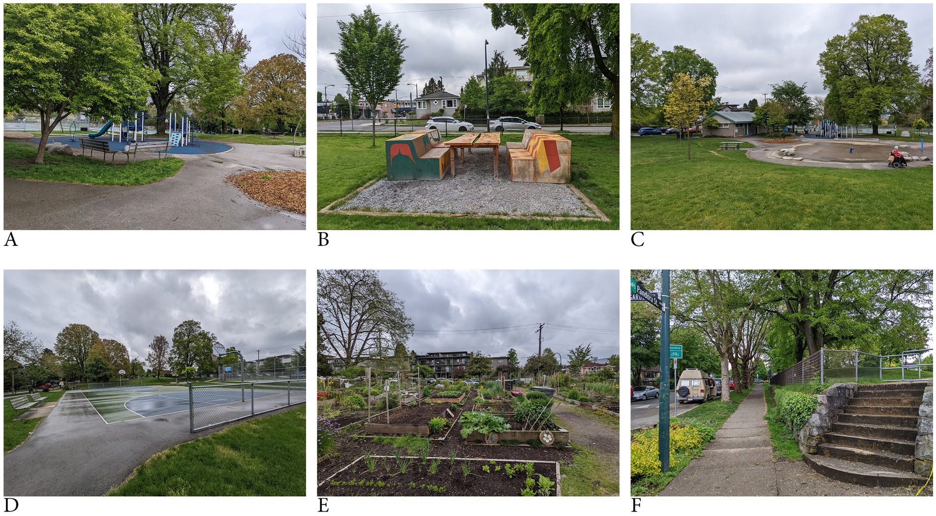
Figure 1. Amenities at Pandora Park (A) Playground (B) Picnic Area (C) Splash Park (D) Basketball courts (E) Community gardens (F) Pathways and stairs.
We collected environmental data using RGB sensors connected to a remotely piloted aircraft system (RPAS or drone). The data outputs consist of an orthomosaic, a point cloud (.las file format) and an object mesh (Figure 2). These data files were brought into ArcGIS Pro, geolocated, and then exported to the ESRI online portal.
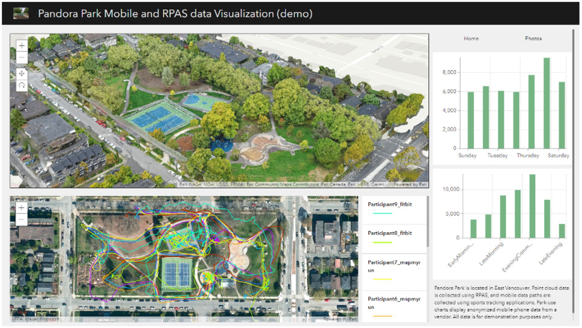
Figure 2. Screenshot of prototype visualisation.
We generated human movement data using various sports tracking applications that include a GPS tracker. We used an Apple watch, Fitbit and a smartphone with the “Mapmyrun” application. Our research team walked around the park, engaged in recreational activities there, and then exported the data into our ArcOnline content. This data collection process was meant to simulate a sample dataset for the prototype and was not meant to accurately represent activities of the general population. It also served to inform us of the challenges and opportunities associated with using wearables as a data resource for future projects. We also purchased data for our visualisation. This data was aggregated smartphone data, collected June – Sept months in 2022. It represented the sum of park visitors who entered the park and remained there for at least 20 min. We presented the data as bar charts in the visualisation. To understand how these data could be used together we combined these data into one screen view using the proprietary ESRI “Experience Builder” tool (Figure 3). These were shared online as a web page. We also prepared a video to demonstrate the tools interactivity.1
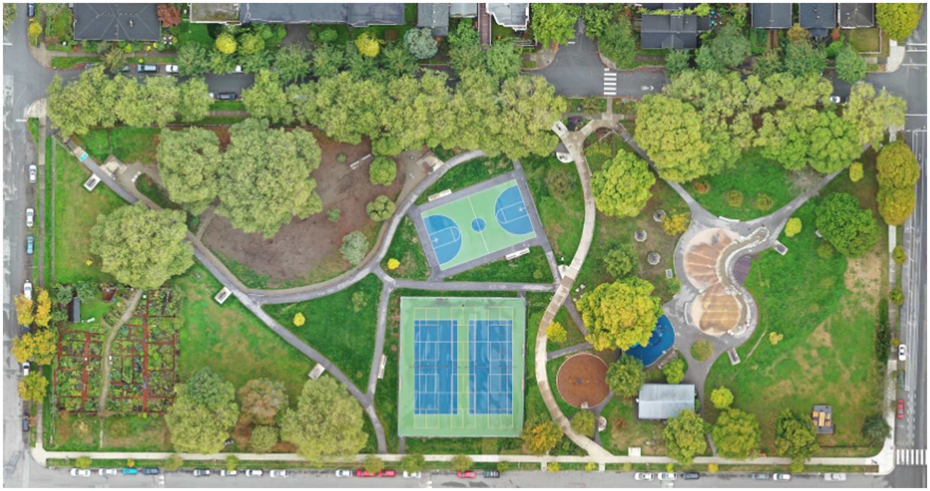
Figure 3. Orthomosaic generated from drone data collected at Pandora Park.
2.2 Expert interviews
The expert interview is a common qualitative empirical research method that aims to collect data by interviewing people who have specialised knowledge or experience in a particular field of action. This method can help uncover phenomena and understand social realities that may not be easily accessible nor observable by other methods, including implicit, tacit, or contextual knowledge, as well as opinions, attitudes, and values (Döringer, 2021). Our intent was to progress toward constructing categories in the opportunity space of urban forest design for data visualisation, and explain links between them, to foster conceptual clarity.
We conducted semi-structured interviews with eight urban forestry researchers who have a range of knowledge and experience with design, public engagement and human-nature research. We used a snowball sampling method, where interviewees suggested other colleagues who fit the criteria, to recruit researchers at the University of British Columbia (Vancouver, Canada). During these one-on-one interviews, we presented the visualisation, and asked the experts how it might be applied in their work and the problems these kinds of visualisations might address. Transcripts of the interviews were open coded and codes were grouped into themes, through axial coding according to established critical grounded theory methods based on the pre-established study objectives (Timonen et al., 2018). The overall coding and analysis were conducted by a single researcher and findings were discussed with the research team and compared to the notes and quotes in the transcripts. The interview process was approved by the university office of research ethics and the interview script is available in the Supplementary material.
We first presented the prototype tool and then allowed for comments and questions. We included questions like “What ways do you think this tool could be used? What about this tool stands out to you and why? After receiving feedback about the specific tool, we invited speculative comments about this kind of data visualisation in urban forest applications. Our intention was not to investigate the specific tool itself, but rather to understand the opportunities and limitation of tools with similar data and formats. We asked “What problems can a visualisation like this solve? And “Can you realistically see yourself using a tool like this? Finally, we asked about future uses, which experts or organisations might use a tool like this and what they would use it for. We also asked if they would make modifications to make it more useful. For all of the questions we prompted further discussion and speculation. We asked them questions to provide more context or detail (“tell me more?,” or “can you explain what you mean with an example?”).
3 Results
Participants included PhD candidates, research assistants and professors across ranks. They stated that their expertise included topics such as: creating green space policy, developing technologies for green space use and maintenance, green gentrification, park planning, public space design, park management and community engagement. We identified three main design-related domains that showed applicability for the visualisation. These include (1) design analysis, (2) public engagement (3) sustainability (Table 1).
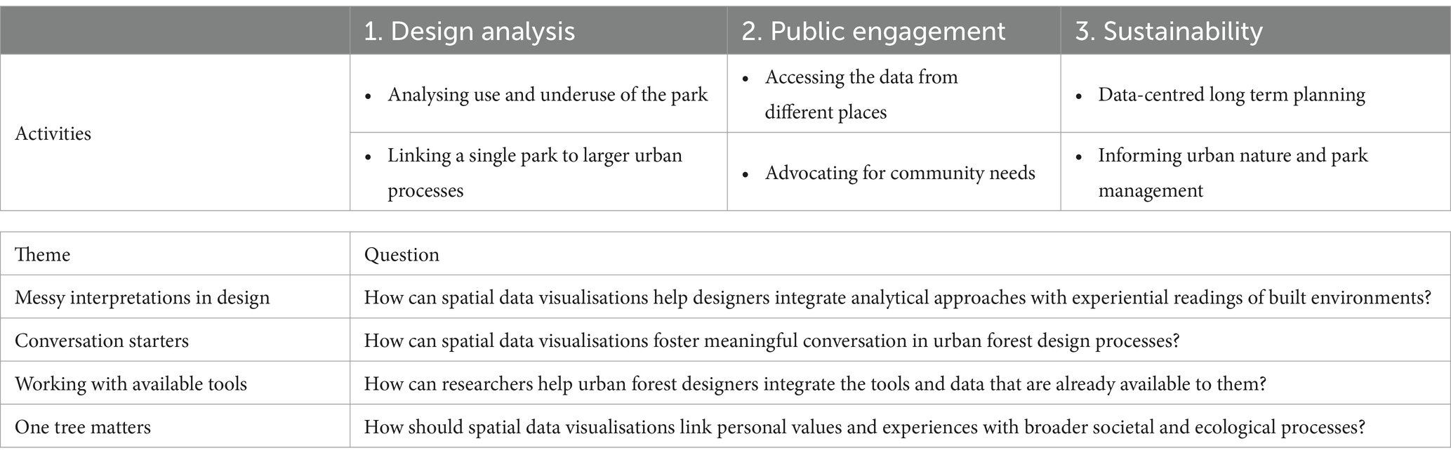
Table 1. Summary of multi-sources data visualisation topics and research questions.
3.1 Design analysis
3.1.1 Analysing use and underuse of the park
Participants mentioned that knowing locations and paths that are well-used can help designers understand what features might be preferred by people so that they can be enhanced, receive more maintenance, or replicated (P3, P4, P5, P6). Such information was cited as helpful to learn the human population capacity of the park by observing the visitation counts, and cross referencing with the park condition information (P4). Participants talked about summarising mobility flows within and to the park (P3, P4) as well as common arrival and exit locations (P6). P6 also explained that knowing when spaces are underused can also help the design of features that address issues of urban vitality and promote a sense of safety through programmatic additions or features such as lighting (P6).
Temporal factors related to use were also seen as useful for designers to understand which features promote use at various times of day, week, or year (P6, P3, P4). Participants mentioned that understanding when park programs are most attended could be helpful in determining which amenities to include in future renovations or upkeep, as well as to introduce to other parks nearby (P6, P7). Additionally, it was brought up that temporal variation can also be linked to weather and microclimate data which can help designers provide, maintain or reduce heating or cooling amenities (P3). Participants thought this could be particularly helpful to understand how people use tree shade to deal with urban heat (P3), or of vegetation damage from trampling (P6).
(…it is helpful to know) “where people spend the most time in the park, to know if changes are needed for design; more shaded areas to cool down, more exposed areas to enjoy the sun, or more trails are needed to prevent vegetation from being trampled…” (P5)
3.1.2 Linking a single park to larger urban processes
Even though this visualisation only presented a single park, P3 and P5 talked about the broader urban context. P5 mentioned the value of being able to compare multiple parks to learn which features attract more visitors. P8, P3, and P6 commented that it is important to understand how people arrive at the park, where they come from and through which access points, with a particular interest in accessibility for different populations (P5, P6). P7 also explained that the visualisation could allow designers to explore how park use changes with nearby urban gentrification (P7). P7 also requested more information about the data sample, for designers to evaluate bias or representativeness of the dataset.
“The power of these kinds of visualisations is in developing future scenarios. What if you increase entry points? What if you enhance features? You could simulate behaviours…and inform decisions by cities, consulting firms, and even think tanks on future pathways.” (P4).
3.2 Public engagement
3.2.1 Accessing the data from different places
P6, P3, and P2 commented on the utility of the visualisation for members of the public. Participant comments shifted between use cases: individuals at home (P6), and groups who might use the visualisation for organised meetings or events (P2).
P6 suggested individuals could use visualisations like this for park visitors to plan a visit to the park if they wanted to avoid crowds (P6), or to select activities to engage in before a park visit (P6). Participants saw utility for the visualisation to facilitate community park planning processes, where residents could be informed of park use and spatial arrangements to provide their feedback and be involved in decision making (P6). They felt this could also occur at home if the visualisation is presented online. P3 felt that the visualisation would be a “cool outreach and community engagement for children” who could see the park from a new perspective and provide their insights or artistic interpretations. P2 expressed the value of including the point cloud data because it means that anyone can gain some insights about the park even if they do not know the place very well, with this tool “anyone can participate in outreach” (P2).
“I am a bit biased, I have always been a visual person. I think better with pictures and maps. So I really like this tool. But, when I think about it, I think many people are like me” (P3).
3.2.2 Advocating for community needs
An important impact of an accessible format is that it can facilitate conversation among many different stakeholders. P7 expressed the impact that the visualisation can have on policy and park planning if a comment feature is included in the tool, and if it is shared with the public online. In this case community residents could track park design updates and the related changes in activities and use of the park over time (P7). The visualisation could also be used at a community hall meeting where residents are asked to provide input in park planning processes (P7). Such processes would be enhanced if participants were able to add their own comments, routines or feedback to the data set, and to engage in community activities even if they are unable to attend an official meeting (P7). When certain user groups talk to each other and gather evidence of the importance of a park or certain nature feature like a tree, they have greater potential to make change at the political level (P2). Such community engagement activities can be powerful mechanisms to advocate for community and nature-centred designs in policy or governmental decision processes (P7).
“If community groups or local residents groups have issues, they can look at the data and… bring it to council” (P2).
3.3 Sustainability
3.3.1 Data-centred long-term planning
While urbanists have engaged in data-centred planning approaches for a long time, small-scale projects such as parks often face challenges in data availability and accessibility. P3 expressed that after having worked in a local municipality they were surprised to find that most “tree inventory data was not very user friendly.” P3 and P4 explained that the point cloud data of the park enables a viewer to see a variety of variables that are not available in most municipal tree inventories such as: the condition of the greenspace vegetation, tree species, tree height and crown size, and tree location. P6 felt that the visualisation could help park managers identify areas that might have maintenance issues. That said, participants also recognised that data-centric decision making at the municipal level cannot be entirely solved by data visualisations. Technologies need to directly relate to practitioners’ tasks and enable them to do their work more efficiently if they are going to use it (P8).
“I like the mobility together with the vegetation data… sometimes you miss the structure with a top-down map.” (P4).
3.3.2 Informing urban nature and park management
Participants commented on a general lack of data about individual parks for research, and for municipal decision making. P3 explained that in their role in a municipal park planning office they would conduct a single visit to each park, per year. They felt that a visualisation that incorporates data over a longer period would be much more reliable. Since many park designers are not necessarily data-experts, they also felt that the visualisation could help them reference data more easily.
P4, P7 and P8 expressed a desire to use the visualisation to conduct broader analysis of park use and access across the urban context. For example, P7 suggested adding development data for the residential context. The drone data combined with tracking data was seen as a useful resource for evaluating which ecosystem services are benefiting residents (P4), and P8 expressed the potential to use visualisations like this map ecosystem service provisioning across an urban area.
” If data is available over a long time and across multiple parks and contexts, one could simulate the provision of nature-based services to residents, which could inform decisions about allocation of new green infrastructure” (P4).
4 Discussion
Our results focus on practical applications and utility for data visualisation tools to directly solve urban forestry problems. That said, the interviews can help us more broadly identify important research questions to promote new ways of thinking about data within the cultures of design in urban forestry. We present four such questions here in our discussion. These high-level questions emerged out of reflection on the interviews, as well as our research in intersecting neighbouring fields in design of the built environment. Design involves analytical and experiential elements; it is embedded in cultures and design is always about meaning (Latour, 2012). GIS research has explored concepts of criticality and participation in mapping (Elwood and Leszczynski, 2013; Kim, 2015; O’Sullivan, 2006). These research contexts inform our discussion and link two forms of design: design of the built environment and the design of data in digital visual tools. We discuss them here with the aim to stimulate conversation, debate, and ideation around opportunities for future research in this emerging field.
4.1 Messy interpretations in design: how can spatial data visualisations help designers integrate analytical approaches with experiential readings of built environments?
Instead of functioning only as technical tools in a predetermined workflow, researchers have found that visualisations can also be open-ended, aimed to stimulate curiosity, and embrace messiness in interpretation (Beurskens et al., 2022). Yet, more research is needed to (1) acknowledge such messiness in geospatial and social research (Law, 2004; Wikstrøm, 2023), (2) explore ways to promote curiosity using data visualisations while providing helpful numeric information (Hacιgüzeller, 2012), and (3) buffer against misinformation and false conclusions (Billger et al., 2017; Kitchin et al., 2015).
As we presented in the introduction, design of the built environment incorporates different ideologies around spatial data to inform decisions. In some cases, maps are used deterministically (for example behaviour mapping techniques) and, in some cases, they inform experiential characteristics of human perceptions of environments (cognitive maps). In our study, individual participants spoke about each data source, and about all three together. The multi-window format appeared to provide the participants with an opportunity to reflect of each data separately, but also to make cross-data inferences that could be formulaic (“how many people walk through this gate?” (P6)), and also interpretive and experiential (“what does it feel like to sit under that tree?” (P8)). Participants expressed different reflections on the data, sometimes quantitative and analytical and sometimes reflective and non-specific. We reflect that the multi-view format as well as the figurative realism of geospatial data in three dimensional visualisations could be an opportunity to invite simultaneous diverging interpretations and design approaches – ranging from analytical to speculative, to creative. We reflect that this could contribute to an important element of design processes - working both analytically, while recognising that design is always about meaning and ethics (Latour, 2012).
4.2 Conversation starters: how can spatial data visualisations foster meaningful conversation in urban forest design processes?
Though “conversation-starter” was not explicitly mentioned by participants, they did express a desire for comment forums or feedback spaces in the user interface, increased use of similar visualisations in public engagement meetings, and universal accessibility for community members. P4 talked about the importance of letting people just see the data without dictating how they use it.
Other researchers recognise a shift from a “knowledge deficit model” to dialogue as a key role for data visualisations in planning and urban design (Metze, 2020). Current researchers explore the role of digital visualisations to promote public engagement by examining their impacts on communicative empowerment, communicative flow, comprehension, transparency (Gower et al., 2023), realising that visualised data in a public context is always political, and requires expertise in social dynamics and facilitation. In such a context visualisations must speak not only to the mind, but to the heart (Lakoff, 2010).
In our study we found that the visual nature of the point cloud data provoked enthusiasm in participants, as did the ability to contextualise the tracking data in three-dimensional space, and to consider visitation patterns. The extent to which the visualisation format promotes dialogue is an opportunity space for further research.
4.3 Working with available tools: how can researchers help urban forest designers integrate the tools and data that are already available to them?
Many technologies are conceptually accessible to design practitioners, but they are rarely used: GPS tracking in wearables and smartphones, lower-priced drones, and aggregated smartphone data. The ease of access to these technologies makes their use appear disproportionately non-trivial. Having collected this data ourselves there remain key obstacles for use in public projects, the most obvious ones being: issues of privacy and collection of a large enough sample of tracking data, regulations associated with drones in cities, post processing of large point-cloud data, and the relatively high-cost of aggregated smartphone visitation data [for other descriptions of barriers in tracking data see: (Rout et al., 2021) and in drone data collection see: Simic Milas et al., 2018]. Therefore, despite these technologies being available for private individuals or companies, their use by designers or practitioners is limited (confirmed by P4, P5 and P6 in our study).
Despite there being significant challenges to operationalising these technologies, our participants still expressed a desire for more data sources (P4, P5, P6, P7), larger samples of data (P6), extensive back-end analytics (P6, P4), and advanced user interaction (P3, P7, P8). We speculate this is because there is a clear gap between what technology is capable of, and economic, legislative, cultural, or social limitations. Indeed, integrating multiple data sources and managing them in established institutions are highlighted as two out of five key challenges for the domain by (Billger et al., 2017) in their review of 114 urban data visualisation articles. We see a need for more research exploring the application space for these existing data sources, so that they can benefit real-world problems.
4.4 One tree matters: how should spatial data visualisations link personal values and experiences with broader societal and ecological processes?
Through our interviews and reflections, we feel that evocative and novel aspects of this kind of visualisation are the spatial scale of the data, and the implicated relevance for its users. P8 summarised this sentiment by stating:
“this is the finer scale that matters to people, it is relevant to how people experience a place, (it is) not theoretical… one tree matters here.” (P8).
P8 felt that a visualisation that describes each tree, and related human experience, makes sense to the public. Additionally, P4 expressed interest in examining the patterns and experiences of individual demographic groups. They wanted to learn when seniors visit the park, how they travel through the park, and places they gather. They expressed interest in learning the story of a senior who visits the park to build empathy towards the park users.
Thus, the human-scale has implications for engagement, uptake, relevance, and impact on action. Our study emphasises that fine-scale data at the site, or park level can serve as stepping stones of larger social-ecological systems (Nordh and Østby, 2013). And yet, it remains a challenge for creators of data visualisations to demonstrate patterns that link individual perspectives to larger processes (Billger et al., 2017). Many open data sources are at the spatial resolution of the neighbourhood (postal code or census grouping) (Rout et al., 2021). The state of the art in data visualisations for planning requires new analytical methods (Yao et al., 2017), as well as research exploring social factors in visualisation use and impact (Metze, 2020).
4.5 Limitations and future research
This research was exploratory in nature and should be interpreted as such. We also focused on exploring the topic of data visualisations “like this” in urban forest design, rather than specific tools. This can make our results broad and reflective rather than precise or deterministic. Due to the exploratory nature of the work, our research focused on one park within one city. This level of specificity allowed us to explore potential strengths and uses of a high-resolution and highly specific dataset. However, this research should be replicated across additional study sites to gain further insight into the uses of these visualisation techniques in different contexts. Our interview sample size was also limited. Future research should engage with more and more diverse perspectives, including community-based participants and those outside of the field of urban and park planning.
5 Conclusion
In conclusion, we began this paper with a description of spatial data visualisation as design material in the built environment. We described two broad approaches to such data, a top-view and a ground-view. We discuss the importance of understanding the embedded nature of data in design processes and the opportunities for data to function in processes beyond isolated, empirical decisions. In this paper we explored this topic with eight urban forestry experts using a prototype data visualisation that presents GPS tracking data at a fine spatial resolution alongside point-cloud data. Our analysis found that the urban forestry experts discussed topics that could be grouped under the concepts of design analysis, sustainability, and public engagement. Based on these discussions we identify questions for future data visualisation research. Questions relate to messiness in data interpretation, meaningful conversation, data and tool accessibility, and linking individual values to broader processes. The research points to the holistic nature of data visualisations in design domains, and the importance of considering the full range of implications, cultures and activities in considering data and a design material. Overall, we recommend future research in questions and highlight the potential for multi-sourced data visualisations to facilitate conversations and data-rich practices among designers, the public, and urban forestry experts.
Data availability statement
The datasets presented in this article are not readily available because data from the interviews is confidential based on the ethics requirements. Requests to access the datasets should be directed to YS5lLnJvdXRAdHVkZWxmdC5ubA==.
Ethics statement
The studies involving humans were approved by University of British Columbia Office of Research Ethics. The studies were conducted in accordance with the local legislation and institutional requirements. The participants provided their written informed consent to participate in this study.
Author contributions
AR: Conceptualization, Data curation, Formal analysis, Investigation, Methodology, Software, Visualization, Writing – original draft, Writing – review & editing. SN: Data curation, Funding acquisition, Software, Visualization, Writing – review & editing. LN: Funding acquisition, Resources, Supervision, Writing – review & editing.
Funding
The author(s) declare that financial support was received for the research and/or publication of this article. This work was supported by Rogers 5G UBC partnership, Mitacs Accelerate, University of British Columbia Campus and Community Planning (CCP) and Campus as a Living Lab (CLL).
Acknowledgments
We would like to thank Johanna Bock, Ibrahim El-Chami, Susan Day, Max Yancho, Michael Kennedy, Urban Natures Lab at UBC.
Conflict of interest
The authors declare that the research was conducted in the absence of any commercial or financial relationships that could be construed as a potential conflict of interest.
Publisher’s note
All claims expressed in this article are solely those of the authors and do not necessarily represent those of their affiliated organizations, or those of the publisher, the editors and the reviewers. Any product that may be evaluated in this article, or claim that may be made by its manufacturer, is not guaranteed or endorsed by the publisher.
Supplementary material
The Supplementary material for this article can be found online at: https://www.frontiersin.org/articles/10.3389/fhumd.2025.1391255/full#supplementary-material
Footnotes
References
Andrienko, N., and Andrienko, G. (2013). Visual analytics of movement: an overview of methods, tools and procedures. Inf. Vis. 12, 3–24. doi: 10.1177/1473871612457601
Arciniegas, G., Janssen, R., and Rietveld, P. (2013). Effectiveness of collaborative map-based decision support tools: results of an experiment. Environ. Model Softw. 39, 159–175. doi: 10.1016/j.envsoft.2012.02.021
Ash, J., Kitchin, R., and Leszcynski, A. (2019). Introducing digital geographies. London, UK: SAGE Publications Ltd.
Assche, V., Kristof, R. B., Duineveld, M., and de Jong, H. (2013). Co-evolutions of planning and design: risks and benefits of design perspectives in planning systems. Plan. Theory 12, 177–198. doi: 10.1177/1473095212456771
Barron, S., Katherine, D., Nicholas, S. G. W., Kozak, R., and Stephen, R. J. S. (2023). “A Scenario Process for Urban Forest Design at the Neighbourhood Level”. Futures. 150. doi: 10.1016/j.futures.2023.103172
Barron, S., Sheppard, S. R. J., and Condon, P. M. (2016). Urban Forest indicators for planning and designing future forests. Forests 7:208. doi: 10.3390/f7090208
Bechtel, R. B., Marans, R. W., and Michelson, W. (1987). Methods in environmental and behavioral research. New York, NY, US: Van Nostrand Reinhold Co.
Bell, S., Dominique, B., Maija, R., Cristina, C.-B., Alan, S., and Ib Asger, O. (2005). “Design of Urban Forests,” in Urban Forests and Trees: A Reference Book, edited by C. Konijnendijk, K. Nilsson, T. Randrup, and J. Schipperijn. Berlin, Heidelberg: Springer. Pp. 149–86.
Beurskens, K., Meyer, F., and Harvey, F. (2022). Qualitative visualisation – perspectives and potentials for population geography. Geogr. Helv. 77, 317–322. doi: 10.5194/gh-77-317-2022
Bibri, S. E., and Krogstie, J. (2017). Smart sustainable cities of the future: an extensive interdisciplinary literature review. Sustain. Cities Soc. 31, 183–212. doi: 10.1016/j.scs.2017.02.016
Billger, M., Thuvander, L., and Wästberg, B. S. (2017). In search of visualization challenges: the development and implementation of visualization tools for supporting dialogue in urban planning processes. Environ. Plan. B Urban Anal. City Sci. 44, 1012–1035. doi: 10.1177/0265813516657341
Bogers, S., Frens, J., Van Kollenburg, J., Deckers, E., and Hummels, C. (2016). “Connected baby bottle: a design case study towards a framework for data-enabled design.” In Proceedings of the 2016 ACM conference on designing interactive systems, New York, NY, USA: Association for Computing Machinery, 301–311.
Cambria, V. E., Campagnaro, T., Trentanovi, G., Testolin, R., Attorre, F., and Sitzia, T. (2021). Citizen science data to measure human use of green areas and forests in European cities. Forests 12:779. doi: 10.3390/f12060779
Campbell, L. K., Svendsen, E. S., and Roman, L. A. (2016). Knowledge co-production at the research–practice Interface: embedded case studies from urban forestry. Environ. Manag. 57, 1262–1280. doi: 10.1007/s00267-016-0680-8
Chen, W., Iyer, A., and Bostanabad, R. (2022). Data centric design: a new approach to design of microstructural material systems. Engineering 10, 89–98. doi: 10.1016/j.eng.2021.05.022
Degen, M. M., and Rose, G. (2012). The sensory experiencing of urban design: the role of walking and perceptual memory. Urban Stud. 49, 3271–3287. doi: 10.1177/0042098012440463
Döringer, S. (2021). ‘The problem-centred expert interview’. Combining qualitative interviewing approaches for investigating implicit expert knowledge. Int. J. Soc. Res. Methodol. 24, 265–278. doi: 10.1080/13645579.2020.1766777
Dy, B., Ibrahim, N., Poorthuis, A., and Joyce, S. (2022). Improving visualization design for effective multi-objective decision making. IEEE Trans. Vis. Comput. Graph. 28, 3405–3416. doi: 10.1109/TVCG.2021.3065126
Elwood, S., and Leszczynski, A. (2013). New spatial media, new knowledge politics. Trans. Inst. Br. Geogr. 38, 544–559. doi: 10.1111/j.1475-5661.2012.00543.x
Endreny, T. A. (2018). Strategically growing the urban Forest will improve our world. Nat. Commun. 9:1160. doi: 10.1038/s41467-018-03622-0
ESRI. (2020). “ArcGIS Experience Builder | Documentation.” Available online at: https://doc.arcgis.com/en/experience-builder/latest/get-started/what-is-arcgis-experience-builder.htm (Accessed March 20, 2025).
Funk, M., Peter, L., and Renee, N. (2024). “Designing with Data, Data-Enabled and Data-Driven Design,” in Handbook of Human Computer Interaction, (eds) J. Vanderdonckt, P. Palanque, and M. Winckler. Springer. Pp. 1–32.
García, M. T. C., and Montané-Jiménez, L. G. (2020). “Visualization to support decision-making in cities: advances, technology, challenges, and opportunities.” In 2020 8th international conference in software engineering research and innovation (CONISOFT), 198–207.
Gibson, J. J. (1979). The ecological approach to visual perception. Classic Edn. Boston, Massachusetts: Houghton Mifflin.
Gifford, R. (ed.)(2016). “Introduction: Environmental Psychology and Its Methods.” in Research Methods for Environmental Psychology, Hoboken, New Jersey: John Wiley & Sons, Ltd. Pp. 1–8.
Gorkovenko, K., Jenkins, A., Vaniea, K., and Murray-Rust, D. (2023). Data-enhanced design: engaging designers in exploratory sensemaking with multimodal data. Int. J. Design 17, 1–23. doi: 10.57698/V17I3.01
Gower, A., Hotker, M., and Grodach, C. (2023). Digital participation models as public engagement tools in planning: A concept exploration. Plan. Theory Pract. 24, 663–678. doi: 10.1080/14649357.2023.2278099
Hacιgüzeller, P. (2012). GIS, critique, representation and beyond. J. Soc. Archaeol. 12, 245–263. doi: 10.1177/1469605312439139
Khan, A. Z., Moulaert, F., Schreurs, J., and Miciukiewicz, K. (2014). Integrative spatial quality: a relational epistemology of space and transdisciplinarity in urban design and planning. J. Urban Des. 19, 393–411. doi: 10.1080/13574809.2014.936142
Kim, A. M. (2015). Critical cartography 2.0: from ‘participatory mapping’ to authored visualizations of power and people. Landsc. Urban Plan. 142, 215–225. doi: 10.1016/j.landurbplan.2015.07.012
Kitchin, R., Lauriault, T. P., and McArdle, G. (2015). Knowing and governing cities through urban indicators, City benchmarking and real-time dashboards. Reg. Stud. Reg. Sci. 2, 6–28. doi: 10.1080/21681376.2014.983149
Konijnendijk, C. C., Ricard, R. M., Kenney, A., and Randrup, T. B. (2006). Defining urban forestry – A comparative perspective of North America and Europe. Urban For. Urban Green. 4, 93–103. doi: 10.1016/j.ufug.2005.11.003
Lakoff, G. (2010). Why it matters how we frame the environment. Environ. Commun. 4, 70–81. doi: 10.1080/17524030903529749
Latour, B. (2012). “A Cautious Prometheus? A Few Steps Toward a Philosophy of Design with Special Attention to Peter Sloterdijk,” in In Medias Res: Peter Sloterdijk’s Spherological Poetics of Being, (eds) L. Tsipouri, L. Noordegraaf-Eelens, V. Stenius, and W Schinkel. Amsterdam, Netherlands: Amsterdam University Press. Pp. 151–64.
Lee-Smith, M. L., Benjamin, J. J., Desjardins, A., Funk, M., Odom, W., Oogjes, D., et al. (2023). “Data as a material for design: alternative narratives, divergent pathways, and future directions.” In Extended abstracts of the 2023 CHI conference on human factors in computing systems, CHI EA ‘23, New York, NY, USA: Association for Computing Machinery, 1–5.
Maier, J. R. A., Fadel, G. M., and Battisto, D. G. (2009). An affordance-based approach to architectural theory, design, and practice. Des. Stud. 30, 393–414. doi: 10.1016/j.destud.2009.01.002
Marušić, B. G. (2011). Analysis of patterns of spatial occupancy in urban open space using behaviour maps and GIS. Urban Des. Int. 16, 36–50. doi: 10.1057/udi.2010.20
McHarg, I. (1969). Design with nature. Garden City, NY: American Museum of Natural History, The Natural History Press.
Mears, M., Brindley, P., Barrows, P., Richardson, M., and Maheswaran, R. (2021). Mapping urban greenspace use from Mobile phone GPS data. PLoS One 16:e0248622. doi: 10.1371/journal.pone.0248622
Metze, T. (2020). Visualization in environmental policy and planning: A systematic review and research agenda. J. Environ. Policy Plan. 22, 745–760. doi: 10.1080/1523908X.2020.1798751
Nesbitt, L., Hotte, N., Barron, S., Cowan, J., and Sheppard, S. R. J. (2017). The social and economic value of cultural ecosystem services provided by urban forests in North America: A review and suggestions for future research. Urban For. Urban Green. 25, 103–111. doi: 10.1016/j.ufug.2017.05.005
Nitoslawski, S. A., Galle, N. J., Van Den Bosch, C. K., and Steenberg, J. W. N. (2019). Smarter ecosystems for smarter cities? A review of trends, technologies, and turning points for smart urban forestry. Sustain. Cities Soc. 51:101770. doi: 10.1016/j.scs.2019.101770
Nordh, H., and Østby, K. (2013). Pocket parks for people – A study of Park design and use. Urban For. Urban Green. 12, 12–17. doi: 10.1016/j.ufug.2012.11.003
O’Sullivan, D. (2006). Geographical information science: critical GIS. Prog. Hum. Geogr. 30, 783–791. doi: 10.1177/0309132506071528
Ostoić, S. K., and van den Bosch, C. C. K. (2015). Exploring global scientific discourses on urban forestry. Urban For. Urban Green. 14, 129–138. doi: 10.1016/j.ufug.2015.01.001
Rout, A., and Galpern, P. (2018). Using personal smartphone location histories in public engagement: locating a new campus amenity. Appl. Geogr. 100, 68–77. doi: 10.1016/j.apgeog.2018.09.003
Rout, A., Nitoslawski, S., Ladle, A., and Galpern, P. (2021). Using smartphone-GPS data to understand pedestrian-scale behavior in urban settings: a review of themes and approaches. Comput. Environ. Urban. Syst. 90:101705. doi: 10.1016/j.compenvurbsys.2021.101705
Rout, A., and Willett, W. (2021). “(big) data in urban design practice: supporting high-level design tasks using a visualization of human movement data from smartphones” in Urban informatics and future cities, The Urban Book Series. eds. S. C. M. Geertman, C. Pettit, R. Goodspeed, and A. Staffans (Cham: Springer International Publishing), 301–318.
Salama, A. M. (2008). “A Theory for Integrating Knowledge in Architectural Design Education. Archnet-IJAR: Int. J. Archit. Res. 2, 100–128.
Schuurman, N., and Leszczynski, A. (2006). Ontology-based metadata. Trans. GIS 10, 709–726. doi: 10.1111/j.1467-9671.2006.01024.x
Simic Milas, A., Cracknell, A. P., and Warner, T. A. (2018). Drones – the third generation source of remote sensing data. Int. J. Remote Sens. 39, 7125–7137. doi: 10.1080/01431161.2018.1523832
Steiner, F. R. (2022). “Ian L. McHarg and Mapping Complex Processes,” in Representing Landscapes, (eds) N. Amoroso and M. Holland New York: Routledge. P. 13.
Sternberg, E. (2000). An integrative theory of urban design. J. Am. Plan. Assoc. 66, 265–278. doi: 10.1080/01944360008976106
Timonen, V., Foley, G., and Conlon, C. (2018). Challenges when using grounded theory: a pragmatic introduction to doing GT research. Int J Qual Methods 17:1609406918758086. doi: 10.1177/1609406918758086
Tunçer, B., and Benita, F. (2022). Data-driven thinking for measuring the human experience in the built environment. Int. J. Archit. Comput. 20, 316–333. doi: 10.1177/14780771211025142
Vogt, J. (2020). “Urban Forests as Social-Ecological Systems,” in Encyclopedia of the World’s Biomes, (eds) M. I. Goldstein and D. A. DellaSala. Oxford: Elsevier. Pp. 58–70.
Wei, L. L., Yen, A. A., Ibrahim, A., Nisar, K., Ismail, Z. I. A., and Welch, I. (2020). Survey on geographic visual display techniques in epidemiology: taxonomy and characterization. J. Ind. Inf. Integr. 18:100139. doi: 10.1016/j.jii.2020.100139
Whyte, W. (1980). The Social Life of Small Urban Spaces. 1st ed. New York: Project for Public Spaces.
Wikstrøm, R. D. (2023). The potential of combining qualitative GIS and map elicitation in daily mobility studies. J. Transp. Geogr. 108:103573. doi: 10.1016/j.jtrangeo.2023.103573
Yaneva, A.. (2012). Mapping controversies in architecture. Oxford, United Kingdom: Taylor & Francis Group. Available online at http://ebookcentral.proquest.com/lib/delft/detail.action?docID=866411 (Accessed March 17, 2025).
Keywords: data-centred design, urban nature, data visualisation, tracking data, human-nature interactions, data as a design material, urban forestry, built environment
Citation: Rout A, Nitoslawski S and Nesbitt L (2025) One tree matters: reflections on data as a design material in urban forestry. Front. Hum. Dyn. 7:1391255. doi: 10.3389/fhumd.2025.1391255
Edited by:
Albrecht Kurze, Chemnitz University of Technology, GermanyReviewed by:
Sandy J. J. Gould, Cardiff University, United KingdomSujithra Raviselvam, Eindhoven University of Technology, Netherlands
Copyright © 2025 Rout, Nitoslawski and Nesbitt. This is an open-access article distributed under the terms of the Creative Commons Attribution License (CC BY). The use, distribution or reproduction in other forums is permitted, provided the original author(s) and the copyright owner(s) are credited and that the original publication in this journal is cited, in accordance with accepted academic practice. No use, distribution or reproduction is permitted which does not comply with these terms.
*Correspondence: Angela Rout, YS5lLnJvdXRAdHVkZWxmdC5ubA==