 Olga Scrivner1*
 Gagandeep Singh1
 Sara E. Bouchard1
 Scott C. Hutcheson1
 Ben Fulton2Matthew R. Link2
 Katy Börner1
- 1Department of Intelligent Systems Engineering, School of Informatics, Computing and Engineering, Indiana University Bloomington, Bloomington, IN, United States
- 2Pervasive Technology Institute, Indiana University Bloomington, Bloomington, IN, United States
Many universities invest substantial resources in the design, deployment, and maintenance of campus-based cyberinfrastructure (CI). To justify the expense, it is important that university administrators and others understand and communicate the value of these internal investments in terms of scholarly impact. This paper introduces two visualizations and their usage in the Value Analytics (VA) module for Open XD metrics on demand (XDMoD), which enable analysis of external grant funding income, scholarly publications, and collaboration networks. The VA module was developed by Indiana University’s (IU) Research Technologies division, Pervasive Technology Institute, and the CI for Network Science Center (CNS), in conjunction with the University at Buffalo’s Center for Computational Research. It provides diverse visualizations of measures of information technology (IT) usage, external funding, and publications in support of IT strategic decision-making. This paper details the data, analysis workflows, and visual mappings used in two VA visualizations that aim to communicate the value of different IT usage in terms of NSF and NIH funding, resulting publications, and associated research collaborations. To illustrate the feasibility of measuring IT values on research, we measured its financial and academic impact from the period between 2012 and 2017 for IU. The financial return on investment (ROI) is measured in terms of IU funding, totaling $339,013,365 for 885 NIH and NSF projects associated with IT usage, and the academic ROI constitutes 968 publications associated with 83 of these NSF and NIH awards. In addition, the results show that Medical Specialties, Brain Research, and Infectious Diseases are the top three scientific disciplines ranked by the number of publications during the given time period.
Introduction
Access to high-performance computing (HPC) systems and advanced cyberinfrastructure (CI) generally is critical to advance research in many scholarly fields. Over the last 30 years, supercomputing has expanded from a few monolithic and extremely fast computing systems into a comprehensive “set of organizational practices, technical infrastructure and social norms that collectively provide for the smooth operation of research and education work at a distance” (Towns et al., 2014). This new form of CI (Stewart et al., 2017) is also used by a large number of researchers, scholars, and artists and is more complicated, including HPC, storage systems, networks, and visualization systems. This requires a new suite of metrics that can help different stakeholders better understand the value of research CI. In addition to job- and system-performance monitoring, metrics now available and needed to understand system usage and value include usage modality [e.g., central processing unit (CPU) usage per group or person, number of users, and wait time]. All of these metrics are essential to better understand “why users do what they do and how they leverage multiple types and instances of CI resources” (Katz et al., 2011). In recent years, there has also been growing interest in measuring the impact of CI on scientific research and publication outcome (e.g., Madhavan et al., 2014, Knepper and Börner, 2016, Fulton et al., 2017). Such insights are particularly relevant for campus CI that requires significant investment and long-term strategic and financial planning. Visualizations help communicate the value of CI to diverse stakeholders ranging from domain experts to academic deans to financial administrators.
Currently, several CI frameworks enable on-demand rendering of impact metrics (e.g., funding, publications, and citations) that result from using HPC resources. While most monitoring tools for HPC are traditionally “largely passive and local in nature” (Furlani et al., 2013a,b), these new frameworks, such as Deep Insight Anytime, Anywhere (DIA2) (Madhavan et al., 2014), and Extreme Science and Engineering Discovery Environment (XSEDE) Metrics on Demand (XDMoD VA) (Fulton et al., 2017), are open source, customizable systems with “increased functionality, an improved interface, and high-level charting and analytical tools” (Palmer et al., 2015). DIA2 is a web-based visual analytics system aiming to assess research funding portfolios (Madhavan et al., 2014). Open XD metrics on demand (XDMoD) is one of the most widely used software systems in the US and is currently employed by more than 200 institutions to evaluate their HPC usage (Palmer et al., 2015; Fulton et al., 2017). The tool has been developed as an open source software for “metrics, basic accounting, and visualization of CPU and storage usage” at the Center for Computational Research of the University at Buffalo (Palmer et al., 2015).
Open XDMoD value analytics (VA) adds a VA module to Open XDMoD. The two visualizations presented in this paper contribute to XDMoD VA functionality as follows:
1. financial and intellectual analytics: analyze grant income and publications by researchers who use information technology (IT) and relate that income to use of local IT systems.
2. co-PI collaboration networks: analyze research collaborations by researchers that use local IT systems.
In this paper, we detail both types of visual analytics for XDMoD VA and demonstrate how they can help understand the IT impact on academic research. Specifically, we describe the data and visual analytics workflows used for the Funding and Publication Impact and the Co-PI Collaboration Network visualizations. The Funding and Publication Impact visualization uses a Sankey graph to interlink IT usage with funding and publication output. The Co-PI Collaboration Network uses NSF and NIH funding data to extract and depict Co-PI collaboration networks together with listings of scholars ranked by the total amount of grants. Both types of visualizations are interactive, supporting overview first, zoom and panning, and details on demand (Shneiderman, 1996). The visualizations are rendered using the web visualization framework (WVF) developed by CNS at Indiana University’s (IU) that allows for an effective, highly customizable rendering of interactive visualizations.
The remainder of the paper is organized as follows: Section “Related Work” discusses prior work on analyzing and visualizing the impact of IT resources, particularly on scholarly output. In Section “Data Acquisition and Preparation,” we outline the data we used, as well as the preprocessing methods needed to render that data useful. Section “Methods” discusses the general methods applied to render data into visual insights. Section “Results” details the results of using the data and methods to render the Funding and Publication Impact and Co-PI Collaboration Network visualizations. Key insights and planned developments are discussed in Section “Discussion and Outlook.”
Related Work
In recent years, there has been growing interest in measuring the impact of HPC on scientific research and publication outcome. Advanced CI resources require significant investment, particularly when implemented at the campus level, and insights about the value of such investments in financial and intellectual terms are essential for the strategic and financial planning of academic institutions (Fulton et al., 2017). A number of studies have examined the relationship between these values and CI resources usage. Three studies can be regarded as a starting point for introducing HPC user metrics: namely, Li et al. (2005), Iosup et al. (2006), and Lee et al. (2006). In addition to traditional metrics (e.g., job size, system utilization), these studies included user and group characteristics to analyze system performance. Hart (2011) extended this idea and highlighted the importance of usage and submission patterns to understand users and their behavior across HPC resources. Knepper (2011) further investigated the relation between users, their HPC usage behavior, and their field of science. Particularly, his study examined PIs, their network affiliation, and the scientific field and allocation size of their research projects from 2003 to 2011 using TeraGrid, a national (US) computing scientific infrastructure. The results revealed that PIs constituted 23% (3,334) of the total TeraGrid project users (14,474) and that molecular biosciences and chemistry are the two scientific fields with the highest number of projects involving TeraGrid usage, 2,292 and 1,828, respectively. Similarly, Furlani et al. (2012, 2013a,b) observed that molecular biosciences recently joined physics at the top of the list of sciences with the greatest CPU usage of Extreme Science and Engineering Discovery Environment (XSEDE), a virtual system providing digital resources and computing services (Towns et al., 2014). In addition, Furlani’s longitudinal study demonstrated a substantial increase in the number of PIs using XSEDE from ~500 in 2005 to ~1,600 in 2011. The authors noted, however, that often a project PI did not personally utilize the XSEDE resources, assigning computing tasks to graduate students or postdocs.
Other research focuses on various metrics for measuring academic performance with respect to HPC usage. Apon et al. (2010) suggest measuring the HPC investment in terms of “competitiveness,” presented as a ranking system. Ranks are calculated using the Top 500 HPC list that reports on the fastest 500 computers in the world. An institution’s rank is based on their investments in HPC according to the Top 500 HPC list. In their study, academic performance was characterized by publication counts and funding awards. Their funding showed that “consistent investments in HPC at even modest levels are strongly correlated to research competiveness.” Apon et al.’s study also presented statistical evidence that NSF research funding and publication counts are good predictors of academic competitiveness. Subsequently, Knepper and Börner (2016) at the relationship between the CPU usage of XSEDE resources utilized by PIs and publication records. In addition, they mapped fields of science into HPC resources, creating a bipartite network. The results demonstrated that among the 27 top fields, physics, chemistry, astronomy, material research, and meteorology/climate modeling utilized XSEDE resources the most. They also observed that the type of HPC resources plays an important role, as some systems link to almost all fields of science (e.g., NICS Kraken), whereas others serve only a small number of fields.
Newby et al. (2014) discussed various forms of “return on investment” in studies of research CI. Their discussion included a number of different types of value derived from investment in advanced CI, including scientific value, workforce development, economic value, and innovation. More recent work has adopted the financial definition of return on investment (ROI): “a ratio that relates income generated … to the resources (or asset base) used to produce that income,” calculated typically as “income or some other measure of return on investment.” Values greater than 1.0 indicate that return is greater than investment (Kinney and Raiborn, 2011). One of the challenges in measuring ROI in financial terms is that returns may take decades to materialize in some disciplines (Stewart et al., 2015). Recently, two studies have applied ROI metrics to study the impact of HPC usage at Indiana University. Thota et al. (2016) compared the annual cost of operating IU’s Big Red II supercomputer with the funds brought into the university by the researchers that used Big Red II. The expected annual average cost for Big Red II is around $15 million dollars. Thota et al. found that for the year 2013, the total grant income to IU by PIs or Co-PIs who make use of this supercomputer was more than double the amount of the cost ($39.8 million). This is suggestive (although not conclusive) of a favorable financial ROI—only suggestive because the analysis of Thota et al. was not able to take into account how critical use of the Big Red II supercomputer was to the grants awarded to users of that system. Similarly suggestive, Fulton et al. (2017) showed a positive correlation between an increase in HPC usage and IU’s award funding over a period of years. Stewart et al. (2015) analyzed the ROI for XSEDE (the eXtreme Science and Engineering Discovery Environment) and argued that the ROI of federal investment in this resource was greater than 1.
Data Acquisition and Preparation
Four data sources are used to analyze and visualize the impact of internal IT usage on external funding, associated publications, and collaboration networks: IT usage data for faculty, staff, and students working at an institution; IU award database; NIH and NSF award data for the same institution together with publications that list these awards in the acknowledgments. These datasets, as well as their matching, cleaning, and preparation for visualization, are detailed subsequently. The overall process is illustrated in Figure 1. Please note that all public data and all code is available online at http://cns.iu.edu/2017-Value-Analytics.html.
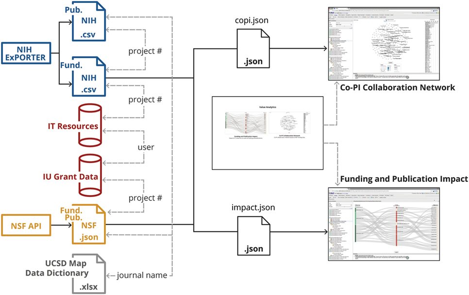
Figure 1. Data sources, data linkage, data preparation for XD metrics on demand value analytics visualizations.
IT Usage Data
XD metrics on demand HPC resource usage log data is used to extract IT usage information. Among others, the logs contain five elements: IT system type, IT system name, units used (CPU hours for computing and Gigabytes for storage), user name, first name, and last name of IT user. An IT system consists of two types, namely storage and compute node, and several systems within each type.
From January 2012 to October 2017, there were two major storage and six computing systems utilized by (co-)PIs for NSF and NIH grants at Indiana University.
Storage
1. Scholarly data archive,
2. Data Capacitator 2
Computing
1. Big Red, a supercomputer,
2. Big Red II, a supercomputer,
3. Karst, a cluster for serial jobs,
4. Mason, designed for data-intensive, HPC tasks (Thota et al., 2016),
5. Quarry, a computing cluster, and
6. Carbonate, designed for data-intensive computing, particularly for genome and phylogenic software.
Among computing systems, Big Red was decommissioned in 2013 and replaced by Big Red II, Quarry was decommissioned in January 2015, and Carbonate became available in July 2017 to replace Mason, scheduled to retire on January 1, 2018.
High-performance computing log files do not differentiate between a group and a single user account. Using unique IT user names and the fields with last and first names, 1,187 instances of group accounts were identified and removed. The log files were then filtered by the year > 2012-01-01 with the storage and computer resources > 0. Tables 1 and 2 provide a summary of IT resource usage at IU from January 2012 to October 2017 with a total of 65,495,233,153 CPU job hours run, 114,893 GB stored, and 4,112 unique users active.

Table 1. Summary of high-performance computing jobs at Indiana University’s by individual users (January 2012 to October 2017).
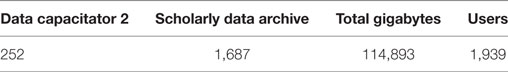
Table 2. Summary of high-performance computing storage usage at Indiana University’s by individual users (January 2012–October 2017).
Internal IU Award Database
Indiana University’s internal grant data are generated from Kuali Financial Services. This database imports user ID, the name of award agency, grant ID, and total amount. For this paper, the following query was specified: (a) the start date is 2012-01-01 and (b) the grant amount is greater than 0. Out of the total of 28,965 awards between 2012-01-01 and 2018-01-01, 597 grants are from NSF and 2,677 grants are from NIH agencies. The number of unique (co-)PI users are 425 for NSF and 690 for NIH.
NIH Grant and Publication Data
NIH grant award numbers and linkages to publications that cite award numbers can be downloaded in bulk using ExPORTER Data Catalog1 or as a data extract using Research Portfolio Online Reporting Tools (RePORTER).2 The NIH data provides access to both intramural and extramural NIH-funded research projects from the past 25 years and publications since 1980 (NIH, 2017). For this study, we have used the RePORTER; however, our methodology is applicable to ExPORTER. When extracting data from the ExPORTER, NIH files are downloaded separately for each year and then merged, whereas the RePORTER output is already merged. The RePORTER query form also allows for generating data by means of query elements, such as keywords, organization names, publications, and others. By combining these elements, the user is able to create highly customized searches of this NIH funding database. In order to obtain the grant total and the number of publications for XDMoD, the following query filters were applied: project year (2012–2017), organizations listed in the NIH lookup (IU Bloomington, IU South Bend, and IUPUI), state (Indiana), and publication year (2012–2017), as illustrated in Figure 2. The Agency/Institute/Center field is kept with its default set to “admin,” and subprojects are set to be excluded.
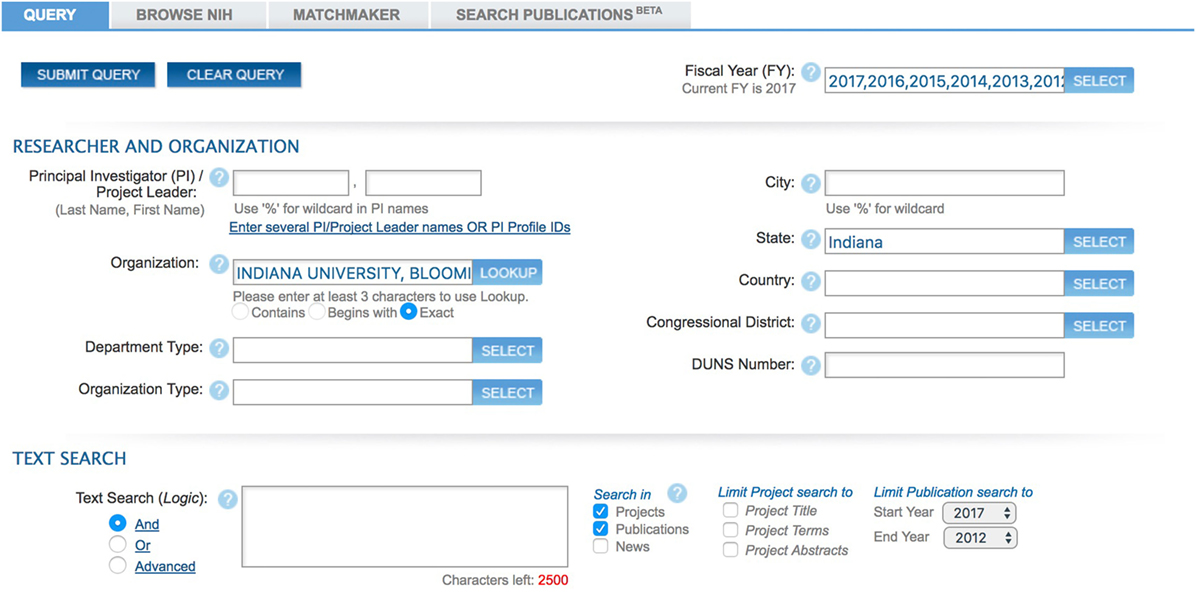
Figure 2. NIH RePORTER online search query.
The query was run on August 22, 2017, 9:00 a.m. EST, and the query results were exported in CSV format with relevant fields: namely, Project Number, Contact PI/Project Leader, Other PI or Project Leader(s), FY Total Cost by IC, and Funding IC. Publication data were exported with the following fields: Core Project Number, ISSN, Journal, PMID, PUB Year, and Title. The results comprised 933 grants and 9,838 unique publications that acknowledge funding by these grants.
NSF Grant and Publication
NSF grants and associated publications were downloaded using the NSF Award Search Web API.3 The API supports highly customized queries. For this project, a query was run on October 31, 2017, 2:00 p.m. EST, using the following filters:
(1) awardeeName = “Indiana University,”
(2) startDateStart = 01/01/2012, and
(3) printFields = id, publication Research, agency, startDate, expDate, fundProgramName,title,piFirstName,piLastName,estimatedTotalAmt,coPDPI,primaryProgram, awardeeCity,awardeeName.4
The results comprised 565 unique awards and 245 unique publications. Data were retrieved in JSON format and converted to a CSV format.
Data Preparation
NIH Award–Publication Linkage
NIH grants and NIH publications are linked via the project number. An additional preprocessing step is required for this linkage. The project number from the grant file is given in a 14-digit format (e.g., 1R01HS022681-01), whereas the publication file is assigned an 11-digit format (e.g., R01HS022681). Combining these two files results in 2,046 unique publication records linked to 293 grants (11-digit format). Funding and Publication Impact data then consist of IT resources, funding agencies, publications, journals, and grant total, merged by (co-)PI and project number. The Co-PI Collaboration Network includes the names of PIs and Co-PIs, grant funding total, and the number of grants awarded.
NSF Award–Publication Linkage
For each award, the NSF API data retrieve publications in the form of a list, which is then split into three fields: authors, publication title, and publication journal. PIs’ first and last name fields were merged, yielding 318 authors, 565 awards, and 245 publications. Among these awards, 55 awards are associated with publications, and 48 (co-)PIs are associated with these 55 awards.
IT User–IU Award Linkage
Information technology user–IU award linkage between IT usage data and IU award data were performed using user IDs. Next, IU awards were linked to NIH and NSF award-publication linkages via project numbers. The result is a table that links 61 IT users to the very same number of (co-)PIs with 83 project awards, and 968 associated publications based on the unique PMID identifier in the case of NIH award or the unique publication title for NSF awards, as the NSF API data do not provide publication-unique identifiers. As a result of this merge, the Funding and Publication Impact data include IT resources, funding agencies, publications, journals, and grant total, merged by PI and project number. The total number of awards associated with IT resources is 657 for NIH and 228 for NSF awards, totaling $339,013,365. It should be noted that our main objective is to measure both financial and academic impacts. We have excluded the IU awards without publications and the awards for which the (co-)PI did not use IT resources. As a result, the number of awards and their publications is lower than the total number of IU awards, thus totaling $ 21,016,055 for 83 NSF and NIH awards.
Data Aggregation
Data aggregation was performed to determine the number of users per IT resource, the total award amount per NIH Institute or Center (IC), and the total number of publications per discipline of science. Table 3 exhibits the total NIH and NSF award amount per IT storage and IT resource for unique project IDs. NIH ICs identify which Center for Scientific Review reviewed the grant application for a funding decision (NIH, 2017). In contrast, NSF API does not provide such a field. Table 3 shows the list of NIH IC and NSF together with the number of awards, publications, and total award amount for the IU dataset.
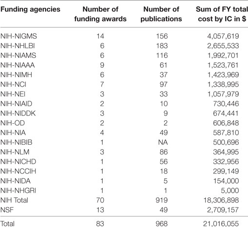
Table 3. NIH ICs and NSF funding grants with IU (co-)PIs that use IT resources.
Publication records were aggregated using the UCSD map of science (Börner et al., 2012), a classification system that assigns each journal to one or more subdisciplines of science that are further aggregated into 13 disciplines of science (e.g., mathematics or biology).5 It should be noted that some journal names retrieved from NIH and NSF vary considerably from the UCSD classification system; several preprocessing steps are necessary, such as lowering cases and normalizing punctuation. There were 245 cases where publication records did not match the UCSD map of science dictionary, and 33 publications were associated with more than one discipline with the same relative association proportion. For these publications, we created two additional categories, “Unclassified” and “Multidisciplinary.” As a result, each publication is associated with one of the 13 disciplines of science. The number of publications per discipline is given in Table 4.
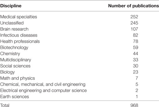
Table 4. Number of publication per discipline associated with the NIH and NSF awards.
Finally, all aggregated data and linkage tables were converted to JSON format as required by the visualization plugin in the XDMoD VA portal. The conversion script is available at http://cns.iu.edu/2017-Value-Analytics.html. The JSON format specification for the Funding and Publication Impact and Co-PI Collaboration Network visualizations is illustrated in Figures 3 and 4.
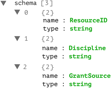
Figure 3. JSON data schema for the Funding and Publication Impact visualization plugin.
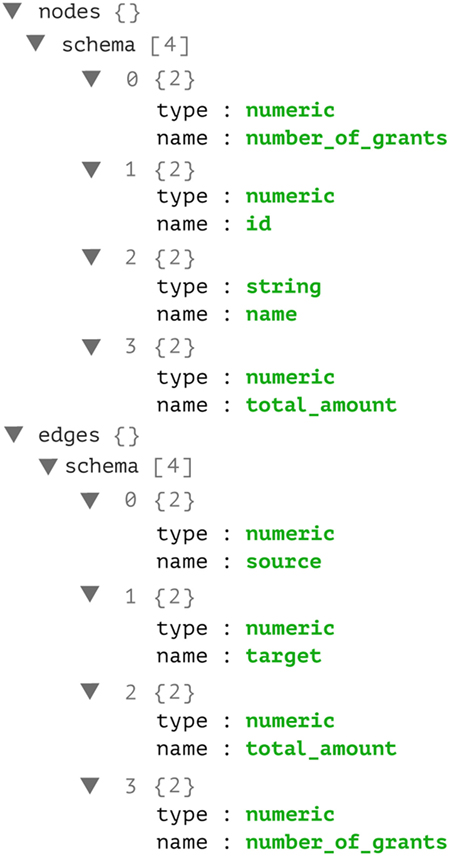
Figure 4. JSON data schema for the Co-PI Collaboration Network visualization plugin.
Methods
Collaboration Network Extraction
The Co-PI Collaboration Network was extracted from NIH grant data as described in Section 3. Co-PIs were calculated by first matching the IU grant database’s “Agency Award Number” to the NIH “Core Project Number,” and then splitting the NIH “Other PI or Project Leader(s)” field by semicolon and counting the number of grants and total grants for each co-author pair to compute the weight for collaboration edges. For NSF, the Co-PI information was extracted from the field “coPDPI,” which also includes Co-PI’s IDs. These IDs were removed and the field was split by comma.
Sankey Graphs and Force Network Layout in WVF
Sankey Graphs
Sankey graphs show the magnitude of flow between nodes in a network as well as the relationship between flows and their transformation (Riehmann et al., 2017). For the Funding and Publication Impact graph, we used the D3 Sankey API.6 It reads input nodes and weighted links and computes positions using the Gauss–Seidel iterative method (Barrett et al., 1994). First, the horizontal position of the left-most nodes is computed; then, nodes further on right are positioned while minimizing link distance. After all the nodes are positioned, a reverse pass is made from right-to-left, and overlapping nodes are moved to minimize collision. The entire process is repeated several times to optimize the layout.
The final visualization features three types of nodes, namely IT resources on left, funding (e.g., NIH institutes and NSF) in middle, and publication disciplines on right. The height of a bar, or node, is proportional to the maximum of the weighted sum of incoming links and the weighted sum of outgoing links. The nodes are placed in ascending order by their heights.
Force-Directed Graphs
Force-directed graphs are used to display the relationship between objects by calculating the position of each node based on their shared edges. The D3 force-directed graph7 applies three primary forces upon the nodes: namely, the sum of all forces, a force between two linked nodes, and a central force using the layout algorithm by Dwyer et al. (2006). The WVF applies linkStrength as a parameter to calculate node positions and it is constant for all nodes.8 In the Co-PI Collaboration Network visualization, the nodes are Co-PIs and edges represent their research collaborations. Node size corresponds to the number of grants and node color denotes the total funding amount in US dollars per PI. Edge thickness indicates the number of coauthored grants.
The WVF
The WVF was used to build both visualizations.9 WVF is a highly configurable packaging of several industry-standard web libraries (Angular, D3, HeadJS, Bootstrap, and many others) that allows its users to quickly build visualization applications. Existing WVF visualizations support rendering interactive horizontal bar graphs, geospatial maps, network graphs, bimodal graphs, science maps, and others. The WVF provides lightweight in-browser aggregation and analysis, but it relies on web services or external data sources to provide primary analyses. Applications built using WVF plugins allow each visualization within a page to use data from and interact with other visualization plugin elements, but through loosely coupled data connections. This allows for both the visualization elements and the aggregation and filtering methods to be replaced or removed without affecting other elements.
Results
This section explains how the data and methods discussed above are applied to IU institutional data and what insights were gained. Specifically, we describe the Funding and Publication Impact and Co-PI Collaboration Network visualizations, as well as the portal that supports easy access to both. The visualizations aim to help stakeholders understand the financial ROI measured in terms of total acquired funding and academic ROI measured by publications associated with these awards.
XDMoD VA Portal
The XDMoD portal is an interactive dashboard with an intuitive graphical interface to XDMoD metrics such as number of jobs, service units charged, CPUs used, or wait time (Furlani et al., 2012). XDMoD metrics can be broken down by field of science, institution, job size, principal investigator, and resource. Academic metrics (e.g., publications, citations, and external funding) can be uploaded by users or incorporated by institutions via Open XDMoD (Fulton et al., 2017). XDMoD VA adds new functionality by offering metrics on financial and scientific impact via visualization plugins, as illustrated in Figure 5. Key features of the VA interface include the ability to interact and drill-down, allowing users to access additional related information simply by clicking inside edges and nodes or selecting the desired filters.
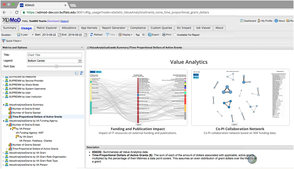
Figure 5. XD metrics on demand value analytics Portal, see interactive version at http://demo.cns.iu.edu/xdmod-p/portal.html.
XDMoD Funding and Publication Impact Visualization
The Funding and Publication Impact visualization allows users to interactively explore the relations between IT resource usage (on left in Figure 6), funding awards aggregated by NIH institute and NSF (in middle), and publications that cite this funding aggregated by scientific discipline (on right). Sankey graph links take users on an exploratory quest, moving from the IT resources via funding to papers published in diverse scientific disciplines.
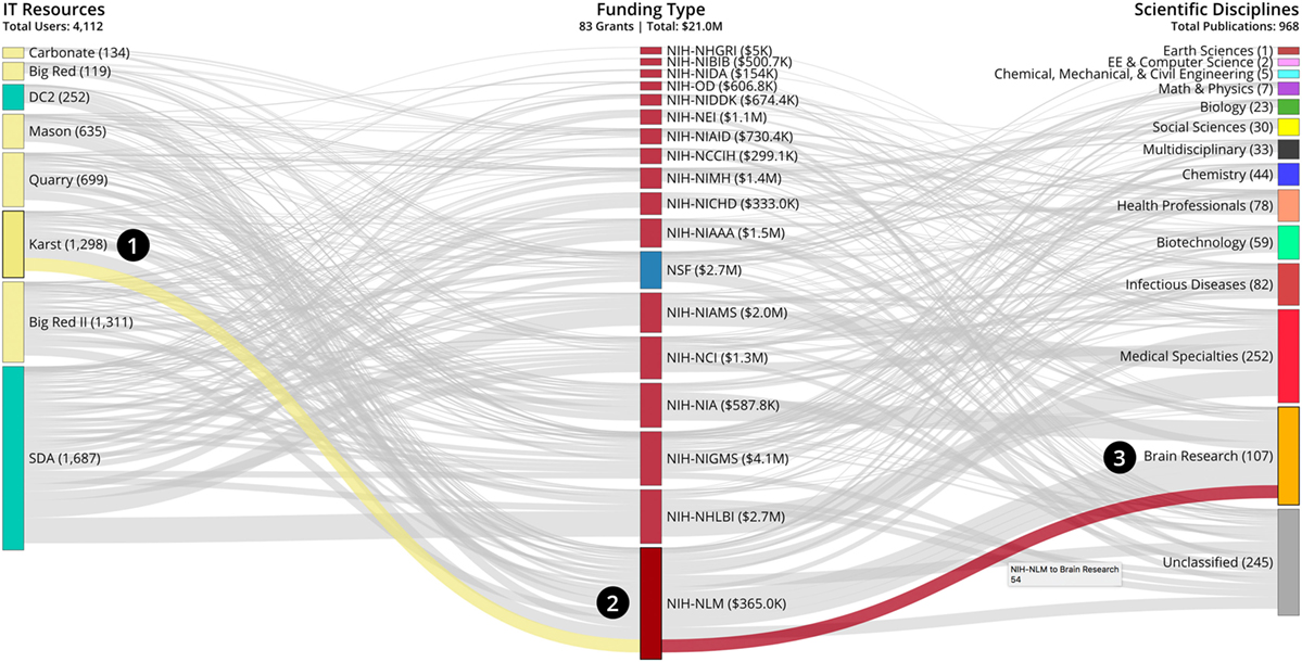
Figure 6. XD metrics on demand value analytics Funding and Publication Impact Visualization, see interactive version at http://demo.cns.iu.edu/xdmod-p/impact.html.
In this interactive visualization, users are provided with various functionalities on demand, such as mouse-over and selection; a legend explaining color and size coding can be viewed on demand. For example, hovering over a particular node will cause that node and all links emanating from it to be highlighted, whereas hovering over a particular link will highlight that link with the color of the node from which the link originated, as illustrated in Figure 6. In this example, the user wishes to explore the connections between IT resource use, grant funding, and the number of publications in the field of Brain Research from Scientific Discipline (3). After hovering over one of the links connected to the Brain Research node from the Scientific Discipline category on the right, the common link will connect Brain Research publications with the funding agency from the Funding category (2) and IT Resources (1). Hovering over a link also brings up additional information relevant to the node (e.g., number of papers, here 54). To explore other links and nodes, the user can simply double-click on them to reset. The example in Figure 6 also illustrates how the user may gain insights from the visual data. In particular, the user’s selection reveals that 54 out of 107 papers in Brain Research acknowledge NIH-NLM funding and that the grants associated with these papers utilized Karst, as a computing IT resource.
Interpretation
The visualization shows that in 2012–2017, a total of 114,894 GB and 65,495,118,259 CPU hours were used by externally funded projects that had associated publications. The grant income to IU by PIs and Co-PIs which use IU HPC resources—for researchers who had both awards and publications during the period analyzed—is $21,016,055. A majority of this funding comes from NIH projects that total $18,306,898 (87%) with the top three ICs being NIH-NIGMS, NIH-NHLBI, and NIH-NIAMS. In terms of publications, IT resource usage, via grants, links to 968 publications. Brain Research, Medical Specialties, and Infectious Diseases have the largest number of publications.
XDMoD VA Co-PI Network Visualization
The Co-PI Collaboration Network visualization is shown in Figure 7. It features a force-directed network layout on the left and a sorted horizontal bar graph on the right. Both visualizations are coupled so that hovering over an investigator in the network highlights that same investigator in the bar graph. The node size for each investigator indicates the number of grants received, while the node color indicates the total award amount; see legend in interactive visualization for details. If two investigators collaborated (i.e., their names are listed together on a grant), there exists an edge between them. The thickness of this edge represents the number of times they collaborated together. To see collaborations in the network, simply hover over the node of a particular investigator. This will highlight the selected investigator node and all emanating edges leading to other collaborator nodes in that investigator’s network. Similarly, hovering over a bar in the bar graph highlights all corresponding entries and renders other bars opaque for easy viewing of the selection. The range filter on the top (1) can be used to increase or decrease the number of node labels in the network visualization. The plus and minus buttons in the top left can be used to zoom in and out. During zooming, the legend is automatically updated to ensure that node values and edge thickness remain accurate.
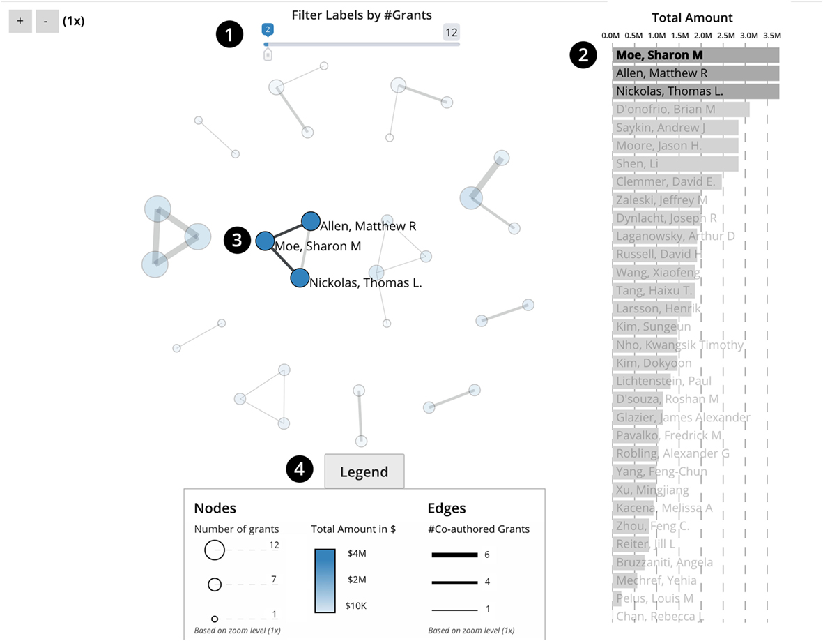
Figure 7. XD metrics on demand value analytics Co-PI Network Visualization, see interactive version at http://demo.cns.iu.edu/xdmod-p/co-pi.html.
Interpretation
The visualization helps identify three key elements of the academic and financial impact: namely, the number of awards, their total dollar amount, and research collaborations. Collaborations are rendered as a network with nodes representing researchers and edges denoting their Co-PI relationships. Given the rather short time frame, there are many, relatively small collaboration clusters. Most links are thin, indicating a one-time collaboration; there are few instances of multiple collaborations denoted by a thicker edge between nodes. A slider (1) filters labels by the number of grants. The legend (4) provides additional insights on the number of grants, their total amount, and the number of co-authored grants. The Total Amount column on the right (2) shows researchers sorted by total funding during the years 2012–2017. By selecting a (co-)PI bar (2), the collaboration network for that (co-)PI is highlighted (3).
Discussion and Outlook
The work presented in this paper aims to help researchers, administrators, and funders understand and communicate the impact of campus CI investments on scholarly productivity in terms of funding intake, publication output, and scholarly networks. The visualizations enable academic institutions to better understand ROI on advanced CI for different types of research (e.g., as expressed by NIH ICs and disciplines of science). As part of the work, we demonstrated different methods for collecting and processing publicly available data from NIH and NSF official sites and from institutional production systems that advance the functionality of the XDMoD VA portal.
Expanding on the work by Knepper and Börner (2016), we primarily focused on the relationship between storage and computing resources utilized by (co-)PIs and associated funding and publication records. Grant income to the university by (co-)PIs who used IT resources during the period analyzed was $339,013,365 for 885 NIH and NSF projects and grant income from (co-)PIs who used IT resources and had both grant awards and publications was $21,016,055. A total of 968 publications were associated with 83 of these NSF and NIH awards. In addition, the results show that Brain Research, Medical Specialties, and Infectious Diseases are the top three scientific disciplines ranked by their publication records during the given time period. Note that only awards associated with publications and IT resources are displayed; and only funding from two agencies, namely NIH and NSF, is shown.
In the future, we plan to advance the presented work as follows:
• Institutions will be able to upload not only IT compute cycles and storage usage counts but also information on storage size and number of compute cycles to provide additional insights into usage patterns across scientific disciplines.
• Funding data will be automatically retrieved via NIH RePORTER and NSF APIs, reducing the amount of manual work involved. Both online resources can be queried periodically to update award and publication data. Data from other funding agencies might be added as well.
• Fuzzy matching algorithms will be implemented to increase the number of journals mapped to scientific disciplines. This will help reduce the number of publications designated as Unclassified.
As Fulton et al. (2017) state, “measuring intellectual outcomes is difficult, particularly since the results of intellectual accomplishments may take years or decades to be fully realized.” To evaluate data quality and data matching (e.g., by PI name), we are working on a comparison of data retrieved from NSF/NIH versus data available via IU’s Sponsored Research production databases. Results will help understand data issues and optimize matching algorithms. Understanding the value of investment in CI is challenging, as the impact of such investments has many dimensions, including intellectual contributions and financial impact. The XDMoD VA modules facilitate understanding of the role CI by analyzing a number of metrics and allowing visualization of the diverse ways in which they impact institutional planning and strategy as well as the development of human knowledge.
Author Contributions
Performed data preparation: OS, BF. Analyzed data: OS, KB. Designed visualization: GS, SB, KB. Wrote the paper: OS, KB, GS, SB, SH, MRL.
Conflict of Interest Statement
The authors declare that the research was conducted in the absence of any commercial or financial relationships that could be construed as a potential conflict of interest.
Acknowledgments
The authors would like to thank Tom Furlani and his team at the University at Buffalo for their leadership in developing XDMoD; Winona Snapp-Childs, and Robert Henschel of UITS at IU for their expert input to the design and implementation of XDMoD VA; and Todd Theriault and Craig A. Stewart for edits and comments on an earlier draft of this paper. This work was partially funded by the National Science Foundation under grants 1053575 and 1566393, and also supported by the IU Pervasive Technology Institute. Any opinions, findings, and conclusions or recommendations expressed in this material are those of the authors and do not necessarily reflect the views of the National Science Foundation.
Footnotes
- ^https://exporter.nih.gov/ExPORTER_Catalog.aspx.
- ^https://projectreporter.nih.gov/reporter.cfm.
- ^https://www.nsf.gov/developer/.
- ^http://api.nsf.gov/services/v1/awards.json?awardeeName=%22Indiana+University%22&offset=26&startDateStart=01/01/2012&printFields=id,publicationResearch,agency,startDate,expDate,fundProgramName,title,piFirstName,piLastName,estimatedTotalAmt,coPDPI,primaryProgram,awardeeCity,awardeeName.
- ^http://cns.iu.edu/2012-UCSDMap.html.
- ^https://bost.ocks.org/mike/sankey/.
- ^https://bl.ocks.org/mbostock/4062045.
- ^https://github.com/d3/d3-3.x-api-reference/blob/master/Force-Layout.md.
- ^https://github.com/cns-iu/wvf.
References
Apon, A., Ahalt, S., Dantuluri, V., Gurdgiev, C., Limayem, M., Ngo, L., et al. (2010). High performance computing instrumentation and research productivity in U.S. universities. J. Info. Technol. Impact 10, 87–98.
Barrett, R., Berry, M., Chan, T. F., Demmel, J., Donato, J. M., Dongarra, J., et al. (1994). Templates for the Solution of Linear Systems: Building Blocks for Iterative Methods, 2nd Edn. Philadelphia, PA: SIAM.
Börner, K., Klavans, R., Patek, M., Zoss, A. M., Biberstine, J. R., Light, R. P., et al. (2012). Design and update of a classification system: the UCSD map of science. PLoS ONE 7:e39464. doi: 10.1371/journal.pone.0039464
Dwyer, T., Marriott, K., and Wybrow, M. (2006). “Integrating edge routing into force-directed layout,” in Graph Drawing, eds M. Kaufmann, and D. Wagner (Berlin: Springer), 8–19.
Fulton, B., Gallo, S., Henschel, R., Yearke, T., Börner, K., DeLeon, R. L., et al. (2017). “XDMoD value analytics,” in Proceedings of the Practice and Experience in Advanced Research Computing 2017 on Sustainability, Success and Impact – PEARC17, 1–7. doi:10.1145/3093338.3093358
Furlani, T. R., Gentner, R. J., Patra, A. K., von Laszewski, G., Wang, F., Palmer, J. T., et al. (2013a). “Using XDMoD to facilitate XSEDE operations, planning and analysis,” in Proceedings of the Conference on Extreme Science and Engineering Discovery Environment Gateway to Discovery – XSEDE ’13 (New York, NY: ACM Press).
Furlani, T. R., Jones, M. D., Gallo, S. M., Bruno, A. E., Lu, C.-D., Ghadersohi, A., et al. (2013b). Performance metrics and auditing framework using application Kernels for high-performance computer systems. Concurr. Comput. 25, 918–931. doi:10.1002/cpe.2871
Furlani, T. R., Schneider, B. I., Jones, M. D., Towns, J., Hart, D. L., Patra, A. K., et al. (2012). “Data analytics driven cyberinfrastructure operations, planning and analysis using XDMoD,” in Proceedings of the SC12 Conference (Salt Lake City, Utah). Available at: https://laszewski.github.io/papers/vonLaszewski-draft-data-analytics-planing.pdf
Hart, D. L. (2011). Measuring TeraGrid: workload characterization for a high-performance computing federation. Int. J. High Perform. Comput. Appl. 25 (4) 451–465. doi:10.1177/1094342010394382
Iosup, A., Dumitrescu, C., Epema, D., Li, H., and Wolters, L. (2006). “How are real grids used? The analysis of four grid traces and its implications,” in 2006 7th IEEE/ACM International Conference on Grid Computing (Washington, DC: IEEE Computer Society Press), 262–269.
Katz, D. S., Hart, D., Jordan, C., Majumdar, A., Navarro, J. P., Smith, W., et al. (2011). “Cyberinfrastructure usage modalities on the TeraGrid,” in Proceedings of the 2011 IEEE International Symposium on Parallel and Distributed Processing Workshops and Phd Forum (Washington, DC: IEEE Computer Society Press), 932–939.
Knepper, R. (2011). “The shape of the TeraGrid,” in Proceedings of the 2011 TeraGrid Conference on Extreme Digital Discovery – TG ’11 (New York, NY: ACM Press).
Knepper, R., and Börner, K. (2016). Comparing the consumption of CPU hours with scientific output for the extreme science and engineering discovery environment (XSEDE). PLoS ONE 11. doi:10.1371/journal.pone.0157628
Lee, B.-S., Tang, M., Zhang, J., Soon, O. Y., Zheng, C., Arzberger, P., et al. (2006). “Analysis of jobs in a multi-organizational grid test-bed,” in Proceedings of the Sixth IEEE International Symposium on Cluster Computing and the Grid (CCGRID’06) (Washington, DC: IEEE Computer Society Press), 59.
Li, H., Groep, D., and Wolters, L. (2005). “Workload characteristics of a multi-cluster supercomputer,” in Lecture Notes in Computer Science, eds D. Feitelson, L. Rudolph, and U. Schwiegelshohn (Berlin: Springer), 176–193. doi:10.1007/11407522_10
Madhavan, K., Elmqvist, N., Vorvoreanu, M., Chen, X., Wong, Y., Xian, H., et al. (2014). DIA2: web-based cyberinfrastructure for visual analysis of funding portfolios. IEEE Trans. Vis. Comput. Graph 20, 1823–1832. doi:10.1109/TVCG.2014.2346747
Newby, G., Apon, A., Berente, N., Eigenmann, R., Fratkin, S., Lifka, D., et al. (2014). “Return on investment from academic supercomputing,” in Presentation at SC14 (Supercomputing 2014). Available at: https://scholarworks.iu.edu/dspace/handle/2022/19242.
NIH. “RePORTER User Manual.” Research Portfolio Online Reporting Tools. (2017). Retrieved from: https://projectreporter.nih.gov/RePORTER_Manual_files/RePORTERManual.pdf
Palmer, J. T., Gallo, S. M., Furlani, T. R., Jones, M. D., Deleon, R. L., White, J. P., et al. (2015). Open XDmoD: a tool for the comprehensive management of high-performance computing resources. Comput. Sci. Eng. Available at: http://www.buffalo.edu/content/dam/www/ccr/pdfs/OpenXDMoD_preprint.pdf
Riehmann, P., Hanfler, M., and Froehlich, B. (2017). “Interactive sankey diagrams,” in Proceedings of the 2005 IEEE Symposium on Information Visualization (INFOVIS ‘05) (Washington, DC: IEEE), 233–240. doi:10.1109/INFVIS.2005.1532152
Shneiderman, B. (1996). “The eyes have it: a task by data type taxonomy for information visualizations,” in Proceedings of the IEEE Symposium on Visual Language, 336–43 (Washington, DC: IEEE Computer Society Press).
Stewart, C. A., Knepper, R. D., Link, M. R., Pierce, M., Wernert, E. A., and Wilkins-Diehr, N. (2017). “Cyberinfrastructure, science gateways, campus bridging, and cloud computing,” in Encyclopedia of Information Science and Technology, 3rd Edn, Vol. IX (Hershey. PA). Available at: http://www.igi-global.com; http://hdl.handle.net/2022/18608
Stewart, C. A., Roskies, R., Knepper, R., Moore, R. L., Whitt, J., and Cockerill, T. M. (2015). “XSEDE value added, cost avoidance, and return on investment,” in Proceedings of the 2015 XSEDE Conference on Scientific Advancements Enabled by Enhanced Cyberinfrastructure – XSEDE ’15 (New York, NY: ACM Press), 1–8. doi:10.1145/2792745.2792768
Thota, A. S., Fulton, B., Weakley, L. M., Henschel, R., Hancock, D. Y., Allen, M., et al. (2016). “A PetaFLOPS supercomputer as a campus resource,” in Proceedings of the 2016 ACM on SIGUCCS Annual Conference – SIGUCCS ’16 (New York, NY: ACM Press), 61–68
Keywords: information visualization, scientometrics, impact analysis, grant income, return on investment, value analytics, high-performance computing
Citation: Scrivner O, Singh G, Bouchard SE, Hutcheson SC, Fulton B, Link MR and Börner K (2018) XD Metrics on Demand Value Analytics: Visualizing the Impact of Internal Information Technology Investments on External Funding, Publications, and Collaboration Networks. Front. Res. Metr. Anal. 2:10. doi: 10.3389/frma.2017.00010
Received: 31 August 2017; Accepted: 28 November 2017;
Published: 29 January 2018
Edited by:
Kevin Boyack, SciTech Strategies, Inc., United StatesReviewed by:
Antonio Perianes-Rodriguez, Universidad Carlos III de Madrid, SpainRicardo Arencibia-Jorge, Centro Nacional de Investigaciones Científicas, Cuba
Copyright: © 2018 Scrivner, Singh, Bouchard, Hutcheson, Fulton, Link and Börner. This is an open-access article distributed under the terms of the Creative Commons Attribution License (CC BY). The use, distribution or reproduction in other forums is permitted, provided the original author(s) and the copyright owner are credited and that the original publication in this journal is cited, in accordance with accepted academic practice. No use, distribution or reproduction is permitted which does not comply with these terms.
*Correspondence: Olga Scrivner, b2JzY3Jpdm5AaW5kaWFuYS5lZHU=