 Dario Rodighiero
 Frédéric Kaplan
 Boris Beaude
- 1Digital Humanities Laboratory (DHLAB), College of Humanities, Digital Humanities Institute, École polytechnique fédérale de Lausanne (EPFL), Lausanne, Switzerland
- 2Sciences and Technologies Studies Laboratory (STSLAB), Faculty of Social and Political Sciences, Institute of Social Sciences, University of Lausanne (UNIL), Lausanne, Switzerland
Scholarly affinities are one of the most fundamental hidden dynamics that drive scientific development. Some affinities are actual, and consequently can be measured through classical academic metrics such as co-authoring. Other affinities are potential, and therefore do not leave visible traces in information systems; for instance, some peers may share interests without actually knowing it. This article illustrates the development of a map of affinities for academic collectives, designed to be relevant to three audiences: the management, the scholars themselves, and the external public. Our case study involves the School of Architecture, Civil and Environmental Engineering of EPFL, hereinafter ENAC. The school consists of around 1,000 scholars, 70 laboratories, and 3 institutes. The actual affinities are modeled using the data available from the information systems reporting publications, teaching, and advising scholars, whereas the potential affinities are addressed through text mining of the publications. The major challenge for designing such a map is to represent the multi-dimensionality and multi-scale nature of the information. The affinities are not limited to the computation of heterogeneous sources of information; they also apply at different scales. The map, thus, shows local affinities inside a given laboratory, as well as global affinities among laboratories. This article presents a graphical grammar to represent affinities. Its effectiveness is illustrated by two actualizations of the design proposal: an interactive online system in which the map can be parameterized, and a large-scale carpet of 250 square meters. In both cases, we discuss how the materiality influences the representation of data, in particular the way key questions could be appropriately addressed considering the three target audiences: the insights gained by the management and their consequences in terms of governance, the understanding of the scholars’ own positioning in the academic group in order to foster opportunities for new collaborations and, eventually, the interpretation of the structure from a general public to evaluate the relevance of the tool for external communication.
Introduction
Science mapping is a research field that deals with visual representations of science. The digital traces employed to create visualizations stand for the information that scholars leave behind them during the daily practice (Börner, 2015). This field puts together the experience inherited from bibliometrics, whose father is acknowledged as being Eugene Garfield (1970), and data visualization, which reassembles practitioners from diverse disciplines from the nineties (Tufte, 1990).
Probably due to the legacy of bibliometrics, science mapping is highly related to the study of publications. Without questioning the value of academic writing, which is still the major form of dissemination for scholarly research, we consider a larger meaning to bibliometrics that might include the multiplicity of academic activities. Writing is not the only activity requested to scholars, and education is equally relevant in their daily practice.
This article deals with the notion of affinities, which is used to study the richness of academic practice. The concept of affinity is relative to the closeness between peers: scholars share an affinity when they have something in common, an interest, a research discipline, a spoken language, a career, etc. This similarity presupposes that the potential of cooperation becomes real when a collaboration takes place. Since its great relevance in the study of academic literature, we widen the collaboration in order to embrace the entire academic practice. The concept of affinity does not only take into account ongoing collaborations, but also the potentiality that lies in an academic collective. In this sense, the actuality of collaboration relies on its potentiality. Through the affinity, we attempt to measure the coexistence of both the actuality and the potentiality of research collectives, in order to create a visualization that invites the exploration of current collaborations and the discovery of new synergies.
Actual and Potential Affinities
Affinities are multiple, and multiplicity implies actual and potential affinities (Deleuze and Parnet, 2007, p. 148). Potential affinities identify all of the possible synergies that exist in a given collective of research. These are evanescent and difficult to grasp, since they change continuously. Peers share a potential affinity when they work in the same building, have a common interest, write e-mails to each other, were friends during college, or share a same tennis court. These are certain circumstances in which an acquaintance can lead to a collaboration.
Sometimes the potential is actualized transforming the potential affinity into an actual affinity. In the academic environment, major actual affinities are easily identifiable through publications, courses, and supervision. However, actual affinities are not always visible because they are lost in the Web, they are not accessible, or simply their digital traces do not exist. For instance, joining a committee is an actual affinity that is not always stored in information systems and, therefore, accessible.
The fact that actual affinities stabilize potential affinities implies that they share the same space, in which actuality and potentiality mix themselves. The actual overlaps the potential in this space, and the potential is ready for being actualized. The visualization creates a space where both actuality and potentiality contribute to give stability to the collective of research. In other words, the visualization makes visible the process of stabilization that occurs in the academic environment.
Whether easy or hard to find, the affinity has to be recorded in order to exist as a digital trace. The concept of traces is widely employed in social science to represent the meticulous activities that individuals perform daily (Latour, 1999; Ingold, 2007). Documents on Academia.edu, the posts on Twitter, and the commits on GitHub are all examples of visible traces. Yet traces can be invisible as in the case of a laptop connecting to the Wi-Fi, or a mobile application logging for parking. Furthermore, not all activities are transformed into digital traces. For example, informal meetings are not recorded. As a consequence, we witness a reduction of traces related to academic practice.
Spatiality
This mapping is profoundly spatial (Lussault, 2013). Relations between entities are translated into spatial distances. Without these distances any visualization would exist, collapsing into a single point (Lévy, 2013b). Creating a visualization of affinities implies to make explicit the correspondence between the spaces of academic practice (i.e., the connections between scholars) and its representation (i.e., the connections between graphical elements).
The spatiality of actual affinities, which consists of all the concrete relationships that scholars establish in order to do science and education, is the result of all the digital traces coming from academic activities. Co-teaching, co-publishing, and co-advising are always made of actual relationships between people. Using the data related to these activities, we accept to translate the practice into information in order to describe it. Using these digital traces, it is possible to display academic practices. Each trace of affinity corresponds to a specific metric that has to be translated in turn as a distance in the space.
This spatial projection is the second reduction to carry out. Reductions are the result of an operation of translation, which is necessary to change the language and the context of information (Callon, 1984). To draw affinities, academic practice is transformed into digital traces, which are subsequently transformed into a visual geometry. With any translation, we face both a loss and a profit: a loss because each transformation is necessarily a reduction in terms of size, and a profit because the new form gives something employable in different contexts, such as visual language.
Maps as Instruments of Governance
That double process of translation allows us to create a map of affinities, which hereinafter is called Affinity Map. Yet why use the term map? Maps are artifacts that belong to the larger family of visualizations. What distinguishes a map from a visualization is its specific use, such as navigation or orientation. For that reason, we refer to maps as instruments conceived for a specific use. In that specific context, the Affinity Map makes visible the academic practice in order to be used as an instrument of governance.
That word governance has been reintroduced in the common language at the beginning of the twentieth century, being usually utilized in rhetorical and solemn contexts (Garner, 2016, p. 437). Today, the governance corresponds to the idea that being in control is a task applicable to both managers and employes. Complexity of organizations prevents that a decision is addressed only to the management, involving a larger number of employes. Governance is a combination of top-down and bottom-up decision-making (Pierre and Peters, 2000, p. 19). According to this meaning, the Affinity Map is devised as an instrument of both collective organization for the directors that operates at global scale, and self-organization for the scholars that have the freedom to regulate their work at individual scale.
This bidirectional approach points out the duality between the collective and its members. On the one hand, there is an urge to see the wholeness of the collective; on the other hand, the same collective can be regulated just by looking at the level of the individuals. The concept of the whole and the parts that compose the whole first arose with Aristotle (Cohen, 2000) and was later reused by the Gestalt theory. Among them, the philosopher and psychologist Christian von Ehrenfels reformulated the former Aristotelian concept by saying that the “whole is somehow more than the sum of its parts” (Ehrenfels, 1937, p. 523). More recently, Bruno Latour revisited that statement claiming that the whole view relies on individual traces (Latour et al., 2012). With respect to the three standpoints, we recognize the importance of both the whole view and the smallest elements. However, we also believe that a complex organization of elements relies upon its hierarchical structure, which is molded between the opposites. This assumption brings us to propose a solution that lies somewhere in between. In that sense, the Affinity Map is a matter of the coexistence between the individuals, the collective, and the organizational structure.
Mapping Collectives and Individuals
The Affinity Map is a visualization that conciliate two levels of representation, the collectives and the individuals. Its design reveals a tendency toward governance addressing two major audiences, the management and the scholars. As a result, the map blends together two domains of visualization: one concerning organizational charts that are common in industry, and one regarding the connectivity of individuals in social environment. A visual investigation illustrates how the visualization of collectives changed in the last century and a half in a sequence of examples.
The engineer Daniel McCallum drew a railroad planning during the first half of the nineteenth century. At that time, he was responsible for the organization of employes for the New-York Railroad and the Erie Railroad. McCallum’s planning is recognized as the beginning of organizational charts in modern history (Rosenthal, 2013). The meticulousness of the detail strikes by depicting individuals of all roles one by one, in the directive as well as in the operational units. That artifact is the result of a meditated process of design that involved different skills and many hours of work (Harley, 2001, p. 125). From the image emerges a tree-like shape, which is an ancient and widespread type of representation (Lima, 2014). However, through a more accurate analysis, a diversified space emerges as two kinds of spatializations: a topographical arrangement of the railroads at the top and a topological organization of the management at the bottom.
At the beginning of the twentieth century, Willard C. Brinton, another engineer, studied the importance of visualization, especially for industry. That issue was so important to him that he wrote two major books on the subject (Brinton, 1919, 1939). In particular, Graphic Methods for Presenting Facts has a whole chapter dedicated to organizational charts where Brinton shows a typical simplification of an organizational structure (Brinton, 1919, p. 14). At that time, the Industrial Revolution influenced the mentality as much as the figurative systems: the tree in the visualization is now horizontally flipped. At the top, the roots clearly say that the president is recognized as the most important person. Furthermore, the structural complexity has been reduced by transforming departments in functional elements. Looking at these charts, we witness the disappearance of the individual.
A few years before the Brinton’s first book, the social scientist Jacob Levy Moreno introduced what everyone refers to nowadays as the network visualization (1934). Moreno, who moved to the USA during the time of Nazi Germany, introduced visualizations in his work to study relations of friendship (Scott, 2000, p. 9). Moreno created a friendship network based on interviews that conducted with a limited number of subjects (Moreno, 1934, p. 33). Nodes represent individuals, and lines correspond to friendships. Lines also illustrate the direction of a certain friendship, otherwise they present an orthogonal stroke in the middle to indicate a reciprocal tie. Moreno pointed out the significance of the visual approach in social sciences, attaching importance to the individual.
Approximately 40 years later, Allen Gordon drew the first citation visualization (Garfield, 1970, p. 134). The similarity with Moreno’s visualization is noticeable in spite of the time gap. Furthermore, today the same visual language is still in use, such as in the case of co-authorship studies (Börner et al., 2005).
At the end of the twentieth century, Mark Lombardi used the network as an instrument of investigation and communication. Lombardi indeed found that networks were a very powerful way to organize his studies concerning crime and conspiracy networks. It is interesting also to notice that Lombardi was greatly influenced by data visualization, especially by Sir Edward R. Tufte (Lombardi and Hobbs, 2004, pp. 43–46). Lombardi introduced two major innovations through his artwork. First, he introduced a very strong visual esthetic that is still inspiring the design of networks today. Second, he gave an identity to individuals by using their own names. For example, Lombardi displays his inquiry on Bill Clinton and the Lippo group through a network where nodes correspond to organizations and individuals (Lombardi and Hobbs, 2004, pp. 111–113). The names of all the individuals involved in the scandal are clearly made visible in this handmade artwork.
King’s College London employs actual affinities to illustrate scholar networks (Elena Pierazzo, 2017). The visualization shows an administration system that the publisher Elsevier sells to universities. The ego-network represents the Pierazzo’s academic practice through her collaborations, peers, journals, and external institutions. It is without a doubt a different presentation compared to the standard profile commonly composed of a summary and a list of publications. What radically changed through centralized data and digital traces is the individual representation, which is no longer characterized by publications, but rather by the variety of scientific practice. Representing the practice of scholars is a complex task, but today’s technology is almost ready to describe the academic activity.
Another shift in the visualization field concerns communication. Today, sharing scientific research is increasingly important for many reasons, such as autonomy in funding research (EPFL, 2017, pp. 28–29). As a consequence, institutions are interested in making science public. Moritz Stefaner, for example, created two installations about scientific practice that are permanently exposed at the Max Planck Science Gallery in Berlin and at the ArtLab at in Lausanne (Gego et al., 2006; Stefaner, 2016). In particular, the ArtLab installation displays EPFL professors in a constellation of research disciplines, making their profile publicly visible. The focus here is the public representation of individuals. Through these models, the scholars have another way to be publicly visible in addition to media, conferences, and essays. In a very specific way, scientific practice is opening toward both the scientific and the generic public.
Current Tools
The Affinity Map is a new tool in the market that networks researchers. That market is divided into two classes, which correspond to bottom-up and top-down software. The former class implies that academic data are uploaded and maintained by scholars; ResearchGATE and Mendeley represent an approach that is based on the contribution of their users. The latter class of software asks the organization to populate the database; SciVal and Harvard Catalyst Profiles embrace a top-down model that guarantees more precise data (Vardell et al., 2011; Kim et al., 2014). The Affinity Map belongs to this group.
Therefore, ResearchGATE and Mendeley focus business on online communities. SciVal measures the performance of publications and grants working as an instrument for assessment. Harvard Catalyst Profiles is a tool for researching profiles and fostering collaboration within a very specialized field, medicine.
Among these aims, the Affinity Map intents are closer to the Harvard Catalyst Profiles. Although the two projects are not comparable in terms of size, the design process is totally different. The Harvard Catalyst Profiles output is a website organized in sections giving different instruments with which to interact. On the other hand, the Affinity Map is dedicated to the creation of one visualization representing the collaboration, or more broadly the affinities of an academic collective.
The Affinity Map is based on a canvas technology that makes the rendering fast compared to the SVG standard. The database was created ad hoc to be as free as possible in development. We were aware of the existence of the VIVO project, whose ontology is the only valuable proposal to share academic data (Börner et al., 2012). The freedom we have chosen for working on the project was a good choice; however, we do not exclude a future transformation to match the VIVO ontology standard.
Objectives
The research aims to answer three questions that are related to different parts of this article. First, affinities represent a novel approach to illustrate the intrinsic dynamic of scholars. Given a determined academic collective, are actual and potential affinities identifiable? Second, once these affinities are identified and measured, how to map them? Do actual and potential affinities share the same visual space? How to preserve their scalability and multi-dimensionality? Third, as the map is intended to visually represent scholars who are its users in turn, is possible to validate the map collectively? The first and second issues are tackled in the Section “Materials and Methods” (see The ENAC Case Study and Graphical Grammar). The third issue is discussed in the Interviews, in which we discuss the validation of the Affinity Map (see Interviews).
Materials and Methods
After the introduction, we focus on the act of designing the Affinity Map. This section is structured in three parts: an introduction to the ENAC school and its information sources, a reflection about the problem of evaluation that concerns the scholars, and a description of the graphical grammar that was used to draw the map.
The map is the result of a collaborative design, in which individuals contributed in different ways according to their skills: graphic design, sociology, digital humanities, geography, communication, management, computer science, etc. The group was composed of the authors of this paper, the dean of the ENAC, and a team affiliated to the deanship. Regular meetings were organized over 4 years with the intention to steer collectively the project so as to create a map that may be useful to the school.
The ENAC Case Study
This article describes a map of affinities that relies on the digital traces left by the ENAC. As part of the École polytechnique fédérale de Lausanne (EPFL), the School of Architecture, Civil and Environmental Engineering (ENAC) gathers different disciplines concerning building constructions. The school is composed of almost 1,000 scholars, who are organized in 70 laboratories and 3 institutes: architecture, civil engineering, and environmental engineering. The ENAC represents approximately a quarter of the entire EPFL.
An investigation was necessary to discover the digital traces available on the campus, which were successively selected for their quality and relevancy. The exploration led us to identify three types of actual affinities: the publications stored in the Infoscience system, the courses organized in the IS-Academia service, and the supervision of postdocs and PhD candidates equally recorded in IS-Academia. However, traces concerning potential affinities did not reach a good enough standard to be used. Publication keywords offered interesting insights, but their authorship was too diverse to create a homogeneous corpus. As a result, we decided to generate potential affinities using an algorithm of a text mining algorithm based on the ENAC publications. Besides this, we were able to access some fundamental traces related to the structure of the school: we obtained the laboratory affiliations of the staff and the hierarchical structure of the school.
Publication Repository
The digital traces that are employed to draw the Affinity Map have multiple origins. The first source is Infoscience, which is an information system managed by the EPFL library. Infoscience collects the EPFL publications and makes them available online. The system is based on Invenio, an open-source software created and maintained by the CERN in Geneva that adheres to the Open Archive Initiative, which develops and promotes interoperability standards. Infoscience is accessible through an export of data or a protocol available within the institution. Its publications are enriched by a full set of metadata that counts different information; particularly relevant to the Affinity Map are the authors and the abstracts.
Teaching and Advising Information System
The second source is IS-Academia, which keeps all the information relative to teaching activities. The information system stores courses, teachers, and students from the doctoral schools and the Bachelor’s and the Master’s degrees. IS-Academia is a major resource of the institution and its data are reserved and inaccessible. Only a small part of them are internally available through specific API. In general, raw data are not available for export. However, we obtained a specific export for the information related to the ENAC data, only through an official request made by the deanship. IS-Academia is very relevant for actual affinities as teaching and advising relations are fundamental to enrich the visualization of the academic practice.
Generated Keywords
To solve the issue of potential affinities, we created a text mining algorithm that relies on the publication abstracts stored in Infoscience. Through a mechanism that differentiates a single abstract from the entire corpus, we generated different lists of keywords associated with each laboratory. Furthermore, these lists feature a value that set the importance of each single keyword. The resulting traces use the lexicon to reveal the most meaningful words related to the laboratories. This information allows to measure the spatiality on the basis of the language used in the abstracts, which we assume relevant in order to define the distance in terms of potential affinities.
School Structure
The fourth source is an information system maintained by the VPSI, the Vice Presidency for Information Systems of EPFL. That system collects a large amount of data, the majority of which are private. A specific data set was relevant in order to enrich the map information. Through an export similar to the case of IS-Academia, we obtained three tables: the list of employes and their ID, the hierarchy of laboratories, and the dump of the staff affiliations that connects the laboratories with their members.
Integrating Digital Traces into a Database
Centralization of information sources was an important issue. The best solution was offered by the annual report, which ENAC professors are requested to compile at the end of the calendar year. That report was recently transformed into digital form to speed up its completion and avoid misspellings. The cohesion of interests allowed us to use the annual report as the main centralizing affinities source and, at the same time, to benefit from a data validation system. As the annual report is synchronized with the primary sources, school professors have a semi-automated system at their disposal. The effort to fulfill the report is enormously reduced, and professors are simply asked to check the exactitude of imported data. They also can hide records that might be sensitive—for example, in the case of a nuclear study—and add missing information that could have been accidentally lost. Consequently, this procedure allows not only to improve the data quality but also to validate information that is used in the map. Furthermore, this process contributes to the map’s transparency, making the professors active contributors of the design process (Van Es et al., 2017, p. 178).
Graphical Grammar
The Affinity Map is the result of a series of decisions based not only upon the digital traces, but also upon the visual design. Hereafter, its graphical grammar is presented throughout a zoom movement from the whole school to the individuals. This part is organized in subsections that correspond to distinct graphical principles. Subsections discuss the general principles and the results that inspired each specific solution.
Hexagonal Grid to Improve Reading
The whole visualization situates the ENAC laboratories in the space according to four types of affinities, respectively, advising, publications, teaching, and keywords (see Figure 1). Affinities connect the laboratory according to a force of attraction that is applied to nodes. The more affinities exist between a pair of laboratories, the more their position on the diagram-space will be closer. The map is the result of a mix of actual (advising, publications, and teaching) and potential affinities (keywords), which creates an arrangement that describes the actuality and the potentiality of collaborations.
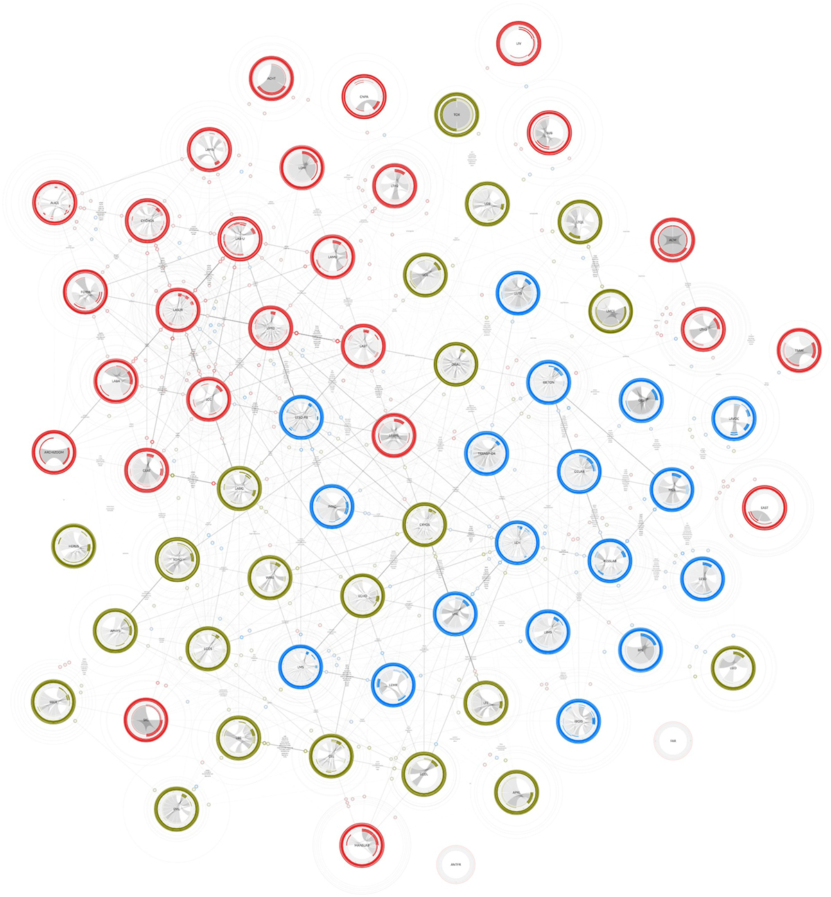
Figure 1. The Affinity Map of the School of Architecture, Civil and Environmental Engineering school. The arrangement is the result of three forces (relational, repulsive, and gravitational) applied to each node. The general arrangement shows the closeness of the laboratories according to actual and potential affinities.
At a macro scale, the colors that characterize the different laboratories are immediately noticeable. These colors correspond to the hierarchical organization of the school, which is made up of three institutes: red for architecture and social sciences (IA), blue for civil engineering (IIC), and green for environmental engineering (IIE). That specific palette had been introduced before starting the project. We applied a standard normalization to that palette, in order to balance the brightness of each color according to a perceptive scale, based on the Lab system (Homann, 2009, pp. 33–57).
At first glance, the general organization of the school is the main information. The network configuration shows how the three institutes are intertwined within the school. An effect of clustering is immediately observable: IA is on the top left, IIC is on the bottom right, and IIE on the bottom left. That arrangement reproduces the academic organization of the laboratories through their affinities.
The network is the result of a system of forces applied to a force-directed graph based on the Verlet integration (Verlet, 1967). The simulation, which is part of the d3.js library (Meeks, 2015), operates individually on all the nodes, treating them as particles. The final arrangement is the result of the sum of forces applied to these particles.
The Affinity Map arrangement relies on three different forces: a force of attraction between the nodes based on the affinities, a force of gravity that keeps the visual unity of the collective avoiding orphans, and a force of repulsion applied to each node that creates the hexagonal grid.
The relational force is applied to laboratories according to their actual and potential affinities. That makes possible the general arrangement that is quantified corresponding to a percentage that was agreed during the design. The percentage of strength is calculated giving to the advising, the teaching, and the keywords a value of 20%, whereas the force of attraction based on publication is weighted at the 30% as we assumed that more important than other affinities.
The gravity force is equally applied to all of the nodes with respect to the center of the visualization. The main reason for using such force is that the Affinity Map is a visualization that represents a collective of research. Displaying some laboratories far from the other means to set them apart, to detach them from the collective. Although the gravity force can produce a less accurate arrangement, we prefer to transmit a sense of collectivity by grouping the laboratories together. Furthermore, as will be discussed later in the Section “Filling the Gap of Regular Spaces,” the closeness of laboratories is used to foster collaborations. Keeping laboratories detached from the collective allows scholars to see potential affinities.
The third force of repulsion naturally creates a regular grid based on the hexagon pattern. That force is equally applied to each node, avoiding, overlapping, and creating a regular space around them. The grid is a way to organize distances in a regular way. Regular alignment through a grid was remarkably used by Harry Beck to make the London underground map more readable (Spence, 2014, pp. 5–6). Furthermore, the hexagonal pattern is widely found in nature for its space optimization (Thompson, 1942, p. 527). The hexagonal grid is, thus, an expedient to improve the readability and guarantee equal distances between nodes. This solution avoids nodes overlapping and reduces the plate-of-spaghetti effect that often appears in highly connected networks.
Breaking Affinities Down into Constellations
Forces corresponding to different affinities can be activated and deactivated to advance the reading and exploring different configurations that we call constellations.
The use of different affinities creates a major visualization issue concerning the multi-dimensionality of relations. In the network visual grammar, these links are merged down into unique lines making the recognition of a specific relation impossible. Although the issue of multi-dimensionality is tackled by satellites in the Section “Satellites Display Links Heterogeneity,” we propose to facilitate reading by decomposing the visualization in different constellations.
Constellations are diagrammatic configurations that represent groups of heavenly bodies; between the seventeenth and nineteenth centuries these diagrams were often collected and published in form of atlases (Kanas, 2007, p. 1). Likewise, the Affinity Map is an atlas that collects four affinity constellations, namely:
– The constellation of advising, which shows the network of advisors and advised (see Figure 2, upper-left corner);
– The constellation of publications, which illustrates the co-authoring network (see Figure 2, upper-right corner);
– The constellation of teaching activities, which displays the collaborations that take place among laboratories (see Figure 2, bottom-left);
– The constellation of keywords, which is a configuration of linguistic similarities based on publication abstracts (see Figure 2, bottom-right).
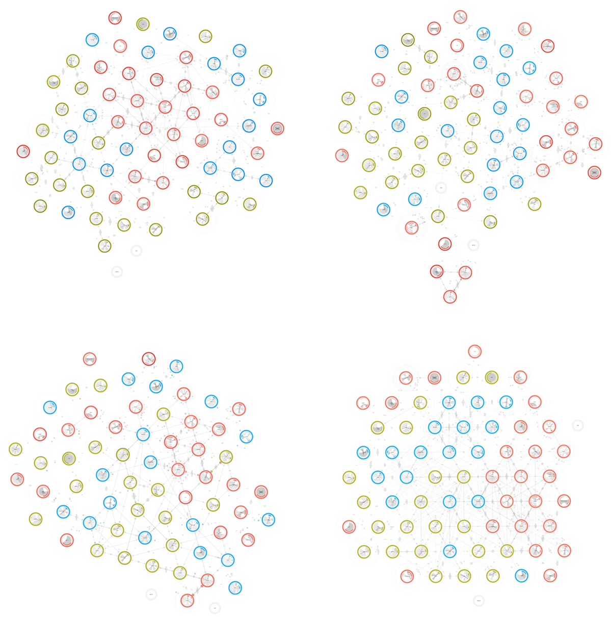
Figure 2. The various constellations of the Affinity Map. The affinities that regulate the distances (see Figure 1) can be activated and deactivated producing different arrangements. Constellations are displayed from the upper-left in text organization, namely advising, publications, teaching, and keywords.
The atlas of the Affinity Map is not only made up of four constellations plus their total sum. Indeed, forces can be reassembled to compose other configurations: for instance, advising and teaching forces arranges laboratories in the constellation of education, and publications and keywords forces constitute the constellation of research.
These constellations allow readers to have further insights into specific affinities of the ENAC. For example, among the constellations we listed above, it is interesting to note that teaching is the most interdisciplinary one (see Figure 2, bottom-left), and advising compacts architecture in one unique group showing the high level of collaboration in the institute (see Figure 2, upper-left corner). The publication constellation makes visible a tight collaboration among three architecture laboratories (see Figure 2, upper-right corner). Obviously, each reader will be more interested in seeing the position of their own laboratory changing according the selected configuration and, as a consequence, observations change according to the reader.
Filling the Gap of Regular Spaces
Potential affinities are the result of a process of data mining we performed on publication abstracts. Abstracts are grouped by laboratories and compared with all of the other abstracts of the ENAC school. The result is a set of lists associated to the laboratories. Each laboratory is, therefore, characterized by a list of weighted keywords that describes it with respect to the whole collective. This lexical procedure allows us to have a description of the most relevant language of each laboratory.
As mentioned previously, keywords are a type of affinity. Although they are already used as a relation, keywords are employed to draw another informative layer that makes closeness between units more explicit. In the geographical jargon we say that such semantic space and network visualization are connected by a relation of interspatiality, i.e., a relation between two spaces. More specifically we refer to this as a relation of cospatiality as the two levels share the same spatial surface (Lévy, 2013a).
This lexical layer is composed of keywords that are associated with laboratories. Once the network forces are stabilized according to a selected constellation, keywords take place between laboratories that are close. The idea is to represent the common vocabulary of two laboratories whether or not an affinity exists between them.
Figure 3, here expressively simplified to highlight keywords configuration, shows how Laboratory of Integrated Performance in Design (LIPID) shares keywords with its neighbors. For instance, the laboratory shares interests with Laboratory of Cryospheric Sciences (CRYOS) namely solar, thermal, climate, and energy.
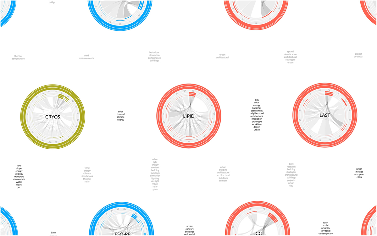
Figure 3. Keywords between laboratories indicate potential affinities. Zooming makes visible the keywords that correspond to laboratory common lexicon. Using the spatialization of the hexagonal grid, keywords adds a further information level that expresses the semantic of the map.
Furthermore, colors indicate the affinity status, respectively black for actual affinities and gray for potential affinities. The black typeface between LIPID and CRYOS indeed identifies an ongoing collaboration.
This supplementary information layer makes the hexagonal grid more meaningful. Its use is not just related to a general improved reading, but the regular spaces created by the grid host the keywords permeating the network visualization with a new type of information. The result is a semantic pattern of expertise that characterizes the map in terms of academic interests.
Satellites Display Links Heterogeneity
When zooming into a laboratory, more details and information appear. Satellites are situated around laboratories and, with the constellations, they are useful to tackle the problem of multi-dimensionality.
Satellites are graphical elements that correspond to actual affinities. They are complementary to the line strokes that usually symbolize links in network visualizations. Both satellites and lines are used in the map to represent actual affinities, whereas potential affinity relations have been hidden to reduce the visual noise.
Satellites and line strokes are complementary for different reasons, one of them concerns the weight of the relation. Lines strokes show the full weight of actual affinities, and form a background indicating the general connectivity of specific areas of the map. On the contrary, satellites indicate the weight of each affinity dividing a value that would be full otherwise. As a consequence, satellites are charged by the multi-dimensionality of the network. The rings that envelop them reflect the weight of all the actual affinities: the inner ring corresponds to advising, the middle one to publications, and the outer one to teaching. The thickness of the rings is proportional with respect to the value of each affinity, and the color is relative to the institute.
Yet the satellite is a visual element that contains more information. Its position indicates the direction and the distance of the related node. The distance between the node and its satellite is relative to the distance between the same node and the related node. As a result, the position of the satellites around a laboratory identifies the placement of the related nodes with respect to the entire map. The resulting context creates a ego-network of a specific node (Scott, 2000, p. 72). However, differing from the classic ego-network approach, satellites create an ego-network for each node of the map.
For instance, as illustrated in Figure 4, the satellites orbiting around LIPID describe laboratory relations. Looking at the colors, we see how the laboratory collaborates with the ENAC institutes; in particular, looking at the rings, it is noticeable that such affinities emanate from teaching activity. In addition, the ring thickness tells us that LIPID has a special alliance with Laboratory of Architecture and Sustainable Technologies (LAST), with which it shares all types of affinities.
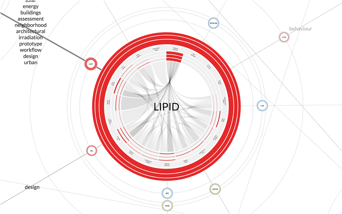
Figure 4. Satellites are the graphical elements that convey link heterogeneity. Their rings represent from the inner advising, publications, and teaching. Furthermore, satellites create an ego-network that summarizes all the actual affinities.
Satellites also tackle the issue of overlapping links. For instance, Figure 4 shows that the laboratories Bioenergy and Energy Planning Research Group (BPE) and Wind Engineering and Renewable Energy Laboratory (WIRE) are situated on the same line. When links have the same direction, common network visualizations prevent from distinguishing such relations. On the contrary, satellites clearly show that BPE is closer than WIRE to LIPID because of the satellites distance (see the lower part of Figure 4).
Individual Collaborations
Zooming finally brings us to the core of the nodes, the laboratories. At that level of detail, individuals represent the smallest entity. The Affinity Map introduces a further level of network that shows the structure of laboratories.
Those specific design choices have different reasons. First, it allows us to simplify the connectivity among laboratories, which would be more difficult to read with individual-to-individual relations. Second, the laboratories are directed by professors, who drive the research in a very personal way; in other words, we can say that the laboratories, at least within the EPFL, are the projection of their own professors’ intentions. Third, the laboratory members are protected by an envelope, beyond which the professor has the entire responsibility for all the activities performed. Fourth, all members whose practices have not been translated into digital traces are part of the laboratory; these members would be disconnected otherwise from the network.
Several visual elements characterize laboratory. The rings that define the borders of the laboratory are indicators of its activity. This activity is normalized according to the average ENAC laboratory, which features three rings of the same thickness. The rings are based on the usual classification: the inner ring for supervision, the middle ring for publications, and the outer ring for the courses. While the sum of the rings has the same thickness to avoid any evaluation in terms of production, there is a variance that indicates the balance of practices. For instance, a major thickness of the middle ring means a preference in research activities. On the contrary, a more evident thickness of the inner and the outer rings corresponds to a more intense activity in education. Figure 5 shows the LIPID from the inside. The inner ring thickness signal a preference in advising activities, while the outer ring shows a moderate contribution in the teaching activity.
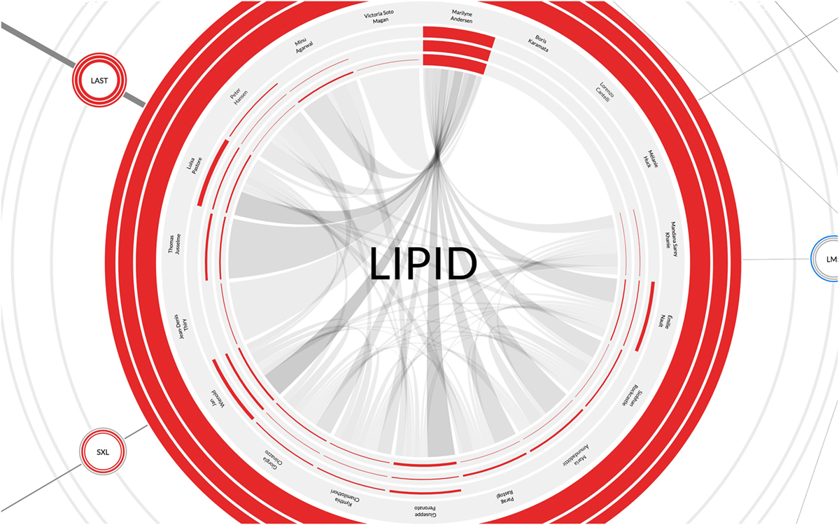
Figure 5. The laboratory node is represented as a network. A chord diagram shows the affinities among the members of the same unit. Then, the usual system of indicators corresponding to advising, publications, and teaching identifies the role of each member (segments of the circumference), and the balance of academic practice of the laboratory (external rings).
A further step inside the visualization shows individuals who work in laboratories, which are organized by seniority clockwise from noon. They are characterized by the name, and the same indexes we encountered in the external rings. With those indicators, each role is easily identifiable: for instance, Professor Marilyne Andersen has an intense activity, postdoc Luisa Pastore an average one, and Victoria Soto Magan has a weak activity because of her recent introduction to the research environment.
Finally, the core of the laboratory is represented by the actual affinities between its members. To describe these affinities, a chord diagram has been implemented. The transparency of the chords is proportional to the affinities. Contrary to standard chord diagrams, the code has been modified in order to represent individuals with the same length. That design choice is a more equal representation that avoids that professors occupy all the circumference, and guarantees visibility to all members, including new members and technical staff.
Figure 5 shows the connectivity of the Professor Marilyne Andersen, which is often the case for all of the laboratories. However, it is interesting to notice the intensity of the chords for all the senior scientists and the doctoral students close to defend their theses. The chord diagram reminds us of the importance of all members of the laboratory, and invites us to think the organization of the school at two levels, internal and external to the laboratory.
Advantages and Limitations of the Visual Method
The method applies to the ENAC case study features different advantages. The double level of relations inside and outside laboratories simplifies the network, which improves the map in terms of readability. Meanwhile, the structural approach of the network prevents the isolation of unconnected scholars, which contribute to the laboratory life through unavailable affinities. The same preservation is applied through the gravity force to laboratories whose affinities are weak, pursuing a logic of representing the collectiveness of the school.
Actual and potential affinities share the same space, arranging laboratories according to a general intention of stimulating collaboration instead of creating divisions. Furthermore, the satellites form ego-networks that draw the laboratory context, and enrich the reading through a node that is characterized by its relations.
However, the case study that allowed us to test the visual method presents some limitations. For instance, a use of larger collectives implies some reflections. The hexagonal arrangement of nodes does not represent a problem as the pattern can be repeated infinitely and the zooming allows readers to move forth and back to the map. The hierarchical structure of laboratories keeps its characteristic of simplifying the visualization of the relations; however, an additional level in the structure requires a change. For example, a virtual representation of the entire EPFL can be tackled in two different ways, by keeping the laboratories and enlarging the map surface area by approximately a factor of four, or by grouping individuals in institutes creating larger nodes. The former requires an optimization of satellites distance, which has to be viewed through a logarithmic scale. The latter needs a larger size of nodes in order to host a greater quantity of individuals, and a different color code that has to correspond to EPFL schools.
As described, the visual method can be tuned in the case of larger academic collectives that can approximately count few thousands of scholars, which corresponds to the size of EPFL. The number of actual affinities can reach five or six types, beyond this limit a change of visualization is needed, for example, by hiding some of them through an interface.
Results
Visualizations are artifacts for reading. So far, this article treated visualizations as a matter for designers. However, we must consider the reader, whose interest is to look at the representation to get new and fresh insights. Inspired by Marcel Duchamp who recognizes the importance of both artists and gallery visitors with regards to artwork interaction (Duchamp, 1994), we might say that visualizations are not complete until they are being read. To summarize the visualization, lifecycle and the importance of both the design and reading, we drew a diagram that organizes them into various steps (see Figure 6).
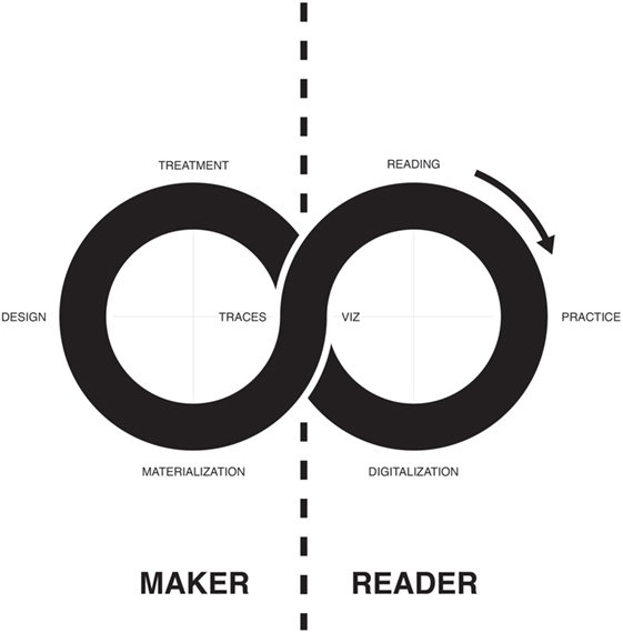
Figure 6. The cycle of the visualization combines mapmaker and reader.
That diagram summarizes the design cycle in four steps: (1) the collection of traces, which means all digital data belonging to a specific practice, (2) the design itself intended as the process of conceiving an artifact, (3) the actualization or the publication of the visualization in a digital or physical form in order to make it accessible, and (4) the visualization as the outcome of this cycle.
On the opposite side, the reading cycle is organized in four steps: (1) the reading of the visualization that gives information to the reader, modifying or conforming to his perception of a specific argument, (2) understanding enriches the reading behavior and consequently its practice, (3) transforming the practice into digital traces, and (4) to obtain traces.
It is interesting to notice that, as opposed to the standard design cycle that mainly focuses on the artifact, the diagram shown in Figure 6 gives more importance to the reader and its behavior. We certainly agree that it be a specific design process, where the reader practice is part of the visual representation. However, the schema summarizes how a visualization might influence the behavior of its reader, with a special focus into scientific practice. We are particularly interested when the reader is represented in the visualization, or more generally when the readers are represented in a sole image. The intimate relationship that the reader establishes with the visualization looking for itself makes the act of reading stronger, creating a personal interest for its own image and situation, in a sort of narcissism or a fixation with a digital perception as happens in social networks (2009).
These two cycles are intertwined forming a lemniscate, the geometrical shape that denotes infinity. This representation is interesting because it creates a superposition between the visualization and the traces, a correspondence that underlines the relationship that exists between the graphical representation and the represented data. Bruno Latour refers to the relation between maps and its reading as connectivity. It is fundamental to understand that visualizations are not a faithful representation of reality. Scientific mapping offers a set of possible visualizations of the science or of the scientific collective. These visualizations pass through a system of reduction and interpretation that transforms them into partial representations of the concrete scientific practice, that are still complex to map today. Connectivity is, therefore, the way through which the reader merges together its own perception of the reality with the technical representation of the visualization. It is important to remember the fact that the visual representation is a process of transformation involving technical and ethical limitations. What the designer is asked to do is applying the most transparent and honest approach to the process of representation. The visualization and the reader’s memory are, therefore, two different modes of verification that are connected to each other (Latour, 2013, p. 74).
Actualization
Actualization is the way through which traces take shape, becoming a tangible object that offers affordance for interacting (Gibson, 2015). Visualizations do not end at the design phase. As a book, they have to be published, or more generally actualized, in order to be openly distributed to the public. We might claim that circulation is a very crucial point for artifacts; without actualization and circulation, no interaction is possible.
The Affinity Map has three specific support for actualization: the screen, the poster, and the carpet. Each of them features different characteristics and is preferred for a specific interaction that implies different reading configurations (see Figure 7). Furthermore, interactions affect the type of audience, which is related to the map in different ways according to the aim. The aims, in turn, are related to three audiences, namely the scholars, the management, and the generic public having different interests.
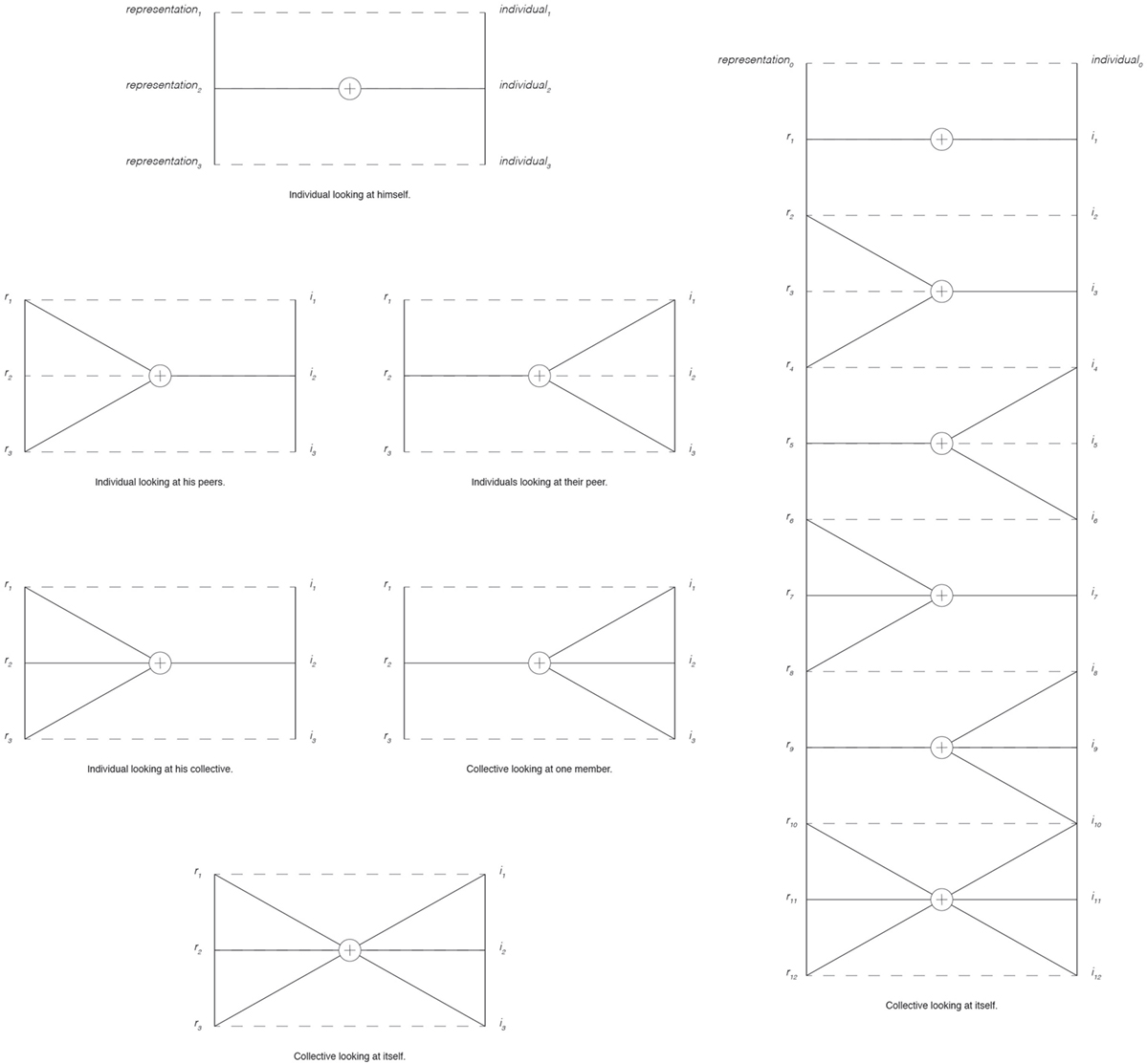
Figure 7. Different configurations of reading. On the left, a set of configurations schematizes the relation between the reader and its image, covering the actualization of the screen and the poster. On the right, we simulate a potential interaction of a collective representing itself, which corresponds to the carpet actualization.
Screen
Interactions with computers are mostly based on use of a screen. This terminal empowers the computer’s communication with dynamic images, making interfaces mutable objects. At the same time, the screen is the sign of a personal use, which corresponds to a private sphere where the user interacts with the computer in a one-on-one experience.
Comparable to a device that privileges privacy—even though it is one of the most traceable objects—the screen is the support through which the reader recognizes himself in the visualization. That form of self-recognition corresponds for the scholar to the moment when he looks at himself (Rodighiero and Cellard, 2016). Where the visualization situates me? Do I feel correctly represented? What makes me different from peers? Answering these questions is a way to reflect about ourselves. If we contextualize these questions in the Affinity Map, a scholar working as a senior scientist has to ask himself whether his position is correctly represented or not. If the answer to this question is positive, the visualization is then accepted. That mechanism of validation is necessary to empower the map to display facts and be accepted by the scientific community.
Scholars are carefully represented through quantitative data, which allows to identify roles and collaborations that link them to other peers of the same laboratory. Although individuals are represented as objectively as possible avoiding any comparisons among members of different laboratories, members of the same laboratory might be compared by readers. It is normal that a user looks at himself as well as others. As previously mentioned, the comparison is an estimate that may create jealousy. However, if interpreted in a positive way, the comparison is a powerful instrument to improve a scholar’s own position. For example, it is particularly true for professors who are not only individuals but are also accountable for their own laboratory. By understanding the mechanism of arrangement, the professor can improve the laboratory position by driving precise collaborations. This point is particularly relevant because the professor can change its practice by mimesis. However, that behavior could bring to the standardization of practice as happened for the h-index and the Impact Factor. Scientific visualizations might be very useful tools to explore and by which to be inspired, but care should be taken to avoid any kind of misuse.
Poster
Another medium to materialize visualizations is the poster. Posters are bigger than screens and they can easily reach the A0 format, which is available in most of the universities. From the point of view of the interaction, posters are big enough to incentivize shared reading rather than personal one. Collective reading promotes discussions and circulation of interpretations (Rodighiero, 2016). This aspect is particularly relevant because the poster fosters a dialog that the screen does not.
In the case of the Affinity Map, posters were being useful in two situations. They are indeed a very good medium in limited collective settings. During steering meetings, visualizations were usually printed and put on the table where attendees were gathered. The visualization presentation was usually followed by a discussion in which the poster was the central element; the participants were used to making statements by pointing onto the poster, and notes and sketches were taken directly on the surface. Then, posters were carefully collected by the dean at the end of each meeting creating a sort of archive.
The poster is not just a way to share visualization, but it is also a representation. For instance, the first time we publicly presented the map, some scholars were so enthusiastic that they stole the poster of their laboratory. That demonstrates the attachment that a collective may have for its own representation. It is interesting to see how a visualization is not just a mere image, but rather a representation as might be a symbol of the collective.
Carpet
Considering those previous examples, it seems that interactions change according to the size of the media. That observation is confirmed by the third medium, the carpet. Printing on a large-scale format allowed us to present the Affinity Map to all ENAC scholars during a collective event. Many individuals could interact at the same time with the map forming different reading groups. Each group interacts in similar ways to the poster, where individuals have a conversation around an object. For the carpet, many groups act simultaneously without the obligation to be stuck in a place. They can move from a visual element to another changing representation by walking. Furthermore, groups can merge or split according to their walking. Individuals represent another level of independency during reading as they can change group, or simply walk by themselves.
The carpet has a dimension that works extremely well for public presentation. Figure 8 shows the Affinity Map during the ENAC Research Day that took place in May 2016. For that event, the map was printed on the tarpaulin, usually employed for covering truck trailers. The material was cheap enough to print the map on a large scale, namely on a surface of 250 m2. Each laboratory on the map had a dimension comparable to a 1-m radius.
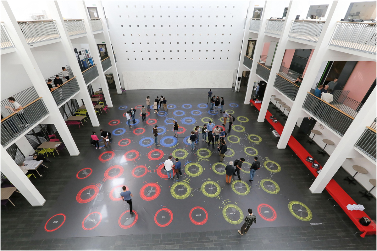
Figure 8. The actualization of the Affinity Map as a carpet. That installation that has been created for the School of Architecture, Civil and Environmental Engineering Research Day covers a surface of 250m2. Members of the school were invited to walk on to find themselves and their peers (reproduced with the permission of the copyright holder Alain Herzog, 2016).
The scale of the carpet allowed to have two types of reading. One that we might call close reading, which consisted of walking on the carpet. That closeness allowed to read the names of laboratory members, and obviously encourage discussions on the representation of individuals and laboratories, as well as collaborations. The other interaction corresponds to a distant view, which corresponds to a reading from a further standpoint. The map was indeed situated within a large hall with two levels of the balcony. From them, the perspective is different and consequently the reading also. From balconies, names were not visible. We were, therefore, seeing a sort of visual simplification where laboratories only were visible by color, position, and corresponding acronyms.
Audiences
Actualization introduced three possible settings for interaction, which are intertwined to three different audiences identified for the usage of the Affinity Map, namely scholars, the management, and general public. They have diverse aims according to the role they cover in the organization. The Affinity Map is initially intended for scholars, who are interested in improving their position and discover potential collaborations within the school. However, through minor modifications, the very same visualization can be adapted for managers or for external communication.
Scholars
Scholars have two different modalities to interact with the Affinity Map. The first interaction is private, and it takes place in front of a screen or a poster. The question that a scholar asks himself is whether his position on the map is appropriate or not. If the scholar is interested in improving his position, one possible way is through imitation. This means looking at someone in a better position and imitates his behavior to get closer to that position. Otherwise, the scholar can use the mechanisms of the map, which are totally transparent to the public. This is exactly what is happening in many cases with the evaluation indexes used in the academic environment.
The second interaction is public, and it takes place with posters or carpet. The personal analysis here is a more discursive approach involving the reader and his peers. This approach is more appropriate to a higher level of reading. The focus moves from the individual to the collective, and the discussion turns toward the exactitude of the graphical representation from a group of peers. That level involves the truthfulness of data. Do visual elements correspond to the work of the collective? Do chosen data correctly represent daily practice?
The Management
The management’s needs are different and belong to a private sphere. Consequently, for the management, the preferred modalities are the screen and the poster. The screen is perfect for personal thinking, to get an interactive and personal comprehension of the organization. The poster is different because it means to think collectively, even though it is also an interesting instrument to support its own decisions. The visualization is indeed not only a tool of exploration to get insights, it is also a way to demonstrate them (Latour, 1986; Hoyningen-Huene, 1987; Lynch, 1988; Boechat and Venturini, 2016). Justification is a key action that a manager makes in front of peers in the case of a private meeting, or in front of the organization in the case of a public meeting. Visualization is important because it is a way to support ideas, project, and decisions.
For instance, the creation of a new laboratory might be justified by the visualization pointing out to a void that could be filled in certain areas. Otherwise, the map can also justify the closing of a laboratory. The Affinity Map might even support the split of a laboratory because its dimension is too large to be administered by a single professor, establishing a new academic position.
The Affinity Map can, therefore, also be used as an evaluation method, as is the case for the h-index or the Impact Factor. Although the initial use of the map is not meant to evaluate scholars—exactly as in the case of the IF (Garfield, 2006)—the mapmaker cannot avoid the use of the map to grant promotions and for recruitment. The intelligence of use is something that must be guaranteed by a thoughtful management class.
External Public
The last audience is the general public. Transparency is more and more common in organizations to show that public funds are properly used. Architects such as Norman Foster use the concept of transparency to create public buildings as was the case for the Reichstag in Berlin—which houses the German parliament and is characterized by a glass dome—and London City Hall, which is the center of political activities in the city (Foster, 2011).
The Affinity Map is, therefore, a way to communicate to the external public what is going on. The carpet is specifically adapted to that audience because of its appearance. Indeed, the carpet is a scenic, huge, and strange object that grabs the public’s attention. It arouses curiosity and transforms the interaction into a game. It is a very good way to present the faculty, even though it would be more meaningful for a member of the school. In this specific case, the map may be simplified by removing some useless elements and putting importance on keywords, which better than other visual elements describe the subjects of research, which is more interesting to a general public.
Interviews
The Affinity Map assessment was based on a series of interviews with ENAC members. Nine subjects were selected according to their institute and role in order to have a homogeneous feedback of the entire school. In particular, we chose three types of positions: the full professor who leads a laboratory, the tenure-track professor who directs a unit equally but has to be confirmed, and the senior scientist who is the first professor assistant. We chose those senior profiles because we considered them more appropriate to evaluate the representation of both the individuals and the utter collective. As a consequence, selecting on seniority allowed us to find scholars that know the organization more precisely than others. The interviewees are summarized in Table 1 where names were replaced by letters to respect their privacy.

Table 1. Affinity Map evaluation has been conducted through interviews.
Interviewees were aware of the Affinity Map as were all the ENAC members. Indeed, the project was introduced to the scientific collective at its beginnings, and successively presented through two installations during the ENAC Research Day. This public event assembled the school members, and hosted the map in the form both of the carpet in May 2016 and of the digital application in May 2017. After the latter date, that application was internally published on the Web for scholars’ private use. When the meetings were organized, namely between June and July 2017, the interviewees were, therefore, well informed about the project cycle, and they had had access to the digital version for several weeks.
At the time of interviews, the selected scholars interacted with the carpet or the digital application at least once. However, meetings were organized even in the case they did not interact with the visualization. They were usually set up in the scholar’s personal office to facilitate a comfortable situation. One of the authors was selected to do the interviews in order to keep the conversation informal. Two objects were used during the meetings, a laptop featuring the most recent Affinity Map version and a sheet with the questions scholars were invited to answer. These questions were structured in four sections as illustrated in Table 2. Three sections focused on the different map’s levels: respectively for the individuals, the laboratory neighborhood, and the whole organization. Another section dealt with audiences. As a result, the interviews were organized to comprehend the level of users’ satisfaction according to the level of the zoom. The questions about the audiences toward the end were expressly open with the intention of focusing on the interviewee’s most passionate subjects.
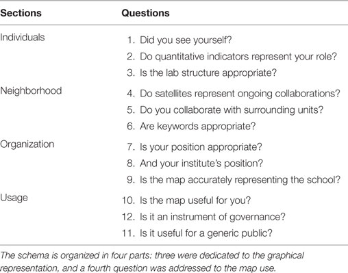
Table 2. Questions schema used during interviews.
The interview structure is merged with interviewees as shown in Table 3. The table reports the overall answers indicating whether the answer was positive or not. Furthermore, the asterisk refers to a precise definition or a relevant comment, which is clarified in Table 4. The following two tables summarize the global outcome of the interviews and allows us to see the most relevant questions.
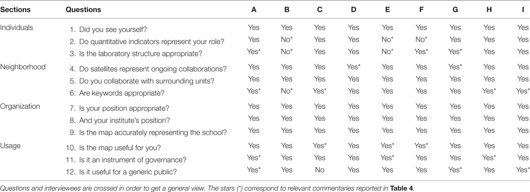
Table 3. Results of the interviews.
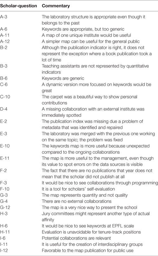
Table 4. Most relevant comments of questions referenced to Table 3.
A general overview at the Table 3 makes plain that the spatiality of the map was accepted. The positions of laboratories and institutions, and the global organization are considered correct (see Organization of Table 3).
Scholars have no problem in finding themselves on the map (see Question 1). However, some of them did not recognize themselves in the quantitative displaying of data for two precise problems (see Question 2). In one case, it was an error of metadata; the professor’s name was indexed through a string rather than an ID within the Infoscience system (E-2). Once we corrected the metadata, the professor agreed with the representation. In the other two cases, we faced an exception of practice (B-2 and F-2). Indeed, two scholars did not have many publications because one was focused on the publication of a book, and the other on programming. That interpretation is both correct and ambiguous as the data concern a specific year. Visualizing more calendar years, for example, would solve the issue that regard the representation of scientific practice over a much longer period.
Question 3 is about the laboratory structure. Although the laboratory diagram is said to represent correctly the individuals and the collaboration, different issues emerged. First, some individuals are not correctly represented because the position of teaching assistants is not transformed in traces—only professors and external lecturers are associated to the courses (see B-3). Second, it was suggested to consider the programming (see F-3) and the committees (see H-3) as actual affinities. Third, there was a problem within the Affinity Map code that was solved (see E-3). Fourth, a professor brought up the question of synchronization since we present a visualization of the previous year (see A-3). Although we recognize this limit of the map, we consider that a delayed and validated visualization is still better than a visualization closer in time without a formal revision of information.
Question 4 confirmed the quality of data we used for affinities, since no major remarks concern the satellites. It is interesting how, again, the map allowed to spot a problem in data sources, precisely in the IS-Academia repository (D-4). Furthermore, a scholar stressed the fact we show only affinities within the ENAC (G-4). That issue will be tackled in a further development that will contextualize the school within the EPFL, showing collaborations with external laboratories. In that sense, we yet collected metadata related to extra EPFL collaborations; that means that it will be possible in the future to map even affinities with external institutions, further enriching the overall context.
While question 5 confirmed the correctness of actual affinities, question 6 arose a large commentary due its interest. In general, the interviews validated the keyword approach confirming a diffuse interest on them. A couple of interviewees complained about the approximation of information (A-6 and B-6). However, it has to be said that the two cases correspond to laboratories that usually publish in French when the keyword extraction works with one sole language. Unfortunately, we have not been able to solve the problem of the French minority since the extractor shows the best outcomes with large quantity of information. Otherwise, the other scholars gave us encouragement and suggestions about how the use of keywords might be improved (C-6, H-6, and I-6).
Finally, interviewees differently demonstrated interest for the three audiences. It is important to notice that scholars consider the Affinity Map a tool for governance, remarking its usefulness for being aware of the self-evaluation (F-10) and their own contributions (C-10), and appreciating the arrangement based on potential affinities (E-10). They recognized without any doubt the benefits that such a map might bring to the management (E-11, H-11, and I-11), suggesting improvement that might adapt the map to institute directors (A-11). Then, they also appreciated the map as a public way to present themselves toward the outside (G-12 and I-12), maybe by simplifying it (A-12).
Validation through the Interviews
The effectiveness of the map relies on the result of the interviews. The reason for that approach lies in the fact that the individuals and the collective are entities that cannot be validated through quantitative approach. For instance, there is no way to quantify the degree of recognition of a scholar in the map. Through the interviews, we have been able to see the reactions of the ENAC scholars to a possible representation of themselves. Indeed, when the global configuration of the school did not arise particular problems, the main visual issues were related to individual representations that scholars looked with a great interest. Looking at a collective is different from looking at the single individuals, and we invested attention in their representation.
Furthermore, the validation of the map by scholars did not happen in the sole moment of interviews as the project development has been presented to ENAC scholars on a 6-month basis. Through a semi-collective design process, we arrived to a common agreement on the map. This agreement was the result of many individual face-to-face conversations we had with the ENAC scholars, and probably the most difficult task of the entire project.
Discussion
Today organizations are more than ever complex systems. They are large, ramified, distributed, and intertwined so that their organic structure seems like a tangle of activities. Day by day individuals contribute to keeping these structures alive with their work, thoughts, and personalities, and as a result organizations rely on these daily practices.
Contemporary sociology aims to untangle the network of practices through the analysis of digital traces that are distributed in desktop computers, smart phones, Wi-Fi and GPS signals, payment systems, badges, information systems, etc. Digital traces are all the information that individuals leave behind them during everyday activities. The challenge is, therefore, to recompose a faithful image of an organization using the data that its members left behind in various forms.
Understanding the academic organization from the activities of its members deeply interests the management. The dynamics of employes is a fundamental piece of information in order to take decisions and plan for the future. In particular, managers are interested to have a global view in order to optimize as much as possible the performance of both the organization and its employes.
The concept of performance deals with the challenge of obtaining the very best from the employes. Today the management often uses indicators to measure their performance. However, in a perspective of governance where a network of individuals is responsible for the whole organization, the same indicators are at the disposal of all the employes as a form of self-discipline.
Nowadays, performance does not only interest corporations but also large universities. In the academic environment, scholar performance is measured by different indicators such as the citation count, the h-index, or the impact factor. Directors and boards use such metrics to evaluate or recruit employes and, at the same time, the same scholars use them in order to be positively evaluated or recruited. That bidirectional use of the indicators clearly shows that the academic environment adheres to the logic of performance-based governance.
Current academic governance policies do not usually take into account a dimension that plays a critical role in research and teaching dynamics, affinities between scholars. This article focuses on this dimension and the way to represent it. Affinities are diversified as they can take many forms, from a common interest to a committee membership, from a shared teaching activity to an article co-authoring. Affinities are multiple as scholars might share different kinds of affinities at the same time, which reinforce their overall ties.
Affinities can be classified as actual and potential. A certain number of potential affinities indicate a predictable tie between scholars. Such affinities might be representative for subjects of research, common interests, continuity between topics, sharing the same mother language, graduating at the same university, publishing in the same journals, attending same conferences and committees, etc. These potential affinities become an actual tie when a collaboration takes place as it may be the case in co-authoring a paper, or supervising the same doctoral candidate. As a consequence, affinities offer two different dimensions, one is solid and composed of different ongoing collaborations, and one is projected toward the possible opportunities to explore.
Designing an affinity indicator can be fundamental within the academic organization. Situating affinities in a visual representation creates a new space where actual and potential performances are blended together. Contrary to the other metrics that reinforce the distances between individuals, the logic of affinities helps plan the future through collaborative dynamics. The central idea is to represent what is happening with a special consideration in fostering new synergies. With respect to the logic of governance, planning these synergies is the interest of both the management and the scholars. For that reason, the metric of affinities has to be at the disposal of the whole collective. Furthermore, in order to use it, the metric has to take the shape of an instrument or a map, so that it may orientate all the actors among all the possible choices offered by the collective of research.
Conclusion
This article relies on a design approach to the problem of governance. In particular, that approach wanted to solve the visualizing issue of the organizations. Visualizing large organizations according to the affinities of their members is a problem that interests corporations as well as large academic institutions. The concept of affinity stays between the actualization and the potential of the social ties for structuring the organization from the inside. Although the interactions between many individuals are difficult to understand, social scientists and cartographers are trying to find a way to represent the environment through the ties between individuals, beyond the common organizational chart. In the specific context of the university, the Affinity Map proposed a new method of visualizing the affinities between scholars.
With respect to the various scientific metrics, we argued that the academic metric cannot be limited just to the literature written by scholars and a few other activities they engage in. The daily practice of scholars corresponds to a complex network of collaborations that is particularly difficult to describe. Our study underlined the fact that academic practices are translated into digital traces partially, and that the efforts of tracing the academic activities must go further than one of the two looking at publications and citations. Following the characterization of the different kinds of collaboration (advising, publications, and teaching), we revealed the plurality of affinities within the ENAC collective. Our aim was to make visible the affinities that are normally hidden. We also emphasized the distinction between actual and potential affinities; the former was useful for depicting the current state of the collaborations, and the latter were useful to predict future collaborations.
We introduced a method to display these affinities, which required particular attention to their multidimensional and multi-scale nature. We introduced the rings to overcome the mono-dimensionality of links that networks represent through lines. These rings are able to quantify multiple values associated with both nodes and connections. They inform as to whether a laboratory is more involved in education or research, or whether a connection is the result of a common publication. Although our approach was based on actor-network theory, we embodied the organizational hierarchy within the map: colors, nodes, and arcs represent institutes, laboratories, and individuals, respectively. Furthermore, the map focused on the organization of both the school and the laboratories, according to the level of the zoom. That choice also made the network more readable, reducing the network connectivity.
The satellites reduced the entire network around each node. Even focusing on a node, the reader does not lose the perception of the whole network. The Affinity Map was built on a system of single ego-networks that qualify and quantify each laboratory context. The reader no longer has to look around in order to study the links of a single node, as the satellites also report the distance of each corresponding node according to the entire network.
The Affinity Map relies on a hexagonal pattern, which simplifies the network through the creation of a regular arrangement that improved its readability. A set of forces constrained and limited the proximity between nodes creating homogeneous spaces. This arrangement was used to display the keywords that help to clarify the semantic proximity of laboratories.
In this article, we stressed the importance of design, which is understood as the ability and the sensibility of solving a specific problem. This approach was important for studying the academic environment and creating a discussion about the problem of representing practice of scholars. Moreover, design was equally important to evaluating and discovering the affinities for the map construction. Indeed, the relative digital traces were scattered and unavailable; much work was required in order to have them at our disposal. Our design approach brought about the discovery of data through visual results, and helped us to choose which further steps to take. Design also played a crucial role in the actualization of the map, trying to experiment different solutions to make it available to the users. In a very special sense, the design was a way to acquire, evaluate, translate, and visualize academic practice.
Through the design process we were able to understand the importance of the individual, barely considered at the beginning of the project. Indeed, the individual has a double function as it is represented in the map and it is also the reader of the same map. We understood the importance of the individual as a scholar when we observed the ENAC through 10 years of data, and we understood its importance as a reader when we saw the collective interacting with the map. Designing and reading are two sides of the same coin, for which designers and readers are asked to contribute. Designers, scholars, managers, organizations, technologies, materials, data, digital traces, and actualizations are all active actors in the lifecycle of the visualization.
Author Contributions
All authors contributed equally to the article.
Conflict of Interest Statement
The authors declare that the research was conducted in the absence of any commercial or financial relationships that could be construed as a potential conflict of interest.
Acknowledgments
I am grateful for the generous funding provided by the ENAC and its dean, Professor Marilyne Andersen.
References
Boechat, M., and Venturini, T. (2016). From analysis to presentation. Les Cahiers Du Numérique 12, 185–196. doi: 10.3166/lcn.12.4.185-204
Börner, K., Conlon, M., Corson-Rikert, J., and Ding, Y. (2012). VIVO: A Semantic Approach to Scholarly Networking and Discovery, eds J. Hendler, and Y. Ding Vol. 2. (Morgan & Claypool Publishers), 1–178.
Börner, K., Dall’Asta, L., Ke, W., and Vespignani, A. (2005). Studying the emerging global brain: analyzing and visualizing the impact of co-authorship teams. Complexity 10, 57–67. doi:10.1002/cplx.20078
Brinton, W. C. (1919). Graphic Methods for Presenting Facts. New York: The Engineering Magazine Company.
Callon, M. (1984). Some elements of a sociology of translation: domestication of the scallops and the fishermen of St. Brieuc Bay. Sociol. Rev. 32, 196–233. doi:10.1111/j.1467-954x.1984.tb00113.x
Cohen, S. M. (2000). Aristotle’s Metaphysics. Available at: https://plato.stanford.edu/archives/win2016/entries/aristotle-metaphysics/.
Deleuze, G., and Parnet, C. (2007). Dialogues II (New York: Columbia University Press) [H. Tomlinson and B. Habberjam, Trans].
Elena Pierazzo. (2017). Elena Pierazzo. Available at: https://kclpure.kcl.ac.uk/portal/en/persons/elena-pierazzo(79e611df-2a08-4dcd-8541-a0e912ec63c1).html.
Garfield, E. (1970). Citation indexing for studying science. Nature 227, 669–671. doi:10.1038/227669a0
Garfield, E. (2006). The history and meaning of the journal impact factor. JAMA 295, 90–93. doi:10.1001/jama.295.1.90
Gibson, J. J. (2015). The Ecological Approach to Visual Perception. New York; London: Psychology Press.
Goldschmidt, L., Weibel, P., and Rottner, N. (2006). Gego 1957–1988: Thinking the Line. Ostfildern; New York: Hatje Cantz.
Harley, J. B. (2001). “Power and legitimation in the English geographical atlases of the eighteenth century,” in The New Nature of Maps: Essays in the History of Cartography, ed. P. Laxton (Baltimore, MD: JHU Press), 109–148.
Homann, J.-P. (2009). Digital Color Management: Principles and Strategies for the Standardized Print Production. Berlin; Heidelberg: Springer.
Hoyningen-Huene, P. (1987). Context of discovery and context of justification. Stud. History Phil. Sci. A 18, 501–515. doi:10.1016/0039-3681(87)90005-7
Kim, M. J., Winkler, S. J., Bierer, B. E., and Wolf, D. (2014). Harvard catalyst – the clinical translational science center IND/IDE consult service: providing an IND/IDE consult service in a decentralized network of academic healthcare centers. Clin. Trans. Sci. 7, 150–155. doi:10.1111/cts.12146
Latour, B. (1986). “Visualisation and cognition: thinking with eyes and hands,” in Knowledge and Society Studies in the Sociology of Culture Past and Present ed. H. Kuklick, Vol. 6, 1–40.
Latour, B. (1999). “Circulating reference: sampling the soil in the Amazon forest,” in Pandora’s Hope: Essays on the Reality of Science Studies (Cambridge, MA: Harvard University Press), 24–79.
Latour, B. (2013). An Inquiry into Modes of Existence: An Anthropology of the Moderns. Cambridge, MA: Harvard University Press.
Latour, B., Jensen, P., Venturini, T., Grauwin, S., and Boullier, D. (2012). “The whole is always smaller than its parts” – a digital test of Gabriel Tardes’ monads. Br. J. Sociol. 63, 590–615. doi:10.1111/j.1468-4446.2012.01428.x
Lévy, J. (2013a). “Interspatialité,” in Dictionnaire de la géographie, eds J. Lévy, and M. Lussault (Paris: Belin), 569–570.
Lévy, J. (2013b). “Lieu,” in Dictionnaire de la géographie, eds J. Lévy, and M. Lussault (Paris: Belin), 612–613.
Lima, M. (2014). The book of Trees: Visualizing Branches of Knowledge. New York: Princeton Architectural Press.
Lombardi, M., and Hobbs, R. (2004). Mark Lombardi: Global Networks. New York: Independent Curators International.
Lussault, M. (2013). “Spatialité,” in Dictionnaire de la géographie, eds J. Lévy, and M. Lussault (Paris: Belin), 947–950.
Lynch, M. (1988). The externalized retina: selection and mathematization in the visual documentation of objects in the life sciences. Hum. Stud. 11, 201–234. doi:10.1007/BF00177304
Pierre, J., and Peters, B. G. (2000). Governance, Politics and the State. London: Palgrave Macmillan.
Rodighiero, D. (2016). “Circulation of opinions in visualization reading,” in Presented at the Proceedings of the Workshop on Valuable Visualization of Healthcare Information: from the Quantified Self Data to Conversations, Vol. 1658, 13–19. Available at: https://infoscience.epfl.ch/record/220655
Rodighiero, D., and Cellard, L. (2016). Self-Recognition in Data Visualization: How People See Themselves in Social Visualizations. Available at: https://infoscience.epfl.ch/record/218454/
Rosenthal, C. (2013). Big Data in the Age of the Telegraph. McKinsey Quarterly. Available at: http://www.mckinsey.com/business-functions/organization/our-insights/big-data-in-the-age-of-the-telegraph
Spence, R. (2014). Information Visualization. Cham; Heidelberg; New York; Dordrecht; London: Springer International Publishing.
Stefaner, M. (2016). EPFL Data Monolith. Available at: http://truth-and-beauty.net/projects/epfl-data-monolith
Van Es, K., Lopez Coombs, N., and Boeschoten, T. (2017). “Towards a reflexive digital data analysis,” in The Datafied Society: Studying Culture through Data, eds M. T. Schäfer, and K. Es van (Amsterdam: Amsterdam University Press).
Vardell, E., Feddern-Bekcan, T., and Moore, M. (2011). SciVal experts: a collaborative tool. Med. Ref. Serv. Q. 30, 283–294. doi:10.1080/02763869.2011.603592
Keywords: data visualization, bibliometrics, network visualization, scholarly metrics, collaboration metrics, affinities
Citation: Rodighiero D, Kaplan F and Beaude B (2018) Mapping Affinities in Academic Organizations. Front. Res. Metr. Anal. 3:4. doi: 10.3389/frma.2018.00004
Received: 31 August 2017; Accepted: 25 January 2018;
Published: 19 February 2018
Edited by:
Kevin Boyack, SciTech Strategies, Inc., United StatesCopyright: © 2018 Rodighiero, Kaplan and Beaude. This is an open-access article distributed under the terms of the Creative Commons Attribution License (CC BY). The use, distribution or reproduction in other forums is permitted, provided the original author(s) and the copyright owner are credited and that the original publication in this journal is cited, in accordance with accepted academic practice. No use, distribution or reproduction is permitted which does not comply with these terms.
*Correspondence: Dario Rodighiero, ZC5yb2RpZ2hpZXJvQGljbG91ZC5jb20=