 Nicolas Delcombel
 Thierry Duval
 Marc-Oliver Pahl2
- 1Lab-STICC, UMR CNRS 6285, IMT Atlantique, Brest, France
- 2Institut de Recherche en Informatique et Systèmes Aléatoires (IRISA), UMR CNRS 6074, IMT Atlantique, Cesson-Sévigné, France
This paper assesses the usefulness of an interactive and navigable 3D environment to help decision-making in cybersecurity. Malware programs frequently emit periodic signals in network logs; however, normal periodical network activities, such as software updates and data collection activities, mask them. Thus, if automatic systems use periodicity to successfully detect malware, they also detect ordinary activities as suspicious ones and raise false positives. Hence, there is a need to provide tools to sort the alerts raised by such software. Data visualizations can make it easier to categorize these alerts, as proven by previous research. However, traditional visualization tools can struggle to display a large amount of data that needs to be treated in cybersecurity in a clear way. In response, this paper explores the use of Immersive Analytics to interact with complex dataset representations and collect cues for alert classification. We created a prototype that uses a helical representation to underline periodicity in the distribution of one variable of a dataset. We tested this prototype in an alert triage scenario and compared it with a state-of-the-art 2D visualization with regard to the visualization efficiency, usability, workload, and flow induced.
1 Introduction
To secure a network, many cyber security operators use Intrusion Detection Systems (IDS) that generate numerous false positive alerts (Joo et al., 2003; Marchetti et al., 2016). The tasks undertaken by the operator involve classifying these alerts based on the information available. However, once an IDS has triggered an alert, it does not provide search and inspection capabilities to assist in the investigation. There is a need for tools to help operators gain situational awareness regarding the context of the alert, such as interactive visualizations. However, existing tools are often limited by the lack of screen space and medium of interaction with the data.
One solution to these data representation problems may be to use Immersive Analytic (IA) techniques. IA explores how new interactions and display technologies such as virtual reality can support analytical reasoning and decision-making (Dwyer et al., 2018a). It can be used to display complex data and provide new ways to interact with it in a 3D environment that supports operator reasoning as well as collaboration.
To assess interest in Immersive Analytics for cybersecurity, we present a user study on IA for investigation of alerts raised on datasets with periodic events. In Section 2, we present the context of the application of our representation. In Section 3 we present related work on interactive and immersive visualizations for periodic signals, as periodic signals can be indicators of malware activity in a network (Huynh et al., 2017). In Section 4, we present the concept of Cybercopters swarm, inspired by the work from Delcombel et al. (2021), which uses a helix metaphor to display periodic signals. We implemented multiple Cybercopters to represent the different sensors of a dataset at the same time. We present the evaluation protocol in Section 4.3, compared our representation to a 2D visualization based on the state of the art with an alarms triage task on a real-world data set. Then we present our results in Section 5, and assess the effectiveness, efficiency, usability, induced flow, and workload of each prototype with cybersecurity laymen, in addition, we collected feedback from domain specialists. In Sections 6, 7, we discuss these results and open discussion to consider future work.
Our first contribution to the field of Visual Analytics is to demonstrate that the third dimension makes it possible to display and link together attributes of a dataset more efficiently than 2D visualizations. Indeed, the third dimension helps correlate several representations in 3D space by grouping them spatially along a common axis in ways that 2D visualizations cannot offer. In our work this is demonstrated by the fact it is possible to use two attribute representations (the helical representation of a sensor and its associated alert bar share the same temporal axis) instead of overloading one spiral representation with multiple attributes. Our second contribution is to demonstrate that the immersive representation induced more flow in users than the 2D version. Indeed, participants felt more competent and in control in VR, they also felt the experience to be more rewarding and had a feeling of time distortion in VR. Our third contribution is to show that the immersive representation is more physically exigent than the 2D one, which is consistent with previous work. Finally, we highlight the importance of choosing the right interactor for the task at hand, as participants highly enjoy interacting with the representations using a joystick.
2 Context
Cyber operators usually classify alarms raised by anomaly detection algorithms (Marchetti et al., 2016). To do so, they start with the alarms and identify where the anomaly occurred. Then they try to understand the events that caused the alarms before deciding whether an alarm is a true or false positive, meaning operators need tools that correlate the raised alarms to the monitored data. These tools need to display the context of the alarm while providing ways to drill down into the data. However, the visualizations of the alarm should not interfere with other visualizations once operators start drilling down into the data.
For Industry 4.0 it is challenging to detect attacks on Operational Technology (OT) networks after attackers move laterally from a compromised Information Technology (IT) network. IT and OT networks were previously meant to be separated but with the emergence of new technologies such as the Internet of Things, OT networks tend to be connected to the internet, which can make them vulnerable to attacks. However, there are few solutions to detect attacks on OT networks, one way to do this is to use already available data, such as those from physical sensors. Indeed, suspicious behavior could indicate an attack (although it could also be due to a mechanical malfunction). To detect these suspicious values, Lohfink et al. (2020) describe a visualization system based on spiral visualizations to sort alarms raised by matrix profiles on the sensors of a water treatment plant. We choose this use case to evaluate the usefulness of a swarm of Cybercopters, as the sensors display periodic signals. To provide insights into this use case, in this section we describe the dataset used, how the anomaly detection algorithm works, and the requirements of the visual sorting system.
2.1 Secure water treatment (SWaT) dataset
The SWaT1 dataset (Inoue et al., 2017) describes data (IT and OT) relating to the testbed of a water treatment plant over 11 days. The water plant operates normally during the first 7 days of the dataset. On the eighth day, cyberattacks are launched against the plant and may perturb its operations. We are interested in the data coming from sensors and actuators of the physical part of the dataset (Table 1). They cover the six processes of the plant, from the water’s arrival to its distribution in the circuit. The 51 sensors and actuators display periodic behavior that can be modified during attacks and which aim to disrupt the nominal operation of the plant. For this experiment, we used 10,000 s (2 h 50 min) of the nominal operation of the plant and 27,700 points (7 h 40 min) of the operation under attack (Figure 1).
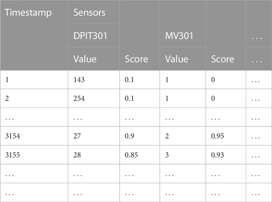
TABLE 1. We applied the Matrix Profile Algorithm to detect anomalies on every sensor of the SWaT Dataset. Each sensor has a certain value and an abnormality score associated with each timestamp (one per second).
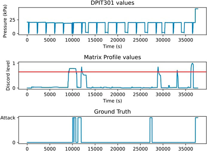
FIGURE 1. The matrix profile algorithm applied to the DPIT 301 sensor and the ground truth of the attacks (Inoue et al., 2017).
2.2 Matrix profiles
Matrix profiles are pattern discovery and anomaly detection algorithms. They do not require training before being used on a dataset and have few parameters to tune (Anton et al., 2019). Matrix profile algorithms create time windows for each time step of the dataset. Each window is compared to the others, resulting in a similarity score between 0 (the pattern present in this window can be found somewhere else) and 1 (the pattern present in this window is the only one that exists in the dataset). The closer to 1 the score of an event, the more likely this event is an anomaly (Yeh et al., 2017). (Lohfink et al., 2020) define three categories of score: Type I indicates that an anomaly is unlikely; type II, in which the score is higher than normal but not enough to be considered as a sure anomaly; and type III, where the score is high enough to be a sure anomaly. The thresholds between these categories are set using the part of the dataset without attack to raise as few false positives as possible. Yet, this anomaly detection method is bound to raise false alarms, which makes a visualization tool necessary to categorize them.
2.3 Requirements
To judge and compare our solutions, we use five of the six requirements expressed by Lohfink et al. (2020) following interviews with experts.
R1: System monitoring and triage analysis should be supported simultaneously.
R2: Detected anomalies should be highlighted in the data.
R3: Identification of false positives should be possible using the visualization system.
R4: Identification of false negatives should be possible using the visualization system.
R5: The visualization system should render triage analysis possible by cybersecurity experts and laymen.
We removed the requirement: Classification of values in category II as abnormal or normal as we do not use category II alert in this experiment. Indeed, we regrouped the categorization of category II and category III alerts as the same task: categorizing a detected abnormal behavior as a True or False positive, as the authors indicate that category II can be omitted if there is no need for a “buffer” interval.
3 Related work
To highlight periodic signals in the displayed data, some people use classical representations such as histograms to display the network activity over time, such as Gove and Deason (2019). Others use specific representations for this task, such as spirals or concentric circles. Interactive spirals are used to highlight patterns within a temporal dataset (Tominski and Schumann, 2008), using the Gestalt laws of similarity and continuity, the position of data of similar values is used to link them together in groups (Leslie Reiser and Koffka, 1935). These spirals have been used in cybersecurity by Lohfink et al. (2020) to represent SWaT data.
Foresti (Foresti et al., 2006), Legg (Legg, 2015), and Ngoc Anh Huynh (Anh Huynh et al., 2016) use concentric circles to highlight periodic patterns within a dataset. They make it possible to correlate the data represented on the circles with other information, such as the locations where the alerts appeared, by providing enough space (Foresti et al., 2006) in the center of the representation. This advantage comes at the cost of not being able to change the time step represented. Because they need large spaces of visualizations, these representations may lack space to be usable, as they need to use three dimensions of the visualization space (two to display the time series in cyclic form and the third one to display its value) to display a two-dimensional time series. This can make it difficult to correlate other information with these representations because it will require a large display space.
To link spiral or circular representations to others, either the link that passes over the representations or the color change of the representations can be used. In both cases, information is lost either because of occlusion or because using color for correlation is a drawback if it is already used to represent one dimension of the data. The last drawback is especially important for periodic visualizations where color is needed to represent time series. The difficulty in correlating these representations with other types of representations can be a problem for the operator’s situational awareness, as different types of visualizations need to be used to display various types of data.
3D environments offer another means of representing data that can be used to correlate representations together without losing information. The idea of using 3D for data visualization goes back to the late 1990s and since then many evaluations have been made on the interest of stereoscopic 3D representations compared to 2D equivalents. For example, it can help link data without occlusion (Prouzeau et al., 2017) and link them using their placement in the 3D environment with abstract (Reipschlager et al., 2021) or real data (Tominski et al., 2005), such as sensors positions. Recently, the field of immersive analytics has emerged (Chandler et al., 2015) and is in search of use cases for 3D visualizations (Dwyer et al., 2018b). Although 3D immersive visualizations have a definite advantage over 2D visualizations, in some cases (Fonnet and Prie, 2021), such as those of spatial data, the results for more abstract data are mixed and the benefit of 3D must be studied on a case-by-case basis, depending on the type of data and the user’s goal. Another advantage of Immersive Analytics is the possibility of using more intuitive interactions (Besançon et al., 2021). This is why this paper studies the interest of Immersive Analytics to connect different visualizations and interact with them.
One 3D representation that helps to highlight periodic signals is the helix (Gautier et al., 2017). It has been used in cybersecurity successfully by Scott et al. (2003) who used haptic feedback in addition to a dashboard with a 3D representation to represent networks under different attacks. This experiment did not aim at comparing a 2D representation with a 3D representation, but rather at comparing a 3D representation enhanced with haptics to the same 3D representation without haptics. Both (Gautier et al., 2017) and (Scott et al., 2003) proposed to use an interface with a screen and a keyboard and a mouse, and not an immersive solution as these technologies were not widespread at the time. More recently, an immersive helix representation has been used for electronic warfare and has been proven better than 2D tools (Cantu et al., 2018). However, the data used in this experiment is not continuous temporal data such as that from the SWaT sensors (Fonnet and Prie, 2021). Furthermore, although the task was to detect periodic patterns, there was no objective to correlate these patterns to alerts. Delcombel et al. (2021) evaluated a helical representation of a non-immersive interface, the Cybercopter, in usability and efficiency in a fraud detection scenario inspired by (Webga and Lu, 2015) and validated by their industrial partners. Results showed that Cybercopter is indeed able to help participants find periodic patterns and investigate them. Based on these findings, we evaluate the benefits and drawbacks of an immersive representation system based on multiple Cybercopters compared to a state-of-the-art 2D interface in an alert classification task.
To evaluate the benefits of Immersive Analytics, subjective metrics such as usability and workload are often measured on top of quantitative metrics like completion time. We argue that the flow state of participants should also be taken into account. Flow is a psychological state where individuals become fully immersed in an activity, losing track of time and surroundings, and is often associated with high performance and positive emotions (Csikszentmihalyi, 1975). Since cybersecurity operators need to make quick decisions with minimal errors, enhancing their flow state can improve their concentration and task performance. Previous research has explored how mixed reality can induce flow in users (Kim et al., 2022), and immersive analytics could offer similar benefits.
4 Materials and methods
Based on the Cybercopter by (Delcombel et al., 2021), we created the Cybercopters swarm (Figure 2) which implements multiple helical representations to highlight periodic behaviors in time-oriented data.
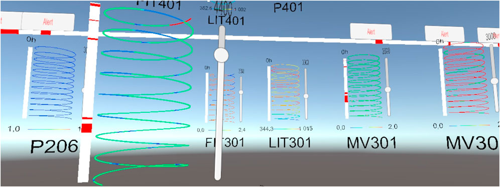
FIGURE 2. Global view of the Cybercopters swarm: Each helix represents the value of one sensor during 10 h. A large alert bar can be added in the environment to give a general idea of when alerts occur.
In a helix, each data point is placed on a helical scale depending on its time value, which flows from bottom to top (Delcombel et al., 2021). The period of the helix is the number of time steps between two data points vertically aligned on the helix, which corresponds to the number of data points between them. By modifying the period value, the user can make periodical patterns appear. Indeed, when the period of the helix is the same as the one of a periodic pattern, the data points of similar values will align vertically, which makes it possible to easily spot the pattern (Figure 3).
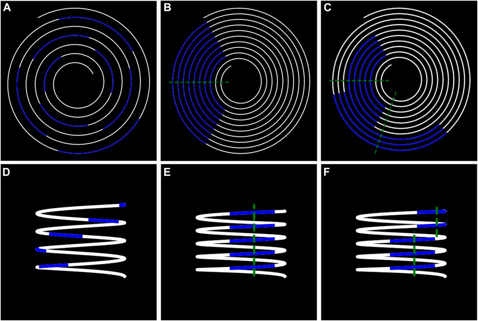
FIGURE 3. Comparison between spirals and helix. The same signal is represented in visualizations (A) and (B). It is possible to make periodic patterns appear by changing the period of the spiral. The same principle happens in visualizations (D) and (E) when changing the period of the helix. On visualization (B) and (E), all the points of the spiral (or the helix) that cross the green line are spaced by the same period of time. On visualization (C, F), a break in the periodic pattern appears, the distances between the two green lines represent a phase shift.
4.1 Helices justifications against spirals
4.1.1 Spirals 2D limitations
In a spiral, the time is curved from the center to the outside, and the color of each data point corresponds to the value of the sensor (Figure 3). The points of the spiral that cross the same straight line through the center of the spiral are separated by the same number of data points, thus the same time length. The period of the spiral can be defined by this number. By modifying the period, one can make periodic patterns appear in the displayed data. Indeed, if the period of the pattern is the same as the period of the spiral, then the patterns will align radially and will be easily recognizable thanks to the gestalt law of proximity. Although spirals have the advantage to change the periodicity of their representation, which is very valuable when seeking a break in periodicity, they have limitations for attribute correlations. Indeed, the best way to correlate two attributes is to represent them on a common scale (Cleveland and McGill, 2007), which is not possible in 2D because the 2 axes are already taken to represent spirals or circles. This is why the usual 2D solutions use other channels, such as width or hue to represent attributes on the main visualization (sub-figures c and d on Figure 4). However, the combination of the width visual channel with hue and shape channels can cause confusion and discomfort as they are not entirely separable in the human eye (Ware, 2008). Another solution is to use an additional visualization to represent additional attributes and connect the two visualizations with links, which can be harmful as it can hide or occlude other information.
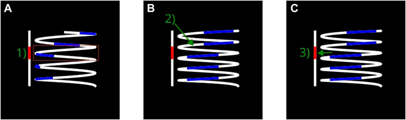
FIGURE 4. The helix allows space to represent alerts on an adjacent representation. Thus, the representation of the abnormal area does not interfere with the representation of the sensor data. This makes it easier to support the work of operators who can: (A) Detection of the zone suspicious activities, (B) focus on the helix to make a break appears in a periodic pattern (C). Control if the break corresponds to the alarm.
4.1.2 Use of helices
We attempted to represent data in a way that emphasizes periodicity in the same way as the spirals by modifying the period of the representation to highlight breaks in periodicity. However, the representation also needs to help correlate breaks in periodicity with alerts. As stated, the best way to correlate two attributes is to represent them on a common scale, to do so, we expand the spiral into a helix by using the third dimension, which adds a new axis to the visualization (Figure 5). This visualization allows for a clear separation between attributes so the variations of one do not interfere with the signals of the others, while still making them easily correlatable. The added axis can connect other visualizations to the helix if they share this axis to display a common attribute. One difference between helices and spirals is that every circle has the same length in a helix while they grow larger in a spiral, distorting the perception of time.
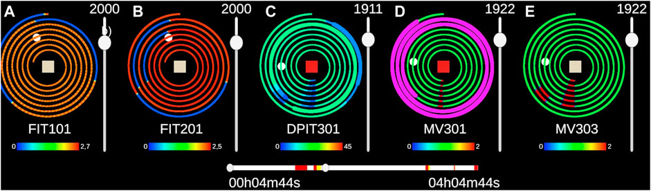
FIGURE 5. The five sensors of set1 are represented with the 2D interface. The timeline in the middle enables users to select the period displayed. The interface used to answer alerts is pictured at the bottom. We can see a false negative on MV303 as there is a clear break within the periodic pattern. A click on the red button at the center of the spiral of DPIT301 highlights the two alerts present in the selected time frame. When they are not highlighted, the thickness of the spirals indicates the presence of alerts.
4.1.3 First prototype: Cybercopter
Based on the related work, we created the first prototype Delcombel et al. (2021) of Cybercopter using a helix that can change the period to display periodic patterns in a 3D scene. Each cube of the helix represents a time step and the color of the cube signals the number of events during that time step. When clicking on a cube, additional information appears behind the helix and represents distributions of other variables during the time stamp selected. The participant can choose which variables to display. This representation helps the participant compare the data of different days together. Moreover, alerts were not displayed at all in this prototype Due to covid restrictions, we used a web-based prototype to pass the experiments on participants’ computers. To explore the scene, they moved with keyboard arrows and look around with the mouse. Moreover, we only did a simple experiment to validate usability and efficiency, but did not compare it to a 2D visualization.
4.1.4 Second prototype: Cybercopters Swarm
The difference between the two prototypes is the use of a virtual reality headset for our second prototype. The motion head parallax helps users to better understand 3D visualizations. Moreover, this prototype displays alerts raised on a dataset from the cybersecurity community.
In the Cybercopters Swarms case, the third dimension is used to represent the time axis on which alerts and periodicity breaks can be compared. This way, the operator can easily identify the probable zone of the breaks without modifying the view of the data, and can then search for the breaks in the data without looking at the alert. If one break is found, the operator can verify that it is at the level of the alert. Indeed, one data point of a helix stays at the same height whatever the period chosen, hence the vertical axis of a helix can be used as a temporal axis. Thanks to this property, it is possible to link other representations to the helix by using their vertical position. Their position represents the timestamp at which the events they describe happened. Using the Gestalt law of proximity, users can correlate these representations with patterns in the data points at the same height as they are spatially close. Moreover, two helices with different periods will still have their data points at the same vertical position, which can simplify the comparison between them when they are displayed side by side.
4.2 SWaT representation using multiple helices
We used the Cybercopters swarm to visualize the SWaT data. Each sensor and actuator has periodic patterns and can be associated with alerts. For this purpose, each sensor is represented by a Cybercopter with its period. We chose to represent 10 h 30 min of the dataset based on (Lohfink et al., 2020), more data points could be displayed if needed. The period of the helix can be set by the user with the slider on the side of the helix, or by pointing the helix with their hand while using the joystick of a controller, to allow them to be more precise without moving their arms. By moving a hand through the helix, the user can obtain the timestamp of this point to determine the time of an event. Each sensor has a unique legend that depends on these values over the entire data range. The user can rotate all data points along the vertical axis of the helix if they want to better align an alert with suspect comportment in the data. This interaction also helps to change the view of the helix if some parts are occluded by the spires in the front Dwyer et al. (2018b).
In order to give an overview of the situation, a large alert bar regrouping all alerts is present at the horizon (Figure 1). When the user wants to know which sensor(s) corresponds to which alert, the representation uses an audio signal coupled with a visual signal to indicate to the user the sensors corresponding to an alert. When the user selects an alert, a geo-spatialized sound from the corresponding sensor enables them to locate its approximate position, and then they can locate the sensor more precisely thanks to the color change of the sensor name. If multiple sensors trigger an alarm, the sounds are played one after another.
Helices can be presented as a “wall” but other arrangements can be used such as a half circle if the number of sensors increases (Liu et al., 2020). The placement of the helices in the 3D environment can also be performed according to the position of the sensor in the real environment (Tominski et al., 2005), or according to the place of the sensor in the process in a more abstract way. Even though our experiment takes place in Virtual Reality, it could be possible to use the helix metaphor with Augmented Reality inside the water plant to convey the state of each sensor to operators within the plant (ElSayed et al., 2015).
We chose to place the participants in a seated position because it corresponds to the position of a cybersecurity analyst working at a desk. Moreover, according to (Wagner et al., 2018), being seated does not negatively affect performances in IA; however, it can augment the physical and mental performance, while increasing the effort required to complete the task. This is also more relevant in the comparison with the 2D interface where participants are also seated. According to (Kraus et al., 2020) a VR table, i.e., a place where visualizations are represented and interacted with, reduces reduce the amount of travel required to complete a task significantly. However, according to Liu et al. (2020) radial layouts seem to better represent a high number of representations. We chose a compromise between both, where all the helixes are represented in a radial layout and where the participants can select the interesting helixes to interact with in front of them. This choice creates a need for a selection tool for distant objects, hence the laser to bring in the sensors to the participant. They can select a helix by pointing it with the virtual ray at the end of their hand, and it goes directly into their hand with a button click. Using this interaction, they can remain seated during the visualization process and do not need to move in the 3D environment. For example, they can organize their environment at their convenience according to the task they want to perform: Zoom in on the sensor they are interested in, group several sensors with similar behavior together, or throw away a sensor that has become useless. Lastly, the user can change the size of the helix by gripping it with both hands and moving them apart. We chose to use the basic controllers of the HTC vive for the interactions, as it is common practice in the IA community Besançon et al. (2021).
Other representations can be linked spatially to a helix to represent the timeline of alerts raised on each sensor next to them (Figure 3). When an alert is raised on a sensor, the alert bar turns red at the corresponding timestamps. Thus, the user can link a suspicious break in patterns to the alert at the same height. This representation ensures that the same visual dimension is not used to represent two different dimensions of data: the sensor values and the alert values. Thus, the user always has access to both information, and the thickness of the line can be used to represent another dimension of the dataset.
To develop Cybercopter, we undertook two pilot experiments where participants helped us improve the usability and interface of our prototype. The final size of the helices and their distance from the user were preferred by these early participants, who also suggested adding a rotation feature to the helix without rotating the alert bar. One early tester suggested using joysticks to interact with the helix, both to change the period and rotate the helix, as they felt it was the more intuitive solution. However, we did not want too many complex interactions so as not to be too biased with respect to 2D. However, it could be interesting to conduct a second experiment, examining interactions with these kinds of representations in the future.
4.3 System evaluation
To assess the usefulness Cybercopters, we compared it to a 2D interface based on Lohfink et al. (2020) work. They used a spiral based interface to display periodic patterns in data from the sensors of the SWaT. A video demonstrating both prototypes is available in the Supplementary Materials.
4.3.1 2D prototype
The 2D interface is separated into two parts: The timeline displays alerts on the dataset and allows the selection of the window of time displayed on the spirals plots (Figure 4). The alerts displayed on the timeline represent alerts on all the sensors. Inspired by (Lohfink et al., 2020), the time window covers a maximum of 14,400 values, equivalent to 4 h of logs. This maximum can be changed if needed. To navigate through the dataset, users can drag either side of the slider or simply click on their area of interest to relocate the time window.
The period of each spiral can be changed separately with the slider to the right and the mouse wheel for more precise changes. To simplify understanding of the interface by the participants, the color of the data points follows a heatmap according to the sensor value over the whole dataset and not just the window. Legends are always visible and display the minimum and maximum values of each sensor. For the experiment, we represented only five sensors at a time, but 10 can be displayed at the same time on the same window without causing performance issues.
To display alerts raised on a sensor, the thickness of the spiral is increased at the time of the alert, which draws the eye to critical areas. Moreover, the alert square at the center of the spiral turns red if the sensor data contains an alert over the selected time range. To highlight the alerts, the participant can click on them to make the alerts flash in magenta (Figure 4).
When the mouse passes over a spiral, a luminous point appears above it and on the corresponding time step in the other spirals. This facilitates comparison, as the same time step is not at the same place in two spirals with different periods.
The 2D prototype was also part of the pilot studies, which helped improve its interface, such as determining the right size of spirals and sliders.
4.3.2 Implementation and scalability
Both prototypes have been developed with unity 2019.3.7f1 in C#. The VR version uses Steam VR2 and tilia3 for specific interactions. The data treatment is realized with python 3.7 using the matrix profile library developed by the Matrix Profile Foundation (Van Benschoten et al., 2020). Data are transferred from python to unity via. json files. Although it is performed asynchronously for now, this implementation could be used to process data continuously in future work.
4.3.3 Apparatus
The evaluation of both conditions was performed on the same device: A laptop with a 15 inch screen with a resolution of 1920 × 1080 pixels. The laptop had 32 GB of RAM, an Intel Core i7 processor, a Nvidia Quadro RTX 3000 graphic card, and was equipped with the operating system Windows 10. The 2D version is used in full screen and can display 10 sensors smoothly, participants interact with it using the mouse. The VR version uses the Vive Cosmos and its controllers and can display the 51 sensors in the scene and interact with them without slowing down. In both conditions, the participants are seated in front of the computer.
4.3.4 Participants
We recruited 24 unpaid volunteers (3 females, 21 males) aged from 23 to 50 years old (mean: 29.5, sd: 7.4), and 75% had previous experience with a 3D environment (video games, CAD, 3D modeling, etc.). We then asked them to rate their experiences in virtual reality (mean: 2.45, sd: 1.35) and cybersecurity (mean: 2, sd: 1.45) on a scale from 1 (absolute novice) to 5 (expert). All participants had at least a master’s degree in a STEM field. Even though only a few of them had expertise in cybersecurity, the task was understandable enough for people with a strong scientific background. Three cybersecurity experts were interviewed separately to provide feedback, meaning they were not enough participants to have statistically significant results. There was one colorblind participant, who had no problem undertaking the experiment.
4.3.5 Data collection
At the beginning of the experiment, each participant answered a demographic questionnaire. In this study, the independent variable was the method of representation of the data. This factor has two possible values in this context: 2D with spirals (2DSpirals) and 3D with helix (3DHelix). Dependent variables were split into two categories: Quantitative objective measures [response times to alerts and percentage of good answers) and qualitative subjective measures gathered from questionnaires (System Usability Scale (Brooke, 2020), Raw NASA TLX (Hart and Staveland, 1988), and SHORT Flow State Scale (Jackson et al., 2010)].
4.3.6 Protocol
4.3.6.1 Presentation
The context of the experiment was explained to each of the participants, including the data used and their periodic characteristics. For the participant to understand why there are false alerts, they were given a brief description of how the matrix profile algorithm works and its limitations. The participant learned that their goal during the experiment was to process alerts and distinguish true from false positives. The participant was free to ask any questions they felt were necessary to clarify any doubts. They then signed the informed consent form.
4.3.6.2 Tutorial
The participant performed a training session to become familiar with the first interface used. For both interfaces, the same data were used. The participant was first asked to find a periodic pattern in a simple dataset. Then they investigated four alerts: One true positive due to a break in a periodic pattern, one due to a power surge, and two false positives. During these tasks, they were presented with all functionalities of the interface and could train using the answer buttons.
4.3.6.3 Task scenario
Then, the participant performed an alert processing task with this prototype. For the experiment, we represented only 5 sensors, without the general alert bar, and asked participants to judge the alerts of one sensor. Since there were two sets of alerts, half of the participants started with set 1, and the other half started with set 2. Set 1 was composed of FIT101, FIT201, DPIT301, MV301, MV303, and set 2 of LIT101, P101, AIT202, P205, and MV301 (Figure 6). The sets were chosen so that sensors had similar patterns although different values, as they were part of the same process. For the detection of periodicity breaks, the window of the matrix profile algorithm was set to 2000 for DPIT301 and 4400 for MV301, and the threshold that raiseed alarms was set to 0.65.
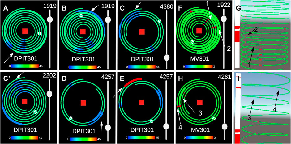
FIGURE 6. Alerts of sets1 are represented with the 2D interface (A,B,C,C′,D,E). (C′) represents the same alert as (C) with half the period. The pattern of “one long, one short” (p = 2200s) of (C′) can be detected as easily as the “two peaks” pattern (p = 4400s) of (C). Alerts of set 2 are represented with both interfaces, (F, G) represent alerts 1 and 2, (H, I) represent alerts 3 and 4.
In order to take into account the learning effect on the task at hand, we combined both the ordering of 2D and 3D prototypes and the ordering of set 1 and set 2. Therefore, participants were divided into four groups of 6 who went through the tasks as follows:
G1: First set 1 with 2D prototype, then set 2 with 3D prototype.
G2: First set 2 with 2D prototype, then set 1 with 3D prototype.
G3: First set 1 with 3D prototype, then set 2 with 2D prototype.
G4: First set 2 with 3D prototype, then set 1 with 2D prototype.
Firstly, participants had to detect a false negative in MV303 for set 1 and AIT202 for set 2, i.e., detect a rupture of pattern in a sensor where no alerts have been raised. Before the name of the sensor is given, they pressed the start button of Motif 1 and then pressed the stop button when they had explained their answer, allowing them to measure their response time. This part assesses R4: The ability to detect false negatives in the system. They were then asked to detect a false negative in FIT 201 for set 1 and in P101 for set 2 in a part with no particular pattern. Because a first pilot we conducted showed us that participants are reluctant to declare that they found nothing, and we wanted to prepare them for a false positive in the alarms. Alerts from these four sensors were deleted to create false negatives.
Lastly, participants answered alerts raised on one sensor, as we wanted to evaluate the efficiency of the 3D visualization above the 2D one more than the efficiency of a swarm. We relied on expert opinions about the swarm. The preprocessing of the alarms was undertaken before the experiment using the same matrix profile algorithm. They happened at different times on the same sensor but were all visible on the sensor at the beginning of the experiment. Participants could choose to answer alerts in the order of their choices, but all responded in chronological order. They were informed that all alerts were happening on the same sensor for each set, DPIT301 for set 1 and for MV301 set 2. For set 1, participants had to answer 5 alerts and for set 2 they had to answer 4 alerts. The first 4 alerts had similar patterns and were used to compare completion time. It was not possible to find the fifth alert for set 1 in other sensors of the dataset. However, we kept it to verify that participants were able to detect an alert causing a surge instead of a break in periodic patterns (Figure 6). Set 1 alerts where all raised on DPIT301 and set 2 alerts where all raised on MV301 (Figure 6). Participants answered alerts by pressing the button True Positive or False Positive of the corresponding alert. The timer began when they pressed the start button on top of the 5 alerts. Participants were asked to answer as fast as possible while providing a necessary explanation for their reaction to simulate a situation where an SOC operator has to answer alerts fast and correctly. Therefore, the recorded time corresponds to the time spent between the last alert handled and the conclusion of the participant’s reasoning (true or false positive). We believe that this measured time is relevant because it contains the detection of the alert processed and the search for a potential break in a periodic pattern, which corresponds to the real work of an operator. Additionally, they were asked to respond completely to each alert before trying to respond to the next. These questions assess R3: “Identification of false positives should be possible using the visualization system” and R2: “Detected anomalies should be clearly highlighted in the data”. After sorting the alerts, participants were asked questions about the characteristics of the alerts they assessed R1:
• If they treated the first alert as a True Positive they were asked: At what time did the pattern break? What was its period?
• If they treated the third alert on DPIT301 as a True Positive they were asked: What was the period of the pattern before it broke?
These questions are inspired by those ofLohfink et al. (2020) to evaluate their interfaces. Compared to the originals, we kept only the questions about the quantification of the characteristics of an alert, as the other questions assessed abilities to detect alerts and classify them as false or true positive, which are already covered in our experiment. After the tasks, each participant answered questionnaires and a discussion/open question phase takes place. They repeated the tutorial, tasks, and questionnaires with the other set and interface. At the end of the experiment, they were also asked if one set was more difficult than the other, and if yes, which one.
4.3.7 Hypotheses
We formulated the following hypotheses about the two representations:
HYPOTHESES 1:. Both conditions are as efficient for the detection of a break in periodic patterns, this is measured with success rate and response time. As both visualizations are meant to display periodic signals, both of them are supposed to be successful to complete this task.
HYPOTHESES 2:. Both conditions have the same success rate for alert responses. Both visualizations were meant to correlate alerts with breaks in periodic signals. Participants should be equally effective with both interfaces.
HYPOTHESES 3:. 3DHelix is faster than 2DSpirals for alerts responses. As the 3D prototype is meant to facilitate correlations between alerts and signals, it should improve the response time of the participants over the 2D version.
HYPOTHESES 4:. 2DSpirals require less effort than 3DHelix, as indicated by the measurements and answers to the Raw NASA-TLX. 3D interfaces for Immersive Analytics require more mental and physical effort Wagner et al. (2018).
HYPOTHESES 5:. 3DHelix has the same usability as 2DSpirals, this was measured by answers to the System Usability Scale. The VR interfaces and their interactions were simple and intuitive enough to have usability at least as high as the 2D version.
HYPOTHESES 6:. 3DHelix induced more flow than 2DSpirals, as measured by the answers to the Short Flow Scale 2. The 3D prototype uses a visualization technique and interactions that make it easier to focus only on the task at hand, which can make it easier to reach a flow state.
5 Results
5.1 Quantitative results
All participants detected a rupture in periodicity without alerts in both conditions. We checked for the normality of the distribution of response time with a Shapiro-Wilk test (p = 3.7e-06) to use a Student test to compare the mean response time of the two conditions. This student test rejects the hypothesis that there is a difference in mean between spirals and Cybercopters (p = 0.155).
Success rates were almost similar for every alert between both conditions (Table 2). The first alert was the easiest to detect as the rupture in periodicity is very clear, all participants found it with Cybercopters, and only one missed it with the spirals. The second one follows the first closely and was missed by more people than the first (with an 80.
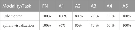
TABLE 2. Success rates for alerts classification.
Among the participants who detected the first alert, only one did not find the time of occurrence of the threat with Cybercopters, while all were able to identify it using the spiral visualization. In both cases, they all gave the right answer for the periodicity of the pattern before it broke. For the third question, participants sometimes found the “double peak” period of DPIT301 (4400 s) and sometimes the “alternative pattern” period (2200 s). When they found the former, we asked them if they could identify a shorter period. In that case, they all found 2200 s. Using Cybercopters, 7/9 participants found the right period, compared to the 6/8 participants who discerned it using spirals (Table 3).
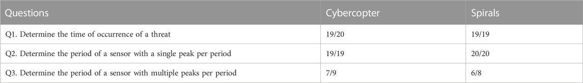
TABLE 3. Success rate of responses determining the characteristics of the alerts. For the third question, only DPIT301 (set1) had a multiple peak period.
The average time of the whole experience was 1 h per participant, including reception and questionnaire completion. The time measured for each set represents the time between the beginning of the experiment and the response to the last alert. We used a t-test corrected with the Holm–Bonferroni method (Figure 7) to determine the statistical difference between conditions. Cybercopters are significantly faster for set2 (p-value
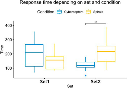
FIGURE 7. Response time to each alert depending on the set and interface. The response times to set2 are significantly different between the two interfaces (p
To better understand the time differences between the two sets, we studied the time measured for each alert. This indicates the response time to the alert minus the response time to the previous alert. Thus, the potential differences between the response times of the first alerts do not bias the results of the subsequent alerts. We then constructed a mixed linear model with time as a fixed variable, and the explanatory variables were: the conditions, the sets, and the interactions between the two. The conditions, as well as the interactions between the conditions and the sets, are significant (p-value = 0.009). To determine which pairs of alerts are significantly different, we used paired wise t-test corrected with Holm–Bonferroni method (Figure 8). Cybercopters are faster for alerts 2 (p-value = 0.02) and 4 (p-value = 0.03) of the set2. In all other cases, there is no difference in response time depending on the conditions and sets. With Cybercopters, the mean completion time for alert 2 is 19 s (std = 16) and 6 s (std = 2) for alert 4. With spirals, they averaged a completion time of 66 s (std = 34) for alert 2 and 24 s for alert 4 (std = 15).
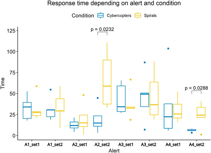
FIGURE 8. Response time to each alert depending on the set and interface. The response times to alerts 2 and 4 of set 2 are significantly different between the two interfaces.
5.2 Qualitative results
5.2.1 Questionnaires
Norman (2010) suggest that it is valid to evaluate the difference of significance between the answers of each question of a Likert scale questionnaire: They propose using multiple two-way ANOVA to determine the significance of the difference between the two conditions, which is what we did in our analysis. For all questions except the third one of the short flow scale, the only significant differences observed were between Cybercopters and the spiral prototype.
The SUS score was 74 (with a variation of 14) for the 2D prototype and 77 (with a variation of 15) for the 3D prototype. Both prototypes achieved a score above 71, which is usually taken as an indication of good usability (Bangor et al., 2009). A Shapiro test indicates that the data do not follow a normal distribution (p = 0.06), so we used a Wilcoxon test to determine that the difference in usability between the two prototypes is not significant (p = 0.45).
The only significant difference in the items of the SUS was for the ninth question (p-value = 0.012): The participants felt more confident using 3D than in 2D (Figure 9). (1. p = 0.4, 2. p = 0.2, 3. p = 0.3, 4. p = 0.4, 5. p = 0.6, 6. p = 0.4, 7. p = 0.4, 8. p = 0.6, 10. p = 0.2).
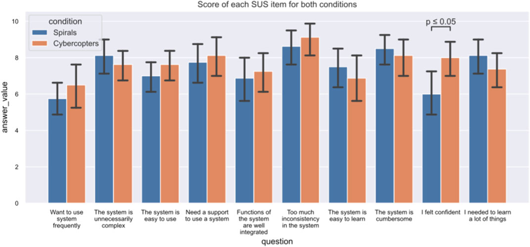
FIGURE 9. Detailed answers to the SUS for both interfaces. The only significant difference between them related to the ninth question, gauging the confidence of the participants.
Both prototypes score 27 at the NASA TLX (with a variation of 7 for both), which is considered a medium workload (Prabaswari et al., 2019). The only significant difference in the items related to the physical requirement (p = .011): participants found Cybercopter to be more physically demanding than the 2D interface (Figure 10). (1. p = 0.7, 3. p = 0.5, 4. p = 0.1, 5. p = 0.5, 6. p = 0.8).
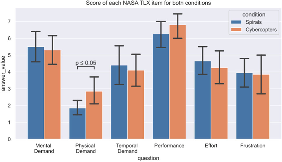
FIGURE 10. Detailed answers to the NASA-TLX for both interfaces. The only significant difference between them was the second question, asking about the physical demands of the task.
The average level of flow experienced by participants using the spiral prototype was 3.42 (with an average error of 0.56) and the average flow felt when using Cybercopter was 3.74 (with an average error of 0.65). Because the Shapiro test indicates that data do not follow a normal distribution (p-value = 0.24) we used a Wilcoxon test that indicates that the difference of flow induced in participants by the two prototypes was significant (p-value = 0.008). The participants felt a slightly higher state of optimal competence when using the virtual reality prototype. The study of specific items allows us to better understand this difference.
For the SHORT Flow State Scale items (Figure 11), participants felt more in control of what they were doing with Cybercopter (p-value = 0.025), they found that time passed differently in the virtual environment (p-value = 0.03), and they found the experience more rewarding with the immersive interface (p-value < 1e-05). There was a small difference in the participants’ sense of competence (p-value = 0.07), they felt that they perform better with Cybercopter. Question 3 of the Short Flow Scale is the only one that depends on the interaction between set and condition (p-value = 0.002), so we followed up with a Tuckey HSD to know what interactions are significant. When studying the set2, participants felt more spontaneous with Cybercopter than with spirals.
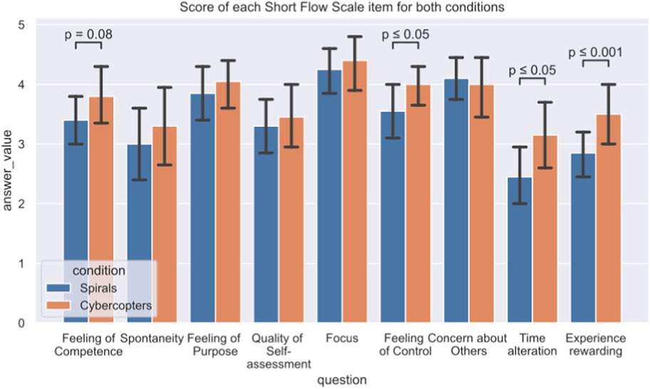
FIGURE 11. Detailed answers to the Short FLOW Scale for both interfaces. There are significant differences in questions about feelings of competence, the controls, time distortion, and how rewarding participants found the experience.
5.2.2 Open discussions and observations
All participants enjoyed using the immersive solution. They all understood both metaphors after the tutorials and every participant was able to use the immersive prototype after the 10 min tutorial, even those who never used VR before. For the two conditions, the participants found that there was a lack of reference points, such as graduations along the timeline. Eight participants did not use the click to highlight alerts and preferred to use the time sliders to detect where the alert was located. Five preferred Cybercopter because the alerts are next to the sensor’s data, and two because the alignment was linear and not radial. Five Participants found that set 2 was more difficult than set 1 (three of them used Cybercopter with set 2 while two of them used spirals), two found that set 1 was more difficult than set 2 (they both used spirals with set 1, which could indicate that using spirals is more difficult than using Cybercopters), others did not find a difference. For the 3D prototype, participants particularly enjoyed using the joystick to interact with the periodicity, as they found it very natural, even those with no experience using gaming controllers. None encountered any occlusion problems nor reported any. In 2D, participants claimed that they liked the wheel despite never using it after the tutorial.
5.3 Experts interviews
Three experts were interviewed, their experience ranging from 3 to 15 years. All experts worked in SOCs. Their opinions diverge on virtual reality, one of them used their virtual reality headset daily to manage the different windows of their console tools in a 3D environment. Another was more dubious, because virtual reality cuts the user off from the real world and thus from colleagues, even if they were very interested in the visualization and organization capacities offered by 3D environments. This participant outlined that they would prefer 3D representations in augmented reality, which would keep a link with the real world. All are interested in the new interactions offered by virtual reality headsets. More particularly, for Cybercopters, they appreciated the possibilities of creating correlations of different data with the helices. They would have appreciated more interaction and filtering options with the helices and spirals, for instances being able to halve or double the period with a button or manually align certain specific points to see if a pattern appears. They felt that the helix swarm was an interesting premise, as they could compare several sensors in relation to each other. They also used the space available to sort sensors in groups of similarity, for instance choosing to select sensors that display the same signals as a suspicious sensor. However, they would like to use the virtual space to convey more information. For instance, the 3D space could be used to represent the water plant plan or more graphs (2D or 3D) to convey context, such as the internet traffic to detect the path the cyber attacker took to disturb the plant. They found the interactions intuitive, but one suggested using a gaming controller to control the representation as they were more familiar with that type of interactor. The main drawback the experts noted is that virtual reality cut them from their usual tools, and they felt that they needed another way to access their tools, such as a data collector, IDS, or even classic communication tools.
6 Discussion
6.1 Interpretation of the results
The percentage of responses to alerts and false negatives validate requirements 2, 3, and 4 for both the Cybercopter and spiral visualization, validating Hypotheses 1. Furthermore, there was no significant difference between the success percentages of the two visualization systems. The participants were able to detect the first occurrence of a threat, to give its date as well as its associated period (single or double) for both prototypes, which validates requirement 1. Finally, out of the 24 participants, 20 outlined that they had very little experience with cybersecurity (
Concerning Hypotheses 3, the response time depends not only on the way the alert was treated but also on the sensor set, which we did not expect. Indeed, MV301 (set2) is an actuator of the process, controlling DPIT301 (set1), and their patterns seemed similar enough to be compared. It turns out that this was not the case, and that Cybercopters helped operators respond to set2 faster than spirals: more precisely, Cybercopters helped participants answer alerts 2 and 4 significantly faster than the spiral. Therefore, we reject Hypotheses 3, as Cybercopters are not more efficient than the 2D prototype to answer every alert. It is however interesting to look at the alerts where Cybercopters help answer faster than spirals. In those cases, it is more complicated to distinguish one alert from another. Indeed, the patterns of MV301 are shorter than those of DPIT301 and the alert times are longer, perhaps a combination of the two makes the 2D solution less efficient than the 3D one because the alert representation does not overlap with the data. This is consistent with the behavior of users who have difficulty distinguishing between different alerts when there are several alerts displayed on the same spiral. Indeed, both alerts 2 and 4 happen shortly after the previous alert (Figure 6), which forced users to play with the size of the time-window to display only one alert (it seemed that the highlight did not help to separate alerts). Displaying only one alert hides its context, which makes its categorization more difficult, whereas, with the helical representations in which the alert signal is next to the data, participants had no problem distinguishing one alert from another because they were at different heights. This is confirmed by the difference in spontaneity between the two conditions on set2 reported in the flow questionnaire. The separation between the representations of alerts and sensor data helps investigation of the sensor data when the user knows where the anomaly has happened. This confirms interest in the separation between representations while using space to correlate them.
The other responses to the questionnaires depended only on the condition (helices vs. spirals). The SUS score of both solutions confirms the usability of both prototypes, which is consistent with the results of Lohfink et al., who also found that the 2D prototype was usable via feedback from the ISO 9241/10 questionnaire. Since both interfaces have comparable usability, Hypotheses 5 is validated.
Participants felt that there was the same workload involved with using Cybercopters and spirals, which rejects Hypotheses 4. However, they felt that Cybercopters required more physical effort than the 2D interface, which is consistent with previous work Wagner et al. (2018), however, Cybercopters did not cause a higher workload than the 2D solution. Participants felt more confident (SUS item 8) and in control (Flow item 8) with Cybercopters than with the 2D solution. Moreover, the immersive representation created more flow in participants, which validates Hypotheses 6, giving them stronger feelings of competence and meaning that time seems to pass faster in the 3D environment, perhaps because of the more natural interactions or better immersion in the data. The speed at which participants adopted the joysticks allowed them to interact more fluidly, which allowed them to stay focused on the tasks at hand. Participants found Cybercopters more rewarding probably because they had aspects that resemble a video game, which can have a positive effect on motivation.
Finally, as shown by Weber et al. (2001) spirals and helices are compatible and can be combined to get the best of both worlds: ease of use of a WIMP (Windows, Icons, Menus, and Pointing device) interface and a huge environment to correlate data. For instance, one could choose to use a spiral to browse periodic data and switch to a helix to answer alerts.
6.2 Design implications
Based on our experiment and results, this study indicates conclusions on using Immersive Analytics compared to 2D visualizations. More specifically, in the field of cybersecurity:
• If the goal of a representation is to correlate multiple visualizations together, then even if a 3D visualization is not more efficient than a 2D one for a specific task (such as detecting periodic signals), adding a dimension may be worth it. In a line of work where the correlation between data is important, such as cybersecurity, this can be a valuable asset.
• Immersive Analytics designers should be careful of the physicality of their interactions, as IA can be more tiring even when sitting. This point could also be seen as an opportunity to help sedentary employees move.
• Immersive Analytic designers should carefully choose the interactors and interactions they propose. The fact that participants chose to only interact with the helix via joysticks instead of the slider, highlights how a small change in the choice of interactor can have a huge impact. In the future, specific interactors could be developed for each visualization task.
• Better visualization and interaction help participants undertake tasks more smoothly, which induces more flow in Immersive Analytics users. In a domain like cybersecurity where the days can be long and repetitive, this could allow the operators to be more attentive during working hours. However, the time distortion effect could be problematic in a time-sensitive environment where decisions need to be taken quickly.
• Finally, the biggest drawback the experts found is that Immersive Analytics cut them off from their usual tools. To address this problem, Wang et al. (2020) used an augmented reality headset, enabling users to use 3D visualizations while interacting with the computer screen, keyboard, and mouse. Another option to let cybersecurity operators access their tools while using Immersive Analytics is to bring 2D windows into a 3D environment (Hoppe et al., 2020). Both solutions have their perks, Augmented Reality allows operators to interact with their environments, including their fellow operators. However, Virtual Reality allows the creation of a new working space that is independent of real conditions, which allows them to arrange the visualizations in space at will. In both solutions, it could be an interesting future research direction to bring classical tools and Immersive Analytics together to support a complete workflow.
7 Conclusion and future work
The present study proposed a 3D approach to help classify alerts on periodic data. This approach represents several attributes using different visualizations and correlates them by positioning them along a common axis. The visualizations are separated and the variations of one attribute do not disturb the representation of the other. This also makes it possible to use the optimal representation for each attribute according to its characteristics, such as a helix to highlight periodicity. To apply this method to a cybersecurity use case, we implemented a 3D immersive visualization based on helical visualizations, which helped to discern periodic signals and ruptures within temporal data while displaying multiple types of information. It should also be noted that we only correlated two attributes, but it seems possible to add other representations around helices.
We compared our prototype with a state-of-the-art prototype based on spiral representations through a user study with cybersecurity laymen and experts. Participants answered alerts raised by a pattern recognition algorithm on the data of sensors and actuators of an OT dataset. Our results show that the helical representation is as efficient as the spiral-based one, and in some complex cases, it reduces the response time of the participants, which validates our approach. In addition, participants are more confident and more in a flow-like state with the immersive solution, despite the higher physical demands.
Our future work will seek to improve the helical prototype based on feedback from participants and experts, particularly the interactions with the time period of the representations as well as tools to filter data intuitively. We also try more precisely understand which properties of the data make the helical representation more efficient: it could be the type of pattern, the size and location of the alerts, or perhaps a combination of both. A new user study could be conducted to answer these questions and help to create a design space for helical visualizations. Additionally, the Cybercopter swarm was designed for one user, and we are confident we can build on this foundation to propose a multi-user solution for Cybercopters.
Helical representations are meant to be one type of representation that can be linked to others in a 3D environment in order to create a 3D dashboard. Therefore, we propose other 3D visualizations to correlate their data with those present on the helix, such as the geographical location of sensors in the plant or the state of IT sensors over time. This will enable the study of methods of correlation between multiple representations, and especially the advantages and disadvantages of using their positions in 3D space, as the potential usefulness of this method has been demonstrated with Cybercopters.
Data availability statement
The raw data supporting the conclusion of this article will be made available by the authors, without undue reservation.
Ethics statement
Ethical review and approval was not required for the study on human participants in accordance with the local legislation and institutional requirements. The patients/participants provided their written informed consent to participate in this study.
Author contributions
ND conceptualized, designed the software, designed and carried out the experiment, collected and analyzed the data, and wrote the manuscript. All authors contributed to manuscript revision, read, and approved the submitted version.
Acknowledgments
This work was supported by the industrial chair Cybersecurity for Critical Networked Infrastructures (https://CyberCNI.fr) with support of the FEDER development fund of the Brittany region. This work was supported by French government funding managed by the National Research Agency under the Investments for the Future program (PIA) grant ANR-21-ESRE-0030 (CONTINUUM).
Conflict of interest
The authors declare that the research was conducted in the absence of any commercial or financial relationships that could be construed as a potential conflict of interest.
Publisher’s note
All claims expressed in this article are solely those of the authors and do not necessarily represent those of their affiliated organizations, or those of the publisher, the editors and the reviewers. Any product that may be evaluated in this article, or claim that may be made by its manufacturer, is not guaranteed or endorsed by the publisher.
Supplementary material
The Supplementary Material for this article can be found online at: https://www.frontiersin.org/articles/10.3389/frvir.2023.1156656/full#supplementary-material
Footnotes
1https://itrust.sutd.edu.sg/itrust-labs_datasets/dataset_info/.
2https://assetstore.unity.com/packages/tools/integration/steamvr-plugin-32647.
3https://www.vrtk.io/tilia.html.
References
Anh Huynh, N., Keong Ng, W., Ulmer, A., and Kohlhammer, J. (2016). “Uncovering periodic network signals of cyber attacks,” in 2016 IEEE Symposium on Visualization for Cyber Security (VizSec). doi:10.1109/VIZSEC.2016.7739581
Anton, S. D., Lohfink, A. P., Garth, C., and Schotten, H. D. (2019). “Security in process: Detecting attacks in industrial process data,” in Proceedings of the Third Central European Cybersecurity Conference. doi:10.1145/3360664.3360669
Bangor, A., Kortum, P., and Miller, J. (2009). Determining what individual SUS scores mean; adding an adjective rating. J. Usability Stud. 4, 114–123.
Besançon, L., Ynnerman, A., Keefe, D. F., Yu, L., and Isenberg, T. (2021). The state of the art of spatial interfaces for 3D visualization. Comput. Graph. Forum 40, 293–326. doi:10.1111/cgf.14189
Brooke, J. (2020). SUS: A ’quick and dirty’ usability scale. Usability Eval. Ind., 207–212. doi:10.1201/9781498710411-35
Cantu, A., Duval, T., Grisvard, O., and Coppin, G. (2018). “HeloVis: A helical visualization for SIGINT analysis using 3D immersion,” in 2018 IEEE Pacific Visualization Symposium (PacificVis), 175–179. doi:10.1109/PacificVis.2018.00030
Chandler, T., Cordeil, M., Czauderna, T., Dwyer, T., Glowacki, J., Goncu, C., et al. (2015). “Immersive analytics,” in 2015 Big Data Visual Analytics (BDVA), 1–8. doi:10.1109/BDVA.2015.7314296
Cleveland, W. S., and McGill, R. (2007). Graphical perception: Theory, experimentation, and application of graphical methods. J. Am. Stat. Assoc. 17, 1–25.
Delcombel, N., Kabil, A., Duval, T., and Pahl, M.-O. (2021). CyberCopter: A 3D helical visualisation for periodic signals of cyber attacks, 1–5 VR4Sec 2021 (Security for XR and XR for Security).
Dwyer, T., Bach, B., Dachselt, R., Carpendale, S., Collins, C., and Lee, B. (2018a). “Immersive analytics: Exploring future interaction and visualization technologies for data analytics,” in Proceedings of the 2016 ACM International Conference on Interactive Surfaces and Spaces ISS 2016, 529–533. doi:10.1145/2992154.2996365
Dwyer, T., Marriott, K., Isenberg, T., Klein, K., Riche, N., Schreiber, F., et al. (2018b). Immersive analytics: An introduction. Cham: Springer International Publishing, 1–23. doi:10.1007/978-3-030-01388-2_1
ElSayed, N., Thomas, B., Marriott, K., Piantadosi, J., and Smith, R. (2015). “Situated analytics,” in 2015 Big Data Visual Analytics (BDVA), 1–8. doi:10.1109/BDVA.2015.7314302
Fonnet, A., and Prie, Y. (2021). Survey of immersive analytics. IEEE Trans. Vis. Comput. Graph. 27, 2101–2122. doi:10.1109/TVCG.2019.2929033
Foresti, S., Agutter, J., Livnat, Y., Moon, S., and Erbacher, R. (2006). “Visual correlation of network alerts,” in IEEE Computer Graphics and Applications (IEEE), 1275–1279.
Gautier, J., Davoine, P.-a., and Cunty, C. (2017). “Helical time representation to visualize return-periods of spatio-temporal events,” in 19th AGILE International Conference on Geographic Information.
Gove, R., and Deason, L. (2019). “Visualizing automatically detected periodic network activity,” in 2018 IEEE Symposium on Visualization for Cyber Security (VizSec), 1–8. doi:10.1109/VIZSEC.2018.8709177
Hart, S. G., and Staveland, L. E. (1988). Development of NASA-TLX (task load index): Results of empirical and theoretical research. Adv. Psychol. 52, 139–183. doi:10.1016/S0166-4115(08)62386-9
Hoppe, A., Camp, F., and Stiefelhagen, R. (2020). “Enabling interaction with arbitrary 2D applications in virtual environments,” in HCI international 2020 - posters, 30–36. doi:10.1007/978-3-030-50729-9_4
Huynh, N. A., Ng, W. K., and Do, H. G. (2017). “On periodic behavior of malware: Experiments, opportunities and challenges,” in 2016 11th International Conference on Malicious and Unwanted Software (MALWARE), 85–92. doi:10.1109/MALWARE.2016.7888733
Inoue, J., Yamagata, Y., Chen, Y., Poskitt, C. M., and Sun, J. (2017). “Anomaly detection for a water treatment system using unsupervised machine learning,” in 2017 IEEE International Conference on Data Mining Workshops (ICDMW), 1058–1065. doi:10.1109/ICDMW.2017.149
Jackson, S. A., Eklund, R. C., and Martin, A. J. (2010). The flow manual - the manual for the flow Scales. Mind Gard., 4–85.
Joo, D., Hong, T., and Han, I. (2003). The neural network models for IDS based on the asymmetric costs of false negative errors and false positive errors. Expert Syst. Appl. 25, 69–75. doi:10.1016/S0957-4174(03)00007-1
Kim, G., Jin, B., and Shin, D. C. (2022). Virtual reality as a promotion tool for small independent stores. J. Retail. Consum. Serv. 64, 102822. doi:10.1016/j.jretconser.2021.102822
Kraus, M., Weiler, N., Oelke, D., Kehrer, J., Keim, D. A., and Fuchs, J. (2020). The impact of immersion on cluster identification tasks. IEEE Trans. Vis. Comput. Graph. 26, 525–535. doi:10.1109/TVCG.2019.2934395
Legg, P. A. (2015). “Visualizing the insider threat: Challenges and tools for identifying malicious user activity,” in 2015 IEEE Symposium on Visualization for Cyber Security (VizSec). doi:10.1109/VIZSEC.2015.7312772
Leslie Reiser, O., and Koffka, K. (1935). Principles of gestalt psychology. J. Educ. Psychol. 27, 310–313. doi:10.1037/h0052629
Liu, J., Prouzeau, A., Ens, B., and Dwyer, T. (2020). “Design and evaluation of interactive small multiples data visualisation in immersive spaces,” in 2020 IEEE Conference on Virtual Reality and 3D User Interfaces (VR), 588–597. doi:10.1109/vr46266.2020.00081
Lohfink, A.-P., Anton, S. D. D., Schotten, H. D., Leitte, H., and Garth, C. (2020). Security in process: Visually supported triage analysis in industrial process data. IEEE Trans. Vis. Comput. Graph. 26, 1638–1649. doi:10.1109/TVCG.2020.2969007
Marchetti, M., Guido, A., Pierazzi, F., and Colajanni, M. (2016). “Countering Advanced Persistent Threats through security intelligence and big data analytics,” in 2016 8th International Conference on Cyber Conflict (CyCon), 243–261. doi:10.1109/CYCON.2016.7529438
Norman, G. (2010). Likert scales, levels of measurement and the ”laws” of statistics. Adv. Heal. Sci. Educ. 15, 625–632. doi:10.1007/s10459-010-9222-y
Prabaswari, A. D., Basumerda, C., and Utomo, B. W. (2019). The mental workload analysis of staff in study program of private educational organization. IOP Conf. Ser. Mater. Sci. Eng. 528, 012018. doi:10.1088/1757-899X/528/1/012018
Prouzeau, A., Lhuillier, A., Ens, B., Weiskopf, D., and Dwyer, T. (2017). “Visual link routing in immersive visualisation arnaud,” in Proceedings of the 2019 ACM International Conference on Interactive Surfaces and Spaces, 189–190. doi:10.1145/1235
Reipschlager, P., Flemisch, T., and Dachselt, R. (2021). Personal augmented reality for information visualization on large interactive displays. IEEE Trans. Vis. Comput. Graph. 27, 1182–1192. doi:10.1109/TVCG.2020.3030460
Scott, C., Nyarko, K., Capers, T., and Ladeji-Osias, J. (2003). Network intrusion visualization with niva, an intrusion detection visual and haptic analyzer. Inf. Vis. 2, 82–94. doi:10.1057/palgrave.ivs.9500044
Tominski, C., and Schumann, H. (2008). “Enhanced interactive spiral display,” in SIGRAD 2008. The Annual SIGRAD Conference Special Theme: Interaction, 53–56.
Tominski, C., Schulze-Wollgast, P., and Schumann, H. (2005). “3D information visualization for time dependent data on maps,” in Ninth International Conference on Information Visualisation (IV'05), 175–181. doi:10.1109/IV.2005.3
Van Benschoten, A., Ouyang, A., Bischoff, F., and Marrs, T. (2020). MPA: A novel cross-language API for time series analysis. J. Open Source Softw. 5, 2179. doi:10.21105/joss.02179
Wagner, J., Freitas, C., and Nedel, L. (2018). Virtualdesk: A comfortable and efficient immersive information visualization approach. Comput. Graph. Forum 37, 415–426. doi:10.1111/cgf.13430
Wang, X., Besançon, L., Rousseau, D., Sereno, M., Ammi, M., and Isenberg, T. (2020). “Towards an understanding of augmented reality extensions for existing 3d data analysis tools,” in Proceedings of the 2020 CHI Conference on Human Factors in Computing Systems (New York, NY, USA: Association for Computing Machinery), 1–13. CHI ’20. doi:10.1145/3313831.3376657
Ware, C. (2008). “Visual thinking: For design,” in Morgan kaufmann series in interactive technologies. (Amsterdam: Morgan Kaufmann).
Weber, M., Alexa, M., and Müller, W. (2001). “Visualizing time-series on spirals,” in IEEE Symposium on Information Visualization, 2001. INFOVIS 2001, 7–13. doi:10.1109/infvis.2001.963273
Webga, K., and Lu, A. (2015). “Discovery of rating fraud with real-time streaming visual analytics,” in 2015 IEEE Symposium on Visualization for Cyber Security (VizSec), 1–8. doi:10.1109/VIZSEC.2015.7312770
Yeh, C. C. M., Zhu, Y., Ulanova, L., Begum, N., Ding, Y., Dau, H. A., et al. (2017). “Matrix profile I: All pairs similarity joins for time series: A unifying view that includes motifs, discords and shapelets,” in 2016 IEEE 16th International Conference on Data Mining (ICDM), 1317–1322. doi:10.1109/ICDM.2016.89
Keywords: immersive analytics, cybersecurity, periodic signals, virtual reality, alarm classification
Citation: Delcombel N, Duval T and Pahl M-O (2023) Cybercopters Swarm: Immersive analytics for alerts classification based on periodic data. Front. Virtual Real. 4:1156656. doi: 10.3389/frvir.2023.1156656
Received: 01 February 2023; Accepted: 20 March 2023;
Published: 13 April 2023.
Edited by:
Marcos Serrano, Université Toulouse III Paul Sabatier, FranceReviewed by:
Benjamin Lee, University of Stuttgart, GermanyArnaud Prouzeau, Inria Bordeaux—Sud-Ouest Research Centre, France
Copyright © 2023 Delcombel, Duval and Pahl. This is an open-access article distributed under the terms of the Creative Commons Attribution License (CC BY). The use, distribution or reproduction in other forums is permitted, provided the original author(s) and the copyright owner(s) are credited and that the original publication in this journal is cited, in accordance with accepted academic practice. No use, distribution or reproduction is permitted which does not comply with these terms.
*Correspondence: Nicolas Delcombel, bmljb2xhcy5kZWxjb21iZWxAaW10LWF0bGFudGlxdWUuZnI=