 Omeed Ashtiani
 Hung-Jui Guo
 Balakrishnan Prabhakaran
- The Erik Jonsson School of Engineering and Computer Science, Department of Computer Science, The University of Texas at Dallas, Richardson, United States
Introduction: Augmented Reality (AR) systems are systems in which users view and interact with virtual objects overlaying the real world. AR systems are used across a variety of disciplines, i.e., games, medicine, and education to name a few. Optical See-Through (OST) AR displays allow users to perceive the real world directly by combining computer-generated imagery overlaying the real world. While perception of depth and visibility of objects is a widely studied field, we wanted to observe how color, luminance, and movement of an object interacted with each other as well as external luminance in OST AR devices. Little research has been done regarding the issues around the effect of virtual objects’ parameters on depth perception, external lighting, and the effect of an object’s mobility on this depth perception.
Methods: We aim to perform an analysis of the effects of motion cues, color, and luminance on depth estimation of AR objects overlaying the real world with OST displays. We perform two experiments, differing in environmental lighting conditions (287 lux and 156 lux), and analyze the effects and differences on depth and speed perceptions.
Results: We have found that while stationary objects follow previous research with regards to depth perception, motion and both object and environmental luminance play a factor in this perception.
Discussion: These results will be significantly useful for developers to account for depth estimation issues that may arise in AR environments. Awareness of the different effects of speed and environmental illuminance on depth perception can be utilized when performing AR or MR applications where precision matters.
1 Introduction
The understanding of depth cues has been studied since the late 19th century. Of these cues, we see that color and luminance in particular have been researched to find which colors appear in front of one another. This phenomenon has originally been investigated by researchers of the psychology and vision fields, where artists use these cues for their illustrations. As technology advances, researchers have studied the effects of how color cues interact with motion cues on the brain (Self and Zeki, 2004). With emerging Augmented Reality (AR) and Mixed Reality (MR) technology, researchers should focus on understanding how depth cues work on not only real objects but virtual objects as well.
An MR system is defined as having the following properties: 1) combines real and virtual objects in a real environment, 2) runs interactively and in real-time, and 3) registers (aligns) real and virtual objects with each other (Cipresso et al., 2018). Inaccurate depth rendering or perceptions can cause issues for users across multiple domains, including construction, gaming, education, and the medical field, as users expect their input actions to reflect across virtual space.
Due to the importance of depth perception in AR across a variety of disciplines, understanding depth cues, such as color and luminance, can be a useful tool in ensuring accurate depth information is presented in AR systems. Here, we refer to luminance as the relative brightness of an object in contrast to its background and color as hue. Prior to the development of AR systems, much work has been conducted on understanding these depth cues in the real world. With the increase in AR technologies, some researchers have transitioned to focusing on perceptions in augmented space. Although color and luminance as depth cues have been thoroughly studied, most of the work has been investigated on stationary objects, both in the real world and AR. A lot of work in AR with relation to speed or motion involves automatic object tracking or trajectory prediction. However, in relation to human perception of speed and depth, not a lot of work has been evaluated based on color and luminance.
1.1 Need for perception studies in OST-AR devices
Video See-Through AR (VST-AR) displays capture the real world via a camera and render the captured video to the user, overlaying the virtual 3D graphics objects with the captured video. The renderings of the real world may have artifacts that are not present in the real world, due to the effects of foreground or background lighting conditions, resulting in emphasized shadows or reduced image quality. Although previous research has studied the effect of color and luminance of virtual objects on depth perception, these studies have been carried out using VST-AR displays. Because VST headsets render real-world environments with possible image processing artifacts, there could be some safety concerns when users move around in the real world with their headsets on. In contrast, Optical See-Through AR (OST-AR) displays, offer the unique view of images projected onto see-through glass, allowing users to see AR objects directly overlaying the real world without any modification, and in real-time. This observation of the real world allows users to feel more comfortable and walk more similarly to how they would with no headset (Adam Jones et al., 2012). Therefore, it is useful to study how objects, both stationary and moving, are viewed in AR with relation to depth and speed prior to moving in AR.
As articulated earlier, most of the research on this topic of depth perception based on the color and luminance of virtual objects and the effect of motion cues has been conducted for Video See-Through (VST) AR displays. Very little research seems to have been done to test the effects of not only color and luminance on depth perception in OST-AR displays, but also the effects of environment, whether dim or bright, and the effects of AR object mobility To the best of our knowledge, this is the first study to explore and analyze these distinctions and their interactivity with one another in the context of OST-AR displays.
1.2 Proposed approach
Based on the limitations mentioned in Section 1.1, our work is designed to investigate the impact of factors such as object color, object luminance, environmental lighting, and motion of MR objects and how they interact with one another. Due to the popularity of Microsoft’s HoloLens 2 (Microsoft, 2022), an OST-MR device, we conducted our study by using the HoloLens 2 for all participants. The HoloLens 2 is a battery-powered, stereoscopic OST headset created by Microsoft that has a battery life of about 2 h. It projects light to a lens, overlaying AR and MR information over the real world. However, these virtual objects are created at 500 nits, and are to be recommended in an environment between 500 and 1,000 lux. We have found that for our experiment of creating MR objects, we can work in a range of 100–1500 lux. External illumination far exceeding this value, such as the brightness of the Sun, diminishes the visibility of these objects, as the average lux in direct sunlight is between 32,000 and 100,000, whereas ambient daylight is 10,000 to 25,000. In our geographical location, the outdoor lux was well above that recommended by Hololens 2 specification and objects were nearly invisible. Also, it would be difficult to control for external variables across all users, such as Sun positioning and lighting on a given day, increasing the variability of perception.
Due to this degradation, we excluded outdoor environments and conducted our study only indoors, using internal illumination within the range of 100–500 lux. We conducted two experiments to address the concerns in Section 1.1.
• In a brightly lit indoor environment, measured at 287 lux, with AR objects moving toward the user.
• In a dimly lit indoor environment, measured at 156 lux, with AR objects moving toward the user.
Our contributions for OST-AR/MR Headsets (HoloLens 2) are as follows.
• Evaluate the effects of depth cues’ color and luminance on depth perception in indoor environments.
• Evaluate the effects of motion cues with relation to those depth cues with objects in motion
• Recommendations for color and luminance of depth cues based on environment and motion of objects.
2 Related works
2.1 Color and luminance as depth cues
Depth cues have been studied comprehensively for over a century in the real world. Of these depth cues, color and luminance have been the main targets. As far back as late the 19th century, Ashley studied the intensity of light in visual estimates of depth (L Ashley, 1898). They found that in monocular experiments, the trend where an increase of light and decrease of perceived distance follows something similar to Weber’s Law, and that in both monocular and binocular experiments, brighter targets appear closer (Ekman, 1959). In another monocular experiment, Pillsbury and Schaefer investigate neon red and argon blue, noticing that red appears nearer to the eye, but only in specific conditions (Pillsbury and Schaefer, 1937). Johns and Sumner investigated the apparent ‘brightness’ of different colors, finding them to be in this order from brightest to darkest: White, Yellow, Green, Red, Blue, Black (Johns and Sumner, 1948). Troscianko investigated color gradients with monocular vision, finding that a saturation gradient of red-gray was particularly effective at affecting perceived depth, but not the red-green hue gradient (Tom et al., 1991). Multiple other authors have found that luminance is a major cue for perceived distance (Coules, 1955; Payne, 1964).
Farnè took it a step further and found that it was not brightness alone, but that it was brightness in relation to its background that influenced perceived distance. Farnè judged white and black on varying backgrounds, ranging from near white to near black, and found that the target with the higher contrast with the background is perceived as nearer, as opposed to merely the brighter target being nearer. Dengler and Nitschke also observed this phenomenon with orange and blue, orange being the brighter color. They noticed that orange appears before blue on darker backgrounds, but this apparent depth reverses as the background shifts into a brighter color (Dengler and Nitschke, 1993). O’Shea also found this trend, noting that even with differing sizes, the objects with larger contrast to the background appear closer (O’Shea et al., 1994). Bailey et al. took a more in-depth study of the effects of warm and cool colors (Bailey et al., 2006). Several studies have furthered these conclusions, finding that lower contrast is further away, luminance is a major cue to distance, and that in terms of contrast, certain colors are seen as advancing (reds, warm colors) and others are retreating (blues, cool colors) (Guibal and Dresp, 2004; O’Shea et al., 1994; PayneJr, 1964; Pillsbury and Schaefer, 1937).
As technology advanced, researchers started analyzing depth cues in pictures, screens, and AR displays. For 2D displays, Kjelldahl found lighting influenced the accuracy of depth perception on 3D objects (Kjelldahl and Martin, 1995). Guibal and Dresp found that red, when supported by any spatial cue, wins over green on lighter backgrounds. Yet, on darker backgrounds, green or white wins over red for perceived nearness (Guibal and Dresp, 2004). Do et al. investigated color, luminance, and fidelity, finding that brighter colors win over darker on certain backgrounds, yet increased fidelity plays a role as well (Do et al., 2020). Other researchers investigated depth cues in 2D renderings (Berning et al., 2014; Fujimura and Morishita, 2011). Arefin et al. investigated context and focal distance switching on human performance with AR devices (Phillips et al., 2020).
A lot of work in AR with relation to speed or motion involves automatic object tracking or trajectory prediction (Chen and Meng, 2010; Gao and Spratling, 2022; Lee et al., 2020; Li et al., 2021; Morzy, 2006). Bedell et al. investigated which judgment is perceived first, color change or movement, and found that it depends on motion cycle (Bedell et al., 2003). However, in relation to human perception of speed and depth, not a lot of work has been evaluated based on color and luminance.
When evaluating depth cues in AR, work has been done on both the mobile and HUD front (Chatzopoulos et al., 2017; Dey and Sandor, 2014; Diaz et al., 2017; Kalia et al., 2016; Singh et al., 2020). Swan et al. found that judgments differ depending on how far an AR object is, noticing that object distance is underestimated before 23 m and overestimated afterward (Edward Swan et al., 2007). Singh et al. (2009) further studied depth judgments at near-field distances between 34 and 50 cm. Livingston et al. found that outdoor environments cause overestimation yet indoor environments lead to understimation, though these can be closer to correct measurements with linear perspective cues (Livingston et al., 2009). Multiple other authors investigated the effects of environment, device, or occlusion on perspective in AR (Dey et al., 2012; Kruijff et al., 2010). Gabbard et al. noted the color blending phenomenon, where, as the background luminance increases, AR colors appear more washed out (Gabbard et al., 2013). Gombač et al. found that depth cues matter less when a VR or AR object is held by the user (Gombač et al., 2016). Rosales found that the position of the object mattered as well, as objects off of the ground appeared further away than those on the ground (Salas Rosales et al., 2019). Adams investigated the use of shadows in 3D AR space on depth perception (Adams, 2020). Weiskopf and Ertl (2002) evaluated brightness, saturation, and hue gradient with respect to depth-cueing, deriving parameters for their schema. Li et al. (2022) worked on mapping specific colors to depths to assist users with depth perception in VR while Du worked on 3D interaction with depth maps for Mobile AR (Du et al., 2020). Other authors evaluated the effects of perceived distance on depth perception, noticing that at some distances, AR objects are underestimated while at other distances, they are overestimated (Edward Swan et al., 2007). Dey and Sandor presented insights from AR experiments with depth perception and occlusion in outdoor environments. They found that egocentric and exocentric distances are underestimated in handheld AR, where depth perception can improve if handheld AR systems dynamically adapt their geometric field of view to match the display field of view (Dey and Sandor, 2014). Many researchers focus on the effects of a real-world background on AR objects (Dey and Sandor, 2014; Gabbard et al., 2013; Kruijff et al., 2010).
Do et al. (2020) is the most relevant with regard to luminance and color cues. The authors researched the effects of luminance, color, shape, and fidelity, albeit in VST Mobile AR. They performed a paired comparison experiment, where they showed stationary VST-AR objects and asked the user to choose one and only one that was closer. They then verified these relationships by performing the coefficient of agreements between users and the coefficient of consistency for each user.
2.2 Color and motion cue integration
In previous literature, speed and motion cues are considered for object detection and not as factors affecting depth perception (Bedell et al., 2003; Cucchiara et al., 2001; Dubuisson and Jain, 1993; Møller and Hurlbert, 1997). When accounting for speed, these works focus on sequences of frames for automatic object tracking or trajectory prediction (Chen and Meng, 2010; Lee et al., 2020; Li et al., 2021; Morzy, 2006). Self et al. found that color and motion-defined shapes activate similar regions in the brain more strongly when used together than either of these cues separately (Self and Zeki, 2004). Some research works specifically include the color of either the object or environment to assist with prediction (Gao and Spratling, 2022; Wu et al., 2014). Oueslati et al. show the importance of being aware of ever-changing contexts of environments (Oueslati et al., 2021). However, Verghese et al. investigated locational and color cues for attentional bias (Verghese et al., 2013). They found that locational cues are important for prediction, although color could not be used to focus attention and integrate motion alone. Hong et al. demonstrated that the motion of an object affects both its own color appearance and the color appearance of a nearby object, suggesting a tight coupling between color and motion processing (Cappello et al., 2016). Based on these papers, we hope to provide insight into the effects of color and motion in relation to OST-AR and depth perception.
3 Experimental design
3.1 Design choices
3.1.1 Experimental methodology
In prior research such as (Do et al., 2020), paired comparison experiments have been employed to evaluate the quality of certain features. In this experimental methodology, a user sees a combination of two objects and picks between the two to decide which object has the better or expected quality. We follow this (paired comparison) approach in our research. Typically, in the paired comparison experiments done in the literature, the user is not allowed to give the opinion that both objects have the similar quality of features being evaluated. Instead, an analysis of consistency is done by checking for ternary relationships, such as circular triads. For instance, let us consider our research in which users must choose which colored cue is closer. Here, following the ternary relationships, if colora is closer than colorb and colorb is closer than colorc, then it must follow that colora is closer than colorc. We analyze the user’s choices to check if this ternary relationship holds or not. This check also helps us to understand if the user is choosing at random. If random choices are made by the users, this inequality may not be followed, resulting in the formation of a circular triad. This metric is further explained in Section 4.1, to find if choices are random or follow a pattern. In this case, we measure the depth perception of the objects.
In each experiment, we cycle through hue and luminance pairs. The hues and luminance tested can be seen in Figure 1. The experiments differ in terms of movement, i.e., objects moving towards the user at varying speeds, and environmental lighting. Based on past research, we expected warm colors to be perceived as nearer than cooler colors at the same luminance, in dim environments, with the reverse true in brighter environments. However, we wanted to observe if these results are maintained when using an OST-AR device, in dim and bright indoor environments, and when objects are moving. Although the HoloLens2 is an OST-MR device, we use its AR capabilities for the purpose of these experiments.
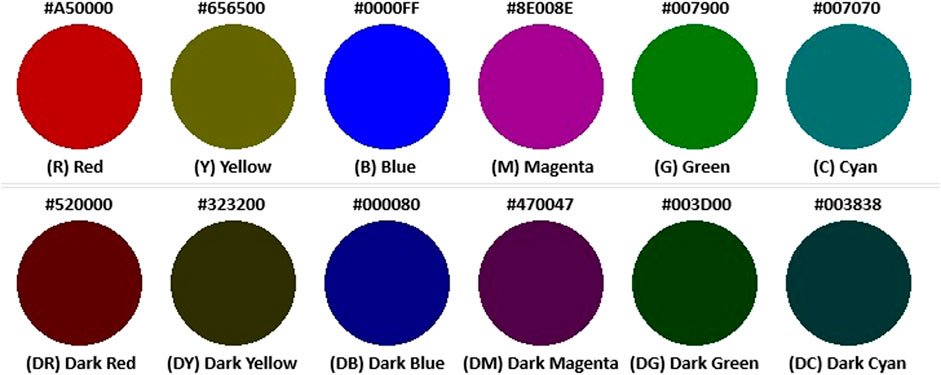
FIGURE 1. The color conditions used for the paired comparisons. A color is displayed with its given abbreviation and hex color code (Based on data from Do et al. (2020)).
3.1.2 Experimental setup
The experiments were performed in an indoor environment. In this environment, users had at least 5 m of space in front of them with a width of at least 6 m to their side. A large, white background was placed before them at a 5-m distance to compare the orbs on a static background, leaving the rest of the peripheral environment the same. We ensured that the orbs were not occluded behind any walls and that there was ample room between the AR objects and any real objects. Two spheres, each roughly 25 cm in diameter across each dimension, were placed in front of the user. These spheres were 2.0 m away from the user on the x-axis, left and right respectively, and 4.5 m away from the user on the z-axis. This leads to the visual angle subtended being calculated as
3.1.3 User study design
Users were tasked with selecting the orb that appeared either closer to them or would collide with them first if moving. After selection, the selected orb would have a marker, indicating its selection for 500 ms, in line with other similar paired comparison experiments. We conducted the same experiment across two lighting conditions: 1) a bright environment measured at 287 lux, and 2) a dimmer environment measured at 156 lux, as seen in Figure 2. Lastly, after every combination of colors was seen and a choice selected, the spheres would begin moving at a speed of 0.5 m/s. After every combination was seen again, the spheres would increase to 1.0 m/s.
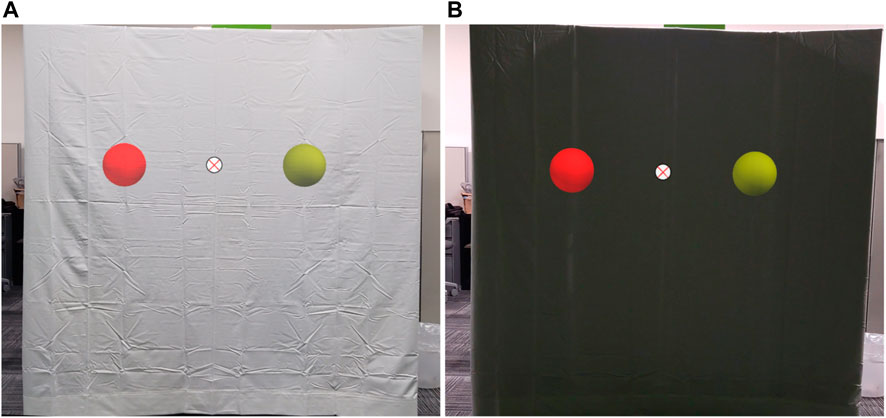
FIGURE 2. Augmented Reality Color Experiment - On the (A) a bright environment measured at 287 lux, and (B) a dimmer environment measured at 156 lux.
In this manner, we could analyze the effects of color, luminance, and motion on depth perception in OST-AR headsets, in both lighting conditions. The variables recorded included color choice, speed, distance, experiment location, and time-until-object-chosen for each object pair.
3.2 Color hue and luminance
Six color hues were selected to represent the spectrum of colors. Three warm colors (red, magenta, and yellow) were chosen along with three cool colors (green, blue, cyan). Both the bright and dark versions of each color were included, leading to a total of 12 color combinations. All colors were luminance-balanced. This methodology, based on the previous work (Do et al., 2020), allows us to compare and contrast our results with theirs. Each color was tested on a similar background for each of our two experiments, so that the differences in luminance conditions could be contrasted in both bright and darker environments, along with movement conditions.
3.3 Pre-experiment
Before participation in the paired comparison experiment, participants filled out a background survey to ensure that they had normal or corrected-to-normal vision and did not suffer from any form of color blindness. After confirmation, the users used the HoloLens 2 eye-calibration and color-calibration features to ensure that the device was calibrated to their eye specifications. Afterward, we brought the user to the starting position where they partook in a small tutorial featuring gray orbs, placed at different lengths away from the user. The user was tasked with selecting which orb appeared closer to them by using a game controller, where they used the left and right triggers to select the respective orb. As the tutorial progressed, the distances between the gray orbs decreased until both orbs were equidistant from the user at both the x and z-axes. To ensure that the users felt comfortable with the system, users went through 40 iterations of orb selection, where the first 20 iterations contained a difference in distance, the next 10 iterations were equidistant from the user and stationary, and the last 10 were equidistant and moved towards the user starting from 0.1 m/s and increasing to 1.0 m/s at a rate of 0.1 m/s after each selection. After successfully completing the tutorial, users were then moved on to the experiments.
3.4 Experiment
After the pre-experiment, all possible combinations of each color and luminance were generated. As there are 6 colors and 2 luminances, there are 12 possible color/luminance pairs, leading to n = 12. By choosing r = 2 colors, we generate each pair randomly, randomizing the order in which they are presented as pairs and randomizing which sphere is on the left and right respectively. For each speed, we use the combinatorics formula to create the total possible pairs,
4 Evaluation methodology
Paired comparison experiments require participants to select between two objects based on a shared quality, as explained in Section 3. We presented the participants with two differently colored versions of the same virtual object via an OST-MR headset and asked them to select the object that appeared closer to them (stationary) or would collide with them first (moving). The participants were instructed to evaluate a set amount of comparison pairs from the set of color conditions.
Suppose that n is the number of colors that we wish to compare against one another. A participant will be presented with pairs. In our experiment, we have 12 color conditions and thus, each participant compares 66 pairs at each speed for the respective experiment. The user’s observation is recorded for each selection. After these 66 selections, the next speed is chosen, for up to three speeds, speed = [0.0 m/s, 0.5 m/s, 1.0 m/s]. An example of this selection matrix can be seen in Table 1. We list the combinations in the table such that the row color was selected over the column color. We then add these matrices for each user together and display the total number of selections.
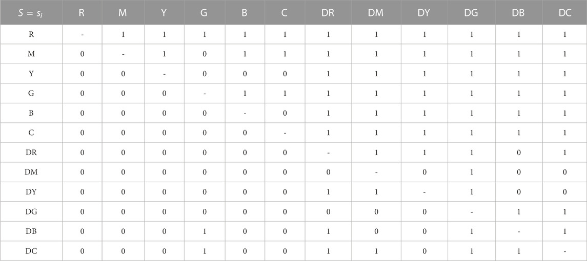
TABLE 1. Example preference matrix for a participant sj when shown all color combinations. We use a 1 to signify that the row color was selected over the column color. As this is a paired-comparison experiment, users select one of the two objects.
Table 1 is representative of how the data was selected and shows the selection of one user’s selection during the object moving experiment, regardless of speed.
4.1 Statistical analysis
We employed the same methodology and analysis methods as Ledda et al. (2005) and Do et al. (2020), who showed support for using the following methods of analysis in a paired comparison experiment.
4.1.1 Kendall coefficient of agreement
If all participants vote the same way, then there is complete agreement. However, this is not usually the case and it is important to determine if there is actual agreement between participants. Kendall’s coefficient of agreement utilizes the number of agreements between pairs. In most paired experiments, we find the agreement as follows:
In Equation 1, pij is the number of times that colori is chosen over colorj. The sum of the combination of matches is then taken.
Σ Can then be used to calculate the coefficient of agreement, or the sum of the number of agreements in pairs, extending over all pairs excluding the diagonal component.
We calculate the coefficient of agreement among participants. Kendall and Babington Smith (1940) define the coefficient of agreement, u, as:
where s is the number of participants and n is the number of items being compared.
Should all of the participants make identical choices, then u would be equal to 1. As participants disagree, u decreases to −1/(s − 1) if s is even and −1/s if s is odd.
This coefficient, u, acts as a metric of agreement between the participants. We can test the significance of this agreement to determine if participants agree with one another using a large sample approximation to the sampling distribution (Siegel and Castellan, 1988).
χ2 is asymptotically distributed with n(n − 1)/2 degrees of freedom. We can use a table of probability value for χ2, found at (Siegel and Castellan, 1988) in Table C. Using this statistic, we can test the null hypothesis that there is no agreement among participants, which implies that all colors are perceptually equivalent.
4.1.2 Coefficient of consistency
When using combinations, paired comparison experiments often measure the transitive property of participants’ choices to ensure consistency. As explained in Section 3, we check if the ternary relationship holds among the user’s choices and if a circular triad is getting formed due to randomness in the choices. Inconsistency can frequently occur when the items being compared are similar, making it difficult to judge. We calculated the coefficient of consistency, ζ, as defined by Kendall and Babington Smith (1940) and used in Do et al. (2020), for even n, where c denotes the number of circular triads:
We can determine the number of circular triads using the following formula (David, 1988):
where n is defined as the number of colors and pi is the score of each color. It is important that participants can have a low coefficient of consistency, ζ, while having a high coefficient of agreement u. This can occur should participants individually make inconsistent decisions leading to a large number of circular triads, yet the population also makes similar inconsistent decisions. ζ ∈ [0, 1], tending towards 0 if inconsistency increases. ζ will be lower if colors are perceptually similar.
5 Results and discussion
5.1 Participants
5.1.1 Participants
For both experiments, we had 15 volunteers. Each participant participated in both the dark and bright experiments, although the order of the experiments was randomized. The age range of the volunteers was 18–30, with the majority of participants between 18 and 23. These participants also varied in technology use and were recruited from both campus and local organizations. Each participant was assigned a random preset to ensure there were not any effects on the population from similar ordering. The average time taken by a user to complete each experiment ranged from 10 to 16 min with the average time being 14 min. Upon completion of each segment, users verbally reported any observations they had about the color and speed of the objects.
5.2 Results
For analysis, we created 3 combined preference matrices for each experiment, based on speed/distance, leading to 6 total matrices. In the 2 bar graph figures, we show total scores for each color in both environments, showing how many times a color was selected over another color at each speed and for each experiment, ordered from the colors most often chosen to the colors least often chosen.
In both experiments at all speeds, brighter colors were perceived as both closer and faster than darker colors. When objects are stationary, red and magenta appear closer to users in both external brightness levels. However, as objects begin moving, green is selected at a higher frequency as appearing closer or faster for many participants. In the dark environment, the darker colors seemed to vary in selection as speed increased, with no real commonality between the speeds. The results can be seen in Figure 3. At speed = 0.0 m/s, the darker colors appear near indistinguishable.
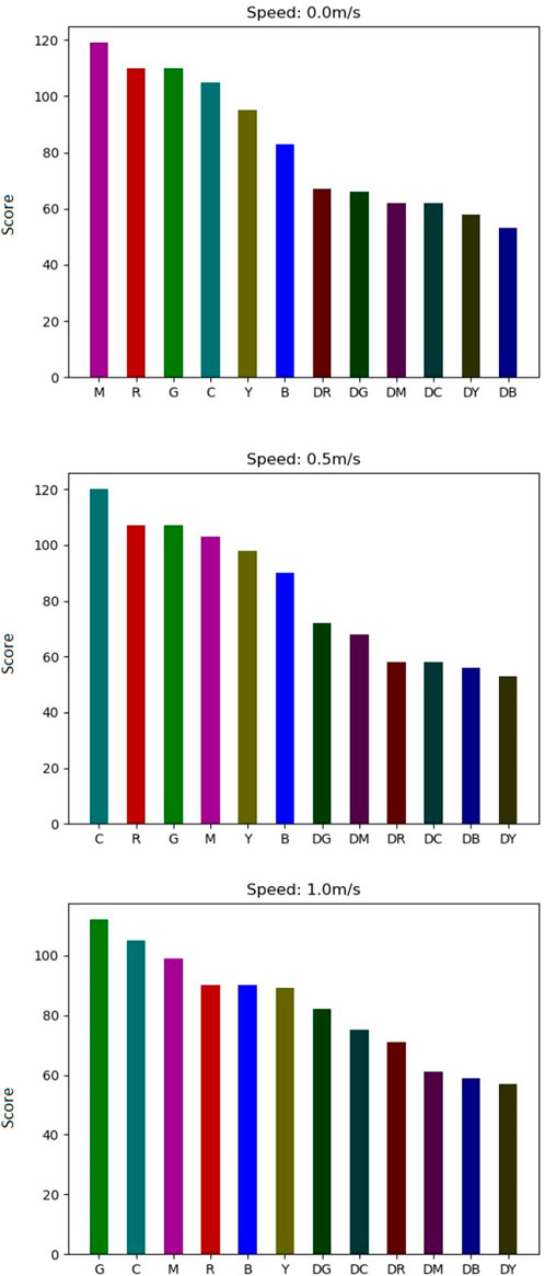
FIGURE 3. Bar graphs of total scores of each color for each speed in the dark environment. Colors are ordered from greatest score to least score.
In the bright environment, at speeds 0.5 and 1.0 m/s, we see that all darker luminances appear indistinguishable sans dark green, as seen in Figure 4.
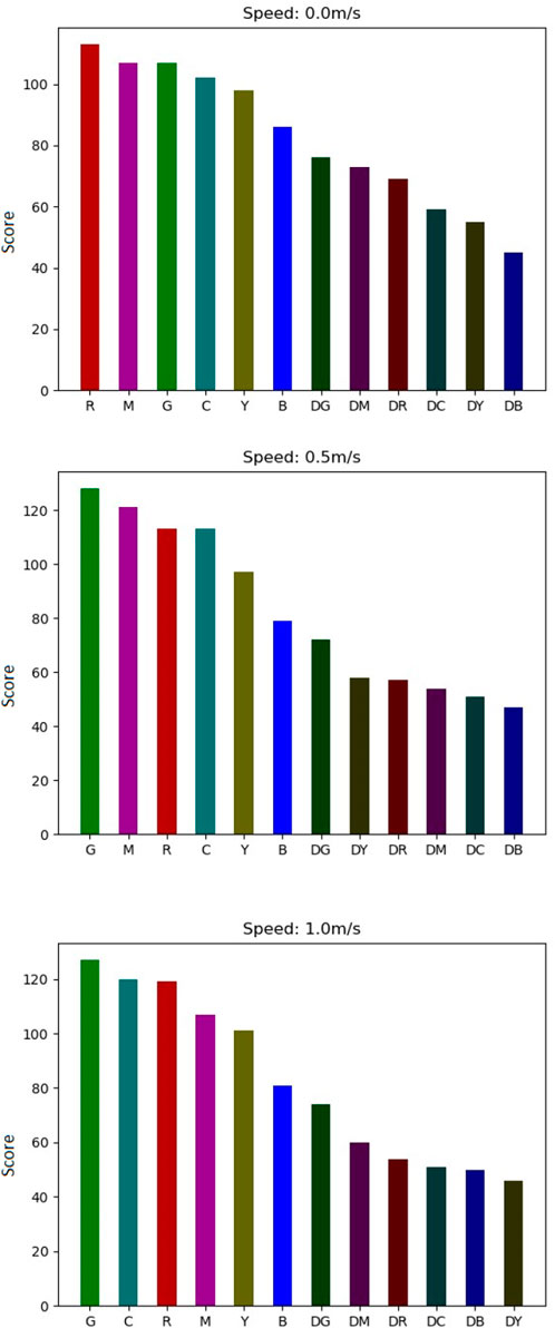
FIGURE 4. Bar graphs of total scores of each color for each speed in the bright environment. Colors are ordered from greatest score to least score.
After analyzing which colors were chosen, we evaluated the coefficient of agreement μ, the χ2, and the coefficient of consistency ζ as described in Section 4.1.1, among participants’ choices for each speed and each experiment, which can be seen in Table 2. The χ2 score shows that the average user was agreeable to their own choices. The users also seem to be within agreement with one another, as agreeability in this case is between
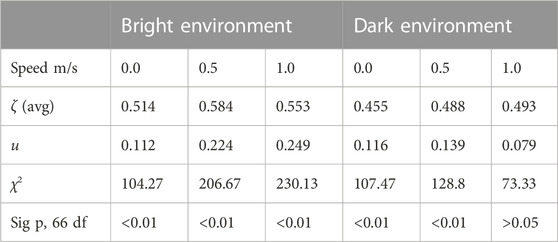
TABLE 2. Metrics for Statistical Analysis of each environment and speed.
We analyzed the significance of the coefficient of agreement u for all models using an approximation described in Section 4.1.1. If the p-value of the coefficient of agreement is significant, then groups can be created of perceptual similarity, where all colors in said groups are not perceived as significantly different. However, at α = 0.05 level for 66 degrees of freedom, we can conclude that there is some agreement amongst participants for all experiments except for speed = 1.0 m/s in the dark environment. Therefore, we can reject the hypothesis that there is no significant difference between the colors.
5.3 Discussion and recommendations
Our preliminary results indicate that the speed of moving 3D virtual objects interacts with color and luminance to affect depth perception, to an extent, in OST-AR headsets. Color and luminance are well-studied depth cues, but the influence of these depth cues can vary depending on the speed of a 3D object and the luminance of the environment.
For both experiments, brighter colors appeared closer than darker colors. However, at all speeds, two observations stand out. One, warmer colors did not triumph over cooler colors of the same luminance and two, blue and yellow seem to be consistently chosen the least amount amongst brighter colors. For all experiments except the bright environment where objects moved at 0.5 ms/, dark blue and dark yellow were also chosen the least when compared to the other dark colors.
When discussing with participants, many participants noted that darker colors were more translucent than brighter colors, causing them to appear more faded out, thus signaling that these objects were further away. This was especially noticed in brighter environments, where the increase in brightness caused greater translucency. Upon review of previous works, it seems that this issue may reside only with OST-AR devices, as video AR overlays the virtual objects over a camera-rendered screen, thus there are no translucency issues with the AR objects themselves. This could also explain the agreements being higher for the brighter environments, as for any bright/dark pair, brighter colors were nearly always chosen. Even for specific dark pair combinations, users were able to see one of the objects more clearly, as dark blue and dark yellow were rarely chosen.
However, while in the dim environment, participants noted that the darker objects were more easily viewable. This lack of translucency caused objects to appear more opaque, causing users to be unsure of which objects appeared closer. This caused much less agreement among users. For both experiments, adding motion to these objects changes which color/luminance pair appears closer to the user. Green overtakes magenta in all cases, though sometimes barely. The background illumination also appears to play a factor in the depth perception of AR objects, as we found it harder to see objects in very bright settings, such as an outside Sun setting. AR developers should consider at least three factors when creating objects or adding color to already existing objects.
• The environmental luminance, whether dimly lit or brightly lit based on lux values
• The color and if depth or speed perception matters
• The AR object, whether stationary or moving
It is also well documented that the human visual system is most responsive to green detail as opposed to red and blue (Bayer, 1975). This aspect of the acuity human visual perception system could be the reason for the correlation between the perception of object speed, and the color green, as the experiment results show greener colors appeared closer in the movement experiments.
We recommend that application developers be aware of what type of environment their users will be in. If the application is designed with dim settings in mind, colors are less distinguishable and thus may not have an intended effect. Similarly, if the objects are moving at 1.0 m/s, then the current agreement is insignificant. However, if the users are in brighter environments, brighter luminances will allow the object to be more perceptible and appear closer. Safe choices for stationary objects for closeness appear to be magenta and red, while cyan and green also become good choices. Dark colors especially should be avoided in bright environments, as they may not even be perceptible to the users.
Our findings aim to help improve applications where developers bring attention to moving objects using depth cues, such as an object tracking system. If developers understand the interactions of motion cues on depth cues, these effects can be properly utilized to the developer’s and user’s advantage.
5.4 Limitations
The results are primarily valid for the HoloLens 2 and might hold good for other OST-HMDs with similar color perception. While it is possible that these perceptions may not translate fully to other OST-HMD devices, the results and the experimental design can be adopted for similar experiments to understand the effects on depth and speed perception for other OST-HMD devices.
The total amount of pairs that each participant saw was 396. Users discussed impatience, and thus, we stuck with a combination of pairs instead of investigating permutations, which would have doubled the number of observations. However, by evaluating a coefficiency of consistency, we can better understand if there is a pattern of distinguishability for each participant.
There are a few limitations to consider when using an OST-AR device, such as the HoloLens 2. These devices struggle to render objects in brighter conditions and are quick to overheat in hotter environments. In this research, we worked with the limitations set forth by Microsoft. We have found that in our geographical location, the MR objects are nearly invisible when rendered in outdoor environments during the daytime with bright sunshine. Furthermore, due to the changing nature of outdoor lighting and lighting arrangements, such as the position of the Sun and the resulting orientation of lighting on a given day, it would be difficult to ensure uniform outdoor environments for all the users involved in the study, increasing the variability of perception. Hence, our research results are limited to indoor environments.
6 Conclusion
In this paper, we evaluated the effects of color, luminance, motion, and environment settings on the depth perception of 3D objects with an OST-AR headset. To determine these effects, we conducted two paired-comparison experiments. The results of our study indicate that motion cues on 3D AR objects work with the color and luminance of not only the object but also the environment to affect the depth perception of objects in OST-AR devices. For indoor settings, speed augments which colors are perceived as closer, up to a certain extent. Motion plays a role in perceived depth estimation when working with AR object colors and luminance, as well as the luminance of the environment. We have shown that for OST-AR devices, similar to prior research in the real world, colors with a brighter luminance appear closer than colors with a darker luminance.
In the future, we plan to investigate the effects of speed estimation of objects moving towards a third-party object in comparison to moving towards the user, i.e., time-until-collision. We hope that the results of this experiment can provide insight for object tracking systems with additional highlighting of objects for visibility, as specific color choices may be necessary based on environment and motion. Developers will find it advantageous to understand the effects of motion and environment, as well as previously studied depth cues on depth perception for 3D AR objects.
Data availability statement
The raw data supporting the conclusion of this article will be made available by the authors, without undue reservation.
Ethics statement
The studies involving humans were approved by University of Texas at Dallas Institutional Review Board. The studies were conducted in accordance with the local legislation and institutional requirements. The participants provided their written informed consent to participate in this study.
Author contributions
OA conducted all experiments and wrote the majority of the paper outline. BP edited the paper and provided insight into experimentation, acting as advisor. H-JG assisted with editing the paper and conducting some experiments. All authors contributed to the article and approved the submitted version.
Funding
This research was sponsored by the DEVCOM U.S. Army Research Laboratory under Cooperative Agreement Number W911NF-21-2-0145 to BP.
Conflict of interest
The authors declare that the research was conducted in the absence of any commercial or financial relationships that could be construed as a potential conflict of interest.
Publisher’s note
All claims expressed in this article are solely those of the authors and do not necessarily represent those of their affiliated organizations, or those of the publisher, the editors and the reviewers. Any product that may be evaluated in this article, or claim that may be made by its manufacturer, is not guaranteed or endorsed by the publisher.
Author disclaimer
The views and conclusions contained in this document are those of the authors and should not be interpreted as representing the official policies, either expressed or implied, of the DEVCOM Army Research Laboratory or the U.S. Government. The U.S. Government is authorized to reproduce and distribute reprints for Government purposes notwithstanding any copyright notation.
References
Adam Jones, J., Edward Swan, J., Singh, G., Reddy, S., Moser, K., Hua, C., et al. (2012). “Improvements in visually directed walking in virtual environments cannot Be explained by changes in gait alone,” in Proceedings of the ACM symposium on applied perception (SAP ’12) (New York, NY, USA: Association for Computing Machinery), 11–16. doi:10.1145/2338676.2338679
Adams, H. (2020). “[DC] resolving cue conflicts in augmented reality,” in 2020 IEEE Conf. Virtual Real. 3D User Interfaces Abstr. Work (Atlanta, GA: VRW), 547–548. doi:10.1109/VRW50115.2020.00125
Ashley, M. L. (1898). Concerning the significance of intensity of LIght in visual estimates of depth. Vis. Res. 5, 595–615. doi:10.1037/h0068517
Bailey, R. J., Grimm, C. M., and Davoli, C. (2006). The real effect of warm-cool colors. WUCSE-2006-17 (Jan 2006).
Bayer, B. E. (1975). Color imaging array. Retrieved October 10th., 2023 Available at: https://patents.google.com/patent/US3971065A/en (Patent No. US05/555,477, Filed March 5th. Accessed October, 2022.
Bedell, H. E., Chung, S. T., Ogmen, H., and Patel, S. S. (2003). Color and motion: which is the tortoise and which is the hare? Vis. Res. 43, 2403–2412. doi:10.1016/s0042-6989(03)00436-x
Berning, M., Kleinert, D., Riedel, T., and Beigl, M. (2014). “A study of depth perception in hand-held augmented reality using autostereoscopic displays,” in 2014 IEEE international symposium on mixed and augmented reality (New York, NY: ISMAR), 93–98. doi:10.1109/ISMAR.2014.6948413
Cappello, V., Marchetti, L., Parlanti, P., Landi, S., Tonazzini, I., Cecchini, M., et al. (2016). Ultrastructural characterization of the lower motor system in a mouse model of krabbe disease. Sci. Rep. 6 (2016), 1. doi:10.1038/s41598-016-0001-8
Chatzopoulos, D., Bermejo, C., Huang, Z., and Pan, H. (2017). Mobile augmented reality survey: from where we are to where we go. IEEE Access 5 (2017), 6917–6950. doi:10.1109/ACCESS.2017.2698164
Chen, J., and Meng, X. (2010). “Trajectory prediction of moving objects,” in Moving objects management (Springer), 105–112.
Cipresso, P., Chicchi Giglioli, I. A., Raya, M. A., and Riva, G. (2018). The past, present, and future of virtual and augmented reality research: a network and cluster analysis of the literature. Front. Psychol. 9 (2018), 2086. doi:10.3389/fpsyg.2018.02086
Coules, J. (1955). Effect of photometric brightness on judgments of distance. J. Exp. Psychol. 50, 19–25. doi:10.1037/h0044343
Cucchiara, R., Grana, C., Piccardi, M., and Prati, A. (2001). “Detecting objects, shadows and ghosts in video streams by exploiting color and motion information,” in Proceedings 11th international conference on image analysis and processing (IEEE), 360–365.
David, H. A. (1988). The method of paired comparisons. C. Griffin. Available at: https://books.google.com/books?id=bB21VsB_GyYC. Accessed October, 2022.
Dengler, M., and Nitschke, W. (1993). Color stereopsis: a model for depth reversals based on border contrast. Percept. Psychophys. 53, (1993), 150–156. doi:10.3758/bf03211725
Dey, A., Jarvis, G., Sandor, C., and Reitmayr, G. (2012). “Tablet versus phone: depth perception in handheld augmented reality,” in 2012 IEEE international symposium on mixed and augmented reality (Orlando, FL: ISMAR), 187–196. doi:10.1109/ISMAR.2012.6402556
Dey, A., and Sandor, C. (2014). Lessons learned: evaluating visualizations for occluded objects in handheld augmented reality. Int. J. Human-Computer Stud. 72, 704–716. doi:10.1016/j.ijhcs.2014.04.001
Diaz, C., Walker, M., Albers Szafir, D., and Szafir, D. (2017). “Designing for depth perceptions in augmented reality,” in 2017 IEEE international symposium on mixed and augmented reality (New York, NY: IEEE), 111–122. doi:10.1109/ISMAR.2017.28
Do, T., Joseph, L. V., and Ryan, M. M. (2020). The effects of object shape, fidelity, color, and luminance on depth perception in handheld mobile augmented reality. IEEE - ISMAR.
Du, R., Turner, E., Dzitsiuk, M., Prasso, L., Duarte, I., Dourgarian, J., et al. (2020). “DepthLab: real-time 3D interaction with depth maps for mobile augmented reality,” in Proceedings of the 33rd annual ACM symposium on user interface software and technology (UIST ’20) (New York, NY, USA: Association for Computing Machinery), 829–843. doi:10.1145/3379337.3415881
Dubuisson, M.-P., and Jain, A. K. (1993). “Object contour extraction using color and motion,” in Proceedings of IEEE conference on computer vision and pattern recognition (IEEE), 471–476.
Edward Swan, J., Adam, J., Kolstad, E., Livingston, M. A., and Smallman, H. S. (2007). “Egocentric depth judgments in optical, see-through augmented reality,” in IEEE transactions on visualization and computer graphics 13, 429–442. doi:10.1109/TVCG.2007.1035
Ekman, G. Ö. S. (1959). Weber’s law and related functions. J. Psychol. 47 (2), 343–352. doi:10.1080/00223980.1959.9916336
Fujimura, M., and Morishita, C. (2011). “Depth representation method by color tone for 3D graphics modeler,” in 2011 international conference on complex, intelligent, and software intensive systems, 639–642.
Gabbard, J. L., Edward Swan, J., and Adam, Z. (2013). “Color blending in outdoor optical see-through AR: the effect of real-world backgrounds on user interface color,” in 2013 IEEE virtual reality (VR), 157–158. doi:10.1109/VR.2013.6549410
Gao, B., and Spratling, M. W. (2022). More robust object tracking via shape and motion cue integration. Signal Process. 199(2022), 108628. doi:10.1016/j.sigpro.2022.108628
Gombač, L., Čopič Pucihar, K., Kljun, M., Paul, C., and Jan, G. (2016). “3D virtual tracing and depth perception problem on mobile AR,” in Proceedings of the 2016 CHI conference extended abstracts on human factors in computing systems (CHI EA ’16) (New York, NY, USA: Association for Computing Machinery), 1849–1856. doi:10.1145/2851581.2892412
Guibal, C. R., and Dresp, B. (2004). Interaction of color and geometric cues in depth perception: when does “red” mean “near”?. Psychol. Res. 69(2004), 30–40. doi:10.1007/s00426-003-0167-0
Johns, E. H., and Sumner, F. C. (1948). Relation of the brightness differences of colors to their apparent distances. J. Psychol. 26, 25–29. doi:10.1080/00223980.1948.9917393
Kalia, M., Berge, C., Roodaki, H., Chakraborty, C., and Navab, N. (2016). Interactive depth of focus for improved depth perception, 221–232. doi:10.1007/978-3-319-43775-0_20
Kendall, M. G., and Babington Smith, B. (1940). ON THE METHOD OF PAIRED COMPARISONS. Biometrika 31 (03), 324–345. doi:10.1093/biomet/31.3-4.324
Kjelldahl, L., and Martin, P. (1995). A study on how depth perception is affected by different presentation methods of 3D objects on a 2D display. Comput. andGraph. 19(1995), 199–202. doi:10.1016/0097-8493(94)00143-M
Kruijff, E., Swan, J. E., and Feiner, S. (2010). “Perceptual issues in augmented reality revisited,” in 2010 IEEE international symposium on mixed and augmented reality, 3–12. doi:10.1109/ISMAR.2010.5643530
Ledda, P., Chalmers, A., Tom, T., and Seetzen, H. (2005). Evaluation of tone mapping operators using a high dynamic range display. ACM Trans. Graph. 24 (3), 640–648. doi:10.1145/1073204.1073242
Lee, D., Oh, Y. J., and Lee, I. K. (2020). Future-frame prediction for fast-moving objects with motion blur. Sensors (Basel) 20, 4394 doi:10.3390/s20164394
Li, B., Pi, D., and Hou, M. (2021). EP-LSTM: novel prediction algorithm for moving object destination. IET Intell. Transp. Syst. 15 (2), 235–247. doi:10.1049/itr2.12017
Li, Z., Cui, Y., Zhou, T., Jiang, Yu, Wang, Y., Yan, Y., et al. (2022). “Color-to-Depth mappings as depth cues in virtual reality,” in Proceedings of the 35th annual ACM symposium on user interface software and technology (UIST ’22) (New York, NY, USA: Association for Computing Machinery), 14. doi:10.1145/3526113.3545646
Livingston, M. A., Ai, Z., Edward Swan, J., and Smallman, H. S. (2009). “Indoor vs. Outdoor depth perception for mobile augmented reality,” in 2009 IEEE virtual reality conference, 55–62. doi:10.1109/VR.2009.4810999
Mohammed Safayet Arefin Phillips, N., Alexander, P., Gabbard, J. L., and Edward Swan, J. (2020). “Impact of AR display context switching and focal distance switching on human performance: replication on an AR haploscope,” in 2020 IEEE conference on virtual reality and 3D user interfaces abstracts and workshops (Washington, DC: VRW), 571–572. doi:10.1109/VRW50115.2020.00137
Møller, P., and Hurlbert, A. (1997). Interactions between colour and motion in image segmentation. Curr. Biol. 7(1997), 105–111. doi:10.1016/S0960-9822(06)00054-6
Morzy, M. (2006). “Prediction of moving object location based on frequent trajectories,” in Computer and information sciences – ISCIS 2006, albert levi, erkay savaş, hüsnü yenigün, selim balcısoy, and yücel saygın (Berlin, Heidelberg: Springer Berlin Heidelberg), 583–592.
Microsoft (2022). Microsoft HoloLens 2. Available at: https://www.microsoft.com/en-us/hololens/hardware (Accessed October 13, 2022).
O’Shea, R. P., Blackburn, S. G., and Ono, H. (1994). Contrast as a depth cue. Vis. Res. 34, 1595–1604. doi:10.1016/0042-6989(94)90116-3
Oueslati, W., Tahri, S., Limam, H., and Akaichi, J. (2021). A new approach for predicting the future position of a moving object: hurricanes’ case study. Appl. Artif. Intell. 35, 2037–2066. doi:10.1080/08839514.2021.1998299
Payne, C. (1964). Color as an independent variable in perceptual research. Psychol. Bull. 61 (3), 199–208. doi:10.1037/h0046183
Pillsbury, W. B., and Schaefer, B. R. (1937). A note on ’advancing and retreating’ colors. Am. J. Psychol. 49 (1), 126–130. doi:10.2307/1416066
Salas Rosales, C., Grant, P., Adams, H., Stefanucci, J., Sarah Creem-Regehr, W. B. T., and Bodenheimer, B. (2019). “Distance judgments to on- and off-ground objects in augmented reality,” in 2019 IEEE conference on virtual reality and 3D user interfaces (Champaign, IL: VR), 237–243. doi:10.1109/VR.2019.8798095
Self, M. W., and Zeki, S. (2004). The integration of colour and motion by the human visual brain. Cereb. Cortex 15, 1270–1279. doi:10.1093/cercor/bhi010
Siegel, S., and Castellan, N. J. (1988). Nonparametric statistics for the behavioral sciences. second ed. Oxford, United Kingdom: McGraw–Hill, Inc.
Singh, G., Edward Swan, J., Adam Jones, J., Lin, L., Stephen, R., and Ellis, (2009). “Depth judgment measures and occluders in near-field augmented reality,” in Proceedings of the 6th symposium on applied perception in graphics and visualization (APGV ’09) (New York, NY, USA: Association for Computing Machinery), 127. doi:10.1145/1620993.1621021
Singh, G., Ellis, S. R., and Edward Swan, J. (2020). The effect of focal distance, age, and brightness on near-field augmented reality depth matching. IEEE Trans. Vis. Comput. Graph. 26 (2020), 1385–1398. doi:10.1109/tvcg.2018.2869729
Tom, T., Montagnon, R., Le Clerc, J., Malbert, E., and Chanteau, P.-L. (1991). The role of colour as a monocular depth cue. Vis. Res. 31 (1991), 1923–1929. doi:10.1016/0042-6989(91)90187-a
Verghese, A., Anderson, A. J., and Vidyasagar, T. R. (2013). Space, color, and direction of movement: how do they affect attention?. J. Vis. 13, 20. doi:10.1167/13.8.20
Weiskopf, D., and Ertl, T. (2002). A depth-cueing scheme based on linear transformations in tristimulus space. Available at: https://api.semanticscholar.org/CorpusID:14102589. Accessed July, 2023.
Keywords: augmented reality, virtual reality, depth perception, motion cues, color perception
Citation: Ashtiani O, Guo H-J and Prabhakaran B (2023) Impact of motion cues, color, and luminance on depth perception in optical see-through AR displays. Front. Virtual Real. 4:1243956. doi: 10.3389/frvir.2023.1243956
Received: 21 June 2023; Accepted: 31 October 2023;
Published: 06 December 2023.
Edited by:
Giacinto Barresi, Italian Institute of Technology (IIT), ItalyReviewed by:
Kenneth Moser, Capella University, United StatesFrancesco De Pace, Polytechnic University of Turin, Italy
Copyright © 2023 Ashtiani, Guo and Prabhakaran. This is an open-access article distributed under the terms of the Creative Commons Attribution License (CC BY). The use, distribution or reproduction in other forums is permitted, provided the original author(s) and the copyright owner(s) are credited and that the original publication in this journal is cited, in accordance with accepted academic practice. No use, distribution or reproduction is permitted which does not comply with these terms.
*Correspondence: Omeed Ashtiani, b21lZWQuYXNodGlhbmlAdXRkYWxsYXMuZWR1