Abstract
In recent years the use of complex machine learning has increased drastically. These complex black box models trade interpretability for accuracy. The lack of interpretability is troubling for, e.g., socially sensitive, safety-critical, or knowledge extraction applications. In this paper, we propose a new explanation method, SLISE, for interpreting predictions from black box models. SLISE can be used with any black box model (model-agnostic), does not require any modifications to the black box model (post-hoc), and explains individual predictions (local). We evaluate our method using real-world datasets and compare it against other model-agnostic, local explanation methods. Our approach solves shortcomings in other related explanation methods by only using existing data instead of sampling new, artificial data. The method also generates more generalizable explanations and is usable without modification across various data domains.
1. Introduction and related work
Over the past decade, we have seen a veritable explosion in the use of complex machine-learning models. Many of these can be considered black box models due to the difficulty of manually following and understanding the steps in their decision processes. This lack of simulatability (Lipton, 2018) makes the black box models uninterpretable. The need for interpretability stems from the fact that high accuracy is not always sufficient; we often also want and need to understand how the model works.
Explainable artificial intelligence (XAI) aims to gain insight into the decision processes of AI models. This can be achieved using models that directly aim for interpretability, e.g., super-sparse linear integer models (Ustun et al., 2014), decision sets (Lakkaraju et al., 2016), or general additive models (Caruana et al., 2015). However, when black box models are used, we must turn to explanations in order to be able to understand how the model works. Explanations give a partial, simplified, or approximate view of the black box model. This simplification is unavoidable because if the complex models were interpretable, explanations would be unnecessary.
Interpretability and explainability is especially important in safety-critical real-world applications, e.g., in medicine (Caruana et al., 2015), but also when trying to understand the world, such as in physics when classifying particle jets (Komiske et al., 2017). Explanations can also be used to facilitate human-AI collaboration (Wang et al., 2016) or to “debug” the black box models, to uncover unwanted biases or shortcuts (Ribeiro et al., 2016; Lapuschkin et al., 2019). Finally, in some situations it is a legal requirement (Goodman and Flaxman, 2017).
Explanation methods for black box models can generally be divided into three categories: global explanations, for the entire model, (e.g., Baehrens et al., 2010; Henelius et al., 2014, 2017; Datta et al., 2016; Adler et al., 2018); local explanations, for single predictions, (e.g., Ribeiro et al., 2016, 2018; Fong and Vedaldi, 2017; Lundberg and Lee, 2017; Guidotti et al., 2018; Björklund et al., 2019); and model inspection, describing internal components of the model, (e.g., Saltelli, 2002; Erhan et al., 2009; Cammarata et al., 2020). Multiple local explanations can also be combined to provide a holistic overview (Lapuschkin et al., 2019; Björklund et al., 2023). See, (e.g., Guidotti et al., 2019; Xie et al., 2020) for recent surveys of explanations.
In this paper, we focus on a model agnostic (applicable to any complex model), post-hoc (no modifications to the complex model), local explanation method that locally approximates a complex model with a simple, interpretable model. For the simple model, we use a robust regression method called slise (Björklund et al., 2019). Robust regression tries to find a good regression model when the data contains outliers. Using robust regression for finding local explanations is appropriate since we expect that the local explanation covers only a subset of data items, with the remaining items being vertical outliers (Rousseeuw and van Zomeren, 1990).
Figure 1 shows a simple example of how a linear model can be used to approximate a complex model locally. The linear model is constrained to pass through a selected data point, making the explanation local to that point. The slise method yields a linear model matching the complex model for a subset of the points. The error tolerance for this subset can be adjusted and is visualized as the shaded area around the linear model.
Figure 1
slise falls into the same niche (model agnostic, post-hoc, and local approximations) as, among others, lime (Ribeiro et al., 2016) and shap (Lundberg and Lee, 2017). These methods approximate a complex model with a linear model in a neighborhood around the data item of interest. The neighborhoods are also the big difference to slise. slise finds subsets consisting of actual data, while lime and shap do not require data, only summary statistics, since the neighborhoods are randomly generated.
Defining these neighborhoods is non-trivial (Guidotti et al., 2018; Laugel et al., 2018; Molnar, 2019), and can even be exploited (Slack et al., 2020). Furthermore, data is rarely distributed evenly across the space of possible values but instead follows some structure or subspace data manifold; for example, random sampling of pixels is unlikely to yield natural images.
Additionally, most black box models are trained with the assumption that the data they will be applied on is from the same distribution as the training data. The black box models are likely to utilize, and even depend on, patterns in the training data. If the models are applied to data items unlike those in the training data, the model predictions are often unreliable, with little explanatory value (Hooker et al., 2021). Therefore, if the neighborhood samples are inconsistent with the training data distribution, the generated explanations may be arbitrary.
Figure 2 shows an example of a dataset with a clear structure where the data manifold consists of two linear subspaces at x2 ≈ −1 and x2 ≈ +1, respectively. Inside either of the two linear subspaces, the decision process is simple, so any sufficiently complex model should be able to achieve high accuracy. However, these models will return predictions for items outside the data manifold. If we base our explanations on the predictions outside the data manifold, we might end up with an arbitrary explanation, as shown in the figure. That explanation is perfectly accurate for the model, but if we in the “real world” never see such data items, how relevant would such an explanation be to a user?
Figure 2
This realization is significant because it suggests that one cannot always cleanly separate the model from the data, especially when forming explanations. That is why we, with slise, propose to observe how the black box models perform on actual data instead of randomly sampling around the data item of interest, as done in most of the prior work, (e.g., Baehrens et al., 2010; Ribeiro et al., 2016; Fong and Vedaldi, 2017; Lundberg and Lee, 2017). We demonstrate the utility of using actual data in Section 4.
Using actual data instead of generating new data also allows us to update the explanations if we want to change the context of the black box models. If we, for example, want to investigate how the model works on newly captured data (instead of training data), we can give that to slise instead (no ground truth needed), or if we want to investigate a specific behavior, such as the difference between two classes in a multiclass setting, we can subsample the data given to slise. For example, we can study how a classifier trained on the emnist (Cohen et al., 2017) dataset differentiates between numbers 2 and 3 by restricting the data to only those numbers, see Section 3.3.
1.1. Contributions
In this paper, we study slise, a robust regression method with applications to local explanations of opaque machine learning models. This paper extends our conference paper (Björklund et al., 2019), which introduces the slise algorithm. We have split the conference paper into two separate journal contributions: one presenting and evolving the robust regression method (Björklund et al., 2022), while this paper uses the slise method to explain black box models.
The problem we are trying to solve is presented in Section 2 along with the slise algorithm, including improvements since the original paper. In Section 3, we include more datasets and examples of using slise to explain black-box models, primarily focusing on how to interpret the explanations. Completely new contributions are presented in Section 4, where we quantitively compare the explanations of slise to other state-of-the-art explanation methods using various performance metrics, and in Section 5, where we explore how slise can readily be combined with other explanation methods.
2. Problem definition
The problem definition follows that of Björklund et al. (2019) and Björklund et al. (2022). This section presents the necessary definitions and recaps the main theorems.
2.1. Robust regression
Let (X, y), where X ∈ ℝn×d and y ∈ ℝn, be a dataset consisting of n pairs where we denote the ith d-dimensional item (row) in X by xi (the predictor) and similarly the ith element in y by yi (the response). We use the shorthand [n] = {1, …, n}.
We now state the robust regression problem in this paper: Problem 1. Given X ∈ ℝn×d, y ∈ ℝn, the error tolerance ε ∈ ℝ≥0, and the regularization strengths λ1, λ2 ∈ ℝ≥0; find the regression coefficients α ∈ ℝd minimizing the loss function:
where the residual errors are given by , H(·) is the Heaviside step function satisfying H(u) = 1 if u ≥ 0 and H(u) = 0 otherwise, and denotes the L1-norm and the L2-norm.
A non-zero value for the L1 regularization term λ1 in Equation (1) leads to sparse solutions, i.e., solutions where some regression coefficients vanish (Tibshirani, 1996). Sparse solutions make the linear model easier to interpret since the user can focus on the non-zero coefficients. This is especially important for explaining high-dimensional datasets (Guidotti et al., 2019).
The Heaviside function in Equation (1) selects a subset S of the data items:
The items in the subset S are non-outliers since they match the linear model. Minimizing Equation (1) leads to maximizing the subset S due to the division by n and subtraction of ε2 in the second factor of the loss function. This makes Problem 1 a combinatorial problem in disguise:
Theorem 1. Problem 1 is NP-hard and hard to approximate.
Proof. Problem 1 can be reduced to the maximum satisfying linear subsystem problem (Ausiello et al., 1999, Problem MP10), which is known to be NP-hard and not approximable within nγ for some γ > 0 (Amaldi and Kann, 1995). Here, the goal is to find an α, in Xα = y, such that as many equations as possible are satisfied. This is equivalent to Problem 1 with ε = 0 and λ· = 0.
2.2. Local explanations
To use slise for local approximation of a black box model, we require that the regression plane passes through the data item we wish to explain (xk, yk), where k ∈ [n]. Equivalently, constraining rk = 0 in Problem 1. This constraint is easily satisfied by centering the data on the item being explained using the transformation yi←yi−yk and xi←xi−xk for all i ∈ [n], after which rk = 0 follows. Hence, it suffices to consider Problem 1 when finding a (global) robust regression model and providing a local explanation for a data item.
If the complex model is a classifier that outputs class probabilities P ∈ [0, 1]n, we transform these probabilities to unconstrained linear values using the logit transformation yi = log(pi/(1−pi)), yielding a vector y ∈ ℝn. This new vector y−yk is then used to find the explanation. Therefore, we approximate complex classifiers with a logistic model rather than a linear one in the vicinity of the point of interest. Note that even if the form of the regression function used is the same as in the standard logistic regression, slise does not maximize the likelihood like the logistic regression.
2.3. The SLISE algorithm
We solve Problem 1, in practice, using graduated optimization (Mobahi and Fisher, 2015). Graduated optimization iteratively solves a difficult optimization problem by progressively increasing the complexity. In slise, we parameterize the complexity by softening the Heaviside step function in Equation (1) to
where σ(z) = 1/(1+e−z) is the sigmoid function and ϕ(z) = min(z, 0) is a rectifying function. When β = 0, Equation (3) reduces to convex optimization. We can then gradually increase β to increase the complexity, and when β → ∞ Equation (3) becomes equivalent to Equation (1), illustrated in Figure 3. At each step, we use the optimal solution of the previous step as a starting point for the optimization of Equation (3). By choosing the step size based on the approximation ratio between two β:s, we get some guarantees for the quality of the found optimum.
Figure 3
Theorem 2. Given ε, β1, β2≥0, such that β1 ≤ β2, the approximation ratio, k, between Equation (3) with β = β1 and Equation (3) with β = β2 is
where and
Proof. See Björklund et al. (2022) for details.
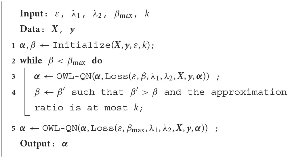
The pseudocode for the slise algorithm can be seen in Algorithm 1. The graduated optimization (lines 2–4) alternates between optimizing α, using OWL-QN, a Quasi-Newton optimizer with built-in L1 regularization (Schmidt et al., 2009), and increasing β based on Theorem 2. The time complexity of Algorithm 1 is , where i is the total number of iterations from the graduated optimization and OWL-QN (Björklund et al., 2022).
Algorithm 1
 |
The slise algorithm is implemented in both R1 and Python2. The source code for the algorithm and experiments is open source and available for download from GitHub.
3. Datasets
In this section, we present the datasets used in this paper. For each dataset, we also show examples of how slise explains predictions from black-box models. The datasets in this paper are three common machine learning datasets, mtcars (Section 3.1), imdb (Section 3.2), and emnist (Section 3.3), and a high-energy physics dataset, jets (Section 3.4) for which one of the authors (KK) is a domain expert.
The main parameter of slise is the error tolerance ε. Ideally, ε would be chosen based on knowledge of the dataset, “how much error can be tolerated”. ε can also be used to select between more local (smaller ε) and more general explanations (larger ε). Additionally, slise has built-in regularization that can be parameterized through λ1 (for lasso regularization) and λ2 (for ridge regularization).
Selection of these parameters is subjective (Lipton, 2018). How local and sparse (when using lasso regularization) the explanations need to depend on the user, dataset, and use case. However, in this paper, we perform a grid search over ε ∈ [0.1, 1.0] and , evaluating the parameters using cross-validation and slise for (global) robust regression. For each ε, we select the λ1 that results in the best mean absolute error (MAE). We then select the ε, which results in a subset size closest to |S| = n/2.
With images, the explanations are visualized as images, see Section 3.3, so sparsity is not as important. And with correlated variables, such as neighboring pixels, lasso regularization tends to prioritize one of the variables (Tibshirani, 1996). Therefore, for images, we also use ridge regularization, with λ2 = 2λ1, which tends to spread the weight more evenly across correlated variables.
3.1. Tabular regression
We start with a tabular regression dataset, mtcars (Henderson and Velleman, 1981). The task is to predict the fuel efficiency (miles per gallon). As the black box model, we train a random forest (Breiman, 2001) with 500 decision trees. The variables in the mtcars dataset have widely different magnitudes (these cars can have hundreds of horsepower but only around five gears). Therefore, we normalize the data by subtracting the (variable-wise) median and dividing by the median absolute deviation (Rousseeuw and Hubert, 2011) before running slise. We also include the terms of the linear model (the variable values times the coefficients).
The explanation for the random forest prediction for a selected car is presented in Table 1. Compared to the other cars, this is a very light car, so the term from the weight is positive. The engine has a usual number of cylinders but with smaller displacement, which also is beneficial for fuel efficiency. The main detriment to fuel efficiency is that the car is tuned for high acceleration.
Table 1
| Variable | Unnormalized | Normalized | Random forest | ||
|---|---|---|---|---|---|
| Car | Car | Model | Term | Importance | |
| Weight | 2.620 | −0.918 | −0.382 | 0.351 | 276.450 |
| Cylinders | 6.000 | 0.000 | −0.198 | 0.000 | 157.752 |
| Displacement | 160.000 | −0.258 | −0.099 | 0.025 | 242.052 |
| mile time | 16.460 | −0.882 | 0.097 | −0.086 | 31.383 |
| Horsepower | 110.000 | −0.168 | −0.044 | 0.007 | 184.004 |
| Axle ratio | 3.900 | 0.291 | 0.044 | 0.012 | 67.661 |
| Manual | 1.000 | 1.000 | 0.013 | 0.013 | 11.425 |
| Straight | 0.000 | 0.000 | 0 | 0 | 23.484 |
| Gears | 4.000 | 0.000 | 0 | 0 | 19.891 |
| Carburettors | 4.000 | 1.348 | 0 | 0 | 31.943 |
Explaining why the random forest predicts that this car has a fuel efficiency of 20.8 MPG.
The explanation uses normalization to account for the different magnitudes of the variables. Sparsity is not necessary for this dataset, but we use λ1 = 0.1 to demonstrate how lasso prioritizes variables and causes zeroes in the coefficients. The error tolerance is ε = 0.2.
One heuristic for measuring the global variable importance of Random forests is by aggregating the impurity decreases across all trees (Breiman, 2002). This procedure is different from the local linear approximation of slise, and results in different variable rankings (in Table 1). However, both methods have primarily identified the same variables as the most important ones, the exception being the quarter mile time that is locally more important.
As always with explanations, there is a trade-off between interpretability and faithfulness to the black box model. Here, we used lasso regularization to control the trade-off; sparser models are easier to interpret (Guidotti et al., 2019), but when variables are correlated, such as weight and displacement, the more important variable gets a larger coefficient (Tibshirani, 1996). However, with reasonable values for λ1 the approximation is still faithful, as we will see in Section 4. Note that we expect the correlation to also be present in the random forest due to how random forests are constructed.
3.2. Sentiment analysis
The imdb dataset (Maas et al., 2011) contains movie reviews. We transform the reviews into real-valued vectors with a bag-of-words-model after case normalization, removal of stop words, removal of punctuation, and stemming. We divide the obtained word frequencies by the most frequent word in each review to adjust for different review lengths, and we only consider the 1,000 most common words.
The task is to determine if the sentiment of a review is positive or negative. To do so we use an svm that outputs probabilities. Before applying slise, we transform the probabilities into unconstrained values as described in Section 2.2. Furthermore, since the word frequency matrix is sparse we make the explanations more local by only giving slise the columns for the words that appear in the explained review.
Figure 4 shows an explanation for an imdb review. This review has an ambiguous phrase: “not bad”. The classification is incorrect (negative), since the svm does not understand that the word “not” negates the word “bad”. The explanation reveals this by giving negative weights to the words “couldn't” and “bad” in a context where the meaning is actually positive.
Figure 4
3.3. Image classification
Images of handwritten digits, such as those in the emnist dataset (Cohen et al., 2017), represent relatively high-dimensional data that is easily visualized. The images in emnist are 28 × 28 grayscale pixels, and the values of the pixels are scaled to the range [0, 1]. slise is applicable to emnist because of the consistent centering and scaling of the images. More complex image datasets would require more data, and color images have the other conundrum of visualizing the color channels intuitively. For those images, slise can be combined with other explanation techniques; see Section 5.
As the model, we use a convolutional neural network (cnn) with three convolutional and pooling layers followed by two fully connected layers. The activation functions are ReLU except for the final softmax function, and we train the network with label smoothing (Szegedy et al., 2016) to limit overconfidence. The added nuance from the label smoothing is also beneficial for explanations.
In this classification task, we have 10 classes (one for each digit), but for the sake of explaining why the 2 in Figure 5 is predicted to be a 2 we only consider the binary subtask of classifying 2:s and non-2:s (using the logit transformation to turn the probabilities into unconstrained values). Furthermore, we subsample the dataset so that 50 % of the items have the same predicted class (2) as the image we want to explain.
Figure 5
Figure 5 (middle and right) shows saliency maps where every pixel corresponds to a coefficient in the α-vector. The colors in the saliency map indicate whether a black pixel supports (purple, middle) or opposes (orange, right) the prediction that the image represents a 2 (and vice versa for white pixels). The saturation represents the importance of the pixel in the classification (the relative weight in the α-vector).
Note that neural networks “see” images as discrete pixels, while humans may interpret them as pen strokes. Explanations have a tradeoff between assisting humans and matching the underlying black box model. With slise we typically use the same representation as the black box model, thus, we expect an explanation in terms of pixels (and not strokes).
The most striking feature in the saliency maps is the solid horizontal purple region at the bottom of the image. This region is indeed quite characteristic for a 2, so it is natural that the classifier uses this to detect 2:s. The other feature in the saliency maps is the orange area in the middle, where images of 2:s tend to be mostly empty. Note that this explanation is not applicable to all 2:s, (e.g., the small orange area at the bottom slightly contradicts 2:s with a straight bottom line).
Since slise uses actual data, the data influences the explanations. Modifying the dataset, (e.g., by selecting a subset of the data, allows us to answer different questions about the data and the models). For example, restricting the dataset to only 2:s and 3:s allows investigating why an image is predicted to be a 2 and not a 3. This is demonstrated in Figure 6. Both 2:s and 3:s have few black pixels on the left so this part of the explanation has been de-emphasized. 3:s have more black pixels in the center and on the right side, and also an empty space below the center. We see that the explanation has been shifted accordingly.
Figure 6
Explanations give us a feeling that we may understand the decision process of the neural network. To examine if this indeed is the case, we design a new way of writing 2:s. Figure 7 demonstrates that a horizontal line at the bottom is sufficient to predict the image to be a 2 with a likelihood of 66.3 %. Label smoothing is limiting very high probabilities, and we are only maximizing the likelihood of a 2, not minimizing the likelihood of other digits, (e.g., this image has a likelihood of 25.5 % to be a 6, which we could avoid by including the “top half” of a 2).
Figure 7
3.4. Classifying particle jets
High energy physics is one domain where adhering to the generating model (the laws of nature!) is essential for trusting the results. The jets dataset (HIP CMS Experiment, 2018) contains data on particle jets extracted from simulated proton-proton collision events released by CMS Collaboration (2017). Here, we cannot naïvely create new artificial data points when explaining the predictions, since the new data could violate, (e.g., energy conservation laws. slise automatically adheres to this constraint by only using existing data to construct the explanations). Furthermore, the black box model is only trained on data that follows the generating model, so randomly generated inputs will yield more or less random outputs.
The classification task in question is to decide whether the particle that created the jet was a quark or a gluon. Quarks and gluons are elementary particles, which cannot be observed directly and are instead detected via cone-shaped cascades of stable particles called jets. On this level, the quark and gluon jets look superficially very similar, but they exhibit specific statistical differences (CMS Collaboration, 2013).
Quantum chromodynamics can be used to explain the behavior of the color-charged quarks and gluons in particle collisions. The theory dictates that gluons are more likely to radiate additional gluons in the aftermath of the initial collision. The gluon jets, on average, contain more particles than quark jets. Consequently, jets originating from gluons are generally wider than quark jets. The total energy of the jet is also distributed differently among its constituents depending on the jet's origin. Quark jets tend to have fewer particles carrying the majority of the total energy.
Table 2 shows the explanation for a quark jet classified with a neural network (three hidden layers with ReLU activation and batch normalization trained with label smoothing). This jet is very narrow (QG_axis2 and jetGirth) with high transverse momentum (jetPt and QG_ptD). From the explanation, we can see that this makes the prediction more likely to be a quark, which is supported by the underlying physical theory of quark and gluon jets. Increasing the multiplicity (QG_mult) would make the jet more gluon-like, but since the jet has a relatively average multiplicity, the term is quite small. Splitting the multiplicity (into jetChargedMult and jetNeutralMult) does not help the prediction, which matches our expectations.
Table 2
| Variable | Jet | Normalized | Model | Term |
|---|---|---|---|---|
| jetGirth | 0.020 | −1.209 | −0.604 | 0.730 |
| QG_axis2 | 0.002 | −1.033 | −0.529 | 0.546 |
| jetPt | 1196.690 | 6.594 | 0.054 | 0.359 |
| QG_ptD | 0.935 | 4.204 | 0.061 | 0.256 |
| QG_mult | 16.000 | −0.270 | −0.437 | 0.118 |
| jetNeutralMult | 20.000 | 0.270 | 0.084 | 0.023 |
| jetChargedMult | 33.000 | 1.012 | 0.000 | 0.000 |
Explaining why a neural network classifies this jet as 84% likely to originate from a quark.
The explanation uses normalization, logit transformation of the probabilities, and the parameter values ε = 0.25 and λ = 20.
Particle jets are complex physical objects that can be represented in various ways. In another example, we classify the jets by projecting the constituent particles onto a 2D plane in a particle detector's cylindrical coordinate system (Cogan et al., 2015; de Oliveira et al., 2016; Komiske et al., 2017). In Figure 8, we show a jet image (left) where the value of each pixel is the sum of the energies from all particles passing through it. The explanation (right) follows the reasoning above; the classification depends on the distribution of the particles. Jets originating from a gluon generally have a wider spread with more particles, while in quark jets, the centermost particles carry most of the energy.
Figure 8
In other local explanation methods, we would need a way to sample from the data distribution such that the physical constraints are satisfied. However, this would be a challenging task requiring in-depth knowledge of underlying physical processes or more machine learning, which would require further explanations. With slise, we only use actual data that we know is physically accurate. If we move to another domain than particle jets, we use the same procedure without having to devise new methods for generating or filtering new samples. Thus, slise is not only “model-agnostic” (can be applied to multiple types of models) but also “data-agnostic” (works the same way for multiple data types). We present comparisons to other methods next in Section 4.
4. Comparison of explainers
This section compares slise to other model-agnostic, post-hoc, local explanation methods that also produce explanations in the form of local linear approximations, namely lime (Ribeiro et al., 2016) and shap (Lundberg and Lee, 2017), see Section 4.1. When comparing explanations, a qualitative visual comparison is necessary, see Section 4.2, since the choice of explanation method is subjective (Lipton, 2018; Lahav et al., 2019).
We also use established numerical quality metrics found in literature (Bach et al., 2015; Lundberg and Lee, 2017; Alvarez-Melis and Jaakkola, 2018; Guidotti et al., 2020). In Section 4.3 we compare how well the explanations approximate the black box models by measuring the difference between the predictions. We do this for both the item being explained (does the explanation match the black box model) and for other data items (how general is the explanation). In Section 4.4 we then check if the explanations highlight the most relevant features and in Section 4.5 we check if the methods are stable; small changes in the input should not affect the explanations too much.
In this section, we show that the performance of methods requiring the creation of new data is highly dependent on how appropriate the creation process is. Furthermore, we also show that slise improves the state-of-the-art, especially when it comes to how well the explanation approximates the black box model.
4.1. Methods
We compare slise against the lime (Ribeiro et al., 2016) and shap (Lundberg and Lee, 2017) explanation methods. slise, lime, and shap are all model agnostic (do not even require gradients), and the explanations are linear models, making the comparison easier. However, the procedure used to find the linear models, and the meaning the coefficients, differ.
lime (Ribeiro et al., 2016) typically starts by discretizing the data item being explained. Continuous variables in tabular data are split into four quantiles. In images lime groups similar and nearby pixels into “superpixels”. lime then generates a “neighborhood” of new data items by randomly mutating some variables. In tabular data, the continuous variables are sampled from a normal distribution (with the shape informed by the training data) before discretization. In images, the superpixels are randomly “turned off” by replacing them with gray. Finally, a distance-weighted lasso model (Tibshirani, 1996) is fitted to approximate the predictions for the neighborhood.
In this comparison, we use lime both with and without the discretization for tabular data. We use two different sizes for the superpixels for the image data. For all variants, we create neighborhoods of size 10, 000, which is more than usual but should avoid artifacts due to undersampling.
shap is posed as an improvement to lime and uses Shapley values (Lundberg and Lee, 2017) instead of lasso to find the approximating linear model. Similarly to discretized lime, shap investigates how beneficial the current variable values are vs. changing them. shap has multiple variants, but we only consider model-agnostic ones. kernel-shap uses a fixed “background” value for the variables, while sampling-shap finds background values by sampling from the dataset.
In this comparison, we use sampling-shap for both tabular and image data, and kernel-shap for images (with gray pixels as the background). With shap we forego the superpixels of lime, but also exceed the standard neighborhood size by setting it to 10, 000. Furthermore, shap recommends using a logit transformation for classifiers (similar to slise), which we do.
Since lime and shap need to sample new data, the data generation process is crucial. Especially for image data, there is no obvious optimal solution. In this paper, we use lime to investigate different superpixel sizes and shap for different replacement pixels. With lime and kernel-shap, we replace the pixels with gray, which is the default. Other standard options would be inverting the color (Bach et al., 2015), but that is not suitable for the jet images dataset, or using the background color (Okhrati and Lipani, 2021), but that assumes that the background offers no information. This assumption does not hold; certain parts of the empty space can be necessary for the classification (as seen in the explanations of Figure 9).
Figure 9
For slise we use the same parameters as in Section 3. For image data, we also consider a lime-slise hybrid where we use the (smaller) superpixels and data generation from lime but with a linear model from slise instead of lasso. With lime-slise we also use the same neighborhood size of 10, 000.
As baselines for all experiments, we use a global linear model and a random linear model, with coefficients drawn from a normal distribution with zero mean and unit variance. In the case of classification, the linear models are logistic regression models. All experiments for all datasets and all methods have been run 100 times, aggregating the results.
4.2. Qualitative comparison
The choice of explanation is subjective and depends on both the task and the user's capabilities (Lipton, 2018). A qualitative comparison is hence necessary. Figure 9 shows explanations for predictions from the methods being compared in a classification task using the emnist dataset. Note that there is a difference in how to interpret the colors. The slise explanation shows whether a pixel should be black (purple) or white (orange) to support the classification. The other explanations show if the current value (either black or white) supports (purple) or opposes (orange) the classification.
The main phenomenon in all explanations is the empty space in the middle. The secondary feature that shows up in some explanations is the horizontal line at the bottom. The horizontal line is especially prominent in the slise explanations, due to the use of real data: Beside 2:s, only 3:s and 5:s have a somewhat straight line at the bottom, but since they lack the empty space in the middle, they are not predicted to be 2:s.
Figure 10 shows a qualitative comparison for a jet from the jet images dataset. In this dataset, gray is not a “neutral” color, causing issues for the lime-based explanations and shap (gray). shap (sample) is an improvement by having different magnitudes for different pixels. Still, since it only considers whether a pixel should be preserved or changed, it does not describe the underlying physical phenomena as well as slise.
Figure 10
4.3. Approximation
Since all methods provide local approximations, a natural comparison is to check how good the approximations are. For this, we consider the local accuracy (Lundberg and Lee, 2017) and coverage (Guidotti et al., 2018). Local accuracy is the absolute difference between the prediction of the complex model and the local approximation for the explained data item:
where ei(·) is the prediction from the locally approximating linear model and f(·) is the prediction from the black box model. Coverage counts how many other data items the approximation is suitable for. We measure this by checking if the absolute difference between the black box model and the approximation is at most 0.1:
The results are presented in Table 3. Both slise and shap stay locked to the data item of interest, giving them perfect local accuracy. However, the local models of lime sometimes have an error larger than a global linear model. slise has the best coverage, due to the subset size being part of the optimization criteria Equation (2). The global model and lime (with no discretization) are in second place for coverage. The methods using discretization generally have less coverage, because the discretization process is specific to the explained item.
Table 3
| Data | Method | Local accuracy | Coverage | Consistency | Stability |
|---|---|---|---|---|---|
| mtcars | slise | 0.000 ± 0.000 | 0.347 ± 0.049 | 0.816 ± 0.233 | 0.137 ± 0.135 |
| shap | 0.000 ± 0.000 | 0.166 ± 0.060 | 0.949 ± 0.055 | 0.176 ± 0.231 | |
| lime (nd) | 0.296 ± 0.320 | 0.336 ± 0.056 | 0.961 ± 0.047 | 0.311 ± 0.317 | |
| lime | 0.227 ± 0.218 | 0.117 ± 0.056 | 0.933 ± 0.053 | 0.306 ± 0.257 | |
| Global | 0.194 ± 0.137 | 0.344 ± 0.000 | 1.000 ± 0.000 | 0.157 ± 0.107 | |
| Random | 2.360 ± 1.988 | 0.031 ± 0.037 | 0.000 ± 0.240 | 2.219 ± 1.926 | |
| jets | slise | 0.000 ± 0.000 | 0.743 ± 0.039 | 0.999 ± 0.010 | 0.037 ± 0.037 |
| shap | 0.000 ± 0.000 | 0.274 ± 0.041 | 0.954 ± 0.075 | 0.065 ± 0.064 | |
| lime (nd) | 0.154 ± 0.146 | 0.411 ± 0.032 | 0.990 ± 0.029 | 0.158 ± 0.147 | |
| lime | 0.075 ± 0.057 | 0.292 ± 0.063 | 0.907 ± 0.129 | 0.094 ± 0.073 | |
| Global | 0.082 ± 0.056 | 0.739 ± 0.005 | 1.000 ± 0.000 | 0.070 ± 0.051 | |
| Random | 0.361 ± 0.243 | 0.161 ± 0.071 | 0.000 ± 0.296 | 0.359 ± 0.238 | |
| imdb | slise | 0.000 ± 0.000 | 0.325 ± 0.042 | 0.875 ± 0.098 | 0.204 ± 0.213 |
| shap | 0.000 ± 0.000 | 0.205 ± 0.032 | 0.981 ± 0.013 | 0.205 ± 0.229 | |
| lime (nd) | 0.092 ± 0.115 | 0.194 ± 0.032 | 0.946 ± 0.089 | 0.314 ± 0.248 | |
| lime | 0.136 ± 0.128 | 0.205 ± 0.015 | 0.928 ± 0.065 | 0.248 ± 0.167 | |
| Global | 0.174 ± 0.148 | 0.282 ± 0.057 | 1.000 ± 0.000 | 0.198 ± 0.154 | |
| Random | 0.391 ± 0.291 | 0.194 ± 0.020 | 0.000 ± 0.101 | 0.398 ± 0.276 | |
| emnist | slise | 0.000 ± 0.000 | 0.700 ± 0.055 | 0.664 ± 0.067 | 0.049 ± 0.101 |
| lime-slise | 0.000 ± 0.000 | 0.265 ± 0.151 | 0.776 ± 0.073 | 0.093 ± 0.128 | |
| shap (gray) | 0.000 ± 0.000 | 0.320 ± 0.164 | 0.101 ± 0.093 | 0.055 ± 0.097 | |
| shap (sample) | 0.000 ± 0.000 | 0.204 ± 0.133 | 0.414 ± 0.055 | 0.063 ± 0.068 | |
| lime (original) | 0.058 ± 0.059 | 0.150 ± 0.128 | 0.962 ± 0.068 | 0.088 ± 0.090 | |
| lime (small) | 0.271 ± 0.200 | 0.160 ± 0.125 | 0.758 ± 0.056 | 0.300 ± 0.214 | |
| Global | 0.491 ± 0.399 | 0.379 ± 0.051 | 1.000 ± 0.000 | 0.560 ± 0.421 | |
| Random | 0.430 ± 0.330 | 0.247 ± 0.080 | 0.000 ± 0.024 | 0.433 ± 0.338 | |
| jet images | slise | 0.000 ± 0.000 | 0.399 ± 0.041 | 0.997 ± 0.018 | 0.143 ± 0.124 |
| lime-slise | 0.000 ± 0.000 | 0.260 ± 0.033 | 0.666 ± 0.093 | 0.171 ± 0.131 | |
| shap (gray) | 0.000 ± 0.000 | 0.255 ± 0.032 | 0.392 ± 0.164 | 0.159 ± 0.126 | |
| shap (sample) | 0.000 ± 0.000 | 0.276 ± 0.025 | 0.691 ± 0.032 | 0.196 ± 0.140 | |
| lime (original) | 0.082 ± 0.055 | 0.262 ± 0.019 | 0.974 ± 0.085 | 0.197 ± 0.124 | |
| lime (small) | 0.178 ± 0.098 | 0.244 ± 0.009 | 0.809 ± 0.033 | 0.270 ± 0.144 | |
| Global | 0.231 ± 0.182 | 0.245 ± 0.027 | 1.000 ± 0.000 | 0.306 ± 0.201 | |
| Random | 0.222 ± 0.155 | 0.252 ± 0.031 | 0.001 ± 0.035 | 0.250 ± 0.179 |
Measuring how well the approximating linear models match the complex model.
Local accuracy is the difference between the predictions from the complex model and the approximation on the data item of interest; lower is better. Coverage measures how many data items have a difference of less than 0.1; larger is better. Consistency measures how similar repeated explanations are using rank similarity; higher is better. Stability measures the loss for the approximation on the nearest neighbor; lower is better. The best results for each dataset and metric are highlighted in bold.
4.4. Relevance
We want the explanations to highlight the most relevant features (or pixels) for the prediction. According to Bach et al. (2015), this can be measured by “destroying” the most important variables (proposed by the explanations) and observing the change in the prediction. The most relevant explanation is the one that identifies the variables that cause the largest change.
With tabular data, we “destroy” variables by adding or subtracting one standard deviation. For non-discretized explanations, the sign is based on the sign of the coefficients. And, for discretized explanations, we select the optimal sign by trying both. With image data, we destroy the pixels by inverting them (Bach et al., 2015, black to white and vice versa). Furthermore, we sort the changes in the prediction according to the importance of the variable in the explanation, and combine the results from both increasing and decreasing the prediction, so that the random model should average to zero.
The results can be seen in Figure 11. Even though relevance is based on generating new data, something we explicitly try to avoid withslise, we see that slise performs in line with the other methods. slise is also the only explanation method to consistently identify the correct variables for the jet images dataset. The global model finds variables that are generally important but is unable to account for local conditions. Choosing the correct replacement values (shap variants) and superpixel size (lime variants) affects the results. Furthermore, replacing lasso in lime with slise, to create lime-slise, is an improvement.
Figure 11
4.5. Stability
We want the explanations to be consistent. We re-run the explanations, but with the default number of samples for lime and shap, and calculate the consistency as the Kendall rank similarity between the coefficients of the two explanations. Our approach is the same as the reiteration similarity of Amparore et al. (2021), but with rank similarity instead of (Jaccard) set similarity.
The results in Table 3 show that slise is consistent, only struggling with the mtcars and emnist datasets. This is due to the smaller number of data items relative to the number of features; more data tends to have a smoothing effect on the NP-hard loss landscape of Problem 1. shap also has trouble with the image datasets, likely due to similar reasons (increasing the number of samples would help). Contrastingly, lime performs well on the image datasets, but the high number of tied ranks due to the superpixels makes the comparison to the other methods less apt. Furthermore, the results from lime-slise show that the superpixels are better suited for emnist than jet images.
We also want the explanations to be stable, meaning that a slight change to the input should not require a completely different explanation (Guidotti et al., 2020). Since we compare different methods, where the linear coefficients have different meanings, we cannot directly compare the coefficients, as in Alvarez-Melis and Jaakkola (2018). Instead, we use the fact that the explanations are linear models, and measure how well the explanation predicts the outcome for the nearest neighbor:
where xnn(i) is the nearest neighbor to xi.
The results can be seen in Table 3. slise generally has the best stability (lowest error). On the more discrete-like datasets (imdb and emnist), shap and lime are also relatively stable.
4.6. Summary
In summary, slise and shap have, by definition, optimal local accuracy, and several methods, including slise, are quite stable (see Table 3). The local models given by slise are also the best at generalizing to other data items. lime lacks constraints that would make the prediction of the local linear model match the prediction from the black box model for the data item being explained. As a result, the local accuracy of lime is sometimes worse than a global model. Finally, measuring relevance requires the generation of new data, something we try to avoid with slise, but even here slise is comparable to the other methods.
As noted in Section 4.2 there is a difference in how the linear approximations work for different explanation methods. shap evaluates the advantage of keeping the current value vs. changing it. This makes the reasoning behind the linear model coefficients more difficult to interpret (Kovalerchuk et al., 2021). Meanwhile, the linear model from slise operates directly on the data, so the coefficients describe how a change to the input would affect the prediction. How the coefficients of the linear models from lime should be interpreted depends on the discretization.
The big advantage of using slise is that there is no need to generate new data. Therefore, we do not need to tweak the data generation (the reason for including multiple variants of lime and shap in the comparison). Furthermore, by using actual data we preserve structures in the data, such as correlations (Tan et al., 2021), and only probe the black box model where the predictions are reliable (Hooker et al., 2021). The jet images dataset is a prime example of how naïve data generation can fail, see Section 4.2 and Figure 11. This does not mean that one cannot use generated data with slise, such as with the lime-slise hybrid, but that it would require all the same considerations as with the other methods.
5. Combining explainers
slise is foremost a general algorithm for robust regression (Björklund et al., 2022). Therefore, the algorithm can readily be integrated with other algorithms, such as lime in Section 4. The robust nature enables slise to be useful for explanations even when a linear model is not an appropriate approximation, or more abstract features are necessary.
5.1. Visualizing convolutions
In recent years, much effort has been put into visualizing the internal dynamics of artificial neural networks. The focus has been on convolutions and how the complexity grows with each successive layer; for a survey, see, (e.g., Qin et al., 2018), or the series of articles at Cammarata et al. (2020).
In Figure 12, we demonstrate how slise can be used together with a type of convolution visualizations called Activation Maximization (Erhan et al., 2009). We begin by selecting an internal layer, the flattening layer between the last convolutional layer and the first fully connected layer. We then use activation maximization to visualize what kind of images cause the largest activations for each node in that layer. Finally, we use slise (ε = 0.5, λ1 = 9) to show how the activation of these internal nodes (on actual data) leads to the classification of an emnist digit.
Figure 12
Activation maximization usually starts from random noise and then applies gradient ascent to find the input that maximally activates a neuron or a filter. Here, we visualize neurons rather than filters, so we add some L2-regularization to remove the color from irrelevant pixels. Furthermore, since the network contains pooling layers, there are likely multiple equally good maximizations that are only differentiated by spatial shifts. This is typically not an issue, but we want to show the shift that is best aligned with the digit we are trying to explain. For this reason, we start from the digit we are explaining (instead of random noise).
In Figure 12, the digit being explained is shown as an outline on top of images that maximally activate some internal neurons. We have applied a slight Gaussian blur to the images to make them easier to read. The plots on the bottom row show how much the 3 activates the neuron, the coefficients of the linear model given by slise, and the term.
Neuron 18 looks for empty space between the image's center and the top, with filled-in pixels above and below. The heuristic is fairly good for detecting 3:s, which is why slise gives it a large weight. Convolutional layers sometimes function as edge detectors (Olah et al., 2020). Neuron 26 is a combination of an edge detector around the lower arc of the 3 and the central horizontal line. Convolutional layers can also detect textures, such as diagonal lines. Neuron 17 combines two diagonals to detect the intersection at the center of the 3. Neurons 11 and 13 activate based on the empty space in the lower half of the 3. Finally, neuron 29 does not seem related to 3:s.
The problem with these explanations is that one has to interpret not only a linear model but also multiple images. In Figure 12, only the six neurons with the largest absolute terms are shown to reduce the amount of cognitive load required for the interpretation. Furthermore, the neurons (and thus the images) might match multiple features, and one feature might require multiple neurons, making the interpretation more difficult. We can use adversarial training to minimize this issue, creating more transparent explanations (Kim et al., 2019; Chalasani et al., 2020). Despite that, Figure 12 shows that the internal features the CNN uses seem reasonable.
6. Limitations of local linear explanations
Using linear models in explanations has been criticized because variables with different units and magnitudes are summed together (Kovalerchuk et al., 2021). One solution is normalizing the magnitudes, which also helps regularization prioritize important variables (Tibshirani, 1996).
Local explanations are not necessarily unique. Multiple suitable explanations might exist for the same prediction (Björklund et al., 2023); consider, for example, explanations with different levels of locality (Wachter et al., 2017), different amounts of regularization (Section 3), or how the importance can shift between heavily correlated variables (Tan et al., 2021).
Furthermore, Watson (2022) argues that giving bounds for where the approximation is valid is needed to better understand and trust the explanations. In comparison, slise outputs the subset of the data items where the approximation is valid; see Equation (2).
There is growing evidence that when deploying an explainable artificial intelligence system, the explanations must be tailored for the intended users (Lipton, 2018; Lahav et al., 2019) and use visualizations and concepts familiar to the user (Kovalerchuk et al., 2021). This paper does not tackle personalized explanations but instead focuses on the methods to create explanations in the first place. Using slise for explanations requires that the user knows the basics of linear models, with the caveats outlined above, as is demonstrated in Section 3.4 where we let a domain expert contrast the explanations to current physical theories.
Finally, a linear model is only as interpretable as the variables are understandable. For example, the “weight” variable from the mtcars dataset is quite natural, but “pixel 238” is not. One solution is to present the variables differently (e.g., as an image instead of individual pixels) or by replacing the variables with more interpretable ones. Replacing the variables risks worsening the faithfulness of the explanations (to the black box model), but the increase in interpretability can make it a worthwhile trade-off. An example is the discretization of the variables in lime (Ribeiro et al., 2016). slise also supports replacing variables, as demonstrated by the lime-slise hybrid in Section 4.
7. Conclusions
This paper demonstrates how a robust regression algorithm, slise (Björklund et al., 2022), can be used to find explanations for outcomes from black box machine learning models. We approximate the black box model with a simple linear model. When the number of variables is large, slise supports sparsity to make the interpretation easier.
Creating realistic data is generally quite complicated and this problem can be avoided using slise. Contrary to other explanation methods in the same niche (model-agnostic, local explanations), slise does not create any new data. Avoiding the creation of new data also helps us capture the interaction between the data and the model and provides consistent operation across data domains when we do not have to design different data-creation procedures for different data types.
slise can readily be combined with ideas from other explanation methods, such as activation maximization and superpixels (see Sections 4, 5). These two examples let slise use higher-level features for the explanations. Higher-level features can be beneficial since they make complex structures easier to interpret. This flexibility of slise stems from the general purpose robust regression algorithm.
We also compare slise to other local, post-hoc explanation methods, both qualitatively and quantitatively using multiple metrics in Section 4. slise yields consistently good results and extends the state-of-the-art when generalizing the approximation. lime Ribeiro et al. (2016) sometimes fails to give local explanations that adhere to the data item being explained, which is one reason why it has largely been succeeded by shap (Lundberg and Lee, 2017). Regarding ease of use, slise worked well out-of-the-box in our experiments, whereas shap and especially lime might require considerable effort to find and evaluate different data creation procedures.
Since this paper is focused on the methods to generate linear explanations, a natural follow-up work would be to apply it to some real-world problem, maybe considering personalized explanations or evaluating the trade-off of using more interpretable features. Some other explanation methods, such as lime, utilize a distance function to control the locality of the explanations. Defining a good distance function is non-trivial (Wilson and Martinez, 1997), which is why slise only compares predictions (see Equation 1). The utility of adding distance-based weights to slise is another potential future work.
Our implementation of slise is available for both R1 and Python2 under an open-source license.
Statements
Data availability statement
Publicly available datasets were analyzed in this study. This data can be found here: MTCars: https://doi.org/10.2307/2530428; IMDB: https://aclanthology.org/P11-1015; EMNIST: https://doi.org/10.1109/IJCNN.2017.7966217; JETS: https://doi.org/10.7483/OPENDATA.CMS.7Y4S.93A0.
Author contributions
AB, AH, EO, KK, and KP have contributed to the writing of this manuscript. The experiments were implemented and executed by AB. All authors contributed to the article and approved the submitted version.
Funding
Supported by Research Council of Finland (Decisions 345704 and 346376). AB was supported by the Doctoral Programme in Computer Science at University of Helsinki. Open Access funding was provided by University of Helsinki. The authors wish to thank the Finnish Computing Competence Infrastructure (FCCI) for supporting this project with computational and data storage resources.
Conflict of interest
AH is employed by OP Financial Group.
The remaining authors declare that the research was conducted in the absence of any commercial or financial relationships that could be construed as a potential conflict of interest.
Publisher’s note
All claims expressed in this article are solely those of the authors and do not necessarily represent those of their affiliated organizations, or those of the publisher, the editors and the reviewers. Any product that may be evaluated in this article, or claim that may be made by its manufacturer, is not guaranteed or endorsed by the publisher.
References
1
AdlerP.FalkC.FriedlerS. A.NixT.RybeckG.ScheideggerC.et al. (2018). Auditing black-box models for indirect influence. Knowledge Inform. Syst.54, 95–122. 10.1007/s10115-017-1116-3
2
Alvarez-MelisD.JaakkolaT. S. (2018). On the robustness of interpretability methods. arXiv preprint arXiv:1806.08049. 10.48550/arXiv.1806.08049
3
AmaldiE.KannV. (1995). The complexity and approximability of finding maximum feasible subsystems of linear relations. Theoret. Comput. Sci.147, 181–210.
4
AmparoreE.PerottiA.BajardiP. (2021). To trust or not to trust an explanation: using LEAF to evaluate local linear XAI methods. PeerJ Comput. Sci.7, e479. 10.7717/peerj-cs.479
5
AusielloG.Marchetti-SpaccamelaA.CrescenziP.GambosiG.ProtasiM.KannV. (1999). Complexity and Approximation. Berlin; Heidelberg: Springer.
6
BachS.BinderA.MontavonG.KlauschenF.MüllerK.-R.SamekW. (2015). On pixel-wise explanations for non-linear classifier decisions by layer-wise relevance propagation. PLoS ONE10, e0130140. 10.1371/journal.pone.0130140
7
BaehrensD.SchroeterT.HarmelingS.KawanabeM.HansenK.MüllerK.-R. (2010). How to explain individual classification decisions. J. Mach. Learn. Res.11, 1803–1831. Available online at: https://jmlr.org/papers/v11/baehrens10a.html
8
BjörklundA.HeneliusA.OikarinenE.KallonenK.PuolamäkiK. (2019). “Sparse robust regression for explaining classifiers,” in Discovery Science, Vol. 11828 (Cham: Springer International Publishing), 351–366.
9
BjörklundA.HeneliusA.OikarinenE.KallonenK.PuolamäkiK. (2022). Robust regression via error tolerance. Data Mining Knowledge Discov.36, 781–810. 10.1007/s10618-022-00819-2
10
BjörklundA.MäkeläJ.PuolamäkiK. (2023). SLISEMAP: supervised dimensionality reduction through local explanations. Mach. Learn.112, 1–43. 10.1007/s10994-022-06261-1
11
BreimanL. (2001). Random forests. Mach. Learn.45, 5–32. 10.1023/A:1010933404324
12
BreimanL. (2002). Manual on Setting Up, Using, and Understanding Random Forests v3.1. Technical Report 58, Statistics Department University of California Berkeley, CA.
13
CammarataN.CarterS.GohG.OlahC.PetrovM.SchubertL. (2020). Thread: circuits. Distill 5. 10.23915/distill.00024
14
CaruanaR.LouY.GehrkeJ.KochP.SturmM.ElhadadN. (2015). “Intelligible models for healthcare: predicting pneumonia risk and hospital 30-day readmission,” in Proceedings of the 21th ACM SIGKDD International Conference on Knowledge Discovery and Data Mining (Sydney NSW: ACM), 1721–1730.
15
ChalasaniP.ChenJ.ChowdhuryA. R.WuX.JhaS. (2020). “Concise explanations of neural networks using adversarial training,” in Proceedings of the 37th International Conference on Machine Learning (PMLR), 1383–1391.
16
CMS Collaboration (2013). Performance of Quark/Gluon Discrimination in 8 TeV pp Data. Technical report, CMS-PAS-JME-13-002.
17
CMS Collaboration (2017). Simulated Dataset {QCD\_Pt\-15to3000\_TuneZ2star\_Flat\_8TeV\_pythia6} in {AODSIM} Format for 2012 Collision Data.
18
CoganJ.KaganM.StraussE.SchwarztmanA. (2015). Jet-images: computer vision inspired techniques for jet tagging. J. High Energy Phys.2015, 118. 10.1007/JHEP02(2015)118
19
CohenG.AfsharS.TapsonJ.van SchaikA. (2017). “EMNIST: Extending MNIST to handwritten letters,” in 2017 International Joint Conference on Neural Networks (IJCNN) (Anchorage, AK: IEEE), 2921–2926.
20
DattaA.SenS.ZickY. (2016). “Algorithmic transparency via quantitative input influence: theory and experiments with learning systems,” in 2016 IEEE Symposium on Security and Privacy (SP) (San Jose, CA: IEEE), 598–617.
21
de OliveiraL.KaganM.MackeyL.NachmanB.SchwartzmanA. (2016). Jet-images — deep learning edition. J. High Energy Phys.2016, 69. 10.1007/JHEP07(2016)069
22
ErhanD.BengioY.CourvilleA.VincentP. (2009). Visualizing Higher-Layer Features of a Deep Network. Technical Report 1341, University of Montreal.
23
FongR. C.VedaldiA. (2017). “Interpretable explanations of black boxes by meaningful perturbation,” in 2017 IEEE International Conference on Computer Vision (ICCV) (Venice: IEEE), 3449–3457.
24
GoodmanB.FlaxmanS. (2017). European Union Regulations on algorithmic decision-making and a “right to explanation”. AI Mag.38, 50–57. 10.1609/aimag.v38i3.2741
25
GuidottiR.MonrealeA.MatwinS.PedreschiD. (2020). “Black box explanation by learning image exemplars in the latent feature space,” in Machine Learning and Knowledge Discovery in Databases (Cham: Springer International Publishing), 189–205.
26
GuidottiR.MonrealeA.RuggieriS.PedreschiD.TuriniF.GiannottiF. (2018). Local rule-based explanations of black box decision systems. arXiv preprint arXiv:1805.10820. 10.48550/arXiv.1805.10820
27
GuidottiR.MonrealeA.RuggieriS.TuriniF.GiannottiF.PedreschiD. (2019). A survey of methods for explaining black box models. ACM Comput. Surv.51, 1–42. 10.1145/3236009
28
HendersonH. V.VellemanP. F. (1981). Building multiple regression models interactively. Biometrics37, 391.
29
HeneliusA.PuolamäkiK.BoströmH.AskerL.PapapetrouP. (2014). A peek into the black box: exploring classifiers by randomization. Data Mining Knowledge Discov.28, 1503–1529. 10.1007/s10618-014-0368-8
30
HeneliusA.PuolamäkiK.UkkonenA. (2017). Interpreting classifiers through attribute interactions in datasets. arXiv preprint arXiv:1707.07576. 10.48550/arXiv.1707.07576
31
HIP CMS Experiment (2018). Helsinki OpenData Tuples.
32
HookerG.MentchL.ZhouS. (2021). Unrestricted permutation forces extrapolation: variable importance requires at least one more model, or there is no free variable importance. Stat. Comput.31, 82. 10.1007/s11222-021-10057-z
33
KimB.SeoJ.JeonT. (2019). Bridging adversarial robustness and gradient interpretability. arXiv preprint arXiv:1903.11626. 10.48550/arXiv.1903.11626
34
KomiskeP. T.MetodievE. M.SchwartzM. D. (2017). Deep learning in color: towards automated Quark/Gluon jet discrimination. J. High Energy Phys.2017, 110. 10.1007/JHEP01(2017)110
35
KovalerchukB.AhmadM. A.TeredesaiA. (2021). “Survey of explainable machine learning with visual and granular methods beyond quasi-explanations,” in Interpretable Artificial Intelligence: A Perspective of Granular Computing (Cham: Springer International Publishing), 217–267.
36
LahavO.MastronardeN.van der SchaarM. (2019). What is interpretable? Using machine learning to design interpretable decision-support systems. arXiv preprint arXiv:1811.10799. 10.48550/arXiv.1811.10799
37
LakkarajuH.BachS. H.LeskovecJ. (2016). “Interpretable decision sets: a joint framework for description and prediction,” in Proceedings of the 22nd ACM SIGKDD International Conference on Knowledge Discovery and Data Mining (San Francisco, CA: ACM), 1675–1684.
38
LapuschkinS.WäldchenS.BinderA.MontavonG.SamekW.MüllerK.-R. (2019). Unmasking Clever Hans predictors and assessing what machines really learn. Nat. Commun.10, 1096. 10.1038/s41467-019-08987-4
39
LaugelT.RenardX.LesotM.-J.MarsalaC.DetynieckiM. (2018). Defining locality for surrogates in post-hoc interpretablity. arXiv preprint arXiv:1806.07498.
40
LiptonZ. C. (2018). The mythos of model interpretability: in machine learning, the concept of interpretability is both important and slippery. Queue16, 31–57. 10.1145/3236386.3241340
41
LundbergS. M.LeeS.-I. (2017). “A unified approach to interpreting model predictions,” in Advances in Neural Information Processing Systems, Vol. 30, eds. Guyon, I., Von Luxburg, U., Bengio, S., Wallach, H., Fergus, R., Vishwanathan, S., and Garnett, R. (Long Beach, CA: Curran Associates, Inc.).
42
MaasA. L.DalyR. E.PhamP. T.HuangD.NgA. Y.PottsC. (2011). “Learning word vectors for sentiment analysis,” in Proceedings of the 49th Annual Meeting of the Association for Computational Linguistics: Human Language Technologies (Portland, OR: Association for Computational Linguistics), 142–150.
43
MobahiH.FisherJ. W. (2015). “On the link between Gaussian homotopy continuation and convex envelopes,” in Energy Minimization Methods in Computer Vision and Pattern Recognition, eds. Tai, X. C., Bae, E., Chan, T. F., and Lysaker, M. (Cham: Springer International Publishing), 43–56.
44
MolnarC. (2019). Interpretable Machine Learning: A Guide for Making Black Box Models Interpretable. Lulu, Morisville, NC.
45
OkhratiR.LipaniA. (2021). “A multilinear sampling algorithm to estimate Shapley values,” in 2020 25th International Conference on Pattern Recognition (ICPR) (Milan), 7992–7999.
46
OlahC.CammarataN.SchubertL.GohG.PetrovM.CarterS. (2020). An overview of early vision in inceptionV1. Distill5, e00024. 10.23915/distill.00024.003
47
QinZ.YuF.LiuC.ChenX. (2018). How convolutional neural networks see the world — A survey of convolutional neural network visualization methods. Math. Found. Comput.1, 149–180. 10.3934/mfc.2018008
48
RibeiroM. T.SinghS.GuestrinC. (2016). ““Why should I trust you?”: explaining the predictions of any classifier,” in Proceedings of the 22nd ACM SIGKDD International Conference on Knowledge Discovery and Data Mining (San Francisco, CA: ACM), 1135–1144.
49
RibeiroM. T.SinghS.GuestrinC. (2018). “Anchors: high-precision model-agnostic explanations,” in Proceedings of the AAAI Conference on Artificial Intelligence (New Orleans, LA), 1527–1535. 10.1609/aaai.v32i1.11491
50
RousseeuwP. J.HubertM. (2011). Robust statistics for outlier detection. WIREs Data Mining Knowledge Discov.1, 73–79. 10.1002/widm.2
51
RousseeuwP. J.van ZomerenB. C. (1990). Unmasking multivariate outliers and leverage points. J. Am. Stat. Assoc.85, 633–639.
52
SaltelliA. (2002). Sensitivity analysis for importance assessment. Risk Anal.22, 579–590. 10.1111/0272-4332.00040
53
SchmidtM.BergE.FriedlanderM.MurphyK. (2009). “Optimizing costly functions with simple constraints: a limited-memory projected quasi-newton algorithm,” in Proceedings of the Twelth International Conference on Artificial Intelligence and Statistics (Clearwater Beach, FL: PMLR), 456–463.
54
SlackD.HilgardS.JiaE.SinghS.LakkarajuH. (2020). “Fooling LIME and SHAP: adversarial attacks on post hoc explanation methods,” in Proceedings of the AAAI/ACM Conference on AI, Ethics, and Society (New York, NY: Association for Computing Machinery), 180–186.
55
SzegedyC.VanhouckeV.IoffeS.ShlensJ.WojnaZ. (2016). “Rethinking the inception architecture for computer vision,” in 2016 IEEE Conference on Computer Vision and Pattern Recognition (CVPR) (Las Vegas, NV: IEEE), 2818–2826.
56
TanS.HookerG.KochP.GordoA.CaruanaR. (2021). Considerations when learning additive explanations for black-box models. arXiv preprint arXiv:1801.08640. 10.48550/arXiv.1801.08640
57
TibshiraniR. (1996). Regression shrinkage and selection via the Lasso. J. R. Stat. Soc. Ser. B Methodol.58, 267–288.
58
UstunB.TracàS.RudinC. (2014). Supersparse linear integer models for interpretable classification. arXiv preprint arXiv:1306.6677. 10.48550/arXiv.1306.6677
59
WachterS.MittelstadtB.RussellC. (2017). Counterfactual explanations without opening the black box: automated decisions and the GDPR. Harvard J. Law Technol.31, 841–888. 10.2139/ssrn.3063289
60
WangD.KhoslaA.GargeyaR.IrshadH.BeckA. H. (2016). Deep learning for identifying metastatic breast cancer. arXiv preprint arXiv:1606.05718. 10.48550/arXiv.1606.05718
61
WatsonD. S. (2022). Conceptual challenges for interpretable machine learning. Synthese200, 65. 10.1007/s11229-022-03485-5
62
WilsonD. R.MartinezT. R. (1997). Improved heterogeneous distance functions. J. Artif. Intell. Res.6, 1–34.
63
XieN.RasG.van GervenM.DoranD. (2020). Explainable deep learning: a field guide for the uninitiated. arXiv preprint arXiv:2004.14545. 10.48550/arXiv.2004.14545
Summary
Keywords
XAI (explainable artificial intelligence), model-agnostic explanation, interpretable machine learning, local explanation, explanations, interpretability, HCI (human-computer interaction)
Citation
Björklund A, Henelius A, Oikarinen E, Kallonen K and Puolamäki K (2023) Explaining any black box model using real data. Front. Comput. Sci. 5:1143904. doi: 10.3389/fcomp.2023.1143904
Received
13 January 2023
Accepted
20 July 2023
Published
08 August 2023
Volume
5 - 2023
Edited by
Daniel Marino, Amazon, United States
Reviewed by
Kalia Orphanou, Open University of Cyprus, Cyprus; Elvio Amparore, University of Turin, Italy
Updates
Copyright
© 2023 Björklund, Henelius, Oikarinen, Kallonen and Puolamäki.
This is an open-access article distributed under the terms of the Creative Commons Attribution License (CC BY). The use, distribution or reproduction in other forums is permitted, provided the original author(s) and the copyright owner(s) are credited and that the original publication in this journal is cited, in accordance with accepted academic practice. No use, distribution or reproduction is permitted which does not comply with these terms.
*Correspondence: Anton Björklund anton.bjorklund@helsinki.fi
†ORCID: Anton Björklund orcid.org/0000-0002-7749-2918
Andreas Henelius orcid.org/0000-0002-4040-6967
Emilia Oikarinen orcid.org/0000-0002-9623-6282
Kimmo Kallonen orcid.org/0000-0001-9769-7163
Kai Puolamäki orcid.org/0000-0003-1819-1047
Disclaimer
All claims expressed in this article are solely those of the authors and do not necessarily represent those of their affiliated organizations, or those of the publisher, the editors and the reviewers. Any product that may be evaluated in this article or claim that may be made by its manufacturer is not guaranteed or endorsed by the publisher.