 Huidan Zhang
 Daisuke Sakamoto
 Tetsuo Ono
- 1Human Computer Interaction Laboratory, Graduate School of Information Science and Technology, Hokkaido University, Sapporo, Japan
- 2Human Computer Interaction Laboratory, Faculty of Information Science and Technology, Hokkaido University, Sapporo, Japan
- 3Faculty of Engineering, Department of Robotics, Kyoto Tachibana University, Kyoto, Japan
Introduction: With the growing use of virtual reality (VR) in areas like education and digital reading, understanding the factors that impact legibility in these environments is crucial. While traditional screen legibility has been extensively studied, the transition to VR requires reevaluation, especially when considering different languages and the distinction between native and non-native speakers.
Method: This study explores font preferences in VR for Chinese, Japanese, and English, focusing on font weight, style, complexity, and viewing distance. Additionally, we employed cross-linguistic VR-based experiments with quantitative assessments and qualitative interviews.
Result: Our findings reveal that font preferences are influenced by a combination of language familiarity (native/non-native), viewing distance, and character complexity (glyph). Therefore, serif fonts enhance the legibility of complex logographic characters at close distances, whereas sans-serif fonts are more effective for alphabetic scripts, particularly at longer viewing distances. Moreover, when processing unfamiliar languages, users tend to shift their evaluation criteria from focusing primarily on legibility to a more balanced assessment that also incorporates aesthetic appeal.
Discussion: These insights underscore the importance of adaptive typographic strategies in VR, offering evidence-based guidelines that can enhance both legibility and user experience for a diverse global audience.
1 Introduction
Virtual reality (VR) technology has rapidly advanced, fostering more inclusive and open environments (Sakamoto and Ono, 2024) while expanding its applications across education, training, and digital reading (Cauz et al., 2024; Huang et al., 2021). Previous research has extensively explored the impact of various digital factors on legibility in traditional screen interfaces. Studies have demonstrated that font characteristics, including type, weight, contrast, and character width, significantly affect legibility (Oderkerk and Beier, 2022; Beier and Oderkerk, 2021; Korinth et al., 2020). For instance, bold fonts can enhance letter recognition in small-scale reading contexts (Oderkerk and Beier, 2022), while the complexity and stroke width of character impact word processing efficiency (Ohnishi and Oda, 2021). Additionally, individual factors such as age, vision, and reading disabilities (Calabrese et al., 2016; Rubin et al., 2006; Rello and Baeza-Yates, 2016), as well as the cognitive preferences of native (L1) and non-native (L2) speakers (Chatrangsan and Petrie, 2019; Gauvin and Hulstijn, 2010), play critical roles in shaping font preferences and legibility.
However, the transition to VR presents unique challenges and opportunities, necessitating a reevaluation of these factors within spatial and interactive environments. Traditional flat design principles may require modification due to the shifts in user perspective and interaction modes in VR. For instance, overall font size must be larger than in screen interfaces, and results can vary significantly depending on device resolution. Current research on VR legibility primarily focuses on factors such as device resolution, font type, font complexity, font color, font size, text background, and line spacing (Zhou et al., 2024; Jessner, 2008; Rahkonen and Juurakko, 1998), as well as reading fonts under specific conditions, such as while moving (Matsuura et al., 2019) or from different angles (Rzayev et al., 2021). Despite this, a noticeable gap remains in the literature concerning VR environments, especially regarding font preferences among native and non-native speakers across different languages.
This study addresses this gap in research by investigating the font preferences of native and non-native speakers within VR environments, focusing on three linguistic contexts: Chinese, Japanese, and English. Chinese and Japanese are logographic languages, whereas English is alphabetic, resulting in fundamentally different orthographic characteristics. Understanding these preferences is crucial for developing guidelines that enhance digital reading experiences in VR and accommodate the diverse needs of users from different linguistic backgrounds. By addressing this gap, the study aims to provide scientific evidence for optimizing font design and improving text legibility in VR, ultimately contributing to more effective and inclusive digital reading environments.
2 Related work
2.1 Digital factors affecting digital reading
Previous studies on screen interfaces have extensively explored the impact of fonts on legibility. Research indicates that font characteristics such as font weight (Oderkerk and Beier, 2022; Minakata and Beier, 2021), glyph contrast (Beier and Oderkerk, 2021), and character stroke width (Korinth et al., 2020; Ohnishi and Oda, 2021) significantly affect legibility. For instance, Oderkerka and Beier (2022) found that bolder fonts can enhance letter recognition in small-scale reading contexts (Oderkerk and Beier, 2022). In contrast, Beier and Oderkerk (2021) suggest that bold fonts with high stroke contrast should not be prioritized in designs where letter recognition is critical (Beier and Oderkerk, 2021). Additionally, changes in character width significantly influence legibility, with wider characters improving word processing (Korinth et al., 2020). However, the difference between serif and sans-serif fonts is minimal (Ali et al., 2013; Arditi and Cho, 2005).
In VR environments, the principles of traditional flat design may require modification due to changes in user perspective and interaction modes. Given the spatial context, the overall font size should be slightly larger than in screen interfaces. Additionally, results can vary significantly depending on device resolution. Current research primarily focuses on factors such as device resolution, font type, font complexity, font color, font size, text background, and line spacing (Zhou et al., 2024; Jessner, 2008; Rahkonen and Juurakko, 1998), as well as reading fonts under specific conditions (e.g., while moving (Matsuura et al., 2019) or from different angles (Rzayev et al., 2021)). For example, Zhou et al. found that higher resolution allows for smaller characters, but for more complex Chinese characters, larger sizes are necessary (Zhou et al., 2024).
2.2 Individual factors affecting legibility
While font characteristics impact individuals differently and no single font suits everyone, the primary factors influencing legibility from a personal perspective include age (Calabrese et al., 2016), vision (Galiano et al., 2023; Rubin et al., 2006), and the presence of reading disabilities (Rello and Baeza-Yates, 2016). Familiarity with the text or font also plays a crucial role (Newbold and Gillam, 2010; Beier, 2009).
For instance, research by AurÃlie CalabrÃStudy on font preferences of native and non-native speakers in a virtual reality environment et al. indicates significant differences in legibility across age groups, specifically among individuals aged 8–16 years, 16–40 years, and over 40 years (Calabrese et al., 2016). Increasing font size, rather than character width, has been shown to effectively aid individuals with low vision in reading (Rubin et al., 2006). For individuals with reading disabilities, sans-serif and monospaced fonts have been found to improve reading performance (Rello and Baeza-Yates, 2016).
However, familiarity with the text or font is multifaceted. For example, readers who are familiar with specific fonts tend to read text faster. Beier, Sofies research found that familiar fonts enhance reading speed, illustrating the importance of exposure to particular font designs (Beier, 2009). Moreover, familiarity with the content of the text can also influence legibility, as readers are better able to anticipate and recognize words and phrases they frequently encounter (Newbold and Gillam, 2010).
2.3 Cognitive font preferences of native and non-native speakers
Native (L1) and non-native (L2) speakers exhibit substantial differences in reading and processing visual cues due to cultural and linguistic variations. For instance, studies have shown that British participants find sans-serif fonts easier and less tiring to read, whereas Thai participants prefer serif fonts for the same reasons (Chatrangsan and Petrie, 2019). Moreover, using bold fonts for emphasis can aid L2 learners remember discourse content (Lee and Fraundorf, 2019).
Hanna S. and colleagues compared Dutch (L1) and English (L2) reading, revealing that decreased font legibility affects L2 reading time more significantly than L1 reading time (Gauvin and Hulstijn, 2010). Similarly, Pae, H. et al. examined how Korean and Chinese speakers process English words using normal, alternating, and reversed fonts. They found that Chinese native speakers are more sensitive to visual distortions than Korean speakers, suggesting that the linguistic templates established in L1 play a significant role in processing English vocabulary (Pae and Lee, 2015).
Furthermore, the orthographic features of one’s native language (L1) significantly impact English as a Second Language (ESL) learners’ English acquisition. For example, learners whose native language is logographic (e.g., Chinese) may struggle with recognizing and spelling English words due to the absence of an alphabetic system in their L1. In contrast, learners from alphabetic backgrounds (e.g., French, German) tend to recognize and spell English words more efficiently due to their familiarity with alphabetic systems and spelling rules (Akamatsu, 1999).
2.4 Summary
Language consists of sentences, which are composed of individual words. While research on fonts remains an evergreen topic in both traditional interfaces and VR environments, much of the existing literature has focused on font preferences among native speakers, particularly within the English language. However, Chinese and Japanese are logographic languages, whereas English is alphabetic, resulting in fundamentally different orthographic characteristics. This paper aims to bridge this gap by comparing the font preferences of native and non-native speakers across three linguistic environments: Chinese, Japanese, and English.
3 Experiment
We designed an experiment to examine the font preferences of L1 and L2, LN speakers in VR. Using the Oculus Quest 3, participants viewed pairs of characters or words with same glyph (content) at four distances (0.5 m, 2.5 m, 5 m, and 10 m) and rated legibility on a 1–5 scale. Participants used the Quest Touch Pro controllers to make their selections. Thirty participants (native Chinese, Japanese, and English speakers) completed tasks in their native language and one randomly assigned non-native language. Finally, we collected both quantitative font scores and qualitative user feedback, analyzing how various parameters such as distance, glyph characteristics, native language, and font type affected font preferences.
3.1 Apparatus
The device used in the experiment was the Oculus Quest 3, paired with the Meta Quest 3 Elite Strap as the head-mounted display. This setup featured two LCD screens with a resolution of
3.1.1 Text size
To ensure consistent testing conditions, the text size in virtual reality was fixed for this experiment, with the font height set to 70 mm. To address concerns regarding resolution consistency and maintain visual quality, dynamic resolution scaling was activated throughout the experiment. Dynamic resolution adjusts the rendering resolution in real-time based on GPU load, balancing performance and visual clarity. By enabling dynamic resolution, we minimized dependency on the device’s fixed pixel density (ppd), as the system dynamically adapts the resolution to maintain optimal clarity under varying conditions. Before the experiment, a pre-test was conducted to verify that the text clarity at all distances met the visual requirements for the study.
3.1.2 Virtual environment
We created a VR corridor environment measuring
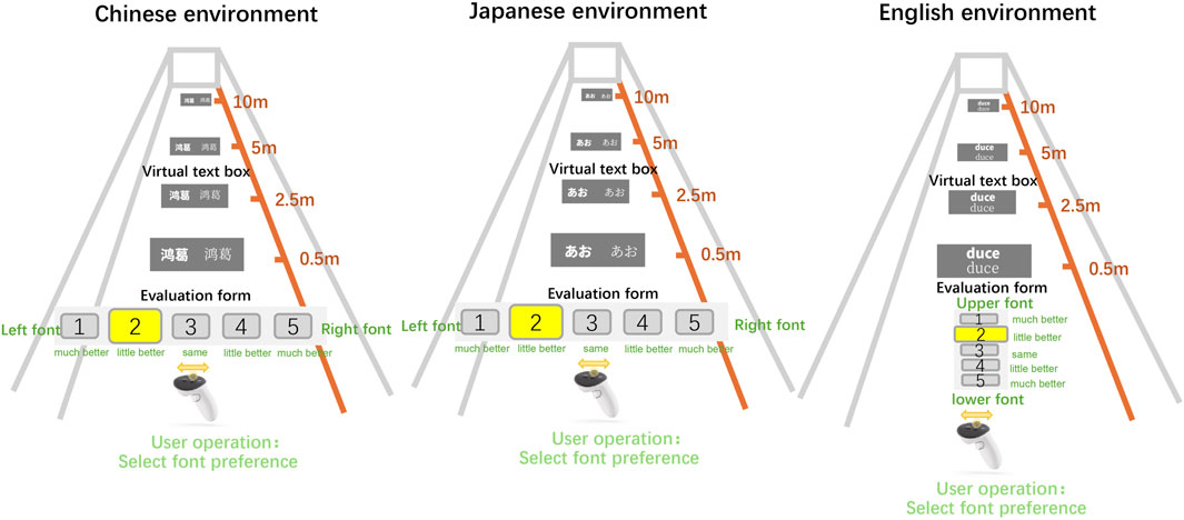
Figure 1. Schematic diagram of experimental setups for Chinese, Japanese, and English tests.
3.2 Participants
We recruited 30 participants through flyers and social media, including 10 native Chinese speakers (6 males, 4 females), 10 native Japanese speakers (5 males, 5 females), and 10 native English speakers (7 males, 3 females). To control for the potential influence of age on font preference, as highlighted in Calabrese et al.’s research on MNREAD Acuity Charts across various age groups (8–16 years, 16–40 years, and over 40 years) (Calabrese et al., 2016), we ensured age consistency among our participants. Consequently, all participants were aged between 20 and 40 years. Among them, eight had no prior experience with VR headsets, while 22 had used VR headsets before. All participants had normal or corrected-to-normal vision, with 11 having normal vision, two wearing contact lenses, and 17 wearing glasses.
3.3 Design
In our study, participants from various native language backgrounds were asked to select their preferred font presentation within a virtual reality environment, where the same glyph (i.e., content) was displayed at a fixed distance. To systematically explore the factors that may influence font preference, we manipulated four primary independent variables:
3.3.1 Glyph
To ground our glyph stimuli in each languages writing system, we selected the smallest meaningful or visually discrete units available. In logographic and mixed-script languages (Chinese and Japanese), individual characters (Hanzi, Hiragana, Katakana, and Kanji) correspond directly to morphemes or syllabic units and remain visually self-contained. In alphabetic English, single letters are graphemes without standalone meaning, whereas single words are the minimal meaningful lexemes. Accordingly, for Chinese and Japanese we presented isolated characters (following (Wang et al., 2020; Zhou et al., 2024)), and for English we presented isolated high-frequency words. Participants never performed any reading or comprehension task; they made purely perceptual legibility judgments, ensuring our results reflect visual distinctions between fonts rather than lexical or semantic differences.
Based on the complexity and characteristics of each language, we grouped the fonts accordingly. For this experiment, the glyphs were categorized into three main groups: kana, Chinese characters (Hanzi and Kanji), and the Latin alphabet, corresponding to Japanese, Chinese, and English respectively. Chinese characters (Hanzi and Kanji) are block characters, while English consists of linear characters.
Because perceived complexity varies within each script, we classified glyphs by visual complexity. The complexity of block characters, such as Chinese characters, primarily stems from the number of strokes, with more strokes typically indicating greater complexity. Various methods have been used to calculate the complexity of Chinese characters, including stroke count, skeleton length (total stroke length) as discussed by Bernard and Chung (2011), the slice method (calculating the frequency of strokes in horizontal, vertical, and diagonal slices, and taking the maximum intersection number) (Majaj et al., 2002), or using the square of the symbol’s perimeter divided by the “ink” area (Vildavski et al., 2022). In this experiment, we adopted a method that combines stroke count and ink area to calculate the complexity of both Japanese and Chinese characters.
Considering the subtle differences between Chinese Hanzi and Japanese Kanji, the Kanji materials used in this experiment were sourced from the commonly referenced Japanese Kanji database (based on the Cabinet notification of 30 November 2010), while the Hanzi were sourced from a GitHub Chinese character database. The stroke count for each character was determined, and the pixel value at 100 pt was calculated using Python’s Pillow library. Character complexity C was calculated as shown in Equation 1:
where “NUMBER” represents the stroke count, “PIXEL” is the pixel value, and
The complexity of all characters (including Japanese Kanji, Hiragana, and Chinese characters) was compiled and categorized into four levels:
To avoid fatigue and ensure a diverse character group presentations, we selected specific font groups from each category. The detailed classification of the character groups used in this experiment is shown in Table 1.
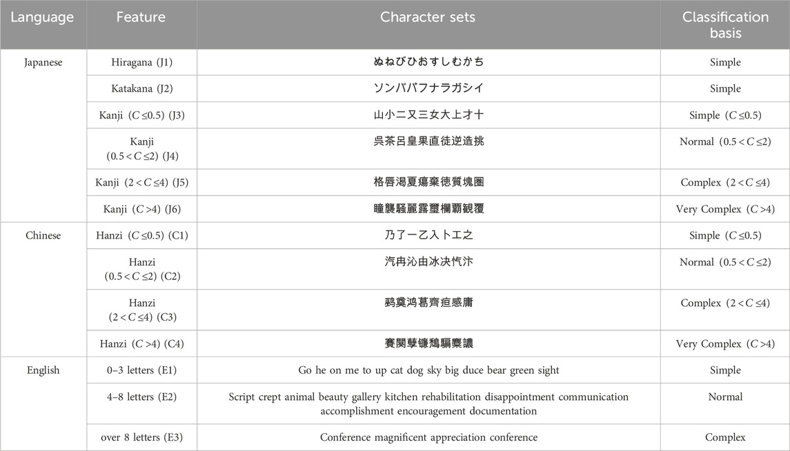
Table 1. Character Glyph classification by feature across Chinese, Japanese, and English.
3.3.2 Fonts
Fonts play a crucial role in how easily readers can recognize and process text, whether on a screen or in print. In typography, faces are broadly divided into sans-serif (uniform stroke widths, minimal decoration; often used for digital interfaces and on-screen body text) and serif (clear contrast between strokes, small “feet” or flares at line ends; inherited from traditional printing and frequently chosen for print materials, headings, or long passages to aid readability). Within each style, weight variants (Thin/Light, Medium, Black/Bold) further influence legibility by altering stroke thickness.
In this experiment we focus on four scripts Latin letters, Chinese characters, hiragana, and katakana and their distinguishing features are highlighted in red in Figure 2: in the sans-serif examples, strokes remain nearly constant in width and lack terminals; in the serif examples, you can see pronounced contrasts between horizontal and vertical strokes and decorative serifs (subtle hooks or wedges at stroke ends). Note also that in Noto Serif the Latin and Chinese glyphs adopt a crisp, woodblock-print aesthetic, whereas its kana glyphs retain softer, brush-inspired terminals. To cover the wide range of stylistic differences across languages, we selected the universally adopted Google Noto fonts (Noto Sans, Noto Sans JP, Noto Sans SC, Noto Serif, Noto Serif JP, Noto Serif SC). In the Example column of Figure 2 we show representative glyphs at increasing complexity levels English cases E1–E3, Chinese cases C1–C4, and Japanese cases J1–J6 to give readers an immediate, intuitive sense of each scripts visual characteristics.
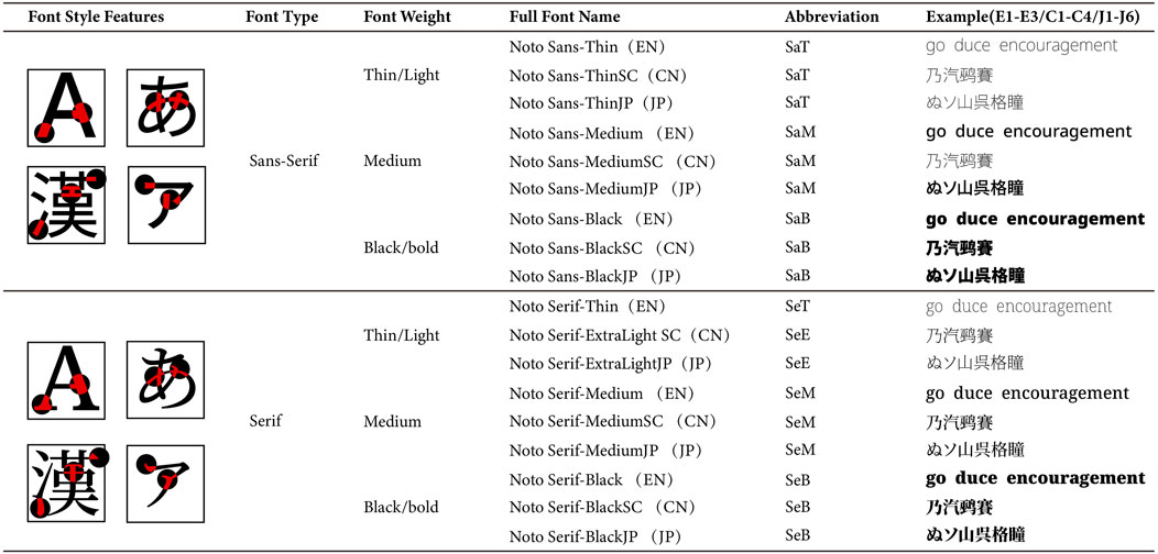
Figure 2. Font style features and classification of Google Noto fonts.
3.3.3 Distance
Alger et al. highlighted that in VR, information should not be placed at distances shorter than 0.5 m or longer than 20 m (Alger, 2015). Therefore, we defined four distances within the virtual environment: 0.5 m (D1), 2.5 m (D2), 5 m (D3), and 10 m (D4). These distances correspond to: the minimum distance at which characters are still recognizable, a comfortable reading distance for near sighted individuals, a suitable reading distance for farsighted individuals, and the maximum distance at which character outlines are barely distinguishable.
The purpose of setting these distances was to maximize the contrast in font preference at comfortable, near, and far distances across different fonts and glyphs.
3.3.4 Native
Since this experiment involves native languages, second languages, and unstudied languages, it is important to clarify the terminology used. For native languages and second languages, we adhere to the standard definitions: L1 refers to the native language, and L2 is the second language acquired sequentially (Jessner, 2008). However, in this study, Chinese is considered an unstudied language for some Japanese and native English speakers, and there is no standardized term for such scenarios. Some researchers refer to these as “L3, L4–Ln” (Rahkonen and Juurakko, 1998) or “Additional Languages” (Gardner, 1983). For the purposes of this experiment, we will temporarily classify these as “No Prior Exposure to the Language” (LN).
Before participating in the experiment, participants completed a basic information form to self-assess their proficiency in their L1, L2, and LN. The form categorized languages based on features such as “familiarity with Chinese characters (Hanzi), recognition of Chinese characters (Kanji), knowledge of Japanese Kana, and familiarity with English words.” Each proficiency level was assessed using a four-tier scale. If a participant selected “none” do not recognize any characters for a language, it was classified as LN.
For clarity, we distinguish between native and non-native speakers using the designations provided. According to our statistics, the final language distribution among participants is as follows: Chinese (CL1: 10 participants, CL2: 13 participants, CLN: 7 participants); Japanese (JL1: 10 participants, JL2: 19 participants, JLN: 1 participant); and English (EL1: 10 participants, EL2: 20 participants, ELN: 0 participants).
3.4 Task
Participants were presented with a series of trials in which they viewed pairs of glyph sets, each containing identical content but rendered in two different fonts. For each trial, the glyph sets were displayed at one of four fixed distances (0.5 m, 2.5 m, 5 m, or 10 m). Participants were asked to compare the two fonts and rate their relative legibility on a 1–5 scale, with 1 indicating a strong preference for the font on the left, 5 indicating a strong preference for the font on the right, and 3 representing a neutral stance. In addition to these comparisons, each participant completed the task twice once in their native language and once in a randomly assigned non-native language. This design allowed us to systematically assess how factors such as glyph characteristics, font type, viewing distance, and native language influenced font preferences.
3.5 Procedure
Upon arrival at the experiment site, participants were welcomed by our research team. We provided a comprehensive introduction to the purpose, procedure, and important considerations of the experiment. After reading and signing the informed consent form to confirm their voluntary participation, participants underwent brief training on how to use the VR equipment. This training included instructions on wearing the VR headset, using the Oculus controllers, and adjusting the equipment for comfort and proper interpupillary distance. The experiment was available in Japanese, Chinese, and English versions.
Participants selected their native language version and were then randomly assigned to one of the other non-native language versions. Each language experiment included 10 native and 10 non-native participants, with 5 participants from each of the other two language groups. Informed consent was obtained in accordance with the Institutional Review Board of Hokkaido University1.
After practicing until they felt confident in understanding the requirements and mastering the procedure, the experiment began. The character canvas and evaluation interface were presented to the participants. The character canvas displayed two glyph sets with the same content but different fonts at randomly selected distances of 0.5 m (D1), 2.5 m (D2), 5 m (D3), and 10 m (D4). Participants used the direction keys on the Oculus controller to compare and evaluate the legibility and weight of the fonts. The evaluation scale ranged from 1 to 5, with options from “left font is much better” to “right font is much better.” To minimize fatigue, the evaluation scale was reset to the middle position (3) after each selection. To address potential visual fatigue from repeated selections, we conducted semi-structured interviews with a subset of 13 participants. The detailed interview records, with all names edited into numbers, can be found in the GitHub repository. Participants were encouraged, but not required, to explain why they found one font more readable than another. After completing the evaluation, a thank you screen appeared. Participants were given a 2–3 min rest while the data was compiled and confirmed. They were then asked to complete the same test in different non-native language. The entire experiment took less than 30 min. Finally, participants removed the VR equipment and were invited to verbally share their experiences, feelings, and subjective assessments of the experiment. The research staff then accompanied participants out of the lab, ensuring they left smoothly and contentedly.
The overall flow of the experiment and the detailed task steps are illustrated in Figure 3, which outlines both the main procedural steps and the individual tasks that participants completed during the experiment.
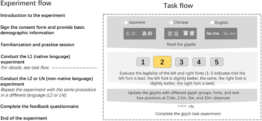
Figure 3. Experiment flow and task flow diagram.
3.6 Data analysis and processing
3.6.1 Data collection
At the conclusion of the experiment, we collected a comprehensive dataset for each glyph presented during the trials, which included the following independent variables:
The dependent variables collected for each trial included:
In total, we collected 12,476 valid datasets, comprising 5,802 sets for the Japanese experiment (6 glyph groups
3.6.2 Data pre-processing
The randomized stimulus presentation in our full factorial design led to minor frequency imbalances across font comparison conditions. To establish comparable metrics, we implemented a normalized scoring system translated the 5-point evaluation scale into comparative scores for each font. Participants’ ratings were converted as follows:
This trichotomous scoring system (0, 1, or 2 points per comparison) operationalized three distinct preference levels:
To disentangle the effects of font preference, glyph, distance, and native language, our analysis progressed through four investigative phases.
First, We ran separate General Linear Models (GLM) the full dataset and to each distance (D1–D4) to test main effects (Font, Distance, Glyph Complexity, Native Language) and interactions (Font
Next,. for items showing significant effects, such as Distance
Finally, to present our findings more clearly, we recalculated the winning rates (the number of times a font was selected divided by the total number of trials) for data showing significant trends and converted them into probabilities for better observation and visual representation.
4 Results
4.1 Semi-structured interview analysis
During the experiment, early participants (IDs 02, 05, 06, 10) reported issues related to distraction and boredom, stemming from the repetitive nature of the selection tasks. To address the potential cognitive fatigue induced by these repetitive choices, we conducted semi-structured interviews with a targeted subset of 13 participants during the mid-to-late stages of the experiment. The primary objective of these interviews was to gain deeper insights into participants’ cognitive processes, subjective experiences, and any challenges they encountered throughout the experiment.
The interview questions were designed to explore several key areas, including, but not limited to:
Personal Preference: Do you have any specific fonts that you prefer in your daily life?
Reason for Choice: What makes the current font more readable to you?
Emotional Response: How does this font affect your feelings or emotional response?
Challenges: What difficulties or challenges did you experience during the experiment?
These interviews were systematically recorded and transcribed, followed by a thematic analysis to identify recurring themes and patterns. The analysis revealed that, while legibility was the primary concern for most participants aligning with the core objective of our experimental design some participants were also influenced by their emotional preferences, such as a preference for thin or bold fonts. Additionally, a small subset of participants prioritized aesthetic appeal over legibility in their font choices.
The thematic analysis of the interview data highlighted several critical insights:
4.1.1 Language-specific differences
Chinese and Japanese: At the closest distances (D1), participants generally found serif fonts more readable than sans-serif fonts, although overly bold fonts were considered inappropriate. As the viewing distance increased (D2 to D4), the influence of font type diminished, while the impact of font weight became more pronounced. For complex glyphs
English: Thin sans-serif fonts were found to be more readable at close distances (D1), while thin serif fonts were preferred at a comfortable near distance (D2). At the farthest distances (D4), bold fonts were easier to read. One participant noted that short words were readable in any font, but longer words were more legible in thinner fonts.
4.1.2 Font aesthetics vs. legibility
Close Distances: At the nearest and comfortable near distances (D1 and D2), participants showed a preference for font aesthetics. For Chinese and Japanese text, serif fonts were more popular, whereas for English text, sans-serif fonts were favored. Font weight preferences varied depending on the complexity of the glyphs.
Far Distances: As the distance increased (D3 and D4), the emphasis shifted from aesthetics to legibility. Participants exhibited a growing preference for sans-serif fonts for Chinese and Japanese text, and for serif fonts for English text.
The interview results provide valuable background information and insights that supplement and help in interpreting the experimental results.
4.2 Analysis of individual factors
Our experiment was conducted across three different language environments. Participants, whose native languages varied, completed tasks in both their native language and a non-native language. In each experiment, six distinct fonts were evaluated under varying viewing distances and levels of glyph complexity. Overall, as shown in Figure 4, English fonts received the highest scores, while Chinese fonts scored the lowest. Pairwise comparisons revealed significant differences: (CN vs. EN:
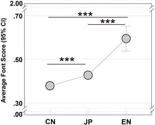
Figure 4. Overall font preferences of Chinese, Japanese, and English Experiments. The x-axis represents different language experiments (CN = Chinese, JP = Japanese, EN = English), and the y-axis shows the mean font scores (with 95% confidence intervals). Significant differences are marked by “*”.
In our experimental design, two fonts were presented in random pairs, and participants were asked to choose the more legible font under the given conditions. The selected font received either 1 or 2 points, whereas the non-selected font received 0 points. If participants judged the two fonts to be equivalent, both fonts were assigned 0 points. Consequently, the overall results can be interpreted in two ways. First, the influence of font characteristics on legibility may vary by language: English fonts received higher scores compared to Chinese or Japanese fonts. Second, participants performance on non-native language tasks may have had a strong influence. Specifically, since nearly all non-native speakers (CL1 and JL1) were L2 speakers in the English experiment, while the non-native groups in the Japanese and Chinese experiments comprised both L2 and LN participants, preferences for unfamiliar scripts may differ substantially from those of native speakers particularly in the Chinese experiment.
Next, we conducted between-subjects tests on both the main effects (Font, Distance, Glyph, and Native Language) and their interaction terms for each language experiment (CN, EN, JP), as summarized in Table 2. Although the main effects showed high levels of significance, our focus was on the more complex interaction effects (i.e., two-way and three-way interactions). Therefore, the following discussion emphasizes the group-level effects of these interaction variables across the different language conditions.
Table 2. Tests of between-subjects effects by Glyph, font, distance, and native language.
In the Chinese group, significant interactions were observed for:
In the Japanese group, significant interactions included:
For the English group, significant interactions were found for:
Notably, in the English experiment, the interaction between Font and Glyphs did not reach statistical significance
Although some of these interaction effects exhibit medium effect sizes, the complexity of these interactions coupled with the sensitivity of font evaluation requires a comprehensive interpretation. Therefore, we classified the experiments by language and performed detailed comparisons of the various parameter combinations within each language environment.
4.2.1 Chinese experiment
Figure 5 illustrates the overall comparative relationships among fonts in the Chinese experiment at different distances. We focus first on these global patterns. For more detailed analysis especially the complex interactions of font
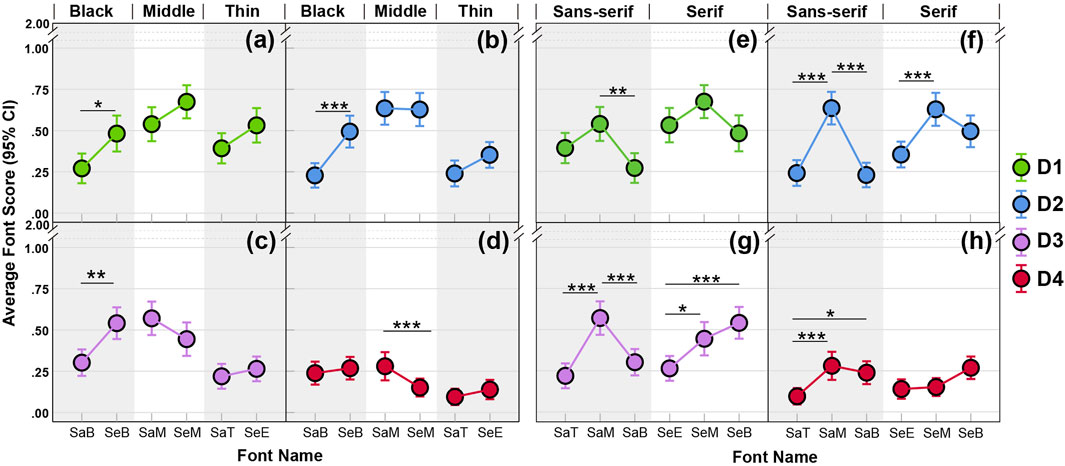
Figure 5. Legibility comparisons across Chinese font styles and weights at four viewing distances. (a–d) present serif vs. sans-serif contrasts under each weight category, while (e–h) present weight contrasts (Black, Middle, Thin) within each font styles; the x-axis lists font names, and the y-axis shows mean performance scores (0–2) with 95% confidence intervals; post hoc pairwise comparisons (EMM) are indicated by asterisks (
Based on the between-group effects at each distance, at D1 and D2 the font
4.2.1.1 Serif Font vs. Sans-Serif Font
As shown in Figures 5a–d, for D1–D3 (panels abc) the bold serif font (SeB) tended to yield higher scores than the bold sans-serif font (SaB). Moreover, at D1 we found that JL1 and CL1 showed greater acceptance of SeB compared to EL1
4.2.1.2 Font weight comparisons
As shown in Figures 5e–h, at close distances D1 and D2 (panels ef) the medium weights (SaM, SeM) performed best. However, neither the font
At far distances D3–D4 (panels gh), particularly at D3, SaM and SeB yielded the highest scores. Although D4 scores were generally low, the trend across weights mirrored that of D3 (panels g–h) i.e., SaM outperformed SaT, and serif fonts showed increasing scores from light to bold. Since the interaction effects at D3 and D4 were not significant
In summary, for Chinese characters at close viewing distances (D1–D2), the bold serif font (SeB) is most legible especially for the JL1 and CL1 groups and simple glyphs pair best with SeB, whereas complex glyphs benefit more from lighter weights such as SaT or SeE. This may be because at close range the visual system prefers a balance between glyph complexity and font weight: highly complex characters require lighter weights to avoid visual overload, while very simple characters need slightly heavier weights to enhance clarity. Additionally, close viewing makes fine details more discernible, so decorative strokes in simple glyphs may confer greater comfort for native readers (CL1 and JL1).
4.2.2 Japanese experiment
Figure 6 illustrates the overall font performance in the Japanese experiment at four viewing distances. Subplot layout and parameter settings match those of the Chinese experiment. As in the Chinese analysis, we first assess global font effects see Figure 6, then fit separate GLM models per distance to test font
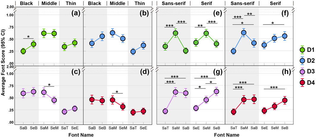
Figure 6. Legibility comparisons across Japanese font styles and weights at four viewing distances. (a–d) present serif vs. sans-serif contrasts under each weight category, while (e–h) present weight contrasts (Black, Middle, Thin) within each font styles; the x-axis lists font names, and the y-axis shows mean performance scores (0–2) with 95% confidence intervals; post hoc pairwise comparisons (EMM) are indicated by asterisks
Based on between group tests of interaction terms at each distance:
4.2.2.1 Serif Font vs. Sans-Serif Font
At D1 (panel a), SeB scored significantly higher than SaB. MM comparisons show that Japanese natives (JL1)
By D3 and D4 (panels cd), SaM outperformed SeM, especially for glyph J3
4.2.2.2 Font weight comparisons
In panels eh of Figure 6, we compare light, medium, and bold weights of each font (panels efgh):
At D1 (panel e), Medium weights (SaM, SeM) significantly outperformed both light and bold. For example, SaM outperformed SaT
At D2 (panel f), In sans serif fonts, SaM remained best, but SaB began to pull ahead of SaT, especially at J3
By D3–D4 (panels gh), Both SaM and SaB outperformed SaT across most glyphs. At D3 (panel g), SaT was the weakest than SaB and SaM (J1–J5:
In other words, at close distances, bold decorative weights improve legibility of simple glyphs; at far distances, light weights become unsuitable. Overall, Japanese natives (JL1) favor bold weights at near range, while English natives (EL1) show strong preferences for sans serif at all distances, and Chinese natives (CL1) are less inclined toward bold weights.
4.2.3 English experiment
Figure 7 illustrates the overall font performance in the English experiment at four viewing distances, with subplot arrangement and analysis procedures as in the Chinese experiment. We first assess global font effects see Figure 7, then fit separate GLM models per distance to test font
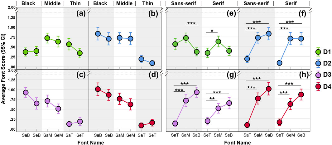
Figure 7. Legibility comparisons across English font styles and weights at four viewing distances. (a–d) present serif vs. sans-serif contrasts under each weight category, while (e–h) present weight contrasts (Black, Middle, Thin) within each font styles; the x-axis lists font names, and the y-axis shows mean performance scores (0–2) with 95% confidence intervals; post hoc pairwise comparisons (EMM) are indicated by asterisks
4.2.3.1 Serif font vs. Sans Serif font
In Figures 7a–d, although no post hoc comparison between serif and sans serif of the same weight reached statistical significance, clear trends emerged. At D1 and D2, the light serif font (SeT) scored lower than its sans serif counterpart (SaT). At D3 and D4, the bold serif font (SeB) scored lower than bold sans serif (SaB), and medium serif (SeM) scored lower than medium sans serif (SaM). Notably, at D4 the Font
4.2.3.2 Font weight comparisons
In Figures 7e–h, multiple post hoc tests revealed significant effects. At the closest distance D1, medium weights (SaM and SeM) performed best for both serif and sans. Because no detailed interaction effects were significant at D1
In summary, sans serif fonts slightly outperformed serif overall. At the nearest distance, medium weight fonts held an advantage. As distance increased, both medium and bold weights remained strong especially bolds which were most preferred by Japanese native readers. Light weights (both serif and sans) are generally unsuitable for VR presentation at comfortable (D2–D3) or far (D4) distances.
4.2.4 Summary
Because the number of possible interaction combinations is large, we only summarize in the main text those cases where all three tests between-group effects, Univariate Tests, and EMM pairwise comparisons were significant and the effect size was non-negligible. While this approach guarantees statistical rigor, it can obscure overall trends and make it harder to visually assess the full data pattern. Since the font
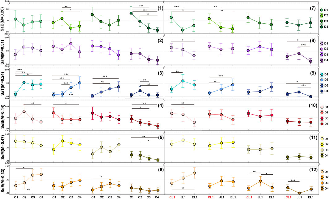
Figure 8. Font performance trends of Chinese fonts under varying glyph complexity, native language groups, and viewing distances. (1)–(6) illustrate how font performance varies with different glyph complexities (x-axis), while (7)–(12) show how performance differs across native language groups (x-axis). In all panels, the y-axis indicates the mean font performance scores (0–2 scale) with 95% confidence intervals, where “M” denotes the average score for each font. Separate post hoc analyses were conducted for each trend, with significant differences marked by “*”.
For the Chinese experiment, our findings suggest that at extreme long distances (D4) serif fonts and light fonts (e.g., SaT, SeM, and SeE) should be avoided (see panels 3, 5, and 6 in Figure 8). Moreover, complex glyphs whether rendered in bold or light weights resulted in suboptimal legibility (refer to panels 1–6 in Figure 8). Therefore, it is recommended to increase font size when possible, particularly for native English speakers (see panels 8–11 in Figure 8). For simple Chinese characters, increasing font weight at longer distances improves legibility for both native and non-native groups. Conversely, at closer distances (D1–D2), the bold serif font SeB demonstrates superior acceptability, especially among Japanese (JL1) and Chinese (CL1) native speakers. Specifically, simple glyphs benefit from bold serif fonts (e.g., SeB), while complex glyphs perform better with light fonts like SaT or SeE. This likely reflects the eye’s need for balanced weight distribution: lighter fonts reduce visual density for complex characters, while slightly heavier weights optimize simple characters (see panels 2, 3, 5, and 6 in Figure 8). Additionally, decorative serif details enhance comfort for Chinese natives and Japanese natives at close range. These aesthetic considerations should be balanced against legibility requirements.
For the Japanese experiment, the trend of Chinese characters (Kanji: J3–J6) was similar to that observed in the Chinese experiment. At extreme long distances (D4), light fonts such as SaT and SeE are not recommended (see panels 3 and 6 in Figure 9). Furthermore, for complex glyph forms, the use of bold fonts (e.g., SaB and SeB) should be minimized (see panels 1 and 4 in Figure 9). Instead, medium-weight fonts adjusted in size according to complexity are recommended. For simple glyphs, a moderate weight increase enhances legibility, with decorative bold fonts improving perception at close range. Crucially, native language groups exhibit distinct preferences: English speakers (EL1) favor sans-serif fonts overall, Chinese speakers (CL1) show lower acceptance of bold fonts, while Japanese speakers (JL1) demonstrate strong preference for bold fonts (both serif and sans-serif) at close distances with large text. At comfortable or close distances (D1–D3), serif fonts with reduced weight improve legibility for complex Chinese characters (see panels 1, 2, 3, and 5 in Figure 9), whereas light fonts such as SaT and SeE remain unsuitable for simple glyphs (see panels 3 and 6 in Figure 9).
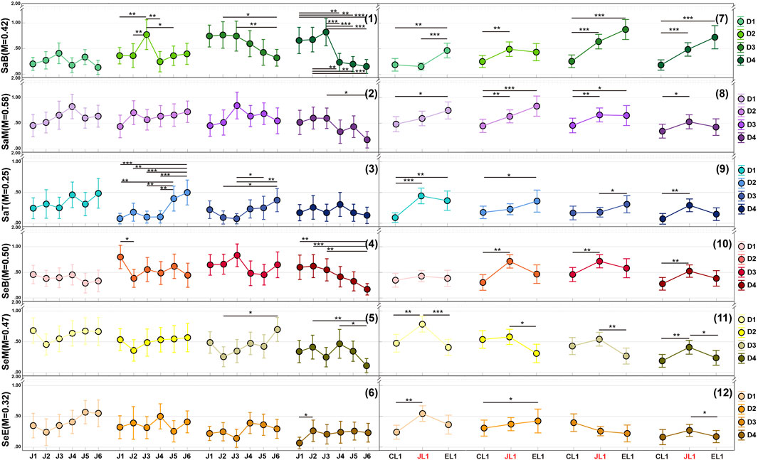
Figure 9. Font performance trends of Japanese fonts under varying glyph complexity, native language groups, and viewing distances. (1)–(6) illustrate how font performance varies with different glyph complexities (x-axis), while (7)–(12) show how performance differs across native language groups (x-axis). In all panels, the y-axis indicates the mean font performance scores (0–2 scale) with 95% confidence intervals, where “M” denotes the average score for each font. Separate post hoc analyses were conducted for each trend, with significant differences marked by “*”.
An additional consideration in the Japanese experiment is the role of kana. Katakana (J2), characterized by predominantly straight strokes, and Hiragana (J1), known for its curvilinear features, exhibit different font preferences. At closer distances (D1 and D2), Hiragana tends to be more suitable for serif fonts, regardless of weight. However, at farther distances (D3 and D4), the differences between the two become less pronounced.
In the English experiment, sans-serif fonts generally outperform serif fonts marginally. Complex glyph forms (i.e., complex words) did not significantly affect legibility, and detailed comparisons did not reveal clear trends (see panels 1–6 in Figure 10). At close distances (D1), medium-weight fonts demonstrate optimal performance. As distance increases (D2-D3), both medium and bold weights show good results, with bold fonts (SaB, SeB, SeM) being strongly preferred by Japanese speakers (JL1). Additionally, JL1 participants increasingly preferred bold fonts like SaB and SeB at D3 and D4 (see panels 7 and 10 in Figure 10), while native English speakers favored bold fonts at D4. Notably, light fonts (both serif and sans-serif) are unsuitable for VR presentation at D2-D4.
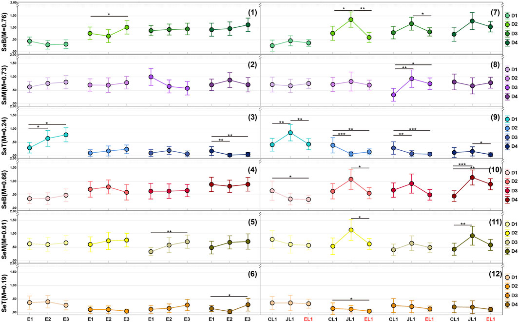
Figure 10. Font performance trends of English fonts under varying glyph complexity, native language groups, and viewing distances. (1)–(6) illustrate how font performance varies with different glyph complexities (x-axis), while (7)–(12) show how performance differs across native language groups (x-axis). In all panels, the y-axis indicates the mean font performance scores (0–2 scale) with 95% confidence intervals, where “M” denotes the average score for each font. Separate post hoc analyses were conducted for each trend, with significant differences marked by “*”.
5 Discussion
5.1 Distinct font preferences for native and non-native speakers across language groups
Our experimental results indicate that different native language groups exhibit distinct font preferences when processing both their native language and non-native scripts. Specifically, familiarity with a language leads to clear font preferences, whereas for unfamiliar languages, these preferences become less defined.
More precisely, the results demonstrate that, in each language-specific experiment, both native and non-native speakers showed varying font preferences between their L1 and non-L1 scripts. However, a detailed comparison in the Results section revealed that the influence of viewing distance on trends related to native language preferences was somewhat inconsistent. Although the Distance
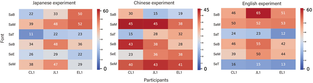
Figure 11. Heatmap illustrating font
To define significant areas of heat on the maps, we applied a rule based on mean values and differences. First, we calculated the mean of the heat map data and preliminarily designated values above this mean as significant. To more precisely identify areas of concentrated high values, we further defined any value above the mean as “concentrated heat” if its difference from surrounding high-value areas was less than or equal to 10.
Figure 11 shows that, for Japanese fonts, native Chinese (CL1) and Japanese (JL1) speakers preferred Sans-MediumJP (SaM), Serif-MediumJP (SeM), and Serif-BlackJP (SeB) fonts, whereas native English speakers (EL1) favored Serif-BlackJP (SeB) and Sans-MediumJP (SaM) fonts. In the English experiment, both native (EL1) and non-native speakers (CL1 and JL1) exhibited similar preferences, focusing on Sans-Black (SaB), Sans-Medium (SaM), Serif-Black (SeB), and Serif-Medium (SeM) fonts, with a notable bias toward sans-serif typefaces.
For Chinese fonts, the heat maps revealed a more dispersed preference pattern, especially among non-native participants (JL1 and EL1). In contrast, native Chinese speakers (CL1) demonstrated a clear preference for Sans-MediumSC (SaM), Serif-BlackSC (SeB), and Serif-MediumSC (SeM) fonts, a pattern similar to their preferences for Japanese fonts. Conversely, non-native speakers (JL1 and EL1) showed more varied preferences for Chinese fonts, with a notably lower win rate for Sans-BlackSC (SaB).
This phenomenon suggests that when individuals are exposed to a familiar language (whether L1 or a well-practiced L2) for example, when EL1 and CL1 are processing Japanese or when CL1 and JL1 are processing English they tend to display similar and distinct font preferences, likely influenced by legibility considerations. In contrast, when the language is unfamiliar (L2 or LN), such as JL1 and EL1 encountering Chinese, font preferences are less pronounced. In these cases, aesthetic judgment may play a more decisive role, particularly at closer distances where the letterform contours are clearly discernible. This finding supports earlier research by Blohm et al. (2018) and Gao et al. (2019), which suggests that fonts with lower inherent legibility can sometimes enhance aesthetic appreciation when semantic content is not the primary focus.
Our detailed comparisons indicate that as the viewing distance increases especially at the extreme limit both native and non-native participants shift their criteria toward recognizability of letter contours. For complex Chinese and Japanese characters, neither bold nor thin typefaces significantly improve overall preference, implying that a larger font size may be necessary. In contrast, for simpler Chinese characters, kana, and English words, non-serif bold fonts tend to perform better at longer, particularly extreme, viewing distances. Everyday visual environments shape font biases across scripts.
Finally, although direct empirical data are limited, cultural exposure may further shape these biases. JL1 participants consistently favored bold weights across all language contexts perhaps reflecting the ubiquity of heavy lettering in Japanese signage and advertising. Likewise, in our English experiment, sans-serif and bold styles were strongly preferred by every group. Mackiewicz found that academic audiences rated sans-serif PowerPoint text nearly twice as readable as serif text (Mackiewicz, 2007), and since our sample comprised mostly university students, habitual exposure to these styles may have influenced their legibility judgments.
5.2 Impact of font style and weight on preferences and design implications
Typefaces are primarily defined by their style (serif vs. sans-serif) and weight (thin, medium, bold). Overall, since medium-weight fonts exhibited the best performance, we focused on comparing the trends between bold (black) and thin (light) fonts, excluding medium-weight fonts for clarity. Figure 12 illustrates these trends, with blue lines representing bold fonts and orange lines representing thin fonts. Dark-colored lines denote serif fonts, while light-colored lines denote sans-serif fonts. The x-axis indicates the typeface design (i.e., glyph complexity), and the y-axis shows the win rate (calculated as the number of wins divided by the total number of appearances) for each font across different glyph complexities.
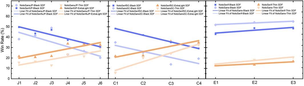
Figure 12. Win rate trends of fonts across languages and Glyph complexity levels.
Clear trends emerged across languages. For both Japanese and Chinese, a crossover trend was observed with increasing complexity: bold fonts tended to show a decrease in win rate, while thin fonts exhibited an increase. This suggests that as character complexity increases, bold fonts become less favorable, while thin fonts become more favorable. Moreover, English shows a more parallel trend, indicating that glyph complexity has minimal impact on font performance. However, bold English fonts consistently achieve higher win rates than their thin counterparts. This observation aligns with our findings, where English font preferences were more influenced by weight, whereas Japanese and Chinese preferences were more affected by glyph complexity. These findings align with prior work (e.g., Oderkerk and Beier, 2022) showing that increasing letter width improves letter recognition particularly for shorter and wider shapes while the complexity of Chinese and Japanese characters influences font preferences differently. Simpler characters tend to favor bolder weights, whereas more complex characters benefit from thinner strokes.
Regardless of complexity, serif fonts consistently outperformed sans-serif fonts for both Chinese and Japanese. In contrast, for English, sans-serif fonts slightly outperformed serif fonts. This reinforces the notion that serif fonts are generally preferred for more complex scripts like Chinese and Japanese-especially in close-range contexts-whereas sans-serif fonts are more suitable for English, particularly at longer viewing distances.
In summary, our findings highlight that font weight and style preferences are significantly influenced by both the inherent complexity of the script and the language context. Bold fonts are typically favored for simpler characters, while thinner fonts are preferred for more complex characters, especially in Japanese and Chinese. These insights have important implications for typography and interface design across different languages.
5.3 Summary
While initial GLM analyses revealed multiple factors significantly influencing font preferences in Sections 4.2.1–4.2.3, a detailed examination of the results in Section 4.2.4 and subsequent discussions identified two primary determinants: the interaction between viewing distance and glyph complexity (Font
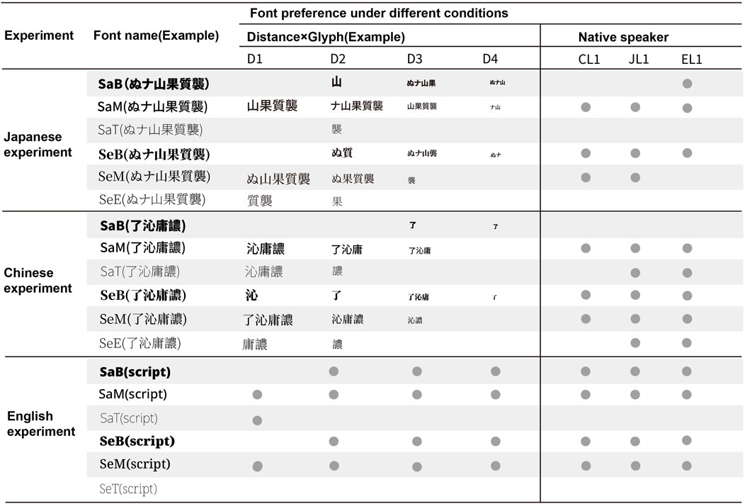
Figure 13. Comprehensive overview of font preferences by distance
First, for Chinese and Japanese, the interaction between glyph complexity and viewing distance had the greatest impact on font preference. To illustrate varying glyph complexities, we selected representative characters at each level, such as “ぬ, ナ, 山, 果, 質, 襲” (J1–J6) for Japanese and “了, 沁, 庸, 譨” (C1–C4) for Chinese. Because English font preference did not significantly depend on glyph complexity, we used the word “script” (E2) as a proxy. Drawing on the detailed comparisons in the Results section, we identified which fonts performed relatively well at specific distances and for different glyphs (acknowledging that VR experiences differ substantially from screen-based viewing, but using font size to approximate distance). We applied an average score threshold of 0.5 to determine whether a font performed well. For English, glyph complexity showed no significant effect, whereas the Distance
Second, although the initial ANOVA suggested that native language, Native
Our key findings can be summarized as follows:
1. Different font weights showed distinct preferences across varying distances. In Chinese and Japanese, heavier fonts and simpler glyphs were preferred at greater distances. At closer distances (D1, D2), medium-weight fonts generally performed well across most glyphs, while lighter fonts were more suitable for complex glyphs. In contrast, English results indicated that thinner fonts consistently performed poorly, and heavier fonts were less preferred at the closest distance (D1). Therefore, in VR environments, it is advisable to avoid thin fonts for English and to refrain from using heavy fonts at D1, regardless of whether they are serif or sans serif.
2. In Chinese and Japanese experiments, serif fonts outperformed sans serif fonts at non-extreme distances (D1, D2, D3). At closer distances especially D1 serif fonts provided a clear advantage due to their decorative details, which were more visible at close range. This was particularly evident for complex glyphs (J5, J6; C3, C4). However, bold serif fonts (SeB) were unsuitable at very close distances. Additionally, within Japanese scripts, Hiragana tended to benefit more from serif fonts than katakana. We hypothesize that katakana (e.g., ナ, フ), composed mostly of straight strokes, resembles simpler Chinese characters (e.g., 一, 七) and thus gains little from decorative elements. In contrast, Hiragana (e.g., な, ふ) with more curved strokes, appears more decorative and therefore benefits more from serif detailing.
3. Familiarity with glyphs leads to more consistent and pronounced preferences. For example, because English is widely recognized as an international language, CL1 and JL1 participants showed nearly identical font preferences for English. In the Japanese experiments, CL1 participants familiar with kanji and often learning Japanese as a second language (regardless of proficiency) exhibited preferences similar to JL1 participants. In contrast, EL1 participants, whose native language is alphabetic, displayed different preferences. Finally, in the Chinese experiments, both EL1 and JL1 participants, with no prior study of Chinese, showed more variable preferences.
4. When participants encountered entirely unfamiliar glyphs, their preference criterion shifted from “legibility” to “visual appeal.” Although we instructed participants to focus on legibility, the semi-structured interviews revealed that complex or unknown characters (e.g., certain Chinese glyphs) were primarily evaluated based on perceived attractiveness. Consequently, our second finding that serif fonts are preferable at close distances should be interpreted with caution. However, as the viewing distance increases and decorative details become less discernible, participants regardless of background tend to favor whichever font appears clearer.
6 Limitations and future work
Although this study provides initial insights into cross linguistic font preferences in VR, several contextual factors limit the generalizability of our findings.
First, This study serves as a foundational exploration of font preferences. However, because we focused exclusively on single characters and words without sentence-level context, Therefore, the findings may not fully generalize to real-world text comprehension, where semantic content and context interact with typographic features. For instance, while our decontextualized results suggest a serif preference for Chinese and Japanese characters, these preferences may shift when participants must read meaningful sentences or understand longer passages. Second, this study is the narrow selection of font types and weight categories examined, which focused solely on black, medium, and thin weights. This limited range may not capture the full spectrum of typographic nuances such as variable fonts, stroke contrast, kerning, or other design elements especially for non-Latin scripts with unique typographic requirements. Future research should broaden the range of font characteristics to gain a better understanding of how various dimensions of type design interact with legibility and aesthetic preferences.
Third, all experiments were conducted on a single Meta Quest 3 head-mounted display (HMD) in a controlled laboratory environment; different headsets (with varying resolution, optics, or field of view) and real-world conditions (ambient lighting, multitasking, varied display sizes) could alter visual acuity, fatigue, and legibility thresholds. Finally, our study relied on a relatively small sample size (30 participants, with 20 in each native versus non-native language group), which limits the generalizability of the results. Although prior research indicates that individual differences in font preference are substantial, a larger and more diverse sample would enable more robust statistical analysis and the exploration of subgroup differences. Future work should recruit a broader participant pool to validate these findings across different age groups, educational backgrounds, and cultural contexts.
In summary, while this study provides initial insights into font preference, Future research should address these limitations by (1) incorporating meaningful text to examine how semantic content interacts with typographic features; (2) expanding the range of font characteristics tested; (3) evaluating font legibility across multiple HMD platforms and realistic reading scenarios; and (4) recruiting larger, more diverse participant samples to explore subgroup and cultural effects. By doing so, we can strengthen and broaden the applicability of VR typography guidelines across varied contexts and user populations.
7 Conclusion
This study conducted a cross-linguistic VR experiment to systematically investigate font preferences among native and non-native speakers across varying viewing distances (D1-D4) and glyph complexity levels. Participants performed pairwise font comparisons in three language contexts Chinese, Japanese, and English within an immersive virtual environment, generating distinct preference judgments. Through quantitative analysis of interaction effects (Font
Although our work is limited by the lack of semantic context and a restricted font set, it still makes three key contributions to VR text adaptation. First, it provides empirical evidence of cross-linguistic divergence in font preferences, demonstrating that Chinese characters in Chinese and Japanese contexts benefit from serif fonts at close distances (D1–D2) while requiring greater weight adjustments for complex glyphs compared to alphabetic systems (English) consistent with prior findings on orthographic processing (Oderkerk and Beier, 2022). Second, the study highlights the dynamic interplay between aesthetic preferences and functional legibility, particularly for non-native readers who often prioritize visual appeal over legibility in unfamiliar scripts. This phenomenon aligns with dual-process theories of typographic perception (Blohm et al., 2018; Gao et al., 2019). Third, we derive practical design guidelines: (1) for English interfaces across varying distances, prioritize sans-serif fonts and increase font weight as distance increases; (2) for Chinese and Japanese texts at close distances, adjust font weight according to glyph complexity (using lighter weights for complex characters and heavier weights for simpler ones); and (3) implement adaptive text sizing for extreme viewing distances rather than relying solely on weight adjustments.
By integrating psycholinguistic principles with VR-based experimentation, this work bridges critical gaps in cross-cultural typography research. It provides a methodological framework for evaluating perceptual-cognitive interactions in immersive environments while offering actionable strategies to enhance digital inclusivity ensuring VR interfaces accommodate diverse linguistic populations through evidence-based font design. Future extensions incorporating semantic content and expanding typographic variables could further refine these guidelines, ultimately advancing VR as a universal medium for global communication.
Data availability statement
The original contributions presented in the study are included in the article/Supplementary Material, further inquiries can be directed to the corresponding author.
Ethics statement
The studies involving humans were approved by Institutional Review Board of Hokkaido University. The studies were conducted in accordance with the local legislation and institutional requirements. The participants provided their written informed consent to participate in this study.
Author contributions
HZ: Conceptualization, Data curation, Formal Analysis, Funding acquisition, Investigation, Methodology, Project administration, Resources, Software, Supervision, Validation, Visualization, Writing – original draft, Writing – review and editing. DS: Supervision, Writing – review and editing, Formal Analysis, Methodology, Project administration. TO: Supervision, Writing – review and editing.
Funding
The author(s) declare that financial support was received for the research and/or publication of this article. This work was supported by the JST SPRING (Grant Number JPMJSP2119), JST FOREST Program (Grant Number JPMJFR226S), and JST CREST (Grant Number JPMJCR21D4) Japan.
Conflict of interest
The authors declare that the research was conducted in the absence of any commercial or financial relationships that could be construed as a potential conflict of interest.
Generative AI statement
The author(s) declare that no Generative AI was used in the creation of this manuscript.
Publisher’s note
All claims expressed in this article are solely those of the authors and do not necessarily represent those of their affiliated organizations, or those of the publisher, the editors and the reviewers. Any product that may be evaluated in this article, or claim that may be made by its manufacturer, is not guaranteed or endorsed by the publisher.
Supplementary material
The Supplementary Material for this article can be found online at: https://www.frontiersin.org/articles/10.3389/frvir.2025.1590871/full#supplementary-material
Footnotes
1An electronic spreadsheet containing all behavioral measurements and participant demographics is available in the GitHub repository associated with this study.
References
Akamatsu, N. (1999). The effects of first language orthographic features on word recognition processing in English as a second language. Read. Writ. 11, 381–403. doi:10.1023/A:1008053520326
Alger, M. (2015). Visual design methods for virtual reality. Ravensbourne. Available online at: http://aperturesciencellc.com/vr/VisualDesignMethodsforVR_MikeAlger.pdf. (Accessed 9 July 2025).
Ali, A. Z. M., Wahid, R., Samsudin, K., and Idris, M. Z. (2013). Reading on the computer screen: does font type have effects on web text readability? Int. Educ. Stud. 6, 26–35. doi:10.5539/ies.v6n3p26
Arditi, A., and Cho, J. (2005). Serifs and font legibility. Vis. Res. 45, 2926–2933. doi:10.1016/j.visres.2005.06.013
Beier, S., and Oderkerk, C. A. (2021). High letter stroke contrast impairs letter recognition of bold fonts. Appl. Ergon. 97, 103499. doi:10.1016/j.apergo.2021.103499
Bernard, J.-B., and Chung, S. T. (2011). The dependence of crowding on flanker complexity and target–flanker similarity. J. Vis. 11, 1. doi:10.1167/11.8.1
Blohm, S., Wagner, V., Schlesewsky, M., and Menninghaus, W. (2018). Sentence judgments and the grammar of poetry: linking linguistic structure and poetic effect. Poetics 69, 41–56. doi:10.1016/j.poetic.2018.04.005
Calabrese, A., Cheong, A. M., Cheung, S.-H., He, Y., Kwon, M., Mansfield, J. S., et al. (2016). Baseline mnread measures for normally sighted subjects from childhood to old age. Investigative Ophthalmol. Vis. Sci. 57, 3836–3843. doi:10.1167/iovs.16-19580
Cauz, M., Clarinval, A., and Dumas, B. (2024). Text readability in augmented reality: a multivocal literature review. Virtual Real. 28, 59. doi:10.1007/s10055-024-00949-6
Chatrangsan, M., and Petrie, H. (2019). “The effect of typeface and font size on reading text on a tablet computer for older and younger people,” in Proceedings of the 16th international web for all conference, 1–10. doi:10.1145/3315002.3317568
Galiano, A. R., Augereau-Depoix, V., Baltenneck, N., Latour, L., and Drissi, H. (2023). Luciole, a new font for people with low vision. Acta Psychol. 236, 103926. doi:10.1016/j.actpsy.2023.103926
Gao, X., Dera, J., Nijhof, A. D., and Willems, R. M. (2019). Is less readable liked better? The case of font readability in poetry appreciation. PLoS One 14, e0225757. doi:10.1371/journal.pone.0225757
Gardner, R. C. (1983). Learning another language: a true social psychological experiment. J. Lang. Soc. Psychol. 2, 219–239. doi:10.1177/0261927x8300200209
Gauvin, H. S., and Hulstijn, J. H. (2010). Exploring a new technique for comparing bilinguals L1 and L2 reading speed. Available online at: https://hdl.handle.net/10125/66644. (Accessed 9 July 2025).
Huang, X., Zou, D., Cheng, G., and Xie, H. (2021). A systematic review of AR and VR enhanced language learning. Sustainability 13, 4639. doi:10.3390/su13094639
Jankowski, J., Samp, K., Irzynska, I., Jozwowicz, M., and Decker, S. (2010). “Integrating text with video and 3d graphics: the effects of text drawing styles on text readability,” in Proceedings of the SIGCHI conference on human factors in computing systems, 1321–1330. doi:10.1145/1753326.1753524
Jessner, U. (2008). A dst model of multilingualism and the role of metalinguistic awareness. Mod. Lang. J. 92, 270–283. doi:10.1111/j.1540-4781.2008.00718.x
Korinth, S. P., Gerstenberger, K., and Fiebach, C. J. (2020). Wider letter-spacing facilitates word processing but impairs reading rates of fast readers. Front. Psychol. 11, 444. doi:10.3389/fpsyg.2020.00444
Lee, E.-K., and Fraundorf, S. (2019). Native-like processing of prominence cues in l2 written discourse comprehension: evidence from font emphasis. Appl. Psycholinguist. 40, 373–398. doi:10.1017/s0142716418000619
Mackiewicz, J. (2007). Audience perceptions of fonts in projected powerpoint text slides. Tech. Commun. 54, 295–307. doi:10.1109/IPCC.2006.320391
Majaj, N. J., Pelli, D. G., Kurshan, P., and Palomares, M. (2002). The role of spatial frequency channels in letter identification. Vis. Res. 42, 1165–1184. doi:10.1016/s0042-6989(02)00045-7
Matsuura, Y., Terada, T., Aoki, T., Sonoda, S., Isoyama, N., and Tsukamoto, M. (2019). “Readability and legibility of fonts considering shakiness of head mounted displays,” in Proceedings of the 2019 ACM international symposium on wearable computers, 150–159. doi:10.1145/3341163.3347748
Minakata, K., and Beier, S. (2021). The effect of font width on eye movements during reading. Appl. Ergon. 97, 103523. doi:10.1016/j.apergo.2021.103523
Newbold, N., and Gillam, L. (2010). “The linguistics of readability: the next step for word processing,” in Proceedings of the NAACL HLT 2010 workshop on computational linguistics and writing: writing processes and authoring aids, 65–72. Available online at: https://aclanthology.org/W10-04.pdf. (Accessed 9 July 2025).
Oderkerk, C. A., and Beier, S. (2022). Fonts of wider letter shapes improve letter recognition in parafovea and periphery. Ergonomics 65, 753–761. doi:10.1080/00140139.2021.1991001
Ohnishi, M., and Oda, K. (2021). The effect of character stroke width on legibility: the relationship between duty ratio and contrast threshold. Vis. Res. 185, 1–8. doi:10.1016/j.visres.2021.03.006
Pae, H. K., and Lee, Y.-W. (2015). The resolution of visual noise in word recognition. J. Psycholinguist. Res. 44, 337–358. doi:10.1007/s10936-014-9310-x
Rahkonen, M., and Juurakko, T. (1998). Logit analysis in l2 research: measuring l1 and l2/ln effects. Int. J. Appl. Linguistics 8, 81–110. doi:10.1111/j.1473-4192.1998.tb00122.x
Rello, L., and Baeza-Yates, R. (2016). The effect of font type on screen readability by people with dyslexia. ACM Trans. Accessible Comput. (TACCESS) 8, 1–33. doi:10.1145/2897736
Rubin, G. S., Feely, M., Perera, S., Ekstrom, K., and Williamson, E. (2006). The effect of font and line width on reading speed in people with mild to moderate vision loss. Ophthalmic Physiological Opt. 26, 545–554. doi:10.1111/j.1475-1313.2006.00409.x
Rzayev, R., Ugnivenko, P., Graf, S., Schwind, V., and Henze, N. (2021). “Reading in vr: the effect of text presentation type and location,” in Proceedings of the 2021 CHI conference on human factors in computing systems, 1–10. doi:10.1145/3411764.3445606
Sakamoto, D., and Ono, T. (2024). Metaverse technologies can foster an inclusive society. Nat. Hum. Behav. 8, 1827–1828. doi:10.1038/s41562-024-01987-5
Vildavski, V. Y., Verde, L. L., Blumberg, G., Parsey, J., and Norcia, A. M. (2022). Pseudosloan: a perimetric-complexity and area-controlled font for vision and reading research. J. Vis. 22, 7. doi:10.1167/jov.22.10.7
Wang, Z., Gao, P., Ma, L., and Zhang, W. (2020). “Effects of font size, line spacing, and font style on legibility of Chinese characters on consumer-based virtual reality displays,” in HCI international 2020–late breaking posters: 22nd international conference, HCII 2020, Copenhagen, Denmark, july 19–24, 2020, proceedings, Part I 22 (Springer), 468–474. doi:10.1007/978-3-030-60700-5_59
Keywords: human-centered computing, virtual experiment, font preference, multilingual, legibility
Citation: Zhang H, Sakamoto D and Ono T (2025) Study on font preferences of native and non-native speakers in a virtual reality environment. Front. Virtual Real. 6:1590871. doi: 10.3389/frvir.2025.1590871
Received: 11 March 2025; Accepted: 30 June 2025;
Published: 30 July 2025.
Edited by:
Lei Zhang, Kennesaw State University, United StatesReviewed by:
Paul Macaruso, Community College of Rhode Island, United StatesCamila Peres Nogues, Federal University of Rio Grande do Sul, Brazil
Copyright © 2025 Zhang, Sakamoto and Ono. This is an open-access article distributed under the terms of the Creative Commons Attribution License (CC BY). The use, distribution or reproduction in other forums is permitted, provided the original author(s) and the copyright owner(s) are credited and that the original publication in this journal is cited, in accordance with accepted academic practice. No use, distribution or reproduction is permitted which does not comply with these terms.
*Correspondence: Huidan Zhang, emhhbmdodWlkYW42NjZAZ21haWwuY29t