 Huidan Zhang
 Daisuke Sakamoto
 Tetsuo Ono
- 1Human computer interaction laboratory, Graduate School of Information Science and Technology, Hokkaido University, Sapporo, Japan
- 2Human computer interaction laboratory, Faculty of Information Science and Technology, Hokkaido University, Sapporo, Japan
Introduction: Multilingual communication shapes education, culture, and decision-making, However, we lack a clear picture of how native writing systems influence visual processing.
Methods: We conducted virtual reality experiments comparing native Chinese, Japanese, and English readers, who read both native and non-native scripts in immersive VR settings.
Results: Native Chinese and Japanese readers read faster but were more prone to confusion with similar glyphs, while English readers took longer and struggled with structural complexity. These patterns among native Chinese and Japanese readers persisted even with non-native scripts.
Discussion: Our findings reveal a lasting visual divergence shaped by native-script experience, offering guidance for VR interface design and script-sensitive language learning tools.
1 Introduction
Language, as an integral part of daily life, profoundly shapes human activities ranging from communication and education to cultural exchange and decision-making. In today’s multilingual societies, bilingualism or even trilingualism has become commonplace. However, fundamental differences exist between second language (L2) learners and native speakers in orthographic processing (Singhal and Meena, 1998), phonological awareness (Akker and Cutler, 2003), and syntactic integration (Baker, 2010). These differences are particularly pronounced between logographic systems (e.g., Chinese Hanzi) and alphabetic systems (e.g., English), as they employ distinct visual encoding strategies (Perfetti, 2007), imposing divergent cognitive demands on learners due to their contrasting visual-spatial organizations.
Chinese, as a prototypical logographic system, manifests in the multi-dimensional arrangement of components within a confined spatial unit. For instance, the Chinese character赢 (yíng, “to win”) integrates five distinct radicals (亡, 口, 月, 贝, 凡) into a cohesive 2D configuration. This spatial complexity starkly contrasts with the linear sequencing of alphabetic systems such like English, where words expand horizontally through letter combinations (e.g., the English word “unbreakable” elongates horizontally by combining the prefix un-, root break, and suffix -able). Japanese further complicates this dichotomy by blending logographic Kanji (adapted from Hanzi) with syllabic Kana-a system historically derived from cursive simplifications of Chinese characters during the Heian period (794–1185 CE).
To ensure cross-linguistic consistency in our experimental design, we adopt a visually oriented definition of glyphs as the minimal perceptual units in writing systems. A glyph may correspond to: A single graphene (e.g., a Chinese Hanzi character like 水 shuǐ, “water”), Part of a graphene (e.g., diacritics in alphabetic scripts), or A composed glyph combining multiple graphemes (e.g., English words like “experiment”). This framework allows systematic comparison across languages:
To illustrate these structural differences, we developed a comparative diagram, as shown in Figure 1. Such diversity raises critical questions: How do orthographic variations influence visual perceptual processing, and how might they inform the design of language-learning tools in digital environments?
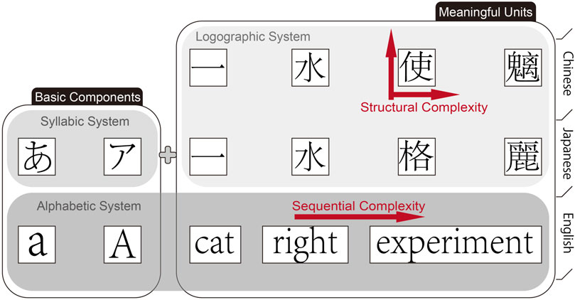
Figure 1. A Cross-Linguistic Comparison of Orthographic Structures.This figure illustrates the differences in visual structure among Chinese (logographic), Japanese (logographic-syllabic), and English (alphabetic) writing systems. Chinese characters combine multiple components into a compact two-dimensional form (e.g., the character 使), exemplifying “structural complexity.” In contrast, English words extend along a horizontal axis by adding letters in sequence, reflecting “sequential complexity.” Japanese incorporates both kanji and kana, offering a blend of visual and linear elements. In this system, kana and individual English letters function as basic units without inherent meaning, whereas a single Chinese character or a complete English word serves as the smallest meaningful unit. The concept of a “glyph” is introduced here as a unifying framework for cross-linguistic comparison.
Existing human-computer interaction (HCI) research has predominantly focused on alphabetic paradigms, despite the fact that the majority of the world’s population is bilingual or multilingual, surpassing the number of monolingual individuals (Da Rosa et al., 2023). This gap is especially salient in immersive technologies like virtual reality (VR), where depth perception and spatial rendering may interact uniquely with the visual properties of writing systems. For example, logographic characters, with their compact 2D structures, likely require holistic visual processing (Tan et al., 2005), whereas alphabetic words demand sequential decoding (Dehaene et al., 2010). Meanwhile, although Japanese kana represent syllables, L2 learners may perceive them as visual gestalts similar to kanji, akin to Kanji, due to their visual chunking (Kosaka, 2023). These observations underscore the need for a systematic framework to compare cross-linguistic visual perceptual in digitally mediated contexts.
Crucially, second language acquisition begins with zero proficiency, meaning even among L2 learners, varying familiarity levels lead to significant differences in language processing (Baker and E, 2010). To account for this, participants self-assessed their familiarity with Chinese, English, and Japanese through pre-experiment questionnaires. We categorized proficiency into three dimensions: native (L1), second language (L2), and no prior exposure (LN). This approach ensures a comprehensive analysis of how orthographic features impact individuals across proficiency levels.
To address these questions, we designed a VR-based experiment investigating how orthographic structures influence readability across three languages: Chinese (logographic), English (alphabetic), and Japanese (hybrid). Participants from these linguistic backgrounds (L1, L2, and LN) performed character/word recognition tasks under varying conditions of complexity (stroke density/word length), structural similarity, and viewing distance. During the experiment, we recorded error rates, invisibility rates (failure to recognize glyphs), and task completion times, followed by between-group effect analyses and post hoc tests to identify influencing factors. Prior to experimentation, we formulated the following hypotheses:
For Error Rates.
For Invisibility Rates.
For Task Completion Time.
We selected virtual reality (VR) over traditional screens or augmented reality (AR) for its ability to isolate and control experimental variables. Unlike traditional displays, which are influenced by user-specific factors such as height, viewing habits, and ambient distractions, VR allows precise standardization of visual stimuli while eliminating extraneous environmental interference. By creating a controlled immersive environment, we aimed to explore how cross-linguistic orthographic differences lead to distinct visual perceptual demands. Our findings inform the development of educational strategies and interface designs that facilitate more efficient L2 acquisition for non-native learners.
This study bridges linguistics and HCI, offering novel insights into adaptive multilingual systems that accommodate the structural diversity of global writing systems.
2 Cross-linguistic cognitive differences in native vs. non-native language processing
2.1 Cognitive and behavioral disparities in L1 vs. L2 processing
Research comparing native (L1) and second language (L2) processing has evolved significantly since the late 20th century. Early studies emphasized cultural schemata and prosodic awareness as critical factors in L2 comprehension. For instance, L2 readers perform better with culturally familiar content (Singhal and Meena, 1998), while non-native users adapt their language structures when interacting with AI assistants, prioritizing clarity over fluency (Wu et al., 2020). Prosodic processing further differentiates L1 and L2 users: native listeners leverage stress patterns for rapid semantic parsing (Akker and Cutler, 2003), whereas L2 learners struggle with prosodic cues due to interference from their L1 rhythmic patterns (Baker, 2010; Kawase et al., 2025).
Advancements in cognitive psychology and educational technology have shifted focus to orthographic differences between writing systems. Studies highlight that L1 and L2 readers exhibit distinct processing strategies rooted in graphemic familiarity, the visual recognition of writing units. For example, Lee and Fraundorf (2019) found that font legibility significantly impacts L2 learners’reading efficiency, while Gauvin and Hulstijn (2010) showed that degraded typography disproportionately hinders non-native speakers. These findings underscore the role of visual ergonomics in L2 acquisition.
Orthographic layout parameters, such as spacing and text directionality, further modulate cross-linguistic processing. While word spacing improves comprehension for L2 readers of Chinese (Bassetti, 2009), script directionality (e.g., left-to-right vs. right-to-left) shows negligible transfer effects in L2 English reading (Fernandez et al., 2023). Collectively, these studies reveal that L1-L2 disparities arise from both macro-level factors (cultural schemata, prosody) and micro-level visual properties (typography, layout).
2.2 Glyph perception in logographic vs. alphabetic systems
Glyphs—the minimal visual units of writing systems—serve as critical interfaces between orthography and cognition. Unlike morphemes or graphemes, glyphs emphasize visual form over linguistic meaning, making them pivotal for investigating cross-linguistic perceptual differences.
Logographic systems (e.g., Chinese Hanzi) compress semantic complexity into spatially nested structures. Despite increased stroke density, complex characters like 贏 (yíng, “to win” show no significant impact on comprehension (Fu et al., 2025), suggesting holistic visual processing dominates. In contrast, alphabetic systems (e.g., English) exhibit sequential complexity: longer words like “unbreakable” linearly integrate morphemes, requiring incremental decoding that amplifies cognitive load (Hyönä et al., 2024). This dichotomy reflects fundamental differences in visual information encoding: logographic systems prioritize spatial efficiency, while alphabetic systems demand temporal sequencing (Liversedge et al., 2024).
L1 background further modulates glyph perception. Pae and Lee (2015) found that Chinese-native speakers exhibit heightened sensitivity to typographic distortions in English, likely due to their reliance on holistic glyph recognition. Such findings align with Kosaka (2023), which attributes L2 learners’gestalt-like processing of Japanese Kana to visual chunking strategies. These studies collectively suggest that L1 orthographic experiences shape visual processing biases, with logographic learners favoring global features and alphabetic learners focusing on local details.
2.3 Synthesis and research positioning
Early foundational work on immersive text interaction, such as Billinghurst et al.’s evaluation of wearable information spaces in head-mounted displays (Billinghurst et al., 1998), laid the groundwork for understanding spatial presentation and readability in virtual environments. Building on this, prior research in virtual reality and augmented reality human-computer interaction has advanced our understanding of text rendering in immersive interfaces. These studies have examined font properties (e.g., Font, Text size and Letter-spacing (Oderkerk and Beier, 2022; Minakata and Beier, 2021)), display thresholds such as device resolution and viewing distance (Zhou et al., 2024; Jessner, 2008; Rahkonen and Juurakko, 1998), layout considerations including interface composition and perspective (Rzayev et al., 2021), and extreme reading conditions like reading during head or body motion (Matsuura et al., 2019). However, most experiments have involved monolingual, native speakers. Consequently, it remains unclear whether these design guidelines apply to non-native speakers, who employ fundamentally different perceptual strategies when processing text.
Similarly, behavioral and cognitive psychology has generated a rich literature on L1-L2 differences in glyph perception and reading patterns. Examples include eye-tracking studies of saccades, skips (Cui, 2023), and regressions to orthographic research dating back to the early 2000s (Perea and Rosa Martínez, 2000). However, these insights have seldom been translated into concrete recommendations for immersive interface or educational design.
Together, these gaps point to two critical shortcomings:
Our study addresses these shortcomings by:
Through this targeted exploration of glyphs as the smallest visual units, we provide a foundational perspective to guide future work in both VR-HCI and language learning-enhancing readability, reducing perceptual load, and improving learning outcomes across diverse linguistic populations.
3 Experiment
We examined how glyph complexity and similarity affect legibility for native (L1) and non-native (L2, LN) speakers at four distances in a VR environment using Oculus Quest 3. Participants (Japanese, English, Chinese) completed trials in their L1 and a randomly assigned L2. Glyphs were categorized by complexity (stroke count or word length) and similarity (structural resemblance). Glyphs were systematically selected from four to five predefined pairs per category (each pair consists of two characters/words) with left/right positions randomized to prevent memorization.
To minimize order effects, participants were randomly assigned to forward (0.5 m
3.1 Apparatus
The experiment used an Oculus Quest 3 with Elite Strap, featuring dual LCDs (2064
3.1.1 Text size
To ensure consistent testing conditions, the text size in virtual reality was fixed in this experiment. The font height was set to 70 mm. To address concerns regarding resolution consistency and maintain visual quality, dynamic resolution scaling was activated in this experiment. Dynamic resolution adjusts the rendering resolution in real-time based on GPU load, balancing performance and visual clarity. By enabling dynamic resolution, we effectively minimized dependency on the device’s fixed pixel density (ppd), as the system dynamically adapts resolution to maintain optimal clarity under varying conditions. Prior to the experiment, a pre-test was conducted to verify that the text clarity at all of distance met the visual requirements for the experiment demand.
3.1.2 Virtual environment
We created a 14
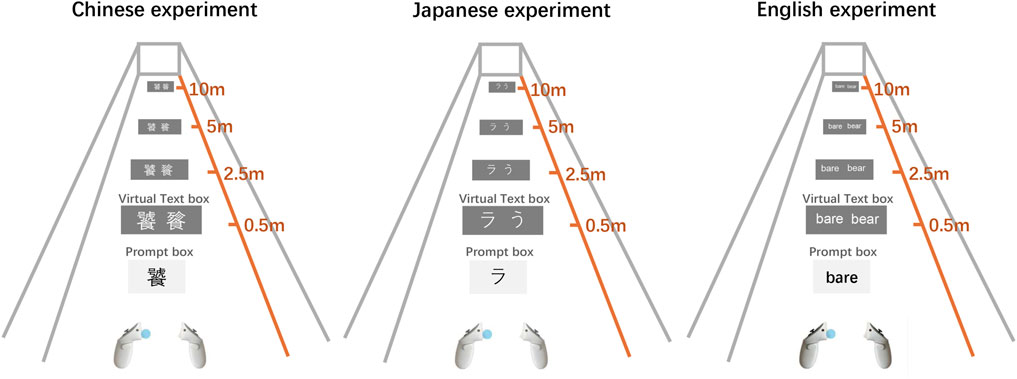
Figure 2. Schematic of the experiment scene. This figure illustrates the virtual environment in which participants viewed a text box containing either two Chinese/Japanese characters or two English words at varying distances (0.5 m, 2.5 m, 5 m, and 10 m).
3.2 Participants
We recruited 30 participants through flyers and social media, including 10 native Chinese speakers (6 males, 4 females), 10 native Japanese speakers (5 males, 5 females), and 10 native English speakers (7 males, 3 females).Each linguistic group of participants was further divided into two subgroups, with 5 participants assigned to the forward distance order and 5 participants assigned to the reverse distance order. To control for the potential influence of font on different age groups, as highlighted in Calabrese et al.’s research on MNREAD Acuity Charts across various age ranges (8-16, 16-40, and over 40 years) (Calabrèse et al., 2016), we aimed to maintain age consistency among our participants. Consequently, all participants were aged between 20 and 40 years. Of these, eight had no prior experience with VR headsets, while 22 had used VR headsets before. All participants had normal or corrected-to-normal vision, with 11 having normal vision, two wearing contact lenses, and 17 wearing glasses.
3.3 Design
We used a between-participant design. The four independent variables were as follows:
3.3.1 Glyph complexity and similarity
Because this experiment does not consider the participants’ language abilities, we used pseudo-text as the content, following the approach used by Wang et al. (2020), and Zhou et al. (2024) in their studies on the legibility of Chinese characters (Hanzi) in VR environments. This approach to pseudo-text was first defined by Wilks (1987) (Wilks and Fass, 1992) that allows researchers to focus on aspects such as font legibility, text formatting, and visual ergonomics, without the confounding effects of semantic content. We organized the materials into two main dimensions: first by complexity, and then by similarity within each complexity level.
3.3.1.1 Complexity classification of Japanese, Chinese, and English characters
Hiragana, Katakana, and Kanji are classified as block characters, whereas English consists of linear characters. For block characters, complexity is primarily determined by the number of strokes, with a higher stroke count indicating greater complexity. Although other methods exist for calculating character complexity, such as combining stroke count with factors like skeleton length (i.e., total stroke length) (Bernard and Chung, 2011), slices (Majaj et al., 2002), or the square of the symbol’s perimeter divided by the “ink” area (Vildavski et al., 2022), this experiment employed a method that combines stroke count with ink area to determine the complexity of Japanese and Chinese characters (Kanji and Hanzi).
Considering the subtle differences between the Chinese Hanzi and Japanese Kanji, the Japanese Kanji materials used in this experiment were sourced from the commonly referenced Japanese Kanji database (based on the Cabinet notification of 30 November 2010), while the Chinese Hanzi were sourced from a GitHub Chinese character database. The stroke count for each character was determined, and the pixel value at 100 pt was calculated using Python’s Pillow library. Character complexity C was calculated as shown in Equation 1:
Because the raw
The complete character dataset, processing code, and output results are publicly available on Open Science Framework (OSF) for verification. For linear characters, represented by English words composed of letters, we categorized the words into three groups based on length: short (up to 3 characters), medium-length (four to eight characters), and long words (9 or more characters). This classification method aligns with the approach used by Jukka (Hyönä et al., 2024) in their study on complexity categorization for Finnish, an alphabetic system.
3.3.1.2 Similarity classification of Japanese, Chinese, and English characters
Within each complexity level, characters were further divided into similar and dissimilar groups. Character similarity was classified into two levels: Similar, and Dissimilar. As block characters, Chinese characters (Kanji and Hanzi) were evaluated based on structural resemblance and stroke count. We defined the similarity of Chinese characters (Kanji and Hanzi) as follows: similar characters typically share similar shapes and structures, with stroke differences of no more than two. Dissimilar characters, on the other hand, often have different shapes and structures, with stroke differences greater than two.
Hiragana and Katakana, on the other hand, differ in stroke style, with Hiragana featuring more curves owing to its cursive nature, while Katakana contains more straight lines. Therefore, we defined the similarity of Kana characters as follows: given the simplicity and similar stroke counts of Kana characters, their similarity is primarily determined by the order of strokes.
English words, composed mainly of roots and affixes, especially in longer words, were grouped based on the similarity of their roots and affixes. Specifically, similar words share similar roots (with length differences of no more than three letters) and affixes and are of comparable length, while dissimilar words differ in both roots and affixes.
To minimize participant fatigue and ensure diverse presentation of stimuli, we randomly displayed five different sets of glyphs within each classification group. Based on the complexity and similarity categorizations, the glyph conditions are organized as follows:
Table 1 lists character sets categorized by complexity and similarity (e.g., stroke count, structural resemblance) for each language, with “Similar” and “Dissimilar” groups defined according to the specific characteristics of each language.
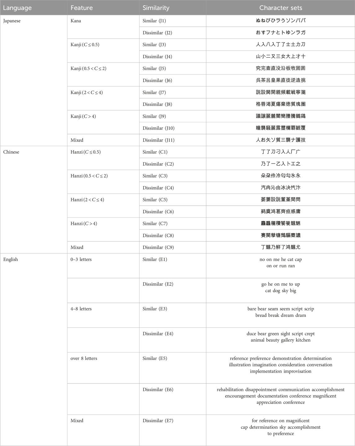
Table 1. Character Glyph classification by feature and similarity across Chinese, Japanese, and English.
3.3.2 Fonts
Regardless of the medium, fonts can have a significant impact on the legibility of characters or text within a passage. Mainstream typefaces are typically classified as serif or sans-serif categories and further differentiated by weight, such as light, medium, or heavy. Given the vast number of font variations and the significant stylistic differences between languages, we selected the universally adopted Google Noto fonts (Sans, SansJP, SansCN, Serif, SerifJP, SerifCN). This font was chosen for its consistent style across different languages and its broad adoption. The font classifications utilized in our study are presented in Table 2.
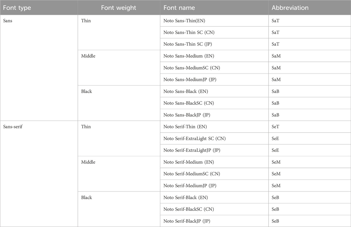
Table 2. Font classification by type, weight, and language-specific fonts.
3.3.3 Distance
Alger highlighted that in VR, information should not be placed at distances less than 0.5 m or more than 20 m. Therefore, we defined four distances within the virtual environment: 0.5 m (D1), 2.5 m (D2), 5 m (D3), and 10 m (D4). These distances correspond to: the minimum distance at which characters are still recognizable, a comfortable reading distance for nearsighted individuals, a suitable reading distance for farsighted individuals, and the maximum distance at which character outlines are barely distinguishable.
3.3.4 Native language
Participants were evaluated on three language categories: native (L1), second (L2), and unfamiliar (LN). Standard definitions apply to L1 and L2 (Jessner, 2008). For cases where Chinese was unfamiliar to some Japanese and native English speakers, we designate it as LN, following conventions in previous studies (Rahkonen and Juurakko, 1998; Gardner, 1983). Prior to the experiment, participants self-assessed their proficiency in L1, L2, and LN using a four-tier scale based on familiarity with Chinese characters (Hanzi), Japanese Kanji and Kana, and English words. A response of “none-do not recognize any characters” led to classification as LN.
Based on these classifications, participants were grouped as follows: Chinese (CL1 for Chinese native speakers, CL2 for Chinese second-language learners, and CLN for those unfamiliar with the Chinese), Japanese (JL1, JL2, JLN), and English (EL1, EL2, ELN). The final distribution of participants by language proficiency was: Chinese (CL1: 10, CL2: 13, CLN: 7), Japanese (JL1: 10, JL2: 19, JLN: 1), and English (EL1: 10, EL2: 20, ELN: 0).
3.4 Task
As shown in Figure 2, The task required participants to identify the character or word displayed in the prompt box and determine its position (left or right) within the text box on the glyph canvas. For example, in the Chinese experiment, the character “饕” appears in the prompt box and is positioned on the left side of the canvas displaying “饕餮”, prompting a left trigger press. Similarly, in the Japanese and the English experiments, “ラ” and “bare” are positioned on the left, necessitating the same selection. This setup enables the assessment of language-specific glyph recognition across diverse linguistic backgrounds.
3.5 Procedure
Participants were welcomed, briefed on the purpose and procedure, and gave informed consent in accordance with the Institutional Review Board of Hokkaido University. As compensation, each participant received a QUO card valued at JPY 1,000 upon completing the experiment. They then completed VR training and a pilot session until proficient with the HMD and Quest Touch Pro controllers.
The experiment was conducted in Japanese, Chinese, and English. Each participant performed one comprehension task in their L1 and one in a randomly assigned non-native language (L2 or LN). For each language, 10 native and 10 non-native participants (5 from each of the other two groups) were split into forward (D1→D4) or reverse (D4→D1) distance orders.
In the main task, participants completed one trial for each combination of 4 distances (0.5, 2.5, 5, 10 m)
Following HMD removal, participants provided subjective feedback. Figure 3 illustrates the overall flow and task steps. All behavioral measurements, participant demographics, and representative recordings of the experimental procedure are available in the supporting data repository on the OSF.
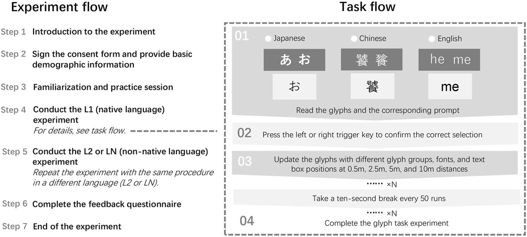
Figure 3. Experiment Flow and Task Flow Diagram This figure illustrates the overall flow of the experiment, starting with the introduction and consent signing, followed by practice sessions, the main tasks in L1 (native language) and L2/LN (non-native language), and concluding with participant feedback. The task flow section on the right details the specific steps participants followed during each trial, including reading the glyph prompt, selecting the matching glyph using the Quest Touch Pro controllers, and taking breaks between sets of trials.
3.6 Data collection and analysis
3.6.1 Data collection
We assessed accuracy by comparing each selection (left/right) with the glyph shown and the prompt. Incorrect choices defined the Error Rate, while grip-button presses on entirely illegible glyphs defined the Invisibility Rate. Selection latency was recorded as Task Completion Time.
Participants used the Quest Touch Pro triggers to select the matching glyph, guessing when it was unclear but still visible and pressing the grip button when it was unreadable. The system logged glyph distance, font, response type (left, right, invisible), and completion time for every trial.
In total, we gathered 12,960 valid trials: • Japanese: 11 glyph groups × 4 distances × 6 fonts × 20 participants = 5,280 • Chinese: 9 glyph groups × 4 distances × 6 fonts × 20 participants = 4,320 • English: 7 glyph groups × 4 distances × 6 fonts × 20 participants = 3,360.
This dataset provides a comprehensive view of participants’ performance and visual perceptual processes.
3.6.2 Data analysis
We collected error rates, invisibility rates, and task completion times. Because the task was simple and both error and invisibility events were rare, traditional regression models would yield unreliable estimates. We therefore used SPSS’s Generalized Linear Model (GLM) framework (an ANOVA within the generalized linear model class) to evaluate between-group differences and performed post-hoc pairwise comparisons using both Tukey’s HSD and estimated marginal means (EMM), excluding effects with negligible
Task completion times served as supplementary measures. We again applied the GLM to assess group effects and conducted Tukey’s HSD and Estimated Marginal Means (EMM) for post-hoc analysis, omitting effects with negligible
4 Result
To minimize individual-difference errors and keep the task straightforward, we simplified the design so that even LN participants (with no language background) could succeed through careful observation. We examined all incorrect and invisible responses and recorded task completion times to ensure data reliability and rule out accidental touches. Because correct responses predominated, error and invisibility rates were low-violating the homogeneity-of-variance assumption in our GLM ANOVA. These rare events, however, are critically informative. Therefore, we applied Estimated Marginal Means (e.g., pairwise comparisons) and Post Hoc Tests (e.g., Multiple Comparisons), complemented by visualizations and practical interpretation, to deliver a comprehensive and nuanced analysis.
However, since the study involves four distance levels, each representing distinct sensory experiences, treating distance as an independent parameter for analysis might lack interpretative value. To address this, and to focus more closely on glyph characteristics, we further conducted between-group effect tests across different languages and distance levels. The results are categorized and discussed based on language and distance.
4.1 Error rates
While the experiment included a large number of trials overall, the distribution of trials across multiple conditions (e.g., Glyph, Font, and Native) resulted in relatively few trials for each specific combination of variables. Combined with the low overall error rates, this can be considered a low-event-rate design rather than a traditional small-sample experiment. The total number of errors under different distances and conditions is summarized in Table 3. In Table 3, “Errors” represents the total number of errors for each distance, while the “Glyph” column lists values for each language in the order of C1–C9, J1–J11, and E1–E7. To enhance readability, similar glyphs are highlighted in bold (C1, C3, C5, and C7 for Chinese; J1, J3, J5, J7, and J9 for Japanese; and E1, E3, and E5 for English). The “Font” column lists values for fonts in the order of SaB, SaM, SaT, SeB, SeM, and SeE/SeT (SeE for Japanese and Chinese, and SeT for English). The “Native” column lists values for native speakers in the order of Chinese, Japanese, and English participants, while “Total” represents the total number of trials for each distance.
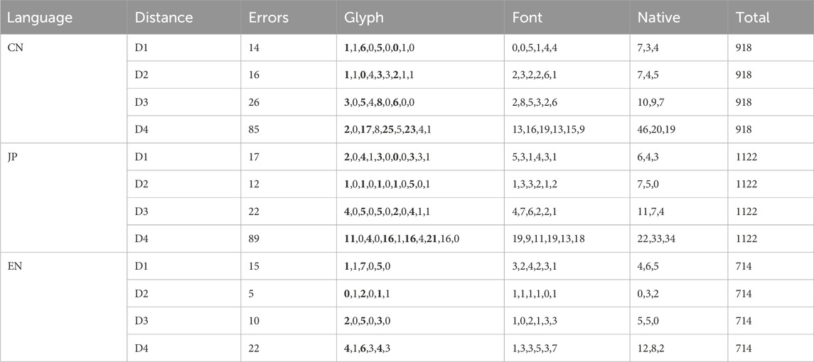
Table 3. Error distribution across different distances, glyphs, fonts, and native languages.
From Table 3, it can be observed that error rates for Chinese and Japanese primarily occur under the D4 distance condition. In contrast, English experiments exhibit lower overall error rates, with slightly higher rates under D1 and D4.
4.1.1 English experiment
At the farthest distance (D4), only a main effect of Native reached significance [
Under D3 and D4, both Post-hoc contrasts confirmed that native English speakers (EL1) made significantly fewer errors than both Chinese speakers (CL1) and Japanese speakers (JL1)
Interaction effects (Glyph × Native and Font × Glyph) produced more nuanced patterns under D3. Estimated marginal means showed elevated error rates for visually similar glyph sets (E1:
These patterns suggest that logographic-language natives are particularly prone to errors when encountering similar English glyphs. Moreover, at D3, Serif Medium (SeM) and Serif Thin (SeT) fonts further increased error rates for E3 glyphs relative to other glyphs (all
In summary, at close viewing distances (D1, D2), error rates remain uniformly low regardless of glyph or font. As viewing distance increases (D3, D4), however, a native-language effect becomes apparent, with English natives making fewer errors than Chinese and Japanese natives. This gap is especially pronounced at D3, where the combination of visually similar glyphs and Serifthin font details disproportionately disrupts participants from logographic backgrounds (CL1 and JL1). We can speculate that logographic-language natives may be processing English text in a manner more akin to symbolic scripts.
4.1.2 Japanese experiment
ANOVA results were examined separately by viewing distance. Under the farthest distance (D4), there were significant main and interaction effects for Glyph
Overall, glyph identity was the primary driver of error rates. Specifically, visually similar glyphs consistently produced higher error rates than non-similar ones, with this effect most pronounced at greater distances. For example, under D4 the non-similar glyphs J4 and J6 yielded lower error rates than the similar sets J5, J7, and J9
Glyph complexity played a secondary role. At D4, the simpler glyph J3 evoked fewer errors than the medium-complexity similar J5
Interactions with Native language and Font added further nuance under specific conditions. At far distances (D3/D4), native English speakers were particularly challenged by complex glyphs: for J9
4.1.3 Chinese experiment
ANOVA results were examined for each viewing distance. Under the farthest distance (D4), Glyph was the sole significant factor influencing error rates
Overall, glyph identity drove error susceptibility. At D4, among glyphs of equivalent stroke count, visually similar forms (e.g., C5, C7) elicited higher error rates than non-similar counterparts of the same complexity (C4, C6, C8;
At the comfortable viewing distance D3, similarity remained the dominant influence: the medium-complex similar glyph C5 showed elevated errors relative to non-similar glyphs C2, C6, C8
4.1.4 Interaction analysis
The main factors affecting error rates were Native and Glyph and their interaction. Trends across distances are shown in Figure 4, with parts (a–c) depicting Glyph × Native interactions for Chinese, Japanese, and English experiments.
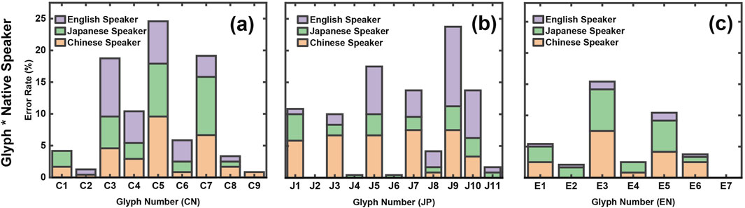
Figure 4. Error rates for Chinese, Japanese, and English Experiments.Parts (a), (b), and (c) depict the interaction between Glyphs and Native language groups. Glyphs C1–C9, J1–J11, and E1–E7 represent increasing complexity, with odd-numbered glyphs (e.g., C3, J5, E3) being similar and even-numbered glyphs (e.g., J2, J4) dissimilar. In the Chinese experiment (a), glyphs C3, C5, and C7 show the highest error rates, with English speakers performing worse on C3 but better on C5 and C7 compared to Chinese and Japanese speakers. In the Japanese experiment (b), J9 exhibits the highest error rates, with native Japanese speakers showing consistently lower errors than others. Chinese speakers show balanced errors, while English speakers’errors increase with complexity. In the English experiment (c), overall error rates are lower, but E1, E3, and E5 show peaks, especially for Chinese and Japanese speakers, with E3 being the most error-prone glyph.
From these plots:
Similar glyphs were consistently more error-prone, especially for Chinese and Japanese speakers, while complexity affected native English speakers most in the Japanese experiment. Lower errors for complex glyphs in the Chinese experiment may reflect marking them as “invisible” rather than guessing.
Significant Glyph-Font interactions

Figure 5. Error bar plots (95% confidence intervals) for Glyph-Font interactions in the English experiment (D3) and Japanese experiment (D4).
4.1.5 Summary
In summary, the error rates results based on our hypotheses are as follows:
Hypothesis 1. Native speakers exhibit lower error rates compared to non-native speakers. Supported in the English and Japanese experiments. In the Chinese experiment, native and non-native speakers showed comparable overall error rates and both groups exhibited stable errors on similar glyphs, indicating that glyph similarity affects Chinese participants regardless of native status.
Hypothesis 2. Similar glyphs increase error rates. Confirmed across all languages, with peaks at C5 (Chinese), J9 (Japanese), and E3 (English). Non-native English speakers (CL1 and JL1) had higher error rates on similar English glyphs than native speakers, suggesting that logographic-script users rely on visual similarity in alphabetic scripts in a comparable manner.
Hypothesis 3. Glyph complexity affects error rates. Partially supported and less influential than similarity. Elevated errors occurred at C4 (Chinese) and J10 (Japanese). Native English speakers’errors rose with complexity in the Japanese experiment but fell in the Chinese experiment, possibly because highly complex Chinese glyphs
Hypothesis 4. Font styles affects error rates. Partially supported. Significant Glyph × Font interactions appeared in English (D3) and Japanese (D4), yet glyph similarity remained the dominant factor.
4.2 Invisibility rates
The overall invisibility rates across the Chinese, Japanese, and English experiments is summarized in Figure 6. A one-way ANOVA revealed a significant main effect of language
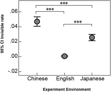
Figure 6. Overall invisibility rates Across Different Language Experiment Environments. The x-axis represents different language experiment environments, while the y-axis indicates the 95% confidence interval of the mean invisibility rates. Overall, the Chinese group had the highest invisibility rates, followed by the Japanese group, while the English group’s invisibility rates were nearly zero.
Post-hoc comparisons showed that the Chinese group exhibited a significantly higher invisibility rates than both the Japanese group
In addition, we compiled the total number of invisible instances across different distances for each language, along with counts under various conditions (e.g., glyphs, fonts, and native languages), as shown in Table 4. Similarly, and consistent with the structure of Table 3, similar glyphs (e.g., C1, C3, C5 for Chinese; J1, J3, J5 for Japanese; E1, E3, E5 for English) are highlighted in bold for easier readability.
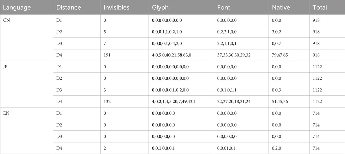
Table 4. Invisible times distribution across different distances, glyphs, fonts, and native languages.
The invisibility rates in the Chinese and Japanese experiments were primarily concentrated under the D4 condition, where the number of invisible instances increased dramatically. In contrast, English experiments showed an invisibility rates of less than 0.001, likely due to accidental inputs, meaning that invisibility was virtually non-existent. Therefore, English data was excluded from further discussion of invisibility rates. From a practical perspective, invisibility under D1 and D2 conditions in the Chinese experiment is not expected to occur, rendering these data unreliable and excluded. Under the D3 condition, the data show 7 invisible instances in Chinese and 3 in Japanese. In the Japanese experiment, invisible instances occurred for Japanese native speakers under glyph J7 with the SaT font, and for two English native speakers under glyph J9 with the SeE and SaM fonts. In the Chinese experiment, invisible instances were associated with glyphs C5, C7, and C8, predominantly for English native speakers, and mainly with Sans fonts. Among these glyphs, J7, J9, C5, and C7 are categorized as similar glyphs, while C8 is considered a complex glyph. This indicates that even under the D3 (comfortable distance) condition, similar glyphs, particularly those with higher complexity, may affect visibility.
4.2.1 Chinese experiment
Since the invisibility rates was primarily concentrated under the D4 condition, we conducted between-group effect analysis and revealed large effects of Glyph
Post-hoc comparisons indicated that Glyph complexity determined invisibility: more complex glyph were less clearly visible. Specifically, simple similar glyphs (C1, C3) had lower invisibility rates than complex similar glyphs (C5, C7;
Moreover, the Glyph
Despite some variability, native speakers consistently showed lower invisibility rates, suggesting that they either rely more on educated guesses when uncertain or genuinely perceive glyph forms more sharply than non-native speakers.
4.2.2 Japanese experiment
A between-group ANOVA showed that Glyph
Glyph complexity was the dominant driver of invisibility rates: the simpler glyphs J1–J6 were far more visible than the highly complex J7, J9, and J10
The Glyph × Native interaction emerged for the most challenging forms. At J7
4.2.3 Interaction effects
Overall, Glyph and its interaction with native language were the main factors influencing invisibility rates. To further analyze these relationships, we created stacked area graphs, as shown in Figure 7, to compare the effects of Glyph and native language.
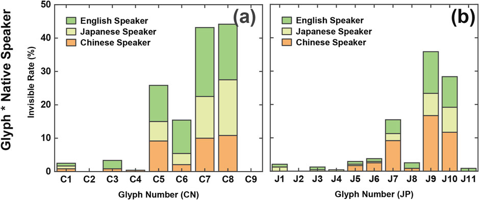
Figure 7. Invisibility Rates in Chinese and Japanese Experiments. Part (a) illustrates the invisibility rates for glyphs C1 to C9 in the Chinese experiment, grouped by native language (Chinese, Japanese, and English speakers).Part (b) depicts the invisibility rates for glyphs J1 to J11 in the Japanese experiment, similarly grouped by native language. Glyphs C5, C6, C7, and C9 showed higher invisibility rates in the Chinese experiment, while glyphs J7, J9, and J10 exhibited higher invisibility rates in the Japanese experiment.
The visualization results revealed comparable patterns between the Chinese and Japanese experiments regarding glyphs and native languages. In the Chinese experiment, glyphs C5, C6, C7, and C9 exhibited higher invisibility rates, while in the Japanese experiment, glyphs J7, J9, and J10 showed higher invisibility rates.
Further analysis indicated differences across native language groups. In the Chinese experiment, Japanese native speakers had lower invisibility rates for glyph C5 compared to Chinese and English native speakers, while English native speakers had higher invisibility rates for glyph C6. Glyphs C7 and C8 displayed relatively consistent invisibility rates across all native groups. In the Japanese experiment, Japanese native speakers consistently exhibited the lowest invisibility rates. However, for glyphs J7, J9, and J10, Chinese native speakers demonstrated higher invisibility rates compared to Japanese native speakers, slightly exceeding those of English native speakers.
In summary, glyph complexity is the primary factor influencing invisibility rates, although glyph similarity also plays a role. In the Chinese experiment, English native speakers had slightly higher invisibility rates compared to Chinese and Japanese native speakers. Conversely, in the Japanese experiment, Japanese native speakers had lower invisibility rates than both Chinese and English native speakers.
4.2.4 Summary
Based on the hypotheses, the following conclusions are drawn for invisibility rates:
Hypothesis 1. Native speakers exhibit lower invisibility rates compared to non-native speakers.This hypothesis was supported. In the Chinese experiment, English native speakers exhibited higher invisibility rates compared to Chinese and Japanese native speakers. Similarly, in the Japanese experiment, despite the use of numerous Chinese glyphs, Chinese native speakers had higher invisibility rates compared to Japanese native speakers. These findings confirm that native speakers generally exhibit lower invisibility rates than non-native speakers.
Hypothesis 2. Glyph similarity is a major factor influencing invisibility rates.This hypothesis was partially supported. While similar and complex glyphs, such as J7 and J9, showed some influence on invisibility rates in the Japanese experiment, glyph similarity was not the dominant factor. For instance, J8, which shares the same complexity level as J7, exhibited a lower invisibility rates, suggesting that glyph similarity has a minor but not predominant effect.
Hypothesis 3. Glyph complexity is a major factor influencing invisibility rates.This hypothesis was confirmed. Glyph complexity was found to be the primary factor affecting invisibility rates in both Chinese and Japanese experiments. Complex glyphs such as C3, C4, C7, and C8 in the Chinese experiment, and J7, J9, and J10 in the Japanese experiment, consistently exhibited higher invisibility rates compared to simpler glyphs like C1, C2, J1, and J2.
Hypothesis 4. Fonts influence invisibility rates.This hypothesis was not supported. Results showed no significant impact of fonts or their interactions on invisibility rates in either the Chinese or Japanese experiments.
In conclusion, glyph complexity is the primary factor influencing invisibility rates for both Chinese and Japanese speakers, whereas native speakers exhibited lower invisibility rates than non-native speakers, particularly for complex glyphs (e.g., C7 and C8, J9 and J10).
4.3 Task completion time
Prior to the experiment, participants were instructed to ‘select as quickly as possible.’ During each trial, we recorded the Mean Task Completion Time. Table 5 summarizes the mean task completion time across viewing distances, glyphs, fonts, and native-language groups. MT denotes the mean completion time at each viewing distance, and Total denotes the grand mean across D1–D4; all values are reported in deciseconds (1 ds = 0.1 s) for ease of comparison. The ordering and structure of the conditions follow those in Tables 3, 4. As in Table 3, similar-looking glyphs are shown in bold to facilitate readability. In this section, we first applied a full-factorial GLM ANOVA to assess main and interaction effects at each viewing distance, followed by post-hoc comparisons on significant main effects to establish initial trends. Next, we visualized those two-way interactions that reached significance. Finally, guided by the GLM main and two-way interaction results, we employed linear mixed-effects (LME) regression to explore why certain language groups performed differently under specific three-way interaction conditions. As with the GLM, separate LME models were run for each experiment (Chinese, Japanese, English) and for each distance (D1–D4). All data, analyses, and code are available on Open Science Framework (OSF) for full transparency.
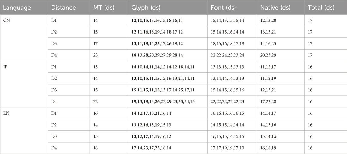
Table 5. Mean task completion time across different distances, glyphs, fonts, and native languages.
Although reaction time is not treated as direct evidence for our primary conclusions-since participant fatigue from repeated trials may have influenced times-it offers valuable supplementary insight. In particular, reaction time helps interpret the trends observed in error and invisibility rates, providing additional support for our main findings.
4.3.1 GLM model analysis
4.3.1.1 English experiment
ANOVA results by viewing distance showed that at the farthest distance (D4), Glyph
Across D4, D3, and D2, visually similar glyphs consistently required more processing time than dissimilar ones, particularly the longest glyph E5. Under D4, E3 and E5 were slower than E1, E2, E4, E6, and E7
The font effect at D4 was small but detectable: SeT required more time than SaB, SaM, and SeM
4.3.1.2 Japanese experiment
Separate ANOVAs by viewing distance showed that at D4, Glyph
Across all distances, native Japanese and Chinese speakers outperformed English speakers: at D4, CL1 was faster than JL1 and EL1
The Glyph × Native interaction further highlighted that, as glyphs grew more complex (J6–J10), English speakers took longer than both Japanese and Chinese speakers (EL1 vs. CL1/JL1:
4.3.1.3 Chinese experiment
Separate ANOVAs by viewing distance revealed that at D4, Glyph
Overall, Glyph, Native, and their interaction remained significant with moderate–large effect sizes. At the farthest distance (D4), response time scaled with complexity-more intricate glyphs took longer-while similarity made no additional difference within the same complexity tier. At the intermediate distance (D3), complexity still dominated, but visually similar pairs (C3 vs. C4, C5 vs. C6, C7 vs. C8) introduced extra delay. Under nearer distances (D2, D1), only complexity slowed recognition; similarity no longer added time. also, we observed a consistent native-language advantage: participants whose native script matched the stimuli (Chinese and Japanese speakers) recognized glyphs more rapidly than those without such familiarity. The Glyph × Native interaction mirrored this ordering for nearly every glyph (except the simplest C1 and C2), confirming that logographic familiarity conferred a speed advantage across character types and viewing conditions.
4.3.2 Interaction analysis
Based on the ANOVA results, we calculated the average task completion time for each group of categorical variables. To illustrate the interaction effects, we visualized Glyph with Native language in Figure 8 parts (a–c) present the interaction between Glyph and Native language.
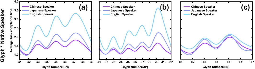
Figure 8. Average Task Completion Time by Glyph and Native Language for Chinese, Japanese, and English Experiments. Parts (a–c) illustrate the interaction between Glyph and Native language groups in the Chinese, Japanese, and English experiments, respectively. In the Chinese and Japanese experiments, English native speakers generally require more time to complete tasks (parts (a) and (b)), especially for complex glyphs such as C3, C5, C7 in Chinese and J7, J9, J10 in Japanese. Under the D4 condition, compared to D3, there is a notable increase in average task completion times. In the English experiment (part (c)), task completion times are similar across all native language groups, with visually similar glyphs (such as E3 and E6) requiring slightly more time than dissimilar glyphs.
The figures reveal that, across all languages, similar glyphs generally require more time for recognition. In the Japanese experiment, complex glyphs, particularly intricate Kanji characters, demand significantly longer recognition times. This effect is moderately noticeable in Chinese and Japanese, while in English, the impact is minimal.
Figures 8a–c shows that native English speakers (EL1) require more time to complete tasks in the Chinese and Japanese experiments than native Japanese (JL1) and Chinese (CL1) speakers. In the Japanese experiment, EL1’s completion time increases as Kanji complexity rises. In the English experiment, all three native groups (Chinese, Japanese, and English) take slightly longer to recognize similar glyphs, though the overall differences remain small.
4.3.3 LME model analysis
To elucidate how complex three-way interactions influence reading performance, we report the most robust effects from our linear mixed-effects (LME) models:
4.3.3.1 Chinese experiment (D3–D4)
English-native speakers (EL1) experienced pronounced delays when moderate-complexity characters were rendered in extreme stroke-weight fonts at far distances. At D3, the EL1 ×SeB ×
4.3.3.2 Japanese experiment (D1)
At D1, EL1 are 0.86 s slower when Glyph looks similar (J1,J3,J5,J7,J9) in the SeB font
4.3.3.3 English experiment (D1)
LME analysis revealed a strong effect of word length: short versus long words led to a 0.57 s faster response
By integrating these LME-derived effects with our GLM results and interaction plots, we propose that optimal VR text design must carefully balance stroke weight and glyph distinctiveness to accommodate cross-lingual differences across viewing distances.
4.3.4 Summary
In summary, the results for task completion time based on the hypotheses are as follows:
Hypothesis 1. Native speakers complete tasks faster than non-native speakers. This hypothesis is partially supported. In the Chinese experiment, the hypothesis was confirmed, as Chinese native speakers completed tasks significantly faster than non-native speakers across all distance conditions. However, in the Japanese experiment, the performance of Chinese and Japanese native speakers was comparable, with Chinese native speakers even outperforming Japanese native speakers under certain conditions (e.g., D4). In the English experiment, Chinese and Japanese native speakers consistently completed tasks faster than English native speakers.
Hypothesis 2. Similar glyphs increase task completion time. This hypothesis is fully supported. Across all language experiments and all distance conditions, both native and non-native speakers required more time to process similar glyphs, confirming the significant impact of glyph similarity.
Hypothesis 3. Complex glyphs increase task completion time. This hypothesis is also fully supported. In all language experiments and across all distance conditions, complex glyphs consistently required longer task completion times. Notably, in the Japanese experiment, glyph similarity had a greater impact on task completion time than glyph complexity.
Hypothesis 4. Fonts influence task completion time. This hypothesis is partially supported. Overall, font type had minimal influence on task completion time. However, our LME analysis shows that under specific conditions-such as the D1 distance in the Japanese experiment and the D2 distance in the Chinese experiment,the SeB font (serif bold) required significantly longer recognition times compared to other fonts, particularly for English-native participants.
5 Discussion
Our results demonstrate that glyph complexity and similarity significantly affect legibility across Chinese, Japanese, and English. We first summarize the experimental findings, then discuss design implications and study limitations.
5.1 Differences in visual recognition between L1 and L2 participants
5.1.1 Logographic L1 participants: faster processing with elevated similarity sensitivity
As shown in Figures 8a–c Native Chinese (CL1) and Japanese (JL1) participants-familiar with logographic scripts-exhibited faster task completion times in the Chinese and Japanese experiments and matched or slightly outperformed English native participants (EL1) in the English experiment. This aligns with Tan et al. (Tan et al., 2005), who attribute accelerated logographic processing to holistic visual strategies.
However, Figure 4 show that CL1 and JL1 groups incurred higher error rates for visually similar glyphs across languages. In the Chinese experiment, no significant native-language effect on error rates was found
A likely explanation is that logographic readers rely on holistic, configural processing-treating each character as a unified shape-which allows rapid outline-based localization of strokes and radicals but neglects internal detail. As a result, recognition of simple and complex forms follows the same contour-driven mechanism. This strategy may underlie certain social behaviors: for example, logographic users often prefer subtitles and on-screen comments (danmaku) over dubbing, since text can be processed simultaneously with video content (Li, 2024). However, this contour-focused approach also incurs costs in the digital age: increased typographical errors and “digital dysgraphia,” where users recall only rough outlines and struggle with precise stroke recall (Huang et al., 2021). Furthermore, this bias can hinder alphabetic L2 acquisition: many Asian learners depend heavily on visuospatial-orthographic resources in short-term memory and typing tasks (Liu et al., 2025), while phonological training is often insufficient in some curricula, exacerbating difficulties with linear decoding rules (Zhong and Kang, 2021).
5.1.2 Alphabetic L1 participants: complexity-driven slower processing and sensitivity
Native English (EL1) participants exhibited low error and invisibility rates for simple glyphs (Chinese C1-C2; Japanese J1-J4), but both error/invisibility rates and task completion times rose sharply once complexity exceeded
A likely explanation is that alphabetic-script speakers leverage automatic morphological decomposition-using syllable-morpheme mappings to visually parse word forms-whereas logographic-script speakers depend on holistic contour and radical matching. In tasks featuring visually similar but semantically distinct Glyphs (e.g., “consideration” vs. “conversation”), this reliance on whole-shape matching elevates error rates for logographic L1 participants. By contrast, English native speakers perform unconscious, automated decomposition without extra semantic processing cost (Kraut, 2015). Even experienced L2 English learners (EL2), despite years of study, tend to default to contour-matching strategies in purely shape-based tasks: they may match EL1 speeds but still incur higher error rates when glyphs share similar outlines yet differ in meaning.
On the other hand In natural reading, English speakers decompose words into letters and letter groups, a strategy that does not generalize to multi-stroke logographs. When presented with high-complexity characters (e.g., C3, C5, C7 or J7, J9, J10) at far distances (D4), EL1 participants could not leverage any automatic radical- or contour-based processing and thus required extra time to visually parse and compare shapes. By contrast, CL1 and JL1 have internalized radical structures and stroke patterns through years of literacy training, allowing them to chunk complex forms even in low-resolution VR conditions.
In summary, The interaction effects between glyph complexity and native language likely arise from fundamental differences in how logographic and alphabetic readers process visual forms, and combined with script-specific familiarity.Therefore EL1 participants resist word-length complexity in their native script but incur higher error rates and longer task completion times for complex logographic glyphs.
5.1.3 Minimal impact of font on error and invisibility rates
Across three language experiments, while typographic variations showed no systematic effects on error or invisibility rates in most intergroup comparisons, our linear mixed-effects (LME) model analysis revealed font characteristics systematically modulated task completion speed under specific stimulus combinations meeting statistical significance criteria. For instance, in the Japanese experiment, non-native speakers (EL1) exhibited marked processing delays when encountering heavy serif fonts (e.g., +0.86–1.01 s at D1 viewing distance,
5.1.4 Summary
In conclusion, glyph similarity and complexity affect reading performance differently depending on language backgrounds. Native speakers from the Chinese character culture (CL1 and JL1) are more influenced by visual similarity, while English native speakers (EL1) are more affected by glyph complexity in non-native scripts. Familiarity with glyph structure aids native speakers from the Chinese character culture in efficient information processing but also increases their sensitivity to similar glyphs, resulting in higher error rates. English speakers, owing to lower familiarity with non-native glyph structures, maybe require greater cognitive load to interpret complex characters. Font had a minimal effect on error and invisibility rates, influencing task outcomes only under specific experimental conditions. These findings underscore that familiarity with glyph structure enhances visual processing efficiency but also heightens sensitivity to similarity, whereas complexity emerges as a primary challenge in non-native reading.
5.2 Educational and design implications
This study explores the impact of Chinese character complexity and similarity on the legibility of Chinese, Japanese, and English texts for native (L1) speakers, second language (L2) learners, and individuals with no prior exposure to the language (LN). Our findings offer valuable insights into how these factors affect legibility across languages and suggest potential improvements for educational strategies and design considerations.
5.2.1 Learning Chinese and Japanese characters for English native speakers
Our findings reveal intrinsic differences in glyph perception among native speakers of Chinese (CL1), Japanese (JL1), and English (EL1), shaped by cultural and linguistic backgrounds. For Chinese and Japanese speakers, long-term exposure to the Chinese character system fosters high familiarity with complex and visually similar glyphs, resulting in faster task completion times. However, this familiarity also increases sensitivity to glyph similarity, leading to higher error rates when encountering visually similar characters.
This heightened tolerance for similarity within the structure of Chinese characters (Kanji and Hanzi) allows Chinese and Japanese speakers to overlook minor errors in visually similar characters without significantly impacting comprehension. Additionally, the inherent ambiguity in the visual features of Chinese characters has facilitated the development of fields such as handwritten character recognition (Li et al., 2016). Compared to English words, Chinese characters (Kanji and Hanzi) have a higher threshold for similarity, suggesting that as long as the overall structure of the character remains intact, substituting certain parts with visually similar elements, such as simplified graphical symbols or even English letters, may not interfere with recognition for native speakers. Additionally, studies have shown that non-native beginners often rely on visual aids as a strategy for memorizing Chinese characters (Leminen and Bai, 2023).
This tolerance for structural similarity can be leveraged to assist second language (L2) or no prior exposure to the language (LN) learners in recognizing Chinese characters (Kanji and Hanzi). For example, educational tools could incorporate structured, hybrid glyphs that integrate familiar visual cues or supplementary English letters to help learners identify key components of complex characters. Moreover, the rich information embedded in complex characters could be utilized to create mnemonic devices or visual aids that reinforce specific character components, easing the visual perceptual load for L2 and LN learners and supporting more efficient character recognition and learning.
5.2.2 Learning English for Chinese and Japanese native speakers
For native speakers of Chinese and Japanese, English is typically learned as a second language (L2). Our findings suggest that these learners are particularly sensitive to visual similarity in English glyphs, rather than word length or complexity. Unlike the logographic Chinese system, which allows for semantic encoding–even with unfamiliar characters (Cheng, 1981)–the English phonetic system relies heavily on phonological encoding and structural analysis. English word recognition depends on phonological pathways, frequency effects, morphological structure, and sequential redundancy, which help the brain convert visual input into phonological and semantic information. Without familiarity with English phonetic structures, Chinese and Japanese learners maybe experience additional cognitive load when processing visually similar English words or letters.
One potential strategy is to present English vocabulary in a structured, pattern-based format that leverages learners’existing familiarity with complex characters. Although some studies, such as those by Jankowski et al. (Jankowski et al., 2010), have explored innovative approaches like arranging English words in square formats resembling Chinese characters, this approach may come with a higher learning cost. Instead, grouping words by common prefixes, suffixes, or roots could help Chinese and Japanese learners process English words as unified, meaningful units, similar to how they interpret characters in their native languages. This method could reduce the visual perceptual load of learning English vocabulary by drawing analogies to familiar morphological structures.
Additionally, educational programs should place a greater emphasis on phonological training. Currently, much language instruction focuses on written skills, with limited exposure to spoken English outside of standardized listening assessments or media consumption. Unlike Japanese, which has a more straightforward syllabic structure, English phonemes are not always clearly linked to specific written forms.
A study focusing on enhancing Chinese character input efficiency through a multi-channel approach that integrates phonetic and handwriting modalities (Chen et al., 2020) suggests that a similar multi-sensory method could also be highly beneficial in English education. Although the study specifically addresses Chinese character input, the combination of auditory, visual, and tactile channels used in this approach may prove effective in reinforcing English learning, particularly for Asian students. Therefore, future educational tools should aim to strengthen the connections between English pronunciation, spelling, meaning, and practical usage through multi-sensory learning experiences.
5.2.3 Accessible interface layouts
Script-specific perceptual habits demand adaptive interface designs. Logographic users (Chinese/Japanese speakers) exhibit stronger preference for dense, grid-like layouts (e.g., multi-element panels, nested icon clusters) that mirror the spatial compression of characters, while alphabetic-language users usually perform better with linear, minimalist layouts aligned with sequential parsing. We propose language-responsive layout systems that dynamically adjust interface density. For example, Interfaces could switch between grid-based displays (optimized for logographic users) and linear flows (for alphabetic users), enhancing information findability through spatial reorganization and typographic adaptation. Future work should establish cross-cultural design standards to address the growing linguistic diversity of digital platforms.
5.2.4 Enhancing language learning and legibility in VR environments
VR’s immersive nature reduces external distractions and fosters sustained attention, making it an ideal platform for language study. Its multimodal interactions-combining visual, auditory, and spatial cues-can lower visual perceptual load, especially for phonology-driven languages like English, by reinforcing sound-symbol and meaning associations.
By integrating AI, a VR system can adapt in real time to each learner’s level: for L2 users, simplifying text or adding phonetic/semantic hints; for L1 users, increasing text density or complexity. VR can also recreate cultural contexts, offering contextualized practice that deepens both linguistic and pragmatic competence.
Together, immersion, multimodal support, and adaptive presentation in VR can improve text legibility and accelerate language acquisition across writing systems.
5.3 Limitations and future work
Sample Diversity and Size: This study primarily recruited participants in Japan, resulting in skewed L2/LN distributions. While we ensured balanced L1 groups (native Chinese, Japanese, and English speakers), the L2 and LN groups remained uneven due to geographic constraints. Moreover, although we collected many trials, the absolute counts of errors and invisible responses were insufficient, leading to sparse data. Future work should recruit larger, more geographically and linguistically balanced cohorts and adjust task difficulty or glyph complexity to elicit an appropriately robust, high-quality dataset.
Complexity Measures for English: In this study, we used word length as the primary index of complexity for English text. However, previous research (Cai and Li, 2014) have demonstrated the importance of considering case variations when assessing English readability. Uppercase letters, for instance, often differ significantly in visual structure from their lowercase counterparts. This is especially apparent in three distinct case scenarios: all lowercase, all uppercase, and title case (capitalizing only the first letter of each word). These variations can influence recognition speed and accuracy owing to differences in visual cues such as ascenders, descenders, and uniformity of character height. Future research should incorporate a wider range of complexity measures, including case variations, to obtain more comprehensive insights.
Font Styles: Although font style had minimal impact in this experiment, this may be attributed to the use of the widely legible Google Noto font family. While we included both serif and sans-serif typefaces, as along with three different font weights, the selected fonts were all common and highly readable styles typically used in written materials. As a result, the variation between fonts may have been too subtle to produce significant differences in legibility. Prior studies (Wallace et al., 2022) have demonstrated that a broader range of font styles can produce more pronounced effects on readability. Future research should explore a wider variety of font styles, particularly those with greater stylistic variation, to better assess the differential impact of typography on legibility across languages.
Potential Bias Toward Logographic Systems: The experiment’s visual-centric design, which excluded auditory or semantic cues (e.g., using pseudo-glyph tasks to minimize linguistic familiarity effects), may inadvertently favor logographic learners accustomed to holistic visual processing. This bias could explain English natives’ (EL1) longer task times and higher error/invisibility rates in non-native scripts. To address this, future designs should integrate multi-modal stimuli (e.g., auditory prompts for alphabetic systems) to balance perceptual strategies across writing systems.
Vision Correction and Visual Acuity: Although all participants self-reported normal or corrected-to-normal vision (using glasses or contact lenses) and this was logged in the Participant Information file, we did not administer a formal vision test before the experiment. As a result, residual differences in visual acuity may have influenced legibility measures. Future studies should include standardized vision screenings to control for these individual differences.
Despite these limitations, the present findings lay a solid groundwork for a number of promising avenues:
Together, these efforts will yield both richer theoretical models of cross-linguistic reading in VR and concrete, evidence-based guidelines for multilingual text design.
6 Conclusion
This study systematically investigated how the complexity and similarity of glyphs in different languages (Chinese, Japanese, and English) influence legibility in native (L1) and non-native (L2, LN) reading environments, aiming to uncover visual perceptual differences across diverse linguistic backgrounds. Conducted in a VR environment using the Oculus Quest 3 device, the experiment involved participants from Chinese, Japanese, and English linguistic backgrounds who performed tasks under varying conditions of distance, font, and language. Participants were asked to identify a glyph displayed in a prompt box and select its matching counterpart from two options. The experiment measured key outcomes such as error rates, invisibility rates, and task completion times, while exploring how factors such as glyph complexity, similarity, font styles, viewing distances, and participants’ native language backgrounds interacted to affect legibility. These findings provide a basis for understanding how glyph characteristics shape the reading experiences of native and non-native speakers across different linguistic and cultural contexts.
The results show that for native Chinese and Japanese speakers (CL1 and JL1), familiarity with glyph structures significantly improves visual perceptual efficiency, enabling them to complete tasks in less time. However, this familiarity also heightens their sensitivity to glyph similarity, leading to a higher error rates. This phenomenon is observed not only in Chinese and Japanese but also in English, likely because of the influence of their native language background. In contrast, native English speakers (EL1) were primarily affected by glyph complexity when reading non-native scripts (Chinese and Japanese), resulting in longer task completion times. This reflects the additional visual load required to decode unfamiliar visual patterns. However, compared to native Chinese and Japanese speakers, native English speakers were less influenced by glyph similarity.
This difference further confirms the significant impact of linguistic and cultural backgrounds on visual perceptual. The characteristics of one’s native language directly affect the difficulty of processing second or unfamiliar languages, either increasing or decreasing the perceptual challenge. These findings underscore the importance of continued research into the visual perceptual challenges associated with multilingual text legibility.
While this study establishes a foundational understanding of cross-linguistic text legibility, future research should aim to expand sample diversity and include more comprehensive complexity metrics. Although the results of this experiment indicate that font styles did not significantly affect legibility, future studies should test a broader range of font types, particularly those with greater stylistic variation. Such efforts could lead to the development of more inclusive and effective multilingual text design solutions. Ultimately, this study not only provides new perspectives for theoretical research but also lays a solid foundation for practical applications in human-computer interaction, language learning, and cross-cultural communication. Approached from a rendering strategy standpoint, the persistent perceptual divergences observed across language groups imply the necessity of adaptive solutions tailored to native-script experience.
Data availability statement
The datasets presented in this study can be found in online repositories. The names of the repository/repositories and accession number(s) can be found in the article/Supplementary Material.
Ethics statement
The studies involving humans were approved by Institutional Review Board of Hokkaido University. The studies were conducted in accordance with the local legislation and institutional requirements. The participants provided their written informed consent to participate in this study.
Author contributions
HZ: Writing – original draft, Writing – review and editing. DS: Writing – review and editing, Supervision. TO: Writing – review and editing.
Funding
The author(s) declare that financial support was received for the research and/or publication of this article. This work was supported by the JST SPRING (Grant Number JPMJSP2119), JST FOREST Program (Grant Number JPMJFR226S), and JST CREST (Grant Number JPMJCR21D4) Japan.
Conflict of interest
The authors declare that the research was conducted in the absence of any commercial or financial relationships that could be construed as a potential conflict of interest.
Generative AI statement
The author(s) declare that Generative AI was used in the creation of this manuscript. The authors used [OpenAI/ChatGPT-4o] solely for language editing (grammar and style) to improve the readability of this manuscript. The authors confirm that the logic, structure, data analysis, and conclusions presented remain entirely the work of the authors. The final version has been thoroughly reviewed and approved by all authors to ensure accuracy and integrity.
Publisher’s note
All claims expressed in this article are solely those of the authors and do not necessarily represent those of their affiliated organizations, or those of the publisher, the editors and the reviewers. Any product that may be evaluated in this article, or claim that may be made by its manufacturer, is not guaranteed or endorsed by the publisher.
Supplementary material
The Supplementary Material for this article can be found online at: https://www.frontiersin.org/articles/10.3389/frvir.2025.1579525/full#supplementary-material
References
Akker, E., and Cutler, A. (2003). Prosodic cues to semantic structure in native and nonnative listening. Biling. Lang. Cognition 6, 81–96. doi:10.1017/S1366728903001056
Baker, E. R. (2010). “Non-native perception of native English prominence,”. Cambridge University Press, 1–4. doi:10.4312/elope.21.1.63-88
Bassetti, B. (2009). Effects of adding interword spacing on Chinese reading: a comparison of Chinese native readers and English readers of Chinese as a second language. Appl. Psycholinguist. 30, 757–775. doi:10.1017/S0142716409990105
Bernard, J.-B., and Chung, S. T. L. (2011). The dependence of crowding on flanker complexity and target–flanker similarity. J. Vis. 11, 1–16. doi:10.1167/11.8.1
Billinghurst, M., Bowskill, J., Dyer, N., and Morphett, J. (1998). “An evaluation of wearable information spaces,” in Proceedings. IEEE symposium on virtual reality (IEEE), 20–27. doi:10.1109/VRAIS.1998.658419
Cai, H., and Li, L. (2014). The impact of display angles on the legibility of sans-serif 5×5 capitalized letters. Appl. Ergon. 45, 865–877. doi:10.1016/j.apergo.2013.11.004
Calabrèse, A., Cheong, A. M. Y., Cheung, S.-H., He, Y., Kwon, M., Mansfield, J. S., et al. (2016). Baseline mnread measures for normally sighted subjects from childhood to old age. Investigative Ophthalmol. and Vis. Sci. 57, 3836–3843. doi:10.1167/iovs.16-19580
Chen, X., Lu, Y., and Liu, J. (2020). Stroke-speech: a multi-channel input method for Chinese characters. Proc. Eighth Int. Workshop Chin. CHI 20, 69–72. doi:10.1145/3403676.3403687
Cui, Y. (2023). Eye movements of second language learners when reading spaced and unspaced Chinese texts. Front. Psychol. 14, 783960–2023. doi:10.3389/fpsyg.2023.783960
Da Rosa, D. M., Souto, M. L. L., and Silveira, M. S. (2023). “Designing interfaces for multilingual users: a pattern language,” in Proceedings of the 27th European conference on pattern languages of programs (New York, NY, USA: Association for Computing Machinery). doi:10.1145/3551902.3551964
Dehaene, S., Pegado, F., Braga, L. W., Ventura, P., Filho, G. N., Jobert, A., et al. (2010). How learning to read changes the cortical networks for vision and language. Science 330, 1359–1364. doi:10.1126/science.1194140
Fernandez, L. B., Bothe, R., and Allen, S. E. M. (2023). The role of l1 reading direction on l2 perceptual span: an eye-tracking study investigating Hindi and Urdu speakers. Second Lang. Res. 39, 447–469. doi:10.1177/02676583211049742
Fu, Y., Liversedge, S. P., Bai, X., Moosa, M., and Zang, C. (2025). Word length and frequency effects in natural Chinese reading: evidence for character representations in lexical identification. Q. J. Exp. Psychol. (Hove). 78 (7), 1438–1449. doi:10.1177/17470218241281798
Gardner, R. C. (1983). Learning another language: a true social psychological experiment. J. Lang. Soc. Psychol. 2, 219–239. doi:10.1177/0261927X8300200209
Gauvin, H. S., and Hulstijn, J. H. (2010). Exploring a new technique for comparing bilinguals’ l1 and l2 reading speed. Read. a Foreign Lang. 22, 84–103.
Huang, S., Zhou, Y., Du, M., Wang, R., and Cai, Z. G. (2021). Character amnesia in Chinese handwriting: a mega-study analysis. Lang. Sci. 85, 101383. doi:10.1016/j.langsci.2021.101383
Hyönä, J., Cui, L., Heikkilä, T. T., Paranko, B., Gao, Y., and Su, X. (2024). Reading compound words in Finnish and Chinese: an eye-tracking study. J. Mem. Lang. 134, 104474. doi:10.1016/j.jml.2023.104474
Jankowski, J., Samp, K., Irzynska, I., Jozwowicz, M., and Decker, S. (2010). Integrating text with video and 3d graphics: the effects of text drawing styles on text readability. Proc. SIGCHI Conf. Hum. Factors Comput. Syst. (CHI ’10) (ACM), 1321–1330. doi:10.1145/1753326.1753524
Jessner, U. (2008). A dst model of multilingualism and the role of metalinguistic awareness. Mod. Lang. J. 92, 270–283. doi:10.1111/j.1540-4781.2008.00718.x
Kawase, S., Davis, C., and Kim, J. (2025). Impact of Japanese l1 rhythm on English l2 speech. Lang. Speech 68, 118–140. doi:10.1177/00238309241247210
Kosaka, T. (2023). The effects of chunk reading training on the syntactic processing skills and reading spans of Japanese learners of English.
Kraut, R. (2015). The relationship between morphological awareness and morphological decomposition among English language learners. Read. Writ. 28, 873–890. doi:10.1007/s11145-015-9553-4
Lee, E.-K., and Fraundorf, S. (2019). Native-like processing of prominence cues in l2 written discourse comprehension: evidence from font emphasis. Appl. Psycholinguist. 40, 373–398. doi:10.1017/S0142716418000619
Leminen, F., and Bai, S. (2023). “Applying visual mnemonics enhances Chinese characters learning for Chinese as second language learners: a mixed-method study,”, 23. New York, NY, USA: Association for Computing Machinery, 150–154. doi:10.1145/3626686.3631646
Li, F., Shen, Q., Li, Y., and Mac Parthaláin, N. (2016). Handwritten Chinese character recognition using fuzzy image alignment. Soft Comput. 20, 2939–2949. doi:10.1007/s00500-015-1923-y
Li, J. (2024). Reception of audiovisual translation in China: a survey study. Perspect. Stud. Transl. Theory Pract. 32, 1–21. doi:10.1080/0907676X.2024.2361269
Liu, Y., Zhang, D., Fu, Y., Liu, Y., and He, W. (2025). Phonological and orthographic processing during second language typing production of Chinese–English bilinguals. Acta Psychol. 255, 104910. doi:10.1016/j.actpsy.2025.104910
Liversedge, S. P., Olkoniemi, H., Zang, C., Li, X., Yan, G., Bai, X., et al. (2024). Universality in eye movements and reading: a replication with increased power. Cognition 242, 105636. doi:10.1016/j.cognition.2023.105636
Majaj, N. J., Pelli, D. G., Kurshan, P., and Palomares, M. (2002). The role of spatial frequency channels in letter identification. Vis. Res. 42, 1165–1184. doi:10.1016/S0042-6989(02)00045-7
Matsuura, Y., Terada, T., Aoki, T., Sonoda, S., Isoyama, N., and Tsukamoto, M. (2019). “Readability and legibility of fonts considering shakiness of head mounted displays,” in Proceedings of the 2019 ACM international symposium on wearable computers (ISWC ’19) (ACM), 150–159. doi:10.1145/3341163.3347748
Minakata, K., and Beier, S. (2021). The effect of font width on eye movements during reading. Appl. Ergon. 97, 103523. doi:10.1016/j.apergo.2021.103523
Oderkerk, C. A. T., and Beier, S. (2022). Fonts of wider letter shapes improve letter recognition in parafovea and periphery. Ergonomics 65, 753–761. doi:10.1080/00140139.2021.1991001
Pae, H. K., and Lee, Y. (2015). The resolution of visual noise in word recognition. J. Psycholinguist. Res. 44, 337–358. doi:10.1007/s10936-014-9310-x
Perea, M., and Rosa Martínez, E. M. (2000). The effects of orthographic neighborhood in reading and laboratory word identification tasks: a review. Psicológica 21, 327–340.
Perfetti, C. A. (2007). Reading ability: lexical quality to comprehension. Sci. Stud. Read. 11, 357–383. doi:10.1080/10888430701530730
Rahkonen, M., and Juurakko, T. (1998). Logit analysis in l2 research: measuring l1 and l2/ln effects. Int. J. Appl. Linguistics 8, 81–110. doi:10.1111/j.1473-4192.1998.tb00122.x
Rzayev, R., Ugnivenko, P., Graf, S., Schwind, V., and Henze, N. (2021). Reading in vr: the effect of text presentation type and location. Proc. 2021 CHI Conf. Hum. Factors Comput. Syst. (CHI ’21) (ACM) 531, 1–10. doi:10.1145/3411764.3445606
Saredakis, D., Szpak, A., Birckhead, B., Keage, H. A. D., Rizzo, A., and Loetscher, T. (2020). Factors associated with virtual reality sickness in head-mounted displays: a systematic review and meta-analysis. Front. Hum. Neurosci. 14, 96–2020. doi:10.3389/fnhum.2020.00096
Singhal and Meena (1998). A comparison of l1 and l2 reading: cultural differences and schema. internet TESL J. 4, 4–10.
Tan, L. H., Laird, A. R., Li, K., and Fox, P. T. (2005). Neuroanatomical correlates of phonological processing of Chinese characters and alphabetic words: a meta-analysis. Hum. Brain Mapp. 25, 83–91. doi:10.1002/hbm.20134
Vildavski, V. Y., Lo Verde, L., Blumberg, G., Parsey, J., and Norcia, A. M. (2022). Pseudosloan: a perimetric-complexity and area-controlled font for vision and reading research. J. Vis. 22, 7. doi:10.1167/jov.22.10.7
Wallace, S., Bylinskii, Z., Dobres, J., Kerr, B., Berlow, S., Treitman, R., et al. (2022). Towards individuated reading experiences: different fonts increase reading speed for different individuals. ACM Trans. Comput.-Hum. Interact. 29, 1–56. doi:10.1145/3502222
Wang, Z., Gao, P., Ma, L., and Zhang, W. (2020). “Effects of font size, line spacing, and font style on legibility of Chinese characters on consumer-based virtual reality displays,” in HCI international 2020 – late breaking posters: 22Nd international conference, HCII 2020, copenhagen, Denmark, July 19–24, 2020, proceedings, part I (Cham: Springer), 468–474. doi:10.1007/978-3-030-60700-5_59
Wickelgren, W. A. (1977). Speed-accuracy tradeoff and information processing dynamics. Acta Psychol. 41, 67–85. doi:10.1016/0001-6918(77)90012-9
Wilks, Y., and Fass, D. (1992). The preference semantics family. Comput. and Math. Appl. 23, 205–221. doi:10.1016/0898-1221(92)90141-4
Wu, Y., Rough, D., Bleakley, A., Edwards, J., Cooney, O., Doyle, P. R., et al. (2020). “See what i’m saying? Comparing intelligent personal assistant use for native and non-native language speakers,” in Proceedings of the 22nd international conference on human-computer interaction with Mobile devices and services (MobileHCI ’20) (ACM), 1–9. doi:10.1145/3379503.3403563
Zhong, B., and Kang, Y. (2021). Chinese efl teachers’ perception and practice of phonics instruction. J. Lang. Teach. Res. 12, 990–999. doi:10.17507/jltr.1206.15
Keywords: glyph, multilingual, human behavior, visual perceptual divergence, virtual reality, legibility
Citation: Zhang H, Sakamoto D and Ono T (2025) Understanding glyph characteristics on the legibility for native and non-native speakers in virtual reality. Front. Virtual Real. 6:1579525. doi: 10.3389/frvir.2025.1579525
Received: 19 February 2025; Accepted: 21 July 2025;
Published: 22 August 2025.
Edited by:
Domna Banakou, New York University Abu Dhabi, United Arab EmiratesReviewed by:
Roshan Venkatakrishnan, University of Florida, United StatesUshba Rasool, Zhengzhou University, China
Muhammad Zammad Aslam, University of Science Malaysia (USM), Malaysia
Copyright © 2025 Zhang, Sakamoto and Ono. This is an open-access article distributed under the terms of the Creative Commons Attribution License (CC BY). The use, distribution or reproduction in other forums is permitted, provided the original author(s) and the copyright owner(s) are credited and that the original publication in this journal is cited, in accordance with accepted academic practice. No use, distribution or reproduction is permitted which does not comply with these terms.
*Correspondence: Huidan Zhang , emhhbmdodWlkYW42NjZAZ21haWwuY29t