 Patricia Sánchez-Holgado
 Carlos Arcila-Calderón
 Maximiliano Frías-Vázquez
- Department of Sociology and Communication, University of Salamanca, Salamanca, Spain
In recent years, data visualization has been gaining space in journalism, not only in the specialized press, but also in the general press. The objective of this article is to analyze whether there are differences between the impact of receiving a traditional news item and that of a news item with data visualization, in terms of interest, comprehension and attitudes toward data visualization. For this, a study (N = 700) was carried out with two experimental conditions (traditional news vs. news with data visualization), using scientific and health communication news. Moderated mediation analysis were performed to understand how data visualization affects factors such as attitude, or interest, and affects public comprehension. The results showed significant indirect effects that indicate that reading a data visualization news item increases comprehension and, with it, positive attitudes toward data visualization. Variables related to comprehension and interest have been found to have a significant impact on attitudes toward data viewing, opening new lines of research to delve into the factors that affect data-driven news performance.
1. Introduction
With the arrival, development and massive reach of the Internet, the media have reconsidered their business models, production and distribution processes during the last two decades (Pérez-Montoro and Veira-González, 2018). Audience news-reading preferences have become visual and mobile-based, so professionals need to produce simpler, more creative, and more suitable content intended for digital distribution (Baker et al., 2001; Bounegru and Gray, 2021).
Currently, the public plays an active role in communication, since it seeks information on its own and is even the creator of news, which encourages new, more innovative forms of communication. In this context of digitization, characterized by the generation of large amounts of data and the development of tools to analyze them, journalistic practice is adapting. The data is incorporated into the news and help to understand reality, with new content such as info graphics, diagrams, or interactive applications, which offer clearer and simpler information to citizens.
The use of large amounts of data (big data) and its graphic visualization in the media proved to be very relevant during the COVID-19 pandemic, since the public needed to understand news about science, health and technology. The media became the center for daily monitoring information, but also for the publication of warnings and guidelines for action (Bao et al., 2020), which demonstrates the capabilities, opportunities, and challenges of this field, which has still been little studied (Ma, 2021).
This paper focuses on analyzing whether there are differences between the impact of reading traditional news and news with data visualization. The main objective of this work is to carry out an experimental study to evaluate the impact on the interest and attitude of citizens about the comprehension of data visualization news.
2. Theoretical framework and state of the art
Data journalism is the journalistic practice that encompasses the collection, analysis and interpretation of quantitative data in the news (Veglis and Bratsas, 2017). For Bradshaw (2011), data journalism is the process by which, through computers, it collects, cleans, contrasts, uses, visualizes, and combines information from various sources.
Data visualization is a powerful presentation technique for data journalism (Figueiras, 2014). Friendly and Denis (2001) understand data visualization as the science that visually represents data, while Kirk (2012) explains it as “the representation and presentation of data that exploits our visual perceptual abilities to enhance cognition” (p. 17). Visualization implies, therefore, the graphical representation and presentation of relationships between data (Manovich, 2011; Pérez-Montoro and Veira-González, 2018), which includes everything from simple statistical representations (such as bar and circular graphs), to complex simulations that require computer and graphic design skills (Segel and Heer, 2010; Obie et al., 2019).
With the use of massive data, the practice of journalism breaks with the fully narrative style of traditional news (Liu, 2021), using graphic or interactive visualization as a factor that facilitates the comprehension of information (Salvat, 2018). Data visualization has been used for years in financial fields or in mapping, however general journalism was not characterized by exploring large amounts of data (Weber and Rall, 2012; Franklin, 2014; de Haan et al., 2018). Numerous studies have shown that the combination of text and visualizations improves story comprehension, compared to text alone (Moreno and Valdez, 2005; Bucher and Schumacher, 2006; Burmester et al., 2010).
In the age of converging media, single text reports, and even graphic reports can no longer cover the needs of audiences. Visualizing news with data can make up for this shortcoming. It can not only express news content intuitively, but also highlight key points through elements such as icons and colors to help audiences get key information in the news (Burmester et al., 2010). In recent years, the use of data visualization in the news has grown rapidly given its effectiveness in facilitating the understanding of content that is difficult to interpret thanks to the fact that the data can be analyzed visually, with increasing interactivity (Liu, 2021; Ma, 2021).
The new techniques for the creation of journalistic information with data require specific knowledge, as well as the use of databases and management of information visualization programs (showing the contents through graphics, maps, info graphics, or moving graphics) (Vivar and Aguilar, 2013).
The press no longer has the exclusivity of the news, but other media take center stage, which is why some authors are beginning to study the importance of combining data visualization with news with interaction, to attract more audiences (Freixa et al., 2021). Following this idea, these techniques have the ability to attract readers by integrating large amounts of data into the news (Schroeder, 2004; Smit et al., 2014), which makes it possible to understand complex news topics (Bakker et al., 2013).
Pérez-Montoro and Veira-González (2018) establish that thanks to their interactive dimension, these visual products occupy a predominant position in the narrative of the news and play a relevant role in attracting readers. Cairo (2017) states “data visualization is not only to be seen, but to be read and interpreted carefully” (p. 1,026). In this line, Lee and Kim (2016) conducted an empirical study on data visualization and found that the text that accompanies the visualization can influence how readers interpret the visualization, therefore, the news with the combination of text and visualization it makes it easier for the news consumer to process the story.
In fact, there are theories that support this idea, such as the dual-coding theory developed by Paivio (1971), which proposes that visual or audio content activates verbal and non-verbal systems in people. More specifically, this psychological theory posits that people have two representational systems, verbal and non-verbal, which they process differently and on different channels in the human mind. Thus, the non-verbal system refers to the imagery system as it focuses on the analysis of scenes and the generation of mental images. Encoding a stimulus in two different ways increases the chance of recalling a memorized item. When both visual and verbal information can be processed, efficiency in the learning process improves (Paivio, 1971, 1990).
In this sense, one of the challenges for communication researchers has been to know what and how audiences learn through the media (Jensen, 2011). In this line, there are studies that establish that a learning catalyst can be comprehension, the ability of an individual to apply the content of a message to another domain (Woodall et al., 1983). Unfortunately, there is little research that has attempted to measure how well-audiences understand the news (Jensen, 2011). By now, Kintsch and Van Dijk (1978) and Findahl and Höijer (1985) represent two of the most relevant studies on how to measure news comprehension. They measured both recognition and comprehension by assessing the participant's ability to recall “essential parts” of a news story. They found that remembering essential parts of a news article demonstrated an understanding of the overall narrative.
Communication studies began to explore models of spillover effects based on process research (Woodall et al., 1983; Fleming et al., 2006). Indirect effects models assume that relationships between variables are often mediated or moderated by other variables. In the case of comprehension through the media, exposure, and memory may be mediated by elements such as interest. Data visualization can make it easier for readers to understand, but authors such as Burns et al. (2020) establish that, although comprehension is much more than the extraction of individual values, the final interpretation of visualization depends on both the designer and the reader.
Previous research indicates that readers' knowledge of various topics is related to their interest in those topics (Tobias, 1994; Babbitt and Barron, 2004; Forsia et al., 2022). Interest is understood as the extrinsic motivation that predisposes people to participate in certain activities (Forsia et al., 2022). The interest therefore depends on the characteristics of the reader (for example, his Hobbies), inherent factors of the text (for example, his writing style) and the interaction between reader and material (for example, if it meets his needs) (Bernstein, 1955).
On the other hand, attitude is understood as a cognitive process that affects a person's decision to do something or not. Bastug (2014) found that attitude was a significant predictor of reading comprehension.
A classic definition of attitude is that established by Allport, who foresees “a state of mental and nervous disposition, organized through experience, which exerts a dynamic directive influence on the individual's response to all kinds of objects and situations” (Allport, 1935). Also Newcomb (1958) completed that the attitude is “a way of seeing something with liking or disliking.” The attitude, therefore, is understood as the way in which a person understands, perceives and responds to certain situations.
Alexander et al. (1994) found that one of the predictors of comprehension was interest. In this sense, Godin and Gingras (2000) argued that multiple aspects influence the level of comprehension that the public can reach about certain scientific concepts, including scientific literacy and the attitude or interest toward science and technology, since the latter can motivate to demand more quality information on these issues.
As can be seen, the empirical evidence on the use of data visualization in the news and even the fact of how people learn and understand the news is not conclusive. Some authors argue that the increased use of visualizations can make the news more confusing for audiences, since it can be complex to understand and process (Lester, 2000; Brescani and Eppler, 2009). In this line, Holsanova et al. (2008) establish that reading data visualizations takes more time than simply observing images and drawings.
3. Objectives and hypothesis
The main objective of this work is to carry out an experimental study to evaluate the impact on the interest and attitude of citizens about the comprehension of data visualization news. The specific objective, therefore, is to know the factors that influence comprehension and attitudes toward data visualization and to what extent they affect. The following hypotheses are proposed.
H1. Data visualization exerts a positive effect on the interest in news, generating a positive indirect effect on the comprehension of the news.
H1A. The effect will be moderated by the previous attitude toward science, data visualization, and data journalism, so that a more positive previous attitude leads to a greater comprehension of the news.
H1B. The effect will be moderated by previous interest in science, data visualization, and data journalism, so that the greater the interest, the greater the comprehension of the news.
Likewise, it is intended to know if the degree of comprehension of the news can influence the fact that people have more positive attitudes toward data visualization after reading the news. In this way, news with data visualization could be a useful tool not only to increase reading comprehension but also to lead to more positive attitudes of citizens toward data visualization.
H2. Data visualization exerts a positive effect on the comprehension of the news, generating a positive indirect effect on the attitude toward data visualization.
4. Material and methods
4.1. Procedure and sample
An experimental investigation was carried out in Spain. A questionnaire was used that was distributed online through the Qualtrics platform (www.qualtrics.com) (see Supplementary Table 1), accessing a total sample of 700 people. 48.9% of the sample identified as male, 50.5% as female, and 0.60% as another gender. The mean age is 45.03 (SD = 13.84; minimum = 18 years, maximum = 79 years).
The questionnaire was composed of three blocks: (1) pre-test measurements, (2) experimental manipulation, and (3) post-test measurements. In the first block of pre-test measures, socio-demographic questions were included and the variables of previous attitude and previous interest were included.
Then, in the second block, the 700 participants were randomly assigned by the platform to one of the experimental conditions (1 = traditional news n = 374/2 = news with data visualization n = 326). In the experimental manipulation, two versions (traditional news and news with data visualization) of the same news were used. To do this, a real news with data visualization was selected that dealt with the evolution of COVID-19 that contained interactive graphs, images, and a large amount of data (see Supplementary Figure 1). For the traditional version, the same news item was adapted, removing all elements related to data visualization (see Supplementary Figure 2).
Post-test measures were presented immediately after reading the news in a third block and the attitude toward viewing data, interest in reading the news, and comprehension of the news were measured. The post-test measures were presented with questions to contrast the efficacy of the experimental manipulation of data visualization, and measures of the mediating variables (interest/comprehension) and the dependent variables (comprehension/attitude) according to the models proposed (Figures 1–4).
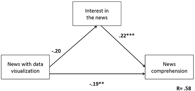
Figure 1. Effect of interest on comprehension in data visualization. Model: independent variable—type of news; mediating variable—interest in the news; dependent variable—comprehension. **p < 0.01; ***p < 0.001.
The questionnaire was designed and controlled during distribution in such a way that it could only be completed in a single session, from start to finish, ensuring that each person took at least 15 min to complete the questionnaire. Qualtrics ensured this requirement. In addition, only those of the participants who spent between 3 and 20 min reading the exposed news were counted as valid cases. Thus, 12 participants were excluded and the total sample was 700 people. To calculate the internal consistency of the instrument, Cronbach's alpha was used, resulting in all cases higher than the recommended value of 0.70 (Cronbach, 1951).
4.2. Measurements
The sociodemographic questions were measured as follows: gender was measured as 0 = male, 1 = female, 2 = other, age was collected and grouped (from 18 to 24, from 25 to 34, from 35 to 49, from 50 to 64 and over 65 years), educational level following the official structure of the Ministry of Education of Spain (1 = primary; 2 = secondary; 3 = professional training; 4 = Graduate or equivalent; 5 = postgraduate or equivalent), employment status (1 = Inactive; 2 = Unpaid domestic work; 3 = Student; 4 = Unemployed; 5 = Active worker).
Regarding the measures used in the pre- and post-test, they are described below, together with the value of Cronbach's alpha obtained:
- Previous attitude (pre-test). Three questions designed for research were included, referring to attitudes toward concepts of data, scientific news and news with data visualization (measured with a scale from 0 = very negative to 10 = very positive) (α = 0.83).
- Previous interest (pre-test). Taking the study by Atwater (1988) as a reference, three questions were included on the level of interest in traditional, scientific news and data visualization (measured on a scale from 1 = not at all interested to 4 = very interested) (α = 0.72).
- Comprehension (pre-test). The level of news reading comprehension is self-assessed, not directly measured by the instrument. It was measured through a 5-item scale (from 1 totally disagree to 5 totally agree) elaborated from a rubric to evaluate reading comprehension in education (Orientaciones Andújar, 2019), to measure how they assess their own understanding and whether they consider themselves capable of identifying the most important points of the news [e.g., “When I read a piece of news, I know what it is about;” “I easily locate the explicit information (what, who, when, how, etc.) of a piece of news”] (α = 0.89).
- Comprehension (post-test). The measurement of post-test comprehension has been carried out in the same way as the pretest comprehension, but adapted to the position after reading a piece of news to measure whether they have been able to identify the most important points of the news [e.g., “I have been able to identify what the news that I just read is about;” “I easily located the explicit information (what, who, when, how, etc.) of the news”] (α = 0.93).
- Interest in the news (post-test). Taking the scale used in the study by Hermans and Prins (2022) as a reference, three items were included to assess the interest shown by people after the news [e.g., “The news I have read is interesting;” “The news included information based on solutions;” using a scale from 0 = not at all to 10 = a lot (α = 0.85)].
- Attitudes toward data visualization (post-test). To measure attitudes toward data visualization, an adaptation of the Schepman and Rodway (2020) scale was made, created to measure attitudes toward artificial intelligence. Their goal was to develop a measurement tool for general attitudes toward artificial intelligence in different contexts. To do this, he identified positive (reflecting social and personal usefulness) and negative (reflecting concerns) subscales, capturing emotions and measuring them with an agreement scale. Participants viewed AI applications involving big data positively, but viewed applications for tasks involving human judgment (e.g., medical treatment, psychological counseling) negatively. Applications with a strong ethical dimension caused more discomfort. This scale was initially validated with a composition of 16 positive items and 16 negative items toward this topic and was later confirmed by reducing the scale to 20 items (Schepman and Rodway, 2022). The scale was adapted using the positive elements for data visualization (e.g., “There are many beneficial applications in the news that use data visualization;” “Data visualization can provide new solutions in journalism”) and It was measured on a scale from 1 = strongly disagree to 7 = strongly agree (α = 0.95).
4.3. Analysis
Once the responses were anonymized, descriptive statistical tests (analysis of frequencies and means) and inferential statistical tests with t-student were applied (see Supplementary Table 3). Next, the regression models were developed, with moderate mediation, where the independent variable is Data Visualization and the dependent variables are interest, comprehension and attitude. Positive charges correspond to the absence of data visualization and negative charges correspond to the presence of data visualization. The moderated mediation analysis was carried out to test the hypothesis, using the IBM SPSS package, version 26, and the Process macro for SPSS (Models 4 with simple mediation and seven with moderated mediation) (Hayes, 2022) (see models and variables in Figures 1–4), with 10,000 bootstrap samples (95% and intervals confidence—CI—corrected for bias). This method is based on multiple linear regression analysis estimated by ordinary least squares (OLS). The moderate mediation model was chosen since it explains how or why a variable influences between X and Y. The analysis design with moderate mediation is necessary to study the effect of each of the independent variable (data visualization) on the dependent one and to measure the possible effects of moderation and at the same time in which conditions this relationship occurs (Igartua and Hayes, 2021; Hayes, 2022).
5. Results
Sociodemographic data is shown in Supplementary Table 2. First, it was observed that the randomization of the experimental groups was effective in terms of gender [ = 4.65, p = 0.09], age groups [ = 6.70, p = 0.08] and educational level [ = 4.33, p = 0.36]. To verify that the mediating processes presented convergent correlations with the proposed hypotheses (that is, between the mediating, moderating and dependent variables), correlations between these variables were analyzed. In addition, it was also confirmed that the mediating and moderating variables showed statistically significant relationships with the dependent variables. These results justify the proposed mediation model (see Table 1).
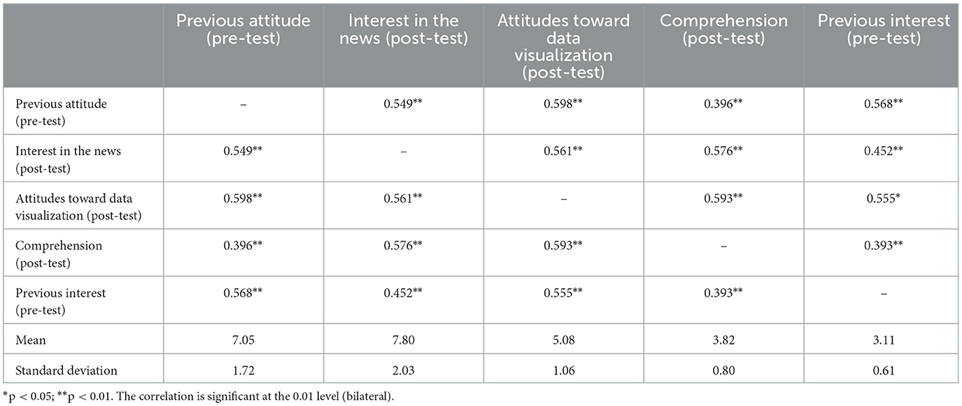
Table 1. Correlations between mediating, moderating, and dependent variables.
In the experimental group that viewed the news without data visualization (traditional version; experimental condition 1), previous interest presented a mean of 3.09 (SD = 0.62), previous attitude 6.96 (SD = 1.72), and previous comprehension 3.93 (SD = 0.69). The posterior interest presents a mean of 7.70 (SD = 2.11), the posterior attitude of 5.06 (SD = 1.09), and the posterior comprehension of 3.71 (SD = 0.83). In the experimental group that viewed the news item with data visualization (visualization version; experimental condition 2), previous interest had a mean of 3.13 (SD = 0.60), previous attitude 7.15 (SD = 1.72), and previous comprehension 3.97 (SD = 0.69). The posterior interest presents a mean of 7.91 (SD = 1.93), the posterior attitude of 5.11 (SD = 1.04), and the posterior comprehension of 3.95 (SD = 0.75) (see Supplementary Table 3).
5.1. Effect of data visualization on interest in news and on news comprehension
To contrast the first hypothesis (H1), an analysis was carried out with PROCESS, specifically with model 4 (Hayes, 2022; Figure 1). In this sense, it was observed that the news with data visualization did not increase interest (B = −0.20, p = 0.18). However, an increase in interest in the news item read caused an increase in its comprehension, regardless of its type (B = 0.22, p = 0.000). In addition, a direct effect was shown between reading a news item that includes data visualization and a greater comprehension of the news item (B = −0.19, p = 0.000). No significant indirect effects were observed [B = −0.04, SE = 0.03, 95% CI (−0.11, 0.02)]. The total effect was (B = −0.24, p = 0.000). It can be stated that the news with data visualization increased comprehension but this relationship was not mediated by interest.
5.1.1. Moderated effect of previous attitude
Regarding the hypothesis H1A, an analysis similar to the previous one was carried out, specifically, with model 7 (Hayes, 2022; Figure 2). Again, news type was found to have no influence on interest (B = 0.29, p = 0.58). However, a relationship was observed between previous attitudes and interest in the news (B = 0.67, p = 0.000). People with more positive previous attitudes generally had greater interest in the news item shown. In this way, interest increased comprehension of the news (B = 0.22, p = 0.000). Although no significant conditional indirect effects were observed, a direct effect of X on Y was again observed, that is, the inclusion of data visualization in the news item increased reader comprehension (B = −0.19, p = 0.000).

Figure 2. Effect of previous attitudes. Model: independent variable—type of news; mediating variable—interest in the news; moderating variable—previous attitudes; dependent variable—comprehension. **p < 0.01; ***p < 0.001.
5.1.2. Moderated effect of previous interest
Regarding the hypothesis H1B, model 7 (Hayes, 2022) was used again (Figure 3). As a result, it was possible to see that previous interest increased subsequent interest (B = 1.72, p = 0.000). Likewise, subsequent interest increased post-news comprehension (B = 0.22, p = 0.000) when the news was about data visualization (B = −0.19, p = 0.000). In this sense, an indirect conditional effect was observed: the fact of reading a data visualization news item increased subsequent interest among those people who had high previous interest, which increased comprehension of the news item [B = −0.08, SE = 0.04, 95% CI (−0.16, −0.00)]. However, the moderate mediation index was not significant.
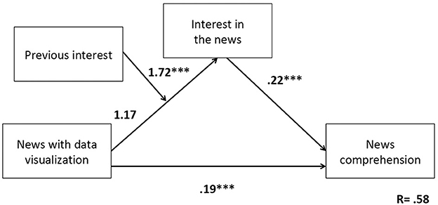
Figure 3. Effect of previous interest. Model: independent variable—type of news; mediating variable—interest in the news; moderating variable—previous attitudes; dependent variable—comprehension. ***p < 0.001.
5.2. Effect of data visualization on the comprehension of the news and on the attitude toward data visualization
Finally, to answer the second hypothesis (H2), the same procedure was followed with model 4 (Hayes, 2022; Figure 4). In this case, a statistically significant indirect effect was observed, such that reading a news story with data visualization increased comprehension, which in turn led to greater positive attitudes toward data visualization [B = −0.19, SE = 0.048, 95% CI (−0.29, −0.10)] (Table 2).
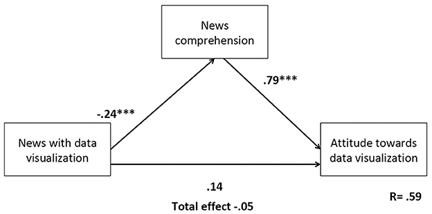
Figure 4. Effect of news comprehension on attitudes toward data visualization. Model: independent variable—type of news; mediating variable—comprehension; dependent variable—attitudes toward data visualization. ***p < 0.001.
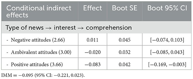
Table 2. Conditional indirect effects.
6. Discussion
This paper aims to provide evidence of the effects of the presence of data visualization in news, measuring interest as a mediating variable, and previous attitude as a moderating variable toward news comprehension. At a theoretical level, this study fills the existing knowledge gap on the effect of some variables that intervene in the reading of a news item that incorporates visualizations with data.
There are few works that study how readers understand the news (Kintsch and Van Dijk, 1978; Woodall et al., 1983; Findahl and Höijer, 1985; Jensen, 2011) and this work contributes in two innovative aspects: first, the application of an experimental methodology to analyze the impact of news with data visualization on readers. Second, the findings yield relevant results on the relationship between previous interest and attitude and interest in the news and its comprehension.
It has been observed that the greater the previous interest, the greater the subsequent interest detected and that the increase in interest in the news is directly related to an increase in their comprehension. Based on this, content producers can work to improve the interest of readers.
On the other hand, it has been revealed that there is a positive direct effect of data visualization on the comprehension of news. It has also been found that people who have previous positive attitudes toward topics such as science, technology or the use of data show a greater interest in science news, regardless of whether they include data visualization or not.
With the competence self-perceived, future works can be contrasted with directly observed competence data. Survey researchers often treat self-rated understanding as a rough indicator of knowledge, which could affect what people believe about a topic. However, recent studies consider whether self-assessments may be unreasonably high and correlated with politics. The results on the topic of climate change suggest that the patterns are different and that among the most conservative, self-assessed understanding is not related or even negatively related to knowledge of the physical world (Hamilton, 2018).
These results are in line with some previous studies, such as those by Godin and Gingras (2000), who mention that the level of understanding of the public can be influenced by the attitude or interest in science and technology. McIntyre (2019) observed that news could have more impact for readers who consider the topic relevant to their own interests. And news with data visualization had better comprehension than traditional news, which was advanced in the studies by Moreno and Valdez (2005), Bucher and Schumacher (2006), and Burmester et al. (2010), who explained that the combination of text and visualizations (even interactive) improves the comprehension of the story, compared to plain text.
That is why it is relevant to train and educate society to increase interest in and demand for data-based information, thus contributing to developing critical thinking and comprehension of scientific communication. Similarly, journalists must be trained to correctly apply data visualization to the news, since according to Smith et al. (2014) the media face three major challenges: (1) time, with an accelerated pace of worked; (2) the simplification of traditional work processes; and (3) the knowledge of the readers to interpret the information.
One of the limitations of this study is having used only one news item per condition. There are studies that emphasize the need to use more than one message per experimental condition (Reeves et al., 2016). It should be noted that the models tested did not perform as expected, as data visualized news and traditional news turned out to have similar levels of interest among people. This may be due to the fact that the theme of the selected news, COVID-19, was very topical and may condition the interest of readers, regardless of whether it includes data visualization.
A second limitation is the exploratory nature of this study, since the fact that there are hardly any similar studies makes it difficult to develop mediation and moderation analysis models, since the role played by each of the variables considered is still poorly defined.
In this sense, future research should delve into the cognitive processes that take place when reading news with data visualization in order to develop guidelines on how to approach its elaboration by journalists, so as to improve comprehension by readers. Given the influence of the media and news on people's learning about the world around them, it is critical that data journalists know how to convey this information. It should be noted that the evolution of the information industry in recent years implies the incorporation of technology and the use of data in all its processes, which shows a concern for making efficient and productive use of these tools (Mogoş, 2016).
Data availability statement
The raw data supporting the conclusions of this article will be made available by the authors, without undue reservation.
Ethics statement
Ethical review and approval was not required for the study involving human participants in accordance with the local legislation and institutional requirements. Written informed consent to participate in this study was not required from the participants in accordance with the national legislation and the institutional requirements.
Author contributions
All authors listed have made a substantial, direct, and intellectual contribution to the work and approved it for publication.
Funding
This work was part of the project Study of Social Perception of Artificial Intelligence in Spain, developed at the University of Salamanca, by members of the Observatory of Audiovisuals Contents. It was financed in the call for grants for the promotion of scientific, technological, and innovation culture, with reference FCT-21-17146, by the Spanish Foundation for Science and Technology (FECYT), an organization belonging to the Ministry of Science and Innovation from Spain.
Conflict of interest
The authors declare that the research was conducted in the absence of any commercial or financial relationships that could be construed as a potential conflict of interest.
Publisher's note
All claims expressed in this article are solely those of the authors and do not necessarily represent those of their affiliated organizations, or those of the publisher, the editors and the reviewers. Any product that may be evaluated in this article, or claim that may be made by its manufacturer, is not guaranteed or endorsed by the publisher.
Supplementary material
The Supplementary Material for this article can be found online at: https://www.frontiersin.org/articles/10.3389/fcomm.2023.1064184/full#supplementary-material
References
Alexander, P., Kulikowich, J., and Schulze, S (1994). The influence of topic knowledge, domain knowledge, and interest on the comprehension of scientific exposition. Learn. Indiv. Diff. 6, 379–397. doi: 10.1016/1041-6080(94)90001-9
Atwater, T. (1988). Reader interest in environmental news. Newspaper Res. J. 10, 31–38. doi: 10.1177/073953298801000105
Babbitt, B. G, and Barron, S. (2004). Assessing reading comprehension: the effects of text-based interest, gender, and ability. Educ. Assess. 9, 107–128. doi: 10.1080/10627197.2004.9652961
Baker, D., Bridges, D., Hunter, R., Johnson, G., Krupa, J., Murphy, J., et al. (2001). Guidebook to Decision-Making Methods. Aiken, SC: Westinghouse Savannah River Company.
Bakker, P., de Haan, Y., and Kuitenbrouwer, C. (2013). What Works? An Inventarization of the Practical and Academic Knowledge on Information Visualizations. Utrecht: University of Applied Sciences.
Bao, H., Cao, B., Xiong, Y., and Tang, W. (2020). Digital media's role in the COVID-19 pandemic. JMIR mHealth uHealth 8, e20156. doi: 10.2196/20156
Bastug, M. (2014). The structural relationship of reading attitude, reading comprehension and academic achievement. Int. J. Soc. Sci. Educ. 4, 931–946.
Bernstein, M.R. (1955). Relationship between interest and reading comprehension. J. Educ. Res. 49, 283–288. doi: 10.1080/00220671.1955.10882283
Bounegru, L., and Gray, J. (2021). The Data Journalism Handbook: Towards a Critical Data Practice. Amsterdam: Amsterdam University Press. doi: 10.1515/9789048542079
Bradshaw, P. (2011). The Inverted Pyramid of Data Journalism. Online Journalism Blog. Available online at https://onlinejournalismblog.com/2011/07/07/the-inverted-pyramid-of-datajournalism/ (accessed July 7, 2022).
Brescani, S., and Eppler, M. J. (2009). “The risks of visualizations: a classification of disadvantages associated with graphic representations of information,” in Conference of International Communication Association (Chicago, IL).
Bucher, H. J., and Schumacher, P. (2006). The relevance of attention for selecting news content. An eye-tracking study on attention patterns in the reception of print and online media. Communications 31, 347–368. doi: 10.1515/COMMUN.2006.022
Burmester, M., Mast, M., Tille, R., and Weber, W. (2010). “How users perceive and use interactive information graphics: an exploratory study,” in Proceedings of the 14th International Conference Information Visualization (IV 2010) (London), 361–368. doi: 10.1109/IV.2010.57
Burns, A., Xiong, C., Franconeri, S., Cairo, A., and Mahyar, N. (2020). “How to evaluate data visualizations across different levels of understanding,” in 2020 IEEE Workshop on Evaluation and Beyond-Methodological Approaches to Visualization (IEEE), 19–28. doi: 10.1109/BELIV51497.2020
Cairo, A. (2017). Visualización de datos: una imagen puede valer más que mil números, pero no siempre más que mil palabras. El Prof. Inform. 26,1025–1028. doi: 10.3145/epi.2017.nov.02
Cronbach, L. J. (1951). Coefficient alpha and the internal structure of tests. Psychometrika 16, 297–334. doi: 10.1007/BF02310555
de Haan, Y., Kruikemeier, S., Lecheler, S., Smit, G., and van der Nat, R. (2018). When does an infographic say more than a thousand words? J. Stud. 19, 1293–1312. doi: 10.1080/1461670X.2016.1267592
Figueiras, A. (2014). “Narrative visualization: a case study of how to incorporate narrative elements in existing visualizations,” in 18th International Conference on Information Visualisation (Paris), 46–52. doi: 10.1109/IV.2014.79
Findahl, O., and Höijer, B. (1985). Some characteristics of news memory and comprehension. J. Broadcast. Electro. Media 29, 379–396. doi: 10.1080/08838158509386594
Fleming, K., Thorson, E., and Zhang, Y. (2006). Going beyond exposure to local news media: an information-processing examination of public perceptions of food safety. J. Health Commun. 11, 789–806. doi: 10.1080/10810730600959705
Forsia, L., Sari, F. I., and Purnawati, P. (2022). The correlation of students' reading interest, vocabulary mastery and their reading comprehension. Engl. Educ. Linguist. Liter. J. 1, 122–131. doi: 10.32678/ell.v1i2.6561
Franklin, B. (2014). The future of journalism: in an age of digital media and economic uncertainty. J. Pract. 8, 469–487. doi: 10.1080/17512786.2014.942090
Freixa, P., Pérez-Montoro, M., and Codina, L. (2021). The binomial of interaction and visualization in digital news media: consolidation, standardization and future challenges. El Prof. Inform. 30, e300401. doi: 10.3145/epi.2021.jul.01
Friendly, M., and Denis, D. J. (2001). Milestones in the History of Thematic Cartography, Statistical Graphics, and Data Visualization. Available online: https://www.datavis.ca/milestones/
Godin, B., and Gingras, Y. (2000). What is scientific and technological culture and how is it measured? A multidimensional model. Public Understand. Sci. 9, 43. doi: 10.1088/0963-6625/9/1/303
Hamilton, L. C. (2018). Self-assessed understanding of climate change. Clim. Change 151, 349–362. doi: 10.1007/s10584-018-2305-0
Hayes, A. F. (2022). Introduction to Mediation, Moderation, and Conditional Process Analysis. New York, NY: The Guilford Press.
Hermans, L., and Prins, T. (2022). Interest matters: The effects of constructive news reporting on Millennials' emotions and engagement. Journalism. 23, 1064–1081. doi: 10.1177/1464884920944741
Holsanova, J., Holmberg, N., and Holmqvist, K. (2008). “Reading styles on a newspaper spread – an eye traking perspective,” in Scandinavian Workshop on Applied Eye Tracking (Lund).
Igartua, J. J., and Hayes, A. F. (2021). Mediation, moderation, and conditional process analysis: concepts, computations, and some common confusions. Span. J. Psychol. 24, e49. doi: 10.1017/SJP.2021.46
Jensen, J. D. (2011). Knowledge acquisition following exposure to cancer news articles: a test of the cognitive mediation model. J. Commun. 61, 514–534. doi: 10.1111/j.1460-2466.2011.01549.x
Kintsch, W., and Van Dijk, T. A. (1978). Toward a model of text comprehension and production. Psychol. Rev. 85, 363. doi: 10.1037/0033-295X.85.5.363
Lee, E.-J., and Kim, Y. W. (2016). Effects of infographics on news elaboration, acquisition, and evaluation: prior knowledge and issue involvement as moderators. New Media Soc. 18, 579–1598. doi: 10.1177/1461444814567982
Liu, J. (2021). Visualization of data journalism of china's mainstream media in public health emergences: taking the data news section of Xinhua net as an example. J. Phys. Conf. Ser. 1880, 012038. doi: 10.1088/1742-6596/1880/1/012038
Ma, Q. (2021). “Unfolding the decision-making dynamics of news visualization production in China,” in Fourth Workshop on Visualization for Communication (VisComm). doi: 10.31219/osf.io/62swr
Manovich, L. (2011). What is visualization? Viual. Stud. 26, 36–49. doi: 10.1080/1472586X.2011.548488
McIntyre, K. (2019). Solutions journalism: the effects of including solution information in news stories about social problems. J. Prac. 13, 16–34. doi: 10.1080/17512786.2017.1409647
Mogoş, A. (2016). “Data analysis and visualization,” in Theory and Tools for Data Journalists, in the Shaping the Future of News Media, eds C. Singla, I. Da Rocha, and X. Ramon (Barcelona: Kit-Book).
Moreno, R., and Valdez, A. (2005). Cognitive load and learning effects of having students organize pictures and words in multimedia environments: The role of student interactivity and feedback. Educ. Technol. Res. Develop. 53, 35–45. doi: 10.1007/BF02504796
Newcomb, T. M. (1958). “Attitude development as a function of reference groups: the Bennington study,” in Readings in Social Psychology, eds E. Eleanor, M. Maccoby, T. M. Newcomb, and E. L. Hartley (New York, NY: Academic Press).
Obie, H. O., Chua, C., Avazpour, I., Abdelrazek, M., Grundy, J., and Bednarz, T. (2019). A study of the effects of narration on comprehension and memorability of visualisations. J. Comp. Lang. 52, 113–124. doi: 10.1016/j.cola.2019.04.006
Orientaciones Andújar (2019). Rubrica Para Evaluar la Comprensión Lectora. Available online at https://www.orientacionandujar.es/2019/05/19/rubrica-para-evaluar-la-comprension-lectora/ (accessed June 30, 2022).
Pérez-Montoro, M., and Veira-González, X. (2018). “Information visualization in digital news media,” in Interaction in Digital News Media, ed M. Pérez-Montoro (London: Palgrave Macmillan), 33–53. doi: 10.1007/978-3-319-96253-5_3
Reeves, B., Yeykelis, L., and Cummings, J. J. (2016). The use of media in media psychology. Media Psychol. 19, 49–71. doi: 10.1080/15213269.2015.1030083
Salvat, G. (2018). From the Infography to the display of data: impact of big data in the design of information. Rev. Int. Cult. Vis. 5, 35–41. doi: 10.37467/gka-revvisual.v5.1822
Schepman, A., and Rodway, P. (2020). Initial validation of the general attitudes towards artificial intelligence scale. Comp. Hum. Behav. Rep. 1, 100014. doi: 10.1016/j.chbr.2020.100014
Schepman, A., and Rodway, P. (2022). The general attitudes towards artificial intelligence scale (GAAIS): confirmatory validation and associations with personality, corporate distrust, and general trust. Int. J. Hum. Comp. Interact. doi: 10.1080/10447318.2022.2085400
Schroeder, R. (2004). Interactive info graphics in Europe-added value to online mass media: a preliminary survey. J. Stud. 5, 563–570. doi: 10.1080/14616700412331296473
Segel, E., and Heer, J. (2010). Narrative visualization: Telling stories with data. IEEE Trans. Vis. Comp. Grap. 16, 1139–1148. doi: 10.1109/TVCG.2010.179
Smit, G., de Haan, Y., and Buijs, L. (2014). Working with or next to each other? Boundary crossing in the field of information visualisation. J. Media Innov. 1, 36–51. doi: 10.5617/jmi.v1i2.875
Smith, A., Chuang, J., Hu, Y., Boyd-Graber, J., and Findlater, L. (2014). “Concurrent visualization of relationships between words and topics in topic models,” in Proceedings of the Workshop on Interactive Language Learning, Visualization, and Interfaces (Baltimore, MD), 79–82.
Tobias, S. (1994). Interest, prior knowledge, and learning. Rev. Educ. Res. 64, 37–54. doi: 10.3102/00346543064001037
Veglis, A., and Bratsas, C. (2017). Reporters in the age of data journalism. J. Media Stud. 6, 225–244. doi: 10.1386/ajms.6.2.225_1
Vivar, J. M. F., and Aguilar, C. S. (2013). El periodismo de datos como especialización de las organizaciones de noticias en internet. Correspond. Anál. 3, 15–34 doi: 10.24265/cian.2013.n3.01
Weber, W., and Rall, H. (2012). “Data visualization in online journalism and its implications for the production process,” in 16th International Conference on Information Visualisation (Montpellier), 349–356. doi: 10.1109/IV.2012.65
Keywords: data visualization, data journalism, comprehension, interest, attitude, public understanding
Citation: Sánchez-Holgado P, Arcila-Calderón C and Frías-Vázquez M (2023) The effect of interest and attitude on public comprehension of news with data visualization. Front. Commun. 8:1064184. doi: 10.3389/fcomm.2023.1064184
Received: 07 October 2022; Accepted: 02 February 2023;
Published: 22 February 2023.
Edited by:
Joana Magalhães, Science for Change, SpainReviewed by:
Debbie Goh, California University of Pennsylvania, United StatesEsther Marín-González, Universidade de Lisboa, Portugal
Copyright © 2023 Sánchez-Holgado, Arcila-Calderón and Frías-Vázquez. This is an open-access article distributed under the terms of the Creative Commons Attribution License (CC BY). The use, distribution or reproduction in other forums is permitted, provided the original author(s) and the copyright owner(s) are credited and that the original publication in this journal is cited, in accordance with accepted academic practice. No use, distribution or reproduction is permitted which does not comply with these terms.
*Correspondence: Patricia Sánchez-Holgado,  cGF0cmljaWFzYW5jQHVzYWwuZXM=
†These authors have contributed equally to this work