 Julia Keizer1*†
 Christian F. Luz2†
 Bhanu Sinha2
 Lisette van Gemert-Pijnen1
 Casper Albers3
 Nienke Beerlage-de Jong4‡
 Corinna Glasner2‡
- 1Centre for eHealth and Wellbeing Research, Section of Psychology, Health and Technology, University of Twente, Enschede, Netherlands
- 2Department of Medical Microbiology and Infection Control, University of Groningen, University Medical Center Groningen, Groningen, Netherlands
- 3Heymans Institute for Psychological Research, University of Groningen, Groningen, Netherlands
- 4Technical Medical Center, Section of Health Technology and Services Research, University of Twente, Enschede, Netherlands
Objectives: Data and data visualization are integral parts of (clinical) decision-making in general and stewardship (antimicrobial stewardship, infection control, and institutional surveillance) in particular. However, systematic research on the use of data visualization in stewardship is lacking. This study aimed at filling this gap by creating a visual dictionary of stewardship through an assessment of data visualization (i.e., graphical representation of quantitative information) in stewardship research.
Methods: A random sample of 150 data visualizations from published research articles on stewardship were assessed (excluding geographical maps and flowcharts). The visualization vocabulary (content) and design space (design elements) were combined to create a visual dictionary. Additionally, visualization errors, chart junk, and quality were assessed to identify problems in current visualizations and to provide improvement recommendations.
Results: Despite a heterogeneous use of data visualization, distinct combinations of graphical elements to reflect stewardship data were identified. In general, bar (n = 54; 36.0%) and line charts (n = 42; 28.1%) were preferred visualization types. Visualization problems comprised color scheme mismatches, double y-axis, hidden data points through overlaps, and chart junk. Recommendations were derived that can help to clarify visual communication, improve color use for grouping/stratifying, improve the display of magnitude, and match visualizations to scientific standards.
Conclusion: Results of this study can be used to guide data visualization creators in designing visualizations that fit the data and visual habits of the stewardship target audience. Additionally, the results can provide the basis to further expand the visual dictionary of stewardship toward more effective visualizations that improve data insights, knowledge, and clinical decision-making.
Introduction
The amount of and reliance on data increases with the increase of scientific publications and information technologies in healthcare (Murdoch and Detsky, 2013; Wang et al., 2018). These big data raise various issues to be resolved by innovative big data analytics, including integrating, analyzing, and visualizing data to translate them into meaningful information (Khan et al., 2014; Ambigavathi and Sridharan, 2018). The translation and communication to specific target groups is challenging (Murdoch and Detsky, 2013). Without this translation and communication, researchers and practitioners cannot optimally use the information, so that the true value of the data remains hidden. Data visualization, here defined as the graphical representation of quantitative information, can facilitate the transformation of data to understandable and actionable information and improve memorization and communication. Data visualization also aids in the interpretation of big data and in the understanding of sophisticated statistical models and their results – two rising trends over the last decades (Bailly et al., 2018; Adam Bohr, 2020). The importance of data visualization can, once again, be observed in the COVID-19 pandemic with the ubiquitous presence of charts and dashboards that aim to inform and support decision-making for a wide variety of target audiences (Comba, 2020).
Data visualization is an active (research) field in itself and is generally part of statistical software for data analysis processes (e.g., R). Information on the data visualization process is numerous and can be transferred between research fields (Tufte, 2001; Kelleher and Wagener, 2011; Gatto, 2015; Evergreen, 2017). However, research on the visual domain context within a research field is often lacking, i.e., what the target audience is accustomed to see and expects in terms of content and design, and how this influences the perception and interpretation of data visualizations from different perspectives (Sedrakyan et al., 2019). Common data visualization practices in a specific domain can be identified by studying the visual dictionary, which consists of the visual vocabulary and visual design space (see Figure 1; Munzner, 2014). The vocabulary represents the content in terms of visualized data attributes. The design space is “an orthogonal combination of two aspects,” namely marks (i.e., graphical elements such as points, lines and areas) and visual channels to control their appearance (i.e., esthetic properties such as color, size and shape) (Munzner, 2014).
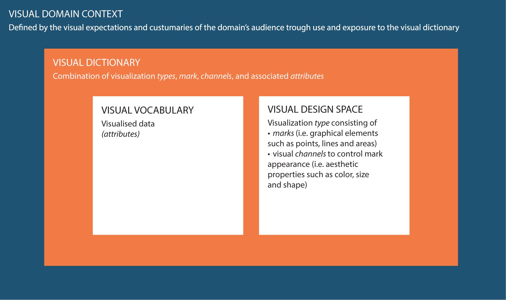
Figure 1. Conceptual framework used in this study to clarify the definitions and interrelations between the visual domain context, the visual dictionary and the visual domain vocabulary and visual design space. To clarify the conceptual definitions a linguistic analogy can be used: a dictionary describes language in terms of both vocabulary (i.e., the set of words familiar in a language) and grammar/punctuation (i.e., the set of structural rules and supporting marks that control the composition and navigability of sentences, phrases, and words). Similarly, the visual dictionary describes visualizations in terms of both visual vocabulary (i.e., the domain content in terms of visualized data attributes) and visual design space (i.e., graphical elements and supporting aesthetic properties). The language or visual domain context is an overarching concept that represents language/visualization in practice, i.e., expectations and customs of the target audience, and how this affects their perception and interpretation of data visualizations. The visual domain context is, just as language, subject to changes over time and subject to interpretation differences based on varying perspectives.
Data and data visualization play important parts in the field of infectious diseases and antimicrobial resistance (AMR) for the reporting on the growing burden on health and healthcare systems (OECD, 2018; World Health Organization, 2020b). Comprehensible and actionable information on antimicrobial consumption, pathogen distribution, or incidence and prevalence of (multi-) drug resistant microorganisms are vital to design interventions to tackle the AMR challenge (World Health Organization, 2015). Reliable data on AMR, robust data analyses, and the correct presentation of data are essential to support crossing borders between human, animal, and ecosystem health, also known as the One Health approach. One example is the surveillance of AMR in humans, animals, and food (European Centre for Disease Prevention and Control [ECDC], European Food Safety Authority [EFSA], and European Medicines Agency [EMA], 2017). In this study, we focus on the hospital level, where antimicrobial and diagnostic stewardship, infection control, and institutional surveillance (further summarized under “stewardship”) are the core components of strategies that promote the responsible use of antimicrobials and improve the quality and safety of patient care (Dik et al., 2016; Dyar et al., 2017). Data visualization is an integral part of these strategies, as it unveils the (local) situation and drivers of AMR, and can have a significant impact on the use of antimicrobials (Luz et al., 2019; Graber et al., 2020).
It has been shown how important it is to study data and data visualization experiences and perceptions in the medical domain and how these can influence the interpretation of data (Aung et al., 2019a,b). Identifying the key messages from a data visualization can be substantially hindered by a suboptimal visualization type. The audience’s background and its familiarity with data visualization (i.e., visual domain context) have to be considered in the design process to avoid these obstacles. Example studies that identified the visual domain context by studying the design space can be found in the field of genomic epidemiology and genomic data visualization (Crisan et al., 2019; Nusrat et al., 2019). Although some recommendations exist that are helpful for stewardship data visualization, common data visualizations practices in the field have yet to be revealed (Carroll et al., 2014; Salinas et al., 2020). The visual domain context and the use of data visualization in the field are unstudied – a systematic approach to define the design space is missing.
In this study, we aim to fill these gaps by assessing and defining the design space of data visualization in stewardship and to create a visual dictionary. The results of this study can help data visualization creators, such as AMR-/data-professionals and scientists, to anticipate the visual domain context of the target audience and link it with existing recommendations for the data visualization process. This could benefit both research and clinical decision-making in the translation and communication of data to understandable and actionable information needed to tackle the AMR challenge, thereby improving the quality and safety of health and healthcare.
Study Data
This study succeeds a mapping study that clustered the AMR field into 88 topics (Luz et al., 2021). The map was generated by assessing the entire body of AMR literature available on PubMed between 1999 and 2018 (152,780 articles). Using a machine learning algorithm (STM), topics were identified based on the title and abstract text (Roberts et al., 2019). The present study used all articles of three of the identified topics: stewardship (n = 3,383 articles), infection control (n = 1,687 articles), and institutional surveillance (n = 2,176 articles). These three topics reflect the core components of an integrated, comprehensive stewardship concept in institutional healthcare (Dik et al., 2016).
For each topic, a sample of 60 articles that contained at least one data visualization was randomly drawn. Data visualization was defined as the graphical representation of quantitative data. Geographical maps and flowcharts were excluded, as geographical data have distinct visual characteristics and challenges beyond the scope of this study (see e.g., Wang et al., 2017; Singleton and Arribas-Bel, 2021). From the sampled articles, one visualization per article was randomly sampled resulting in 180 data visualizations. The study design is shown in Figure 2. To analyze inter-rater reliability, 10 randomly picked data visualizations per topic were analyzed in duplicate, and the joint probability of agreement was calculated by dividing the number of agreements per categorical assessment form question (i.e., visual characteristics described in section “Data Visualization Analysis”) by the total number of assessments (O’Connor and Joffe, 2020).
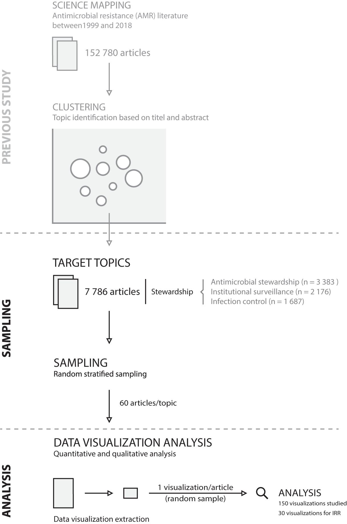
Figure 2. Study design. IRR, inter-rater reliability.
Data Visualization Analysis
The resulting 150 data visualizations (Supplementary Material S1) were analyzed using the nomenclature and categorization by Munzner adapted for this study (Munzner, 2014). This approach dissected data visualizations into visual characteristics:
- Attributes (or variables, parameters, features): the underlying data labeled as categorical, ordered, or quantitative
- Marks: the basic geometric element (points, lines, or areas)
- Channel: channels control the visual appearance of marks
- Position: horizontal, vertical, both
- Color
- Shape
- Tilt
- Size: length, area, volume
- Channel effectiveness
- Magnitude: the effectiveness to express ordered attributes can be ranked: position on common scale (most effective) > position on unaligned scale > length > tile/angle > area > depth > color luminance/saturation > curvature/volume (least effective)
- Identity: the effectiveness to express categorical attributes can also be ordered: color hue >shape
In addition, data visualizations were labeled with the visualization type used (e.g., bar chart, line chart, scatter plot, etc.) and the use of faceting (multiple linked visualizations in a design grid). Each visualization was assessed upon its interpretability without additional text (yes, if interpretable without additional information; partially, if a description was given in a caption; not at all, if a description was absent or only available in the article text).
Visualization quality was captured by rating the first and last impression during the analysis process on a scale form 1 (poor) to 5 (good). The choice of the visualization type given the underlying data was rated on a scale from 1 (poor) to 5 (good). In addition, free, written text was recorded to capture comments and remarks about the data visualization.
A structured assessment form (Supplementary Material S2) was developed comprising all the above-mentioned elements. The form was discussed within a multidisciplinary team of data-visualization and AMR experts. The assessment form was applied to each data visualization in a two reviewer (JK and CL) process. First, the assessment form was used for training the analysis process with 10 data visualizations not part of the final study data. Next, each reviewer analyzed 50% of the study data visualizations followed by a re-review through the other researcher. Consensus was reached through discussion if the first assessment differed.
Quantitative Analysis
Descriptive statistics were calculated for visualization type, number of attributes, faceting, rating, and visualization type choice. Attributes were analyzed for pairwise co-occurrence and presented if a combination occurred more than twice in total.
Visual Dictionary
The visual dictionary was created based on the visual vocabulary (stewardship-related content) and visual design space (characteristics used to design the visualization). The vocabulary was analyzed by identifying attributes and grouping the attribute names using inductive coding. Next, quantitative analyses of visual characteristics (channel, marks, etc.) were performed stratified per attribute, thereby adding the visual design space to the vocabulary. Linking the vocabulary and design space enabled the creation of a visual dictionary to help identify attributes (e.g., resistance) with associated channels (e.g., points and lines on a common scale).
Qualitative Analysis
Comments about the visualizations were coded in Microsoft Excel by two researchers (CL and JK). An open coding round was followed by axial coding to discover related concepts in the sub-codes. Differences were discussed until consensus was reached, which increased the internal validity (Patton, 1999). Next to improvements, CL and JK coded remarks about chart junk (i.e., the unnecessary and/or redundant use of visualization embellishments) (Tufte, 2001).
Results
In total, 150 visualizations were analyzed (IRR: 87% joint probability of agreement). The following sections are separated into visual vocabulary (content) and dictionary with results stratified by identified attributes. These sections are followed by visualization ratings, identified visualization problems, and suggested recommendations for visualization creators.
Visual Vocabulary (Content)
In total, 48 different attributes were coded. The 10 most used attributes were time (n = 69, 46.0%), setting (n = 43, 28.7%), antimicrobial consumption (n = 32, 21.3%), resistance (n = 31, 20.1%), antimicrobials (n = 27, 18.0%), percentage (n = 26, 17.3%), count (n = 24, 16.0%), incidence (n = 24, 16.0%), numeric value (n = 20, 13.3%), and bacteria (n = 12, 8.0%). Attributes could be grouped into objects (e.g., bacteria) and measurements (e.g., percentage). However, the following analysis focuses on attribute combinations and attributes are thus kept ungrouped.
Attributes showed different co-occurrence patterns (Figure 3). The 10 most frequent combinations were time and antimicrobial consumption (n = 21), time and incidence (n = 18), antimicrobial consumption and antimicrobials (n = 12), antimicrobials and resistance (n = 12), time and resistance (n = 12), time and antimicrobials (n = 11), antimicrobial consumption and setting (n = 10), resistance and setting (n = 9), time and setting (n = 9), and percentage and setting (n = 8).
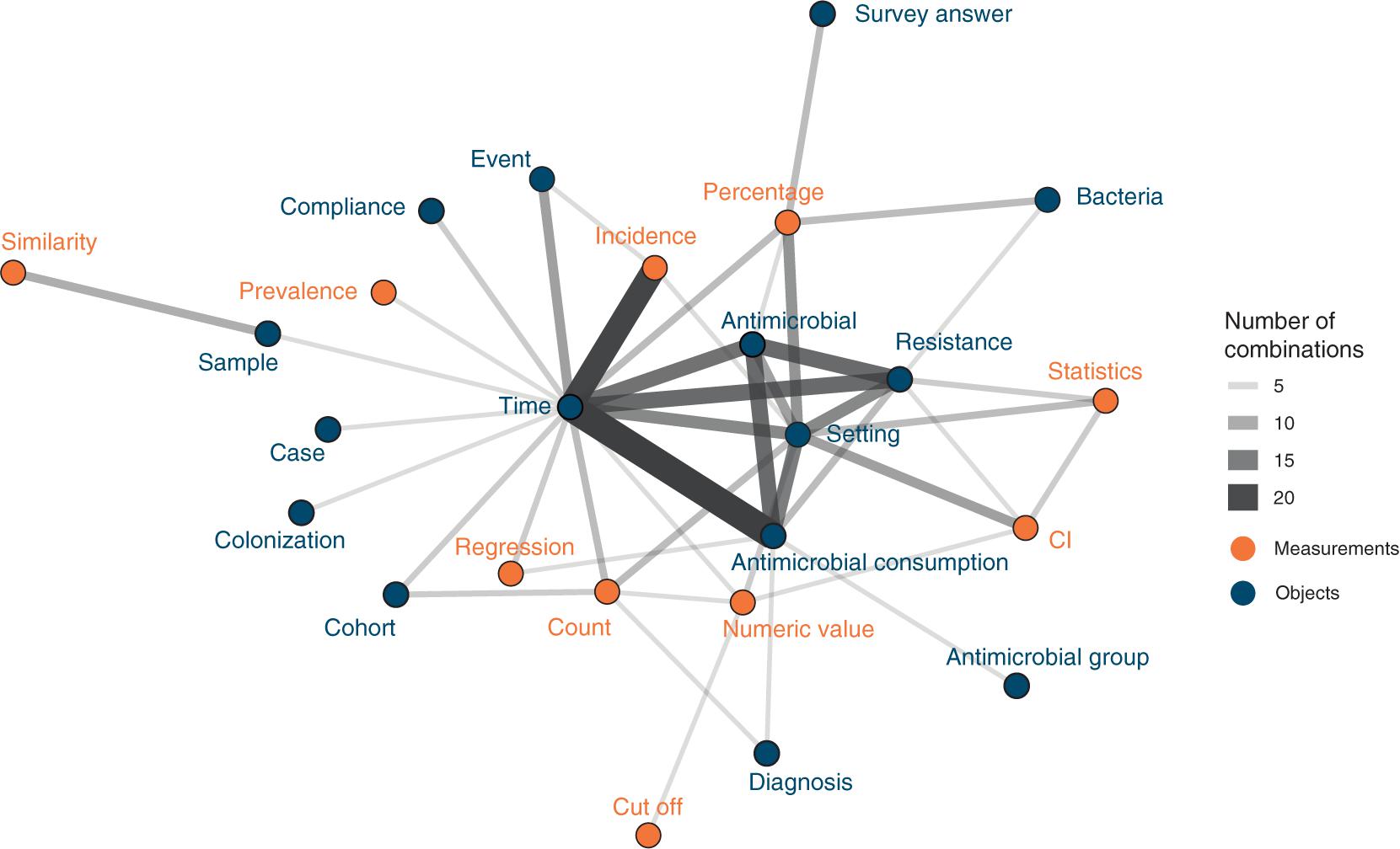
Figure 3. Attribute combinations in visualizations (combination count ≥3), thickness of lines corresponds to combination count. Orange points and labels represent attributes related to measurements; blue points and labels represent attributes related to objects.
Visual Dictionary
Visualization Types
Fourteen different visualization types were identified of which bar charts (n = 54, 36.0%) and line charts (n = 42, 28.1%) were predominantly used. Bar charts were most frequently associated with attributes antimicrobials, bacteria, cohorts, compliance, counts, diagnosis, errors, percentages, resistance, setting, and survey answers. Line charts were predominantly associated with antimicrobial consumption, costs, cut-off, incidence, numeric values, regression, statistics, and time (detailed results available in Supplementary Material S3).
Different visualization types combined in one visualization were used in 10.7% (n = 16) of all visualizations. In these, visualization types that were combined more than once were bar charts with line charts (n = 5, 31.3%) and stacked bar charts with line charts (n = 2, 12.5%). In 41 visualizations (27.3%) facets were used, i.e., one visualization split into a matrix of visualizations using the same axes.
Visual Design Space
Different patterns of visual characteristics could be identified for different attributes (detailed counts and percentages in Supplementary Material S4).
1. Position: Horizontal axes were mostly used for Antimicrobials, bacteria, confidence intervals, counts, cut-offs, diagnoses, events, numeric values, settings, similarity, and time. In contrast, vertical axes were mostly used for antimicrobial consumption, cases, cohorts, counts, errors, incidence, percentages, regression, resistance, samples, statistics, and survey answers.
2. Marks, color, shape: Attributes also differed in their use of marks. Some attributes had clear associations with mark types, e.g., time was always visualized with lines. Area marks were seldomly used, e.g., for antimicrobial consumption, counts, cut-offs, incidence, numeric values, percentages, and resistance. Color and shape channels were frequently used in most attributes. A detailed color and shape channel analysis is available in the Supplementary Material S4.
3. Size: Size was most often visually reflected through length. Area to reflect size was used for antimicrobial consumption, count, cut-off, incidence, numeric values, percentages, and resistance. Volume was rarely used (for count and percentages).
4. Magnitude/ordering: Position on a common scale was mostly used in quantitative and ordered attributes reflecting the best channel effectiveness for these attribute types. Categorical attributes mostly used color hue, which is preferred over the less effective use of shapes. A detailed channel effectiveness analysis is available in the Supplementary Material S5.
Ratings, Problems, and Chart Junk
Visualization Ratings
Overall, 55.3% (n = 83) of all visualizations were interpretable without additional text (in caption or in the manuscript text). The overall choice of visualization type was rated with a mean of 4.62 (SD: 0.9) on a scale from 1 (poor) to 5 (good). The assessment of the visualization quality (scale 1 = poor to 5 = good) was rated with a mean of 3.6 (SD:1.2).
Identified Problems
The coding of the identified problems are presented in the coding scheme in Table 1, including axial codes, open codes, and frequencies. In Supplementary Material S6, additional illustrative quotes per code are presented.
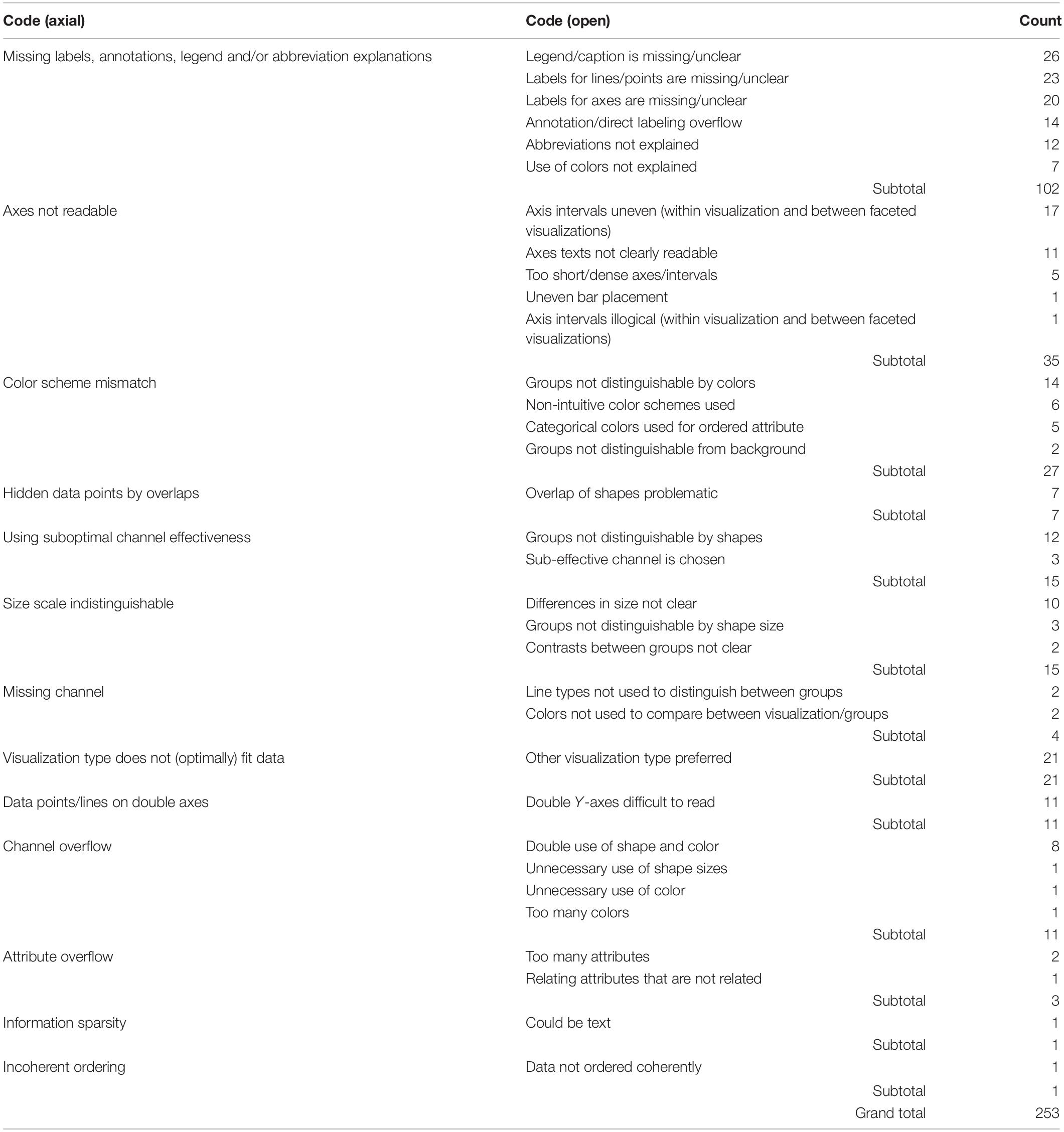
Table 1. Identified problems in stewardship data visualization.
Chart Junk
Most chart junk represented text that cluttered the visualization (n = 8), for example with redundant direct labels for each data point. Other chart junk was found in visualizations using unnecessary 3D (n = 8), background colors (n = 6), shadow (n = 4), and color/shape filling (n = 4).
Examples and Recommendations
To illustrate problems in data visualization, we designed a visualization that exhibits several of the identified problems based on simulated data (Figure 4). Figure 5 proposes an alternative to Figure 4 where the identified problems were avoided. Of note, data such as the simulated data in these figures can be visualized in many different ways, depending on the underlying research questions.
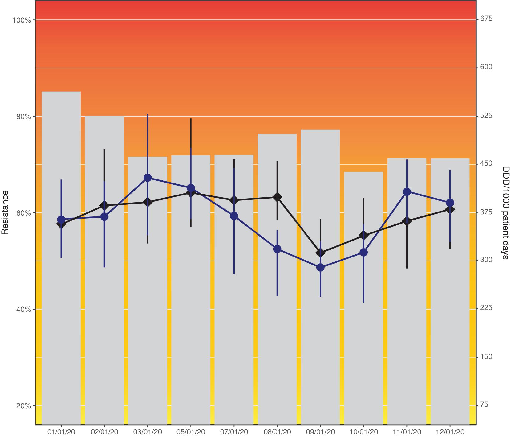
Figure 4. Resistance to amoxicillin in Escherichia coli and consumption of cefuroxime (black) and piperacillin/tazobactam (blue) across hospital departments in 2020. This data visualization (simulated data) shows several problems identified in this study: Axes not starting at zero, use of double y-axes, background colors, hidden data points by overlaps, color scheme mismatch (blue and black difficult to distinguish), unequal axis steps on x-axis, missing legend, incomplete axis labels (abbreviation not explained).
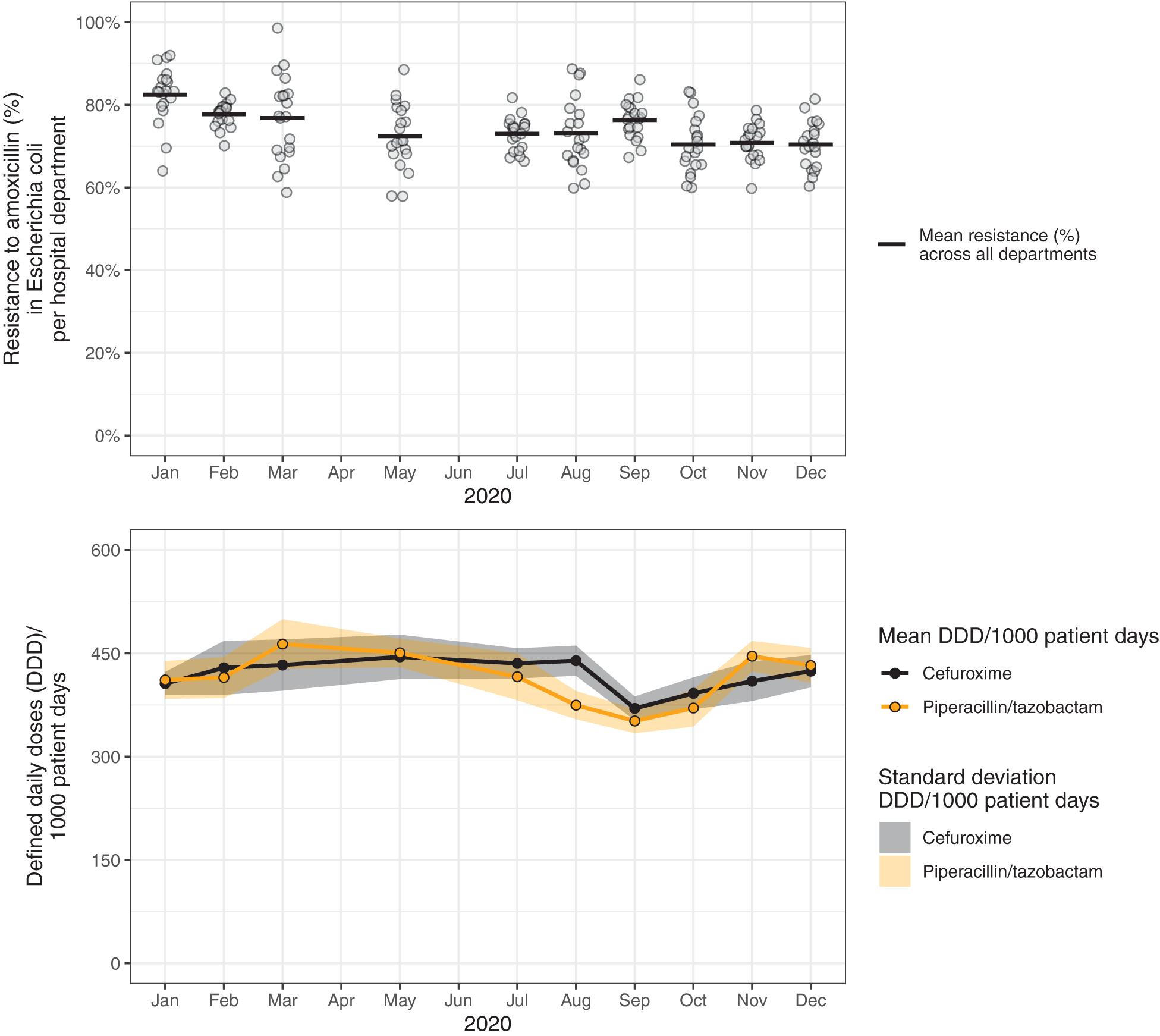
Figure 5. Resistance to amoxicillin in Escherichia coli and consumption of cefuroxime and piperacillin/tazobactam across hospital departments in 2020. These data visualizations use the same data as in Figure 4 (simulated data), but propose an improved visualization.
Figure 6 summarizes the results of this study and presents the visual dictionary of stewardship. In addition, it provides a set of recommendations to avoid the most common problems in data visualizations as identified in this study.
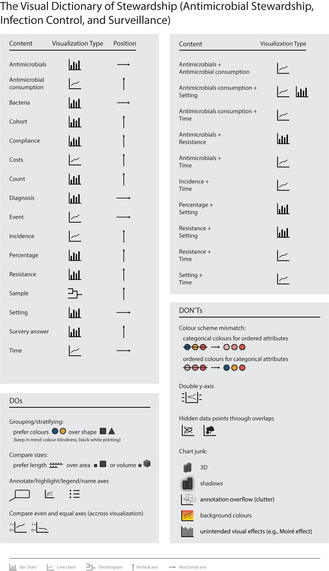
Figure 6. The visual dictionary of stewardship (antimicrobial stewardship, infection control, and institutional surveillance).
Discussion
This study systematically analyzed the visual domain context of stewardship, i.e., antimicrobial stewardship, infection control, and institutional surveillance. Stewardship experts and scientists that create data visualizations can benefit from the revealed visual domain context, since it allows them to anticipate the visual habits of their target audience. The results of this study can serve as the basis to inform visualization creators to optimize visual communication in the field and to guide user-centered design, e.g., in clinical decision support systems.
Findings and Future Directions
With the systematic analysis of the visual domain context of stewardship we revealed common practices and identified problems with current implemented visualizations. In general, the use of data visualizations for communicating data is highly encouraged. It greatly supports the interpretation, memorization, and communication of insights and knowledge gained from data. In this study, we identified 14 different visualization types used in the visual domain context of the field. However, more than 80% of all visualizations used classical (stacked) bar or line charts; quite homogenous design choices. We argue that the visualization type choice is based on tradition and habits as a systematic approach to data visualization in the field was missing until now (Salinas et al., 2020). A lack of awareness and knowledge about data visualization design and design alternatives might lead to suboptimal data visualizations. Examples from our findings were the use of less effective visual channels, suboptimal plot types for the presented data, or mismatches in color choices for different data types. Similar visualization pitfalls were identified in studies focusing on common visualization pitfalls in multidisciplinary research related to visual representations and for environmental data, emphasizing instances where data visualization creators require more support in visualization design choices (Kelleher and Wagener, 2011; Bresciani and Eppler, 2015). Now that we revealed common data visualization practices in the visual dictionary for stewardship by linking often used attributes (i.e., content) and associated design choices (e.g., visualization type or marks), visualization creators in the field can match their visualizations with the audience’s visual expectations and habits.
However, given the wide variety of data in the field and the increased complexity that big data will add (in terms of volume, velocity, variety, veracity, validity, volatility, and value), more “visual variability” might be expected and even needed in the future (Khan et al., 2014; Gotz and Borland, 2016; Galletta et al., 2019). A first step toward visual variability is informing and teaching visualization creators and users about data visualization design alternatives. We see a clear role here for data visualization experts and software developers to cocreate open-source/access tools that support visualization creators in their visualization choices (e.g., reminders for adding labels and legends, suggestions for optimal color schemes, warnings in case of chart junk). Our results and findings from similar studies in other fields can support them in doing so by providing an overview of common data visualization practices in the field, including dos and don’ts (Crisan et al., 2019; Nusrat et al., 2019).
Of note, academic journals play an important part in this process by providing the platform for data visualizations and should be encouraged to promote high quality data visualization practices. Furthermore, it could be worth considering standardizing data visualization for often used data types and contents in the field, given the prominent patterns in the visual dictionary (e.g., time series were part of 43.3% of all studied visualizations) within the large variety of content (48 different attributes such as antimicrobials, bacteria, or time) observed in this study. For time series specifically, an overview of data visualization methods exist (Fang et al., 2020), and similar standardizing initiatives can be found in the AMR field [e.g., European Committee of Antimicrobial Susceptibility Testing (EUCAST; Brown et al., 2015)] and other fields [e.g., the Intergovernmental Panel on Climate Change (IPCC) and standardized medical data visualization based on the ISO13606 data model (Kopanitsa et al., 2015; Gomis and Pidcock, 2018)]. This could help ensure high quality data visualizations for reliable insights in AMR/stewardship related data.
In the light of growing complexities and increasing data volumes, genomic data and their visualization play a special role in the field. Although genomic data visualizations were included in this study, most visualizations were simple dendograms and phylogenetic trees. As with the a priori excluded geographical data, these complex data require dedicated research and visualization techniques which are provided in great detail by others (see e.g., Crisan et al., 2019; Nusrat et al., 2019). An additional important aspect for high quality data visualization in the stewardship and AMR data field is the visualization of uncertainties. The visualization of uncertainties was not within the scope of this study and further research into the optimal display of uncertainty is highly encourage. For more information readers are referred to the work of others (Wilke, 2019; Korporaal et al., 2020; Padilla et al., 2020).
Studying the visual domain context is as important as studying data visualizations themselves. The importance of assessing visual habits and perceptions in data visualization has been demonstrated before in other medical fields revealing that personal preferences and visualization habits might not always match with novel data visualization approaches and recommendations (Backonja et al., 2018; Aung et al., 2019b). Aung et al. (2019b) published an exemplary study in the field of reproductive, maternal, new-born and child health, focusing on data visualization interpretation capacity and preferences in their target audience by combining interviews on interpretability and card-sorting of preferred visualizations. Thus, for data visualization in general we strongly believe that incorporating best practices is essential, but advocate that these should be carefully balanced with visual habits and expectations in the field and the message to be conveyed. Additionally, research is needed to better understand how data visualizations in general impact the viewers in terms of changes in opinions or attitudes that direct decision-making or behavior changes (Pandey et al., 2014).
In future research special attention should be paid to matching the visual dictionary and the context in which the visualization will be used in terms of users, their tasks and current practices (e.g., studying questions like “How do current visualizations support to do current tasks?” and “What visualizations would the target audience like to see?”) (Lam et al., 2012). This also includes color-blindness considerations, as extensively studied by others (Ahmed et al., 2020; Crameri et al., 2020; Burggraaff et al., 2021). We see a clear parallel with user-centered eHealth design that emphasizes the need for a holistic understanding of the interrelations between technology, people, and their context (van Gemert-Pijnen et al., 2018). Both qualitative (e.g., interviews) and quantitative (e.g., eye-tracking in current data visualizations) study designs can contribute to such a holistic understanding, which in turn can inform or improve the design of visualizations (or eHealth) in terms of required content, functionalities, and usability (Keizer et al., 2020). Therefore, complementing research on data visualizations, as the current study and many other studies do, with research that primarily focuses on the interaction between people, their context and how data visualizations can support them, is needed (Lam et al., 2012).
Limitations and Strengths
This study has several limitations. Despite sampling from a comprehensive set of articles that cover the stewardship field, only a limited number of data visualizations were included. Moreover, only data visualizations from scientific publications and not from other sources relevant to stewardship data visualization creators [e.g., data systems used in practice (Huber et al., 2018; Sedrakyan et al., 2019) and AMR policy reports (Anderson et al., 2019; World Health Organization, 2020a)] were included. Therefore, we missed data visualizations for other stewardship content, making our findings potentially more applicable to stewardship researchers than healthcare professionals. However, the observed homogeneity of data visualization types suggests saturation regarding the visual design space for stewardship. Subsequent research into the visual domain context of stewardship should include these additional sources to ensure a more comprehensive picture for healthcare professionals. Even though the extracted data visualizations were systematically analyzed using a structured assessment form based on existing data visualization nomenclature and categorization (Munzner, 2014), the analyses relied on the subjective interpretation and rating by the coding researchers. Several measures were taken to validate our findings, including discussing the assessment form and results within a multidisciplinary team of data-visualization and AMR experts, analyzing the interrater-reliability, and comparing our findings to other data visualization studies. Our study is one of the first empirical studies that explores the use of data visualization in stewardship, thereby adding to the few review studies providing primers for data visualization recommendations and best practices in the stewardship field (Carroll et al., 2014; Salinas et al., 2020). Furthermore, our structured assessment approach can be applied in future studies in the broader One Health field to unravel the visual dictionary of the fields of human, animal, and ecosystem health, considering interdisciplinary differences in data and data visualizations and their integration and interpretation (Lapinski et al., 2015; European Centre for Disease Prevention and Control [ECDC], European Food Safety Authority [EFSA], and European Medicines Agency [EMA], 2017; EFSA, 2021).
Conclusion
In this study, we analyzed the visual domain context of stewardship (antimicrobial stewardship, infection control, and institutional surveillance). We successfully created a visual dictionary that can support the process of creating and using tailor-made data visualizations in the field. Thereby, our results allow data visualization creators to learn the visual language of the diverse field of stewardship. As data-driven solutions for stewardship are of increasing importance, effective processes of transforming this data to insights and knowledge is essential. Data visualization supports and enables this transformation and our results can guide the optimal visualization design choices that are grounded on expectations and habits in the field. In the future, our study can provide the basis to further expand the visual dictionary of antimicrobial stewardship toward more effective data visualizations that improve data insights, knowledge, and decision-making.
Data Availability Statement
The original contributions presented in the study are included in the article/Supplementary Material, further inquiries can be directed to the corresponding author/s.
Author Contributions
JK and CL: conceptualization, data analysis, and writing – original draft. CL: visualization. JK, CL, NB-dJ, and CG: discussing assessment form and results. NB-dJ, BS, LG-P, CA, and CG: supervision. All authors: writing – review and editing.
Funding
This research was supported by the INTERREG-VA (202085) funded project EurHealth-1Health (https://www.deutschlandnederland.eu/project/eurhealth-1health-2/), part of a Dutch-German cross-border network supported by the European Commission, the Dutch Ministry of Health, Welfare and Sport, the Ministry of Economy, Innovation, Digitalization and Energy of the German Federal State of North Rhine-Westphalia and the Ministry for National and European Affairs and Regional Development of Lower Saxony. In addition, this study was part of a project funded by the European Union’s Horizon 2020 Research and Innovation Programme under the Marie Sklodowska-Curie grant agreement 713660 (MSCA-COFUND-2015-DP “Pronkjewail”).
Conflict of Interest
The authors declare that the research was conducted in the absence of any commercial or financial relationships that could be construed as a potential conflict of interest.
Publisher’s Note
All claims expressed in this article are solely those of the authors and do not necessarily represent those of their affiliated organizations, or those of the publisher, the editors and the reviewers. Any product that may be evaluated in this article, or claim that may be made by its manufacturer, is not guaranteed or endorsed by the publisher.
Acknowledgments
The authors would like to thank Anamaria Crisan, Tamara Munzner, and Nils Gehlenborg for the inspiration provided for this study. Preliminary results of this study were presented at the Supporting Health by Technology conference on June 12th, 2021 in Enschede, Netherlands.
Supplementary Material
The Supplementary Material for this article can be found online at: https://www.frontiersin.org/articles/10.3389/fmicb.2021.743939/full#supplementary-material
References
Adam Bohr, K. M. (2020). The rise of artificial intelligence in healthcare applications. Artif. Intell. Healthcare 25, 25–60. doi: 10.1016/B978-0-12-818438-7.00002-2
Ahmed, B. Y., Majeed, Z. H., and Najim, S. A. (2020). “Applying the visualization technique to solve the human color blindness,” in International Conference Of Numerical Analysis And Applied Mathematics Icnaam 2019, Karbala: AIP Publishing, doi: 10.1063/5.0027395
Ambigavathi, M., and Sridharan, D. (2018). “Big data analytics in healthcare,” in 2018 Tenth International Conference on Advanced Computing (ICoAC), Chennai: IEEE, doi: 10.1109/icoac44903.2018.8939061
Anderson, M., Clift, C., Schulze, K., Sagan, A., Nahrgang, S., Ait Ouakrim, D., et al. (2019). Averting the AMR Crisis: What are the Avenues for Policy Action for Countries in Europe?. Copenhagen: European Observatory on Health Systems and Policies.
Aung, T., Niyeha, D., and Heidkamp, R. (2019a). Leveraging data visualization to improve the use of data for global health decision-making. J. Glob. Health 9:020319. doi: 10.7189/jogh.09.020319
Aung, T., Niyeha, D., Shagihilu, S., Mpembeni, R., Kaganda, J., Sheffel, A., et al. (2019b). Optimizing data visualization for reproductive, maternal, newborn, child health, and nutrition (RMNCH&N) policymaking: data visualization preferences and interpretation capacity among decision-makers in Tanzania. Glob Health Res. Policy 4:4. doi: 10.1186/s41256-019-0095-1
Backonja, U., Haynes, S. C., and Kim, K. K. (2018). Data visualizations to support health practitioners’ provision of personalized care for patients with cancer and multiple chronic conditions: user-centered design study. JMIR Hum. Factors 5:e11826. doi: 10.2196/11826
Bailly, S., Meyfroidt, G., and Timsit, J.-F. (2018). What’s new in ICU in 2050: big data and machine learning. Intensive Care Med. 44, 1524–1527. doi: 10.1007/s00134-017-5034-3
Bresciani, S., and Eppler, M. J. (2015). The pitfalls of visual representations. SAGE Open 5:215824401561145. doi: 10.1177/2158244015611451
Brown, D., Canton, R., Dubreuil, L., Gatermann, S., Giske, C., MacGowan, A., et al. (2015). Widespread implementation of EUCAST breakpoints for antibacterial susceptibility testing in Europe. Euro Surveill 20:21008. doi: 10.2807/1560-7917.es2015.20.2.21008
Burggraaff, O., Panchagnula, S., and Snik, F. (2021). Citizen science with colour blindness: a case study on the Forel-Ule scale. PLoS One 16:e0249755. doi: 10.1371/journal.pone.0249755
Carroll, L. N., Au, A. P., Detwiler, L. T., Fu, T.-C., Painter, I. S., and Abernethy, N. F. (2014). Visualization and analytics tools for infectious disease epidemiology: a systematic review. J. Biomed. Inform. 51, 287–298. doi: 10.1016/j.jbi.2014.04.006
Comba, J. L. D. (2020). Data visualization for the understanding of COVID-19. Comput. Scie. Eng. 22, 81–86. doi: 10.1109/MCSE.2020.3019834
Crameri, F., Shephard, G. E., and Heron, P. J. (2020). The misuse of colour in science communication. Nat. Commun. 11:5444. doi: 10.1038/s41467-020-19160-7
Crisan, A., Gardy, J. L., and Munzner, T. (2019). A systematic method for surveying data visualizations and a resulting genomic epidemiology visualization typology: GEViT. Bioinformatics 35, 1668–1676. doi: 10.1093/bioinformatics/bty832
Dik, J.-W. H., Poelman, R., Friedrich, A. W., Panday, P. N., Lo-Ten-Foe, J. R., van Assen, S., et al. (2016). An integrated stewardship model: antimicrobial, infection prevention and diagnostic (AID). Future Microbiol. 11, 93–102. doi: 10.2217/fmb.15.99
Dyar, O. J., Huttner, B., Schouten, J., and Pulcini, C., and Esgap (Escmid Study Group for Antimicrobial stewardshiP) (2017). What is antimicrobial stewardship? Clin. Microbiol. Infect. 23, 793–798. doi: 10.1016/j.cmi.2017.08.026
EFSA (2021). Antimicrobial Resistance in Europe. Available online at: https://multimedia.efsa.europa.eu/dataviz-2015/index.htm (accessed September 8, 2021).
European Centre for Disease Prevention and Control [ECDC], European Food Safety Authority [EFSA], and European Medicines Agency [EMA] (2017). ECDC/EFSA/EMA second joint report on the integrated analysis of the consumption of antimicrobial agents and occurrence of antimicrobial resistance in bacteria from humans and food-producing animals: joint interagency antimicrobial consumption and resistance analysis (JIACRA) Report. EFSA J. 15:e04872. doi: 10.2903/j.efsa.2017.4872
Evergreen, S. D. H. (2017). Effective Data Visualization: The Right Chart for the Right Data. New York, NY: SAGE Publications.
Fang, Y., Xu, H., and Jiang, J. (2020). A survey of time series data visualization research. IOP Conf. Ser. Mater. Sci. Eng. 782:022013. doi: 10.1088/1757-899x/782/2/022013
Galletta, A., Carnevale, L., Bramanti, A., and Fazio, M. (2019). An innovative methodology for big data visualization for telemedicine. IEEE Trans. Ind. Inf. 15, 490–497. doi: 10.1109/TII.2018.2842234
Gatto, M. A. C. (2015). Making Research Useful: Current Challenges and Good Practices in Data Visualisation. Reuters Institute for the Study of Journalism. Available online at: https://ora.ox.ac.uk/objects/uuid:526114c2-8266-4dee-b663-351119249fd5 (accessed February 2, 2021).
Gomis, M. I., and Pidcock, R. (2018). IPCC Visual Style Guide for Authors. Geneva: Intergovernmental Panel on Climate Change.
Gotz, D., and Borland, D. (2016). Data-driven healthcare: challenges and opportunities for interactive visualization. IEEE Comput. Graph. Appl. 36, 90–96. doi: 10.1109/MCG.2016.59
Graber, C. J., Jones, M. M., Goetz, M. B., Madaras-Kelly, K., Zhang, Y., Butler, J. M., et al. (2020). Decreases in antimicrobial use associated with multihospital implementation of electronic antimicrobial stewardship tools. Clin. Infect. Dis. 71, 1168–1176. doi: 10.1093/cid/ciz941
Huber, T. C., Krishnaraj, A., Monaghan, D., and Gaskin, C. M. (2018). Developing an interactive data visualization tool to assess the impact of decision support on clinical operations. J. Digit. Imaging 31, 640–645. doi: 10.1007/s10278-018-0065-z
Keizer, J., Beerlage-De Jong, N., Al Naiemi, N., and van Gemert-Pijnen, J. E. W. C. (2020). Finding the match between healthcare worker and expert for optimal audit and feedback on antimicrobial resistance prevention measures. Antimicrob. Resist. Infect. Control 9:125. doi: 10.1186/s13756-020-00794-7
Kelleher, C., and Wagener, T. (2011). Ten guidelines for effective data visualization in scientific publications. Environ. Modell. Softw. 26, 822–827. doi: 10.1016/j.envsoft.2010.12.006
Khan, M. A.-U.-D., Ali-ud-din Khan, M., Uddin, M. F., and Gupta, N. (2014). “Seven V’s of big data understanding big data to extract value,” in Proceedings of the 2014 Zone 1 Conference of the American Society for Engineering Education, Bridgeport, CT, doi: 10.1109/aseezone1.2014.6820689
Kopanitsa, G., Veseli, H., and Yampolsky, V. (2015). Development, implementation and evaluation of an information model for archetype based user responsive medical data visualization. J. Biomed. Inform. 55, 196–205. doi: 10.1016/j.jbi.2015.04.009
Korporaal, M., Ruginski, I. T., and Fabrikant, S. I. (2020). Effects of uncertainty visualization on map-based decision making under time pressure. Front. Comput. Sci. 2:32. doi: 10.3389/fcomp.2020.00032
Lam, H., Bertini, E., Isenberg, P., Plaisant, C., and Carpendale, S. (2012). Empirical studies in information visualization: seven scenarios. IEEE Trans. Vis. Comput. Graph. 18, 1520–1536. doi: 10.1109/TVCG.2011.279
Lapinski, M. K., Funk, J. A., and Moccia, L. T. (2015). Recommendations for the role of social science research in one health. Soc. Sci. Med. 129, 51–60. doi: 10.1016/j.socscimed.2014.09.048
Luz, C. F., Berends, M. S., Dik, J.-W. H., Lokate, M., Pulcini, C., Glasner, C., et al. (2019). Rapid analysis of diagnostic and antimicrobial patterns in R (RadaR): interactive open-source software app for infection management and antimicrobial stewardship. J. Med. Internet Res. 21:e12843. doi: 10.2196/12843
Luz, C. F., van Niekerk, J. M., Keizer, J., Beerlage-de Jong, N., Braakman-Jansen, L. M. A., Stein, A., et al. (2021). Mapping twenty years of antimicrobial resistance research trends. bioRxiv [Preprint]. doi: 10.1101/2021.03.01.433375
Murdoch, T. B., and Detsky, A. S. (2013). The inevitable application of big data to health care. JAMA 309, 1351–1352. doi: 10.1001/jama.2013.393
Nusrat, S., Harbig, T., and Gehlenborg, N. (2019). Tasks, techniques, and tools for genomic data visualization. arXiv [Preprint]. Available online at: http://arxiv.org/abs/1905.02853.∗ (accessed February 2, 2021).
O’Connor, C., and Joffe, H. (2020). Intercoder reliability in qualitative research: debates and practical guidelines. Int. J. Qual. Methods 19:160940691989922. doi: 10.1177/1609406919899220
OECD (2018). Stemming the superbug tide. OECD Health Policy Studies 2018:224. doi: 10.1787/9789264307599-en
Padilla, L., Kay, M., and Hullman, J. (2020). Uncertainty visualization. PsyArXiv [Preprint]. doi: 10.31234/osf.io/ebd6r
Pandey, A. V., Manivannan, A., Nov, O., Satterthwaite, M., and Bertini, E. (2014). The persuasive power of data visualization. IEEE Trans. Vis. Comput. Graph. 20, 2211–2220. doi: 10.1109/TVCG.2014.2346419
Patton, M. Q. (1999). Enhancing the quality and credibility of qualitative analysis. Health Serv. Res. 34, 1189–1208.
Roberts, M. E., Stewart, B. M., and Tingley, D. (2019). stm: an R Package for structural topic models. J. Stat. Softw. 91, 1–40. doi: 10.18637/jss.v091.i02
Salinas, J. L., Kritzman, J., Kobayashi, T., Edmond, M. B., Ince, D., and Diekema, D. J. (2020). A primer on data visualization in infection prevention and antimicrobial stewardship. Infect. Control Hosp. Epidemiol. 41, 948–957. doi: 10.1017/ice.2020.142
Sedrakyan, G., Mannens, E., and Verbert, K. (2019). Guiding the choice of learning dashboard visualizations: linking dashboard design and data visualization concepts. J. Comput. Lang. 50, 19–38. doi: 10.1016/j.jvlc.2018.11.002
Singleton, A., and Arribas-Bel, D. (2021). Geographic data science. Geogr. Anal. 53, 61–75. doi: 10.1111/gean.12194
Tufte, E. R. (2001). The Visual Display of Quantitative Information, 2nd Edn. Cheshire, CT: Graphics Press.
van Gemert-Pijnen, L., Kelders, S. M., Kip, H., and Sanderman, R. (2018). eHealth Research, Theory and Development: A Multi-Disciplinary Approach. Milton Park: Routledge.
Wang, D., Guo, D., and Zhang, H. (2017). “Spatial temporal data visualization in emergency management,” in Proceedings of the 3rd ACM SIGSPATIAL Workshop on Emergency Management Using, New York, NY: ACM, doi: 10.1145/3152465.3152473
Wang, Y., Kung, L., and Byrd, T. A. (2018). Big data analytics: understanding its capabilities and potential benefits for healthcare organizations. Technol. Forecast. Soc. Change 126, 3–13. doi: 10.1016/j.techfore.2015.12.019
Wilke, C. O. (2019). “16 Visualizing uncertainty,” in Fundamentals of Data Visualization, ed. C. O. Wilke (Sebastopol, CA: O’Reilly Media).
World Health Organization (2020a). Central Asian and European Surveillance of Antimicrobial Resistance. Available online at: https://www.euro.who.int/__data/assets/pdf_file/0003/469200/Central-Asian-and-European-Surveillance-of-Antimicrobial-Resistance.-Annual-report-2020-eng.pdf. ∗ (accessed February 2, 2021).
Keywords: data visualization, visual dictionary, antimicrobial stewardship, infection control, surveillance
Citation: Keizer J, Luz CF, Sinha B, van Gemert-Pijnen L, Albers C, Beerlage-de Jong N and Glasner C (2021) The Visual Dictionary of Antimicrobial Stewardship, Infection Control, and Institutional Surveillance Data. Front. Microbiol. 12:743939. doi: 10.3389/fmicb.2021.743939
Received: 19 July 2021; Accepted: 07 October 2021;
Published: 28 October 2021.
Edited by:
Jørgen J. Leisner, University of Copenhagen, DenmarkReviewed by:
Laurent Guillier, Agence Nationale de Sécurité Sanitaire de l’Alimentation, de l’Environnement et du Travail (ANSES), FranceYaovi Mahuton Gildas Hounmanou, University of Copenhagen, Denmark
Copyright © 2021 Keizer, Luz, Sinha, van Gemert-Pijnen, Albers, Beerlage-de Jong and Glasner. This is an open-access article distributed under the terms of the Creative Commons Attribution License (CC BY). The use, distribution or reproduction in other forums is permitted, provided the original author(s) and the copyright owner(s) are credited and that the original publication in this journal is cited, in accordance with accepted academic practice. No use, distribution or reproduction is permitted which does not comply with these terms.
*Correspondence: Julia Keizer, ai5rZWl6ZXJAdXR3ZW50ZS5ubA==
†These authors have contributed equally to this work and share first authorship
‡These authors have contributed equally to this work and share last authorship