 Britta Ricker
- Copernicus Institute for Sustainable Development, Environmental Sciences, Geosciences Faculty, Utrecht University, Utrecht, Netherlands
A spatial approach to the digital humanities connects tangible geographic sources from the past with clues found in the present-day landscape. Landscapes inspire both regional and national identity, while elevation maps can foster understanding of these landscapes. Digital elevation models (DEM) visualized with effective cartographic design principles can reveal spatial patterns that humans and nature have left in the landscape, and that may otherwise go unnoticed. Different types of DEMs are useful for comparing with old maps, thereby highlighting environmental relationships with cultural heritage. Cartography, the art and science of mapmaking, is riddled with decisions when creating a narrative to communicate cultural heritage. In this example from the Netherlands, I illustrate how this exploratory process can reveal minute spatial patterns that demonstrate years of incredible control over the rivers in the landscape and can serve as artifacts that illuminate examples of cultural heritage. Modifying DEM can lead to valuable digital literacy skills and cartographic communication, while also sparking critical thinking about cultural heritage. This type of precision mapping could be an asset to the digital humanities.
1 Introduction and background
The Earth’s terrain holds secrets accessible through its sediments. Physical geographers, geologists, geomorphologists, and other scientists have long employed precise and detailed methods to map landscapes, thereby uncovering these secrets. There is information locked in surficial terrain, missed by the quantitative scientists, that may interest researchers in the humanities. Landscape patterns are helpful for historians who generate narratives based on their interpretations of the processes that produce the current landscape structure (Yuan and McIntosh, 2015). Landscapes inspire regional and national identity (Renes, 2022). Elevation influences the landscape structure and human decision-making in relation to it is a continuous phenomenon, meaning elevation can be measured everywhere. Visualizing elevation in different ways can help disclose relevant patterns in the landscape and reveal human relationships with it. Datasets that contain elevation information in a digital form are called digital elevation models (DEMs). DEMs are a specific type of Geographic Information (GI). DEM is an umbrella term for a continuous grid with a real value representing elevation in each cell (Štular et al., 2021). Digital terrain models (DTM) offer elevation data from the ground only, while digital surface models (DSM) include all data on the Earth’s surface, including the tops of trees, buildings, and all other features. Relative elevation models (REM), as the name suggests, are elevations in relation to a specific object of interest. Each of these different digital data models offers a unique perspective on the landscape that could help shape understandings and narratives in the humanities. Epistemological perspectives from history, archaeology, heritage, cultural ecology, and anthropology could all glean valuable information from GI of landscapes through DEMs. Archaeologists have utilized DEMs to monitor archaeological morphology and anomalies and even generated specific DEMs (Štular et al., 2021). These disciplines all offer valuable insights into cultural heritage.
Heritage refers to the aspects of the past that we value in the present (Renes, 2022). Old maps illuminate what people prioritized in space in the past and represent resulting power arrangements (Bodenhamer, 2010). Detailed terrain maps generated with high-resolution DEMs are used to produce beautiful maps and visualizations of landscapes that evoke and help answer burgeoning questions related to “what happened here and why did this happen here?” More specifically, what features from the old map, illustrating cultural heritage, can be viewed in these recent DEMs? Comparing these maps could divulge insights from environmental, social, and/or economic perspectives.
The objective of this study is to demonstrate the value of cartography, using different types of DEMs and visual variables such as color, as exploratory devices in the digital humanities, and particularly cultural heritage studies. Here, I demonstrate how this can be a helpful exploratory process to compare what is represented in old maps vs. what is present in the landscape today, as seen in different types of DEMs. With this in mind, the following research questions occur:
What are the strengths and weaknesses of comparing an old map to different cartographic renderings of each of the various types of DEMs as tools for the digital humanities to offer insights into cultural heritage?
Do these recent DEMs reveal traces of their past?
What features from an old map, illustrating cultural heritage, can be identified in a recent DEM?
1.1 Cartography and GIS in the digital humanities
Maps are built upon any data with a geospatial component. Geographic Information Systems (GIS) are used to manipulate, visualize, and manage geospatial data (Longley and Goodchild, 2019; Mark, 2003). GISs are helpful for analyzing geographic data to identify patterns and comparisons, and for enhancing perspectives that can imbue historical and cultural meaning in a landscape (Bodenhamer, 2010). A spatial approach to the digital humanities can connect sources from the past with clues found in the present-day landscape (Bodenhamer, 2010; Bodenhamer and Gregory, 2011; Foley and Murphy, 2015). The humanities have critiqued GIS for “offering a view of the physical environment seemingly stripped of its cultural assumptions” (Bodenhamer, 2010, p. 17). Therefore, humanists are uniquely poised to make maps that represent the world as cultural—not only neutral objects on a plane (Bodenhamer, 2010). Students in the humanities stand to benefit from GI literacy. GI literacy refers to the knowledge, understanding, and expertise to utilize spatial data and tools to derive new insights (De Kleijn et al., 2014). After new insights and information are made, GIS can be used for cartography. It can be a valuable tool for building narratives.
Cartographic principles and visual variables are used to guide the reader toward the cartographer’s communication goals (Caquard and Cartwright, 2014; Dodge et al., 2008; Fish, 2020a, 2020b; Roth, 2021). Maps are an opportunity for visual experimentation and storytelling. Maps can be used to fuse qualitative and quantitative real and conceptual spaces. Landscapes are dynamic, and maps are contingent on current data (Bodenhamer, 2010). The use of maps and GIS can enable knowledge building and understanding in landscape biography studies. For example, long-term transformations in landscapes can be linked to the interplay between social and economic developments as understood from the history of institutions and political formations, and ecological dynamics of landscapes (Kolen et al., 2015; Renes et al., 2020; Roymans et al., 2009). GIS in cultural heritage is primarily used to facilitate and manage assets for sustainable conservation strategies, maintain structures for proactive conservation, and promote public engagement for decision-making and learning (Liu et al., 2024).
Maps generated using current data and cutting-edge techniques can be compared with old maps to reveal values from the past that may or may not still hold value or be seen in the present context. Old and new maps can be used to compare literary history and landscape paintings with travel writers’ accounts of the past as well as with the present-day data (Murrieta-Flores et al., 2017). Making maps can be an exploratory process, with no preconceived notions about cultural heritage and/or without a focused question. These maps can be created of places the map maker knows well (a priori knowledge), or those where they have never been (a priori knowledge). It is much easier to glean cultural heritage artifacts from a map in a region that is well known to either the map maker or to other people with whom the map maker has access.
Maps in the humanities can act as boundary objects, facilitating dialog between people who gather to view and discuss ideas, including (but not limited to) current heritage management issues (Janssen et al., 2014, 2017; Harvey and Chrisman, 1998). Maps can facilitate discussions between historians debating the past, as well as with ecological landscape researchers, and stakeholders, namely, spatial planners, landowners, heritage managers, and local interest groups, during land use planning meetings. It is possible to connect different pasts, different cultural heritages, and different maps. These resources provide rich fodder for historical and contemporary studies, which frequently draw upon old maps for their research and have invested in their preservation and searchability (Joyeux-Prunel, 2020; Travis et al., 2022; Van Egmond, 2021).
Geovisualization is an interactive process for visual exploration, analysis, synthesis, and presentation of geospatial data (Furhrmann et al., 2005; MacEachren and Kraak, 2001). Using a GIS to create a map is a form of geovisualization, in that it is an exploratory activity. A static map can also be considered a geovisualization, as it presents geospatial data. There is no single perfect map; instead, a series of decisions must be made to create a map that meets its intended communication goals (Kraak, 2021). Cartographic elements, such as the scale bar, north arrow, legend, and map title, signal to the reader how to interpret the map and add an authoritative, scientific flair. Visual hierarchy guides the reader’s attention to what is deemed most important. Visual clutter—too much information—can overwhelm and distract the reader. Layout, font choice, and other elements influence the map reader’s experience. The aim for the cartographer is to create an esthetically pleasing map that guides the map viewer’s attention to achieve the intended communication goals (Ricker et al., 2020). Critical cartography examines how cartography has been and continues to be used to convey global dominance and colonial power (Leurs, 2017; Pacheco and Velez, 2009; Rose-Redwood et al., 2020). Cartographic design decisions have significant consequences for both the map maker and the map user (Ricker et al., 2020).
Cartographic visual variables such as color can be used to guide the reader. Color can drastically change where the map user’s attention is drawn to first, and what meaning can be made with the map. Color can be used to imbue cues to match the variable being represented or match other features. Monochrome color schemes—a single color at different shades—are suitable for displaying ordinal data for comparisons. A diverging color scheme combines two sequential color schemes to show increases in two different directions, making them particularly useful for representing ordered data with a relevant midpoint (Kraak et al., 2020). Multihued diverging color schemes are useful for accurate interpretation of quantitative information by emphasizing differences in values (Brewer, 1997). It is recommended to use light colors to represent critical range values and dark colors to represent less critical values (Brewer, 1997). When selecting diverging color schemes that need to be recognizable, it is essential to choose a color scheme with color names people can identify and name (Brewer, 1996). Some color schemes look the same to people with impaired color vision, and those with fine vision often confuse color appearance due to surrounding colors (Brewer, 1996). Recommended color schemes to avoid these pitfalls and that are convenient for individuals with color blindness include red/blue, orange/purple, and yellow/purple (Brewer, 1997). Diverging color schemes are particularly useful for values above and below zero, like elevation in the Netherlands.
1.2 Digital elevation models for the digital humanities
Humans around the world have created maps to contextualize their environment for millennia (Crampton and Krygier, 2006; Harley and Woodward, 1987). The Earth’s surface is constantly changing, due to weathering effects, mass wasting and erosion, soil deposition, soil subsidence caused by farming practices and other forms of human manipulation, saltwater intrusion from sea-level rise, and other causes; thus, DEMs need to be regularly generated and updated. DEM is an umbrella term for different kinds of structured elevation data in digital form (Štular et al., 2021). Elevation is a continuous phenomenon, whereas DEMs are discretely sampled raster data (similar to digital photos or other gridded data) with an elevation value assigned to each grid cell. They are raw data that hold copious amounts of information about the landscape. DEMs can be processed and converted into different types of maps, including contour maps, shaded relief terrain maps, and others, to visualize the Earth’s surface in different ways. DEMs can be created from different data sources (e.g., satellites, drone imagery, and ground-based survey equipment) and from different spatial resolutions. The baseline elevation of a DEM is typically zero or sea level, and all elevations in that DEM are relative to that zero.
Many modern DEMs are derived from light detection and ranging (LiDAR), which involves collecting data from an active sensor that sends out a light amplification by stimulated emission (LASER) pulse and calculates how quickly that LASER pulse returns. These of radiation (LASER) pulse calculations are then classified as first return (e.g., tree canopy or buildings), last return (e.g., ground), or other (e.g., power lines and cars). They can offer millimetric spatial resolution data (more commonly centimetric resolution) of continuous surfaces. LiDAR can be acquired from an airborne platform, such as a plane, drone, or satellite, or from a ground-based platform affixed to a tripod, bound to a car, or even handheld. These data, derived from numerous LASER pulse returns, are termed “point clouds,” and make for huge files that require robust computational power to process and visualize. These data are often collected in a proprietary format. Owing to their extremely high spatial resolution, LiDAR point clouds are often too detailed, too large, and too computationally intensive for practical use. For all these reasons, they need to be reduced in size and converted into an Open Geospatial Consortium (OGC) interoperable format (OGC, n.d.) before they can be used in a GIS.
DSM includes all LASER pulse returns: everything on the surface (the LASER could illuminate that) of the Earth, including trees and buildings. LiDAR can also be used to generate DTM, which records only the last-return LASER pulses, essentially stripping away the trees, buildings, power lines, and other features, and leaving only the Earth’s surface. In the Netherlands, a clever colloquial name for DTM in Dutch is a “mowed field.” Imagine mowing everything off the lawn—what would be left? Only the surface or terrain, which is the DTM. DTM is a phrase used primarily in Europe (Štular et al., 2021) and will be used in this article as well. Confusingly, in the United States, both DTM and DEM are often used interchangeably.
Relative elevation model (REM) is a type of DEM used to exaggerate differences in elevation relative to a baseline other than sea level (e.g., a river thalweg), thereby revealing minute differences and nuanced details to illustrate the relationships between features. REM can be derived from any type of DEM to display the elevation of a landscape in relation to another feature. This technique is most often used to view and find variation in a landscape near water bodies, or to detect soil movements, soil subsidence, coastal changes, and other geomorphological effects. REM is useful in helping to discern how and where river channels migrated over time. REM are typically used in riverine research to illuminate excellent details in the landscape, including the beautiful meandering or braided patterns of streams, and the distributary depositional patterns of alluvial fans.
DEM is raw data, meaning no labels are associated with grid cells, only numbers. With a few button clicks, it is possible to create maps that remove current human-made features, allowing you to see human features from the past that have left their marks on the Earth’s surface. DEMs are pivotal for recreating and understanding decision-making from the past. While we cannot fully understand all of the past changes based on our current knowledge of environmental conditions (from LiDAR or the physical landscape itself), these data sources can be helpful in providing insight into the present and future (Kolen et al., 2015).
Valuable findings using data derived from LiDAR in the humanities include those that identify the remains of Mayan cities that had previously been obscured and made inaccessible by dense vegetation. LiDAR DTMs revealed these ancient cities by stripping away the vegetation (e.g., removing all but the last-return LASER pulses; Canuto et al., 2018; Garrison et al., 2019). Incorporating LiDAR with deep learning techniques in the digital humanities has been used to detect medieval sunken cart tracks, thereby uncovering historical route networks and human movements in the Netherlands and across Europe (Verschoof-van der Vaart and Landauer, 2021). In physical geography, old maps have been utilized to understand tidal ranges and estuary parameters to investigate the geomorphology in the Netherlands (Cox et al., 2022).
1.3 Relative elevation models to show landscape changes over time
Daniel Coe, with the Washington Geological Survey in the United States of America, has popularized relative elevation modeling (REM) through his artistic maps, illuminating the dynamism of rivers across the United States. In REM maps, the elevations portrayed are not relative to a spatially invariant baseline (e.g., sea level), but rather to the local elevation of the modern river channel—a linearly referenced spatially variant baseline. By employing this technique, it becomes possible to detect ever-so-slight changes in elevation relative to the modern river thalweg, including areas where a river has shifted over time, where it has carved out new channels, and where it has deposited rich soils. Figure 1 shows Coe’s comparison of a map of the Lower Mississippi River created in Fisk (1944) (a geologist and cartographer for the United States Army Corps of Engineers) to his REM map derived from LiDAR data (Stone, 2019). What is striking is how comparable the old map is to the REM map: they are both highly accurate geofluvial maps. The old map was made using data collected manually over many years by a team of fluvial geomorphologists. In contrast, the REM map was generated from LiDAR data collected during a single-plane flight.
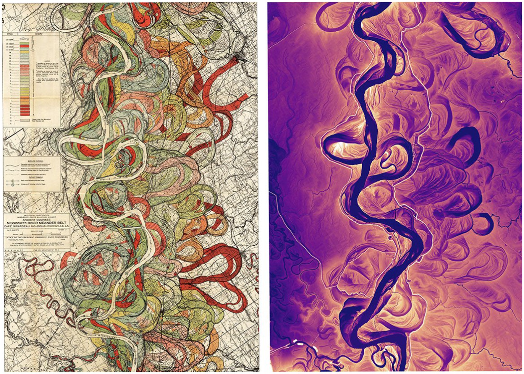
Figure 1. Fisk’s (1944) geofluvial map of the Lower Mississippi River is shown on the left and is used in comparison to Coe’s LiDAR REM map of the same reach of the Mississippi River.
In his REM maps of dynamic riverine environments, Coe often employs vivid sequential color ramps to highlight subtle elevation differences between lower-lying (darker colored) and higher-lying (lighter-colored) riverine deposits that would be difficult to distinguish using a traditional DEM map (see Figures 1, 11). Coe’s REM maps often omit several seemingly mandatory cartographic elements (e.g., title, legend, and north arrow). As a result, Coe’s maps take on the appearance of art more than science, inviting the map reader to wonder and be inspired, and evoking awe in the life and history of the river.
Might this same technique be helpful in illuminating subtle aspects of cultural heritage in a fluvial landscape? Due to their agriculturally rich soils, many of these types of riverine environments have attracted humans for thousands of years. Can REM maps tell us stories about such people’s relationships with the land? Coe explicitly states that this method is not recommended for generating REM in highly controlled rivers (Coe, 2023). However, could this method still be used to help reveal evidence of cultural heritage in the Netherlands?
1.4 Cultural heritage and landscape in the lowlands, the Netherlands
The Dutch, who live in the Netherlands, have demonstrated remarkable control over their landscape. Long before tractors and bulldozers were invented, the Dutch were building tall dikes by hand (and with beasts of burden) to keep water off the land. They have a long history of using windmills to pump water beyond the dikes’ boundaries. There is a relevant and common phrase in the Netherlands: “God made the world, but the Dutch made the Netherlands.”
The Netherlands, during its Golden Age of art, became famous for its paintings portraying vivid Dutch landscapes, a style that remains a source of national pride. Cultural heritage in the Netherlands is thus closely tied to the Dutch landscape, and thereby to their control of rivers and flooding (Renes, 2022). While artistic visualizations of these landscapes provide a direct link with contemporary understandings of cultural heritage, an equally vivid geomorphic picture of the Dutch landscape is recorded in patterns of sediment.
Polders are large areas of land that have been reclaimed from water, typically for agricultural use, and can be found throughout the Netherlands. The grand scale and audacity of Dutch polders have made them symbols of national pride, and journalists, writers, and filmmakers have long documented them as a form of cultural heritage (Renes and Piastra, 2011). The management of water in the Netherlands is an important issue that is closely linked to national security and the survival of the population. Water management has its own branch of national government, that are called Waterboards, with independent elections to combat corruption and political influence that could lead to system failure (Kolen et al., 2015). The Netherlands has its own vertical datum, as much of the country lies below sea level. This standard is the Normal Amsterdam Peil (NAP) or the Average Amsterdam water level, meaning the water level in the canals in Amsterdam is zero despite not being at sea level. The NAP is used as the vertical measurement system all over the country, in every lock, and other parts of Europe as well.
Water has also been used for military defense in the Netherlands. A string of fortresses known as the Dutch Waterline was strategically built to allow large swathes of the country to be flooded to keep out invaders (Renes, 2022). There have been many different formal water defense systems in what is now the territory of the Netherlands. The “Oude Hollandse Waterlinie” (Old Holland Waterline) functioned between 1672 and 1815. The Old Holland Waterline was replaced by the “Nieuwe Hollandse Waterlinie” (New Holland Waterline), which included newly constructed forts as well as refurbished forts from the old waterline (Ministerie van Onderwijs et al., 2018). The New Dutch Waterline defense system has been a United Nations Educational, Scientific and Cultural Organization (UNESCO) World Heritage site since 2021.
1.5 Region of interest: Linge River in the Netherlands
The Linge River is a long (108 km) and highly controlled river in the center of the Netherlands (Figure 2). Historically, it was an important line of transportation. The river was used to transport goods to and from cities, farms, and villages along the river, serving as a vital transportation corridor for the region. The dikes in this area were originally built with precision and optimal structural integrity for keeping water out. Elevated above the perennially soggy Dutch landscape, the crests of these dikes were naturally used as overland transportation routes for humans, animals, and wagons. Today, these dike tops continue to function as roads, but they are barely wide enough to accommodate two-way vehicular traffic.
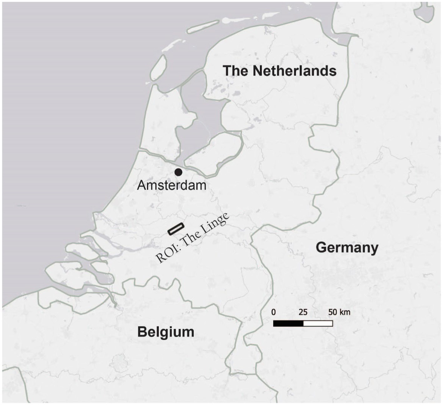
Figure 2. The map featured in this Region of Interest (ROI), represented as a rectangle in the map above, is 13 km long and located in the center of the Netherlands.
The region through which the Linge flows, also known as the Betuwe, is well known for its abundant fruit trees and recreation opportunities. During the spring and summer months, the Betuwe attracts numerous tourists, many of whom bike along the dike tops among the blossoming fruit trees. Others enjoy riding in slow-moving leisure boats, paddling, floating, or swimming along the river. A string of historic waterline forts situated along the Linge are now renovated and transformed into cozy cafes and museums.
Regularly spaced, numbered physical markers placed centuries ago along the Linge Dike on the north side of the river indicate that the dike was (and is) closely monitored by so-called Dike Watchers. Previously, men were stationed at these regular intervals for surveillance purposes, to watch for high water, dike breaches, or other threats. Their job was to safeguard those living near the river and to call more people to act if there were a dike breach, an attack, or any other emergency. The Dutch like to joke that the dikes and dike watchers were placed “to ensure we have dry feet.”
2 Methods
Here, I propose an exploratory method, utilizing publicly available open LiDAR DEMs to explore cultural heritage understandings through cartography. The methods proposed here are used to answer the following research questions:
• What are the strengths and weaknesses of comparing old maps to cartographic renderings using different types of DEMs (e.g., DSM, DTM, and REM), as tools for the digital humanities to offer insights into cultural heritage?
• Do these recent DEMs reveal traces of the landscape’s past?
• What features from an old map that illustrate cultural heritage can also be found in a recent DEM?
To answer these research questions, a four-part process was executed, and each step shared here can be modified (or omitted) based on the learning objectives of a research assignment or project. First, I downloaded DTM, DSM, and aerial photo data as well as an old map of the region of interest (ROI), and the most recent LiDAR DEM data of the same ROI. I downloaded and installed the open-source QGIS software (Section 2.1). The second step was to follow the tutorial offered by Coe (2023) to calculate the REM for the region (Section 2.2). Then, I tested various visualization parameters, including color schemes and elevation stretches, to gain insights into the ROI in the DEMs (Section 2.3). I explored which features from an old map that demonstrate cultural heritage could also be found in the DSM, DTM, and REM. Finally, I shared the maps with residents of the ROI. I used a think-aloud method (Roth et al., 2017) to collect their feedback about what they thought while looking at the different maps (Section 2.4).
2.1 Data access
First, I browsed old maps of the ROI and the Linge River using Utrecht University’s Old Maps Online, an online portal for viewing digitized, georeferenced old maps from the Utrecht University library archives (University and Collection, 2023). For the old map for this study, I selected an 18th-century municipal map of the Linge River whose spatial footprint extends from above (upstream from) Asperen down to Gorinchem (See Figure 3, top map), in the central part of the Netherlands (Bolstra, 1754).
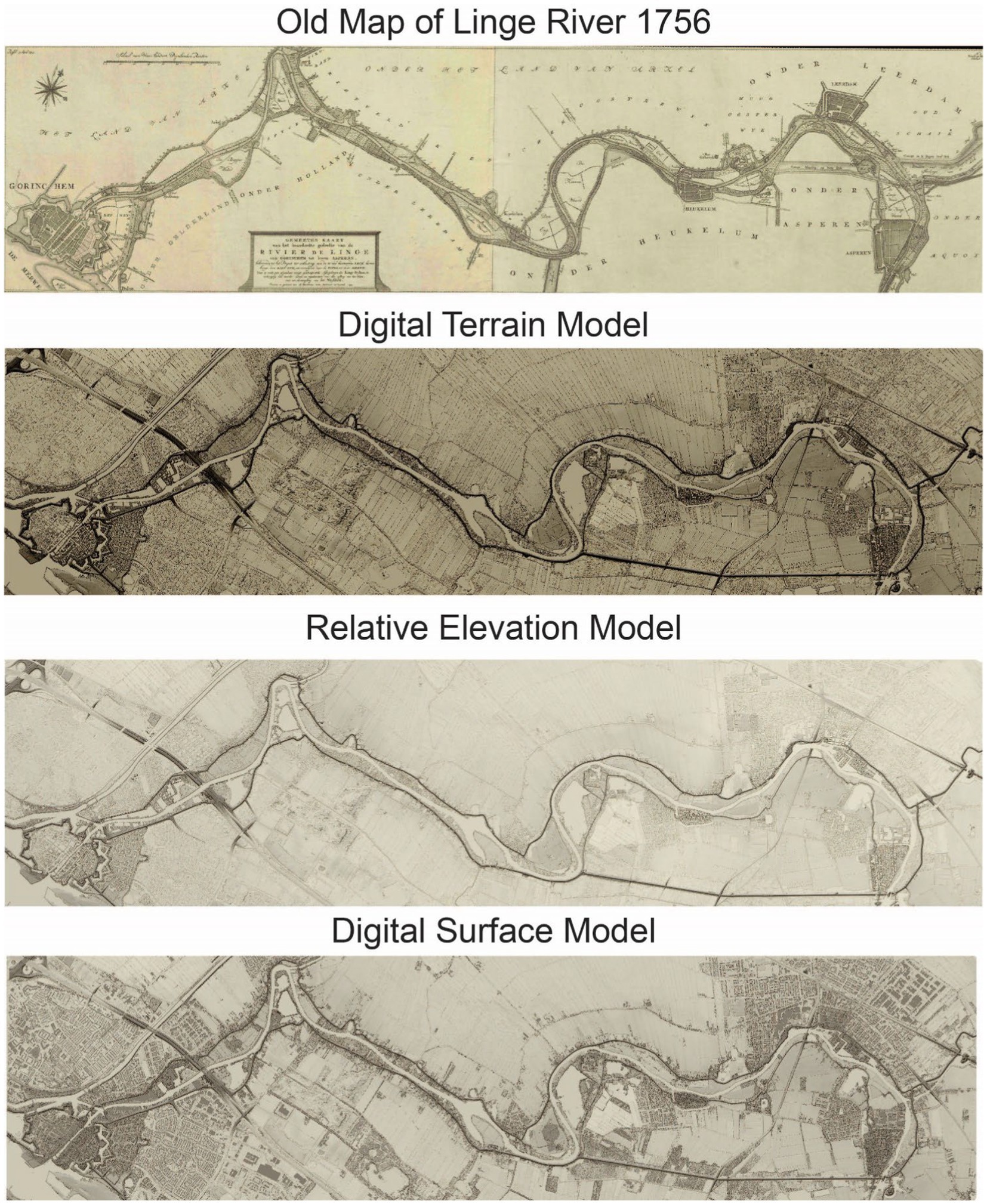
Figure 3. Using the same color scheme and elevation stretch, where 5 m or higher is represented in the darkest brown and −2 m or lower in the lightest shade, it is possible to compare the old map, DTM, REM, and DSM.
To interact with and manipulate the DEM and overlay the old map, GIS software is required. GIS is becoming increasingly accessible through open-data initiatives (Mainka et al., 2015; Ojo et al., 2015) and Free and Open-Source Software (FOSS) (Lamprecht et al., 2020). Quantum Geographic Information System (QGIS) is one such FOSS software. This software is available for both PC and Mac computers. I downloaded and installed the latest version of QGIS. Next, I downloaded all the DTM and DSM files for my ROI, along with digital aerial photographs of the ROI, to visually cross-reference selected spatial features between the various datasets. These data are made publicly available and freely downloadable online in the Netherlands. The LiDAR data used to generate these DEMs are collected annually by the Waterboards and other national agencies that monitor water and are made publicly available (Netherlands Waterschapshuis, 2023). Online data portals are available for downloading these data from the national water authority, through which users can browse and download DEM data by location (Rijkswaterstaat, 2023; van Natijne, 2023). I downloaded eight individual tiles of the DTM data and another eight for the DSM data, both acquired in 2023 for the ROI portion of the Linge River, and both covering the same spatial footprint of the selected old map (see Figure 2).
After QGIS was installed and all the DEM data were opened in the GIS, I then merged (mosaicked) the files in QGIS into a single file for each type of DEM. I named each new merged file to match the data type. For example, DTM_Linge.tiff. Next, I used the identification tool to query the river heights upstream and downstream in each layer of information, which are individual mosaicked DEM files. Using the Properties window, I noted the minimum and maximum river-height values for each of the DEM files to set the color values for each. Following Coe’s directions, I then made a copy of each layer to use to create a shadow effect. I did so by copying each DEM layer and renaming them accordingly, for example: DTM_Shadow_Linge.tiff. In the Properties window, I selected a hillshade shadow effect to make the features pop out visually. Next, I changed the color scheme. In the Properties window, I selected “Single band pseudo color,” and I adjusted the minimum and maximum values relative to the upstream and downstream values. These are important to set manually, so that the visible range of values accentuates the local variation within the map along that specific section of the river.
2.2 Generate the relative elevation model
To create the REM, I followed Dan Coe’s tutorial, which utilized the cross-section method (Coe, 2023). First, it is necessary to draw two-dimensional (2D) cross-sections across the river at regular intervals, with each cross-section extending laterally outward from the river beyond the width of the ROI. All points along a given cross-section polyline are then snapped to the elevation of the river centerline at the corresponding point of crossing. A smoothed three-dimensional (3D) surface is then interpolated between these cross sections, generating a linearly referenced map that records the elevation of the nearest point along the river. Then I took the original DTM and subtracted the new interpolated file to make the resulting REM. Each step is clearly described on Coe’s website; however, based on the data I was working with. I had to make some modifications, which I describe in the following. Note that in Dan Coe’s tutorial, an example from the United States is used, in which a DTM is ambiguously referred to as a DEM.
The main steps are as follows:
• Load the mosaicked DTM file in QGIS.
• Open the old map in QGIS
• Georeference the old map to the DTM file under layer→georeferencer
• I created a new layer and in it a new polygon that outlines the bounds of the old map, the ROI, for comparison purposes later.
• I created a series of lines that cross the river perpendicularly and extend beyond the ROI polygon. The resulting interpolated file will be shaped like the connecting end nodes of the cross-sections, creating a new 3D polygon shape and cutting everything else in sight. The resulting shape may look awkward; keep this in mind. It is essential to ensure the cross-sections extend past the bounds of the ROI.
• In this step, I had to make modifications to Coe’s directions in terms of the annotation of cross sections with elevation values. The values for each cross section need to be descending following the river, since water runs downhill. Coe’s directions state that each cross-section value should match the river elevation value for the pixel where the cross-section crosses the river. However, in the DTMs from the Netherlands, the river value is set to zero for the entire river. Since the dikes are built to keep the water out, many parts of the land around the river are below zero. For these reasons, I made estimates for the values based on the upstream and downstream values identified in the DTM.
• Once estimated, representative values (descending downstream) were assigned to each cross-section. I then proceeded to create the triangulated irregular network (TIN) as the model for the interpolated surface that represents the elevation values relative to the river. This is the most computationally intensive step of the process and may take some time, depending on the power of your computer and the size of the file or area.
• Next, using cell-wise raster band math, I subtracted the values in each cell of the original merged DTM file from the corresponding area in the newly generated TIN model to generate the final REM. This new REM shows the recorded difference in elevation for a given pixel between the original DTM and the elevation of the assumed closest point along the river, thereby accentuating subtle elevation differences.
• Originally, I did not clip the merged images. However, to reduce the size of the files and to focus the map user’s attention, clipping the files to the polygon of the ROI is useful.
2.3 Visual variable color and elevation stretch
Next, I explored the data by interactively adjusting the color scheme and modifying the elevation minimum and maximum values to distinguish the desired range of elevation values upstream and downstream. I also tried different types of color ramps (e.g., sequential, diverging, and monochrome) to observe the visual differences between each. While adjusting the color scheme interactively, it is possible to see the nuanced variations in the landscape that would not be visible otherwise. I changed the color scheme and elevation stretch in the DTM, DSM, and REM for comparison purposes to explore whether anything can be found in relation to national heritage in the different nuanced elevation models. Then, I used the layout tool to export the JPG file used for printing the maps.
2.4 Qualitative data collection: one open question
The maps produced in this research were shared with four residents of the town of Asperen. A think-aloud protocol was implemented. Participants share their thoughts as they interact with the map in real time (Roth et al., 2017; Suchan and Brewer, 2000). The maps were printed on a huge paper (120 cm × 40 cm) to match the size of the original printed old map. These maps were rolled out on a table. The participants were presented with the maps by the map maker of the DEM maps, and they were aware that the presenter had created them. They were asked only one open question: “What do you think?” The reason for picking only this open question was not to influence a specific response about cultural heritage, cartography, or anything else.
3 Results
In this section, I share the results from the exploratory methods used to interact with the DEMs and then compare them to the old map. Here, I compare the different types of DEMs generated using the methods described above. I show how different choices in color scheme and elevation stretch ranges display different relationships and patterns in the landscape. Finally, I share the results from the think-aloud protocol.
3.1 Results of comparison between the DTM, DSM, REM, and the old map
The results of the DMS, DTM, and REM are compared with the old map. First, it is essential to note the file sizes (see Table 1). The spatial resolution for all three DEMs was high, with pixel dimensions of 0.5 × 0.5 m. The full extent files were all well over 3 GB each. The minimum and maximum values are relevant for the stretch values of the elevation for each file.
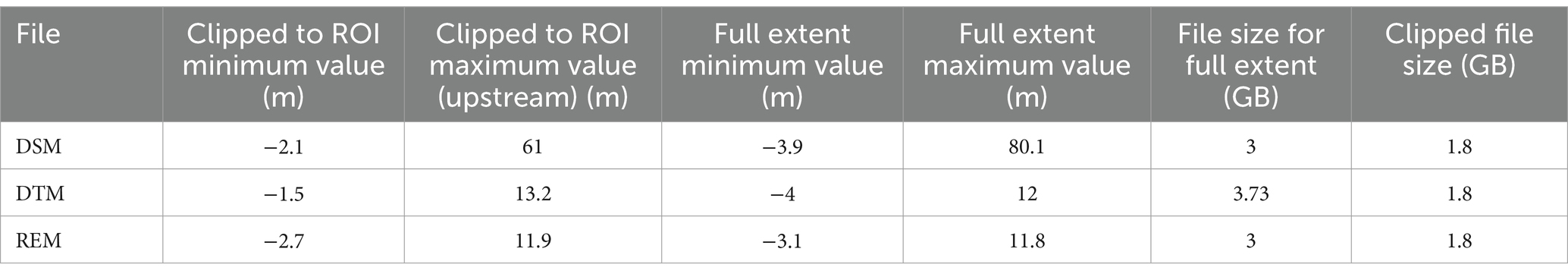
Table 1. Highest and lowest values in each DEM type.
For the easiest comparison between the old map and the different DEMs, Figure 3 presents each DEM using the same elevation stretch and a single saturated hue, to match the same color scheme as the original old map; the darkest brown represents objects 5 m or higher above NAP and the lightest colors −2 m or lower than NAP. Comparing the old map with the new REM is useful in identifying unique features and finding differences and similarities between the two. I used a similar color scheme to facilitate comparisons between the maps, making it easier to preserve the historic look and feel of the map. In terms of cultural heritage, the dikes are valuable and serve as a form of protection. As can be seen in the map shown in Figure 3, these dikes still stand firm, 300 years later. The same small villages depicted on the old map from the 1700s, which are far older, are still there today.
In all DEMs, the dikes were prominent. The more detailed differences between the DEMs are not readily apparent in Figure 3. I used a diverging color scheme to evaluate differences as recommended by Brewer (1996). Figure 4 illustrates the DSM, DTM, and REM using a red-to-blue diverging color scheme, with blue representing the lowest evaluation values and red representing the highest. In the DSM, the built environment grabs the viewer’s attention and dominates the map.
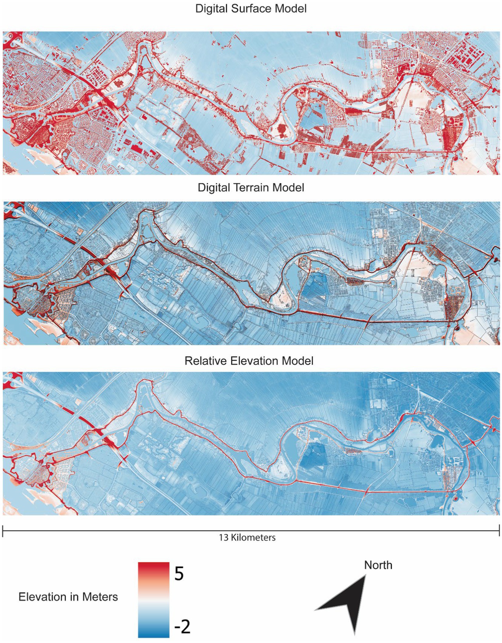
Figure 4. Using a diverging color scheme, it is much easier to see the variation in this map. This DSM displays built structures and trees, offering the map reader a glimpse of the current landscape context. Here the reader can compare the DSM, DTM and REM.
When examined at the variation in ground elevation alone, the flood deposits that are visible in the REM and DTM are rendered invisible in the DSM. The DSM displays rich detail of the built environment, trees, and human settlements around the river. The dikes are significantly higher than the surrounding ground, making them clearly visible in the DSM, DTM, and REM.
As shown in Figure 3, the same elevation range, or stretch as it is called in QGIS, is used for each file type; the same data are represented using a red–blue diverging color scheme in Figure 4. In Figure 5, the area is focused on Heukleum and an area where the river bends. A different diverging color scheme—orange–purple—is used. Different elevation stretches are used for the two types of DEMs, as otherwise, they would be too saturated to discern any variation. It appears that there are two dikes in this region. Different elevation stretches are used to try to extenuate differences in the landscape. However, the differences are minimal. One area appears to be significantly lower than the rest of the area, suggesting that it may be a polder. Concentric dikes are visible. Just outside the bounds of the dikes, it appears that some sediment was fanned at some point in time.
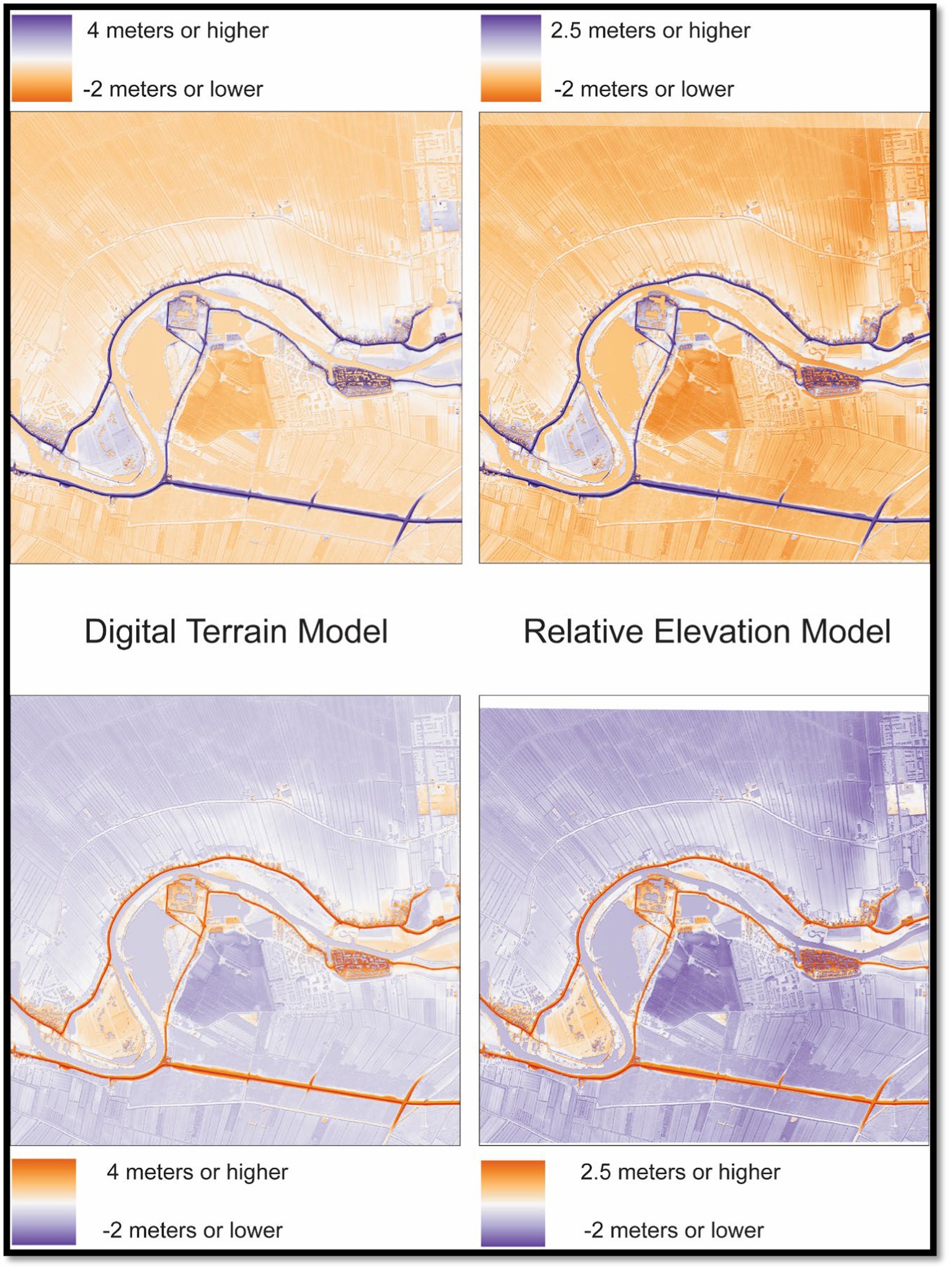
Figure 5. Comparing elevation differences between the REM and DTM.
The DSM displays the entire landscape, including houses, churches, and trees. The color scheme of the elevation represents the highest and lowest points in the area, including buildings. In the DSM, the landscape details are lost in the visualization, and the eye is drawn to the built features and taller features, such as trees. Human-made features, such as houses and fortresses, are most visually prominent in the DSM.
Comparisons between the DTM and DSM for the same area along the Linge, in the town of Asperen, as can be seen in Figure 6. The map in Figure 6 on the left is the DSM, which shows the tops of the buildings and the tree canopy captured by the first LASER pulses. Based on the elevation map on the right, it is clear why these villages were first built on higher land. The sentiment was likely due to the sediment deposited by the river. A neon diverging color scheme is utilized here. It is one of the defaults in QGIS, and the bright yellow grabs the reader’s attention, contrasting well with the dark purples that represent low areas. The DSM on the left in Figure 6 features an elevation stretch with 15 m or higher are represented by the brightest yellow and 3 m or lower are represented by dark purple. The DTM on the right in Figure 6 uses an elevation of 7 or higher, represented as yellow, and 1 m below or even lower than the NAP, as dark purple and white indicate “no data,” such as the river or hollow shadows of buildings.
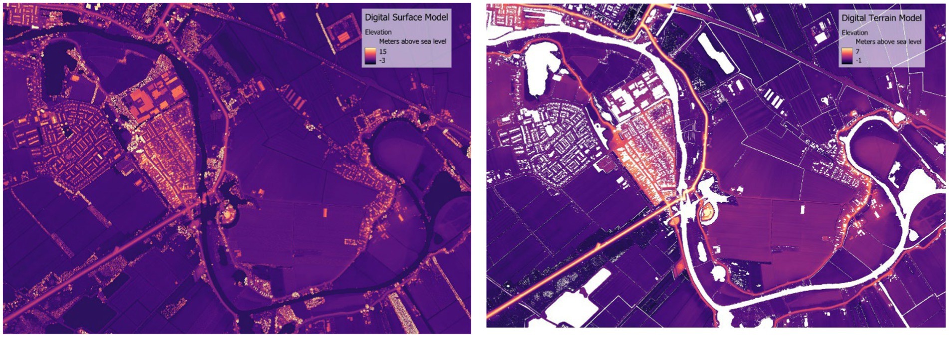
Figure 6. Differences between Digital Surface Model on the left is that includes trees and buildings where as the on the right the Digital Terrain Model does not. For this reason, different elevation scales were used because the highest values are very different in the two elevation models. In the map on the right, the DTM the contours of the fields are visible, where as in the DSM, they are much less prominent.
3.2 Cultural heritage findings
The Netherlands is an essentially uniformly flat landscape. Many large rivers run through the country to reach the North Sea. The old map of the Linge shows the value people placed on building the dikes to keep the Linge River within its boundaries. Rivers typically meander over time. The Linge River is a highly controlled river and has stayed within the diked boundaries that were built by the Dutch people hundreds of years ago. The centimeter variation in the terrain is challenging, if not impossible, to see when standing on the ground. The map in Figure 7 displays the DTM for the same area as the old map; the darkest blue is 3 m below the river, while the white represents 3 m or higher above the river. Straight lines on maps mean human-made objects. Farmers dug drainage channels to have multiple functions. They were used to move water out of arable land and to act as fences to keep livestock in their fields (Figure 7, label 1). Notice that the town of the old Roman city of Asperen is built on higher ground, where the river would have deposited more sediment (Figure 7, label 2). It was safest to build on the highest ground, which is why the settlements were placed there. Finally, note the Dief Dike, which means “thief’s dike” (Figure 7, label 3). While evidence of this dike dates back to the 1200s, it was reinforced and incorporated into the historic Dutch waterline in the 1800s as a defense mechanism (Ministerie van Onderwijs et al., 2018). In the old map, the concept for the Dief Dike is annotated, and it was built and still stands today, visible in all of the DEMs. In the bottom right section of this map, the fortress—now known as the GeoFort—is visible. The two fortresses in this map are part of the Dutch Waterline, now a UNESCO World Heritage Site (Ministerie van Onderwijs et al., 2018). The fortress city of Gorinchem, located in the bottom left section of the map, is visually prominent, as it is where the Linge River meets the much larger Waal River.
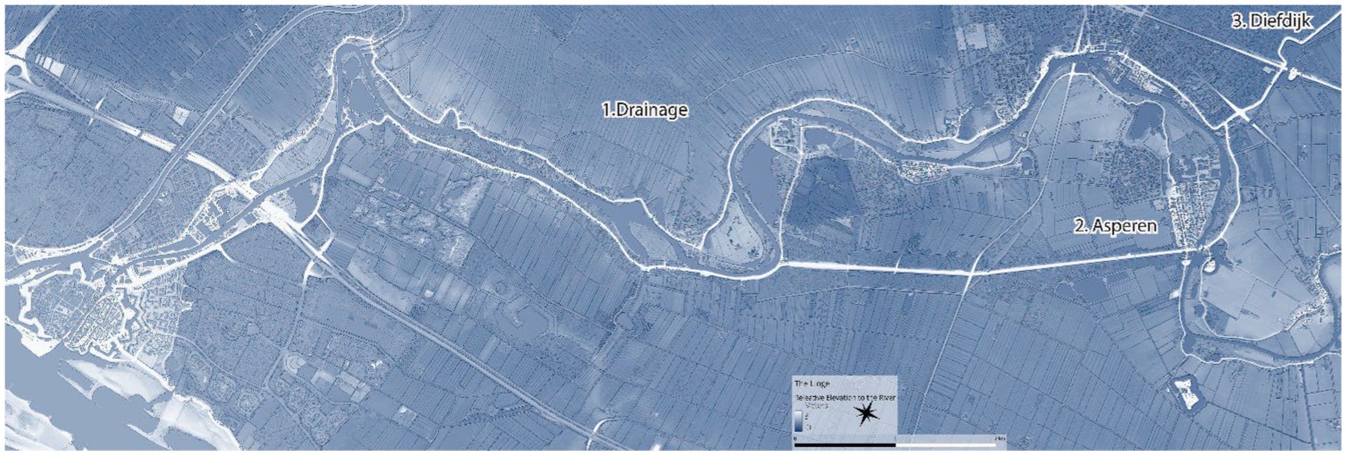
Figure 7. Three features are labeled: 1. the human-made drainage channels, 2. the town of Asperen, and 3. the Dief dike. The fortress city of Gorinchem is in the bottom left of the map. In this REM with a shadow effect, the darkest blue represents 3 m below the river, and white represents everything higher than 3 m above the river—see the subtle changes in elevation outside the bounds of the dike system that bounds the river.
3.3 Results of comparison between different elevation stretch values and color schemes
Coe recommends experimenting with color schemes and elevation stretches to bring different features to the viewers’ attention, allowing for a comparison of results from a variety of color schemes. To quickly make the visual connection that water flows downhill or downstream, intuitively, blue made the most sense as the color palette.
For the following map, Figure 8 DTM, I used a multihued diverging color scheme—again red–blue. Fluvial deposits between the bends of the river are noticeable; the change is very small, but visible in this minimal elevation stretch. The river level has NAP zero in the middle of the color scheme. Using dark blue to represent any area 2 m below the river edge or lower, and red to represent 5 m or higher above the river. Notice here where the river deposited sediments (represented in yellow) in sections around the river, both inside and just outside the dikes. The deposits outside the dikes would have been left there before the dikes were built. Red represents high ground or safe areas, so the dikes and the fortresses grab the reader’s attention. These relative elevation maps clearly convey that older villages were placed on higher ground, at bends in the river that were and are ever so slightly higher due to the rich and high soil deposits the rivers left.
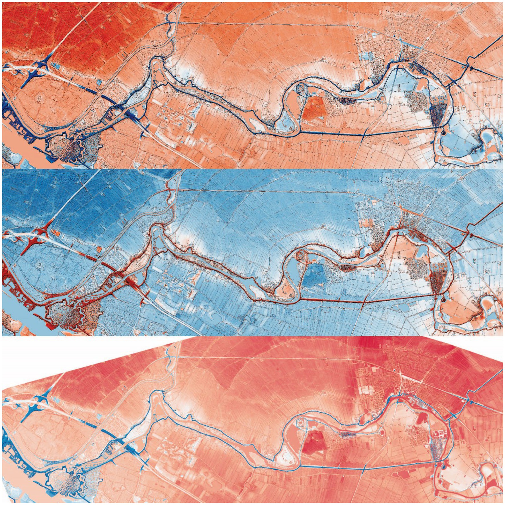
Figure 8. In the top map, the DTM is represented by red for high (4 m or more NAP) and blue for low (−2 m or lower NAP). The DSM is a shadow, allowing trees to be visible in the top two maps. The map in the middle represents the same DTM data with an inverted color scheme, where blue indicates water and red signifies safe areas. The bottom map is the same elevation stretch created with the relative elevation model (REM).
By adjusting the elevation range stretch instead of using the default minimum and maximum values in the entire file, the subtle differences in the flat terrain on the floodplain become visible since the color ramp only covers a limited range of elevation differences.
By changing the color scheme and stretch, the map maker highlights different features. Attention is drawn to the different regions around the river and ROI when different color schemes and elevation stretch results are used, until the desired results are achieved. This is an exploratory process.
Colors may convey emotions. Figure 8 shows the extent of the entire area and the comparison of inverting the color scheme, which may give the map reader a very different perspective. This may alter the story of the map: a feeling of safety (cool colors such as green and blue) vs. a feeling of menacing threat (represented by warm colors like red and orange) from the river. This can be seen particularly well in the middle map in Figure 8, where the orange areas represent fluvial deposits, with red indicating high and blue indicating low.
Figure 8 shows that the stretch is between −2 m and 4 m above the river, whereas the maps in Figure 9 offer different color schemes and different elevation stretches. The maps in Figure 9 are centered again on the town of Asperen, to focus the reader’s attention on this section of the map and the detailed variation there. Blue is zero, indicating the level of the river or a level below zero. Following the dikes in red, many house footprints can be seen built on these higher elevations.
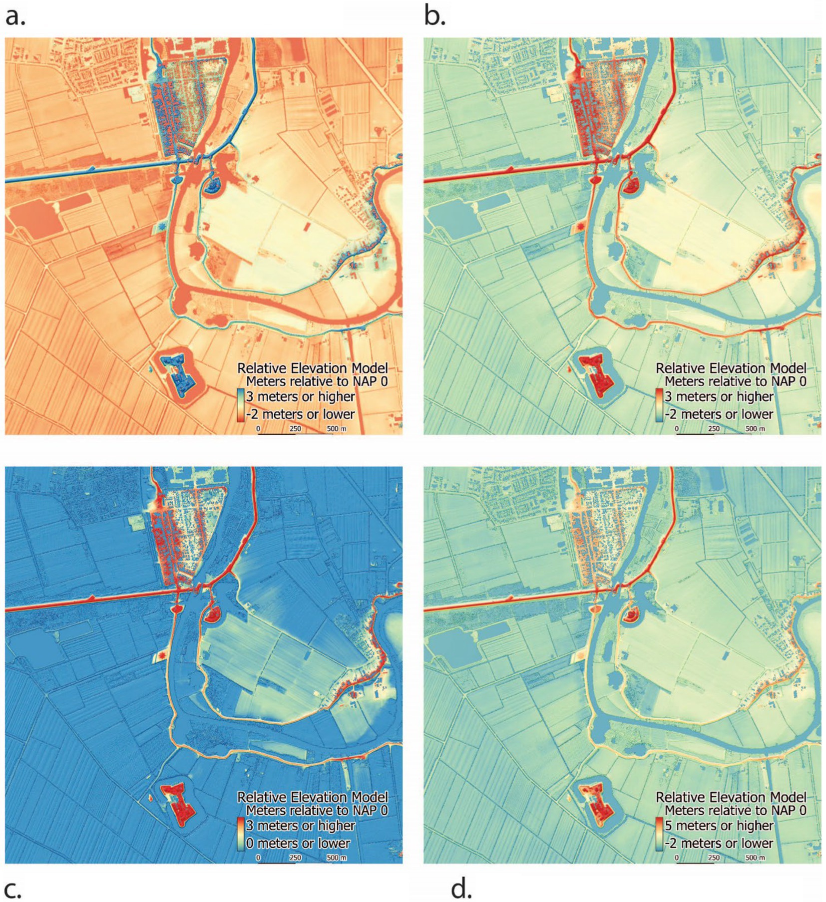
Figure 9. Compare the differences in these maps between color schemes and elevation stretches. (a) Diverging color scheme. (b) Inverted color scheme. (c) Blue is everything lower than 0. (d) Blue is the river and lower.
3.4 Qualitative data results
These maps were shared with four inhabitants of Asperen. Taking a think-aloud approach, the participants were invited to answer the open-ended question, “What do you think?” as they viewed the map. The participants shared many ideas related to esthetic design, safety, and local knowledge.
Readers said they found all of the maps intellectually stimulating and made them think about their town and area in new ways. They said that while they liked the diverging color schemes for data exploration, they would only consider hanging a map on their wall with the color scheme that matched the old map (the Bottom map in Figure 5 was the overwhelming favorite). No one showed interest in the map legends. Although not directly asked, it was clear from their interactions with each map that the map readers preferred examining the DSM since it offered more cognitive anchors—familiar places such as buildings and trees that they recognized in the landscape. They gave verbal and nonverbal cues that they enjoyed viewing this perspective of familiar places.
Through non-verbal cues, such as attention and getting close to the maps, touching them, and discussing what they see, it was clear that the maps evoked interest and wonder. All four participants were able to quickly locate the town of Asperen and orient themselves, as well as identify familiar places.
The map showed very slight elevation differences, but the reader interpreted it as conveying safety. One participant, when viewing the town of Asperen where they live, said, “Look, we are safe since we are so much higher above the river.” The main street in the town of Asperen is only about 4 m above NAP. Compared to the fields around it that are below NAP, this appears safe and high. The color scheme did not appear to influence the opinion of safety. If red was high or low, that did not appear to affect the feeling of safety or fear. The participants also expressed pride in the fact that the dikes are still intact. This gave the local map readers a feeling of national control of the river.
Just below the town, a star is visible in the landscape (Figure 10). The map maker was unsure of what this strange object was, as it was not visible from the ground. The four participants from Asperen all knew that this was a former landfill that had been covered over in the shape of a star and is now a picnic area (see Figure 10). Participants also commented on reference points. They noticed the two fortresses just outside the city of Asperen to the south, which are now a restaurant and a museum. These forts are built into the ground, so it is not possible to see their sharp angles from the ground. Looking at the DEM, the star shape was prominent and clearly higher.
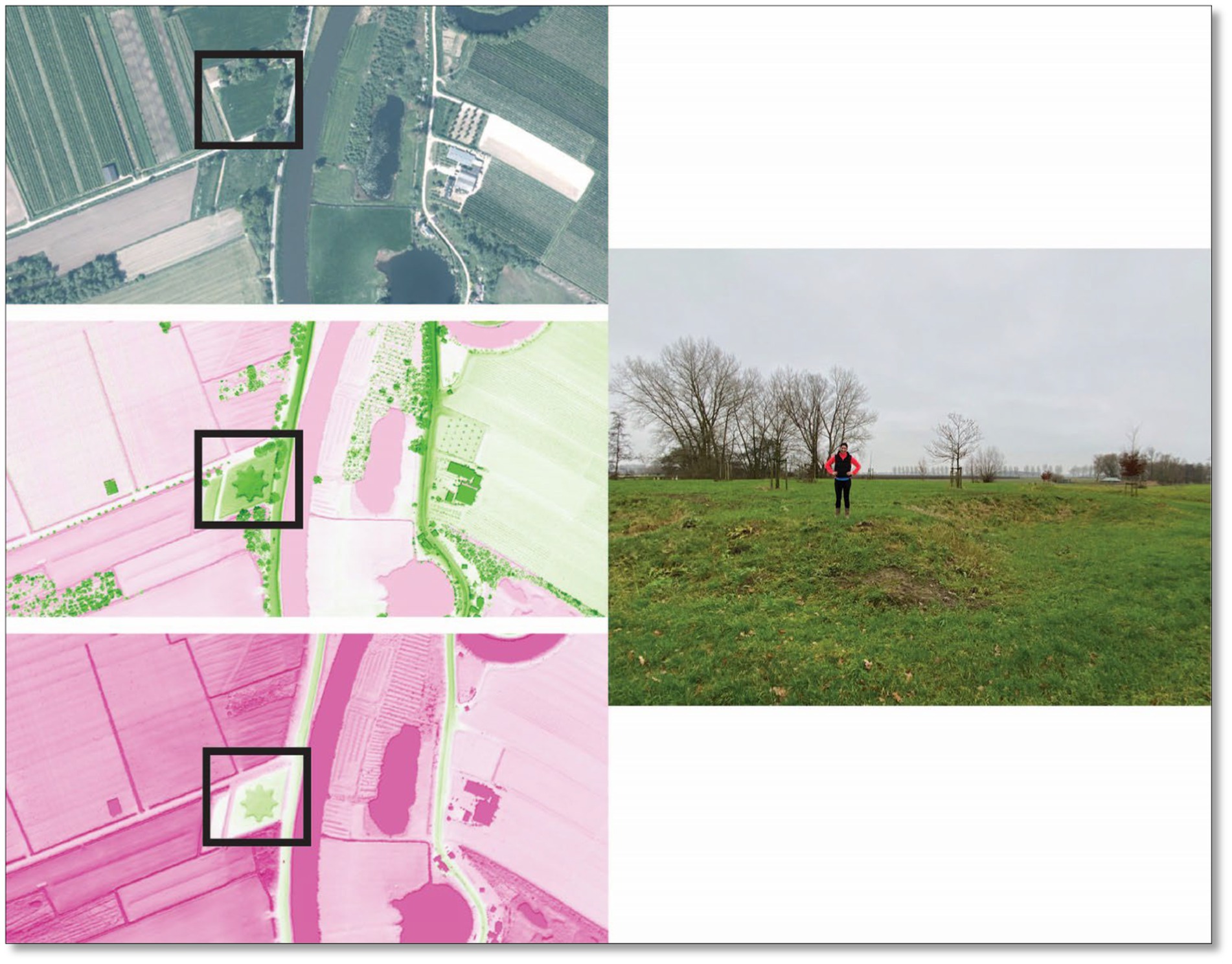
Figure 10. The map on the left, at the top, is an aerial photo, the middle is the DSM, and the bottom map is the DTM. See the star that is only visible in the two DEMs; it is a covered-over landfill. On the right is a photo of the author standing on top of a point of the star, for scale. Written informed consent was obtained from the individual for the publication of any identifiable images or data included in this article.
Figure 10 clearly illustrates features in the landscape that are not visible in familiar aerial images, further showing the value in working with DEMs.
4 Discussion
Landscapes inspire regional and national identity (Renes, 2022), and maps of elevation can foster an understanding of landscapes. REM is heralded for its emphasis on the prominence of riverine geomorphology. This exploration was inspired by Dan Coe’s maps of wild rivers in North America, which are visually striking, often using neon colors and stark black background to evoke wonder and awe of the natural and wild beauty of the rivers in North America. Here, I took a grounded theory approach to explore the value of this process. I illustrate how these maps and DEMs can be used in the digital humanities to illuminate cultural heritage. Even though geologists and physical geographers study different time scales, intervals, and aspects of landscape change compared to those in the humanities, integrated and systematic ways of utilizing the same data can be useful in synthesizing changes in the environment.
Based on the results shared above, it was possible to answer the research questions: What are the strengths and weaknesses of comparing an old map to different cartographic renderings of each of the different types of DEMs, as tools for the digital humanities to offer insights into cultural heritage? Do these recent DEMs reveal traces of their past? What features from an old map, illustrating cultural heritage, can be found in a recent DEM?
4.1 Strengths and weaknesses of the different digital elevation models for cultural heritage research
Each of the DEMs was useful for exploring cultural heritage in this context. For example, the dikes were very visible in each DEM, which made them easy to see and compare with the old map. DSMs offer present-day reference points for the map reader, which often act as anchor points for them and rich conversation fodder. Using the shadow effect to illuminate the buildings is helpful in the map reader who may be familiar with the landscape; it offers more context about how the land is currently being used. Overlaying the DTM on top of the shadowed DSM made the most visually compelling map.
The DTM with a tight elevation range set for the stretch in the color scheme is sufficient to see the minimal variation in this highly controlled river. Since there was little difference between the DTM and the REM in tightly controlled rivers, the step of creating the interpolated layer required for the REM to accentuate the differences in the surface is unnecessary in this particular context. The method of generating an REM is relatively advanced, as it requires extra effort, time, and computing power. If the REM appears too complex and computationally intensive, there is value in investigating the DSM and DTM and comparing only those.
In the context of controlled rivers, interesting patterns can be seen for comparison between visualizing the DTMs alone, which is valuable, while the REMs are valuable for displaying the marks of natural processes on the landscape, such as the geomorphology of rivers and how humans influence them. Coe cautioned against using building REMs for controlled landscapes (Coe, 2023). It was found that he was correct. DTMs can effectively demonstrate elevation differences in a controlled floodplain. Using different forms of DEMs to explore these regions is still valuable for cultural heritage.
The DSM provides more insight into the current built environment. This was a useful reference for the map reader who was familiar with the current landscape. However, when using the DSM to render the elevation stretch, all detail in the floodplain and riverbed was lost. This completely shifted the reader’s attention; it washed out details related to the terrain and focused on the highest points on the map: the houses, churches, and trees. Adding the DSM as a shadow, the stretch of elevation in the DTM was useful to focus the reader’s attention on the river morphology (or lack thereof), while providing recognizable features such as buildings for orientation purposes. Therefore, it is recommended to experiment and combine datasets in different ways, depending on the communication goals or exploration aims of a cultural heritage project. In Table 2, I provide a general overview of the strengths and weaknesses for decision-making of the different types of DEMs for use in the digital humanities.
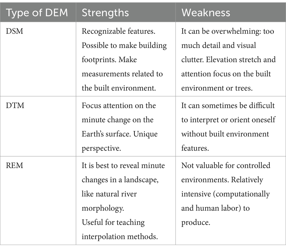
Table 2. Strengths and weaknesses of different types of DEMs for quick comparison.
4.2 Cultural heritage findings in the region of interest
As mentioned earlier in this article, I was curious to find out whether the infrastructural choices made hundreds of years ago in relation to water management are still visible in the landscape today. Do these recent DEMs reveal traces of their past? And what features from an old map, illustrating cultural heritage, can be identified in a recent DEM?
It is known that nationalism and cultural heritage in the Netherlands is closely tied to their landscape and control over rivers and flooding (Renes, 2022). This was reiterated in the think-aloud protocol. Through qualitative data collection, the local map viewers expressed a sense of cultural heritage and pride when viewing these maps. “Look how well we have protected our communities from water from the rivers.” It is striking to see how little the river has changed in the past 261 years. The Dutch have been successful in preserving their landscape and “keeping their feet dry.”
The old map, compared to the maps of the different types of DEMs, illustrates how well the Dutch have controlled the river, as the riverbed has remained unchanged. What is remarkable is that this map from 1756 shows the dikes that were and still are in place, as well as those that have been built since then and are still standing high and strong. These maps are historical artifacts that have influenced infrastructural choices linked to water management that can be found in the landscape today. This proves how the Dutch have controlled the river for the past 350 years. This was most noticeable when presenting the big printed map. It clearly sparked discussion and ideas that could be useful in combination with conducting an oral history. The management of water is such an important issue linked to national security and the survival of the population.
The Netherlands is very flat, so slight changes in elevation are difficult to see when standing on the land or even viewing from above. It is hard to determine which way is downstream of the river because there is such a minimal elevation change, and the river is so slow-moving. In these DTM and REM maps, it is clear to see that the main street in Asperen (the first street built) was located in the highest region, likely due to flood deposits. With the diverging color schemes, these only slightly higher land areas are visible to the map reader. The maps can help improve understanding about the natural characteristics and physical properties of the environment linked to cultural heritage.
Land use in the Netherlands is highly controlled, so the changes in the bends of the river Linge are not striking; it does not meander past the bounds of the dikes. These REM maps of the Linge River depict a sense of security, cultural heritage, and pride in controlling rivers in the Netherlands, making room for the water within the bounds of the dikes for hundreds of years (Renes, 2018).
Other features that can be seen on this map include the straight human-made lines that represent the tiny drainage canals built for agricultural purposes (Figure 7). While presenting these maps to locals in the area, they shared their knowledge of the history of the landscape that I would not have noticed otherwise, such as the old landfill in the shape of a star, which is now covered with grass and acts as an elevated picnic area (Figure 10). While not visible on the old map, participants’ attention was drawn to the fortresses that were visible in all of the DEMs. These fortresses were built after 1845.
4.3 Cartographic design principles: color scheme and elevation range
The color choices on the map influence where the viewer’s attention is drawn first. Further research to investigate the influence of color on understanding the cultural heritage and flood risk could be valuable. Through the qualitative results, it was found that they did not influence the emotion of the data being presented—no fear of low elevation, for example. Participants mentioned that they liked the maps, which matched the color scheme of the old map, featuring neutral colors. While it has been noted that multihued diverging color schemes are useful for accurate interpretation of quantitative information—to emphasize differences in values (Brewer, 1997)—this was not directly tested in the study design and could be in future research.
Esthetically, the maps of the controlled Linge do not appear as mysteriously sinuous and wild as the Snake River map in the United States created by Coe (see Figure 11). The maps of the Linge still evoked excitement and wonder via non-verbal cues from the participants, which could be due to a priori knowledge of the region. In Figure 10, the top map is of the highly dynamic Snake River in Idaho, a map made by Coe, and the bottom map uses a similar striking neon color scheme, displaying the Linge River, not nearly as electrifying or as active as the wild and uncontrolled Snake River. This clearly illustrates why Coe recommends not taking the effort to make these extra steps of interpolation.
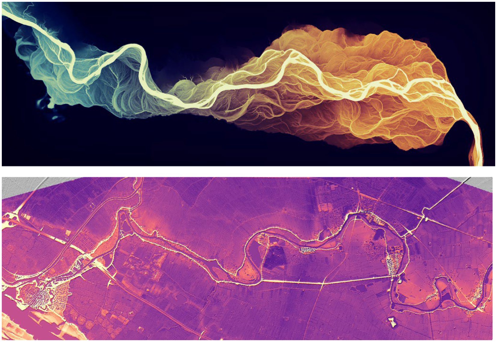
Figure 11. The top map shows Coe’s map of Snake River in Idaho, where the river is wild and uncontrolled, and the elevation change from downstream to upstream is visible. The bottom map shows the Linge, which is a highly controlled river.
4.4 Value of the process of making the maps
The process of making REMs and changing the color scheme for elevation values for the stretch of any of the DEMs is extremely pleasing, making the person using the GIS feel like they are making new discoveries. The level of detail visible on the map influences the type of new questions and answers. For example, being able to work with GIS and change these color schemes and values on the fly gives the student or researcher the freedom to explore what is in the region and what narrative could be generated by what is made visible on a map. It is a valuable digital literacy and GIS skillset for students.
Choices include color, stretch of elevation, and where to center the map. This type of analysis will offer rich fodder for scientific research as well as striking artistic creativity. Cartography is an art and a science. Color is also a significant art of cartography. This could be an exciting assignment in a humanities course. Using the methods offered here presents an opportunity to present a highly interactive environment to spark critical thinking about places students are familiar with, or places far away, to explore new ideas. Learning the value of cartographic principles can help convey unique information about cultural heritage and history.
These methods could be helpful to explore cultural heritage in other parts of the Netherlands and the world. Digital elevation models are available globally, although not necessarily at this spatial resolution. Since DEMs are often publicly available, and the software is open source, this exploration could be done almost anywhere.
Finally, future research could the use of these maps with cultural heritage experts, and more in-depth qualitative studies to determine what can be learned from the maps and which visual variables facilitate this learning. The discussion of color could be systematically evaluated further to see how users interpret information based on different color schemes. For example, these methods of comparing maps with DEMs could involve historians who have specific questions about a region. Targeted questions for map users could be useful to learn about the use of color and what people specifically learn from these maps. More systematic user studies could be conducted to gain specific insights about a place and what can be learned from the map. These maps could be used in oral history to evoke new ideas or spark discussion points in a particular location. Students could make the maps and then invite either locals or historians to use a think-along protocol to reflect on what they think when they see the map. This could be done with high school students or university students in the humanities. The influence of a priori knowledge of a place could also influence what information is learned from a map and what the participant shares in the think-aloud protocol. There are questions for those who create the maps, in both classroom and research settings, about understanding the value of the process vs. the value of the maps alone. Further research could be done to investigate how color influences feelings of national pride and cultural heritage, or whether it does not!
5 Conclusion
Landscape patterns can help historians construct narratives to answer questions about cultural heritage. Cartography and GI can be an asset to those studying the humanities (Joyeux-Prunel, 2020), particularly the cultural landscape. Maps and the process of map-making can help facilitate understandings and discussions about the environment in relation to history and cultural heritage. What is displayed in a map influences what can be learned about the landscape. For example, the range of elevation values, the unit of measure (science), and the color scheme (art) all influence what is communicated and what is learned by the map viewer.
Epistemological perspectives from history, archaeology, cultural ecology, and anthropology could all glean valuable insights from the GI of landscapes. Maps enable answering spatial questions that interest these different perspectives. The digital humanities stand to benefit from the use of DEMs to compare with old maps. New discoveries and connections can be made by comparing historical accounts with recent spatial data such as DEMs. Comparing DTMs, DSMs, and REMs specifically could also be a useful exploratory device in the classroom and the digital humanities. Different types of digital elevation models reveal different patterns and serve diverse purposes, based on the specific research question. Seemingly simple button clicks to change the visual variable of color on a map can change the esthetic quality, the feel of the map, and what is discovered by the reader and researcher.
This spatial approach, embracing GI and spatial technologies, offers an opportunity for exploration by those in the humanities to glean new insights and unlock secrets from the digital terrain. Connecting traditional data sources, such as old maps, with clues found in the landscape using recent data and digital cartography is considered a spatial approach to the digital humanities. Illuminating DEMs can contribute to cultural heritage and help build, refine, support, and communicate a sense of shared identity tied to the landscape.
Utilizing these methods in the classroom is an opportunity to teach valuable digital literacy skills, such as finding and downloading relevant data, using open-source software, and creating maps. This is an engaging way to teach students a technical skill and digital literacy, combining computational thinking and topological relationships between objects.
Maps can be presented and used to ask questions about the historical context, memory, and feelings associated with a place. In the context shared here, a sentiment of pride over the controlled landscape was shared and provided feelings of safety. Using the different color schemes and elevation stretches, different details in the landscape became visible, allowing for visible variations. Implementing these methods for digital humanities can give the researcher or student control over the visual narrative by guiding the reader’s attention through the choice of color, the type of data, and the stretch of the elevation. While this may sound intimidating, this can all be accomplished using open-source software and open data.
The aim of this study was to illustrate the value of cartography, using different types of DEMs and visual variables, such as color, as an exploratory device in the digital humanities, particularly in cultural heritage studies. Creating maps using GIS can be useful for comparing them to old maps and learning about how humans have shaped the landscape over time. I demonstrate how using DEM to create maps can reveal cultural heritage and historically relevant information. They can be used as a device for exploration, to identify new connections and patterns, and to spark excitement. In this case, I demonstrated how humans have controlled nature for hundreds of years. These maps serve as boundary objects to facilitate discussion and spark new ideas among scholars, stakeholders, students, and local communities. Here, I demystified the process of utilizing DEM and GIS to uncover secrets hidden in the terrain that would otherwise go unseen.
Data availability statement
Publicly available datasets were analyzed in this study. Data used in this study were downloaded from Actueel Hoogtebestand Nederland (https://www.ahn.nl/dataroom). This data can be found at: https://geotiles.nl/.
Author contributions
BR: Methodology, Visualization, Writing – original draft, Writing – review & editing.
Funding
The author(s) declare that no financial support was received for the research and/or publication of this article.
Acknowledgments
This article is written in memory of Professor Hans Renes. Before he passed away in 2023, he shared many valuable ideas in his guest lectures in the course Environmental Impact Assessment at Utrecht University. Discussions with him in this course and impromptu walks in Asperen inspired the writing of this article. Thank you to Marco van Egmond for his input and sharing resources from the Utrecht University Special Collections Map and Atlases Library. Thank you to Stephen Newman, who talked through variations of this method and contributed to copy edit. Thank you to those who participated in this study, sharing their knowledge of the local area and looking at my maps. Particularly, “Groote Dank” to Rob Huijsman for evaluating each of the versions of these maps over the kitchen table. I would also like to thank Francis Harvey for his encouragement in writing and finishing this article. Thank you also to students in the University College Utrecht Summer Course Geographical Information Systems UCSCIEARL 5 in 2024, who each made their own maps using the methods presented here. A special thank you to Tyler Jervis, who discussed ideas along the way and pushed my thinking. Thank you to my mother, Sandra Doggett, for proofreading my first draft and to Mick O’Leary for providing the final copyedits. I am eternally grateful to have librarians in the family. Finally, I would like to thank the reviewers for offering valuable feedback that has strengthened this article tremendously.
Conflict of interest
The author declares that the research was conducted in the absence of any commercial or financial relationships that could be construed as a potential conflict of interest.
Generative AI statement
The author(s) declare that no Gen AI was used in the creation of this manuscript.
Publisher’s note
All claims expressed in this article are solely those of the authors and do not necessarily represent those of their affiliated organizations, or those of the publisher, the editors and the reviewers. Any product that may be evaluated in this article, or claim that may be made by its manufacturer, is not guaranteed or endorsed by the publisher.
References
Bodenhamer, D. (2010). “The potential of spatial humanities” in The spatial humanities: GIS and the future of humanities scholarship. eds. B. D. J. Corrigan and T. Harris (Bloomington, IN: Indiana University Press), 14–30.
Bodenhamer, D. J., and Gregory, I. N. (2011). “Teaching spatial literacy and spatial technologies in the digital humanities” in Teaching geographic information science and technology in higher education. eds. D. J. Unwin, N. J. Tate, K. E. Foote, and D. DiBiase (Hoboken, NJ: John Wiley & Sons, Ltd.), 231–246.
Bolstra, M. (1754). Gemeeten kaart van het benedenste gedeelte van de rivier de Linge van Gorinchem tot boven Asperen: behoorende tot het project ter ontlasting van de te veel bezwaarde Leck boven langs den Dief-dyk, en vervolgens door de Linge tot in de Merwe.: waar op med. In TA-TT - (pp. 1 krt. in 2 bl.: kopergrav.; 34 x 133 cm). [Landsdrukkerij]. doi: LK. Available online at: https://utrechtuniversity.on.worldcat.org/oclc/980532070
Brewer, C. A. (1996). Guidelines for selecting colors for diverging schemes on maps. Cartogr. J. 33, 79–86. doi: 10.1179/caj.1996.33.2.79
Brewer, C. A. (1997). Spectral schemes: controversial color use on maps. Cartogr. Geogr. Inf. Sci. 24, 203–220. doi: 10.1559/152304097782439231
Canuto, M. A., Estrada-Belli, F., Garrison, T. G., Houston, S. D., Acuña, M. J., Kovác, M., et al. (2018). Ancient lowland Maya complexity as revealed by airborne laser scanning of northern Guatemala. Science 361:eaau0137. doi: 10.1126/science.aau0137
Caquard, S., and Cartwright, W. (2014). Narrative cartography: from mapping stories to the narrative of maps and mapping. Cartogr. J. 51, 101–106. doi: 10.1179/0008704114Z.000000000130
Coe, D. (2023). Creating REMs in QGIS with the Cross-Section Method. Daniel Coe Personal Website. Available online at: https://dancoecarto.com/creating-rems-in-qgis-the-cross-section-method
Cox, J. R., Leuven, J. R. F. W., Pierik, H. J., van Egmond, M., and Kleinhans, M. G. (2022). Sediment deficit and morphological change of the Rhine–Meuse river mouth attributed to multi-millennial anthropogenic impacts. Cont. Shelf Res. 244:104766. doi: 10.1016/j.csr.2022.104766
Crampton, J. W., and Krygier, J. (2006). An introduction to critical cartography. ACME 4, 11–33. doi: 10.14288/acme.v4i1.723
De Kleijn, M., van Manen, N., Kolen, J., and Scholten, H. (2014). Towards a user-centric SDI framework for historical and heritage European landscape research. Int. J. Spatial Data Infrastruct. Res. 9, 1–35. doi: 10.2902/1725-0463.2014.09.art1
Dodge, M., McDerby, M., and Turner, M. (2008). Geographic visualization: concepts, tools and applications. Hoboken, NJ: Wiley.
Fish, C. S. (2020a). Storytelling for making cartographic design decisions for climate change communication in the United States. Cartographica 55, 69–84. doi: 10.3138/CART-2019-0019
Fish, C. S. (2020b). Cartographic content analysis of compelling climate change communication. Cartogr. Geogr. Inf. Sci. 47, 492–507. doi: 10.1080/15230406.2020.1774421
Fisk, H. (1944) Geological investigation of the alluvial valley of the lower Mississippi River. Oversized Plates. United States Army Corps of Engineers. Available online at: https://ngmdb.usgs.gov/Prodesc/proddesc_70640.htm (Accessed February 14, 2025)
Foley, R., and Murphy, R. (2015). Visualizing a spatial archive: GIS, digital humanities, and relational space. Breac Digital J. Ir. Stud.
Furhrmann, S., Ahonen-Rainio, P., Edsall, R., Fabrikant, S., Koua, E., Tobán, C., et al. (2005) in Making useful and useable geovisualization: design and evaluation issues. eds. J. Dykes, A. M. MacEachren, and M. J. Kraak. 1st ed (Amsterdam: Elsevier), 553–566.
Garrison, T. G., Houston, S., and Alcover Firpi, O. (2019). Recentering the rural: Lidar and articulated landscapes among the Maya. J. Anthropol. Archaeol. 53, 133–146. doi: 10.1016/j.jaa.2018.11.005
Harley, J. B., and Woodward, D. (1987). The history of cartography: volume one. In The History of Cartography. University of Chicago Press. Available online at: https://press.uchicago.edu/books/hoc/HOC_V1/Volume1.html
Harvey, F., and Chrisman, N. (1998). Boundary objects and the social construction of GIS technology. Environ. Plann. A 30, 1683–1694. doi: 10.1068/a301683
Janssen, J., Luiten, E., Renes, H., and Stegmeijer, J. (2017). Heritage as sector, factor and vector: conceptualizing the shifting relationship between heritage management and spatial planning. European Planning Studies. 25, 1654–1672. doi: 10.1080/09654313.2017.1329410
Janssen, J., Luiten, E., Renes, H., and Rouwendal, J. (2014). Heritage planning and spatial development in the Netherlands: changing policies and perspectives. Int. J. Heritage Stud. 20, 1–21. doi: 10.1080/13527258.2012.710852
Joyeux-Prunel, B. (2020). “Digital Humanities for a Spatial, Global, and Social History of Art” in The Routledge companion to digital humanities and art history. ed. K. Brown (London: Routledge), 21.
Kolen, J., Crumley, C., Burgers, G. J., Hackwitz, K.Von, Howard, P., et al. (2015). HERCULES: Studying long-term changes in Europe’ s landscapes. Analecta Praehistorica Leidensia, 45, 209–219. Available online at: https://www.researchgate.net/profile/Jan-Kolen/publication/278962727_HERCULES_Studying_long-term_changes_in_Europe’s_landscapes/links/5587f9d108aeb0cdade1019b/HERCULES-Studying-long-term-changes-in-Europes-landscapes.pdf
Kraak, M. J. (2021). The best map ever? Int. J. Cartogr. 7, 205–210. doi: 10.1080/23729333.2021.1909404
Kraak, M., Roth, R. E., Ricker, B., Kagawa, A., and Le Sourd, G. (2020). Mapping for a sustainable world. United Nations. doi: 10.18356/9789216040468
Lamprecht, A.-L., Garcia, L., Kuzak, M., Martinez, C., Arcila, R., Martin Del Pico, E., et al. (2020). Towards FAIR principles for research & software. Data Sci. 3, 37–59. doi: 10.3233/DS-190026
Leurs, K. (2017). Feminist data studies: Using digital methods for ethical, reflexive and situated socio-cultural research. Fem. Rev. 115, 130–154. doi: 10.1057/s41305-017-0043-1
Liu, B., Wu, C., Xu, W., Shen, Y., and Tang, F. (2024). Emerging trends in GIS application on cultural heritage conservation: a review. Herit. Sci. 12:139. doi: 10.1186/s40494-024-01265-7
Longley, P. A., and Goodchild, M. (2019). Geographic information science and systems. Int. Encycl. Hum. Geogr. 30, 29–36. doi: 10.1016/B978-0-08-102295-5.10557-8
MacEachren, A. M., and Kraak, M.-J. (2001). Research challenges in geovisualization. Cartogr. Geogr. Inf. Sci. 28, 3–12. doi: 10.1559/152304001782173970
Mainka, A., Hartman, S., Meschede, C., and Stock, W. (2015). “Open government: transforming data into value-added city services” in Citizen’s right to the digital city: urban interfaces, activism, and placemaking. eds. M. Foth, M. Brynskov, and T. Ojala (Berlin: Springer), 199–214.
Mark, D. M. (2003). “Geographic information science: defining the field” in Foundations of geographic information science. eds. M. Duckham, M. Goodchild, and M. Worboys (Boca Raton, FL: CRC Press Taylor & Francis Group), 1–18.
Ministerie van Onderwijs; Cultuur en Wetenschap; Projectbureau Nationaal Project Nieuwe Hollandse Waterlinie; Stelling van Amsterdam Programmabureau (2018). Dutch Water Defence Lines UNESCO. In TA-TT -. Project Office for the Defence Line of Amsterdam; New Dutch Waterline programme office. doi: LK. Available online at: https://utrechtuniversity.on.worldcat.org/oclc/1110182071
Murrieta-Flores, P., Donaldson, C., and Gregory, I. (2017). GIS and literary history: advancing digital humanities research through the spatial analysis of historical travel writing and topographical literature. Digital Humanit. Q. Available online at: http://hdl.handle.net/10034/620256
Netherlands Waterschapshuis. (2023). Actueel Hoogtebestand Nederland. Current Height of the Netherlands. Available online at: https://www.ahn.nl/
OGC. (n.d.). Open Geospatial Consortium. Available online at: https://www.ogc.org/ (Accessed November 30, 2022)
Ojo, A., Curry, E., and Zeleti, F. A. (2015). A tale of open data innovations in five smart cities. Proceedings of the Annual Hawaii International Conference on System Sciences, 2015-March, pp. 2326–23e35. doi: 10.1109/HICSS.2015.280
Pacheco, D., and Velez, V. (2009). Maps, mapmaking, and critical pedagogy: exploring GIS and maps as teaching tool for social change. Seattle J. Soc. Justice, 54, 23–46. Available online at: https://digitalcommons.law.seattleu.edu/cgi/viewcontent.cgi?article=1057&context=sjsj (Accessed February 14, 2025)
Renes, H. (2018). New nature in old landscapes: Some Dutch examples of the relation between history, heritage and ecological restoration. Environ. Values 27, 351–375. doi: 10.3197/096327118X15251686827714
Renes, H. (2022). Landscape, heritage and national identity in modern Europe. London: Palgrave Macmillan.
Renes, H., Kolen, J., Egberts, L., and Conijn, A. (2020). Editorial Journal of European Landscapes. J. Eur. Landscapes 1, 1–4. doi: 10.5117/jel.2020.1.47034
Renes, H., and Piastra, S. (2011). Polders and politics: New agricultural landscapes in Italian and Dutch Wetlands, 1920s to 1950s. Landscapes 12, 24–41. doi: 10.1179/lan.2011.12.1.24
Ricker, B., Kraak, M., and Engelhardt, Y. (2020). “The power of visualization choices: Different images of patterns in space” in Data visualization in society. eds. M. Engebretsen and M. Kennedy (Amsterdam: Amsterdam University Press), 407–423.
Rijkswaterstaat. (2023). Actueel Hoogtebestand Nederland 4 (Actual Height Netherlands). Available online at: https://www.ahn.nl/ahn-viewer
Rose-Redwood, R., Barnd, N. B., Lucchesi, A. H., Dias, S., and Patrick, W. (2020). Decolonizing the map: recentering indigenous mappings. Cartographica 55, 151–162. doi: 10.3138/CART.53.3.INTRO
Roth, R. E. (2021). Cartographic design as visual storytelling: synthesis and review of map-based narratives, genres, and tropes. Cartogr. J. 58, 83–114. doi: 10.1080/00087041.2019.1633103
Roth, R. E., Çöltekin, A., Delazari, L., Filho, H. F., Griffin, A., Hall, A., et al. (2017). User studies in cartography: opportunities for empirical research on interactive maps and visualizations. Int. J. Cartogr. 3, 61–89. doi: 10.1080/23729333.2017.1288534
Roymans, N., Gerritsen, F., van der Heijden, C., Bosma, K., and Kolen, J. (2009). Landscape biography as research strategy: the case of the South Netherlands Project. Landsc. Res. 34, 337–359. doi: 10.1080/01426390802381185
Stone, D. (2019). See the Mississippi Ricker’s hidden history, uncovered by lasers. Natl. Geogr. Available online at: https://www.nationalgeographic.com/science/article/mississippi-rivers-hidden-history-uncovered-by-lidar
Štular, B., Lozić, E., and Eichert, S. (2021). Airborne LiDAR-derived digital elevation model for archaeology. Remote Sens. 13:1855. doi: 10.3390/rs13091855
Suchan, T. A., and Brewer, C. A. (2000). Qualitative methods for research on mapmaking and map use. Prof. Geogr. 52, 145–154. doi: 10.1111/0033-0124.00212
Travis, C., Dixon, D. P., Bergmann, L., Legg, R., and Crampsie, A. (2022). Routledge handbook of the digital environmental humanities. New York: Routledge.
University and Collection (2023). OldMaps Online. Klokan Technologies GmbH. Available online at: https://uu.oldmapsonline.org/compare
Van Egmond, M. (2021). Visualizing the historical Utrecht skyline. E-Perimetron, 16, 106–114. Available online at: https://www.e-perimetron.org/Vol_16_3/VanEgmond.pdf
van Natijne, A. (2023). GeoTiles. Available online at: https://geotiles.citg.tudelft.nl/
Verschoof-van der Vaart, W. B., and Landauer, J. (2021). Using CarcassonNet to automatically detect and trace hollow roads in LiDAR data from the Netherlands. J. Cult. Herit. 47, 143–154. doi: 10.1016/J.CULHER.2020.10.009
Keywords: cultural heritage, GIS, LiDAR, digital elevation model, cartography, old maps
Citation: Ricker B (2025) Digital elevation models, old maps, and cultural heritage—geospatial assets for the digital humanities. Front. Commun. 10:1507385. doi: 10.3389/fcomm.2025.1507385
Edited by:
Karolina Uggla, Mälardalen University, SwedenReviewed by:
Tumasch Reichenbacher, University of Zurich, SwitzerlandAntoni Moore, University of Otago, New Zealand
Copyright © 2025 Ricker. This is an open-access article distributed under the terms of the Creative Commons Attribution License (CC BY). The use, distribution or reproduction in other forums is permitted, provided the original author(s) and the copyright owner(s) are credited and that the original publication in this journal is cited, in accordance with accepted academic practice. No use, distribution or reproduction is permitted which does not comply with these terms.
*Correspondence: Britta Ricker, Yi5hLnJpY2tlckB1dS5ubA==