 Giulia Neri1Shevyn Marshall1
 Harry Kai-Ho Chan1*
 Abdallah Yaghi1Dash Tabor2Rahul Sinha2
 Suvodeep Mazumdar1
- 1The University of Sheffield, Sheffield, United Kingdom
- 2Tubr, Sheffield, United Kingdom
Introduction: This study examines the utilization, challenges, and design principles of data visualization approaches, focusing on their applications within AI-assisted decision-making contexts, by reviewing relevant literature. We explore the types of visualization approaches used and the challenges users face. We also examine key visual elements that influence understanding and the evaluation methods used to assess these visualizations.
Methods: A systematic literature review (SLR) adhering to PRISMA protocols was carried out across five major academic databases, resulting in 127 relevant studies published from 2011 to July 2024. We synthesize insights from existing visualization approaches used in decision-making, and evaluates key aspects such as usability, interactivity, accessibility, and cognitive load management.
Results: We identified a range of visualization forms including charts, graphs, dashboards, and interactive platforms aimed at enhancing data exploration and insight extraction. The identified challenges include achieving a balance between complexity and usability, fostering intuitive design, and providing sufficient training to aid accurate interpretation of complex data. Specific visual elements, such as color usage, symbolic representation, and data density control, are highlighted as essential for enhancing user comprehension and supporting effective decision-making. Interactive and customizable visualizations tailored to individual cognitive styles proved especially effective. We further underscore the importance of diverse evaluation methods, including usability testing, surveys, and cognitive assessments, to iteratively refine visualization approaches based on user feedback.
Discussion: Our findings suggest that users benefit most from customizable, interactive approaches that cater to varied cognitive preferences and incorporate continuous training to reduce interpretive biases. This research contributes to best practice development for designing accessible, effective visualization approaches suited to the complex decision-making needs in data-centric environments.
1 Introduction
Data visualization plays a crucial role in transforming complex data into accessible and interpretable formats, including charts, graphs, scatter plots, or other visualization types (Gubala and Meloncon, 2022). Kirk (2016) defines data visualization as “the representation and presentation of data to facilitate understanding” (p. 52), framing comprehension as a dynamic process that involves perception, interpretation, and reasoning. This perspective assumes an active user who derives meaning from visual artifacts.
As data-driven practices expand across domains, these has been increasing attention to how visualization approaches can effectively communicate insights to diverse audiences. Despite the widespread availability of visualization approaches, there remains uncertainty over which specific visual elements (e.g., color, layout, and interactivity) best facilitate users comprehension and decision-making, particularly for users with limited data literacy.
In addition, evaluation techniques for visualizations are evolving, with traditional task-based assessments and user feedback surveys increasingly supplemented by real-time engagement metrics. However, consistent standards for evaluating visualization effectiveness are still limited, particularly as interactive features become more prevalent in visualizations and more central to user experience (Survey Point, 2023).
In this review, we focus on the decision-making context, where stakeholders or domain expert users are responsible for making informed decisions. We use the term domain expert users (or domain experts) to refer to individuals with subject-matter expertise (e.g., in healthcare, education, or business) who engage with data visualizations to support their decision-making. Typically, these users lack formal training in data science, programming, or visual analytics (Wong et al., 2018). This definition aligns with the concept of the lay audience described in Meloncon and Warner (2017). In particular, the interaction of domain experts with visualizations focuses on interpreting and applying the presented information to inform decisions, rather than developing or customizing the visualizations themselves.
We define AI-assisted decision-making tools as systems designed to support human decision-makers in analyzing data, identifying patterns, and generating recommendations. These tools are intended to enhance human-based judgement, particularly in scenarios involving complex or large-scale data, rather than replacing humans in making decisions. In this paper, we adopt a broad definition of Artificial Intelligence (AI), as “a system's ability to interpret external data correctly, to learn from such data, and to use those learnings to achieve specific goals and tasks through flexible adaptation” (Haenlein and Kaplan, 2019). AI encompasses a range of techniques, including machine learning, predictive modeling, rule-based logic and optimization algorithms (Gudigantala et al., 2023).
These AI-assisted tools are deigned to process complex data, identify patterns and provide recommendations that help stakeholders make faster, more accurate, and better informed decisions. While such tools do not always require a visual interface, this review focuses specifically on those that incorporate data visualization approaches to support interpretability and usability for end users. In these cases, as we will see in Section 3, visualization plays an important role in helping users understanding on the system's outputs, through approaches such as interactive dashboards, visual summaries or visual comparisons. Our perspective is consistent with prior research in Miller (2019) which emphasizes the importance of user-centers design for effective decision-making.
In this paper, we distinguish between visualization tools to be software applications used to create data visualizations (e.g., Tableau, Power BI), and visualization approaches and types to refer to the specific graphical formats in which data is presented (e.g., bar charts, treemaps).
Given the rapid developments in data visualization field, there is a growing need to understand how these tools are used by domain experts, who often rely on visualizations for critical decision-making and communication. In addition to academic interest, there is also significant industry demand for better data visualization approaches that serve domain experts. Technology companies building customer-facing platforms face substantial challenges in designing visualizations for domain experts who struggle to interpret complex data representations. Despite incorporating research-backed insights into their designs, UI/UX designers often default to conventional visualization patterns that fail to effectively communicate meaning to users without technical backgrounds. This disconnect creates a critical gap between data availability and usability, particularly in contexts where busy professionals need to quickly extract actionable insights from dashboards viewed on mobile devices. Industry practitioners report that existing visualization solutions frequently overwhelm users, resulting in low engagement and reduced operational value, underscoring the pressing need for this systematic review to bridge theoretical research with practical implementation challenges.
While prior studies like Gubala and Meloncon (2022) and Meloncon and Warner (2017) have explored various visualization techniques and their impact on user comprehension, gaps remain in our understanding of: (1) which specific approaches most effective for domain experts without technical backgrounds; (2) the challenges these users face in interpreting visualizations; and (3) the influence of individual visual elements on comprehension and decision-making. Furthermore, evaluating these visualizations requires an understanding of not only their design, but also their real-world application and effectiveness. To address these gaps, this systematic literature review addresses the following four research questions:
• RQ1: What types of data visualization approaches are used in AI-assisted decision-making tools to support decision-making by domain experts?
• RQ2: What challenges do domain experts encounter in understanding, interpreting, and comprehending data visualizations?
• RQ3: Which visual aspects and elements in data visualization influence user understanding and decision-making?
• RQ4: What evaluation methods have been employed to assess these visual elements and visualizations?
To address these research questions, this literature review synthesizes current approaches to data visualization, critically examines the challenges domain experts face in interpreting visual information, and explores the visual elements that most significantly influence comprehension and decision-making. By evaluating the methods used to assess visualizations, the review seeks to highlight research gaps and support the development of evidence-based practices that enhance the usability and effectiveness of data visualization approaches for domain experts without technical backgrounds.
Several previous existing literature reviews have examined the role of data visualization in enhancing user comprehension. Gubala and Meloncon (2022) conducted an integrative analysis of empirical studies across multiple fields, exploring how data visualization enhances comprehension of complex information. Their work builds upon an earlier review by Meloncon and Warner (2017), which examined 25 studies across fields such as health and medicine, underscoring both the potential and limitations of visual representation in specialized domains.
Some recent studies have explored new visualization techniques, such as pictographs, dashboards, and interactive features, aimed at simplifying data presentation. Yet, as noted by Jiang et al. (2023), significant challenges persist in determining how best to design visualizations that optimize user understanding across varying contexts. However, previous reviews have primarily focused on domain-specific applications or the technical dimensions of data visualization. In contrast, this systematic review centers on visualization strategies designed for domain experts without technical background, bringing together state-of-the-art techniques and evaluation methods. By addressing this gap, we aim to contribute practical insights and recommendations for designing and assessing data visualizations that more effectively support domain experts in decision-making and data communication.
The remainder of the paper is structured as follows. Section 2 outlines the methodology used to conduct the systematic literature search and provides an overview and synthesis of the selected studies. Section 3 presents the main findings and addresses each of the research questions. Section 4 discusses the key factors influencing users' understanding and decision-making, summarizes the findings, outlines the limitations of the review, and concludes with suggestions for future research.
2 Methods
The SLR has been conducted in accordance with PRISMA guidelines (Page et al., 2021). The database search was carried out on 1st July 2024.
2.1 Search strategy
This systematic literature review employed a structured keyword search across five major databases: IEEE Xplore, Scopus, Web of Science, the ACM Digital Library (including both the Full-Text Collection and the Guide to Computing Literature), and PubMed, adopting a similar approach to that used by Gubala and Meloncon (2022).
The primary search terms are summarized in Table 1. To ensure comprehensive retrieval, keyword variations including both UK and US spellings (e.g., “visualization” and “visualization”) were explicitly included across all database queries, accounting for orthographic differences in terminology. But for the sake of illustration, we only show American spelling here. Because Web of Science does not support wildcard characters within quotation marks, a slightly adjusted set of terms was applied for that platform. A complete list of all keywords used is provided in Appendix Table 1.
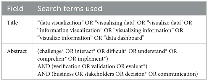
Table 1. Search terms used.
To ensure topical relevance, the following search string was applied to the Title field: “data visualization” OR visualizing data” OR “visualize data” OR “information visualization” OR “visualize information” OR “visualizing information” OR “data dashboard*”. A range of synonymous terms was included to maximize the retrieval of pertinent studies.
To further narrow the scope and target studies aligned with this review's focus, the following additional keywords were applied to Abstract field.
• challenge* OR interact* OR difficult* OR understand* OR comprehen* OR implement is used to retrieve documents that focus on, or mention, challenges the user might encounter in their interaction with data visualization approaches.
• verification OR validation OR evaluat* is used to retrieve documents that focus on, or mention, how data visualization approaches are evaluated.
• business OR stakeholders OR decision* OR communication is used to retrieve documents that focus on, or mention, how data visualization approaches are used by domain experts in decision-making. Typically, these domain experts are center to interpreting data and making practical decisions (i.e., stakeholders), but lacks formal training in technical aspects such as data science, programming, or visual analytics, and thus are also called non-technical users (Wong et al., 2018).
After retrieving the articles from the selected databases, the following inclusion criteria were used to determine eligibility for this systematic review. Studies were included if they met all of the following conditions:
• Published in journals or conference proceedings.
• Published in 2011 or later.
• Written in English.
• Available online in full-text.
We target post-2011 literature, as this year marks a significant shift in the data visualization landscape, fuelled by advancements in big data technologies and mainstream industry adoption. Notably, Manyika et al. (2011) emphasized the transformative role of data and visualization approaches in unlocking insights across industries, underscoring a foundational change in how data-driven practices are perceived and applied. The limiters in the five databases are used to capture these inclusion criteria.
Figure 1 show the PRISMA flow diagram. After manual deduplication, 156 unique studies remained. The abstracts were then screened to assess their relevance to the review objectives. A total of 29 studies were excluded after abstract or full-text screening due to the misalignment with the scope of this review. More specifically, studies were excluded for the following reasons:
• Studies whose primary contribution lies in technical innovation in algorithmic development for visualization, with no or limited consideration of user interaction or decision-making contexts of the visualization, such as the dimensionality reduction method LaptSN (Sun et al., 2023) or large-scale rendering techniques (Park et al., 2018).
• Studies that used data visualization solely to present findings, without examining the visualization design, such as online survey results on language learning challenges (Jhamb et al., 2020).
• Studies focused on proposal of architecture, model or development of complex systems, in which visualization was either absent or have a minor role, and the visualization is not analyzed or evaluated, such as recommender systems (Huang et al., 2019), data distribution model of regional sports tourism (Chen, 2017), or robot teleoperation systems (Ueda et al., 2015).
• Studies targeting user groups outside the intended scope, such as tools designed for visually impaired users (Aljasem, 2020; Gorniak et al., 2023), which involve accessibility challenges distinct from visualization design considerations for decision-markers;
• Studies that are not related to data visualization in decision-making or users understanding, such as an analysis of children's drawings (Charitos et al., 2024), or explorations of socio-cultural dimensions of visualization (de Almeida, 2022).
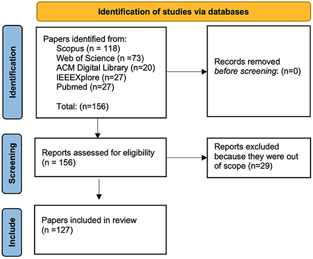
Figure 1. PRISMA flow diagram.
After the screening, 127 papers are included in this review.
2.2 Data extraction and synthesis
2.2.1 Domains of the papers
We manually categorized the domains of the papers into six categories.
Figure 2 shows the distribution of publications across the six domains over the years from 2011 to 2024. The chart shows a clear upward trend in the total number of relevant publications. The database search was conducted in July 2024; therefore, the publication count for that year may be incomplete.
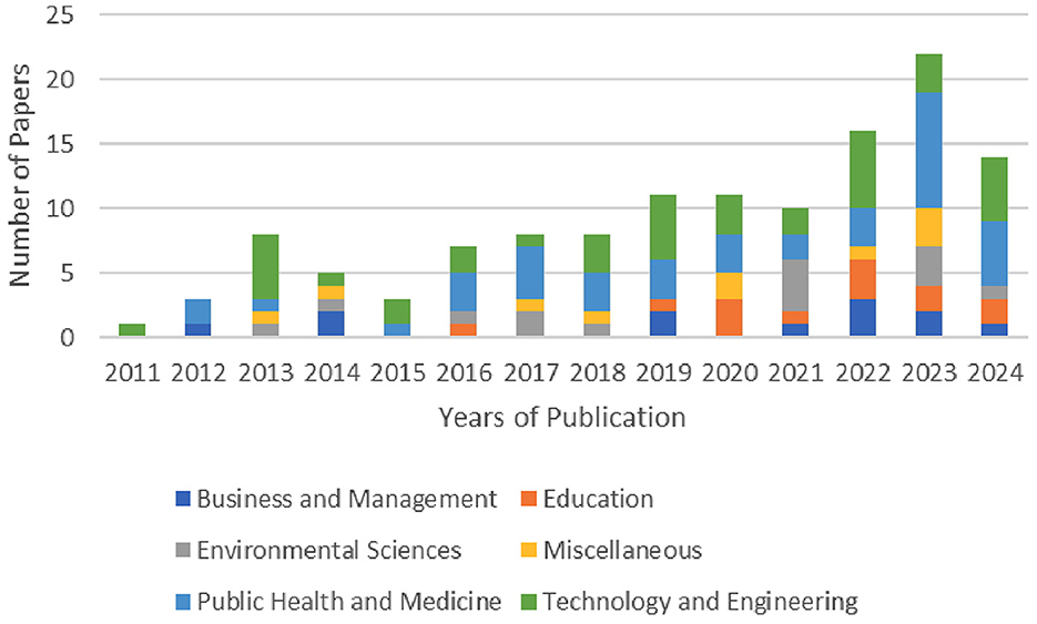
Figure 2. Domains and years of publication.
Figure 3 shows the distribution of the 127 studies reviewed, categorized into six domains: (a) Technology and Engineering, (b) Public Health and Medicine, (c) Environmental Sciences, (d) Education, (e) Business and Management, and (f) Miscellaneous. The highest concentration of studies is in Technology and Engineering and Public Health and Medicine (39 each), followed by Environmental Sciences (14), Education (13), Business and Management (12), and Miscellaneous (10). The full list of papers, sorted by domain, is provided in Appendix Table 2. Note that the domain categories were applied post-selection, based on the substantive content of each study already deemed relevant to decision-making tools for domain experts. The details of the categories are listed as follows.
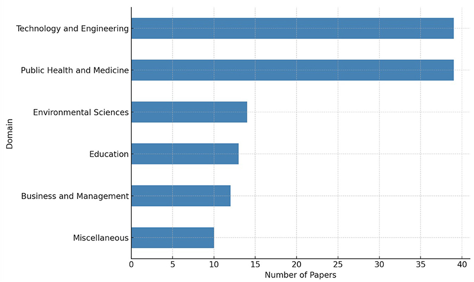
Figure 3. Domains distribution of the selected article.
(a) Technology and engineering. Studies focusing on the development, deployment, or evaluation of visualization approaches in computational, technical, or engineering-related contexts. This includes cybersecurity (Wu et al., 2024), AI interface design (Ai et al., 2022), systems monitoring (Evergreen and Metzner, 2013), and infrastructure analytics (Andreou et al., 2023; Somanath et al., 2014).
(b) Public health and medicine. Studies where data visualization approaches are applied within healthcare delivery, medical decision-making, or public health monitoring. This includes both clinical dashboards (Thayer et al., 2021; Wanderer et al., 2016) and approaches designed for population-level health insights (Albarrak, 2023; Burgan et al., 2024; Gisladottir et al., 2022).
(c) Environmental sciences. Studies that employ visualization in fields such as climate monitoring (Haara et al., 2018), energy systems (Stecyk and Miciula, 2023), ecology (Morini et al., 2023), or sustainability (Medeiros et al., 2016; Zheng et al., 2021). These visualizations often help domain experts engage with spatial or temporal environmental data.
(d) Education. Visualizations developed for educational purposes, including learner analytics (Ismail et al., 2022), performance feedback systems (Alger et al., 2024; Hernndez-Caldern et al., 2023), or curriculum-level decision-making (Akanmu and Jamaluddin, 2016; Deshmukh et al., 2023).
(e) Business and management. Studies situated in commercial or organizational contexts, such as business intelligence (Alwi et al., 2023), project management (Sanchez-Ferrer et al., 2019), or supply chain optimization (Couto et al., 2022; Luo, 2023). Data visualization supports managerial or operational decision-making (Ballarini et al., 2022).
(f) Miscellaneous. Studies that do not clearly fall into the above categories. This includes domains such as social services (Ansari et al., 2022), humanitarian logistics (Euman and Abdelnour-Nocera, 2013), community planning (Kukimoto, 2014), or other multi-contextual applications involving experimental or early-stage systems (Lizenberg et al., 2020; Mao et al., 2018; Muller and Tierney, 2017).
2.2.2 Types and methods of the papers
Table 2 summarizes the distribution of papers by type and the research methods employed in the empirical studies. Of the 127 papers reviewed, 9 are literature reviews, while the remaining 118 are empirical studies. Among the empirical studies, 49 adopted quantitative methods, for example, Handoko et al. (2023) applied Structural Equation Modeling Partial Least Squares (SEM-PLS). Seventeen studies employed qualitative approaches; for instance, Daradkeh (2015) utilized direct observations, think-aloud protocols, and content analysis of participant responses. The remaining 52 studies adopted mixed-methods designs. These include studies such as Burgan et al. (2024), which combined stakeholder perception surveys with semi-structured interviews, and Kettelhut et al. (2017), which employed a quasi-experimental design along with pre- and post-questionnaires, supplemented by qualitative participant feedback.
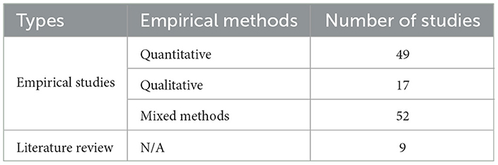
Table 2. Summary of the types and methods used in the studies.
3 Findings and implications
Section 3.1 through 3.4 directly address the four research questions posed in this review. Specifically, Section 3.1 responds to RQ1 by mapping the range of data visualization approaches in AI-assisted decision-making contexts. Section 3.2 addresses RQ2 by identifying the key challenges that hinder users understanding and effective use of these approaches. Section 3.3 responds to RQ3 by analyzing how specific visual elements influence comprehension and decision-making outcomes. Finally, Section 3.4 answers RQ4 by reviewing the evaluation methodologies employed to assess the usability and effectiveness of visualization types and approaches.
3.1 Data visualization approaches in decision-making tools
In this section, we detail the types of data visualization approaches used in AI-assisted decision making tools to support decision-making. Table 3 shows a summary of the approaches, which each are detailed below.
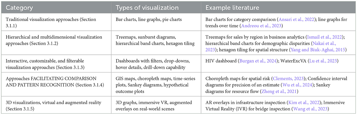
Table 3. Summary of data visualization approaches in decision-making tools (Section 3.1).
3.1.1 Traditional visualization approaches
Traditionally, data visualization has depended on familiar types like bar charts, line graphs, and pie charts. These methods have proven to be fundamental in depicting quantitative data clearly and efficiently (Ansari et al., 2022; Luo, 2023; Llaha and Aliu, 2023; Bafna et al., 2019; Shaheen et al., 2019). Bar charts are particularly effective for comparing different categories, while line graphs excel at illustrating trends over time (Andreou et al., 2023). The simplicity of these visualizations also avoids visual noise (i.e., visual clutter) (Evergreen and Metzner, 2013).
However, as the era of big data has emerged, these conventional approaches have struggled to adequately represent large and complex datasets, prompting the creation and adoption of more sophisticated visualization techniques (Muller and Tierney, 2017).
3.1.2 Hierarchical and multidimensional data visualization approaches
As data complexity increases, hierarchical and multidimensional visualization approaches have become prevalent. These approaches allow for the representation of large-scale and structured data in an intuitive manner, helping users explore relationships within datasets. Treemaps, sunburst diagrams, and hierarchical band charts provide hierarchical data representation, allowing users to explore and understand relationships within the data at different levels of detail (Akanmu and Jamaluddin, 2016; Ismail et al., 2022; Diaz et al., 2022).
Treemap is a commonly used visualization for hierarchical data. In business analytics, for example, treemaps are effective for displaying hierarchical information such as sales performance by regions and product categories (Ismail et al., 2022). These visualizations help users identify patterns that may not be immediately apparent in traditional two-dimensional charts. In the security domain, treemap and rules tree visualizations allow users to explore the log coverage, helping users understand the distribution and classification of security logs. Euman and Abdelnour-Nocera (2013) note that treemaps are effective for pattern recognition. However, they are less effective at revealing insights when data variation is limited.
In addition, hierarchical data visualizations are useful in understanding the relationships between metrics. Hierarchical band charts, for instance, visualize data across demographic groups, helping professionals identify disparities and target interventions (Nakai et al., 2023). The hexagon-tiling algorithm can be used to represent hierarchical data in a map-like format, improving spatial understanding (Yang and Biuk-Aghai, 2015).
3.1.3 Interactive, customizable, and filterable visualization approaches
Dashboards have emerged as a particularly effective and efficient visualization approach because of their comprehensive data overview capabilities (Borrego and Lewellen, 2014; Shetty and Keshavjee, 2024; Goodwin et al., 2021). Filterability, as a commonly seen feature in dashboard, allows users to visualize and focus on the subset of data relevant to them (Stern et al., 2024; Burgan et al., 2024; Ansari and Martin, 2024; Upreti et al., 2024; Balaji et al., 2024; Haara et al., 2018; Ries et al., 2012; Sopan et al., 2012; Porter et al., 2021; da Silva Franco et al., 2019). For instance, Burgan's dashboards for HIV pre-exposure data can be filtered by variables such as ethnicity, region and gender. The filtering can be accomplished in different ways [e.g., by selecting a specific tab that corresponds to a subset of the data as in Burgan et al. (2024), or by selecting options from a drop-down menu as in Ansari and Martin (2024)].
Customisability is mentioned as an attribute of usable visualizations [e.g., allowing the user to enlarge certain portions of a graph, as suggested by Wilhelm et al. (2014)]. On the other hand, interactivity, such as hover-over details and clickable elements, can improve users' interaction effectiveness and efficiency (Choudhary et al., 2024). This is crucial for decision-makers who need to understand data nuances to make informed choices (Freeman et al., 2023; Bornschlegl et al., 2018; Morgan et al., 2018). For example, the visualization system WaterExcVA not only provides users with an overview of the water supply abnormalities, but also allows them to drill down to specific points in time and space (Lu et al., 2023).
3.1.4 Approaches facilitating comparison and pattern recognition
Another major ability of visualization types is to represent trends and allow comparison, by displaying multiple data points simultaneously (Ancker et al., 2024; Alger et al., 2024; Balaji et al., 2024; Bishop et al., 2013). For example, Cheng and Senathirajah (2023) 's experiment points out the effectiveness of a tool which compiles multiple metrics in one graph, enhancing pattern recognition and thus decision-making capabilities. On the other hand, Alger et al. (2024) critiques the RateMyProfessor tool interface for its inability to display multiple variables at the same time (e.g., difficulty of the course and perceived expertise of the professor).
As highlighted in Medeiros et al. (2017), Geographic Information Systems (GIS) mapping visualize the geographical distribution of risks on one screen, helps users perceive it effectively. Similarly, Clements (2023) points out the usefulness of choropleth maps for spatial data visualization, where various areas (e.g., subnational administrative units) can be represented in different colors. The author states that time-series plots with smoothing functions are “the most common way of demonstrating temporal data, at sub-national, national, and global levels.” Kettelhut et al. (2017) mention the benefit of visualizations integrating spatial data on hospital settings, to highlight the area of risk.
Trend plots are commonly used because they integrate multiple factors and provide a holistic view of the data. They are especially helpful for illustrating trends over time and connecting data to contextual situations (e.g., a physician can associate a higher heart rate with going up a staircase) (Sadhu et al., 2023).
The usefulness of incorporating contextual information in the visualizations has also been pointed out by Alwi et al. (2023) in the context of Business Intelligence (e.g., supplier overview, material overview, service overview). The cumulative distribution function graphs and the quantile dot graphs are useful to compare the distributions of data (Wu et al., 2024).
The tool described in Monsivais et al. (2018) combines geographic specificity and interactivity, enhancing user understanding and decision-making by allowing data exploration at various scales. Also, Herring et al. (2017) uses map-based visualizations that allow users to explore the impacts of climate change locally by comparing different emission scenarios.
The color-coded risk maps and correlation analysis (like Kendall's tau) are used to compare different risk rankings, aiding in quick decision-making processes (Medeiros et al., 2016). The Component Network Meta Analysis (CNMA) approach, utilizing various visualization formats like CNMA-UpSet plots, CNMA heat maps, and CNMA-circle plots, allows for the effective display and comparison of data from multiple studies (Freeman et al., 2023).
Hypothetical outcome plots (i.e., animated diagrams) can also facilitate pattern recognition, because they can display different possible outcomes over time, allowing users assess their likelihood (Wu et al., 2024). Besides, the confidence interval diagrams are used to indicate the precision of an estimate (Wu et al., 2024). Holdsworth and Zagorecki (2023) suggests that node link diagrams might help the user to create a mental picture of an emergency response.
Real-time information is also often represented by visualizations (Choudhary et al., 2024). Time-series visualization such as line charts, area charts, and candlestick charts are often employed to track changes over time in industries in particular finance. Heat-maps are used to highlight patterns and correlations. Geospatial visualizations are used to display location-based data to optimize routes, as well as to track the spread of diseases. Streaming data visualizations are used to represent continuous data streams (e.g., to monitor social media usage). Sankey Diagrams display the flow of resources within a system (Zheng et al., 2021).
3.1.5 3D visualizations, use of virtual reality and augmented reality
3D visualizations can significantly enhance the comprehension of complex datasets for users. Kaya et al. (2023) showed that 3D visualizations facilitate a better understanding of COVID-19 data than traditional 2D approaches. Moreover, 3D visualizations have been used to optimize energy consumption patterns by providing a more intuitive user experience and reducing visualization complexity (Stecyk and Miciula, 2023). In the field of structural engineering, 3D visualizations are particularly effective in displaying the structural condition of a building (Kim et al., 2022). Similarly, Lizenberg et al. (2020) uses RViz to generate 3D models to visualize real-time data on vehicles and their surroundings, improving the understanding of dynamic environments. Ntoa et al. (2017) utilizes rack close-ups and room views with interactive features to manage and monitor the equipment effectively.
In infrastructure inspections, augmented reality (AR) is used to overlay virtual information onto real-world environments, allowing inspectors to visualize data in real-time and make more informed decisions (Kim et al., 2022). This technology is particularly useful in fields that require precise spatial awareness and real-time data analysis, such as engineering and architecture. In Wang et al. (2023), Immersive Virtual Reality (IVR) was used in conjunction with 2D displays for bridge inspections, where 3D elements were also used to highlight the severity of damages, facilitating more accurate assessments.
3.2 Challenges in understanding visualizations
This section synthesizes the findings from the literature to understand the difficulties and challenges that users may encounter when interacting with data visualizations. These challenges often stem from the complexity of the visualizations, the design of the interfaces, and the lack of user training. Table 4 presents a list of the types of challenges, which each are detailed in this section.
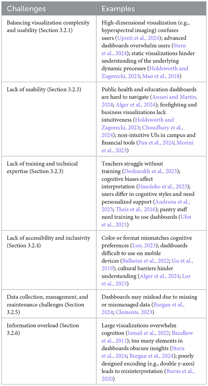
Table 4. Summary of challenges in understanding visualizations (Section 3.2).
3.2.1 Balancing visualization complexity and usability
A significant challenge consistently identified in the literature is the balance between the complexity and the usability of visualizations. It has been suggested that heterogeneous data represented by various visualization techniques may introduce complexities that are difficult for a lay audience to interpret (Morini et al., 2023; Al-Ghamdi, 2024; Choudhary et al., 2024; Contreras, 2019; Langton and Baker, 2013). For example, Density Plots and Cumulative Distribution Functions require a higher level of statistical literacy than that of an average domain expert user (Wu et al., 2024). Similarly, Upreti et al. (2024) state that horticulture experts struggle to understand high dimensional hyper-spectral data.
Stern et al. (2024) discuss how interactive dashboards and advanced visualization approaches, while powerful, can become overwhelming for users, particularly those without a technical background. The complexity of these approaches can make them difficult to use, reducing their effectiveness and limiting their adoption (Flor et al., 2023; Alger et al., 2024). According to Yan et al. (2013), the ease with which users can access detailed information via menus or touchscreen influences their willingness to and use the applications.
Al-Ghamdi (2024), Wu et al. (2024) and Choudhary et al. (2024) also highlight this challenge in the context of technology and business applications. These studies emphasize the importance of designing visualizations that are both powerful enough to handle complex datasets and user-friendly enough for domain experts to use effectively. Achieving this balance requires careful consideration of the user interface design, the level of interactivity, and the way data is presented. According to Golfarelli and Rizzi (2020), domain expert users may struggle in choosing the correct type of visualization for a given dataset and analytical goal. Also, overlapping elements in the visualizations can lead to difficulties in extracting detailed information (Somanath et al., 2014).
Holdsworth and Zagorecki (2023) point out that static representations “do not capture the pace of change and sequence of interactions”, when the visualization is used to help firefighters develop a mental image of an emergency response. Further, Mao et al. (2018) add that static images and textual data do not suit battlefield analysis, which is why their approach involves transforming them into animated representations, which are more aligned with the cognitive processes of the users.
3.2.2 Lack of usability
The lack of usability is a significant challenge for domain expert users, especially when the interface design is overly complex or not intuitive. Ansari and Martin (2024) discuss how public health dashboards, which are designed to manage and present complex health data, often pose usability challenges for domain expert users who may find the interface difficult to navigate. Alger similarly highlights challenges in educational dashboards, where domain expert users might struggle with interfaces that are not user-friendly (Alger et al., 2024).
Holdsworth and Zagorecki (2023) explore how public safety dashboards, particularly those used in firefighting services, present usability challenges. The need for quick decision-making can be hindered by complex, non-intuitive interfaces.
Wu et al. (2024) and Choudhary et al. (2024) address the usability challenges in technology and business applications. They note that domain expert users often struggle with the sophisticated interfaces of data visualizations, which can be a significant barrier to effective data-driven decision-making. Pan et al. (2024) and Morini et al. (2023) focus on campus management and financial services, respectively. These visualizations often require a level of interaction that domain expert users find challenging, particularly when the interface is not intuitive.
3.2.3 Lack of training and technical expertise
Patel (2023) and Lundkvist et al. (2021) highlight the importance of providing training to stakeholders to help them navigate and effectively utilize complex visualizations. Without such training, users may struggle to interpret data accurately. For instance, Deshmukh et al. (2023) discuss the challenges teachers face in interpreting complex data visualizations without training. Handoko et al. (2023) explore how cognitive biases can affect users' interpretation of visual data, emphasizing the need for proper training to mitigate these biases and ensure accurate data interpretation.
Stecyk and Miciula (2023) mention the steep learning curve associated with advanced visualization approaches, indicating that stakeholders often require additional training to use these approaches effectively. Moreover, Andreou et al. (2023) and Theis et al. (2016) highlight that the variability in cognitive styles and processing abilities among lay users can create challenges in understanding complex visualizations. Andreou et al. (2023) suggests that personalized training programs can address these discrepancies, enhancing the accessibility of the approaches.
Luo (2023) also highlights the need for user training to improve the ability to interpret graphical data correctly and consistently, as differences in cognitive styles can impact how users interact with and understand data visualizations. Similarly, Ufot et al. (2021) stress the importance of consistent usage and training to maintain accuracy and improve productivity among non-technical staff (e.g., pantry users), particularly in environments where data interpretation skills vary widely.
Ai et al. (2022) mention the need for continuous training and motivation to help stakeholders effectively use intelligent visualizations, indicating that without ongoing training, the effectiveness of these visualizations may be diminished. Peng and Cao (2022) discuss the complexity of mathematical models, noting that stakeholders may struggle to understand and interpret these without proper training.
3.2.4 Lack of accessibility and inclusivity
Lack of accessibility may prevent the user from interacting with the visualization, or make the interaction more difficult. Patel (2023) discusses the challenges non-technical users face in interpreting complex data presentations, emphasizing the importance of designing accessible visualizations and providing the necessary support to ensure users can utilize them effectively.
Deshmukh et al. (2023) highlights the difficulties teachers face in selecting the right type of visualization to communicate their messages effectively, pointing out the need for visualizations that are both accessible and intuitive. Nakai et al. (2023) discusses the challenges of understanding complex hierarchical visualizations, noting that these visualizations require significant effort to interpret, particularly for users without a technical background. de Camargo et al. (2020) adds that non-technical users often find it difficult to synthesize and interpret data presented in traditional tabular formats, suggesting that graphical representations may be more accessible.
Luo (2023) emphasizes the importance of cognitive style differences, noting that users with different cognitive preferences may find certain visualization formats more challenging to interpret (i.e., verbalizers prefer tables, while visualisers prefer graphs). Chiang et al. (2022) and Ballarini et al. (2022) discuss the difficulties non-technical users face when trying to interpret data from multiple sources and formats, particularly when the data must be manually mapped across databases. Ballarini et al. (2022) adds that, when displaying the data on a mobile device, it is important to keep the data points visible and understandable. Gu et al. (2019) makes a similar observation, adding that different usability considerations are needed for touch screens.
After pointing out that Public Health data dashboards need to be understood by Government workers, as well as by Health practitioners, Alger et al. (2024) warns against the use of technical language on these visualizations. Cultural and linguistic barriers also play a significant role in how visualizations are interpreted, with Lor et al. (2023) emphasizing that stakeholders, such as patients with limited literacy may struggle to comprehend text-heavy visualizations.
3.2.5 Data collection, management, and maintenance challenges
The lack of time and staff availability have been linked to issues with data collection and management, which lead to inaccurate dashboards (Burgan et al., 2024). Once released into the public domain, data visualizations may be misused or misinterpreted (Clements, 2023). Inaccurate data, including incomplete, improperly formatted, and duplicated data, may compromise the accuracy of the visualizations (Alwi et al., 2023). Once the data has been made available, there are issues with accessibility and privacy to consider (Al-Ghamdi, 2024). Developing and maintaining robust visualizations can be resource-intensive (Choudhary et al., 2024).
The preprocessing of data, especially when involving advanced machine learning techniques, may require expert knowledge and considerable time (Upreti et al., 2024).
3.2.6 Information overload
Information overload poses a significant challenge for stakeholders, often leading to misinterpretation and errors in decision-making. Ismail et al. (2022)) and Sullivan et al. (2020) highlight that when users are confronted with large volumes of data or an excessive number of visual elements, they can quickly become cognitively overwhelmed. This overload impairs their ability to extract meaningful insights and can result in a failure to identify key patterns or trends within the data. Sanchez-Ferrer et al. (2019) observes that too many details shown in advance on the dashboard may confuse users.
In the context of medical decision-making, Gisladottir et al. (2022) highlights the issue of information overload, where presenting too many risks can overwhelm physicians, making it harder for them to make informed decisions. Sadhu et al. (2023) sustains that busy clinicians are in need of a dashboard that is meaningful and easy to interpret, and that unnecessary data make the tool more difficult to use and understand.
Behavioral users, as opposed to theoretical rational agents, have difficulties understanding data visualizations, when information is presented in a complex and uneven way. For instance, a tool might highlight certain data points or trends and omit others (Wu et al., 2024).
Stern et al. (2024), Burgan et al. (2024), and Malik and Sulaiman (2016) highlight the cognitive load that domain expert users experience when interacting with complex dashboards. These approaches often present large volumes of data in a format that can be overwhelming, leading to difficulties in identifying key insights. Choudhary et al. (2024) also notes that users can struggle with the amount of information presented, particularly when dashboards lack a clear focus or are cluttered with too many elements. According to Bandlow et al. (2011), large graphs are responsible for cognitive load. Simões Jr et al. (2017) and Lami et al. (2014) make a similar observation for map-based visualizations.
Stecyk and Miciula (2023) and Freeman et al. (2023) emphasize that domain expert users may find it challenging to process and make sense of the information displayed in financial and environmental data visualizations, which often require a high level of understanding to interpret correctly.
Koopman et al. (2020) also addresses the cognitive load that can occur when visualizations are not designed with user capacity in mind. They point out that if the format is too complex or not intuitive enough, it can overwhelm users, particularly those who lack a technical background, thereby increasing the risk of misinterpretation.
Thayer et al. (2021) and Couto et al. (2022) further elaborate on the problem of information overload by discussing how the fast-paced environment in certain fields, such as emergency departments or project management, can exacerbate the effects of data overload. In these settings, stakeholders may struggle to quickly and accurately process scattered information, leading to potential misinterpretations and slower decision-making.
Finally, Burns et al. (2020) underscores the importance of carefully designing visualizations to avoid cognitive overload, noting that complex visual encoding, such as double y-axes, may cause users to misinterpret the data or draw inaccurate conclusions.
In summary, Figure 4 shows the normalized proportion of studies within each domain that reported specific challenges faced by domain experts of data visualization approaches. Complexity vs Usability is the most frequently reported challenge across all domains, followed by Lack of Training or Expertise and Lack of Usability. Information Overload is also notable, especially in Public Health and Technology contexts. Less frequent issues include Accessibility and Data Quality & Maintenance. The Miscellaneous category was excluded to ensure domain comparisons remain interpretable and methodologically consistent.
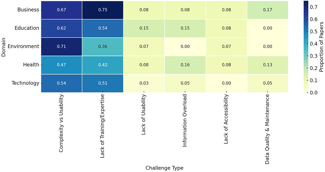
Figure 4. Challenges in each domain.
3.3 Impact of visual aspects and elements on user understanding and decision-making
Visual elements play an important role in how the data is perceived and interpreted by the users. The design choices made in data visualization can also greatly influence user understanding and thus the decision-making process. Table 5 lists the three types of visual elements and their examples. In the following, we explore the impact of data complexity and density, color, and symbolic presentation in visualization approaches.
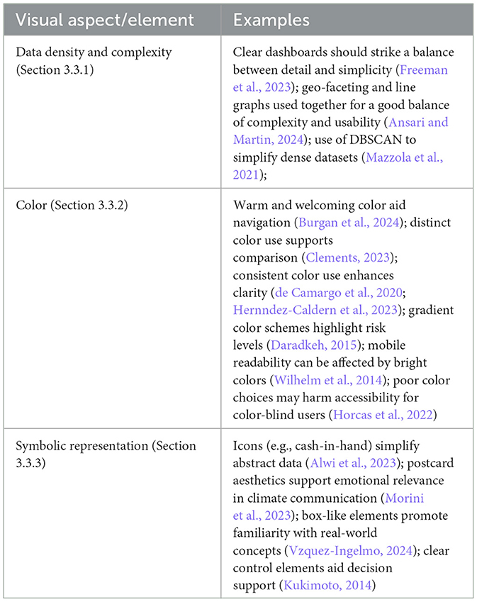
Table 5. Summary of visual aspects and elements (Section 3.3).
3.3.1 Data density and complexity
Balancing complexity and simplicity in data visualization is essential for ensuring that users can comprehend the information without being overwhelmed. Freeman et al. (2023) argue that visualizations must strike a balance between providing sufficient detail and maintaining clarity to avoid confusing users. Lu et al. (2023) and Andreou et al. (2023) highlight that while simplicity is important, it should not come at the expense of important details. Simplifying visualizations should involve removing unnecessary elements without losing critical information, ensuring that the visualization remains informative. Similarly, Cabitza et al. (2022) warn against misleading simplicity, which might confuse the users about results reliability. In fact, overly simplistic visualizations may lack the necessary context for making informed decisions.
According to Ansari and Martin (2024), a tool should display “an appropriate balance between complexity and usability.” In their study, line graphs for each variable serve as the usable element, providing clear and intuitive trend visualization, while geo-faceting represents the complex element, allowing users to explore spatial variations by selecting different areas. Using consistent scales and visual elements proportional to the data also aids user understanding (Wu et al., 2024). On the other hand, Nguyen and Song (2016) state that lay users might struggle with interpreting the visualizations if the sampling methods do not preserve essential information.
Managing data density is critical in data visualization. Overloading a visualization with too much information can overwhelm users, making it difficult for them to discern the key insights (Burns et al., 2020). Perdana et al. (2019) suggest that, to mitigate complexity, the tool's characteristics should be aligned with users' tasks and cognitive abilities.
Mazzola et al. (2021) discuss the use of DBSCAN (Density-Based Spatial Clustering of Applications with Noise) in security-related visualizations, which helps in managing complex datasets by identifying outliers. This technique simplifies the data, allowing users to focus on potential threats without being distracted by irrelevant information.
Sadhu et al. (2023) discuss trend plots that integrate multiple factors, offering a comprehensive view of complex datasets without overwhelming users, allowing users to understand the broader picture without losing sight of the details. Clarity in visualizations also affects how users understand and utilize the information (Azzam et al., 2013). Dashboards should be intuitive enough to allow a non-technical user to engage with them without training (Alwi et al., 2023; Concannon et al., 2019). The information displayed should also be clear and digestible (Morini et al., 2023; Choudhary et al., 2024).
3.3.2 Color
The use of color in visualization plays an important role in enhancing user interaction and comprehension. A “warm and welcoming color scheme” has been associated with navigation ease by the vast majority of Burgan et al. (2024)'s participants, while one participant pointed out that the color red signals “bad” or “wrong.” Wilhelm et al. (2014) observes how bright colors on a mobile device might be difficult to read. Clements (2023) refers to the importance of representing the variables in different colors. A consistent use of colors helps users identify patterns and categories (Wu et al., 2024; Choudhary et al., 2024; Zhang and Padman, 2017; Pitchforth, 2013; Forsman et al., 2013; Price et al., 2016), and intensity (Bacic and Henry, 2012). Andreou et al. (2023) and Patel (2023) further emphasize that color plays a crucial role in engaging users by visually separating different datasets, thereby preventing confusion and enhancing interpretation accuracy. For example, increasing the size of primary elements can help users with low visual acuity, while adjusting the proximity between elements can aid in distinguishing closely related data points (Andreou et al., 2023).
Chen et al. (2023) and Kwong et al. (2022) highlight the role of color in improving the clarity of visualizations. They explain that by using distinct colors for different data elements, users can more easily differentiate and understand the information being conveyed. This reduces cognitive load and makes the visualization more effective for decision-making. Color gradations to indicate varying levels of risk and the layout of information were successfully utilized by Daradkeh (2015). Lee et al. (2015) noted how colors can successfully represent data changes in line graphs.
de Camargo et al. (2020) and Hernndez-Caldern et al. (2023) underscore the importance of consistency in color usage. They argue that when colors are used consistently throughout a visualization, it helps maintain a cohesive visual structure, making the data easier to follow. Chiang et al. (2022), Peng and Cao (2022), and Ballarini et al. (2022) further argue that well-chosen color schemes can make visualizations more engaging and easier to understand, capturing users' attention and making the data more approachable, which is essential for maintaining user interest and improving comprehension.
Horcas et al. (2022) recommend the use of distinct colors and scaling. However, they warn against visual clutter and the use of non-distinct colors for color-blind users. He (2022), Peng and Cao (2022), and Wang et al. (2022) suggest that color can guide user interpretation by drawing attention to key areas of the data. They note that strategic color usage can highlight trends or anomalies in the data, making it easier for users to identify and analyze these patterns. Lizenberg et al. (2020) and Holjevac and Jakopec (2020) highlight the importance of using color to create visual consistency within a dataset. They argue that consistent use of color helps unify the various elements of the visualization, making it easier for users to follow and understand the data.
3.3.3 Symbolic representation
Applying symbols in visualization enhances user understanding and decision-making by making data more interpretable (Ferreira et al., 2020; Cabitza et al., 2022; Ansari et al., 2022). For example, using cash-in-hand icon to represent total spending simplifies complex information (Alwi et al., 2023). Also, Kukimoto (2014) stresses the importance of the clarity of control elements for decision making.
For the sake of constructive climate journalism, Morini et al. (2023) utilizes the aesthetics of travel postcards to represent key sectors affecting climate change such as agriculture and energy, fostering a sense of hopefulness and personal relevance. Tools are considered more usable when they resemble the real world. Visualization experts suggested using meta-elements looking like boxes, as they would have reminded the users of the real world (Vzquez-Ingelmo, 2024). In medical contexts, meaningful symbols derived from medical training enhance the usability of clinical data visualizations (Wanderer et al., 2016).
3.4 Evaluation methods of data visualization approaches
Following the exploration of how different visual elements influence user understanding and decision-making, it is important to assess the effectiveness of these elements within data visualization approaches.
This section reviews the diverse methodologies used to evaluate these approaches, as summarized in Table 6, including heuristic evaluations, usability testing, comparative analyses, cognitive and psychological assessments, iterative design feedback, controlled experiments, and mixed-method approaches. These methods leverage expert judgment, user feedback, and quantitative metrics to refine visualizations, ensuring their usability, functionality, and effectiveness across various contexts and user groups, enhancing users' decision-making capabilities.
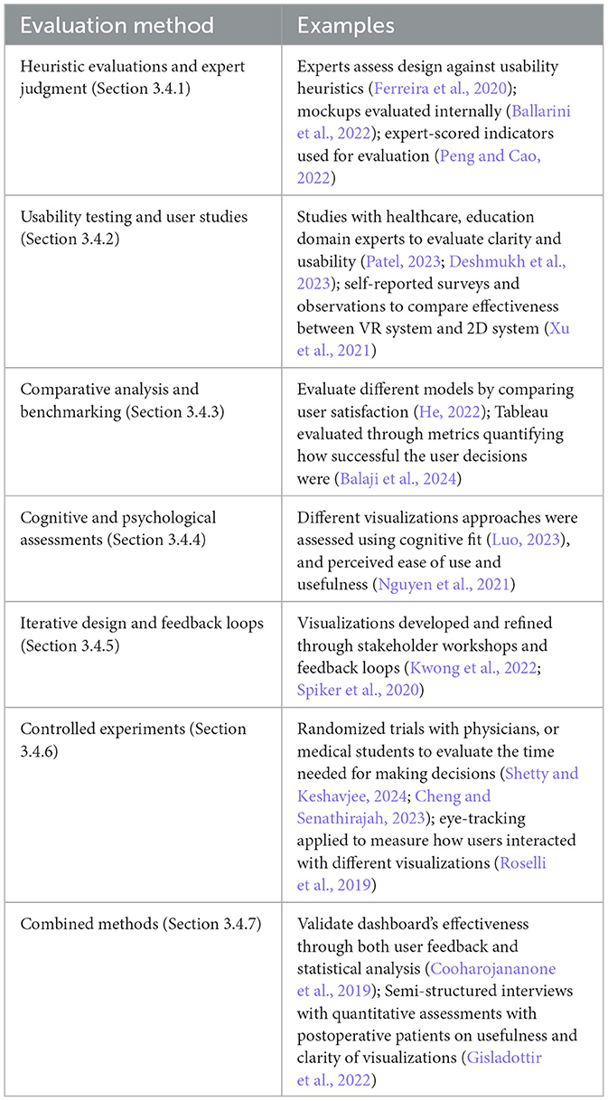
Table 6. Summary of evaluation methods for data visualization approaches (Section 3.4).
3.4.1 Heuristics evaluations and expert judgment
Heuristic evaluation and expert judgment involve experts evaluating the design and functionality of visualizations based on established usability criteria to identify areas for improvement. Ballarini et al. (2022) use a design process that involved creating mockups and gathering feedback from project personnel. Internal evaluations showed improvements in readability and usability, with plans for future user feedback to further validate the visualizations. Ferreira et al. (2020) conduct heuristic evaluations and usability tests, with experienced evaluators identifying usability issues in different development phases. Domain experts provided feedback, which was critical in refining the visualization approaches to meet user needs effectively.
Peng and Cao (2022) employ expert judgment and questionnaire surveys to evaluate data visualization approaches. Experts scored the importance of various indicators, which informed the construction of judgment matrices. Consistency tests were conducted to ensure the reliability and validity of these evaluations. Nielsen's 10 heuristics principles have been used to evaluate a data visualization (Vzquez-Ingelmo, 2024). In the study, two data visualization experts checked the interface against the principles, with the purpose of creating a more user-friendly one.
3.4.2 Usability testing and user studies
Usability testing and user studies are common methods used to assess how well a data visualization serves its users. These methods provide insights into user satisfaction, decision-making efficiency, and the overall effectiveness of visualizations.
Patel (2023) evaluates visualization approaches in healthcare settings through user studies with healthcare professionals, focusing on metrics like decision-making efficiency, interpretation accuracy, and user satisfaction. The goal was to determine how effectively these visualizations supported clinical decision-making. Similarly, Deshmukh et al. (2023) use usability testing involving educational stakeholders to refine a data visualization platform designed to present teacher performance metrics. Feedback was collected to ensure the platform's accessibility and effectiveness in decision-making contexts.
Nakai et al. (2023) employ a participant experiment involving computer science students to evaluate three different visualization techniques. Participants rated these visualizations based on ease of use, bias detection, and overall satisfaction. This approach highlighted the proposed method's superiority over baseline implementations in detecting and understanding biases. Chiang et al. (2022) evaluate the Quality Instructional Management System (QIMS) through trial operations in universities, focusing on feedback from teachers and staff. The study noted improvements in teaching quality through enhanced material retrieval and student performance visualization, though further research was suggested.
Cabitza et al. (2022) conduct a user study via an online questionnaire to assess the effectiveness of visualizations in conveying test results, with a focus on communicating the reducing error and conveying predictive uncertainty. Thayer et al. (2021) evaluate an asthma timeline application using usability testing, post-implementation surveys, and application monitoring. These methods measured user satisfaction, perceived utility, and the efficiency of the application compared to standard electronic health records (EHR). Xu et al. (2021) combine self-reported surveys and observational data to evaluate a VR system against a 2D system. The study measured task completion time, accuracy, and user preferences, using statistical analyses to compare the effectiveness of the two systems in engaging users and promoting energy-saving behaviors.
Ufot et al. (2021) assess data visualizations implemented in a food pantry setting. Staff provided feedback on the visualizations, which were used to improve inventory management. The study highlighted the visualizations' effectiveness in simplifying data and enhancing staff collaboration. Koopman et al. (2020) employ iterative user-centered design processes, including focus groups with patients and physicians, to refine visualization approaches. Thematic analysis of qualitative data ensured that the visualizations met user needs and preferences effectively.
Sullivan et al. (2020) utilize various methods, including website metrics, academic citations, and user surveys, to evaluate the engagement and usability of data visualizations. The study also incorporated feedback from advisory committees and public health use cases to refine the visualizations. Diaz et al. (2022) conduct usability experiments with both expert and domain expert users to evaluate their ability to interpret complex visualizations. While experts navigated the visualizations effectively, domain experts struggled, indicating the need for simpler, more intuitive designs for broader user groups.
Quantitative surveys to measure the stakeholders' perception have been conducted alongside semi-structured interviews with practitioners (Burgan et al., 2024). The Post-Study System Usability Questionnaire (PSSUQ) was used to evaluate Business Intelligent dashboards in Alwi et al. (2023). Eleven domain expert participants filled the questionnaire to assess effectiveness and user satisfaction. Grossman et al. (2018) also evaluate their dashboard via a user satisfaction questionnaire.
Moreover, Sadhu et al. (2023) asked clinicians to evaluate and refine the design of the CarePortal dashboard, which showed patients' data from wearable sensors. A user experience questionnaire was then used to collect feedback.
3.4.3 Comparative analysis and benchmarking
Comparative analysis and benchmarking involve comparing different visualization methods to identify the most effective approach.
He (2022) uses comparative experiments to evaluate different models, focusing on metrics like convergence speed and user satisfaction. Zheng et al. (2021) compare the bricked format and Level of Detail (LOD) algorithm with traditional seismic data reading methods. The findings highlighted significant improvements in loading times and real-time visualization capabilities.
Wang et al. (2022) evaluate ML-assisted visualization approaches using benchmark tasks such as graphic element extraction and visualization generation. The study compares ML methods with non-ML methods, highlighting the effectiveness and efficiency of ML-driven visualizations in solving complex problems. Wu et al. (2024) conduct experiments with human participants (as “behavioral agents”) after a mathematical model (as “rational agent”) set benchmarks. The human participants were asked to engage with various data visualization types to make decisions. The experiment asked, for example, to decide whether to salt a car park based on the forecasted probability of freezing temperatures, and when to leave for the bus stop based on bus arrival time predictions. Mixed-effects Bayesian regression models are used to estimate behavioral payoffs and identify sources of decision-making errors. The results showed that the rational agent consistently outperformed the behavioral agent. However, data visualizations significantly improve the ability of the user to interpret data and make decisions.
In Balaji et al. (2024), the effectiveness of Tableau, the data visualization tool used to aid taxi-drivers in decision making, was evaluated through a metric called total reward per episode, which quantifies how successful their decisions were during each episode based on predefined objectives. Results were visually represented through plots depicting the evolution of total rewards, exploration rates, action distributions, cumulative profits, and reward variance across episodes, providing a comprehensive overview of performance dynamics over time.
3.4.4 Cognitive and psychological assessments
Cognitive and psychological assessments focus on understanding how visualizations influence users' cognitive processes and decision-making. Luo (2023) assesses the cognitive fit of different visualization formats using the Verbalizer-Visualiser Questionnaire, linking decision accuracy and confidence to the visualization format. In Hoeber (2018), interfaces have been evaluated based on their ability to support specific information-seeking behaviors and strategies.
Ai et al. (2022) compared traditional teaching methods with intelligent teaching tools, focusing on teacher-student interactions, engagement levels, and quiz performance. The study highlighted improvements in understanding and retention, particularly with the use of tools like Rain Classroom, which provided real-time data for teachers to adjust their strategies. Nguyen (2021) apply the Technology Acceptance Model (TAM) to evaluate visualization approaches, focusing on perceived ease of use and usefulness. The study revealed that while the tool was user-friendly, its focus on word frequency limited its effectiveness in capturing the full depth of student responses, suggesting the need for more advanced analysis techniques.
Kastens et al. (2020) use a structured research design to evaluate the types and quality of questions generated by participants. The study applied Bloom's taxonomy to categorize questions, providing insights into how different visualization formats influence cognitive engagement and comprehension. Similarly, Burns et al. (2020) introduce a novel framework based on Bloom's six-level taxonomy to evaluate visualizations. The study assessed tasks such as retrieving values, summarizing messages, and predicting future outcomes, comparing alternative designs to highlight how different visualizations support varying levels of cognitive understanding.
3.4.5 Iterative design and feedback loops
Iterative design and feedback loops involve continuously refining visualizations based on user feedback. Kwong et al. (2022) use an iterative process to develop and refine visualizations based on feedback from stakeholders, including healthy volunteers, patients, and clinicians. The evaluation through semi-structured interviews and content analysis allowed for successive improvements, ensuring the visualizations met user needs effectively. Similarly, Spiker et al. (2020)'s evaluation consists of multiple meetings where users reviewed the tool, completed an evaluation form, and provided feedback on its functionalities and usability.
Goodwin et al. (2021) conduct iterative workshops using design techniques like card sorting and affinity diagramming. Feedback from expert panels and broader practitioners was incorporated to refine and improve the visualization approaches continuously. In Hernndez-Caldern et al. (2023), multiple iterations of user feedback were gathered in a detailed evaluation process, involving expert heuristic assessments and real scenario evaluations. The study used virtual sessions to assess user interaction with improved dashboards, emphasizing the importance of iterative feedback in refining visualization approaches.
Mazzola et al. (2021) and Albarrak (2023) focus on refining solutions based on iterative user feedback from various professionals, In Mazzola et al. (2021), this included developers and ERP integrators. The evaluation aimed to improve attractiveness, interpretability, and usefulness, addressing challenges with contextual information for business users.
3.4.6 Controlled experiments
Controlled experiments also play an important role in assessing the practical effectiveness of visualization approaches in enhancing user interaction and decision-making processes.
In the healthcare domain, Shetty and Keshavjee (2024) conducted an experiment involving ten primary care physicians which showed that a significant reduction in the information retrieval time using the newly developed dashboards. Physicians were asked to review ten elements of diabetes care data, and were randomly allocated to initially use either i4C (the newly developed dashboards) or Native Query (database) and then switched to the other method, with their time needed being recorded. Similarly, Cheng and Senathirajah (2023) conduct an experiment with 15 medical students. Students were asked to diagnose clinical cases after engaging with a visualization for different intervals. The results reveal that short interactions with the visualization can reduce cognitive burden and speed up the diagnosis.
On the other hand, a pilot study conducted by Kaya et al. (2023) explored the preference for 2D vs. 3D visualization among 20 participants following COVID-19 news. The results show that 3D is better for complex data. Kaya et al. (2023) also conducted an immersive study which participants used a head mounted display and were able to grab and move the 3D object. All participants favored 3D visualizations over the 2D ones. In Holdsworth and Zagorecki (2023), firefighters were assigned three tasks to be completed with the help of a static node-link diagram (i.e., identifying roles, recognizing stages of a temporal response, and evaluating the response).
Kim et al. (2021) crowd-sourced experiment with 4,800 participants, testing how well participants updated their beliefs under different visualization conditions. Bayesian assistance techniques improved users' belief updating for small data samples but had mixed results for large data samples. Roselli et al. (2019)'s experiments employ eye-tracking technology to measure how users interacted with different visualization. Simulation and numerical analysis were utilized to evaluate the performance of visualization techniques, where numerical simulations on IEEE benchmark systems demonstrated that criticality graphs significantly improved the interpretation of criticality analysis results over traditional tabular presentations (de Camargo et al., 2020).
3.4.7 Combined methods
To address the complexities in evaluating data visualization approaches, studies also employ a combination of methodologies that includes quantitative metrics with qualitative findings. This ensures a comprehensive assessment of both performance and user experience of visualization approaches.
Ansari and Martin (2024) conduct a two-phase evaluation of data dashboards: (1) a user evaluation of existing data dashboards (pairwise user study with community-based organizations and experts) and (2) a usability evaluation of the prototype dashboard with an embedded experiment about visualizing missing race and ethnicity data.
Quantitative methods (i.e., five point scales) and qualitative insights (i.e., reader's emotional response) have been combined to evaluate the dashboards in Morini et al. (2023). Usability testing and user feedback gatherings are also frequently used to evaluate data visualization approaches (Choudhary et al., 2024). Cooharojananone et al. (2019) combine user feedback with statistical analysis of course evaluation data to validate the dashboard's effectiveness.
Gisladottir et al. (2022) used a mixed-method approach involving semi-structured interviews and quantitative assessments with postoperative patients. The study gathered feedback on the usefulness and clarity of visualizations, focusing on patient preferences, information retention, and decision-making confidence.
In summary, Figure 5 illustrates the number of studies in each domain that employed specific evaluation methods for assessing data visualization approaches. It enables direct comparison of methodological preferences across fields such as Health, Technology, Education, and Business. Evaluation methods like Usability/User Studies and Controlled Experiments are most frequently applied, while Heuristic Evaluation and Cognitive Assessments appear more selectively. Note that we excluded the Miscellaneous category to improve readability and interpretability, as it grouped heterogeneous studies without a consistent domain classification, which could skew comparisons across clearly defined fields.
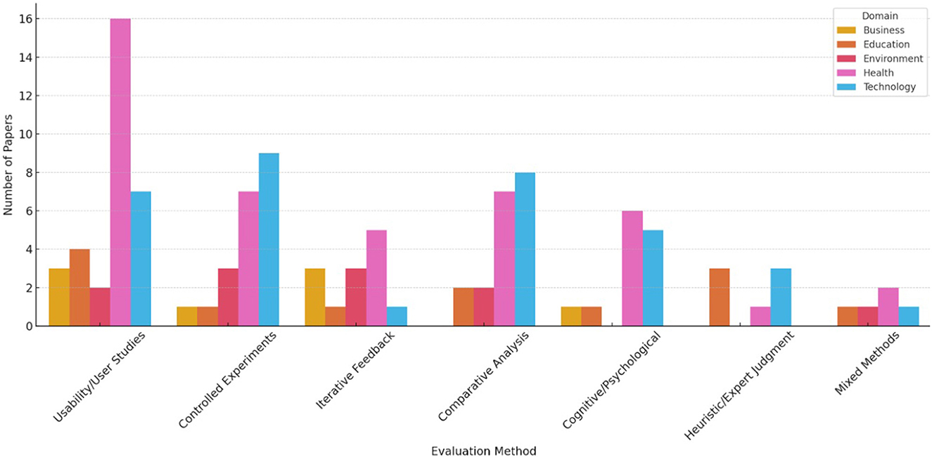
Figure 5. Evaluation method in each domain.
4 Discussion
4.1 Summary of main findings
Following the detailed findings in Section 3 covering what challenges users face in understanding visualizations, how visual elements affect user comprehension and decision-making, and the methods used to evaluate these approaches, we next consolidate the key insights that emerged across the reviewed literature. This summary distills the critical design considerations, evaluation practices, and domain-specific challenges into practical and specific recommendations. By synthesizing these findings, we aim to support researchers and practitioners in developing more effective, accessible and inclusive data visualization tools in real-world decision-making contexts.
Table 7 shows the list of focus areas, and highlights some key issues as well as recommendations for each of these areas.
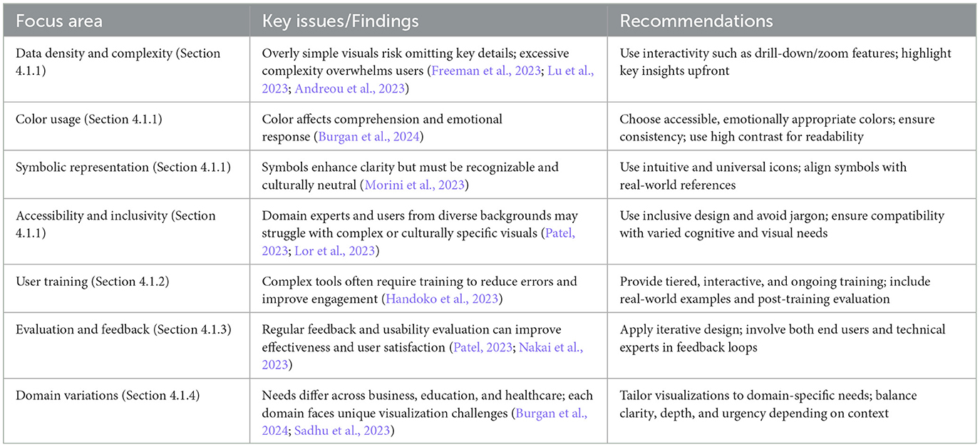
Table 7. Summary of main areas on data visualization design (Section 4.1).
4.1.1 Design considerations
Optimizing data density. Managing data density and complexity is one of the most important considerations in data visualization. A balance must be struck between providing enough detail for informed decision-making and avoiding overwhelming users with too much information (Freeman et al., 2023). While Lu et al. (2023) and Andreou et al. (2023) stress that overly simplistic visualizations risk omitting critical details, which may impair users decision making, complexity for complexity's sake should also be avoided, as it increases the cognitive load on users, making it more difficult to focus on key insights.
The use of clustering techniques, such as DBSCAN, highlighted by Mazzola et al. (2021), is one method of managing data complexity. These techniques allow for the simplification of complex datasets by grouping data points and filtering out noise. Visualizations must also be interactive, enabling users to drill down into details when needed. This is particularly important in fields like healthcare and security, where missing key data points can have significant consequences.
Use of colors. Color is a crucial element in data visualization that aids in distinguishing between different datasets and guiding user attention. However, its misuse can result in confusion, particularly if the colors chosen have unintended emotional connotations or are difficult to distinguish for users with visual impairments. Burgan et al. (2024) mentions that users often associate red with danger or errors, which could skew the interpretation of neutral data. Ensuring appropriate, accessible color choices is key to effective visual communication.
Use of symbolic representation. The use of symbols and signs to represent data can enhance the interpretability of complex visualizations. Morini et al. (2023) demonstrates how using aesthetically resonant symbols, such as those inspired by travel postcards for climate journalism, can make visualizations more engaging and relatable to users. However, symbols must be carefully chosen to ensure that they are universally recognizable, especially in contexts involving domain expert users. Tools that closely resemble real-world objects or scenarios tend to be more intuitive.
Accessibility and inclusivity. Accessibility and inclusivity emerged as recurring concerns across multiple studies. Several authors noted the difficulty domain experts without technical background face in interpreting complex visualizations, particularly when visual elements are not adapted for diverse cognitive styles, visual acuity, or interaction contexts (Patel, 2023; Nakai et al., 2023; Luo, 2023). Lor et al. (2023) and Alger et al. (2024) also emphasize that linguistic and cultural barriers, such as technical jargon or region-specific symbolism, can hinder comprehension among users with limited literacy or from diverse cultural backgrounds. These findings underscore the importance of designing visualizations that are both accessible and culturally neutral to ensure equitable data interpretation for all user groups.
In summary, we have the following recommendations on data consideration in visualizations:
• Employ interactive features such as zoom and drill-down capabilities to allow users to explore data at varying levels of detail.
• Utilize clustering and aggregation techniques to simplify complex datasets, thus highlighting significant patterns without clutter.
• Highlight key insights first and reveal more details as needed. This can reduce cognitive overload.
• Select colors that support the understanding and context of the data, maintaining consistency across different visualizations.
• Design for accessibility by choosing high-contrast color combinations and including alternatives like patterns or textures for users with color vision deficiencies.
• Use intuitive and culturally universal symbols to decrease cognitive load and aid in quicker data interpretation.
4.1.2 User training
Training plays a pivotal role in helping users, particularly in complex environments, effectively interpret and engage with data visualizations and decrease the likelihood of errors. While many visualizations aim to be intuitive, professional users, such as those in healthcare, security, or finance, may require more in-depth training to understand the full potential of advanced visualization types. Training can also be useful to mitigate user bias (e.g., Handoko et al., 2023).
We have the following recommendations:
• Provide tiered training programmes that cater to different expertise levels, from beginners to advanced users. This ensures that all users, regardless of their prior experience with data visualization approaches, can engage effectively.
• Offer interactive, hands-on training sessions to allow users to explore the visualizations themselves, which is far more effective than passive learning. Such training should include real-world scenarios where users can practice interpreting data and making decisions based on visualizations.
• Provide ongoing training and support, particularly in environments where the data being visualized changes frequently. Training should be refreshed regularly to ensure users remain proficient as the visualization approaches evolves.
• Use follow-up evaluations to assess the effectiveness of training in improving user proficiency. Post-training surveys, performance metrics, and observational studies can be used to assess whether training was sufficient or further support is required.
4.1.3 Evaluation and feedback
Evaluation is essential to ensure that visualizations meet user needs, remain intuitive, and effectively communicate insights. Evaluation can provide valuable feedback on how users interact with a visualization. For example, Patel (2023) and Nakai et al. (2023) emphasize the role of usability studies in assessing how well visualization approaches facilitate decision-making.
We have the following recommendations on evaluation and feedback:
• Employ a combination of evaluation methods including usability testing, surveys, and expert heuristic evaluations to gather diverse feedback. This will ensure a comprehensive understanding of how users interact with the visualization and where improvements are needed.
• Implement iterative design processes where visualizations are regularly updated based on user feedback. Engaging users early and often helps identify usability issues and clarify areas where the visualizations may be overwhelming or unclear.
• Use heuristic evaluations, particularly with experts in the field, to identify usability issues that might not be apparent to general users. This ensures that the visualization approach meets the necessary standards of clarity and effectiveness.
4.1.4 Domain variations
Visualization challenges vary significantly across domains, shaped by users' roles and decision contexts. In business, visualization approaches like dashboards support strategic decisions but often overwhelm non-specialist users with complex, real-time data (Burgan et al., 2024; Alwi et al., 2023). In education, the emphasis is on accessibility and interpretive clarity, especially for users with limited data literacy (Deshmukh et al., 2023; Chiang et al., 2022). In healthcare, where decisions are high-stakes and time-sensitive, visualizations must balance clinical precision with rapid comprehension (Sadhu et al., 2023; Shetty and Keshavjee, 2024). These variations highlight the need for domain-sensitive visualization design.
4.2 Limitations
In the following, we discuss the potential limitations of this work.
Language bias. One of the inclusion criteria for papers in this review was that they be written in English. This may have introduced a language bias, as we excluded research published in other languages. As a result, the review may have missed valuable insights from non-English speaking regions or perspectives. This limitation might lead to an incomplete understanding of data visualization practices, especially in culturally diverse contexts where unique approaches and challenges may be present.
Lack of consideration of study impact. Our review does not take into account the impact of the existing studies, such as bibliometric and altmetric measures. While we do so to ensure the comprehensiveness of the review (e.g., to avoid excluding less cited papers), we may not be able to identify key studies that have significantly shaped the field.
Scope limitations. The review was limited to studies sourced from five major academic databases. Although these databases provide extensive interdisciplinary coverage, this restriction may have excluded relevant work published in other repositories or domain-specific platforms. Moreover, gray literature such technical reports, government publications, white papers, and dissertations were not considered. Such sources often contain practical innovations or applied findings, especially in professional or non-academic environments. The exclusion of this material may limit the review's ability to capture emerging trends and real-world applications of data visualization approaches.
Implications of generative AI for visualization design. While our review does not specifically focus on generative AI (GenAI), we recognize its growing relevance within the data visualization community. For example, through automatic chart generation, or the use of large language models to provide natural language explanations. However, our focus is on the visualization design elements, usability considerations, and evaluation methods of data visualization that support domain experts in decision-making contexts. These aspects are largely orthogonal to whether a system incorporates GenAI. In particular, generative models may change how visualizations are created or presented, but not how users perceive and interpret on visual information. For instance, principles such as minimizing cognitive load, selecting appropriate visual encodings, or ensuring interactivity remain important regardless of whether a bar chart is designed manually or generated by AI. Thus, the findings and recommendations of this review apply to both traditional and GenAI-augmented visualization systems for decision-making. Nevertheless, we acknowledge that GenAI introduces new challenges such as transparency, user trust and interpretability of the systems which are important areas for future investigation.
4.3 Conclusions
Data visualization is a crucial tool for presenting complex datasets and AI models in a format that domain expert users can easily understand and use for informed decision making. We have summarized the key directions that contribute to the effectiveness of visualizations for these domain expert audiences, including design considerations, user training, and evaluation and feedback.
Future research in data visualization should aim to address several multifaceted challenges to enhance its effectiveness in aiding users' decision-making. First, one promising direction is the development of adaptive visualization techniques that adjust the complexity and presentation style adaptively based on user background, profiles, and needs. For example machine learning techniques can be leveraged to tailor visual elements in the visualization to suit individual preferences.
Second, it would be interesting to explore new design principles that make visualization more intuitive and comprehensible for domain experts, by incorporating considerations from the fields of psychology, human-computer interactions and education. For example, one could explore how cognitive processes affect data interpretation and design principles to ensure accessibility for people with diverse abilities.
Third, research conducting longitudinal studies on the efficacy of visualization will help to determine their long-term impact, if any, on users' decision-making behavior. Finally, as visualization approaches grow more advanced and are capable of influencing user decisions, it is important to study the ethical implications of design choices in visualization, particularly on the potential for bias in visual interpretations on different visual elements.
Data availability statement
The datasets presented in this study can be found in online repositories. The names of the repository/repositories and accession number(s) can be found in the article/Supplementary material.
Author contributions
GN: Writing – review & editing, Writing – original draft. SMar: Writing – review & editing, Writing – original draft. HC: Writing – review & editing, Writing – original draft. AY: Writing – original draft, Writing – review & editing. DT: Writing – review & editing, Writing – original draft. RS: Writing – original draft, Writing – review & editing. SMaz: Writing – review & editing, Writing – original draft.
Funding
The author(s) declare that financial support was received for the research and/or publication of this article. This research is supported by the University of Sheffield's Regional Innovation Support Programme (Project number 187215), funded by HEIF, UKRI.
Acknowledgments
For the purpose of open access, the author has applied a Creative Commons Attribution (CC BY) license to any Author Accepted Manuscript version arising.
Conflict of interest
DT and RS were employed by Tubr.
The remaining authors declare that the research was conducted in the absence of any commercial or financial relationships that could be construed as a potential conflict of interest.
Generative AI statement
The author(s) declare that no Gen AI was used in the creation of this manuscript.
Publisher's note
All claims expressed in this article are solely those of the authors and do not necessarily represent those of their affiliated organizations, or those of the publisher, the editors and the reviewers. Any product that may be evaluated in this article, or claim that may be made by its manufacturer, is not guaranteed or endorsed by the publisher.
Supplementary material
The Supplementary Material for this article can be found online at: https://www.frontiersin.org/articles/10.3389/fcomm.2025.1605655/full#supplementary-material
References
Ai, Y., Yu, Y., Lei, K., and Liu, W. (2022). “Research and analysis of big data visualization technology,” in Proceedings of SPIE - The International Society for Optical Engineering. doi: 10.1117/12.2628734
Akanmu, S. A., and Jamaluddin, Z. (2016). Designing information visualization for higher education institutions: a pre-design study. J. Inf. Commun. Technol.-Malaysia 15, 145–163. doi: 10.32890/jict2016.15.1.7
Albarrak, A. M. (2023). Determining a trustworthy application for medical data visualizations through a knowledge-based fuzzy expert system. Diagnostics 13:1916. doi: 10.3390/diagnostics13111916
Alger, W., Doan, M., and Caporusso, N. (2024). “Student evaluations of teaching: Using big data visualization to explore challenges and opportunities,” in 2024 47th MIPRO ICT and Electronics Convention (MIPRO) (IEEE), 508–513. doi: 10.1109/MIPRO60963.2024.10569773
Al-Ghamdi, B. A. M. A.-R. (2024). Analyzing the impact of data visualization applications for diagnosing the health conditions through hesitant fuzzy-based hybrid medical expert system. Ain Shams Eng. J. 15:102705. doi: 10.1016/j.asej.2024.102705
Aljasem, D. (2020). “Supporting the design of data visualisation for the visually impaired through reinforcement learning,” in Proceedings of the 17th International Web for All Conference, W4A 2020 (Association for Computing Machinery, Inc.). doi: 10.1145/3371300.3383354
Alwi, N. N. A. N., Hassan, N. H., Baharuden, A. F., Bakar, N. A. A., and Maarop, N. (2023). “Data visualization of supplier selection using business intelligence dashboard,” in Advances in Visual Informatics: 6th International Visual Informatics Conference, IVIC 2019, Bangi, Malaysia, November 19–21, 2019, Proceedings (Springer-Verlag), 71–81. doi: 10.1007/978-3-030-34032-2_7
Ancker, J. S., Benda, N. C., and Zikmund-Fisher, B. J. (2024). Do you want to promote recall, perceptions, or behavior? The best data visualization depends on the communication goal. J. Am. Med. Inform. Assoc. 31, 525–530. doi: 10.1093/jamia/ocad137
Andreou, P., Amyrotos, C., Germanakos, P., and Polycarpou, I. (2023). Human-centered information visualization adaptation engine,” in Proceedings of the 31st ACM Conference on User Modeling, Adaptation and Personalization (Association for Computing Machinery), 25–33. doi: 10.1145/3565472.3592961
Ansari, B., Barati, M., and Martin, E. G. (2022). Enhancing the usability and usefulness of open government data: a comprehensive review of the state of open government data visualization research. Gov. Inf. Q. 39:101657. doi: 10.1016/j.giq.2021.101657
Ansari, B., and Martin, E. G. (2024). Integrating human-centered design in public health data dashboards: lessons from the development of a data dashboard of sexually transmitted infections in new york state. J. Am. Med. Inform. Assoc. 31, 298–305. doi: 10.1093/jamia/ocad102
Azzam, T., Evergreen, S., Germuth, A. A., and Kistler, S. J. (2013). Data visualization and evaluation. New Direct. Eval. 2013, 7–32. doi: 10.1002/ev.20065
Bacic, D., and Henry, R. M. (2012). The role of business information visualization in knowledge creation,” in AMCIS 2012 PROCEEDINGS 18th Americas Conference on Information Systems (Seattle, WA).
Bafna, A., Parkhe, A., Iyer, A., and Halbe, A. (2019). “A novel approach to data visualization by supporting ad-hoc query and predictive analysis: (an intelligent data analyzer and visualizer),” in 2019 International Conference on Intelligent Computing and Control Systems (ICCS), 113–119. doi: 10.1109/ICCS45141.2019.9065380
Balaji, B., Raaj, A. T. M., Harsath, V., Pravin, R. R. S. A., Rani, C., Aarthi, G., et al. (2024). “Taxi revenue optimization with deep q-learning and enhanced data visualization,” in 2024 3rd International Conference on Artificial Intelligence For Internet of Things (AIIoT), 1–6. doi: 10.1109/AIIoT58432.2024.10574699
Ballarini, F., Casadei, M., Borgo, F. D., Ghini, V., and Mirri, S. (2022). “Data visualization and responsive design principles applied to industry 4.0: the mentor project case study,” in ACM International Conference Proceeding Series, 373–377. doi: 10.1145/3524458.3547120
Bandlow, A., Matzen, L. E., Cole, K. S., Dornburg, C. C., Geiseler, C. J., Greenfield, J. A., et al. (2011). Evaluating information visualizations with working memory metrics. Commun. Comput. Inf. Sci. 173, 265–269. doi: 10.1007/978-3-642-22098-2_53
Bishop, I. D., Pettit, C. J., Sheth, F., and Sharma, S. (2013). Evaluation of data visualisation options for land-use policy and decision making in response to climate change. Environ. Plan. B-Plan. Des. 40, 213–233. doi: 10.1068/b38159
Bornschlegl, M. X., Berwind, K., and Hemmje, M. L. (2018). Modeling end user empowerment in big data analysis and information visualization applications. Int. J. Comput. Applic. 25, 30–42.
Borrego, P., and Lewellen, R. (2014). “Collection development and data visualization: How interactive graphic displays are transforming collection development decisions,” in Charleston Conference Proceedings 2014: the Importance Of Being Earnest, eds. B. R. Bernhardt, L. H. Hinds, and K. P. Strauch (Charleston, SC: 34th Charleston Conference Proceedings), 549–556. doi: 10.5703/1288284315637
Burgan, K., Mccollum, C. G., Guzman, A., Penney, B., Hill, S. V., Kudroff, K., et al. (2024). A mixed methods evaluation assessing the feasibility of implementing a prep data dashboard in the Southeastern United States. BMC Health Serv. Res. 24:101. doi: 10.1186/s12913-023-10451-5
Burns, A., Xiong, C., Franconeri, S., Cairo, A., and Mahyar, N. (2020). “How to evaluate data visualizations across different levels of understanding,” in Proceedings - 8th Evaluation and Beyond: Methodological Approaches for Visualization, BELIV 2020, 19–28. doi: 10.1109/BELIV51497.2020.00010
Cabitza, F., Campagner, A., and Conte, E. (2022). “Comparative assessment of two data visualizations to communicate medical test results online,” in Proceedings of the International Joint Conference on Computer Vision, Imaging and Computer Graphics Theory and Applications, 195–202. doi: 10.5220/0010968800003124
Charitos, S., Thompson, L., Brigden, A., and Bird, J. (2024). “Using taxonomies to analyse children's drawings of health data visualisations,” in Proceedings of the 23rd Annual ACM Interaction Design and Children Conference, 902–907. doi: 10.1145/3628516.3659415
Chen, K. (2017). Data distribution model of regional sports tourism in china based on data visualization. Techn. Bull. 55, 16–23.
Chen, Z., Zhang, C., Wang, Q., Troidl, J., Warchol, S., Beyer, J., et al. (2023). “Beyond generating code: evaluating gpt on a data visualization course,” in Proceedings - 2023 IEEE VIS Workshop on Visualization Education, Literacy, and Activities, EduVis 2023, 16–21. doi: 10.1109/EduVis60792.2023.00009
Cheng, L., and Senathirajah, Y. (2023). Using clinical data visualizations in electronic health record user interfaces to enhance medical student diagnostic reasoning: Randomized experiment. JMIR Hum. Factors 10:e38941. doi: 10.2196/38941
Chiang, J.-L., Zhang, Z.-H., and Cheng, H.-C. (2022). “Supporting outcome-based education assessment and evaluation-educational technology solution of a data visualization framework,” in 2022 IEEE 5th International Conference on Information Systems and Computer Aided Education, ICISCAE 2022, 219–224. doi: 10.1109/ICISCAE55891.2022.9927602
Choudhary, V. K., Kumar, G., Suman, S., and Kumar, A. (2024). “A comprehensive review on data visualization techniques for real-time information,” in 7th International Conference on Inventive Computation Technologies, ICICT 2024 (Institute of Electrical and Electronics Engineers Inc.), 866–871. doi: 10.1109/ICICT60155.2024.10544996
Clements, A. C. A. (2023). Spatial and temporal data visualisation for mass dissemination: advances in the era of COVID-19. Trop. Med. Infect. Dis. 8:314. doi: 10.3390/tropicalmed8060314
Concannon, D., Herbst, K., and Manley, E. (2019). Developing a data dashboard framework for population health surveillance: widening access to clinical trial findings. JMIR Formative Res. 3:e11342. doi: 10.2196/11342
Contreras, C. H. (2019). “Surfaces plot a data visualization system to support design space exploration,” in Ecaade Sigradi 2019: Architecture in the Age of the 4th Industrial Revolution, 37th Conference on Education-and-Research-in-Computer-Aided-Architectural-Design-in-Europe (eCAADe) / 23rd Conference of the Iberoamerican-Society-Digital-Graphics (SIGraDi), eds. J. P. Sousa, G. C. Henriques, and J. P. Xavier (Porto, Portugal: Univ Porto, Fac Architecture), 145–152. doi: 10.52842/conf.ecaade.2019.2.145
Cooharojananone, N., Dilokpabhapbhat, J., Rimnong-ang, T., Choosuwan, M., Bunram, P., Atchariyachanvanich, K., et al. (2019). “A data visualization for helping students decide which general education courses to enroll: case of chulalongkorn university,”? in Lecture Notes in Computer Science (including subseries Lecture Notes in Artificial Intelligence and Lecture Notes in Bioinformatics), 627–635. doi: 10.1007/978-3-030-35343-8_66
Couto, J. C., Kroll, J., Ruiz, D. D., and Prikladnicki, R. (2022). Extending the project management body of knowledge (pmbok) for data visualization in software project management. SN Comput. Sci. 3:105. doi: 10.1007/s42979-022-01168-z
da Silva Franco, R. Y., do Amor Divino Lima Rodrigo Santos, R. M., Paixao dos Santos, C. G., and Meiguins, B. S. (2019). Uxmood-a sentiment analysis and information visualization tool to support the evaluation of usability and user experience. Information 10:366. doi: 10.3390/info10120366
Daradkeh, M. (2015). “Exploring the use of an information visualization tool for decision support under uncertainty and risk,” in Proceedings of the The International Conference on Engineering and MIS 2015 (Association for Computing Machinery). doi: 10.1145/2832987.2833050
de Almeida, P. D. (2022). “Information visualization and design activism: an emerging relationship,” in Advances in Design and Digital Communication II, eds. N. Martins, and D. Brand (Cham: Springer), 514–524.
de Camargo, L. F., Moraes, A., Dias, D. R. C., and Brega, J. R. F. (2020). “Information visualization applied to computer network security: a case study of a wireless network of a university,” in Computational Science and Its Applications ICCSA 2020: 20th International Conference, Cagliari, Italy, July 1–4, 2020, Proceedings, Part II (Springer-Verlag), 44–59. doi: 10.1007/978-3-030-58802-1_4
Deshmukh, V., Prithviraj, J., Rautkar, A., Agrawal, R., Dhule, C., and Chavhan, N. (2023). “Interactive data visualization platform to present effective teacher performance with power bi,” in 2023 International Conference on Advances in Computation, Communication and Information Technology (ICAICCIT), 1335–1339. doi: 10.1109/ICAICCIT60255.2023.10466179
Diaz, J., Espinosa, R., and Hochstetter, J. (2022). “Towards more clean results in data visualization: a weka usability experiment,” in Lecture Notes in Computer Science (including subseries Lecture Notes in Artificial Intelligence and Lecture Notes in Bioinformatics), 389–400. doi: 10.1007/978-3-031-05897-4_27
Euman, R., and Abdelnour-Nocera, J. (2013). “Data visualisation, user experience and context: a case study from fantasy sport,” in Proceedings, Part III, of the 15th International Conference on Human-Computer Interaction. Users and Contexts of Use (Springer-Verlag), 146–155. doi: 10.1007/978-3-642-39265-8_16
Evergreen, S., and Metzner, C. (2013). Design principles for data visualization in evaluation. New Direct. Evaluat. 2013, 5–20. doi: 10.1002/ev.20071
Ferreira, F., Santos, B. S., Marques, B., and Dias, P. (2020). “Ficavis: data visualization to prevent university dropout,” in 2020 24th International Conference Information Visualisation (IV), 57–62. doi: 10.1109/IV51561.2020.00034
Flor, V. B. B., Filho, M. B. D. C., de Souza, J. C. S., and Vergara, P. P. (2023). Critical data visualization to enhance protection schemes for state estimation. IEEE Trans. Smart Grid 14, 1249–1261. doi: 10.1109/TSG.2022.3203404
Forsman, J., Anani, N., Eghdam, A., Falkenhav, M., and Koch, S. (2013). Integrated information visualization to support decision making for use of antibiotics in intensive care: design and usability evaluation. Inform. Health Soc. Care 38, 330–353. doi: 10.3109/17538157.2013.812649
Freeman, S. C., Saeedi, E., Ordóñez-Mena, J. M., Nevill, C. R., Hartmann-Boyce, J., Caldwell, D. M., et al. (2023). Data visualisation approaches for component network meta-analysis: visualising the data structure. BMC Med. Res. Methodol. 23:208. doi: 10.1186/s12874-023-02026-z
Gisladottir, U., Nakikj, D., Jhunjhunwala, R., Panton, J., Brat, G., and Gehlenborg, N. (2022). Effective communication of personalized risks and patient preferences during surgical informed consent using data visualization: qualitative semistructured interview study with patients after surgery. JMIR Human Factors 9:e29118. doi: 10.2196/29118
Golfarelli, M., and Rizzi, S. (2020). A model-driven approach to automate data visualization in big data analytics. Inf. Vis. 19, 24–47. doi: 10.1177/1473871619858933
Goodwin, S., Meier, S., Bartram, L., Godwin, A., Nagel, T., and Dork, M. (2021). “Unravelling the human perspective and considerations for urban data visualization,” in IEEE Pacific Visualization Symposium, 126–130. doi: 10.1109/PacificVis52677.2021.00024
Gorniak, J., Ottiger, J., Wei, D., and Kim, N. W. (2023). “Vizability: Multimodal accessible data visualization with keyboard navigation and conversational interaction,” in Adjunct Proceedings of the 36th Annual ACM Symposium on User Interface Software and Technology, 1–3. doi: 10.1145/3586182.3616669
Grossman, L. V., Feiner, S. K., Mitchell, E. G., and Creber, R. M. M. (2018). Leveraging patient-reported outcomes using data visualization. Appl. Clin. Inform. 9, 565–575. doi: 10.1055/s-0038-1667041
Gu, J., Mackin, S., and Zheng, Y. (2019). “Making sense: an innovative data visualization application utilized via mobile platform,” in Proceedings - 20th International Conference on High Performance Computing and Communications, 16th International Conference on Smart City and 4th International Conference on Data Science and Systems, HPCC/SmartCity/DSS 2018, 1105–1109. doi: 10.1109/HPCC/SmartCity/DSS.2018.00184
Gubala, C., and Meloncon, L. (2022). “Data visualizations: an integrative literature review of empirical studies across disciplines,” in IEEE International Professional Communication Conference (Institute of Electrical and Electronics Engineers Inc.), 112–119. doi: 10.1109/ProComm53155.2022.00024
Gudigantala, N., Madhavaram, S., and Bicen, P. (2023). An AI decision-making framework for business value maximization. AI Magaz. 44, 67–84. doi: 10.1002/aaai.12076
Haara, A., Pykinen, J., Tolvanen, A., and Kurttila, M. (2018). Use of interactive data visualization in multi-objective forest planning. J. Environ. Manage. 210, 71–86. doi: 10.1016/j.jenvman.2018.01.002
Haenlein, M., and Kaplan, A. (2019). A brief history of artificial intelligence: on the past, present, and future of artificial intelligence. Calif. Manage. Rev. 61, 5–14. doi: 10.1177/0008125619864925
Handoko, B. L., Reinaldy, N., Wifasari, S., Prasetyo, H., and Meinarsih, T. (2023). “Impact of data mining, big data analytics and data visualization on audit quality,” in Proceedings of the 2023 6th International Conference on Computers in Management and Business (Association for Computing Machinery), 100–105. doi: 10.1145/3584816.3584831
He, X. (2022). Interactive mode of visual communication based on information visualization theory. Comput. Intell. Neurosci. 2022:4482669. doi: 10.1155/2022/4482669
Hernández-Calderón, J.-G., Soto-Mendoza, V., Montané-Jiménez, L.-G., Colula, M. A. M., and Carrillo, J. T. (2023). Information visualization dashboard to proctor test-takers during an online language proficiency test. Interact. Comput. 35, 339–362. doi: 10.1093/iwc/iwac043
Herring, J., VanDyke, M. S., Cummins, R. G., and Melton, F. (2017). Communicating local climate risks online through an interactive data visualization. Environ. Commun.-A J. Nat. Cult. 11, 90–105. doi: 10.1080/17524032.2016.1176946
Hoeber, O. (2018). “Information visualization for interactive information retrieval,” in CHIIR 2018 - Proceedings of the 2018 Conference on Human Information Interaction and Retrieval, 371 374. doi: 10.1145/3176349.3176898
Holdsworth, D., and Zagorecki, A. (2023). A picture paints a thousand words: supporting organizational learning in the emergency services with data visualization. Learn. Organ. 30, 231–250. doi: 10.1108/TLO-01-2022-0001
Holjevac, M., and Jakopec, T. (2020). “Web application dashboards as a tool for data visualization and enrichment,” in 2020 43rd International Convention on Information, Communication and Electronic Technology (MIPRO), 1740–1745. doi: 10.23919/MIPRO48935.2020.9245289
Horcas, J.-M., Galindo, J. A., and Benavides, D. (2022). “Variability in data visualization: a software product line approach,” in Proceedings of the 26th ACM International Systems and Software Product Line Conference - Volume A (Association for Computing Machinery), 55–66. doi: 10.1145/3546932.3546993
Huang, H., Zhang, R., and Lu, X. (2019). “A recommendation model for medical data visualization based on information entropy and decision tree optimized by two correlation coefficients,” in Proceedings of the 9th International Conference on Information Communication and Management, 52–56. doi: 10.1145/3357419.3357436
Ismail, N. I., Abdullah, N. A. S., and Omar, N. (2022). Exploring alumni data using data visualization techniques. Int. J. Adv. Comput. Sci. Applic. 13, 188–195. doi: 10.14569/IJACSA.2022.0130922
Jhamb, S., Gupta, R., Shukla, V. K., Mearaj, I., and Agarwal, P. (2020). “Understanding complexity in language learning through data visualization using python,” in 2020 International Conference on Computation, Automation and Knowledge Management (ICCAKM), 268–274. doi: 10.1109/ICCAKM46823.2020.9051512
Jiang, T., Hou, Y., and Yang, J. (2023). Literature review on the development of visualization studies (2012–2022). Eng. Proc. 38:89. doi: 10.3390/engproc2023038089
Kastens, K. A., Zrada, M., and Turrin, M. (2020). What kinds of questions do students ask while exploring data visualizations? J. Geosci. Educ. 68, 199–219. doi: 10.1080/10899995.2019.1675447
Kaya, F., Celik, E., Batmaz, A. U., Mutasim, A. K., and Stuerzlinger, W. (2023). Evaluation of an immersive covid-19 data visualization. IEEE Comput. Graph. Appl. 43, 76–83. doi: 10.1109/MCG.2022.3223535
Kettelhut, V. V., Vanschooneveld, T. C., McClay, J. C., Mercer, D. F., Fruhling, A., and Meza, J. L. (2017). Empirical study on the impact of a tactical biosurveillance information visualization on users situational awareness. Mil. Med. 182, 322–329. doi: 10.7205/MILMED-D-16-00143
Kim, S., Seo, W., Kim, J., Kim, S.-W., and Jeon, Y.-C. (2022). Impact echo data visualization through augmented reality. J. Infrastr. Syst. 28:04022018. doi: 10.1061/(ASCE)IS.1943-555X.0000701
Kim, Y. S., Kayongo, P., Grunde-Mclaughlin, M., and Hullman, J. (2021). Bayesian-assisted inference from visualized data. IEEE Trans. Vis. Comput. Graph. 27, 989–999. doi: 10.1109/TVCG.2020.3028984
Kirk, A. (2016). Data Visualisation: A Handbook for Data Driven Design. London: SAGE Publications Ltd, 2nd edition.
Koopman, R. J., Canfield, S. M., Belden, J. L., Wegier, P., Shaffer, V. A., Valentine, K. D., et al. (2020). Home blood pressure data visualization for the management of hypertension: Designing for patient and physician information needs. BMC Med. Inform. Decis. Mak. 20:195. doi: 10.1186/s12911-020-01194-y
Kukimoto, N. (2014). “Open government data visualization system to facilitate evidence-based debate using a large-scale interactive display,” in Proceedings of the 2014 IEEE 28th International Conference on Advanced Information Networking and Applications (IEEE Computer Society), 955–960. doi: 10.1109/AINA.2014.116
Kwong, E., Cole, A., Khasawneh, A., Mhina, C., Mazur, L., Adapa, K., et al. (2022). “Evaluation of data visualizations for an electronic patient preferences tool for older adults diagnosed with hematologic malignancies,” in 13th Workshop on Visual Analytics in Healthcare, VAHC 2022. doi: 10.1109/VAHC57815.2022.10108523
Lami, I. M., Abastante, F., Bottero, M., Masala, E., and Pensa, S. (2014). Integrating multicriteria evaluation and data visualization as a problem structuring approach to support territorial transformation projects. EURO J. Decis. Proc. 2, 281–312. doi: 10.1007/s40070-014-0033-x
Langton, J. T., and Baker, A. (2013). “Information visualization metrics and methods for cyber security evaluation,” in IEEE ISI 2013- 2013 IEEE International Conference on Intelligence and Security Informatics: Big Data, Emergent Threats, and Decision-Making in Security Informatics, 292–294. doi: 10.1109/ISI.2013.6578846
Lee, S., Kim, E., and Monsen, K. A. (2015). Public health nurse perceptions of omaha system data visualization. Int. J. Med. Inform. 84, 826–834. doi: 10.1016/j.ijmedinf.2015.06.010
Lizenberg, V., Buechs, B., Knapp, S., Mannale, R., and Koester, F. (2020). “Graphical data visualization for vehicular communication systems in real and virtual test environments,” in AmE 2020 - Automotive meets Electronics; 11th GMM-Symposium, 1–6.
Llaha, O., and Aliu, A. (2023). “Application of data visualization and machine learning algorithms for better decision making,” in CEUR Workshop Proceedings, 97–101.
Lor, M., Yang, N. B., Backonja, U., and Bakken, S. (2023). Evaluating and refining a pain quality information visualization tool with patients and interpreters to facilitate pain assessment in primary care settings. Inform. Health Soc. Care 48, 353–369. doi: 10.1080/17538157.2023.2240411
Lu, Q., Ge, Y., Rao, J., Ling, L., Yu, Y., and Zhang, Z. (2023). Waterexcva: a system for exploring and visualizing data exception in urban water supply. J. Vis. 26, 957–976. doi: 10.1007/s12650-023-00911-9
Lundkvist, A., El-Khatib, Z., Kalra, N., Pantoja, T., Leach-Kemon, K., Gapp, C., et al. (2021). Policy-makers views on translating burden of disease estimates in health policies: bridging the gap through data visualization. Arch. Public Health 79:17. doi: 10.1186/s13690-021-00537-z
Luo, W. (2023). User selection strategies of interactive data visualization format. J. Comput. Inf. Syst. 63, 81–93. doi: 10.1080/08874417.2021.2023338
Malik, M. S. A., and Sulaiman, S. (2016). “An analytical evaluation of information visualization factors for multiple electronic health records,” in 2016 3rd International Conference on Computer and Information Sciences (ICCOINS), 126–131. doi: 10.1109/ICCOINS.2016.7783201
Manyika, J., Chui, M., Brown, B., Bughin, J., Dobbs, R., Roxburgh, C., et al. (2011). Big data: The Next Frontier for Innovation, Competition, and Productivity. McKinsey Global Institute. Available online at: https://www.mckinsey.com/capabilities/mckinsey-digital/our-insights/big-data-the-next-frontier-for-innovation
Mao, C.-C., Tseng, Y.-C., and Chen, C.-H. (2018). “Dynamic information visualization on cognitive ability for intelligence preparation of the battlefield,” in Proceedings of the 6th International Conference on Information and Education Technology (Association for Computing Machinery), 263–266. doi: 10.1145/3178158.3178194
Mazzola, L., Stalder, F., Waldis, A., Siegfried, P., Renold, C., Reber, D., et al. (2021). Security rules identification and validation: the role of explainable clustering and information visualisation. Commun. Comput. Inf. Sci. 1420, 431–438. doi: 10.1007/978-3-030-78642-7_58
Medeiros, C., Alencar, M. H., Garcez, T. V., and de Almeida, A. T. (2017). “Multidimensional risk evaluation: Information visualization to support a decision-making process in the context of natural gas pipeline,” in Risk, Reliability And Safety: Innovating Theory and Practice, eds. L. Walls, M. Revie, and T. Bedford (Glasgow, Scotland: 26th Conference on European Safety and Reliability (ESREL)), 2922–2928. doi: 10.1201/9781315374987-444
Medeiros, C. P., Alencar, M. H., and de Almeida, A. T. (2016). Hydrogen pipelines: Enhancing information visualization and statistical tests for global sensitivity analysis when evaluating multidimensional risks to support decision-making. Int. J. Hydrogen Energy 41, 22192–22205. doi: 10.1016/j.ijhydene.2016.09.113
Meloncon, L., and Warner, E. (2017). Data visualizations: a literature review and opportunities for technical and professional communication,” in 2017 IEEE International Professional Communication Conference (ProComm) (Madison, WI). doi: 10.1109/IPCC.2017.8013960
Miller, T. (2019). Explanation in artificial intelligence: insights from the social sciences. Artif. Intell. 267, 1–38. doi: 10.1016/j.artint.2018.07.007
Monsivais, P., Francis, O., Lovelace, R., Chang, M., Strachan, E., and Burgoine, T. (2018). Data visualisation to support obesity policy: case studies of data tools for planning and transport policy in the uk. Int. J. Obes. 42, 1977–1986. doi: 10.1038/s41366-018-0243-6
Morgan, R., Grossmann, G., Schrefl, M., Stumptner, M., and Payne, T. (2018). “Vizdsl: a visual dsl for interactive information visualization,” in Advanced Information Systems Engineering: 30th International Conference, CAiSE 2018, Tallinn, Estonia, June 11–15, 2018, Proceedings (Springer-Verlag), 440–455. doi: 10.1007/978-3-319-91563-0_27
Morini, F., Eschenbacher, A., Hartmann, J., and Dark, M. (2023). From shock to shift: data visualization for constructive climate journalism. IEEE Trans. Vis. Comput. Graph. 30, 1413–1423. doi: 10.1109/TVCG.2023.3327185
Muller, D., and Tierney, K. (2017). Decision support and data visualization for liner shipping fleet repositioning. Inf. Technol. Manag. 18, 203–221. doi: 10.1007/s10799-016-0259-3
Nakai, Y., Itoh, T., Takahashi, H., Nakashima, S., and Yamamoto, T. (2023). “Hierarchical data visualization of gender difference: application to feeling of temperature,” in 2023 27th International Conference Information Visualisation (IV), 178–183. doi: 10.1109/IV60283.2023.00039
Nguyen, H. N., Trujillo, C. M., Wee, K., and Bowe, K. A. (2021). “Interactive qualitative data visualization for educational assessment,” in ACM International Conference Proceeding Series. doi: 10.1145/3468784.3469851
Nguyen, T. T., and Song, I. (2016). “Centrality clustering-based sampling for big data visualization,” in 2016 International Joint Conference On Neural Networks (IJCNN) (Vancouver, Canada), 1911–1917. doi: 10.1109/IJCNN.2016.7727433
Ntoa, S., Birliraki, C., Drossis, G., Margetis, G., Adami, I., and Stephanidis, C. (2017). “Ux design of a big data visualization application supporting gesture-based interaction with a large display,” in Human Interface and the Management of Information: Information, Knowledge and Interaction Design, HCI International 2017, ed. S. Yamamoto (Vancouver, Canada), 248–265. doi: 10.1007/978-3-319-58521-5_20
Page, M. J., McKenzie, J. E., Bossuyt, P. M., Boutron, I., Hoffmann, T. C., Mulrow, C. D., et al. (2021). The prisma 2020 statement: an updated guideline for reporting systematic reviews. BMJ 372:n71. doi: 10.1136/bmj.n71
Pan, F., Chen, Z., Wu, T., and Li, Y. (2024). “Campus information visualization management and design using the k-means data analysis method,” in Proceedings of the 2023 International Conference on Information Education and Artificial Intelligence (Association for Computing Machinery), 241–246. doi: 10.1145/3660043.3660086
Park, H., Fussell, D., and Navrátil, P. (2018). “Spray: speculative ray scheduling for large data visualization,” in 2018 IEEE 8th Symposium on Large Data Analysis and Visualization (LDAV), 77–86. doi: 10.1109/LDAV.2018.8739224
Patel, A. M. (2023). “The design &evaluation of an information visualization to improve the efficiency &understanding of patient health state,” in 2023 IEEE 11th International Conference on Healthcare Informatics (ICHI), 477. doi: 10.1109/ICHI57859.2023.00071
Peng, Z., and Cao, S. (2022). “Analysis and research on the policy performance of college students returning home to start a business based on data visualization 'artificial intelligence + agriculture',” in Proceedings - 2022 2nd International Symposium on Artificial Intelligence and its Application on Media, ISAIAM 2022, 10–15. doi: 10.1109/ISAIAM55748.2022.00010
Perdana, A., Robb, A., and Rohde, F. (2019). Interactive data and information visualization: Unpacking its characteristics and influencing aspects on decision-making. Pacific Asia J. Assoc. Inf. Syst. 11, 75–104. doi: 10.17705/1pais.11404
Pitchforth, J. (2013). “An evaluation of the circles information visualization tool for presenting bayesian network output,” in 2013 Fifth International Conference on Computational Intelligence, Modelling and Simulation, 83–89. doi: 10.1109/CIMSim.2013.22
Porter, M. E., Hill, M. C., Harris, T., Brookfield, A., and Li, X. (2021). The discoverframework freeware toolkit for multivariate spatio-temporal environmental data visualization and evaluation. Environ. Model. Softw. 143:105104. doi: 10.1016/j.envsoft.2021.105104
Price, M. M., Crumley-Branyon, J. J., Leidheiser, W. R., and Pak, R. (2016). Effects of information visualization on older adults' decision-making performance in a medicare plan selection task: a comparative usability study. JMIR Hum. Factors 3:e5106. doi: 10.2196/humanfactors.5106
Ries, M., Golcher, H., Prokosch, H. U., Beckmann, M. W., and Brkle, T. (2012). “An EMR based cancer diary - utilisation and initial usability evaluation of a new cancer data visualization tool,” in Studies in Health Technology and Informatics (IOS Press), 656–660.
Roselli, L. R. P., de Almeida, A. T., and Frej, E. A. (2019). Decision neuroscience for improving data visualization of decision support in the fitradeoff method. Oper. Res. 19, 933–953. doi: 10.1007/s12351-018-00445-1
Sadhu, S., Solanki, D., Brick, L. A., Nugent, N. R., and Mankodiya, K. (2023). Designing a clinician-centered wearable data dashboard (careportal): participatory design study. JMIR Format. Res. 7:e46866. doi: 10.2196/46866
Sanchez-Ferrer, A., Prez-Mendoza, H., and Shiguihara-Jurez, P. (2019). “Data visualization in dashboards through virtual try-on technology in fashion industry,” in 2019 IEEE Colombian Conference on Applications in Computational Intelligence (ColCACI), 1–6. doi: 10.1109/ColCACI.2019.8781971
Shaheen, S. M., Alhalawani, S., Alnabet, N., and Alhenaki, D. (2019). Analytical experiments on the utilization of data visualizations. Commun. Comput. Inf. Sci. 1097, 148–161. doi: 10.1007/978-3-030-36365-9_12
Shetty, R., and Keshavjee, K. (2024). Towards a regulatory framework for electronic medical record data visualization. Stud. Health Technol. Inform. 312, 64–68. doi: 10.3233/SHTI231313
Simões Jr, P. S., Raimundo, P. O., Novais, R., Vieira, V., and Mendonca, M. (2017). “Supporting decision making during emergencies through information visualization of crowdsourcing emergency data,” in ICEIS: Proceedings Of The 19th International Conference On Enterprise Information Systems, eds. S. Hammoudi, M. Smialek, O. Camp, and J. Filipe (Porto, Portugal: 19th International Conference on Enterprise Information Systems (ICEIS)), 178–185. doi: 10.5220/0006370701780185
Somanath, S., Carpendale, S., Sharlin, E., and Sousa, M. C. (2014). “Information visualization techniques for exploring oil well trajectories in reservoir models,” in Proceedings of Graphics Interface 2014 (Canadian Information Processing Society), 145–150. doi: 10.1201/9781003059325-19
Sopan, A., Noh, A. S.-I., Karol, S., Rosenfeld, P., Lee, G., and Shneiderman, B. (2012). Community health map: a geospatial and multivariate data visualization tool for public health datasets. Gov. Inf. Q. 29, 223–234. doi: 10.1016/j.giq.2011.10.002
Spiker, J., Kreimeyer, K., Dang, O., Boxwell, D., Chan, V., Cheng, C., et al. (2020). Information visualization platform for postmarket surveillance decision support. Drug Safety 43, 905–915. doi: 10.1007/s40264-020-00945-0
Stecyk, A., and Miciula, I. (2023). Empowering sustainable energy solutions through real-time data, visualization, and fuzzy logic. Energies 16:7451. doi: 10.3390/en16217451
Stern, S., Getnet, D., Hoorde, E. V., Cucalon, J., and Cherbaka, N. (2024). “Reducing lead times in manufacturing with real-time data visualizations,” in 2024 Systems and Information Engineering Design Symposium, SIEDS 2024, 337–342. doi: 10.1109/SIEDS61124.2024.10534636
Sullivan, P. S., Woodyatt, C., Koski, C., Pembleton, E., McGuinness, P., Taussig, J., et al. (2020). A data visualization and dissemination resource to support hiv prevention and care at the local level: Analysis and uses of the aidsvu public data resource. J. Med. Internet Res. 22:e23173. doi: 10.2196/23173
Sun, Y., Han, Y., and Fan, J. (2023). Laplacian-based cluster-contractive t-sne for high-dimensional data visualization. ACM Trans. Knowl. Discov. Data 18, 1–22. doi: 10.1145/3612932
Survey Point (2023). The role of real-time engagement metrics in evaluating data visualization tools. Available online at: https://www.surveypoint.com/articles/real-time-engagement-metrics-data-visualization (Accessed October 24, 2023).
Thayer, J. G., Ferro, D. F., Miller, J. M., Karavite, D., Grundmeier, R. W., Utidjian, L., et al. (2021). Human-centered development of an electronic health record-embedded, interactive information visualization in the emergency department using fast healthcare interoperability resources. J. Am. Med. Inform. Assoc. 28, 1401–1410. doi: 10.1093/jamia/ocab016
Theis, S., Brhl, C., Wille, M., Rasche, P., Mertens, A., Beauxis-Aussalet, E., et al. (2016). “Ergonomic considerations for the design and the evaluation of uncertain data visualizations,” in International Conference on Human Interface and the Management of Information (Cham: Springer International Publishing), 191–202. doi: 10.1007/978-3-319-40349-6_19
Ueda, R., Murooka, M., Ohara, Y., Kumagai, I., Terasawa, R., Furuta, Y., et al. (2015). “Humanoid integrated ui system for supervised autonomy with massive data visualization over narrow and unreliable network communication for drc competition,” in 2015 IEEE-RAS 15th International Conference on Humanoid Robots (Humanoids), 797–804. doi: 10.1109/HUMANOIDS.2015.7363445
Ufot, J., Esterline, A., and Bryant, K. S. (2021). “Inventory control at a university food pantry using an MVC software pattern and data visualization,” in SoutheastCon 2021, 1–7. doi: 10.1109/SoutheastCon45413.2021.9401894
Upreti, S., Singh, J., Singh, N. P., Patil, S., Tiwari, M., and Elangovan, M. (2024). “AI-driven horticulture: interactive hyperspectral data visualization,” in 2024 IEEE 9th International Conference for Convergence in Technology, I2CT 2024. doi: 10.1109/I2CT61223.2024.10543764
Vzquez-Ingelmo, A. (2024). “Heuristic evaluation of metaviz: insights and strategic recommendations to elevate user experience in an automated data visualization platform,” in Proceedings of the XXIV International Conference on Human Computer Interaction (Association for Computing Machinery). doi: 10.1145/3657242.3658676
Wanderer, J. P., Nelson, S. E., Ehrenfeld, J. M., Monahan, S., and Park, S. (2016). Clinical data visualization: the current state and future needs. J. Med. Syst. 40:275. doi: 10.1007/s10916-016-0643-x
Wang, Q., Chen, Z., Wang, Y., and Qu, H. (2022). A survey on ml4vis: Applying machine learning advances to data visualization. IEEE Trans. Vis. Comput. Graph. 28, 5134–5153. doi: 10.1109/TVCG.2021.3106142
Wang, Z., Wu, Y., Gonzalez, V. A., Zou, Y., del Rey Castillo, E., Arashpour, M., et al. (2023). User-centric immersive virtual reality development framework for data visualization and decision-making in infrastructure remote inspections. Adv. Eng. Inform. 57:102078. doi: 10.1016/j.aei.2023.102078
Wilhelm, M., Burneleit, E., and Albayrak, S. (2014). “Tactical information visualization for operation managers in mass casualty incidents,” in CEUR Workshop Proceedings, 953.
Wong, Y. L., Madhavan, K., and Elmqvist, N. (2018). “Towards characterizing domain experts as a user group,” in 2018 IEEE Evaluation and Beyond-Methodological Approaches for Visualization (BELIV) (IEEE), 1–10. doi: 10.1109/BELIV.2018.8634026
Wu, Y., Guo, Z., Mamakos, M., Hartline, J., and Hullman, J. (2024). The rational agent benchmark for data visualization. IEEE Trans. Vis. Comput. Graph. 30, 338–347. doi: 10.1109/TVCG.2023.3326513
Xu, L., Francisco, A., Taylor, J. E., and Mohammadi, N. (2021). Urban energy data visualization and management: evaluating community-scale eco-feedback approaches. J. Manag. Eng. 37:04020111. doi: 10.1061/(ASCE)ME.1943-5479.0000879
Yan, Z., Liu, C., Niemi, V., and Yu, G. (2013). Exploring the impact of trust information visualization on mobile application usage. Personal Ubiquit. Comput. 17, 1295–1313. doi: 10.1007/s00779-013-0636-4
Yang, M., and Biuk-Aghai, R. P. (2015). “Enhanced hexagon-tiling algorithm for map-like information visualisation,” in ACM International Conference Proceeding Series, 137–142. doi: 10.1145/2801040.2801056
Zhang, Y., and Padman, R. (2017). “An interactive platform to visualize data-driven clinical pathways for the management of multiple chronic conditions,” in Studies in Health Technology and Informatics (IOS Press BV), 672–676.
Keywords: data visualization, AI-assisted, decision-making, systematic review, visualization design and evaluation methods
Citation: Neri G, Marshall S, Chan HK-H, Yaghi A, Tabor D, Sinha R and Mazumdar S (2025) Data visualization in AI-assisted decision-making: a systematic review. Front. Commun. 10:1605655. doi: 10.3389/fcomm.2025.1605655
Received: 03 April 2025; Accepted: 22 July 2025;
Published: 14 August 2025.
Edited by:
Gemma San Cornelio, Fundació per a la Universitat Oberta de Catalunya, SpainReviewed by:
Verena Elisabeth Fäßler, Vorarlberg University of Applied Sciences, AustriaJavier Cantón-Correa, International University of La Rioja, Spain
Fernanda Pires, Autonomous University of Barcelona, Spain
Copyright © 2025 Neri, Marshall, Chan, Yaghi, Tabor, Sinha and Mazumdar. This is an open-access article distributed under the terms of the Creative Commons Attribution License (CC BY). The use, distribution or reproduction in other forums is permitted, provided the original author(s) and the copyright owner(s) are credited and that the original publication in this journal is cited, in accordance with accepted academic practice. No use, distribution or reproduction is permitted which does not comply with these terms.
*Correspondence: Harry Kai-Ho Chan, aC5rLmNoYW5Ac2hlZmZpZWxkLmFjLnVr