 Nico Graebling1,2*
 Özgür Ozan Şen1
 Lars Bilke1Tuanny Cajuhi3Dmitri Naumov4,1Wenqing Wang1Gesa Ziefle3
 David Jaeggi5
 Jobst Maßmann3
 Gerik Scheuermann2Olaf Kolditz1,6
 Karsten Rink1
- 1Department of Environmental Informatics, Helmholtz Centre for Environmental Research (UFZ), Leipzig, Germany
- 2Image and Signal Processing Group, Institute for Computer Science, Faculty of Mathematics and Computer Science, Leipzig University, Leipzig, Germany
- 3Federal Institute for Geosciences and Natural Resources (BGR), Hanover, Germany
- 4TU Bergakademie Freiberg, Freiberg, Germany
- 5Swiss Geological Survey, Federal Office of Topography (swisstopo), Wabern, Switzerland
- 6Applied Environmental Systems Analysis, TU Dresden, Dresden, Germany
Underground Research Laboratories (URLs) allow geoscientific in-situ experiments at large scale. At the Mont Terri URL in Switzerland, international research groups conduct numerous experiments in parallel. The measured and simulated data as well as research results obtained from them are highly relevant as they improve the general understanding of geological processes, for example in the context of radioactive waste disposal. Unfortunately, the data obtained at the test site is often only available to researchers who are directly involved in a particular experiment. Furthermore, typical visualisation techniques of such data by domain scientists often lack spatial context and accessing and exploring the data requires prior technical knowledge and a high level of effort. We created a digital replica of the Mont Terri URL and thereby implemented a prototype of a Virtual Experiment Information System that integrates highly heterogeneous data from several different sources. It allows accessing and exploring the relevant data embedded in its spatial context without much prior technical knowledge. Both, simulation results and observation data are displayed within the same system. The 4D visualisation approach focuses on three exemplary experiments conducted at Mont Terri and is easily transferable to other experiments or even other URLs. The Unity Game Engine has been used to develop the prototype. This allowed to build the application for various output devices like desktop computers or Virtual Reality hardware without much additional effort. The implemented system reduces the technical effort required to access and explore highly relevant research data and lowers the cognitive effort usually needed to gain insights from measurements, simulation models and context data. Moreover, it promotes exchange among research groups by enabling interactive visualisations embedded in the URL’s spatial context. In addition, a future use of the system for the communication of scientific methods and results to stakeholders or the general public is plausible.
1 Introduction
Underground Research Laboratories (URLs) enable geoscientific in-situ experiments that allow researchers to gain a deeper understanding of geological processes, investigate safety aspects for the disposal of radioactive waste and develop and analyse novel processes for energy production and storage (Nagel et al., 2021).
In recent years, there has been an increasing focus on methods to digitally recreate URLs and visually analyse the data. Examples of virtually reproduced laboratories are the VIRTUS Project1 an virtual underground laboratory in rock salt (Wieczorek et al., 2014), CALLIO LAB2 an underground research centre for various research areas in Finland (Jalas et al., 2017) and SNOLAB3 an underground science laboratory in Ontario, Canada (Duncan et al., 2010). Recently, a new underground laboratory GeoLaB4 has been suggested which will develop scientific-technological solutions for a sustainable exploitation of geothermal energy systems accompanied by sociological studies dealing also with public acceptance of new geotechnologies (Meller et al., 2018). Although all these URLs focus on different research questions and methodology, these examples clearly show the high relevance of URLs in general on the one hand and the increasing importance of visualisations of URL-related data on the other hand.
The Mont Terri URL in the canton of Jura in Switzerland is an example of an underground research site for which a digital replication could improve the accessibility of data from long term in-situ experiments. The URL is embedded in Opalinus Clay, a potential host rock for the final disposal of radioactive waste. Numerous in-situ experiments conducted at Mont Terri URL over the past decades have enabled international collaborative research on a large scale (Bossart et al., 2018). Due to the high level of interdisciplinarity and the manifold technical challenges, the actors and stakeholders involved in this research site are very diverse concerning their profession and specialisation.
Diverse parameters and quantities are measured during all experiments performed at the Mont Terri URL. Most of this sensor data as well as the borehole data is stored in standard databases. These are accessible via a database front-end that also allows data export. Additional manual measurements that are not stored in the databases are conducted. Up to now, all this data has mostly been presented in form of 2D diagrams or non-interactive 3D visualisations with a focus on single experiments and is often only usable for experts from the field with additional prior knowledge.
There are, for example, investigations based on the manual extraction and processing of the measured and simulated data for a single experiment like the work by Ziefle et al. (2021, 2022) concerning the Cyclic Deformation Experiment. They present multi-disciplinary research results for one experiment within the Mont Terri URL and provide images of 3D visualisations for the measured and simulated data.
Another example is the work of Raith et al. (2020) that addresses another experiment within the Mont Terri URL. Their algorithm results in an alternative approach to explore multivariate data for the visual analysis of simulation data compared to the state of the art. The new algorithm has been applied only to data of the selected experiment and is limited to multivariate data with specific properties. Working with the visualisations requires prior knowledge in the field of scientific visualisation and therefore requires training and expertise.
As mentioned before, approaches like these are often limited to a single experiment and present research results with specific 2D plots or screenshots of 3D visualisations. The tools that are used by researchers for the exploration often do not allow for intuitive in-depth interactions within the scene and often lack context data, e.g. in-situ geological conditions and location. This situation increases the cognitive effort needed for the investigation and exploration. In addition, the initial costs of the manual technical setup are high as researchers have to access, extract and prepare data manually before being able to start their exploration. In this regard the preparation and presentation of the data is a time-consuming step and therefore must be either very generic or implemented specifically for each experiment while many different experiments run in parallel. Access is therefore limited to domain experts with prior knowledge in the field of computer science.
The limitations of these approaches have been targeted with the development of virtual 3D Information Systems. An example for such a system is the FE5 Information System (FEIS) described by Yeatman et al. (2019) and Müller et al. (2019). The application digitally replicates parts of the Mont Terri URL in the scope of one experiment and displays sensors and their measurements. The technical system behind this application is called OASIS (Overarching Scientific Information System by BetterDataSystems6) and has also been used for the GAST-experiment7 at the Grimsel test site. It has been implemented as a web browser application and focuses on the extraction, processing and presentation of sensor measurements, also in charts. It does not provide further information on boreholes and shows only limited spatial context. In addition, visualisations are only implemented at a local scale and do not cover the whole URL.
Systems like FEIS clearly reduce the manual technical effort for researchers to access measurement data. But due to their different focus of application they lack an important aspect for in-depth exploration on a larger scale: Besides time series data, for every experiment there is other data such as simulation results or spatial data sets. This additional data may also include fault zones, stratigraphic layers, borehole locations and reports containing drilling documentation. These data sets are of great importance for research, as they play a crucial role in the interpretation of measurement data. Unfortunately, this additional context data is often only available to the researchers running the particular experiment and in most of the cases these data sets are not used during the exploration in a visual interactive process. In addition, information systems like FEIS mainly focus on single experiments which leads to the need for additional, complementary systems for the collaboration and exchange of research teams of different experiments.
In the analysis of this situation, four main challenges for new information and exploration tools for researchers at URLs have been identified that, to our knowledge, have not yet been addressed in combination: 1) Access to data should be possible without major technical barriers and foreknowledge. 2) The data should be embedded into its spatial and temporal context using state of the art visualisations. 3) Exploration of measurements and experiments in general should be implemented in an interactive manner. 4) When presenting the data, it should be taken into account that the target groups for the communication of research projects and results are very diverse in terms of their professional background and their prior knowledge.
Our approach to overcome these four challenges is a prototype of an interactive Virtual Experiment Information System (VEIS) based on a digital replication of the Mont Terri URL that embeds measurements, simulation results and additional data into one spatial context. These data sets are highly heterogeneous concerning their structure, dimensionality and extent. The prototype is usable without further prior knowledge and has been developed in constant discussion and close cooperation with experts from the field. The resulting application does not only allow for user-driven in depth exploration but also gives an overview of the URL and presents curated research results for a selection of three experiments. With this approach the technical access barrier of highly relevant research data is lowered and data is prepared visually in a way that minimises the cognitive effort needed for investigation and exploration. In addition, the application enables and supports exchange among researchers as well as science communication to the broad public.
The following Section 2 explains the general software setup and the methodology of the technical data integration. Then Section 3 presents the interactive visualisations of three selected experiments and explains why these visualisations lower the effort needed for investigation and exploration. Our prototype of a Virtual Experiment Information System is described in Section 4. The paper then ends with the conclusion in Section 5.
2 Setup and Data Integration
2.1 General Application Setup
Our prototype of a VEIS is based on the framework of an Environmental Information System originally developed for hydrological applications (Rink et al., 2020; 2022a) and recently extended for including geotechnical data (Blecha et al., 2019; Rink et al., 2022b). An overview of the general application setup and the integrated data is given in Figure 1. The application is implemented using the Unity Game Engine8 (Unity) which provides (among other things) extensive functionality for interactive 3D scenes. Unity has been used as it supports a wide range of input- and output devices: The application can be built for desktop PCs as well as for stereoscopic Virtual Reality devices like Head-Mounted Displays (HMD) or CAVE-like9 visualisation centres. It supports a variety of input devices from regular desktop PC controllers (keyboard and mouse) to dedicated VR controllers such as HTC Vive Controllers or Flysticks. Another benefit of using Unity is that it can easily be extended by implementing additional modules and methods. Furthermore, Unity also enables the recording of interactive sessions. The movies created in this way can be used for example for presentations.
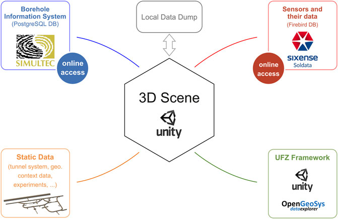
FIGURE 1. Overview of the integrated data sources. The copyright of the logos belong to the corresponding companies.
The performance of the application obviously depends on the complexity of the scene (i.e. the size and quality of rendered objects) as well as the screen resolution of the output device. For the prototype a notebook with a dedicated graphics card10 is sufficient to render the visualisations and animations.
For the usage on HMDs like the Oculus Quest 2 or the HTC Vive Pro, a notebook or PC with a sufficient graphics card and the device specific connectors (i.e., DisplayPort for the Oculus Quest 2) can be used to outsource the time-consuming calculation of separate images for the left and right eye. To use the application in CAVE-like settings plug-in type software modules like MiddleVR11 or UniCAVE12 are required.
2.2 Integration of Static Data
A collection of heterogeneous data sets, originally available in a wide range of data formats, has been included in the prototype and a number of spatial data sets are a fixed part of the application. This is what we call static application data. Although static data might be time-dependent (e.g. results of numerical simulations) and thereby might be displayed in different states, the data sets themselves will not change unless they are explicitly updated by the developer of the application. The following section will explain the integration of the tunnel system, simulation results and the geological context in detail.
The model of the Mont Terri URL’s tunnel system (see Figure 2B) serves as a frame of reference for almost all other data sets. It has been originally created via laser scan. This technique measures the time it takes for a beam of light to travel from the laser scanner to the tunnel walls and back and in this way creates a 3D model (geometry) based on the determined distances.
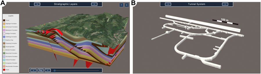
FIGURE 2. Two consecutive viewpoints with different scale: (A) a representation of the stratigraphic layers with additional textured surface data of the surrounding terrain from Google (2021) and (B) laser scan data of the tunnel system.
The digital replica of the Mont Terri URL has been enhanced by results of numerical simulations. These simulations have been conducted using the OpenGeoSys (OGS) simulation software (Kolditz et al., 2012). In total six visualisations of numerical models with varying extents have been included into the scene, displaying the simulation results of saturation, temperature, displacement and fault opening in the Opalinus Clay. In contrast to other static data, these data sets are time-dependent. Therefore, time step information had to be preprocessed using Python scripts to cover the various time formats needed to display the progress of simulations with highly varying time spans. This preprocessed time step data then has been imported into Unity.
In addition, data sets that depict and illustrate the geological context have been included. Originally they have been provided in several different formats and were converted into graphical 3D representations. Examples for these data sets are the stratigraphic layers of the Jura Mountains (see Figure 2A), textured surface data of the surrounding terrain from Google Earth (Google, 2021) and local tectonic fault zones.
All these static data sets vary in structure (raster-, mesh- and time series data), dimensionality (1D to 4D) and extent (from metres to kilometres). Despite the wide variety of formats their processing has been similar: First they have been preprocessed and integrated into a unified geographic context using the OpenGeoSys Data Explorer, other OGS preprocessing tools (Rink et al., 2014) and ParaView (Ahrens et al., 2005). All OpenGeoSys tools are open-source13 and provide various interfaces for the integration and conversion of common data formats in geosciences (e.g., GIS formats and GOCAD). Then, a large variety of postprocessing and visualisation techniques has been applied, such as clipping of the geometry, the extraction of (contour) surfaces and parameters, projections and the colourisation (see Rink et al. (2022b) for details). Next, the data has been exported as geometrical objects in the glTF-file-format (Bhatia et al., 2017). To import these into the Unity scene a combination of several custom importer scripts (implemented in C#) and a dedicated Unity extension14 is used. Besides that, intermediate scripts have been created to transfer additional data from ParaView to Unity. Examples for such additional data are labels for the stratigraphic layers, colour mapping tables or additional time step data like individually formatted time labels.
2.3 Integration of Borehole Data
The Mont Terri Borehole Information System (BIS) is based on a productive PostgreSQL15 database which is maintained by the company Simultec AG. The database consists of 19 tables that represent objects such as boreholes and their drilling sections. The borehole table contains information such as the unique borehole ID, links to attached documents and geometrical attributes like a three dimensional start- and end point as well as the angles azimuth and dip. Via a unique drilling ID the borehole table is linked to the table of drilling sections. This table contains, among other information, geometrical attributes such as the section’s diameter and length.
Due to the fact that not for every borehole the complete set of geometrical information described above is stored, valid and invalid boreholes are distinguished. For the visual representation in the 3D scene of the prototype only boreholes are considered for which either start- and end point are available or the combination of start point, both angles and the length (through the sections) is given. All boreholes (or sections) that are missing this crucial information are considered invalid.
At the time of writing, the database contains 1365 boreholes. While most of these boreholes consist of only one drilling section, some have up to four sections. In total the database contains 1415 drilling of the boreholes are invalid. All of these boreholes consist of exactly one section, so the count of invalid sections is also 16.
To include data on boreholes and sections from the BIS into the prototype libraries provided by PostgreSQL have been imported into the project and implemented C#-scripts to build a communication layer between the Unity-application and the borehole database. This layer allows to flexibly access live data while being able to change which database is currently used (remote or local) with only a few clicks. Furthermore, should not only the address of the database but the type of database system itself change at some point in the future, this does not mean that the entire application has to be adapted. The modularity achieved by this additional layer between database and application results in a high flexibility for such a case as well.
For everyday use, the data retrieval process of the prototype works as follows: Once the application is started, it loads the geometrical data for all boreholes plus related information. Then the borehole data is preprocessed to filter out invalid boreholes. In addition, meta data (e.g. document-links and section-information) is attached to the borehole’s underlying local data object. The described borehole data does not update automatically while the prototype is running but only when restarting the application or manually changing the data source.
As the BIS contains no structured information about the experiment a borehole is associated with, this information must be extracted from the borehole’s name. After retrieving data from the database, the prefixes of all borehole names are collected and considered as experiments.
Internally Unity is only able to use single-precision floating-point vectors for the position and orientation of 3D objects while in the BIS start- and end points are stored with double-precision. For the display of small boreholes in a large environment this precision reduction leads to significant artifacts. That error has been minimised using an extension for double-precision floating-point vectors16 at least for all calculations before displaying visual representations of boreholes. A comparison of both approaches is shown in Figure 3.
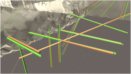
FIGURE 3. Visual representation of the boreholes based on calculations with single-precision floating-point vectors (brown) compared to double-precision (green). The green spheres are marking the actual borehole’s start- and end point as a reference for precision.
2.4 Integration of Sensor Data
Most boreholes in the Mont Terri laboratory are drilled to install sensors for the monitoring of processes within the Opalinus Clay. With that, a variety of parameters such as pressure, temperature, displacement and humidity are determined.
This time-series data is stored in a Firebird17 database which is maintained by the company Sixsense Soldata. Our application accesses the sensors’ names, the date and time of the measurements as well as the measured values. At the time of writing, the database stores measured values for more than 5,700 sensors over a time span of multiple years. The sensors we have focused on in our application measure in intervals of a few minutes. For example, temperature and extensometer measurements are available in the database in intervals of 10 min.
To include this measurement data into the application libraries provided by Firebird have been imported into the project and–as previously described for the borehole data–implemented C#-scripts for an additional communication layer between the Unity-application and the sensor database to provide maximum flexibility.
For everyday use, the data retrieval by the prototype runs as follows: Once the application is started it loads the borehole data as described in subsection 2.3. Then a connection to the sensor database is established and all the sensor data is preprocessed and cached in the background, i.e. the measurements of all available sensors are accessed and preprocessed in the background while users are already able to use the application. As with the borehole data, cached measurements are only updated when the application is restarted or the data source changes.
We implemented a number of preprocessing methods for the sensor data, such as aggregation (average calculation) of measurements per day as well as the creation of a copy of the time-series for which outliers are automatically eliminated. For this outlier elimination, the maximum realistic difference (maximum delta) between two consecutive measurements was determined in consultation with experts from the field for each sensor type. All measurements that deviate more than this maximum delta from the previous measurement are considered outliers. For example, for temperature sensors, whose measured values are stored in the database multiple times per hour, this value is 2°C.
As an example, the preprocessing and caching of the measurements for a set of 5 sensors inside one borehole over a time span of roughly two and a half years (at the time of writing roughly 681,000 measured values) takes less than 1 s. Discussions with experts from the field have shown that a daily aggregation is sufficient for the sensors we focused on in the prototype. Nevertheless, it is technically possible to change our setup to display live and non-aggregated data. This possibility applies both to the data currently shown and to measurements with a much higher temporal resolution. The internal architecture of our application allows to set the level of aggregation for different sensor types individually during creation of the prototype with little effort.
2.5 Local Database Dump
For the borehole data as well as for sensor measurements, the prototype also provides functionality to save a combined local backup copy of the data retrieved from the databases once the online databases have been accessed. This creates the possibility to use the application also in situations in which the database is not accessible or the user’s internet connection is not stable.
The backup is a encapsulated combination of the following dynamic data sets: borehole positions and dimensions, links to borehole-related documents, sensor positions and sensor measurements. It can be considered a local file that can be used without additional software (as e.g. needed to set up and run a local database) when an online database can’t be accessed and must not be confused with a local database.
From a technical perspective the data dump is a text file in the JSON-file-format containing all data objects in a structured way. It is stored locally on the computer on which the application runs. An exemplary data dump containing 1350 boreholes and 92 measurement time-series has a file size of 8.45 MB.
3 Visualisation of Selected Experiments
The created prototype of a Virtual Experiment Information System (VEIS) not only gives an overview of the Mont Terri URL as a whole but also allows for the visual exploration of a selection of three exemplary experiments. These experiments have been chosen because they reflect the great diversity of research conducted at Mont Terri. The illustrations and visualisations of the experiments have been created in close consultation and discussion with experts from the field.
3.1 Experiment Markers
For a selection of 63 experiments, we collected short name, short description and position in 3D space attached or close to the tunnel system. This information has been extracted from Bossart et al. (2018) and the website of the Mont Terri Project18. The resulting 3D experiment markers that can be used to inspect the associated boreholes are depicted in Figure 4A. The right image, Figure 4B, shows an example of the boreholes associated with one of the experiments.
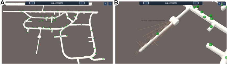
FIGURE 4. Experiments at the Mont Terri URL (A) an overview of the most important experiments and (B) display of the associated boreholes after the selection of one experiment.
For the assignment of 3D positions to the experiment markers an automatic approach has been tested: The bounding box of all boreholes associated with the experiment has been calculated and its center has been chosen as the position for the experiment marker. This approach was not feasible for two reasons: Firstly, the marker is rarely placed close to the tunnel system and this results in a cluttered visualisation. Secondly, the center of the bounding box does not always match the semantic center of the experiment–especially if the experiment contains one or more long or spatially far separated boreholes. Therefore, the mapping of positions has been carried out manually.
In the following we will give an overview of the visualisation and exploration options of a few selected experiments.
3.2 Cyclic Deformation Experiment
The Cyclic Deformation Experiment investigates the impact of air humidity and related desaturation of the claystone on the coupled hydraulic–mechanical effects in the host rock as these effects are relevant for the stability and integrity of a potential waste repository. Therefore, two similar niches have been excavated in close proximity to observe changes of process variables like deformation and water content as well as material parameters like the permeability of the Opalinus Clay under different climatic conditions. One of these niches is open towards the tunnel system allowing air exchange, while the other one is sealed off with an airtight entrance. This is illustrated in Figure 5A.
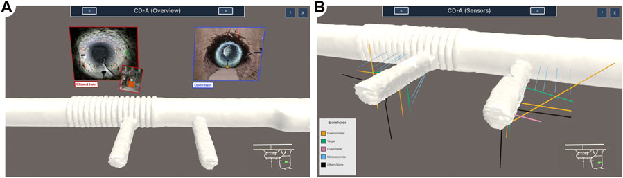
FIGURE 5. Cyclic Deformation Experiment (A) general illustration and (B) boreholes coloured by type of sensor installed inside–both with a mini-map in 2D at the bottom right for orientation.
Some of the 28 boreholes of the experiment have been drilled from the Main Gallery, while others have been drilled from within the niches. In Figure 5B the boreholes are depicted colourised by the main sensors installed inside. In the scope of the Cyclic Deformation Experiment more than 90 sensors have been used to measure displacement (chain extensometers), permittivity (taupe sensors), hydraulic conductivity (evapometers), pressure (minipiezometers) and temperature (measured in addition by several sensors of different types) within the boreholes. Additional measuring devices are installed within the niches and aim on the climatic conditions like air humidity, air temperature, water content and electric resistivity amongst others.
For a small subset of sensors manual acquisition or processing of the measurements is required. This data is therefore not stored in the database (see subsection 2.4). An example of such a complex sensor is the taupe sensor. All other measurements that are stored in the database can be accessed via the VEIS. We present examples for the visualisation of sensor data based on the extensometer measurements acquired within the scope of the CD-A experiment. The used chain extensometers are sensors that measure changes in lengths over time for several segments in a borehole. As they have no fixed point, they only provide information about the degree of shrinking or expanding along the borehole’s axis. The application provides two different visualisation approaches for extensometers and their measurements: the in-chart visualisation and the in-scene visualisation.
For the in-chart visualisation two different modes have been implemented for the colourisation of the sensor segments in the scene: on the one hand, colour by distance to the borehole’s mouth, i.e., the point where it was drilled into the tunnel wall (see Figure 6A) and on the other hand, colour by closest distance to the wall of the niche (see Figure 6B). For the calculation of the distance to the closest niche, a cylinder was used to represent the walls for each of the two niches. This is sufficient because the calculation only needs to be an approximation of the distance to be useful for our visualisation. The exact same colours as in the scene are used in the charts as well to allow for an easy and intuitive recognition of the sensors in their spatial context. In addition to the colour coding of sensors, the borehole, for which the chart is displayed, is highlighted by repeatedly flashing in a marker colour. The side by side view of the chart and the sensor’s position in the scene reduces the cognitive effort needed for exploration.
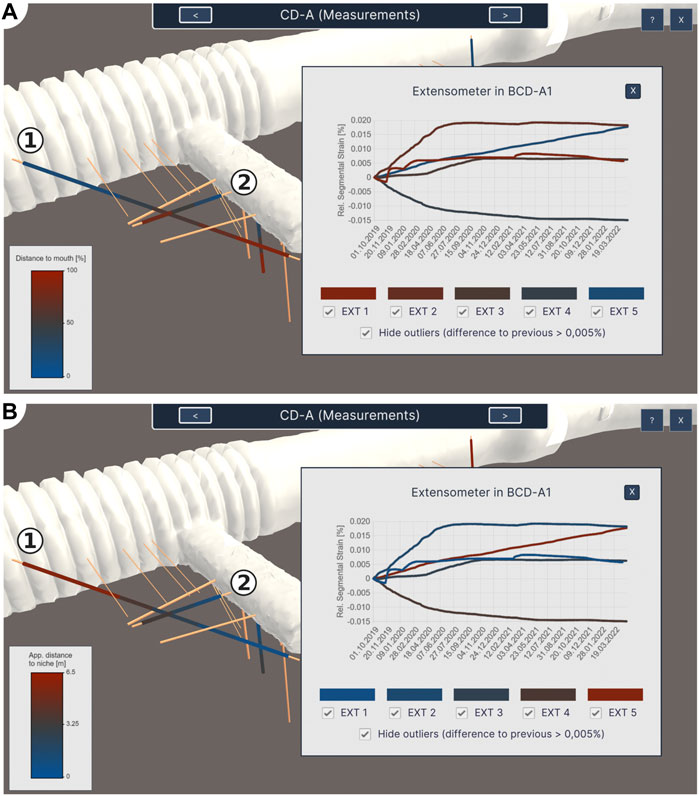
FIGURE 6. The in-chart visualisation of measurements exemplary for the extensometer measurements in the scope of the Cyclic Deformation Experiment (A) with sensor segments coloured by distance to the mouth of the borehole and (B) with sensor segments coloured by distance to the niche (using a cylinder that approximates the niche’s wall). Borehole CD-A1 that has been drilled from the Gallery is marked with (1) and Borehole CD-A9, as an example for a borehole drilled from the niche, is marked with (2).
The benefits of the two different colourisation modes become more obvious with potential questions for investigation in mind: “Does the displacement vary the deeper the sensor is placed inside the borehole?” and “Does the excavated niche influence the measured displacement?”. One may think that the colourisation by depth inside the borehole (Figure 6A) may be sufficient for answering both of these questions. But researchers need the colourisation by distance to the niche (Figure 6B) in addition because there are some boreholes that were not drilled from within the niche but from the Main Gallery (tunnel system in the background). An example for this situation, in which the two modes result in different colourisation, is borehole CD-A1 (marked ① in Figure 6). In contrast, borehole CD-A9 (marked ② in Figure 6) was drilled starting in the niche so both modes result in similar colour gradients for its set of sensors.
For the in-scene visualisation the extensometer chain segments are colourised by the strain relative to the first measurement (see Figure 7A). Therefore, a diverging colour map is used to illustrate the opposing processes of expanding (white to green) and shrinking (white to pink). That makes it easy for the user to visually detect whether there are changes relative to the initial length (and of which type these changes are). This can serve as a first preliminary examination before users then inspect measurements in detail in charts.
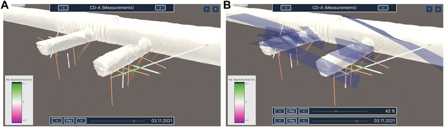
FIGURE 7. The in-scene visualisation of measurements exemplary for the extensometer measurements in the scope of the Cyclic Deformation Experiment (A) without additional context data and (B) with the local fault zones.
A data set illustrating local faults in the surrounding rock can be used as additional context for the in-scene measurement visualisation of the Cyclic Deformation Experiment (see Figure 7B). Their transparency can be set by the user. The visual embedding of measured values into the spatial context allows for investigation of interrelationships. An exemplary question to investigate is: “Do fault zones influence the measured displacement and if so in which way and where?”.
Besides the previously described data, another important data set in the scope of the Cyclic Deformation Experiment are the results of a coupled hydro-mechanical simulation with OGS (see Ziefle et al. (2021; 2022) for details). The model consists of 33,552 nodes and 180,161 tetrahedra, covering a volume of 47 × 27.65 × 18 m3. The displacement and pore pressure evolution have been simulated over a time span of roughly 5 years with 269 time increments. The changes in the liquid degree of saturation result from the pore pressure evolution and are an important quantity to access the water content variations in the Opalinus Clay. For this reason, we selected saturation as an example for visualisation.
In Figure 8, the prototype displays contour surfaces of the simulation results using two different approaches. On the one hand, it provides a semi-transparent rendering from a top-down perspective (Figure 8A) and allows to inspect the saturation effects along a horizontal plane. On the other hand, a lateral perspective, shown in Figure 8B is enhanced by a movable clipping plane, controlled by a second slider. In this way, the user can select the focus of investigation as needed.

FIGURE 8. The two types of simulation visualisation in the scope of the Cyclic Deformation Experiment (A) the semi-transparent top-down view and (B) the opaque front-side visualisation with an additional slider for the clipping plane. Both types of visualisation include an additional symbol to indicate the current meteorological season at the bottom right. see Ziefle et al. (2021, 2022) for details.
In addition, a symbol representing the meteorological season of the current time step is displayed at the bottom right. The current season is an important information for the inspection of the results, since it influences the saturation evolution, especially in the open niche. The strikingly coloured icons which display the current season are easy to perceive and therefore also give users a sense of how much time is roughly passing while they can mainly focus on the visualisation of the simulation. However, users aiming to inspect time steps in more detail than on season-level can always resort to the label that displays year and month next to the slider.
3.3 Full-Scale Emplacement Experiment
The Full-Scale Emplacement Experiment investigates the impact of a tunnel excavation and the effect of heat emission on the surrounding rock. For this purpose, three heaters have been placed in a 50 m long tunnel to investigate thermo-hydro-mechanical effects (Müller et al., 2017; Shao et al., 2017; Papafotiou et al., 2018; Parisio et al., 2018). Here, the heating elements simulate containers of radioactive waste. They work with up to 1,350 W each and emit heat up to 135°C. The dedicated tunnel was filled with bentonite granulate after the heaters have been placed inside it. The effects on the surrounding rock induced by the heat are measured by more than 1,600 sensors that are installed in boreholes and the tunnel itself. These sensors measure a great variety of parameters like temperature, pressure, deformation and humidity. Figure 9 illustrates this general setup of the Full-Scale Emplacement Experiment.
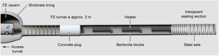
FIGURE 9. Illustration of the Full-Scale Emplacement Experiment from Müller et al. (2017).
In addition to measurements, the effect of the heat emission has also been modelled in a heat transport simulation with a time span of roughly 15 years using OGS. It contains 230 time steps and covers a volume of 100, ×, 80, ×, 100 m3 around the tunnel. The modelled area consists of 164,472 hexahedra and 169,806 points.
The prototype displays these simulation results as a clipped volume (Figure 10A). The diverging colour map for temperature values allows to perceive very high temperatures close to the heaters (white to red) as well as the overall rather low natural temperature of the Opalinus Clay (blue to white). As structures in the blue-to-white area of the colour map were hard to perceive, the colour map has been sampled in discrete bins of 3°C. Although this approach reduces the displayed degree of detail, it allows to inspect the overall more important spatial structure of the heat emission and expansion.
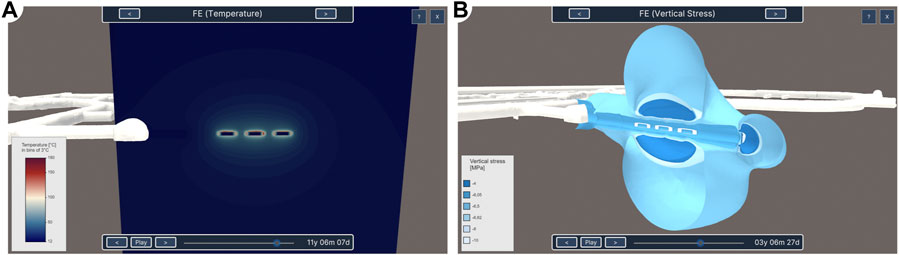
FIGURE 10. The two visualisation techniques for simulation results in the scope of the FE experiment (A) the modelled temperature as discrete bins of 3°C on a clipped volume and (B) the modelled vertical stress as six contour surfaces.
The heat induced by the heaters affects not only the temperature but also other characteristics of the rock. Therefore, another model simulates mechanical parameters such as displacement, stress, and strain of the surrounding Opalinus Clay. This simulation and the underlying model have the same characteristics like domain extent and time span as the temperature simulation mentioned above.
In the application, the results of the vertical stress simulation are displayed as six contour surfaces of increasing values (see Figure 10B). A sequential colour map has been used for the surface colouring here because it allows to intuitively analyse spatial trends and interrelationships.
For both, the temperature as well as the vertical stress simulation, users can individually select a time step or play them as an animation.
3.4 Fault Slip Experiment
The Fault Slip Experiment investigates the influence of pressure on a fault zone within the Opalinus Clay to study the resulting displacement of the rock, the fault opening and therefore also changes in the permeability (Guglielmi et al., 2017, 2020; Shiu et al., 2021). For this purpose water is pumped through a borehole into the fault in intervals of varying degrees of pressure. This injection has been illustrated in Figure 11A. In this image, the red surface represents the part of the fault located within the model domain and the diagram on the right hand side displays the change of pressure over time.
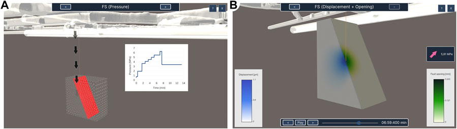
FIGURE 11. Two visualisations of the Fault Slip Experiment (A) a general illustration of the experiment and (B) simulation results with an additional arrow indicating the change of pressure relative to the last time step.
The effects of the applied pressure have been modelled in an OGS simulation of a variety of parameters like pressure, displacement, hydraulic flow and stress. The simulation consists of 314 time steps that cover a time span of 13 min and 27 s. The model covers a volume of 10, ×, 20, ×, 20 m3 and consists of 13,800 nodes as well as 12,276 hexahedra and rectangles to discretise the domain and the fault, respectively.
In the prototype, in addition to the general illustration, a selection of two simulated parameters has been visualised as depicted in Figure 11B: On the one hand, on the clipped simulation’s domain the displacement (white to blue) is shown and on the other hand the fault opening (white to green) is projected onto the surface that represents the fault. Sequential colour maps have been used for both values.
Besides the pure simulation results, the visualisation also displays the currently applied pressure using not only a label with the precise strength but also a coloured arrow that indicates if the pressure increased (pink, pointing up), decreased (blue, pointing down) or stagnated (white, straight) compared to the last time step. These coloured arrows allow users to perceive changes in strength of pressure without paying greater attention to the precise numbers, thus staying focused on the visualisation of the simulation.
4 Virtual Experiment Information System
In the following we give an overview of the Virtual Experiment Information System (VEIS). In contrast to the detailed explanations of specific experiment visualisations in the last chapter we will focus on the general system and explain its basic concepts and components as well as the benefits and limitations.
4.1 Basic Control
In the prototype, users can freely navigate through the 3D scene. If the application is used with a classic desktop setup, mouse and keyboard interactions allow zooming and panning as well as the rotation and translation of the current point of view. The key bindings and interaction instructions are displayed in Figure 12. This view is displayed when the help button ② has been clicked. The button marked ③ allows users to exit the application.
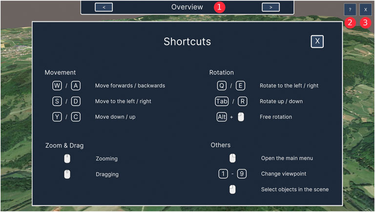
FIGURE 12. The shortcut overview and the basic UI elements: Viewpoint Navigation (1), help button (2) and exit button (3).
4.2 Viewpoints
The created prototype is based on the concept of pre-defined viewpoints. For each viewpoint an individual configuration has been created. This configuration includes the individual visibility of data sets, availability of interactions, animations and illustrations. Users can change the current viewpoint using either the list of viewpoints in the Main Menu or the Viewpoint Navigation element at the top of the screen (see ① in Figure 12) which also displays the current viewpoint’s name.
For each viewpoint the prototype provides an audio comment which is available in English and German. The audio comments contain, on the one hand, geoscientific explanations for the currently visible data sets and, on the other hand, instructions on the user interface interactions that are available for the current viewpoint. For the recording the software Microsoft Azure Text-to-Speech19, that implements speech synthesis based on neural networks, has been used. The audio comments are also part of the video20 provided as supplemental material.
The usage of viewpoints and audio comments allows the Virtual Experiment Information System to be interpreted as a virtual tour for intermediates as well. According to the taxonomy of virtual field trips by Klippel et al. (2019) the implemented tour can be considered an Advanced Virtual Field Trip as it consists of a virtual replica, provides new visual perspectives and enhances the real environment with additional interactions and data such as simulation results.
4.3 Main Menu
The Main Menu is a tool that allows users to control the scene and the visualisations beyond the predefined setup for the viewpoints. It is depicted in Figure 13A. By default it is hidden and opens on a right mouse click.
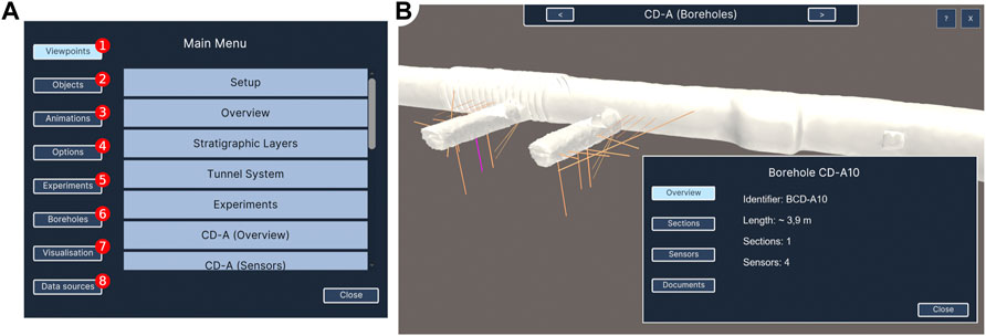
FIGURE 13. Important windows in our application (A) the Main Menu and (B) the Borehole Panel, exemplary for borehole CD-A10.
The first entry ① enables the users to select predefined viewpoints from a list. The entry Objects ② contains a list of all geometrical objects in the scene. In this list, their visibility can be adjusted using a checkbox or a slider for the opacity. The next entry, marked ③, lets users control animations, i.e. select a time step of a simulation result or play it as an animation. Entry ④ contains some general options, e.g. if stereoscopic rendering is enabled or the way notifications are displayed. The entry for Experiments ⑤ displays a searchable list of all experiments and allows for filtering of the boreholes currently displayed in the 3D scene by experiment. Another searchable list is displayed in entry ⑥: Here you can search for boreholes by their ID. A click on a borehole in the list also changes the current point of view so that the geometrical representation of the borehole becomes visible in the 3D scene. Entry ⑦ allows users to change advanced visualisation configurations like the way boreholes and sensors are displayed and colourized. The last entry, marked ⑧, contains options to select the currently used data source and allows users to create a local data dump.
4.4 Borehole Panel
The Borehole Panel aims to provide a general overview of all relevant information on one borehole. This includes the name, the approximated length, an overview about the drilling sections and their diameter, the amount and type of sensors installed inside the borehole as well as a list of documents, images and reports (see Figure 14) that are associated with the borehole or its drilling process. To open the Borehole Panel a borehole must be selected either in the 3D scene with a left mouse click on its cylinder or via the Main Menu. The Borehole Panel is depicted, exemplary for borehole CD-A10, in Figure 13B.
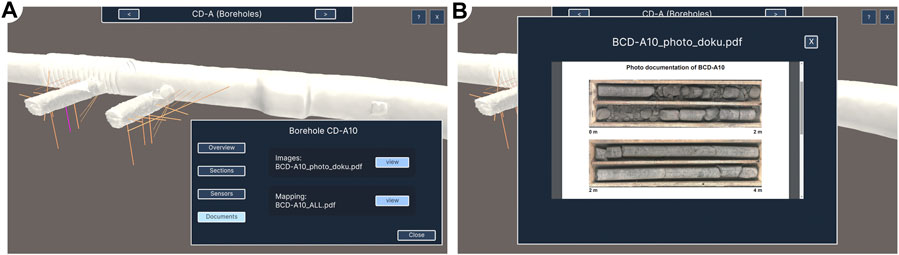
FIGURE 14. Borehole-related documents (A) access via the Borehole Panel and (B) exemplary display of photo documentation for borehole CD-A10.
4.5 Chart View
The Chart View is a window that displays sensor measurements, i.e. time series data. It is exemplarily depicted in Figure 6. The underlying data sets that are displayed in the Chart View are described in detail in subsection 2.4. Besides the chart itself, the Chart View contains checkboxes that can be used to individually toggle the visibility of the currently displayed data sets. Furthermore, users have the option to choose whether they want to see the data as it is stored in the database or whether they prefer the version where outliers have been eliminated. Next to the checkbox for the outliers, the criterion for the elimination of outliers is displayed for reasons of transparency. In both cases, measurements are aggregated on a daily basis by calculating the average. This is necessary because a time span of several years of measurements is displayed.
4.6 Sliders
The prototype’s UI contains three types of sliders: object visibility sliders which control the opacity of a single object, clipping sliders which control which geometrical part of an object is currently visible and time step sliders which control the currently displayed state of measurement data or simulation results. All these sliders are displayed automatically at the bottom of the UI for the viewpoints at which they are relevant. Examples are shown in Figure 8.
The visibility sliders have a range from 0 to 100% which is directly linked to the opacity of the corresponding object. The same range is also used for the clipping sliders. Here, 0 and 100% correspond to two different, fixed positions between which the clipping plane can be moved. For the labels of time step sliders, a variety of different date and time formats were used in order to take into account the different time spans by adjusting the degree of detail (milliseconds to years) that is displayed.
All sliders allow the selection of a step (or value) manually as well as to play the animation automatically using the controls next to the slider. After the animation has been started the Play button turns into a Pause button.
4.7 Mini-Map
In addition to displaying the tunnel system (see subsection 2.2) in the main 3D view, an orthographic top down rendering of it is used as a mini-map in 2D for orientation. Here, the current position and orientation of the user is represented by a green marker. This map provides orientation while navigating through the tunnel system. It is therefore only enabled for a selection of viewpoints for which this feature is useful. An example is shown at the bottom right of Figure 5.
4.8 Accessibility
When choosing the colours for the visualisations, we focused on colour palettes that are colourblind friendly and considered the basic properties of human visual perception, taking into account the work of Brewer et al. (2022), Okabe and Ito (2008) and Nardini et al. (2021). Only for the visualisation of the stratigraphic layers (see Figure 2) was this not possible due to the large number of categories and the fact that the colours for the different rock types are predefined in the lithostratigraphic lexicon of Switzerland 21 provided by the Federal Office of Topography (swisstopo) and the Swiss Academy of Sciences.
In addition to ensuring the usability for people who are colourblind, a variation for people who are Deaf has been implemented: If users mark a checkbox at the start of the application the audio comments are replaced by pop-ups with written text. This is not the default setting as it prevents the user from taking in visual and auditive information about the scene at the same time.
4.9 Benefits and Limitations
The created prototype of a Virtual Experiment Information System lowers the technical access barrier for researchers to explore their data. By combining simulation and observation data it also promotes a deeper understanding of the experiments. The application enables and supports user-driven exploration with interactive types of visualisation, facilitating the gain of new findings. By embedding a variety of heterogeneous data into one spatial context, the application lowers the cognitive effort needed to investigate and explore the data and its context. Furthermore, the application promotes discussions among researchers and supports the creation of presentations, which can be used for exchange between the stakeholders. In this way, it promotes discussions also beyond the scientific context. In addition, the prototype could be further developed to be used as a science communication tool for the broad public or for intermediates in an educational context. Since the system has been implemented as generically as possible, further data sets in similar formats can be integrated with little effort using existing infrastructure. Even the databases as sources for borehole and sensor data can be exchanged with little effort as this step only requires an adaption to the new database’s scheme but not a new technical setup.
The application is neither a database management system for editing data nor a complex measurement exploration tool with a focus on versatile chart displays or advanced (pre-)processing. Therefore, such functionalities are not part of the prototype of a Virtual Experiment Information System. Furthermore, the application is partly based on knowledge of domain-experts concerning the experiments they are conducting. Thus, further development of the application depends on their input and cooperation. This concerns in particular the following aspects: 1) selection and supply of data sets, 2) identification of important tasks, methods and insights from the domain and 3) discussion of suitable visualisations to address these challenges and results from the domain. In addition, it is important to mention that a single visualisation concept for all sensor data is not the aim of the application, as the sensors utilised and experiments taking place at the Mont Terri URL are quite diverse. Hence, similar to the preparation of the extensometer measurements for the in-scene visualisation in the scope of the Cyclic Deformation Experiment, further advanced visualisations for other experiments will once again require individual processing.
5 Conclusion
5.1 Summary
In close cooperation with experts from the domain we developed a prototype of a Virtual Experiment Information System for the Mont Terri Underground Research Laboratory. Besides the focus on three experiments, namely the Cyclic Deformation Experiment, the Full-Scale Emplacement Experiment and the Fault Slip Experiment, the application also provides an overview of the URL itself. The prototype is compatible with various different hardware- and software configurations. Highly heterogeneous data from several different sources have been integrated into one application. This includes static data like a model of the stratigraphic layers and a laser scan of the tunnel system, which provide geological context but also the results of numerical simulations that show potential changes within the Opalinus Clay due to human intervention, e.g., excavation. Besides static data, access layers for two productive databases have been implemented to display borehole and sensor data. This data is updated live to always present the current status of experiments within the URL. The application combines both observation data and simulation results. All data is visualised in an interactive manner to support user-driven exploration. In contrast to related work, our system addresses all four challenges that have been identified during the requirement analysis: It provides access of measurement data without major technical barriers and foreknowledge (1), implements state of the art visualisations that embed the data into its spatial context (2), enables exploration in an interactive 4D scene (3) and takes into account that target groups and prior knowledge may vary by keeping the user interaction as simple as possible (4). The embedding of all data into a common spatial context allows for explorations with low cognitive effort. Besides that, the interactive visualisations also lower the technical access barriers compared to the state of the art. The application promotes exchange among researchers as well as science communication to the broad public.
5.2 Future Work
Future work could, for example, use the infrastructure of the current prototype to embed even more contextual information and illustrations for applications in the field of science communication. In contrast to this work, the target group would then not be researchers but the general public interested in the processes at Mont Terri Underground Research Laboratory, as part of the research and communication on the potential host rocks for radioactive waste storage–a topic with high political and societal relevance. Additionally, future work could also include other experiments into the prototype to cover even more of the research performed at Mont Terri URL. Another conceivable extension of the prototype would be the comparative visualisation of measurement data and simulation results. The addition of the Full-Scale Emplacement Experiment with its extensive temperature measurements would be particularly suitable for this. This data could also be used to test the integration and visualisation of larger data sets and to investigate concepts for the visual aggregation of the data. In addition, the application could be extended to compare the results of simulations conducted using different numerical models.
Data Availability Statement
The data analyzed in this study is subject to the following licenses/restrictions: The visualised data, i.e., borehole data from the BIS as well as sensor related data, that has been collected by the Mont Terri Project is not public data. Therefore we can not provide direct access to the databases. Requests to access these datasets should be directed to bmljby5ncmFlYmxpbmdAdWZ6LmRl.
Author Contributions
NG designed the prototype application, implemented it, postprocessed simulation results, maintained exchange with domain experts and wrote the manuscript; ÖŞ and LB implemented infrastructure for the prototype application; TC, DN and WW provided simulation data as well as domain knowledge. GZ contributed manifold feedback as a domain expert and supported the design of the prototype; DJ and JM provided advice and feedback as domain experts; KR supported designing the prototype, implemented infrastructure for it, postprocessed simulation results and revised the manuscript; GS and OK provided research concepts and revised the manuscript.
Funding
iCROSS (02NUK053E) funded by BMBF and (SO-093) funded by Helmholtz Association • Virtual URL (VR Task) (W2_PH26) funded by the Mont Terri Consortium • GeomInt (03G0866A) funded by BMBF.
Conflict of Interest
The authors declare that the research was conducted in the absence of any commercial or financial relationships that could be construed as a potential conflict of interest.
Publisher’s Note
All claims expressed in this article are solely those of the authors and do not necessarily represent those of their affiliated organizations, or those of the publisher, the editors and the reviewers. Any product that may be evaluated in this article, or claim that may be made by its manufacturer, is not guaranteed or endorsed by the publisher.
Acknowledgments
We are grateful to the support by the Mont Terri Consortium, the Federal Ministry for Education and Research (BMBF) and the Helmholtz Association (HGF) (see funding above). Furthermore, the authors would like to thank swisstopo for enabling this research as well as Simultec AG and Sixense Soldata for technically setting up database access for us.
Footnotes
1https://www.grs.de/en/research-and-assessment/disposal/virtus-virtual-underground-laboratory
4https://www.geolab.kit.edu/english
5Full-scale Emplacement (FE) experiment in URL Mont Terri
6https://www.betterdatasystems.com
7Gas Permeable Seal Test (Teodori et al., 2013)
9Cave Automatic Virtual Environment (CAVE) setups are rooms onto whose walls the virtual world is projected
10One of the notebooks used for development contains an Intel Core i7-9750H with 32 GB RAM and an nVidia Quadro T1000 graphics card
12https://widve.github.io/UniCAVE/
13https://gitlab.opengeosys.org
14https://github.com/Siccity/GLTFUtility
16https://github.com/sldsmkd/vector3d
18https://www.mont-terri.ch/en/experiments/the-most-important-experiments.html
19https://azure.microsoft.com/en-gb/services/cognitive-services/text-to-speech
20https://youtu.be/X71DF7SG5uc
References
Ahrens, J., Geveci, B., and Law, C. (2005). “ParaView: An End-User Tool for Large-Data Visualization,” in Visualization Handbook, 717–731. doi:10.1016/B978-012387582-2/50038-1
Bhatia, S., Cozzi, P., Knyazev, A., and Parisi, T. (2017). “glTF 2.0 Specification,” in Tech. Rep. (Beaverton, Oregon, USA: Khronos Group).
Blecha, C., Raith, F., Scheuermann, G., Nagel, T., Kolditz, O., and Massmann, J. (2019). Analysis of Coupled Thermo-Hydro-Mechanical Simulations of a Generic Nuclear Waste Repository in Clay Rock Using Fiber Surfaces. Proc. IEEE Pac. Vis. Symposium 2019, 189–201. doi:10.1109/PacificVis.2019.00030
Bossart, P., Bernier, F., Birkholzer, J., Bruggeman, C., Connolly, P., Dewonck, S., et al. (2018). “Mont Terri Rock Laboratory, 20 Years of Research: Introduction, Site Characteristics and Overview of Experiments,” in Mont Terri Rock Laboratory, 20 Years. Editors P. Bossart, and A. G. Milnes. 1 edn (Cham: Birkhäuser), 3–22. Chap. 1. doi:10.1007/978-3-319-70458-6_1
Brewer, C. A., Harrower, M., Sheesley, B., Woodruff, A., and Heyman, D. (2022). ColorBrewer 2.0. – Color Advice for Cartography. Avalilable at: http://www.colorbrewer.org (Accessed January 14, 2022).
Duncan, F., Noble, A. J., and Sinclair, D. (2010). The Construction and Anticipated Science of SNOLAB. Annu. Rev. Nucl. Part. Sci. 60, 163–180. doi:10.1146/annurev.nucl.012809.104513
[Dataset] Google (2021). Satellite Images from Google Earth of the Region Around Saint-Ursanne. Switzerland: Google.
Guglielmi, Y., Birkholzer, J., Rutqvist, J., Jeanne, P., and Nussbaum, C. (2017). Can Fault Leakage Occur before or without Reactivation? Results from an In Situ Fault Reactivation Experiment at Mont Terri. Energy Procedia 114, 3167–3174. doi:10.1016/j.egypro.2017.03.1445
Guglielmi, Y., Nussbaum, C., Jeanne, P., Rutqvist, J., Cappa, F., and Birkholzer, J. (2020). Complexity of Fault Rupture and Fluid Leakage in Shale: Insights from a Controlled Fault Activation Experiment. J. Geophys. Res. Solid Earth 125. doi:10.1029/2019JB017781
Jalas, P., Enqvist, T., Isoherranen, V., Joutsenvaara, J., Kutuniva, J., and Kuusiniemi, P. (2017). Callio Lab, a New Deep Underground Laboratory in the Pyhäsalmi Mine. J. Phys. Conf. Ser. 888, 012156. doi:10.1088/1742-6596/888/1/012156
Klippel, A., Zhao, J., Jackson, K. L., La Femina, P., Stubbs, C., Wetzel, R., et al. (2019). Transforming Earth Science Education through Immersive Experiences: Delivering on a Long Held Promise. J. Educ. Comput. Res. 57, 1745–1771. doi:10.1177/0735633119854025
Kolditz, O., Bauer, S., Bilke, L., Böttcher, N., Delfs, J. O., Fischer, T., et al. (2012). OpenGeoSys: an Open-Source Initiative for Numerical Simulation of Thermo-Hydro-Mechanical/chemical (THM/C) Processes in Porous Media. Environ. Earth Sci. 67, 589–599. doi:10.1007/S12665-012-1546-X
Meller, C., Schill, E., Bremer, J., Kolditz, O., Bleicher, A., Benighaus, C., et al. (2018). Acceptability of Geothermal Installations: A Geoethical Concept for GeoLaB. Geothermics 73, 133–145. doi:10.1016/j.geothermics.2017.07.008
Müller, H. R., Garitte, B., Vogt, T., Köhler, S., Sakaki, T., Weber, H., et al. (2017). Implementation of the Full-Scale Emplacement (FE) Experiment at the Mont Terri Rock Laboratory. Swiss J. Geosci. 110, 287–306. doi:10.1007/s00015-016-0251-2
Müller, H. R., Vogt, T., Firat, L. B., Spillmann, T., Giroud, N., and Garitte, B. (2019). “Lessons Learned after More Than 7 Years of Monitoring the Full-Scale Emplacement Experiment at the Mont Terri URL – Extended Abstract,” in Modern2020 – 2nd International Conference about Monitoring in Geological Disposal of Radioactive Waste.
Nagel, T., Görke, U.-J., Konietzky, H., Maßmann, J., Nest, M., Steeb, H., et al. (2021). “Introduction to GeomInt,” in GeomInt–Mechanical Integrity of Host Rocks. Editors O. Kolditz, U. J. Görke, H. Konietzky, J. Maßmann, M. Nest, H. Steebet al. 1 edn (Cham: Springer), 1–13. Chap. 1. doi:10.1007/978-3-030-61909-1_1
Nardini, P., Chen, M., Samsel, F., Bujack, R., Böttinger, M., and Scheuermann, G. (2021). The Making of Continuous Colormaps. IEEE Trans. Vis. Comput. Graph. 27, 3048–3063. doi:10.1109/TVCG.2019.2961674
Okabe, M., and Ito, K. (2008). “Color Universal Design (CUD): How to Make Figures and Presentations that Are Friendly to Colorblind People,”. Available at: http://jfly.iam.u-tokyo.ac.jp/color/(Accessed January 13, 2022).
Papafotiou, A., Senger, R., Li, C., Singh, A., Garitte, B., Müller, H., et al. (2018). A Prediction-Evaluation Approach to the Full-Scale Emplacement Experiment (FE) in Mont Terri. Geol. Soc. Lond. Spec. Publ. 482, 39–73. doi:10.1144/SP482.10
Parisio, F., Vilarrasa, V., and Laloui, L. (2018). Hydro-mechanical Modeling of Tunnel Excavation in Anisotropic Shale with Coupled Damage-Plasticity and Micro-dilatant Regularization. Rock Mech. Rock Eng. 51, 3819–3833. doi:10.1007/s00603-018-1569-z
Raith, F., Blecha, C., Rink, K., Wang, W., Kolditz, O., Shao, H., et al. (2020). Visual Analysis of a Full-Scale-Emplacement Experiment in the Underground Rock Laboratory Mont Terri Using Fiber Surfaces. Workshop Vis. Environ. Sci. (EnvirVis). doi:10.2312/envirvis.20201093
Rink, K., Bilke, L., and Kolditz, O. (2014). Visualisation Strategies for Environmental Modelling Data. Environ. Earth Sci. 72, 3857–3868. doi:10.1007/s12665-013-2970-2
Rink, K., Nixdorf, E., Zhou, C., Hillmann, M., and Bilke, L. (2020). A Virtual Geographic Environment for Multi-Compartment Water and Solute Dynamics in Large Catchments. J. Hydrology 582, 124507. doi:10.1016/j.jhydrol.2019.124507
Rink, K., Şen, Ö. O., Hannemann, M., Ködel, U., Nixdorf, E., Weber, U., et al. (2022a). An Environmental Exploration System for Visual Scenario Analysis of Regional Hydro-Meteorological Systems. Comput. Graph. 103, 192–200. doi:10.1016/j.cag.2022.02.009
Rink, K., Şen, Ö. O., Schwanebeck, M., Hartmann, T., Gasanzade, F., Nordbeck, J., et al. (2022b). An Environmental Information System for the Exploration of Energy Systems. Geotherm. Energy 10, 1–16. doi:10.1186/S40517-022-00215-5
Shao, H., Paul, B., Wang, X., Hesser, J., Becker, J., Garitte, B., et al. (2017). The Influence of Different Supports on the Properties of the Excavation Damaged Zone along the FE Tunnel in the Mont Terri Underground Rock Laboratory. Geol. Soc. Lond. Spec. Publ. 443, 149–157. doi:10.1144/SP443.18
Shiu, W., Guglielmi, Y., Graupner, B., and Rutqvist, J. (2021). Modelling the Water Injection Induced Fault Slip and its Application to In-Situ Stress Estimation. Int. J. Rock Mech. Min. Sci. 137, 104537. doi:10.1016/j.ijrmms.2020.104537
Teodori, S.-P., Rüedi, J., Reinhold, M., and Manca, D. (2013). Design, Testing and Emplacement of Sand-Bentonite for the Construction of a Gas-Permeable Seal Test (GAST). Int. Conf. Environ. Remediat. Radioact. Waste Manag. 15. doi:10.1115/ICEM2013-96086
Wieczorek, K., Behlau, J., Heemann, U., Masik, S., Raab, M., Mueller, C., et al. (2014). “VIRTUS. Virtual Underground Laboratory in Rock Salt,” in Tech. Rep. (Cologne, Germany: GRS-354, Gesellschaft für Anlagen- und Reaktorsicherheit mbH (GRS).
Yeatman, R., König, W., Vogt, T., Lüthi, B. F., and Fisch, H. (2019). “3D Overarching Scientific Information System for the FE Experiment – Extended Abstract,” in Modern2020 – 2nd International Conference about Monitoring in Geological Disposal of Radioactive Waste.
Ziefle, G., Cajuhi, T., Condamin, S., Costabel, S., Czaikowski, O., Fourriére, A., et al. (2021). From Process to System Understanding with Multi-Disciplinary Investigation Methods: Set-Up and First Results of the CD-A Experiment (Mont Terri Rock Laboratory). Saf. Nucl. Waste Dispos. 1, 79–81. doi:10.5194/SAND-1-79-2021
Ziefle, G., Cajuhi, T., Graebling, N., Jaeggi, D., Kolditz, O., Kunz, H., et al. (2022). Multi-disciplinary Investigation of the Hydraulic-Mechanically Driven Convergence Behaviour: CD-A Twin Niches in the Mont Terri Rock Laboratory during the First Year. Geomechanics Energy Environ. 2022, 100325. doi:10.1016/j.gete.2022.100325
Keywords: virtual experiment information system, visual exploration, 4D visualisation, underground research laboratory (URL), mont terri URL, virtual tour, interactive system, opengeosys
Citation: Graebling N, Şen ÖO, Bilke L, Cajuhi T, Naumov D, Wang W, Ziefle G, Jaeggi D, Maßmann J, Scheuermann G, Kolditz O and Rink K (2022) Prototype of a Virtual Experiment Information System for the Mont Terri Underground Research Laboratory. Front. Earth Sci. 10:946627. doi: 10.3389/feart.2022.946627
Received: 17 May 2022; Accepted: 20 June 2022;
Published: 19 July 2022.
Edited by:
Susana Barbosa, University of Porto, PortugalReviewed by:
Roman Leonhardt, Central Institution for Meteorology and Geodynamics (ZAMG), AustriaAldo Ianni, Gran Sasso National Laboratory (INFN), Italy
Copyright © 2022 Graebling, Şen, Bilke, Cajuhi, Naumov, Wang, Ziefle, Jaeggi, Maßmann, Scheuermann, Kolditz and Rink. This is an open-access article distributed under the terms of the Creative Commons Attribution License (CC BY). The use, distribution or reproduction in other forums is permitted, provided the original author(s) and the copyright owner(s) are credited and that the original publication in this journal is cited, in accordance with accepted academic practice. No use, distribution or reproduction is permitted which does not comply with these terms.
*Correspondence: Nico Graebling, bmljby5ncmFlYmxpbmdAdWZ6LmRl