 Christian Kehl
 Delphine M. A. Lobelle
 Erik van Sebille
- 1Institute for Marine and Atmospheric Research, Utrecht University, Utrecht, Netherlands
- 2Department for Information and Computing Sciences, Utrecht University, Utrecht, Netherlands
Lagrangian flow data in oceanography are highly complex, encompassing not only the underpinning Eulerian, advective, vectorial flow fields and the three-dimensional position coordinates of tracer particles but also supplementary trajectory information such as interaction radii of particles, lifecycle source-to-sink information and biochemical process data. Visualising all those data cooperatively in its three-dimensional context is a prime challenge, as it demands to present all relevant information to enable a contextual analysis of the flow process while preventing the most commonly-occurring perceptual issues of clutter, colourisation conflicts, artefacts and the lack of spatial references in fluid-flow applications. In this article, we present visualisation design approaches for 4D spatio-temporal data in their context and introduce a novel colour-mapping approach for 3D velocity tensors. The employed visualisation approach is evaluated towards perceptual adequacy and efficacy with respect to algebraic visualisation design and on an oceanographic case study. The technical and perceptual elements have further implications and applications for still-picture and animated volumetric visualisation design in related applications of the natural sciences, such as geological flow mapping.
1 Introduction
The Lagrangian simulation is an important tool for studying fluvious- and oceanic processes (van Sebille et al., 2020). A Lagrangian simulation approach hereby refers to the track-and-trace of attributed particles in the fluid domain. In the oceans, those particles, which are digital analogues for real-world particulate matter, are transported by hydrodynamic currents and eddies, while their individual transport behaviour is also affected by other physical, biological or chemical processes. A Lagrangian simulation requires initial particle release locations, their parametrization for statistical, physical, biological and chemical processes, and the underpinning, Eulerian fields of hydrodynamic velocity and auxiliary input data. The result of a Lagrangian analysis or simulation is a set of attributed particle trajectories, which can be compared to available observations.
Lagrangian particle simulation is used for oceanographic studies for a diverse set of study objectives. Traditionally, Lagrangian particles are used to trace passive particulates, such as microplastics (Duncan et al., 2018; Everaert et al., 2020; van Sebille et al., 2020), leaked oil particulates (Anguiano-García et al., 2019; Calzada et al., 2021), plankton (Nooteboom et al., 2019; Dämmer et al., 2020), nutrients (Cetina-Heredia et al., 2018), sediments (Devis-Morales et al., 2021) or icesheets (de Vos et al., 2021). Recently, the interest has also shifted to the study of active particles, such as fish (Scutt Phillips et al., 2018; Schilling et al., 2020) and other marine species (Singh et al., 2018; Le Gouvello et al., 2020; Lindo-Atichati et al., 2020). Hence, Lagrangian ocean analysis is key to societal development goals such as the European Union’s Green Deal and the United Nations’ Sustainable Development Goals, for example in order to develop sustainable fisheries, to support the pollution clean-up of the oceans or to achieve an overall sustainable marine ecology.
Following the studies in recent years, a wealth of Lagrangian data is already available. In order to achieve the targets related to the mentioned societal goals mentioned above, those data need to be analysed and understood by scientists and stakeholders, which is done by means of geo-visualisation. Recent studies analysed the existing presentation capabilities (Gomis and Pidcock, 2018; Kehl et al., 2021a), concluding that the technological means (e.g., matplotlib (Hunter, 2007), VTK (Schroeder et al., 2004), Paraview (Ahrens et al., 2005)) support such analysis, whereas the perceptual knowledge and graphical design are the limiting factors in promoting deeper understanding of the simulated fluid processes. This is specifically because co-visualising the semantically complex trajectory data in context with their Eulerian directional velocity fields, which represent the driving processes of particle transport, is highly demanding. Domain experts, professionals and practitioners typically revert to ad-hoc visual designs with panels of dissect, mono- or few-variate plots and without considering perceptual design principles that are provided by the visualisation community. In return, those comparatively simple visualisations require the non-expert reader to cognitively reconstruct the data context from the textual storyline, which leads to potential conflicting interpretations of the data between expert professionals, non-expert decision makers and other stakeholders.
This paper expands on recent investigations into practices, pitfalls and guidelines on Lagrangian ocean analysis visualisation (Kehl et al., 2021a). It specifically addresses the issue of plotting multi-variate Eulerian tensor data, such as velocity fields, in a visually consistent manner while opening further visual channels for the contextual, clutter-reduced co-visualisation of multivariate trajectories and attributes. This paper more so discusses the quality of possible fluid-flow visual designs along algebraic principles (Kindlmann and Scheidegger, 2014), supporting the discussion with visual comparisons to traditional means of velocity visualisations. This visual evaluation is performed for static 2D- and 3D cases as well as a 3D-temporal (i.e., 4D) scenario. Lastly, the paper also showcases the added benefit within complex, multivariate visualisation of biochemically-affected microplastic trajectories in a contextual visualisation that integrates many visual channels for a high information density.
2 Perceptual visualisation of spatial, multivariate, directional data
In this work, we address the question of how to co-visualise continuous field- and point-sampled positional data in a spatial reference framework, in which both grided fields and point-like samples represent multivariate, signed, directional quantities. Additionally, the point-like samples can contain further scalar, semantically-interpreted information. Furthermore, the represented field-data is unsteady (i.e., varies over time), and thus the motion of the point-like objects in the field data is integrated in time, forming attributed trajectories.
The type, amount and complexity of the discussed data demands a visual design so that 1) the drawn symbolics represent the data without conflicting or interfering with themselves, so that 2) the symbolics are unambiguous with respect to the encoded information and by 3) reducing the plotted data to the essentially unique information without inherent sampling bias. In the coupled visualisation of field-, particle- and trajectory data, it is also important that 4) the symbolics for each data source is unique, so that the viewer can directly link the drawn symbols to the individual data source. Those requirements follow principal visualisation guidelines by E. Tufte (Tufte, 2001).
A principal problem, especially considering actual ad-hoc visualisations by domain experts, is the over-abundant use of colour, or more specifically the visual hue (H, i.e., tone) channel, for the encoding of information. As known from perceptual theory (Tufte, 2001; Brewer et al., 2003; Munzner, 2014), the tone is one of the most receptive visual channels, which partially explains its abundant use from a perceptual perspective. Additionally, plotting interfaces ranging from simple infographics to tools such as Matplotlib (Hunter, 2007) and Cartopy (Office, 2010) make tone-based plotting exceedingly simple, which psychologically incentivizes domain experts to rely on this easy-to-use visual encoding and compensate for simplicity panels of similarly-encoded images. This trend can be observed in the domain-specific literature, which has been discussed by visualisation experts (Moreland, 2009; Thyng et al., 2016; Gomis and Pidcock, 2018; Crameri et al., 2020; Kehl et al., 2021a), is reviewed in depth below. Perceptual composition of univariate colour maps is frequently discussed in literature, where Brewer et al. provide the baseline for perceptual adaptations away from a rainbow colour map composition (Brewer et al., 2003). Crameri et al. (2020) introduce brightness-balanced mono- and bitonal colourmaps (e.g., batlow) to fix brightness gradient discontinuities of existing schemes. Nardini et al. present an algorithm for semi-automatic optimization of multi- and many-tonal based on colour distance minimisation and linearity (Nardini et al., 2019; Nardini et al., 2021). That said, neither approach offers avenues for a multivariate colour scheme.
In terms of the nested model of visualisation design, the domain (fluid dynamics and hydrology) and the abstraction (i.e., the constraining data description above) are well defined for the referred cases. The complexity of the data represents a challenge for the idiom (i.e., the visual encoding) of the data, which is also the point of failure for most visual designs in Eulerian-Lagrangian fluid-flow visualisation. The primary goal of the visualisation is the presentation of the data. This means the open question in the encoding procedure is how to map the data by using marks and modulating channels to reprensent the data, i.e. the semiology of the graphical representation (Bertin, 1983; Munzner, 2014).
This semiology challenge is at the core of fluid flow visualisation right from the beginning. Early work by Post and van Walsum illustrated the conversion of experimental, physical flow visualisation techniques to digital techniques using textures (Post and Van Walsum, 1993). This work was later supplemented by line-integral convolution (LIC) (Cabral and Leedom, 1993) and spot noise (de Leeuw et al., 1996; Van Wijk, 2002). Glyph visualisation techniques (Borgo et al., 2013), and especially the use of arrow glyphs (Post and Van Walsum, 1993; Bujack and Middel, 2020), became an established technique in the mapping of velocity data. Geometric flow visualisation (Post and Van Walsum, 1993; McLoughlin et al., 2010) uses trajectories of advected particles to form streamlines and ribbons, which can be modulated in their visual channels for more selective analysis using illustrative techniques (Brambilla et al., 2012). A recent, modern approach to noise modulation of texture-based flow visualisation was presented by Khlebnikov in the form of procedural texture synthesis (Khlebnikov et al., 2012; Khlebnikov et al., 2013).
While a semiology selection is thus available, the adequacy of the referenced techniques demands a closer review. This adequacy can be judged in terms of a technique’s compliance with established perceptual theory (Tufte, 2001; Brewer et al., 2003; Moreland, 2009; Munzner, 2014; Thyng et al., 2016; Gomis and Pidcock, 2018; Crameri et al., 2020), which has been done for the oceanic fluid domain by Kehl et al. (2021a). A more rigorous framework for this adequacy analysis is provided in the form of algebraic visualisation design by Kindlmann and Scheidegger (2014). This framework is the basis of the analysis here, which is why a summary of its key ideas is provided.
The central element of algebraic visualisation design is its commutative diagram (Figure 1A). In principle, the visualisation design space consists of the data D, which are transformed into a representation R (i.e., a selection of visual marks). The representation is then mapped (i.e., plotted or rendered) into a visualisation V using the visual channels. The representation mapping r transforms D to R, while the visual mapping to V is given by v. r and v are expected to be static for a selected combination of marks and visual channel. Data D can be transformed into a new dataset via the data transform α, whereas the visual mapping can equally be transformed by a function ω. According to this algebra, every adequate visualisation follows a commutative principle where every α has one unique, corresponding ω that proportionally performs the same mapping in visual space that α performs in data space. Every visualisation that is unconformal to this commutative principle fails in some form in communicating the message of the visualisation. In other words, the algebra guarantees the principles of invariance, unambiguity and correspondence. Visualisations that fail the invariance vary in their representation mapping so that for one dataset D, there are multiple undefined parameters in r that yield different visual expressions V (Figure 1B). Visualisations are ambiguous if there exist multiple, distinctly different data representations D or R that map to the same visual expression V without a modulation of the mapping function ω (Figure 1C). Lastly, if α is not proportional to ω, there is a lack of correspondence between the underlying data D and their visual representation V (Figure 1D), which prohibits viewers to judge if a visual feature is also a feature in the data, or if it is an artifact of the plotting.
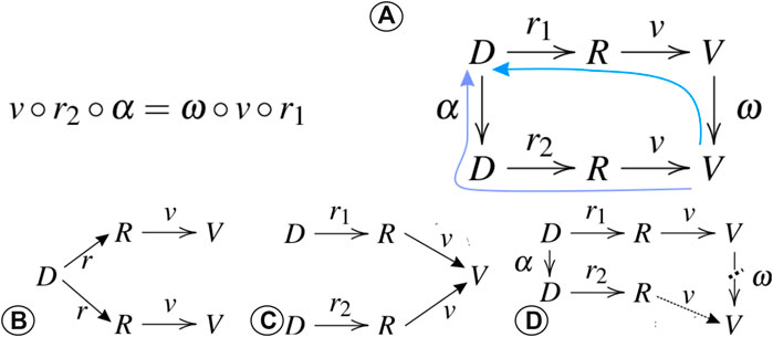
FIGURE 1. Algebraic visualisation design: adequate visualisations adhere to the commutative rules of representation and visual mapping in (A). If the same data map (without a change in α or ω) to different visual expressions, the visualisation has a hallucinator that compromises invariance (B). If multiple, different data map to the exact same visual expression (without a change in α or ω), the visualisation is affected by a confuser that makes the visualisation ambiguous (C). If a change of α corresponds to a disproportionate visual mapping change in ω, the resulting jumbler shows a lack of correspondence in the visualisation (D).
This work applies the algebraic design principles to the prevalent flow visualisation techniques, with a focus on arrow-based glyph visualisations, contoured surfaces geometries and image-based mapping methods. The discussion in this article explicitly excludes a streamline approach, as it links to another challenge and contribution of this work, which is the combined visualisation of Eulerian flow fields and Lagrangian trajectory data. Specifically, streamlines are the trajectory result of a particle integration where the particles’ motion is only defined by the advection along the hydrodynamic velocities.
3 Practices and challenges in visualising multivariate Lagrangian fluid-flow studies
Lagrangian trajectory data for modelling complex fluid-flow processes are inherently multivariate, as supplementary attributes within the modelling process affect the physical forcing and the resulting particle motion in the fluid. Those attributed trajectories need to be visualised to comprehend the influence of the physical parameters and distinct them from the background forcing of the advective hydrodynamic fields. Therefore, considering the application scenario and the potential impact of novel methods, a distinction is made between the visualisation of the complex, multivariate particle trajectories and the contemporary means of visualising the multivariate Eulerian context data.
The published literature on Lagrangian oceanographic studies demonstrates the visual representation of various attributes as driving factors for particle transport. Lebreton et al. show particle release locations, as well as the release amount and their type on a global map, in connection with mass concentrations of the particles ((Lebreton et al., 2018), Figure 5a). Problematic in this depiction is the direct tone correlation between two independent variables, namely the particle source type and the background source contribution anomalies. Lobelle et al. show a visual correlation between particle sinking timescale and particle radius (i.e., size) in a multi-panel visualisation ((Lobelle et al., 2021), Figure 1). The panel visualisation in this case is inefficient in so-called ink space, thus an improved symbol design potentially allows for the fusion of panels into a single, larger visual depiction of the radial correlation. Local temperature has an impact on the biochemical and physical processes that drive tracer transport, as depicted by (Potter (20102018), Figure 1a) and (McInnes et al. (2019), Figure 2). The chaotic colouration in (Potter, 20102018) communicates strong contrasts between the particle temperature and background temperature. Figure 2 in (McInnes et al., 2019) demonstrates a more consistent colouration, although suffering from ordering invariance, where the arbitrary particle plotting order occludes certain data subsets. In the given scenario, the ordering element of either (i) temperature, (ii) particle index or (iii) simulation timestep is not trivial to select, which is why resolving the variances is important. Furthermore, the presentation of biological- or biochemical indicators is important for certain Lagrangian studies depending on the scenario context, which is exemplified by the habitation- and transport index of tuna in (Scutt Phillips et al., 2018). The depiction of group adherence, as in (Wichmann et al., 2021), presents similar semiologic challenges for indicator representation. In conclusion of the discussed studies, only one of them (i.e., (Lebreton et al., 2018)) conveys particle information over a non-hue visual channel, which highlights the visual bias in available literature. Moreover, the need for stronger visual designs of coupled Eulerian-Lagrangian depictions is validated by some literature items (Potter, 20102018), in which the excessive use of the colour as visual channel for all depicted information leads to inconsistent, self-contrasting and ambiguous visualisation with a high potential for author–reader interpretation dissonance.
In a fluid dynamics- and oceanographic scenario, the major multivariate Eulerian component in Lagrangian studies is the hydrodynamic velocity, which is the focus of this review. Directional velocity fields in oceanography apply the same established techniques and symbolics that are reviewed in Section 2. A significant margin of researchers and experts in the domain utilize hedgehog plots for visualising directional velocities, which are supplemented with univariate imaged representations of the velocity magnitude
4 A novel perceptual design for multivariate tensor data
Our goal is the visualisation of directional velocity tensors in a visually consistent manner, which shares similarities in the visualisation of volume gradients in 3D gridded data. The target visual design needs to fulfil the following criteria:
• Multivariate: the scheme needs to support at least three distinct, directional variates (i.e., modes) of vectors
• Divergent: the signed direction needs to be prominent for each mode
• Resilient to frequent chromatic deficiencies in colour-perception: perceivable for viewers affected by different modes and stages of colour blindness
• Definite, neutral, cross mode-consistent zero-point: a data point for which each mode is neutral (i.e., D = fM(x) = 0) must have a neutral visual expression V
• Translucent: rendering and image composition proceeds in a cumulative, layered process, hence the layers shall intermix in the opacity channel
• Visually gradient-neutral: avoid occurrence of visual boundaries (i.e., non-linearities) that are non-existent in the tensor data D
• Consume as few visual channels as possible: leave visual design space of visual marks- and channels for external auxiliary information or coupled data visualisation
In our design, we decide to perform transparency-modulated, coloured image composition. We opt against a glyph-based approach for tensor visualisation as an unsampled, data-wide glyphing leads to visual clutter, and thus is ideally employed selectively or in a sampled process. Glyphs are key in the visualisation strategy of trajectory-related information (see Section 6), because trajectories are essentially non-global and selective by design. They are hence already allocated in the coupled visualisation strategy. For the colour mapping itself, we select specific bands from the hue spectrum for each mode to avoid a rainbow plotting spectrum, which in itself is not gradient-neutral and prone to failure for viewers with colour-perception deficiencies. The rainbow colour map itself is the result of the following mapping for tensor data with three modes:
with I{R|G|B} being the intensity of the red, green and blue colour channel. In order to be resilient to colour perception deficiencies, the mapping needs to stick to a narrowed, selective colour band, while still differentiating between the three modes. Accordingly, the full colour band is split into three major sectors (e.g., a red, green or blue sector), of which one needs to be chosen for a single visualisation. Within the selected sector, k maximally distinct hues are then chosen as a mapping for the individual modes. The following descriptions concentrate on the example of k = 3. Taking the blue sector as an example, the major colour mapping proceeds thus as follows:
Note that the specific hue range, in the presented configuration being maximally distinct, can be shrunk slightly to avoid colour perception issues. This hue-mapping approach, in turn, means the magnitude of the mode cannot be modulated with plain colour intensity. A divergent mapping approach is needed for the magnitude modulation that allows a distinction in the signed direction of each mode. When the mode selection is made by the hue channel, it is possible to use saturation and luminance (i.e., brightness) to encode the positive- and negative magnitude of each mode. Hence, the full colour mapping is illustrated in Figure 2A:
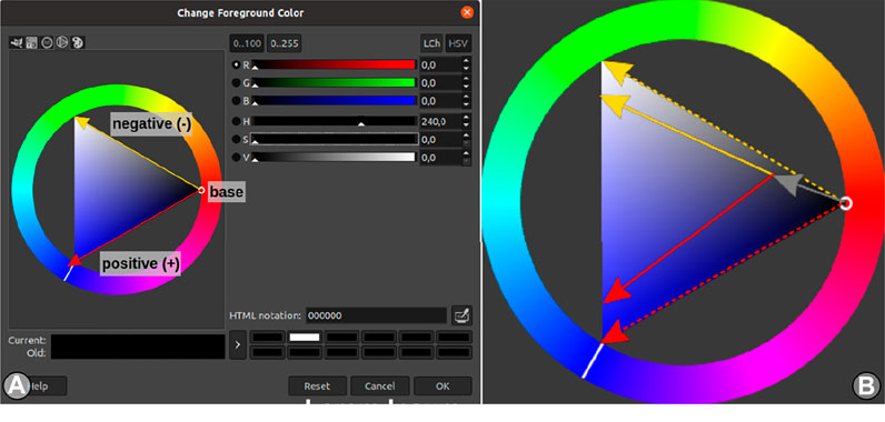
FIGURE 2. Illustration of the saturation- and luminance-modulated colour mapping at the example of mode 2 (i.e., H180) in (A), and its base-shifted form for a more print-compliant base (B).
Lastly, in order to perform this multi-modal colour composition, each mode is rendered into its individual (volumetric) image layer. Those layers are then additively merged, which demands a transparency modulation for each layer. The transparency modulation with opacity O results in the following colour mapping equation:
This colour mapping generally satisfies all stated criteria. Specifically, the mapping is (a) divergent, because there is a distinct and graded mapping of the directional sign of the mode. It is (b) resilient to colour-perception deficiencies, because a single rendering only occupies a single sector of the colour frequency spectrum. In cases where viewers have a distinct deficiency in an individual colour sector, it is possible to recreate the rendering by just selecting a different colour sector (i.e., red or green). The mapping is also (c) visually gradient-free, because the mapping is linearly defined in the HSV colour space without crossing intermittent colour bands. The absence of colour-band non-linearities in this case guarantees the absence of colour-gradient artefacts. Lastly, the remaining issue is the definite zero-base of the mapping, which amounts to plain black. While black as a base is fine, e.g., for screen-based projection, this mapping is inappropriate for printed media, because a new artificial black gradient is introduced around low values in fM (being dark) and true-zero values in fM (being fully white, due to the transparency modulation). In our experiments, this problem is addressed by shifting the colour base to a neutral grey, as in Figure 2B.
In an alternative mapping scheme, it is also possible to shift the channel mapping for the mode base and directional value. Considering a black base, we define a positive-sign hue base, e.g., H280, and a negative hue-base, e.g., H200. The mode itself is hence encoded exclusively with discretized steps in the saturation spectrum. For a three-mode vector, this means to encode the modes at 25%, 50% and 75% of saturation. The actual magnitude of the mode is encoded within the opacity- and luminance channel. This alternative mapping scheme is illustrated in detail in the Supplementary Figure S4, which follows the composition formulation in Eq. 7.
This mapping scheme has the same advantages as the primary mapping scheme, but additionally exhibits a well-defined zero-point. It only applies to a screen-based presentation, as the zero-base is black and (in contrast to the primary scheme) cannot easily be shifted to a brighter base. Finally, for the explicit representation of three-dimensional velocity tensors as the three data modes, the velocity vector mapping
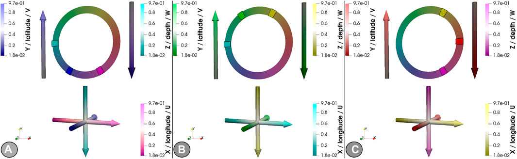
FIGURE 3. Representation of the primary, saturation- and value-modulated perceptual mapping to velocity modes with a blue base (A), green base (B) and red base (C).
5 Evaluating the visual designs with algebraic visualisation principles
The algebraic visualisation approach and its governing principles is detailed in Section 2. The following evaluation scores the fluid-flow visualisation techniques (Section 3) in their application towards the design principles (Section 2).
This paper illustrates the visual mapping schemes using a modulated perlin-noise dataset (Perlin, 1985) with two horizontal- and three vertical major perlin bands, multiplied with an unmodulated, high-frequency 3D field. This dataset is chosen in favour of more common synthetic data, such as the doublegyre () and the bickley jet (), because (i) it is a volumetric, non-divergent field, (ii) it has a steady- and an unsteady version to assess 4D behaviour and appearance, (iii) it is non-stationary with sufficient variation to recognise differences in its data modulation D′, and (iv) it is easy to obtain and use.
5.1 Invariance principle
The invariance principle enforces reproducibility in the visualisation, specifically that presenting the data D with a chosen form of visual mapping ω (with respect to the visual channels) yields the same rendered visual V, irrespective of the form of representation R. In cases where data permutations {r1, r2} of the same data D yield representations that result in different visuals {V1, V2} while applying the same visual mapping ω, a failure to the invariance principle (i.e., a hallucinator) occurs. Hence, in cases where D◦r1◦ω ≠ D◦r2◦ω, the visualisation varies with the form of representation. Such failure can often be traced to problems in data selection, ordering or sampling, and rarely occur for visualisation techniques for unordered and unsampled representations.
In visualising velocities, the hedgehog (i.e., quiver) plot is a prominent plotting technique that is strongly susceptible to hallucinators. In a dense hedgehog plot for every data point, zero-value data points occupy the majority in the plotted space V while representing zero information. It thus represents a visual bias that obscures actual information. Despite the removal of clutter, sparse hedgehog plots (Figure 4A) still contain the illusion of information where zero information is actually contained, which is a prime example of a hallucinator.
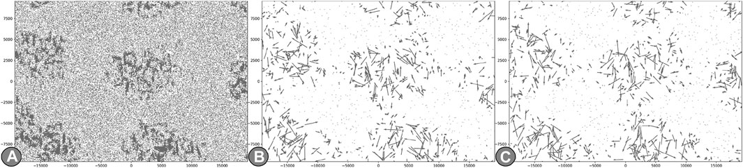
FIGURE 4. Frequent clutter hallucinator for hedgehog plots: representing zero-value data as points gives an illusion of information where none is present, by occupying the majority of the visual ink-space V. Sparser representations R′ (A) reduce the clutter but do not alleviate it. Subsampled sparse representations R′ (B) alleviate the clutter. The sparse representation, in return, introduces a sampling hallucinator, where two expression of the same data (such as (B) and (C)) show considerable regional differences.
Another issue in dense hedgehogs is the loss of the velocity orientation, which this plot is actually meant to display well. The visual clutter that results from the dense plot needs to be removed in order to convey the actual orientation, meaning that the data need to be sampled as a representation. A subsampled sparse hedgehog plot (Figure 4B) alleviates the clutter due to density, while still maintaining possible arrow collisions. Those collisions can be removed by plotting
In an immersive 3D environment, the clutter is pronounced, as it becomes increasingly difficult to identify individual flow patterns (e.g., eddies) or obtain an overall impression of general flow directions. Subsampling (Figure 5A) a dense hedgehog yields little improvement, and even overall replacing arrows with cones (Figure 5B) leads to little noticeable improvements. Only further scaled filtering by
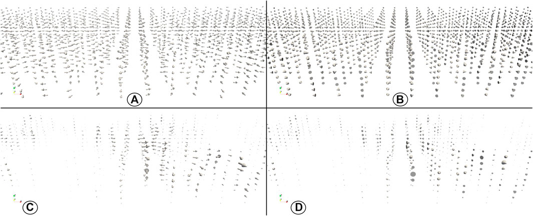
FIGURE 5. Drastic subsampling (A) or glyph replacement with cones (B) does not resolve the outlined clutter hallucinator. Resolving the hallucinator in 3D hedgehog plots is achieved with a
Note that, for the purpose of a coupled Eulerian-Lagrangian visualisation, hedgehog plots have the additional drawback to visually collide with particle positions- and trajectories, and can even partially obscure trajectory segments that are collinear to the presented flow-indicating arrow. It furthermore prevents the plotting of additional Lagrangian information, such as inter-particle forcing directions, with adequate selective arrow glyphs.
Hallucinators are also not limited to hedgehog plots for the visualisation of flow phenomena. Fluids are frequently visualized with contour plots to seperate different flow regimes. Here, the hallucinator dilemma is confounded to number and the selection of contouring values: few contour regions provide only proximate flow regime separations, whereas more contours prevent the separation of individual regimes and obsure intersecting areas of multiple countours. This latter issue leads to a common ordering hallucinator, where order permutation of the drawn elements yields different visualisations. This is more pronounced in an immersive three-dimensional view of occluding isosurfaces after the transparency compositions (Figure 6).
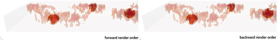
FIGURE 6. The 3D analogue of isosurface contour is further affected by rendering order hallucinators due to the transparency composition.
5.2 Unambiguity principle
According to the unambiguity principle, all data features shall be distinctly visible in the visual design and map to individual visual features in the plot or rendering. Confusers that result as a failure to this principle can, when carefully reflecting the principle and the examples in (Kindlmann and Scheidegger, 2014), be traced back to some form of visual simplification or a reduction of the visual dimension.
One such ambiguity is encountered when plotting 3D tensors via a hedgehog plot. In this case, the ambiguity stems from another source, the loss of the orientation sign of the velocity in at least one primary axis. In this case, the issue is technically traced to the flat orthogonal projection of one of the principal flow axes on the viewing plane. In simple terms, most velocity data are plotted in the lateral xy-plane, thus eliminating the third visual dimension. As a result, flows along the vertical z-axis cannot be separated in axis- or counter-axis direction. Thus, algebraically, in a setting with D = (x,y,z)T, α = {1,1,−1,1}T◦ID and D′ = D◦α, the hedgehog plots V = V′ are identical. It follows that ω = IV ̸x⇒ α = ID.
The discussed issue can be circumvented with the use of bi- or trichromatic colour maps of image representations, where (R, G, B) = (|x|, |y|, |z|) maps to the principal eigenvector
Considering contoured surface representations, the inversion is confused by the contouring process of the velocity magnitude. Therefore, by just employing the contour as visual mark and the hue as differentiating channel, no flow direction can be identified. In contrast, using the directional velocities as surface normals changes the illuminations according to the fluid-flow. As a consequence, the illumination modulates the visualisation V sufficiently so that V(D−1) proportionally differs from V(D), which is shown in the Supplementary Figure S16.
5.3 Correspondence principle
The principle of visual correspondence demands that equal operations (e.g., shift, scale, invert, sort) in data transformation α and visual mapping ω are interchangeable (i.e., congruent) and thus shall lead to the same outcome. When evaluating failures to the correspondence, it implies considering the chain of operations D◦α◦rx◦ω = V, perform a mapping modulation where {α, ω}′ = {I−1, λ × I, I + κ}, and assert that D◦α′◦r◦ω = D◦α◦r◦ω′. If the conditions are violated, the visualisation is susceptible to misleaders.
A prime example is the scaled sparse hedgehog plot: with D being the velocity tensor and |D| being the scalar velocity magnitudes, it is possible to first resample the data points into a sparse representation (r), then plot the arrows and lastly scale the arrows to the magnitude of the sampled data (ω′), as seen in Figure 7B. The result differs from first scaling all data points via
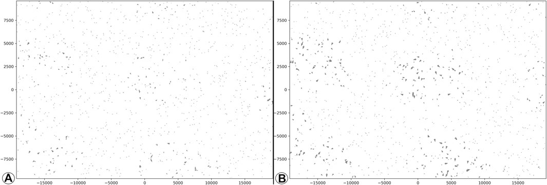
FIGURE 7. Illustration of lacking correspondence in scale transformation on hedgehog plots: pre-scaling the arrow length (V = D◦α′◦r1◦ω; (A) differs from post-selection scaling (V = D◦α◦r1◦ω′; (B).
A strong inversion jumbler happens in image-based visualisation using an intensity mapping scheme. Assuming that R′ = D◦α′◦r with α′ = I−1, the data transform inverts the (signed) directional velocities. The colour mapping then displays the absolute velocity magnitude, for which the sign is irrelevant. Hence, when plotting the untransformed data R = D◦α◦r for visualisation
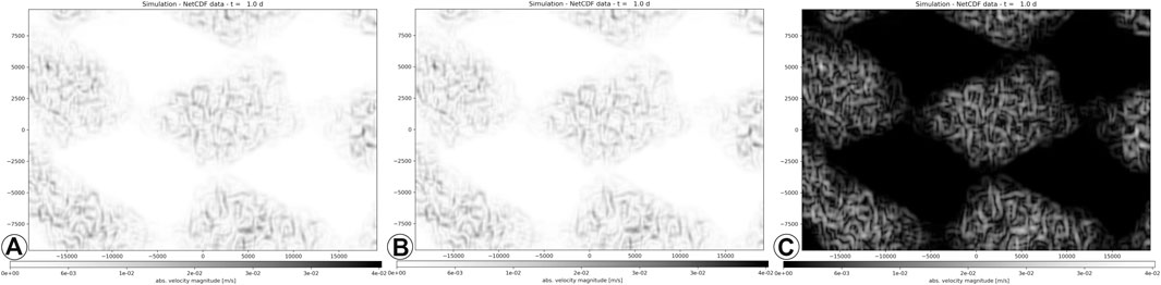
FIGURE 8. Illustration of lacking correspondence in inversion transformation on intensity-mapped images of | v|Ł compared to the original (D → R(α) → V(ω); (A), inverting the data (V2 = D◦α′◦r◦ω; (B) differs from inverting the visual transformation (V1 = D◦α◦r◦ω′; (C).
Moreover, the intensity-based colour mapping is also affected by shift misleaders. Considering R′ = D + α′◦r with α′ = κ, then
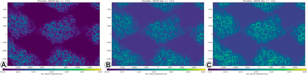
FIGURE 9. A hue-graded colour mapping of
5.4 Perceptual mapping and algebraic design principles
The advantages of the perceptual colour mapping, as demonstrated in Figures 10A,D, becomes visible in the comparison with established visualisation techniques for fluid-flow velocities, as outlined above. The divergent mapping with a signed directional distinction avoids zero-point and inversion confusers that are prevalent in its competing bi-/trichromatic mapping. The transparency grading avoids clutter and zero-point issues that are affecting hedgehog visualisations. In addition, the definite order in the layered composition of the transparency-modulated colours for each direction (i.e., mode) circumvents hallucinators, in contrast to the surface rendering of contours that is derived from the velocity magnitude
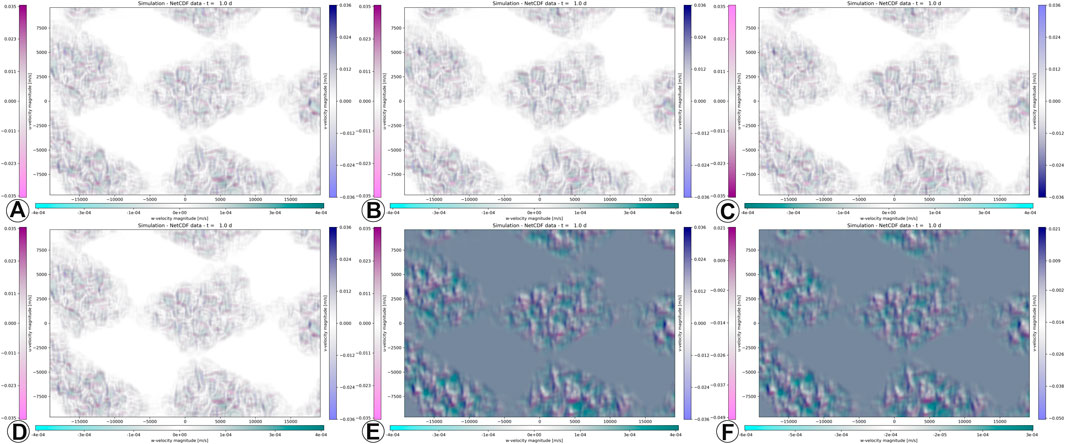
FIGURE 10. Original, unmodulated perceptual mapping, with α = ID and ω = ID, according to Section 4, is shown in (A) and (D). The inverted data α′ = D−1 (B) and the inverted visual mapping ω′ = ω−1 (C) are equivalent. The equivalence of shifted data α′ = D + κ (E) and shifted visual mapping ω′ = ω + κ (F) also displays a resilience to jumblers.
In order to judge the mapping’s stability to jumblers, a plot of pre- (Figure 10B) and post-inverted (Figure 10C) velocities, compared to Figure 10A). Perceptual mapping is also unaffected by shift jumblers, as shown in the plots of pre- (Figure 10E) and post-shifted (Figure 10F) velocities, compared to Figure 10D. Those comparisons demonstrate that pre- and post-transformation lead to the same visual outcomes. In other words, with the perceptual colour mapping, a direct correspondence between data transformation and visual mapping is guaranteed.
6 Perceptual principles in coupled 3D Eulerian—Lagrangian visualisation
The techniques evaluated in the previous sections demonstrate the visualisation of flow velocities on their own as a product of Eulerian fluid-flow. As demonstrated, even in the exclusively Eulerian context, the application of visualisation techniques requires a well thought-out visual design to avoid perceptual issues. Those issues are compounded when coupling the presentation of both Eulerian and Lagrangian data. In this context, the Eulerian data represent the fluid-flow context itself while Lagrangian data represent feature objects that are affected by the flow in a directed motion.
The primary output of Lagrangian flow analysis are trajectories of particle objects, which are either represented as line segments or tubes. Such a plain representation though neglects the direction of temporal dimension of a trajectory, which leads to ambiguities. This means that forward- and backward trajectories map to the same visual expression. The resulting confuser is only partially resolved by adding directional indicators at the tip (such as arrows in Figure 11A or cones), and is only conclusively resolved by distinction of start- and endpoint (see the coloured cone indicators in Figure 11B). Note that an animation can also use particle trails to indicate the trajectory direction without additional symbolics. The temporally-clipped principle of particle trails prevents their application outside the animation format.
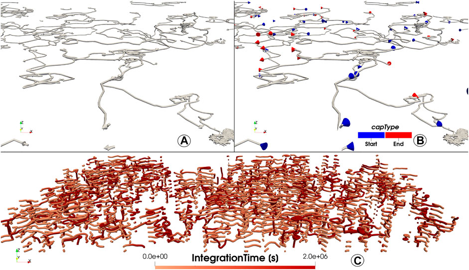
FIGURE 11. Typically, Lagrangian trajectories are line- or tube segments without direction indicators. Tip indicators (e.g., arrows) show a dominant flow directions (A). For conclusively separating forward- and backward trajectories, the start- and end-tip are visually split from one another (such as by hue; b). For comparison, a plot with fully-coloured trajectories (C) is less effective in communicating startpoint and endpoint, while allocating more visual channels than necessary.
Plotting unattributed particle trajectories can simply be done with line plots. In contrast, the introduction (Section 1) and the Lagrangian ocean visualisation literature (Section 3) highlight that (i) the particle trajectory is affected by more than just the hydrodynamic fluid-flow, and that (ii) the particle attributes are essential for comprehending the studied transport pattern. The distinction between Eulerian fluid-flow and Lagrangian particle motion hence requires visualising both information in-context. The combined plot allows identifying trajectory segments that are more affected by the background flow, and differentiate them from the segments where motion is dominated by internal forces. Such a visualisation requires well-defined symbolics for all presented features, which is the purpose of a perceptually-adequate visual design. Hence, the challenge is to co-visualize Lagrangian flow trajectories and their attributes in a Eulerian fluid-flow context, using the means discussed in Section 5. The following paragraphs discuss those visualisation options (van Sebille et al., 2020): hedgehogs and trajectories (Duncan et al., 2018), isocontoured surfaces and trajectories, and (Everaert et al., 2020) colour-mapped image-based rendering and trajectories. The closing case study demonstrates auxilliary symbolics to co-visualize the possible trajectory attributes.
Combining hedgehog plots for the Eulerian flow field with a simple trajectory is possible in terms of symbolics, though both techniques in their simple form have perceptual issues: the plain hedgehog plot suffers from visual clutter, sampling invariance, view-directional ambiguity and a scaling misleader, while the simple trajectory suffers from ambiguity in temporal direction indexing (Figure 12A). Supplementing the trajectory with directional indicators leads to the contextual ambiguity that feature- and background information are represented with the same symbolics, hence it is ambiguous of what is context information and what is feature information (Figure 12B). This ambiguity can be resolved by assigning appropriate indicator colours to the Eulerian- and the Lagrangian arrow- or cone glyphs (Figure 12C). Colour selection is crucial in this case, as dark-tone arrows are problematic for identifying the flow direction in 3D renderings. The issue can be circumvented by using contour outlines to index the glyph direction (Figure 12D), although the direction invariance does not fully disappear. Remaining issues are a possible sampling hallucinator, where Lagrangian- and Eulerian arrows coincide in position but contrast in terms of direction, as well as the known scaling misleader, which is demonstrated in Section 5.3.

FIGURE 12. Visualisation variations by combining hedgehog plots for Eulerian fluid flow velocity fields and Lagrangian particle trajectories: (A) original hedgehog, (B) sparse hedgehog, (C) coloured hedgehogs and trajectory indicators, (D) contoured- and shaded hedgehog and trajectory indicators.
Another possibility of providing fluid-flow background information is with
Lastly, rendering Eulerian velocities as colour-mapped images also facilitates a co-visualisation of Lagrangian trajectories. In all illustrated cases, the fluid velocity amplitude modules the mapped transparency, which inherently reduces information clutter and the occlusion of Lagrangian feature information. A simple visualisation of the
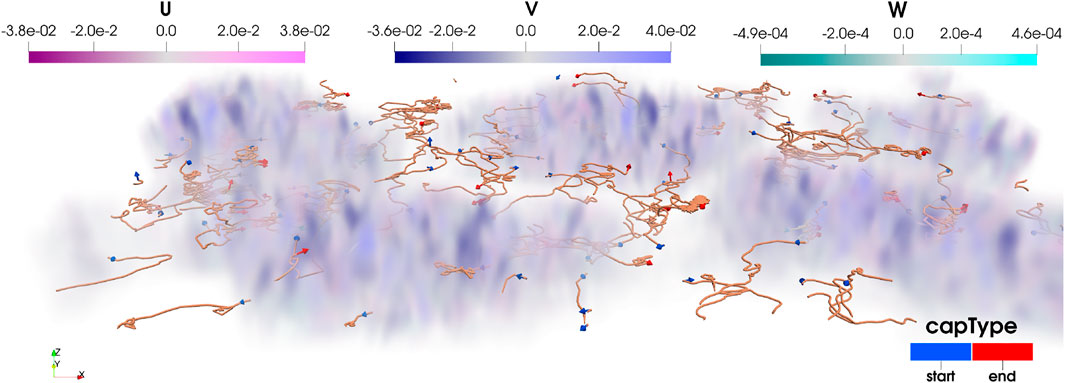
FIGURE 13. Perceptual colour mapping of Eulerian
6.1 Immersive analysis of deep transport of algae—Accumulating microplastics
Our research group at the Institute of Marine and Atmospheric research analyses the transport and fate of marine plastics in the ocean within the TOPIOS (Tracking Of Plastics In Our Seas) project. This transport is affected by the hydrodynamic velocities in the ocean, which are provided by Eulerian simulations, as well as by influencing physical, biological and biochemical processes. One interesting process, which is the focus of the discussed investigation, is biofouling, in which algae accumulates on the surface of plastic particles. This algal accumulation affects the 3D transport of plastic particles in the water column.
The following analysis is based on the biofouling modelling by Lobelle et al. (2021), which expands on the model by Kooi et al. (2017). The study uses Eulerian ocean data from the NEMO-MEDUSA dataset (Yool et al., 2013; Megann et al., 2014) with an adaptive lateral- and vertical resolution of its structured curvilinear grid. The attached algal concentration is governed by Eq. 9 (for the explanation of symbolics and semantics, see (Lobelle et al., 2021, eq. 2). Driving forces in this concentration are the plastic particle’s density ρ and its size r, which is split into the size of the plastic rp and the biofilm thickness rbio. Furthermore, the algal concentration in the ocean is a function of the annual season, which is represented by a season indicator. As a result, the motion of the particle is governed by the oceanic hydrodynamic velocity tensor
All of the above-discussed influence parameters (apart from the Eulerian hydrodynamic velocity) are attributes of the Lagrangian trajectory that needs to be visualised. The goal of the visualisation is to present the Langrangian data in context in order to better understand the interplay of the physical and biological processes. The visualisation challenge is to present all influencing data in-context in a perceptually consistent way. Therefore, novel symbolics for the Lagrangian particle information was developed that maps each attribute to a distinct, non-conflicting mark or channel in the visualisation. A complex glyph is developed to carry the overall six modulating attributes. The core of the glyph is a shape-distinct glyph that represents the season indicator at the release time of the particle, mapping the glyphs in Figure 14 to the individual seasons. This core glyph is then modulated in its green intensity with the particle density ρ and in its scale by the biofilm thickness rbio. The overall particle, as an accumulation of plastic and biofilm, is represented with a spherical shell, that is scaled by the overall particle radius r. The shell is presented with its wireframe line structure to allow for the visibility of the core glyph in an unobstructed manner. The colour intensity of the shell is modulated by the overall algae concentration a in a diverging green-tone colour scale, graded in the luminance channel, which semantically does not conflict with the core intensity as ρ≅a. At last, the vertical motion is indicated in its orientation by a static arrow attached to the core, although this can alternatively be encoded in the core’s illumination equation in cases where the arrow glyph is allocated for a different attribute. The full semantic encoding of the particle glyph is illustrated in Figure 14E.
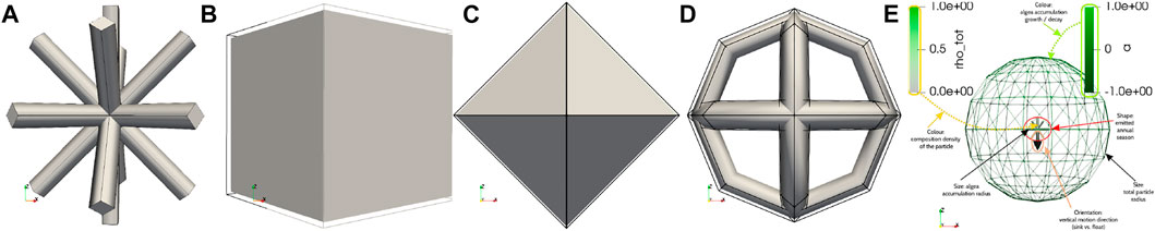
FIGURE 14. Depiction of the seasonal glyphs for December-January-February (A), March-April-May (B), June-July-August (C) and September-October-November (D). In northern hemisphere semantics, they map to winter (A), spring (B), summer (C) and autumn (D). The mapping of Lagrangian particle attributes to the visual marks and visual channels of the complex glyph is illustrated in (E).
With respect to the coupled Eulerian-Lagrangian visualisation, the use of complex glyphs prohibits a glyph-based Eulerian representation (e.g., hedgehog plots), especially when using arrows as encoding elements of the vertical velocity of the particles as that results in semantic ambiguity. A major drawback for contour visualisations of
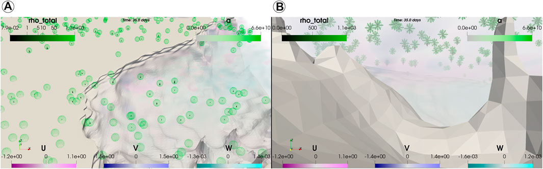
FIGURE 15. Visualisation of algae-accumulating particles in the ocean near an equatorial plateau. The overview provides an impression of particle sizes and floating- or sinking behavior through the arrow-incorporating complex glyphs (A). The Eulerian velocities are clearly visible in a submerged view, as well as the core seasonal glyph type (B).
7 Conclusion
This article discussed the coupled Eulerian-Lagrangian fluid-flow visualisation, and how this visualisation can be designed for perceptual adequacy and efficacy. The analysis was inspired by current practices in the fluid-flow and oceanic domain, as presented in Section 3. In contrast to comparable studies, this work did not just discuss and introduce techniques and symbolics for the visualisation, but discussed the design process with a focus on the specific challenges of coupled Eulerian-Lagrangian scientific visualisation. The article revisited the concept of algebraic visualisation design (Kindlmann and Scheidegger, 2014) with a concise summary in Section 2. Existing fluid-flow visualisation techniques, such as hedgehog plots (i.e., quivers), isocontours and image mapping, were evaluated in their spatial 2D- and 3D form according to the three perceptual principles that the algebraic design process is concerned with. Perceptual issues were pointed out, discussed, and possible resolutions for perceptual failures were introduced.
Despite possible resolutions to some perceptual failures, none of the existing techniques was without perceptual shortcomings. Therefore, Section 4 introduced a novel colour mapping scheme, with a total of six thematic derivations, that is designed to avoid any of the perceptual issues outlined by algebraic visualisation design. This resilience to perceptual issues was demonstrated by comparative experiments in Section 5.4 on synthetic data.
The main challenge of a coupled Eulerian-Lagrangian visualisation and its perceptual design space was explored in Section 6. The analysis shows that perceptual issues in a purely Eulerian visualsation are compounded when coupled with Lagrangian trajectories, because some visual marks (e.g., tubes and arrows in 3D) and visual channels are consumed by the Lagrangian trajectory. In this coupled, temporal-3D scenario, the advantages of the novel perceptual design are clearly visible. In order to connect the fundamental insights with the primary application scenario, Section 6.1 applies the visual design to a complex plastic-tracing case study with algae-accumulation of marine plastic particles. Using the image-based perceptual mapping, the visual designer is free to design and use complex particle glyphs to include, link and communicate the core information to comprehend the plastic transport process.
8 Discussion
The presented work highlights the complexity of coupled Eulerian-Lagrangian fluid-flow visualisation and its specific application in oceanography. The multivariate Eulerian velocity model is often used in such a co-visualisation with Lagrangian trajectories, and the article demonstrates that perceptual errors are frequently encountered in the literature for those coupled visualisations. Our work clearly demonstrated how those perceptual errors can be detected with the evaluation of algebraic design principles.
While those failures to the perceptual principles of invariance, unambiguity and correspondence are to be considered in a specific visual design, Sections 5, 6 discussed modulation and changes to the semiology of prevalent fluid-flow visualisation techniques that resolve those perceptual failures. Therefore, even though the related sections demonstrated the inherent advantages of the novel perceptual mapping approach, it was also demonstrated that the alternative symbolics can be used when being carefully designed for perceptual resilience. As demonstrated by the case study in Section 6.1, a consistent visual design for the coherent co-visualisation is required for any visualisation in Eulerian-Lagrangian fluid-flow applications to avoid conflicting symbolics.
The outlined principles of invariance, unambiguity and correspondence are important because adhering to those principles guarantees a consistent communication with the visualisations. Visualisations that are created with the goal to present the information need to be designed in a way so that the visual author and the viewer have the same, consistent impression of the data in order to agree on claims and scientific insights drawn from the data. This is the major contribution and added benefit of the outlined approach.
The introduced perceptual colour mapping supports the visual design approach and its goals. Considering the three thematic derivations and a secondary, alternative, perceptually equally-consistent mapping, the mapping technique is sufficiently flexible to be adapted to different visual themes and different visual audiences. Furthermore, while the demonstration example maps signed directional Eulerian velocity to the visual space, the colour scheme can also be for the mapping of other higher-order multivariate field data, such as anisotropic diffusion tensors. Therefore, the technique has potential for ongoing studies on the influence of diffusive dispersion in physical oceanography (Reijnders et al., 2022). Note that mapping data with a tensor rank rD > 5 with the perceptual design in Section 4 is disadvised because the incremental stepping between the individual modes becomes indiscernibly small.
Lastly, the complexity in the visual design for Eulerian—Lagrangian flow data opens up a new application case for immersive visualisation and interaction. In most visual designs, the transparency channel of the visualisation is already assigned to the mapping of an individual data feature. Using the transparency channel for spatial selection of regions of interest (ROI) in the data would hence result in an ambiguity in the visualisation. Therefore, other means of ROI selection need to be employed, and immersive selection is a desirable option in such a visual design space. This is an interesting subject of future investigations. Aside the growing potential, there is still a barrier to the adoption of the introduced visualisation techniques and mapping principles, as common practices were established in the related application domains. Novel visualisation insights, such as the perceptual UVW plot, are far outside the common expectation and practice in oceanography and hydrology, hence adoption of those 3D visualisations and their design principles will take time to percolate.
Data availability statement
The raw data supporting the conclusion of this article will be made available by the authors, without undue reservation.
Author contributions
CK initiated the research, performed the literature review, analysed the established techniques according to algebraic design principles, designed the novel mapping scheme and visualised the algae-accumulation case study. ES contributed to the literature review in section 3 with knowledge from physical oceanography. DL lead the conception, investigation, design, simulation and analysis of the algae-accumulating biofouling case study. CK, ES, and DL contributed to manuscript revision, read, and approved the submitted version.
Funding
The research is supported by the “Tracking Of Plastic In Our Seas” (TOPIOS) project (grant agreement no. 715386), and partly by the IMMERSE project (grant agreement no. 821926), both funded by ERC’s Horizon 2020 Research and Innovation program. Furthermore, the NWO Groot-funded nanoplastics project (ref. no. OCENW.GROOT.2019.043) supported the outlined development. Simulations were carried out on the Dutch National e-Infrastructure with the support of SURF Cooperative (project no. 16371 and 2019.034).
Acknowledgments
All authors thank the OceanParcels group of Utrecht University’s IMAU for their valuable feedback in the visual design process.
Conflict of interest
The authors declare that the research was conducted in the absence of any commercial or financial relationships that could be construed as a potential conflict of interest.
Publisher’s note
All claims expressed in this article are solely those of the authors and do not necessarily represent those of their affiliated organizations, or those of the publisher, the editors and the reviewers. Any product that may be evaluated in this article, or claim that may be made by its manufacturer, is not guaranteed or endorsed by the publisher.
Supplementary material
The Supplementary Material for this article can be found online at: https://www.frontiersin.org/articles/10.3389/fenvs.2022.941910/full#supplementary-material
References
Abernathey, R., Marshall, J., and Ferreira, D. (2011). The dependence of southern ocean meridional overturning on wind stress. J. Phys. Oceanogr. 41, 2261–2278. doi:10.1175/JPO-D-11-023.1
Abernathey, R. P., Cerovecki, I., Holland, P. R., Newsom, E., Mazloff, M., Talley, L. D., et al. (2016). Water-mass transformation by sea ice in the upper branch of the southern ocean overturning. Nat. Geosci. 9, 596–601. doi:10.1038/ngeo2749
Ahrens, J., Geveci, B., and Law, C. (2005). Paraview: An end-user tool for large data visualization. Los Alamos, United States: The visualization handbook 717.
Anguiano-García, A., Zavala-Romero, O., Zavala-Hidalgo, J., Lara-Hernández, J. A., and Romero-Centeno, R. (2019). “High performance open source Lagrangian oil spill model,” in Supercomputing. Editors M. Torres, J. Klapp, I. Gitler, and A. Tchernykh (Cham: Springer International Publishing), 118–128.
Beron-Vera, F. J., Hadjighasem, A., Xia, Q., Olascoaga, M. J., and Haller, G. (2019). Coherent Lagrangian swirls among submesoscale motions. Proc. Natl. Acad. Sci. U. S. A. 116, 18251–18256. doi:10.1073/pnas.1701392115
Borgo, R., Kehrer, J., Chung, D. H., Maguire, E., Laramee, R. S., Hauser, H., et al. (2013). Glyph-based visualization: Foundations, design guidelines, techniques and applications. Geneva, Switzerland: Eurographics, 39–63.
Brambilla, A., Carnecky, R., Peikert, R., Viola, I., and Hauser, H. (2012). “Illustrative flow visualization: State of the art, trends and challenges,” in Visibility-oriented visualization design for flow illustration (Geneva, Switzerland: Eurographics Association).
Brewer, C. A., Hatchard, G. W., and Harrower, M. A. (2003). Colorbrewer in print: A catalog of color schemes for maps. Cartogr. Geogr. Inf. Sci. 30, 5–32. doi:10.1559/152304003100010929
Bujack, R., and Middel, A. (2020). State of the art in flow visualization in the environmental sciences. Environ. Earth Sci. 79, 65. doi:10.1007/s12665-019-8800-4
Cabral, B., and Leedom, L. C. (1993). “Imaging vector fields using line integral convolution,” in Proceedings of the 20th annual conference on Computer graphics and interactive techniquesin SIGGRAPH 93 publication in CG domain at a conference with double-blind peer-review process and subsequent journal-grade proceedings print, Anaheim, CA, United States, October 5–8, 2009 ( New York, NY, United States: Association for Computing Machinery), 263–270. Available at: https://dl.acm.org/doi/proceedings/10.1145/166117
Calzada, A. E., Delgado, I., Ramos, C., Pérez, F., Reyes, D., Carracedo, D., et al. (2021). Lagrangian model petromar-3d to describe complex processes in marine oil spills. Open J. Mar. Sci. 11, 17–40. doi:10.4236/ojms.2021.111002
Cetina-Heredia, P., van Sebille, E., Matear, R. J., and Roughan, M. (2018). Nitrate sources, supply, and phytoplankton growth in the great Australian bight: An eulerian-Lagrangian modeling approach. J. Geophys. Res. Oceans 123, 759–772. doi:10.1002/2017JC013542
Crameri, F., Shephard, G. E., and Heron, P. J. (2020). The misuse of colour in science communication. Nat. Commun. 11, 5444. doi:10.1038/s41467-020-19160-7
Dämmer, L. K., de Nooijer, L., van Sebille, E., Haak, J. G., and Reichart, G. J. (2020). Evaluation of oxygen isotopes and trace elements in planktonic foraminifera from the mediterranean sea as recorders of seawater oxygen isotopes and salinity. Clim. Past. 16, 2401–2414. doi:10.5194/cp-16-2401-2020
de Leeuw, W. C., Post, F. H., and Vaatstra, R. W. (1996). “Visualization of turbulent flow by spot noise,” in Virtual environments and scientific Visualization’96, Monte Carlo, Monaco, FR, (Geneva, Switzerland: Eurographics Association), 286–295. Available at: https://link.springer.com/book/10.1007/978-3-7091-7488-3
de Marez, C., Carton, X., Corréard, S., L’Hégaret, P., and Morvan, M. (2020). Observations of a deep submesoscale cyclonic vortex in the arabian sea. Geophys. Res. Lett. 47, e2020GL087881. doi:10.1029/2020gl087881
de Vos, M., Barnes, M., Biddle, L. C., Swart, S., Ramjukadh, C. L., Vichi, M., et al. (2021). Evaluating numerical and free-drift forecasts of sea ice drift during a southern ocean research expedition: An operational perspective. J. Operational Oceanogr. 0, 1–17. doi:10.1080/1755876X.2021.1883293
Delandmeter, P., and van Sebille, E. (2019). The parcels v2.0 Lagrangian framework: New field interpolation schemes. Geosci. Model Dev. 12, 3571–3584. doi:10.5194/gmd-12-3571-2019
Devis-Morales, A., Rodríguez-Rubio, E., and Montoya-Sánchez, R. A. (2021). Modelling the transport of sediment discharged by colombian rivers to the southern caribbean sea. Ocean. Dyn. 71, 251–277. doi:10.1007/s10236-020-01431-y
Duncan, E. M., Arrowsmith, J., Bain, C., Broderick, A. C., Lee, J., Metcalfe, K., et al. (2018). The true depth of the mediterranean plastic problem: Extreme microplastic pollution on marine turtle nesting beaches in Cyprus. Mar. Pollut. Bull. 136, 334–340. doi:10.1016/j.marpolbul.2018.09.019
Everaert, G., De Rijcke, M., Lonneville, B., Janssen, C., Backhaus, T., Mees, J., et al. (2020). Risks of floating microplastic in the global ocean. Environ. Pollut. 267, 115499. doi:10.1016/j.envpol.2020.115499
Falk, M., Seizinger, A., Sadlo, F., Üffinger, M., and Weiskopf, D. (2014). “Trajectory-augmented visualization of Lagrangian coherent structures in unsteady flow,” in International symposium on flow visualization (ISFV14) (Daegu, Korea: Springer).
Hunter, J. D. (2007). Matplotlib: A 2d graphics environment. Comput. Sci. Eng. 9, 90–95. doi:10.1109/mcse.2007.55
Kehl, C., Fischer, R., and van Sebille, E. (2021). Practices, pitfalls and guidelines in visualising Lagrangian ocean analyses. ISPRS Ann. Photogramm. Remote Sens. Spat. Inf. Sci. 54, 217–224. doi:10.5194/isprs-annals-v-4-2021-217-2021
Kehl, C., Reijnders, D., Fischer, R., Brouwer, R., Schram, R., and van Sebille, E. (2021). “Parcels 2.2-an increasingly versatile, open-source Lagrangian ocean simulation tool,” in EGU general assembly conference abstracts (Vienna, Austria: EGU GA). Available at: https://www.egu.eu/contact/
Khlebnikov, R., Kainz, B., Steinberger, M., and Schmalstieg, D. (2013). Noise-based volume rendering for the visualization of multivariate volumetric data. IEEE Trans. Vis. Comput. Graph. 19, 2926–2935. doi:10.1109/TVCG.2013.180
Khlebnikov, R., Kainz, B., Steinberger, M., Streit, M., and Schmalstieg, D. (2012). Procedural texture synthesis for zoom-independent visualization of multivariate data. Comput. Graph. Forum 31, 1355–1364. doi:10.1111/j.1467-8659.2012.03127.x
Kindlmann, G., and Scheidegger, C. (2014). An algebraic process for visualization design. IEEE Trans. Vis. Comput. Graph. 20, 2181–2190. doi:10.1109/TVCG.2014.2346325
Kooi, M., Nes, E. H. V., Scheffer, M., and Koelmans, A. A. (2017). Ups and downs in the ocean: Effects of biofouling on vertical transport of microplastics. Environ. Sci. Technol. 51, 7963–7971. doi:10.1021/acs.est.6b04702
Le Gouvello, D. Z., Hart-Davis, M. G., Backeberg, B. C., and Nel, R. (2020). Effects of swimming behaviour and oceanography on sea turtle hatchling dispersal at the intersection of two ocean current systems. Ecol. Model. 431, 109130. doi:10.1016/j.ecolmodel.2020.109130
Lebreton, L., Slat, B., Ferrari, F., Sainte-Rose, B., Aitken, J., Marthouse, R., et al. (2018). Evidence that the great Pacific garbage patch is rapidly accumulating plastic. Sci. Rep. 8, 4666. doi:10.1038/s41598-018-22939-w
Lindo-Atichati, D., Jia, Y., Wren, J. L. K., Antoniades, A., and Kobayashi, D. R. (2020). Eddies in the Hawaiian archipelago region: Formation, characterization, and potential implications on larval retention of reef fish. J. Geophys. Res. Oceans 125, e2019JC015348. doi:10.1029/2019jc015348
Lobelle, D., Kooi, M., Koelmans, A. A., Laufkötter, C., Jongedijk, C. E., Kehl, C., et al. (2021). Global modeled sinking characteristics of biofouled microplastic. J. Geophys. Res. Oceans 126, e2020JC017098. doi:10.1029/2020JC017098
Maes, C., Blanke, B., and Martinez, E. (2016). Origin and fate of surface drift in the oceanic convergence zones of the eastern Pacific. Geophys. Res. Lett. 43, 3398–3405. doi:10.1002/2016GL068217
McInnes, A. S., Laczka, O. F., Baker, K. G., Larsson, M. E., Robinson, C. M., Clark, J. S., et al. (2019). Live cell analysis at sea reveals divergent thermal performance between photosynthetic ocean microbial eukaryote populations. ISME J. 13, 1374–1378. doi:10.1038/s41396-019-0355-6
McLoughlin, T., Laramee, R. S., Peikert, R., Post, F. H., and Chen, M. (2010). Over two decades of integration-based, geometric flow visualization. Comput. Graph. Forum 29, 1807–1829. doi:10.1111/j.1467-8659.2010.01650.x
Megann, A., Storkey, D., Aksenov, Y., Alderson, S., Calvert, D., Graham, T., et al. (2014). Go5. 0: The joint nerc–met office nemo global ocean model for use in coupled and forced applications. Geosci. Model Dev. 7, 1069–1092. doi:10.5194/gmd-7-1069-2014
Moreland, K. (2009). “Diverging color maps for scientific visualization,” in International symposium on visual computing (Springer), 92–103. Available at: https://www.jvrb.org/old-content/jvrb/pastconferences/PastConferences2009/isvc2009/
Munzner, T. (2014). Visualization analysis and design. Boca Ration, FL, United States: CRC Press. Available at: https://www.taylorfrancis.com/books/mono/10.1201/b17511/visualization-analysis-design-tamara-munzner
Nardini, P., Chen, M., Böttinger, M., Scheuermann, G., and Bujack, R. (2021). Automatic improvement of continuous colormaps in Euclidean colorspaces. Comput. Graph. Forum 40, 361–373.
Nardini, P., Chen, M., Samsel, F., Bujack, R., Böttinger, M., Scheuermann, G., et al. (2019). The making of continuous colormaps. IEEE Trans. Vis. Comput. Graph. 27, 3048–3063. doi:10.1109/tvcg.2019.2961674
Nooteboom, P. D., Bijl, P. K., van Sebille, E., von der Heydt, A. S., and Dijkstra, H. A. (2019). Transport bias by ocean currents in sedimentary microplankton assemblages: Implications for paleoceanographic reconstructions. Paleoceanogr. Paleoclimatology 34, 1178–1194. doi:10.1029/2019PA003606
[Dataset] Office, M. (2010). Cartopy: A cartographic python library with a matplotlib interface. Available at: https://www.bibsonomy.org/bibtex/2bc7d5c53e98cbff7a56b008bb2ce170c/pbett.
Onink, V., Wichmann, D., Delandmeter, P., and van Sebille, E. (2019). The role of ekman currents, geostrophy, and Stokes drift in the accumulation of floating microplastic. J. Geophys. Res. Oceans 124, 1474–1490. doi:10.1029/2018JC014547
Perlin, K. (1985). An image synthesizer. SIGGRAPH Comput. Graph. 19, 287–296. doi:10.1145/325165.325247
Post, F. H., and Van Walsum, T. (1993). “Fluid flow visualization,” in Focus on scientific visualization (Springer), 1–40. Available at: https://link.springer.com/book/10.1007/978-3-642-77165-1
Potter, H. (20102018). The cold wake of typhoon Chaba (2010). Deep Sea Res. Part I Oceanogr. Res. Pap. 140, 136–141. doi:10.1016/j.dsr.2018.09.001
Raith, F., Röber, N., Haak, H., and Scheuermann, G. (2017). “Visual eddy analysis of the agulhas current,” in Workshop on visualisation in environmental sciences (EnvirVis). Editors K. Rink, A. Middel, D. Zeckzer, and R. Bujack (Geneva, Switzerland: The Eurographics Association). doi:10.2312/envirvis.20171100
Reijnders, D., Deleersnijder, E., and van Sebille, E. (2022). Simulating Lagrangian subgrid-scale dispersion on neutral surfaces in the ocean. J. Adv. Model. Earth Syst. 14, e2021MS002850. doi:10.1029/2021ms002850
Schilling, H. T., Everett, J. D., Smith, J. A., Stewart, J., Hughes, J. M., Roughan, M., et al. (2020). Multiple spawning events promote increased larval dispersal of a predatory fish in a Western boundary current. Fish. Oceanogr. 29, 309–323. doi:10.1111/fog.12473
Schroeder, W. J., Lorensen, B., and Martin, K. (2004). The visualization toolkit: An object-oriented approach to 3D graphics. Kitware.
Scutt Phillips, J., Sen Gupta, A., Senina, I., van Sebille, E., Lange, M., Lehodey, P., et al. (2018). An individual-based model of skipjack tuna (katsuwonus pelamis) movement in the tropical Pacific ocean. Prog. Oceanogr. 164, 63–74. doi:10.1016/j.pocean.2018.04.007
Singh, S. P., Groeneveld, J. C., Hart-Davis, M. G., Backeberg, B. C., and Willows-Munro, S. (2018). Seascape genetics of the spiny lobster panulirus homarus in the Western indian ocean: Understanding how oceanographic features shape the genetic structure of species with high larval dispersal potential. Ecol. Evol. 8, 12221–12237. doi:10.1002/ece3.4684
Sinha, A., Balwada, D., Tarshish, N., and Abernathey, R. (2019). Modulation of lateral transport by submesoscale flows and inertia-gravity waves. J. Adv. Model. Earth Syst. 11, 1039–1065. doi:10.1029/2018MS001508
Thyng, K. M., Greene, C. A., Hetland, R. D., Zimmerle, H. M., and DiMarco, S. F. (2016). True colors of oceanography: Guidelines for effective and accurate colormap selection. Oceanogr. Wash. D. C). 29, 9–13. doi:10.5670/oceanog.2016.66
Tufte, E. (2001). The visual display of quantitative information. Graphics Press. Available at: https://books.google.de/books?id=qmjNngEACAAJ&dq=The+visual+display+of+quantitative+information&hl=nl&sa=X&redir_esc=y
van Sebille, E., Aliani, S., Law, K. L., Maximenko, N., Alsina, J. M., Bagaev, A., et al. (2020). The physical oceanography of the transport of floating marine debris. Environ. Res. Lett. 15, 023003. doi:10.1088/1748-9326/ab6d7d
van Sebille, E., Griffies, S. M., Abernathey, R., Adams, T. P., Berloff, P., Biastoch, A., et al. (2018). Lagrangian ocean analysis: Fundamentals and practices. Ocean. Model. 121, 49–75. doi:10.1016/j.ocemod.2017.11.008
Van Wijk, J. J. (2002). “Image based flow visualization,” in Proceedings of the 29th annual conference on Computer graphics and interactive techniques, SIGGRAPH 02 publication in CG domain at a conference with double-blind peer-review process and subsequent journal-grade proceedings print, San Antonio, TX, United States (New York, NY, United States: Association for Computing Machinery), 745–754. Available at: https://dl.acm.org/doi/proceedings/10.1145/566570
Wang, S., Kenchington, E., Wang, Z., Yashayaev, I., and Davies, A. (2020). 3–d ocean particle tracking modeling reveals extensive vertical movement and downstream interdependence of closed areas in the northwest atlantic. Sci. Rep. 10, 21421. doi:10.1038/s41598-020-76617-x
Wichmann, D., Kehl, C., Dijkstra, H. A., and van Sebille, E. (2021). Ordering of trajectories reveals hierarchical finite-time coherent sets in Lagrangian particle data: Detecting agulhas rings in the south atlantic ocean. Nonlinear process. geophys. 28, 43–59. doi:10.5194/npg-28-43-2021
Yool, A., Popova, E. E., and Anderson, T. R. (2013). Medusa-2.0: An intermediate complexity biogeochemical model of the marine carbon cycle for climate change and ocean acidification studies. Geosci. Model Dev. 6, 1767–1811. doi:10.5194/gmd-6-1767-2013
Keywords: perceptual visualization, algebraic design principles, trajectory visualization, tensor visualization, visual design and evaluation methods
Citation: Kehl C, Lobelle DMA and van Sebille E (2022) Perceptual multivariate visualisation of volumetric Lagrangian fluid-flow processes. Front. Environ. Sci. 10:941910. doi: 10.3389/fenvs.2022.941910
Received: 12 May 2022; Accepted: 05 July 2022;
Published: 05 September 2022.
Edited by:
Karsten Rink, Helmholtz Centre for Environmental Research (HZ), GermanyReviewed by:
Felix Raith, Leipzig University, GermanyZakaria Al-Qodah, Al-Balqa Applied University, Jordan
Copyright © 2022 Kehl, Lobelle and van Sebille. This is an open-access article distributed under the terms of the Creative Commons Attribution License (CC BY). The use, distribution or reproduction in other forums is permitted, provided the original author(s) and the copyright owner(s) are credited and that the original publication in this journal is cited, in accordance with accepted academic practice. No use, distribution or reproduction is permitted which does not comply with these terms.
*Correspondence: Christian Kehl, Yy5rZWhsQHV1Lm5s