 Aldo Bonasera
 Suyalatu Zhang
- 1Cyclotron Institute, Texas A&M University, College Station, TX, United States
- 2Laboratori Nazionali del Sud, Istituto Nazionale di Fisica Nucleare (INFN), Catania, Italy
- 3College of Mathematics and Physics, Inner Mongolia University for Nationalities, Tongliao, China
The dynamics of the spreading of the COVID-19 virus has similar features to turbulent flow, chaotic maps, and other non-linear systems: a small seed grows exponentially and eventually saturates. Like in the percolation model, the virus is most dangerous if the probability of transmission (or the bond probability p in the percolation model) is high. This suggests a relation with the population density, ρs, which must be higher than a certain value (ρs > 1,000 persons/km2). A “seed' implanted in such populations grows vigorously and affects nearby places at distance x. Thus, the spreading is governed by the ratio ρ = ρs/x. Assuming a power law dependence τ of the number of positives to the virus N+ from ρ, we find τ = 0.55, 0.75, and 0.96 for South Korea, Italy, and China, respectively.
The recent and serious crisis in China, Italy, and many other countries due to the Coronavirus (or COVID-19), requires a scientific analysis able to clarify and make predictions, that could somehow calm down public opinion and at the same time give indications to contrast the virus. The goal of this paper is to analyze the problem at hand using modern chaos theory [1], which has been applied successfully to turbulent phenomena [2], medical [3], maps [4], nuclear physics [5], and even to financial markets [1]. These different systems have some common features: a small perturbation, which we will indicate as d0, grows exponentially with a coefficient γ, the Lyapunov exponent, and finally saturates [1–3] to a value d∞>>d0. The fact that every chaotic system saturates to a finite value, even though this might be very large, indicates that the “phase-space” is limited and reflects some conservation laws, such as energy conservation for a physical system. We can write the number of people, for instance, as positives to the virus (or deceased for the same reason) as: . In the equation, d (days) gives the time from the starting of the epidemic, or the time from the beginning of the tests to isolate the virus. At time d = 0, N(0) = d0 is the very small value (or group of people) from which the infection started. In the opposite limit, d → ∞, N(∞) = d∞ is the final number of affected people by the virus. Using the equation above we can fit the data at short times, i.e., at the beginning of the virus spread and predict when the virus will saturate and the final number of affected people.
In Figure 1 we display the data regarding the SARS infection for the Hong-Kong region starting on March 15, 2003. As we can see, the model reproduces the data very well and gives a saturation value of d∞ = 1, 731, the number of positives to the SARS virus. The Lyapunov exponent γ = 0.1056 d−1 gives the speed of propagation of the virus (the units are inverse time) and its value is similar to the values we found for COVID-19. It determines when the spread will saturate.
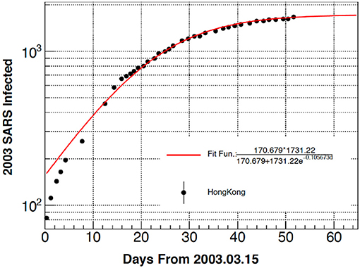
Figure 1. Number of people who tested positive to the SARS virus with function of time starting from March 15, 2003. The theory is given by the full line and the values of the fitting parameters are reported in the inset.
In Figure 2, we turn our attention to the COVID-19 cases recorded in China, the country where the infection started. Our model reproduces rather well the data apart from the small “jump” near day 17 after the start of the measurements. This jump is most probably due to the choice by the Chinese government to intensify the number of tests in the Hubei region, the center of the infection, on that day.
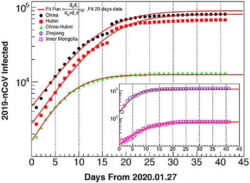
Figure 2. Patients who tested positive for COVID-19 with function of time starting from January 27, 2020. Each region case is clearly indicated in the figure together with the fitting function. Model and theory saturate at long times which implies the epidemic is over. The model suggests 25 days for saturation, shorter than for SARS in Figure 1 (around 50 days).
No jumps are seen in the data regarding other regions. The different curves suggest that most of the cases occurred in the Hubei province and regions like Inner Mongolia reported a very small number, either because of the distance from the epicenter, lower density of population, or other climatic factors. Since both the data and the model reach the asymptotic value, it suggests the epidemics to be over (but could start again). One feature worth noticing from this analysis is the “jump.” In fact, a comparison among different cases is not completely meaningful if we do not know how many cases in total have been analyzed each day. A better quantity than the one displayed in Figures 1, 2 is the ratio of the positive (or deceased) to the virus DIVIDED by the total number of tests. This ratio gives the probability of contracting the virus and we will discuss it in more detail for the Italian case where such information was available at the time of writing to the public [6].
In Figure 3 we report cases for different countries, and notice that the number of positives is about one order of magnitude less than the Chinese one reported in Figure 2. Of course, also in this case, to obtain useful information we need to know how many cases in total were analyzed in each country (i.e., we need the number of negatives as well). As we can see, our model reproduces the data well and it seems that South Korea and Japan are very close to the saturation values, thus suggesting that the crisis is over. Investigating the strategies adopted by these countries is crucial to fight the epidemic. These investigations should take into account the environment for each country. For instance, warmer weather might be effective in lowering the risk of infection. The Italian case seems to be farther away from saturation, which should be reached in about 10–15 days, March 24-2020. The number of positives seems to be the highest, but we cannot compare in absolute terms since the method and the number of tests might be different, thus highlighting the importance of a common protocol in use for this and future epidemics. It must be stressed that during this investigation, the number of tests in Italy increased from about 3,000/day to more than 10,000/day; this increase will of course modify the number of positives to the tests. Thus, in order to have some sensitivity from this analysis, we need to have a constant number of tests performed every day, otherwise it is better to study the ratio of the number of positives divided the total number of tests as we discuss below. For the case of Figure 3, we expect that increasing the number of tests daily of more than a factor of 3 will increase the number of positives accordingly [6].
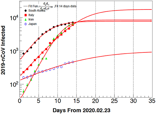
Figure 3. Same as Figure 2 for the different countries indicated in the inset. The South Korea and Iran cases seem to reach the saturation value, suggesting that the epidemic is saturating. If this is confirmed, it suggests that the crisis is saturating within 15 days either due to government actions or the particular conditions (weather, average temperature, density of population, etc). The Japan case is not close to the saturation value, thus we had to force d∞ to a finite value to perform the fit.
The Japanese case is very interesting since it seems to be spreading very slowly (small Lyapunov exponent). This could be the choice of doing (or publishing) a small number of tests each day or testing random subjects and not people who show signs of the infection, as in other countries. Most probably, Japan being an island, the high living costs, and the inhibition of foreign mass tourism, has decreased the spread of the virus together with the prompt action of the government.
In Figure 4 we analyze the Italian case with the important difference that we divide the number of positive patients (or deceased) by the total number of people tested each day. This ratio gives a probability and should be independent of the total number of tests, assuming that the criteria to choose the people to be tested remain the same. The fitting, especially for the positives, is very good and we predict saturation on March 24, 2020 with about 35% positives (full circles). The number of deceased should stabilize around 2.5% of the total number of tested people (crosses). The ratio of deceased/positive is <6% (open crosses) on March 10-2020 (data from http://www.salute.gov.it/nuovocoronavirus). After this first analysis was performed, the Italian government announced very restrictive measures and, at the same time, increased the total number of tests per day substantially. We have updated the results (right panel in Figure 4) and we will continue to do so. It seems that the measurements go to the right direction and the probability asymptotically went down from 35 to 23%. It is important to stress that the probability above does not refer to the total population but just to the people chosen by the physicians to be tested. These are usually persons who exhibit symptoms of the virus, are already recovered, or are recovering at a hospital. A large number of the deceased had other serious conditions, however, data on the age and physical conditions of the tested/deceased are not given. A more detailed study of the Italian case is in progress [6].
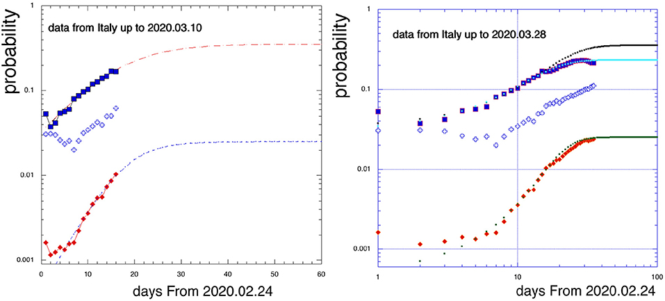
Figure 4. Infection probability (number of positives divided the total number of tested, full squares) and death probability (deceased/total, rhombs) as function of time (days) (from February 24, 2020). The open crosses give the number of deceased DIVIDED by the number of positives. The asymptotic value should be reached on March 24, 2020 (left panel). The right panel includes the last days after the exceptional measures (March 10) were announced by the Italian government. The probability to be infected went down from 35% (left panel) to 23% (right panel). A small decrease is observed for the deceased (lower points).
The analysis above gives the “time evolution” of the spread but no indications on the reason(s) why the spread occurs mostly in some places. Intuitively, and having some knowledge of the percolation model [7], we expect the spread to occur mostly in highly populated regions.
In Figure 5, we report the number of positives as function of the population density for provinces in Italy, http://www.salute.gov.it/nuovocoronavirus, South Korea, and China, https://www.worldometers.info/coronavirus/. A clear correlation is seen, with more than 1,000 cases for population densities higher than 1,000/km2. Exceptions are also seen, for instance in Seoul (S.K.) which has a higher density than Daegu where the infection supposedly started. Thus, if we can define a center of the infection, we can establish a correlation of the positives from the distance to the center. For Italy we chose as the center the middle point between Bergamo and Brescia, two highly populated cities in Lombardy which are only 50 km from each other. Wuhan and Daegu are the other two obvious choices for China and South Korea.
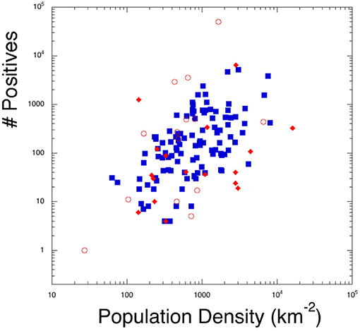
Figure 5. Number of positive cases (on March 20,2020) to the virus as function of the density of population. All the Italian provinces (full squares), South Korean (full rhombs), and some Chinese ones (open circles) are included.
In Figure 6, we plot the number of positives as function of the distance of each province from the “center of the disease” for each respective country. A power law dependence might be inferred with some spreading. The spreading might indicate that other provinces overcome a critical number of cases and they might become themselves a “center of infection.” For instance, Bergamo and Brescia are very close to Milan (the third highest point for the Italian case) and could spread to other Lombardy cities (Cremona and Monza most importantly). This percolation mechanism might be at this point out of control and maybe a strategy would be to search for negatives (especially older people) and move them away from higher risk places. At the time of writing it seems that the spreading is contained below the Appenine mountains, which seem a natural division of the northern part (the Po valley- the most affected), from Tuscany and the center part of Italy [6].
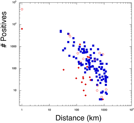
Figure 6. Number of positives from the “center of infection” (on March 20, 2020). The x-axis gives the distance from Wuhan (open circles) for China, Daegu for South Korea (rhombs), and the middle of Brescia and Bergamo for Italy (squares). We located arbitrarily Wuhan and Daegu at a 1 km distance and Bergamo-Brescia at 25 km.
The previous cases can be effectively combined by plotting the number of positives as function of the population density divided by the distance, see Figure 7. A power law fit is also performed, indicating that the spread was more contained for the South Korean case. Apart from the prompt action of the government and the collective response of the population, we “feel” that most serious cases occurred in places farther away from the ocean. Thus, our suggestion would be to move the older population (after careful controls) to sea resorts which should be available in this period.
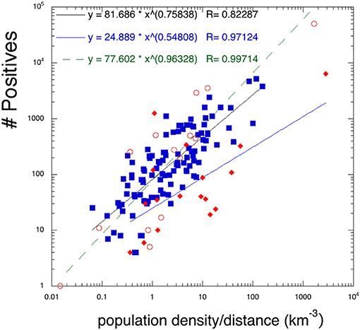
Figure 7. Number of positives as function of the density of the population divided by the distance from the “center of infection” for the different countries as in the previous Figures 5, 6 (on March 20, 2020). A power law dependence is also included, suggesting a lower spread for the South Korean case. Symbols as in Figures 5, 6.
To summarize, we have shown that data analysis based on chaos theory is able to well-reproduce existing data on different viruses (SARS, COVID-19 in this work). It gives predictions for the disease to fully spread in 15–30 days depending on the contrasting action of the health officers and/or the environment. We also suggest that a highly dense population is a principal cause to “feed” the virus. High densities imply a large number of cases, which might overcome the capabilities of health facilities, thus producing a large number of fatalities and substantial differences among different countries having more resources (for instance, ventilators) [6]. Moving higher risk populations to lower densities might help to limit the impact of the virus. Cases like Singapore or other warm countries have resolved their cases in relatively shorter times without any drastic measures like China or Italy, https://www.worldometers.info/coronavirus/. Not all countries might behave as discussed in this work, thus an application of our findings to other cases should help our understanding, especially in view of a persistence of the epidemics if a vaccine is not provided soon. We hope that the spring season might help to resolve the crisis. But it is important to stress that a defeated epidemic might come back. Thus, we should keep our guard at very high levels and maintain precautions: hygiene, washing hands, interpersonal distances, staying home with a fever, etc. The only way to stay safe against the infection is to have a vaccine soon. Massive investments should be done worldwide to produce a vaccine before next winter, and time is short. Our analysis might help in deciding government strategies to save energies in battles we cannot win and prepare for the next wave [8]. The subject is in rapid evolution, for a recent review and updated references see [9].
Data Availability Statement
The raw data supporting the conclusions of this article will be made available by the authors, without undue reservation.
Author Contributions
All authors listed have made a substantial, direct and intellectual contribution to the work, and approved it for publication.
Conflict of Interest
The authors declare that the research was conducted in the absence of any commercial or financial relationships that could be construed as a potential conflict of interest.
References
3. Arena P, Bonasera A, Brigante C, Bucolo M, Di Grazia F, Lombardo D, et al. Towards a portable device for real-time nonlinear characterization of heart dynamics. In: 2008 Mediterr. Conf. Control Autom. - Conf. Proceedings, MED'08 (2008).
4. Baran V, Zus M, Bonasera A, Paturca A. Quantifying the folding mechanism in chaotic dynamics. Rom Journ Phys. (2015) 60:1263–77.
5. Zhang S, Bonasera A, Huang M, Zheng H., Wang DX, Wang JC, et al. Strongly resonating bosons in hot nuclei. Phys Rev C. (2019) 99:044605.
6. Bonasera A, Bonasera G, Chaos ZS. Percolation and the Coronavirus Spread: The Italian Case. (in preparation). Available online at: https://www.medrxiv.org/content/10.1101/2020.04.10.20060616v1 (accessed April 14, 2020).
7. Bonasera A, Bruno M, Dorso CO, Mastinu PF. Critical phenomena in nuclear fragmentation. Rivista Nuovo Cimento. (2000) 23:1.
Keywords: chaos, turbulent mixing, percolation, COVID 19, SARS
Citation: Bonasera A and Zhang S (2020) Chaos, Percolation and the Coronavirus Spread. Front. Phys. 8:171. doi: 10.3389/fphy.2020.00171
Received: 31 March 2020; Accepted: 22 April 2020;
Published: 30 April 2020.
Edited by:
Matjaž Perc, University of Maribor, SloveniaReviewed by:
Gholamreza Jafari, Shahid Beheshti University, IranMichele Bellingeri, University of Parma, Italy
Copyright © 2020 Bonasera and Zhang. This is an open-access article distributed under the terms of the Creative Commons Attribution License (CC BY). The use, distribution or reproduction in other forums is permitted, provided the original author(s) and the copyright owner(s) are credited and that the original publication in this journal is cited, in accordance with accepted academic practice. No use, distribution or reproduction is permitted which does not comply with these terms.
*Correspondence: Aldo Bonasera, Ym9uYXNlcmFAbG5zLmluZm4uaXQ=